Free: 96 PPC tools + my AI Playbook book

These are real business formation / llc pages spending actual money on Google Ads right now.
From real business formation / llc Google Ads campaigns in the US
The landing pages actually worth stealing from
So you know exactly what to avoid
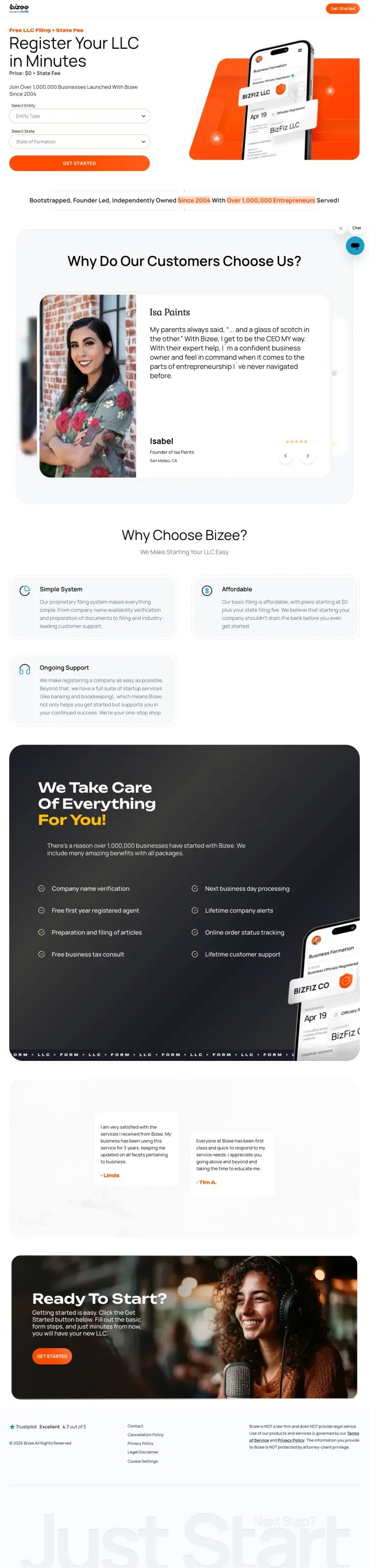
Put the registration form directly in the hero section with only 3 fields (entity type, state, email) so visitors can start the process without scrolling. The headline 'Register Your LLC in Minutes' with 'Price: $0 + State Fee' removes both complexity and price objections in one glance.
Inline form in the hero with just 3 fields (Select Entity, Select State, Get Started) means the visitor can begin the LLC formation process within 5 seconds of landing, no scrolling required
'Join Over 1,000,000 Businesses Launched With Bizee Since 2004' counter immediately below the form provides massive social proof at the exact moment of decision
'Bootstrapped, Founder Led, Independently Owned Since 2004' positioning differentiates from VC-backed competitors and appeals to the entrepreneurial identity of the target audience
The orange and white color scheme is clean but the CTA button ('GET STARTED') uses the same orange as the header banner, reducing its visual pop
The 'Why Do Our Customers Choose Us?' section uses text testimonials with names but no photos, making them feel less authentic than video or photo testimonials
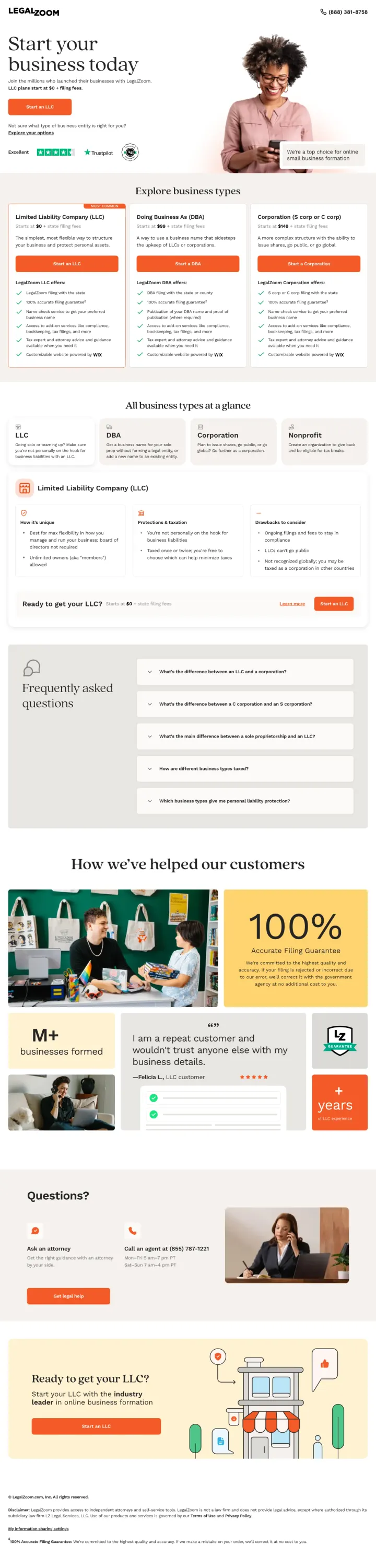
Lead with 'Start your business today' plus the $0 entry price ('LLC plans start at $0 + filing fees'), then immediately present a self-selection mechanism ('I can do most of the work myself' vs 'I want peace of mind knowing attorney guidance is there'). This lets visitors self-segment into Basic ($0), Pro, or Premium without overwhelming them with features.
$0 Basic plan eliminates the price barrier entirely for DIY visitors while the Pro and Premium tiers capture visitors willing to pay for guidance. The three-tier structure with a highlighted 'Recommended' badge on Pro drives most visitors to the middle option
Trustpilot 'Excellent' badge with star rating in the hero provides third-party validation from a recognizable review platform
'Explore business types' section below pricing (LLC, DBA, Corporation, Nonprofit) helps undecided visitors choose the right entity without leaving the page
The hero uses a stock lifestyle photo of a woman in a kitchen that does not communicate 'business formation' and feels generic
The page is long and information-dense with multiple pricing tables, entity comparisons, FAQs, and testimonials, which may cause decision fatigue for visitors who already know they want an LLC
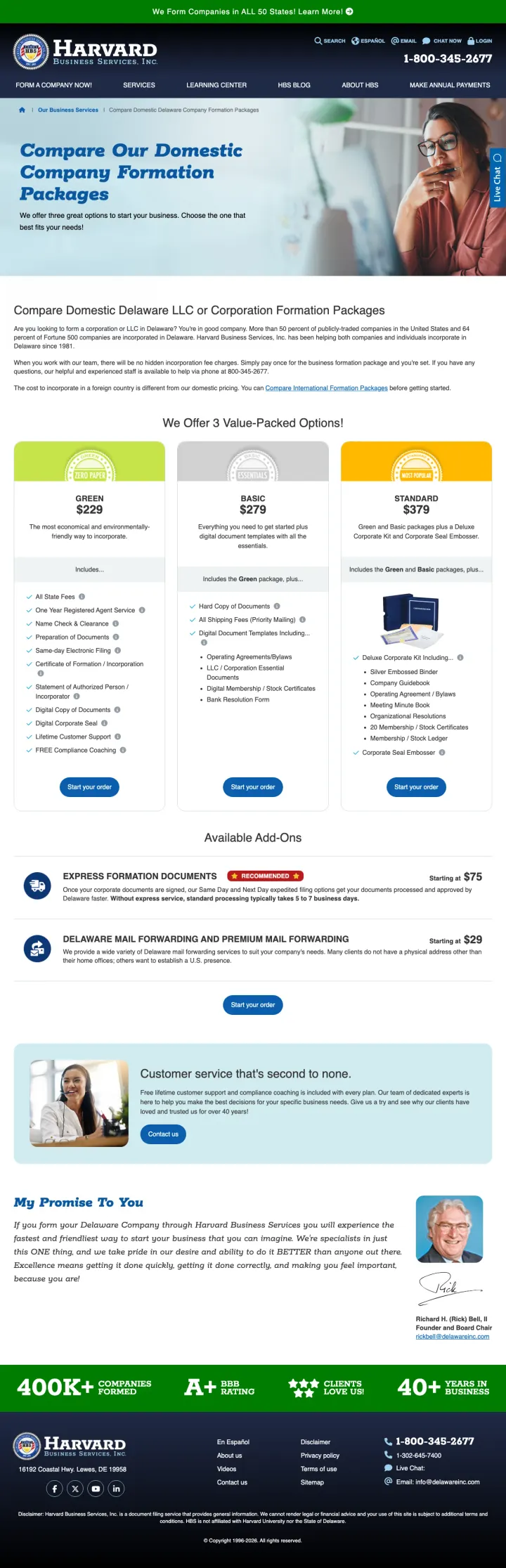
Show three incorporation packages side by side with exact pricing ($329 / $579 / $799) and a clear feature comparison. Then add a personal guarantee with a named individual ('My Promise to You' with founder photo). The combination of transparent comparison pricing with personal accountability creates trust that generic incorporation sites cannot match.
Three-tier comparison table ($329 Silver / $579 Gold / $799 Platinum) with checkmarked features lets visitors self-select the right package without calling for a quote
'My Promise To You' section with founder photo and personal guarantee creates a human connection that is rare in the incorporation services industry. It transforms a commodity service into a relationship
400K+ businesses formed and 40+ years in business as footer trust signals reinforce decades of credibility
The Harvard branding (Harvard Business Services) with the Harvard shield-style logo may create confusion with Harvard University, which could be seen as misleading
The page is dense with information and the pricing table requires careful reading. A more visual comparison with a highlighted recommended plan would speed up decision-making
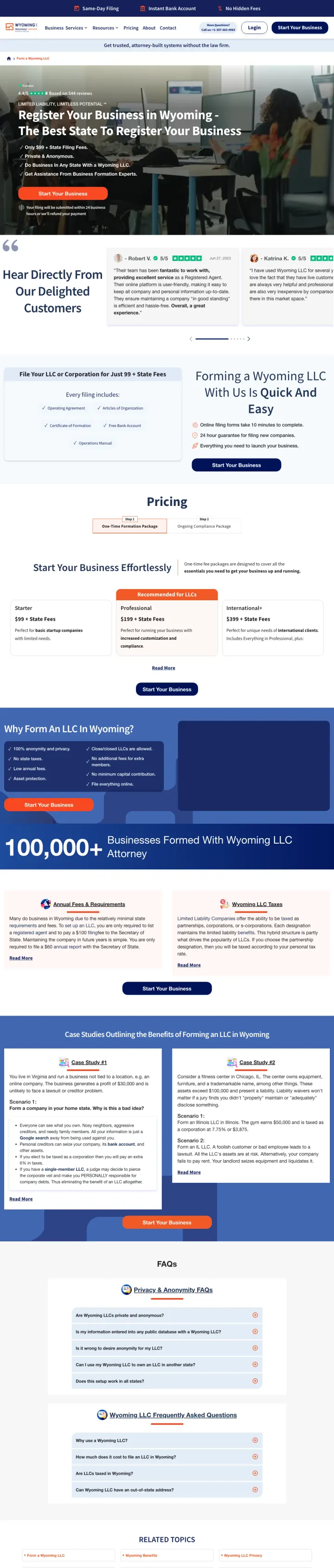
Own a single jurisdiction with attorney branding and a flat-fee hero ('Register Your Business in Wyoming - $0 State Filing Fee, $99 LLC formation, Same-Day Guarantee'). The headline tells the visitor who has already searched 'wyoming LLC' that they are in the right place AND that the entity handling the filing is an attorney, not a filing form.
Hero combines the flat fee ($99 LLC formation including bank account) with the same-day guarantee and the attorney positioning ('Get Assistance From Business Formation Experts'). Three different reassurances compressed into one headline
Named customer testimonials with photos and star ratings (Robert V., Katrina K., etc.) visible in the hero provide peer validation at the moment of decision
'100,000+ Businesses Formed With WyomingLLC Attorney' counter combines scale with specificity. The visitor trusts a number that is big but not suspiciously round
The top promo bar and multiple consent banners crowd the hero area, competing with the orange 'Start Your Business' CTA for attention
The pricing section below the fold shows $0 / $99 / $299 tiers but does not explain which parts of the $99 package exist only because the attorney is handling the filing vs. which parts are standard commodity services. The attorney premium is the whole pitch and it deserves more prominence
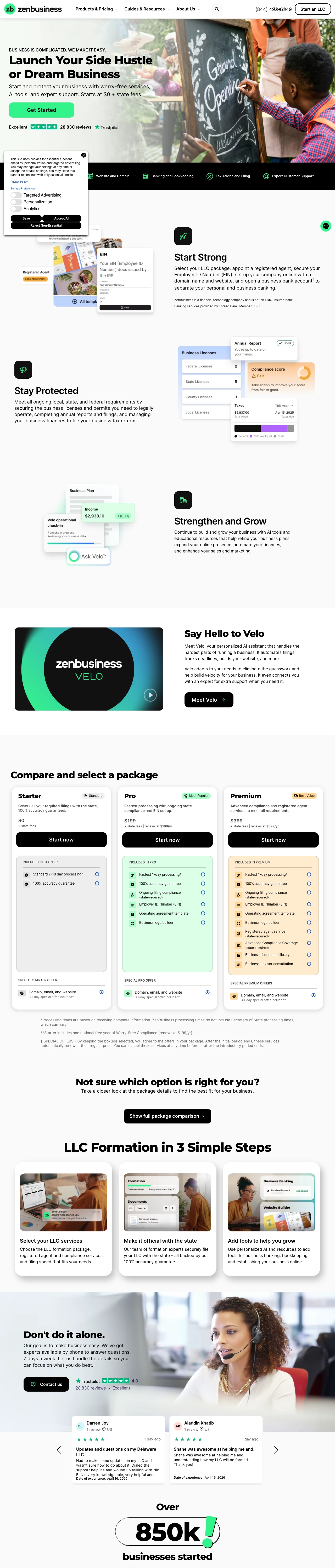
Open with a clean $0 / $199 / $399 three-tier pricing grid where the middle 'Most Popular' Pro tier ($199 with 1-day processing, EIN, ongoing compliance, and operating agreement) is the one most visitors pick. Put a named AI assistant ('Say Hello to Velo') below the pricing so the offer is not a one-time filing but a year-round compliance partner. The Pro tier is the pricing anchor that keeps $0 shoppers spending more.
Trustpilot 'Excellent' badge with 28,830 reviews in the hero is a review count an order of magnitude above most filing competitors, and the number alone does more trust work than any claim in the body copy
The 'Velo' named AI assistant with its own section ('automates filings, tracks deadlines, builds your website') turns the service from a one-off filing into an ongoing product, which justifies the $199 and $399 annual renewal model
Recent-dated customer review block (Trustpilot reviews dated April 11-16, 2026) scrolling live in the footer signals real, fresh activity in a category full of stale testimonials
The pricing grid repeats itself three times down the page (package cards, 'Compare and select a package' blocks, and a full feature comparison table), which creates decision fatigue for visitors who are ready to pick the middle tier and move on
The hero headline 'Launch Your Side Hustle or Dream Business' is softer than Bizee or IncAuthority's blunt 'Register your LLC' language, and for a visitor who already typed 'form llc' into Google the poetic framing adds a beat before the price
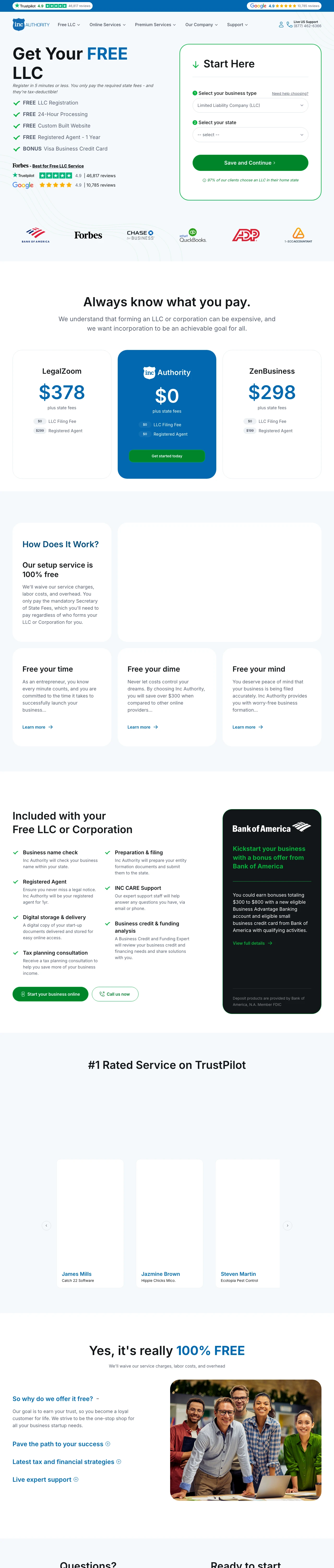
Lead with the word FREE five times in a bulleted list (FREE LLC Registration, FREE 24-Hour Processing, FREE Custom Built Website, FREE Registered Agent, BONUS Visa Business Credit Card). Then add a vs-competitor comparison table on the page itself ('LegalZoom $378 vs Authority $0', 'ZenBusiness $298 vs Authority $0'). Most competitors make the visitor leave to compare prices. IncAuthority forces the comparison on-page.
'Always know what you pay' section with direct side-by-side comparison tables calling out LegalZoom at $378 and ZenBusiness at $298 next to IncAuthority's $0 turns price-shopping into a closing move, not a risk. The competitor names are spelled out, which is rare in paid landing pages
Trustpilot 46,817 reviews at 4.9 stars plus Google 10,785 reviews at 4.9 stars stacked in the hero give a combined review volume that outpaces most competitors in this category by a factor of 2-3x
Forbes 'Best for Free LLC Service' award badge adds third-party editorial validation that a $0 product is not too-good-to-be-true
The hero uses the word FREE ten times between the headline, bullets, and sub-nav, which starts to read like a late-night infomercial and may undercut trust for the analytical buyer who is looking for the catch
The 'BONUS Visa Business Credit Card' line sits alongside the filing bullets without explanation, which reads as gimmicky next to more substantive inclusions like the registered agent
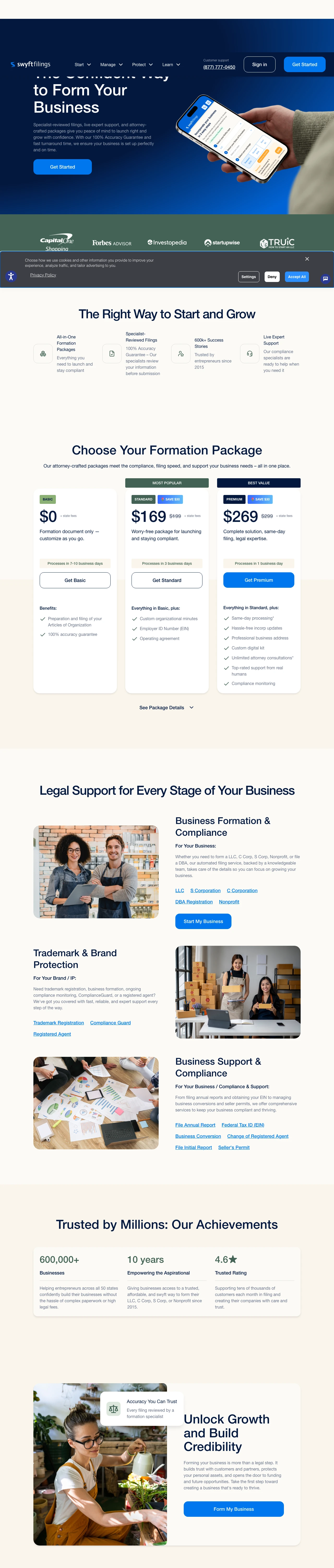
While competitors fight for the lowest number, anchor the hero on competence: 'The Confident Way to Form Your Business' with 'Specialist-reviewed filings, live expert support, and attorney-crafted packages'. Then show three tiers ($0 Basic, $169 Standard, $269 Premium) where Standard and Premium are discounted $30 from a stated MSRP. The framing positions the $0 tier as the loss-leader and the paid tiers as the actual product, backed by attorneys and compliance specialists.
'Attorney-crafted packages' and 'Specialist-reviewed filings' in the hero are the clearest competence signals in the category. They imply that competitor packages are not attorney-crafted, which is a subtle knock on the commoditized filing platforms without naming anyone
Discounted pricing with the MSRP struck through ('$169 $199' and '$269 $299') creates the perception of an active promotion rather than a permanent price, which increases urgency without adding a fake countdown timer
'600k+ Success Stories' plus 'Trusted by entrepreneurs since 2015' is a specific, auditable trust claim that avoids the 'over 1 million' round-number inflation that starts to lose credibility in this category
The hero headline repeats itself in two places (once as small text, once as H1) which suggests a template rendering issue, not a design choice, and undermines polish for the buyer who notices
The tier names ('Basic / Standard / Premium') are generic and recycled from every competitor. Naming the tiers around the buyer ('Self-Serve / Launch-Ready / Attorney-Backed') would reinforce the attorney-crafted positioning the hero establishes
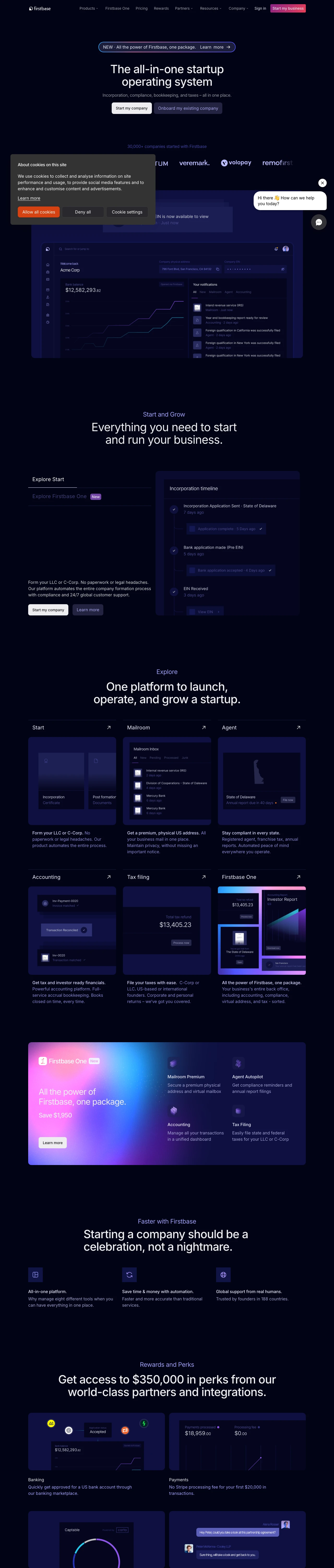
Drop the filing-service vocabulary entirely. Lead with 'The all-in-one startup operating system' and 'Incorporation, compliance, bookkeeping, and taxes, all in one place'. Back it with Y Combinator and HubSpot investor logos, 30,000+ companies started, and 'Trusted by founders in 188 countries'. The visitor who is about to take VC money or build a global product reads this as a peer brand, not a filing website.
Y Combinator investor logo in the hero ribbon immediately signals 'serious startup brand' and disqualifies visitors looking for the cheapest filing, which is exactly the filtering a premium product wants
'All-in-one startup operating system' reframes the product from 'LLC filing' to 'infrastructure layer', which supports higher price points and expands the revenue footprint far beyond the one-time formation fee
Portfolio logo wall showing named companies that started with Firstbase (Plutocard, Lightspin, Tatum, Volopay, Workweek) is the startup-world equivalent of case studies and carries more weight with the founder audience than testimonial quotes would
No pricing anywhere in the hero or above the fold. For a commodity category where every competitor leads with $0 or $99, hiding the number forces the visitor to click through before they can evaluate the offer, which will cost conversion on price-sensitive traffic that slipped through the targeting
'Save $1,950' on Firstbase One is the only price anchor on the page and it references a discount off an unnamed base price, so the visitor cannot calculate the actual cost without clicking Learn More
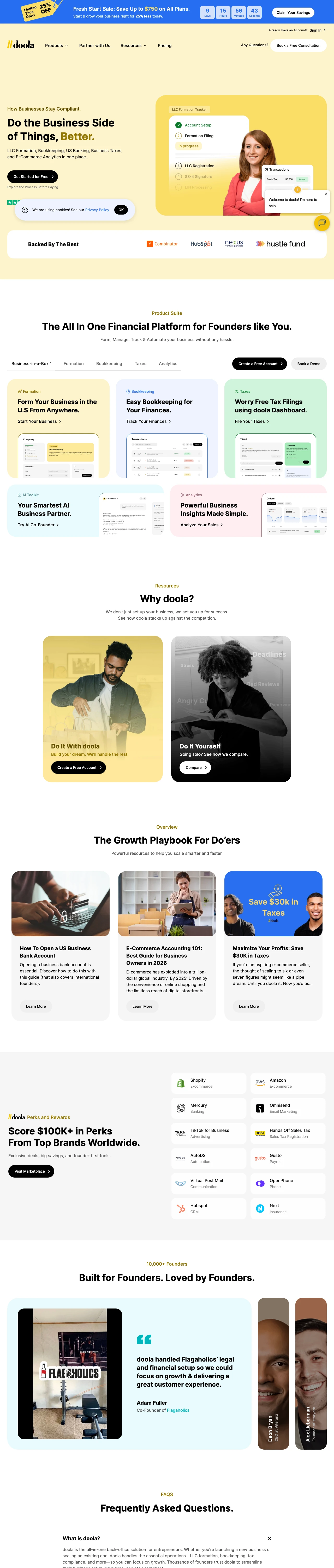
Combine a concrete time-bound promotion ('Fresh Start Sale: Save Up to $750 on All Plans' with live countdown clock) with a specific segment hook ('Form Your Business in the U.S From Anywhere'). The countdown converts price-sensitive shoppers on urgency while the 'from anywhere' framing pulls in international founders who cannot use domestic-only filing services. One hero serves two buyer types.
Live countdown clock (10 days 03 hours 06 minutes 11 seconds) next to the 'Save Up to $750' claim manufactures urgency with a specific dollar amount attached. The combination of discount + deadline is the oldest direct-response pattern in the book and it is missing from most competitors in this category
'Form Your Business in the U.S From Anywhere' explicitly calls out the international founder segment. For non-US residents who cannot use most domestic filing services for banking and EIN reasons, this is message-match at the segment level, not just the keyword level
Y Combinator, HubSpot, and Nexus investor logos plus 'Backed By The Best' section establishes startup-brand credibility similar to Firstbase but targeted at a different buyer (non-US founders instead of VC-track domestic founders)
The countdown timer is the most prominent element in the hero, which for a permanently-running promotion suggests the urgency is manufactured rather than genuine. Analytical buyers will notice that the sale resets and discount the urgency
'Do the Business Side of Things, Better' is a soft headline that hides the international-formation angle. The 'from anywhere' differentiator is the whole reason to pick doola over Bizee and it deserves the H1 slot
Pages that break the playbook in interesting ways
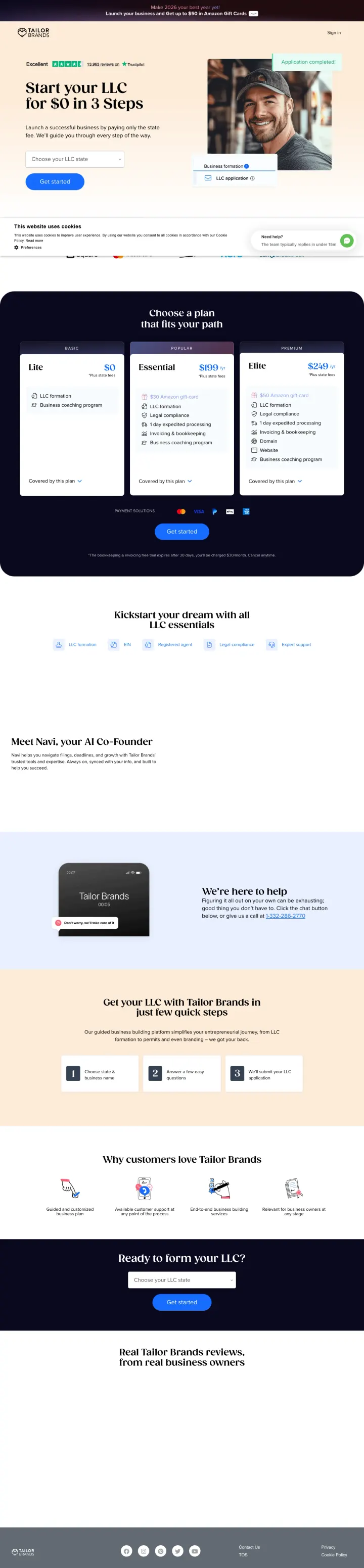
Why This Breaks the Rules: Every other $0 LLC service in this set leads with the filing price and sells the upsell (registered agent, EIN, operating agreement) later. TailorBrands bundles LLC formation with a logo/brand kit that no one asked for. It sounds wrong until you read the hero: 'Start your LLC for $0 in 3 Steps, launch a successful business by paying only the state fee'. They are not selling filings, they are selling the 'launch a business' feeling, then slipping the brand kit into the $0 package.
Headline 'Start your LLC for $0 in 3 Steps' compresses the three objections (will it work, is it hard, what does it cost) into one line. 'Launch a successful business by paying only the state fee' completes the pitch with zero friction
Trustpilot 'Excellent' badge with 13,961 reviews is an unusually high review count for this category. The volume alone signals 'this is the real deal' before the visitor evaluates anything else
Promo banner at the top ('Launch 2026 as your best year yet! Launch your business and get up to $50 in Amazon Gift Cards') uses a concrete time marker and a universally recognized bribe to manufacture urgency without feeling salesy
A cookie overlay sits across the bottom half of the hero on first load, clipping the 'Get started' CTA and the state picker precisely where the first-time visitor's eye is already searching for action
The state picker ('Choose your LLC state') is a dropdown that requires a click before the visitor sees their own state, which adds a micro-friction step that Bizee's 3-field inline form avoids
Brand kit bundling is the differentiator but it is not mentioned in the hero headline. The visitor who clicks through from 'how to make llc in texas' sees the same $0 LLC pitch as every competitor and has to scroll to discover the brand-kit angle
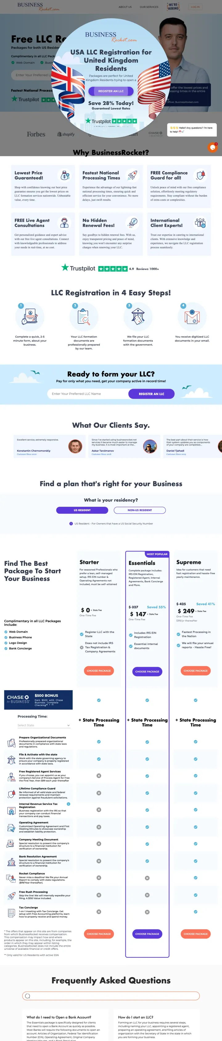
Why This Breaks the Rules: Every other LLC filing page in this set shows a single offer to every visitor. BusinessRocket's page loads with a modal overlay aimed specifically at UK residents ('USA LLC Registration for United Kingdom Residents, Register an LLC, Save 28% Today'). The modal covers the hero entirely on first load. It should be a conversion-killer, but for UK-resident visitors searching for US LLC formation it is the most message-matched hero imaginable. It is a bet that segment-specific overlays convert better than one-size-fits-all heroes.
Segment-specific modal overlay with flag iconography (US and UK flags side by side) turns a generic LLC formation page into a vertical-specific landing page for UK entrepreneurs without building a separate URL
'Same-Day LLC Filing Available' and '$0 Service Fee LLC Filing' in the ad copy create a clean price anchor that the modal preserves for the UK visitor
Trustpilot 'Excellent' badge is visible behind the modal and logos (Forbes, Shopify) anchor credibility for a platform most visitors have not heard of
The modal covers the hero on every visit, not just UK-source traffic. Non-UK visitors see an offer that is not for them and must dismiss it before seeing the actual page. This likely hurts non-UK conversion
'Save 28% Today!' urgency badge is vague. 28% off what? A promotion that does not name the base price reads like a gimmick to the analytical buyer
The page targets 11 keywords with 1,180 total monthly search volume, which is tiny compared to Bizee (371K) and TailorBrands (174K). Either the paid strategy is narrowly targeted or the page is not ranking for the volume its competitors pull
4 pages burning ad spend with fundamental issues
Every click to these pages costs real money. We found broken trust signals, mismatched intent, weak CTAs, and messaging that ignores what the searcher actually typed. Here is what to avoid.
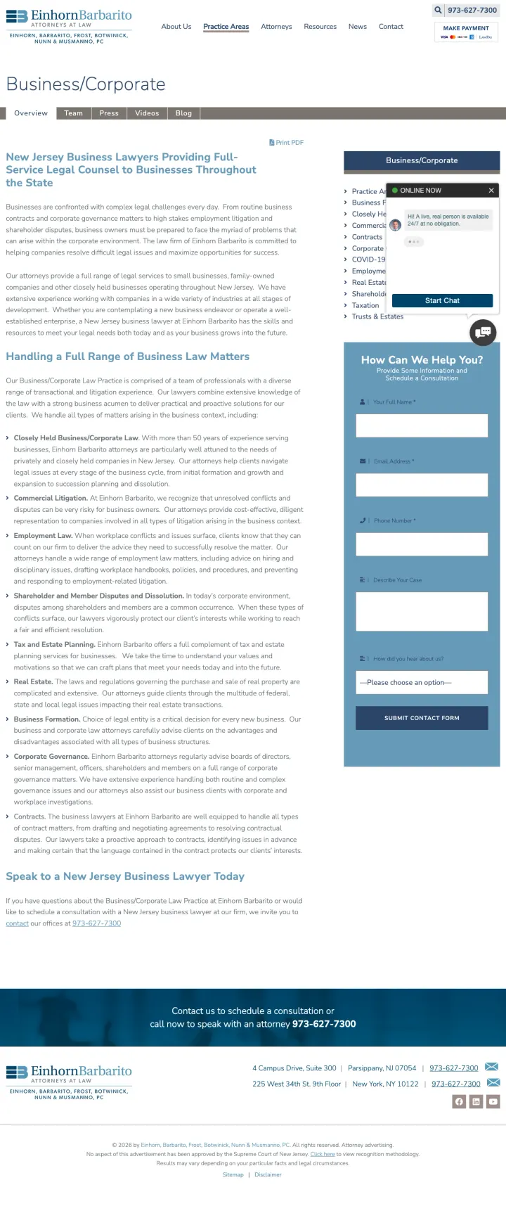
This page targets 'business lawyers in new jersey' (SV: 390) and delivers a long text page listing every type of business law the firm handles (commercial litigation, employment law, real estate, tax). No form, no CTA button, no attorney photos above the fold. The only conversion path is a phone number and address at the very bottom. At legal CPCs of $15-30, every click lands on what reads like a law school syllabus.
Dense paragraphs of text describing each practice sub-area read like a legal directory listing, not a page designed to generate consultations
No attorney photos, no case results, no testimonials. Nothing that differentiates this firm from any other NJ business law firm
No form and no prominent CTA. The visitor must scroll to the footer to find a phone number
The ad targets 'massachusetts business lookup' (SV: 12,100) and the landing page is a SCORE.org resource page that provides instructions for using the Massachusetts Secretary of State's corporate database, then links directly to that government site. The visitor who clicks the paid ad gets directed to a free government tool via an intermediary. SCORE provides no value beyond the link itself, and the visitor will leave immediately to use the actual government search tool.
The page's only purpose is to link to a free government website. Paying for clicks to an intermediary page adds zero value
SCORE.org is a business mentoring nonprofit, not a business formation service. The keyword targeting is fundamentally misaligned
A large stock hero image of a man with a laptop fills the viewport before any useful content appears, giving 'I paid for this click' visitors a generic nonprofit brochure instead of the search tool they asked for
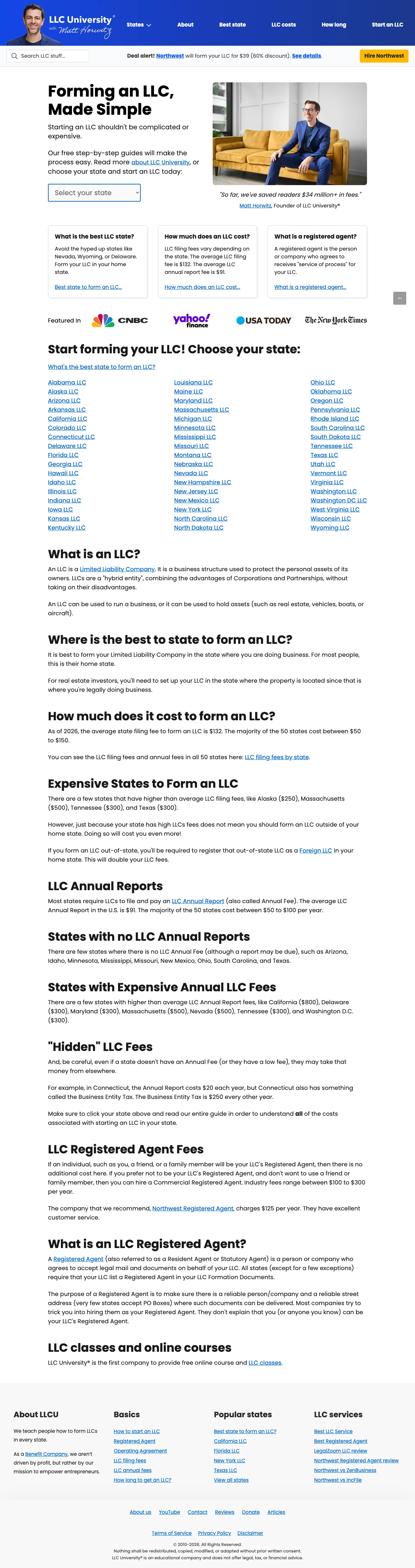
LLC University is a pure content site. There is no formation service, no filing product, no checkout. The homepage leads with 'Forming an LLC, Made Simple' and a state picker, but every click routes to a free educational article, not to a filing flow. The site runs on affiliate revenue from registered-agent services and ad placements, which means it is paying for clicks only to hand the visitor off to a partner. At LLC-formation CPCs of $8-30, this is the worst position in the market: you pay full price for the click, then the visitor has to click again to reach a paid service.
No form, no pricing, no checkout anywhere above the fold. The primary CTA is a state dropdown that leads to another article, not to a purchase
The hero pitch ('Starting an LLC should not be complicated or expensive') sets up an expectation that this site will make it simple, then delivers a 50-state directory of long-form guides instead of a filing service
Every formation-intent keyword sends the visitor one click away from a competitor. The site's best case is that the visitor clicks an affiliate link to Bizee or Northwest, which means the $8-30 CPC is spent to generate a commission worth a fraction of that
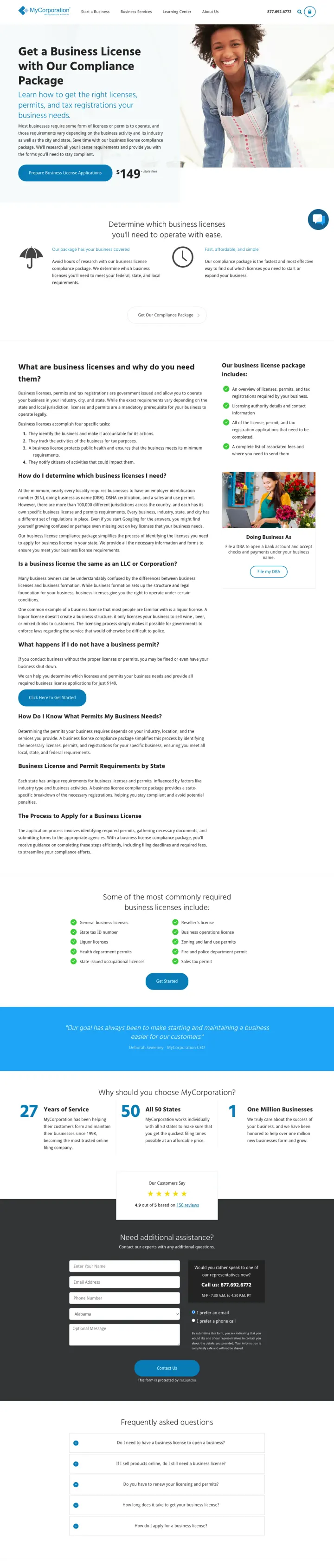
This page targets 'tennessee business license application' (SV: 220) and delivers a generic business license compliance page at $149 + state fees. While the pricing is transparent and the page is professionally designed, the content is generic (not Tennessee-specific) and the form is buried below multiple content sections. The ad promises state-specific help but the page delivers a generic national service page. For visitors searching for their specific state's business license requirements, this generic approach feels like a bait-and-switch.
Generic national page for state-specific search queries creates message mismatch. The ad targets 'tennessee business license application' but the page never mentions Tennessee
The intake form is buried below multiple content sections about what business licenses are and why you need them
The hero stock photo of a smiling woman adds nothing to the message and takes up valuable above-the-fold space
Bizee, LegalZoom, TailorBrands, and BusinessRocket all lead with the same hook: $0 service fee, you only pay the state filing fee. This is a loss-leader model where the upsell (registered agent, EIN, operating agreement, bank account setup) is where the real revenue lives. For the price-sensitive...
Bizee's hero is three form fields (entity type, state, email) and a GET STARTED button. The visitor can begin the LLC formation within 5 seconds of landing, no scrolling, no extra click. BusinessRocket uses the same pattern. This outperforms a 'Start Now' button that routes to a separate form pag...
Harvard Business Services (Delaware, 40+ years, 400K+ businesses formed) and Wyoming LLC Attorney ($99 + bank account included, 100,000 businesses formed) both charge more than the $0 platforms and both win their state-specific searches. They do it with founder photos, statute references, and dee...
MyCorporation targets 'tennessee business license application' and sends traffic to a generic national business-license page that never mentions Tennessee. This is the most common failure pattern in business formation PPC: state keyword goes to a generic page, message match collapses, and the vis...
Winners lead with the price ($0 or a specific tier), put the filing form or tier-picker above the fold, and match the state in the search query. Losers send filing traffic to practice-area law firm pages with no form, to nonprofit resource pages that link out to free government tools, to long-form educational articles about what an LLC is, or to generic national pages for state-specific queries.