Free: 96 PPC tools + my AI Playbook book

These are real car rental pages spending actual money on Google Ads right now.
From real car rental Google Ads campaigns in the US
The landing pages actually worth stealing from
So you know exactly what to avoid
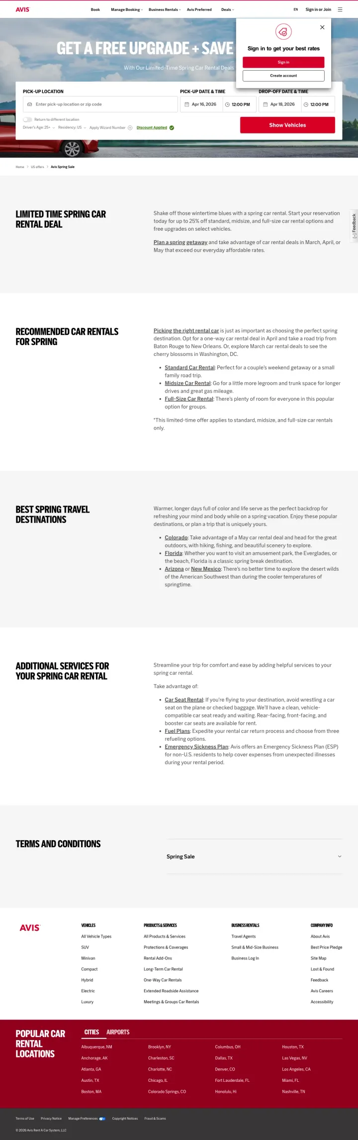
Lead with a time-bound promotional offer ('Free Upgrade + Save up to 25%') above the booking form, so visitors have a concrete reason to book now rather than comparison-shopping competitors.
'Get a Free Upgrade + Save up to 25%' headline immediately answers the visitor's unspoken question 'why should I book here instead of Hertz?' -- in a commodity category, the page that gives a reason wins
Specific vehicle class recommendations for the season (Standard for couples, Midsize for legroom, Full-Size for groups) guide visitors who are overwhelmed by car class options into the right choice without requiring them to understand rental jargon
Destination suggestions (Colorado for hiking, Florida for spring break, Arizona/New Mexico for desert) transform a transactional booking page into a trip-planning moment, which increases time-on-page and emotional investment before the visitor hits 'Show Vehicles'
The booking form appears above the hero image with the promotional headline, so visitors who land at the top of the page see a naked form with no context about the spring sale before scrolling down
Terms and conditions block is 500+ words of dense legal text at the bottom -- while legally required, it dominates the bottom half of the page and pushes the footer out of view
No pricing examples anywhere on the page -- '$X/day for a midsize' would make the '25% off' claim concrete instead of abstract
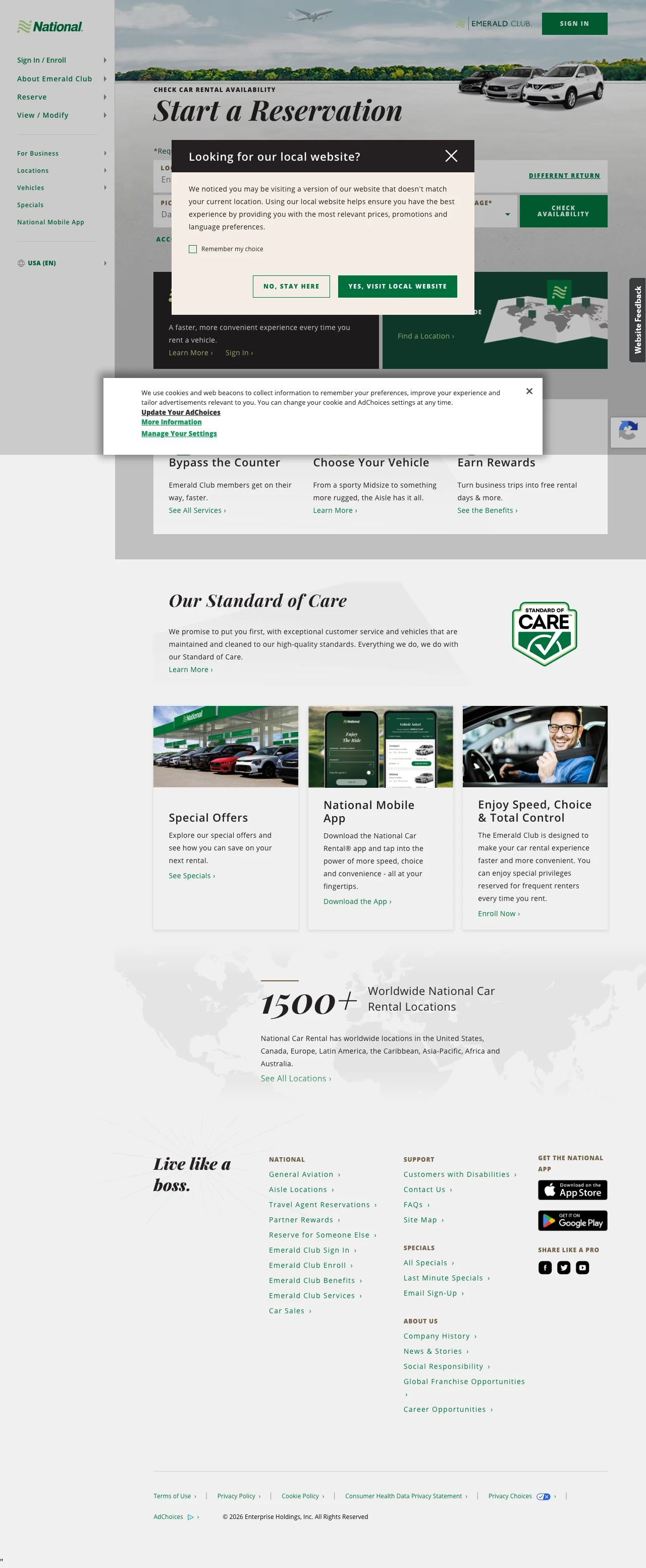
Structure your car rental landing page around three benefit pillars that answer 'why us?' rather than just presenting a booking form. National's 'Bypass the Counter / Choose Your Vehicle / Earn Rewards' trio gives visitors three concrete reasons to choose National over Enterprise or Hertz.
'Bypass the Counter' speaks directly to the #1 pain point of airport car rental -- the 45-minute line at the counter after a long flight. This benefit is worth more than any price discount to frequent travelers
'Choose Your Vehicle' differentiates from competitors where you get whatever car they assign you. The Emerald Aisle concept (walk the lot, pick any car in your class) gives the renter a feeling of control that other brands do not offer
'1,500+ Worldwide Locations' stat with a map visual provides instant credibility for travelers who rent in multiple cities -- it signals that National is not a regional player
A geo-redirect popup ('Would you like to visit your local website?') covers the hero section on initial load, forcing visitors to click through a modal before seeing any content -- this is conversion friction on every single paid click
'Our Standard of Care' section about vehicle cleaning standards feels like a leftover from COVID-era messaging and takes up prime real estate that could showcase pricing or fleet options
No pricing or rate examples anywhere on the page. Visitors searching 'car rental [city]' want to know approximate daily rates before committing to the booking flow
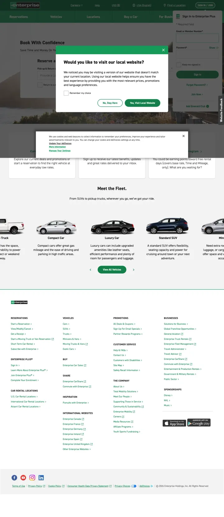
Add a promotional banner or seasonal deal above the booking form. Enterprise sends nearly 1M monthly search volume to this page and converts purely on brand recognition, but a single pricing anchor or limited-time offer would give comparison shoppers a reason to stop searching.
'Meet the Fleet' vehicle carousel with clean photos and category descriptions (Compact, Luxury, SUV, Minivan, Pickup Truck) lets visitors self-select their vehicle class before entering the booking flow, reducing the anxiety of 'will they have what I need?'
Three-card promotions section (Current Deals, Email Offers, Enterprise Plus) below the form gives secondary engagement paths for visitors who are not ready to book immediately
'No Cancellation Fees' messaging from the ad copy is a strong anxiety-reducer for travelers whose plans might change -- but it is buried in the ad and not reinforced on the landing page
Same geo-redirect popup as National ('Would you like to visit your local website?') covers the booking form on initial load. For a page receiving 949K monthly search volume, this popup costs thousands of bookings per month
Cookie consent banner stacks on top of the geo-redirect popup, creating a double-popup wall that visitors must click through twice before seeing any content
No pricing, no promotional offer, no seasonal deal, no discount code anywhere on the page. The ad promises 'Reserve a Car with Enterprise' and the page delivers exactly that -- a reservation form -- but offers zero reason to book here versus Hertz or Avis
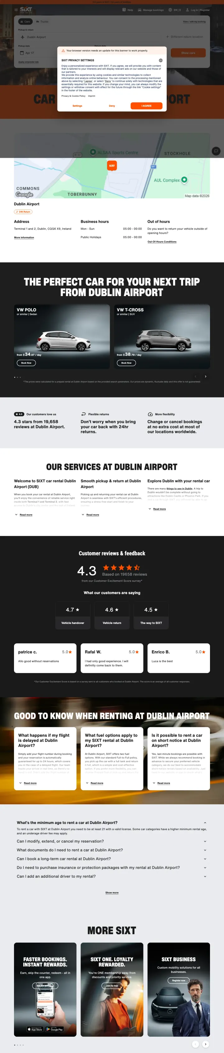
Build airport-specific landing pages that combine the booking form with local fleet availability, real customer reviews for that location, and practical rental tips for first-time visitors to that airport.
Customer reviews section with 4.3/5 star rating specific to Dublin Airport location builds trust through social proof tied to the exact pickup point the visitor searched for
Vehicle category cards with real photos and starting prices (not just generic silhouettes) let visitors mentally commit to a vehicle class before entering the booking flow
Good to Know When Renting at Dublin Airport section answers the three questions every airport renter has: minimum age, fuel policy, and what happens if my flight is delayed
cookie banner obscures the booking form hero on initial load, forcing a click-through before the visitor can interact with anything
The orange and black color scheme feels dated compared to the clean white layouts of Enterprise and National
No pricing shown on the hero or booking form area -- visitor has to scroll to vehicle cards to see any rate information
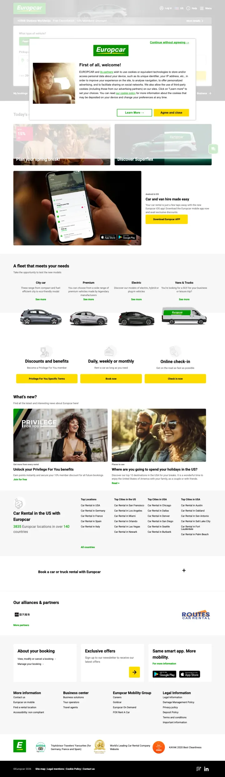
Organize your fleet by customer need (city car, premium, electric, vans and trucks) rather than just by size class (compact, midsize, full-size). Visitors self-select faster when categories match how they think about their trip.
Fleet grid organized by use case (City car, Premium, Electric, Vans & Trucks) with photos lets visitors find their category in seconds without learning rental industry jargon like Intermediate or Standard
Privilege For You loyalty tier banner with clear benefits creates an immediate differentiation hook for returning customers and plants the loyalty seed for first-time visitors
Three-column value strip at the bottom (About Your Booking, Exclusive Offers, Same Smart App) anchors the footer with utility rather than wasting it on a link farm
Cookie consent modal with Agree and Close button covers the entire hero section and booking form on initial load, creating an immediate friction barrier for every paid visitor
Discover Inspiration section with lifestyle travel imagery distracts from the booking intent -- paid search visitors want to book, not browse travel inspiration
The page is extremely long with multiple content sections that push the booking form far above the fold while burying practical information (locations, deals) below three screens of scrolling
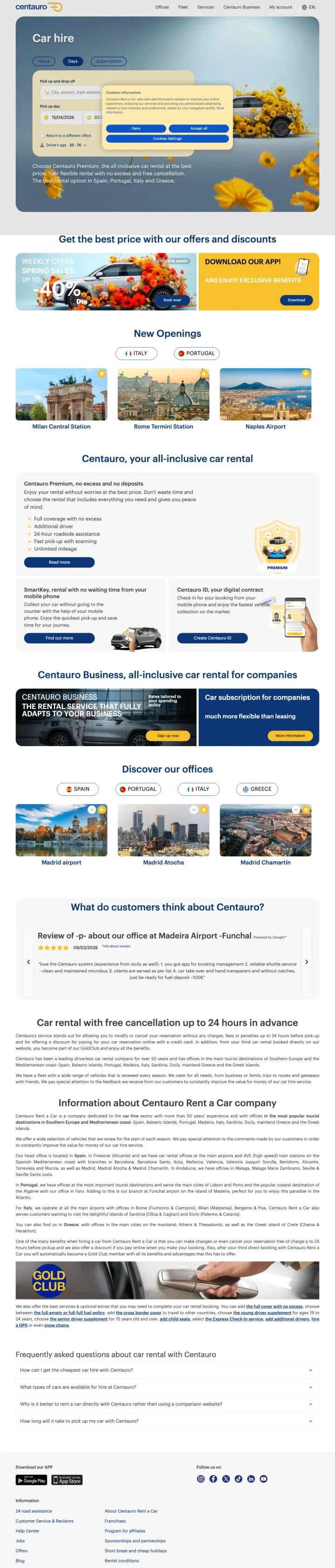
Lead with your pricing model, not your booking form. Centauro puts "all-inclusive car rental" front and center, which immediately answers the hidden fear of every car renter: surprise charges at the counter.
All-inclusive positioning (insurance, unlimited mileage, no hidden fees) as the hero message directly attacks the biggest pain point in car rental -- unexpected charges at pickup that can double the quoted price
Customer review section with specific airport location reviews (Madeira Airport, Funchal) mirrors what Sixt does but adds location-specific social proof that matches the visitor search intent
Free cancellation up to 24 hours messaging reduces booking anxiety for travelers whose plans may change, addressing the second-biggest rental fear after hidden fees
The page is in English but clearly designed for the European market (Spain focus) -- US visitors clicking from Google Ads may feel disoriented by the location options
Gold/orange award badges at the bottom are too small to read and their meaning is unclear without clicking through
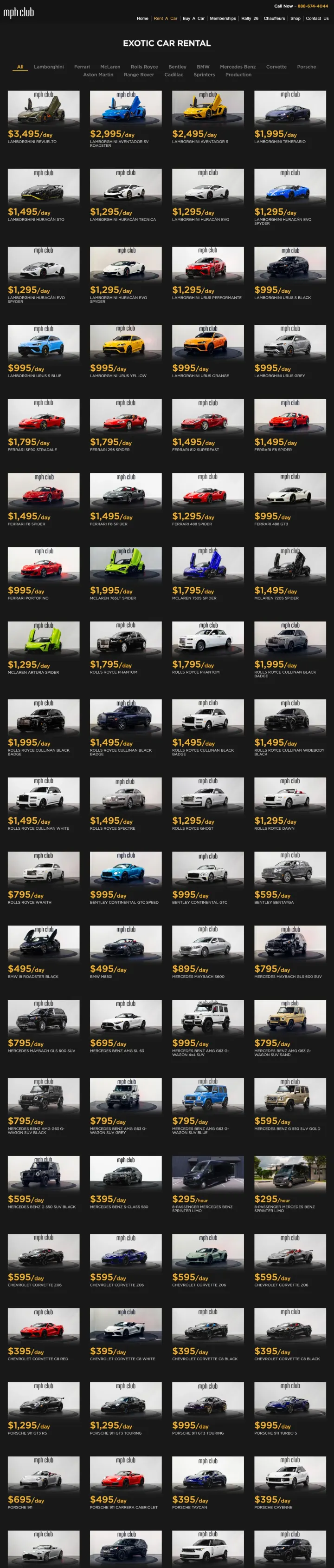
If you serve a premium niche, abandon the standard industry template entirely. MPH Club uses a dark theme, gallery-style vehicle grid, and zero booking forms because their customer does not comparison-shop on price -- they browse on desire.
Dark background with high-contrast vehicle photography creates an aspirational gallery feel that positions rental cars as luxury objects rather than transportation commodities
Phone number prominently displayed (888-674-4044) signals white-glove service -- exotic car renters expect to talk to a person, not fill out a form. The call CTA replaces the booking widget entirely
Vehicle grid showing 40+ exotic cars (Lamborghini, Ferrari, Rolls-Royce, McLaren) communicates fleet depth through visual abundance rather than filter counts or inventory numbers
No pricing visible anywhere on the page -- even luxury buyers want ballpark figures before calling. A "starting from $X/day" per vehicle would not cheapen the brand but would pre-qualify leads
The page is extremely long with dozens of vehicle thumbnails that all look similar at thumbnail size -- no categorization by brand, price tier, or occasion
Yellow "Benefits" section at the bottom with dense text paragraphs clashes with the dark premium aesthetic and reads like SEO filler content
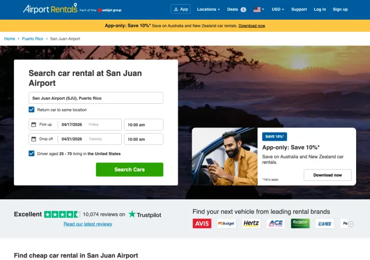
Put the Trustpilot Excellent badge with the actual review count (10,074) next to the search button. A traveller comparing six aggregators in open tabs picks the one with the loudest third-party proof, and a round-number badge ('4.8 stars') reads weaker than a specific integer count.
Hero search form is pre-filled with the specific airport (San Juan SJU) from the URL so the arriving visitor does not have to retype what the ad already promised. Aggregators that do not persist the airport force a redundant input that loses mobile travellers.
Supplier logo bar (Avis, Europcar, Hertz, ACE, CARS) sits directly below the search button so the visitor knows which brands they will be choosing between before they click search. This answers the silent question 'is this a real aggregator or a scraper site'.
Driver age toggle ('Driver ages 24 to 79 years old in the United States') is pre-configured to the common case, so 90% of visitors never see the age friction. Rental age is a buried deal-breaker that derails quote flows on most competitor sites.
Secondary 'App-only Save 10%' banner yellow-striped across the top competes with the main search CTA. A visitor who just landed from a search ad should see exactly one next step, not a cross-sell for the mobile app.
Hero photo (generic couple in a car at sunset) is stock, which undercuts the regional airport specificity the search form is working hard to establish. A real SJU airport pickup photo would reinforce the destination promise.
Pages that break the playbook in interesting ways

Ensure your landing page actually renders for bot traffic and automated crawlers. Hertz's homepage relies entirely on client-side JavaScript rendering, which means any visitor with JS disabled, any crawler, or any slow connection sees a completely white page. For a page receiving over 1M in monthly paid search volume, every rendering failure is money burned.
Nothing is stealable from a blank page, but the lesson is profound: Hertz is spending what is likely millions per month in Google Ads to drive traffic to a page that fails to render under automated testing conditions. If it fails for crawlers, it is failing for some percentage of real users too.
The entire page renders as a white screen -- no content, no form, no branding, nothing. This is likely a heavy SPA (single page application) that requires specific JavaScript execution to render, and the automated capture could not process it
For a page receiving 1,031,700 in monthly paid search volume across 74 keyword variations, any percentage of render failures represents enormous wasted spend
The page was marked 'All screenshots were blank or failed' by the capture system, suggesting this is a consistent rendering issue, not a one-time fluke
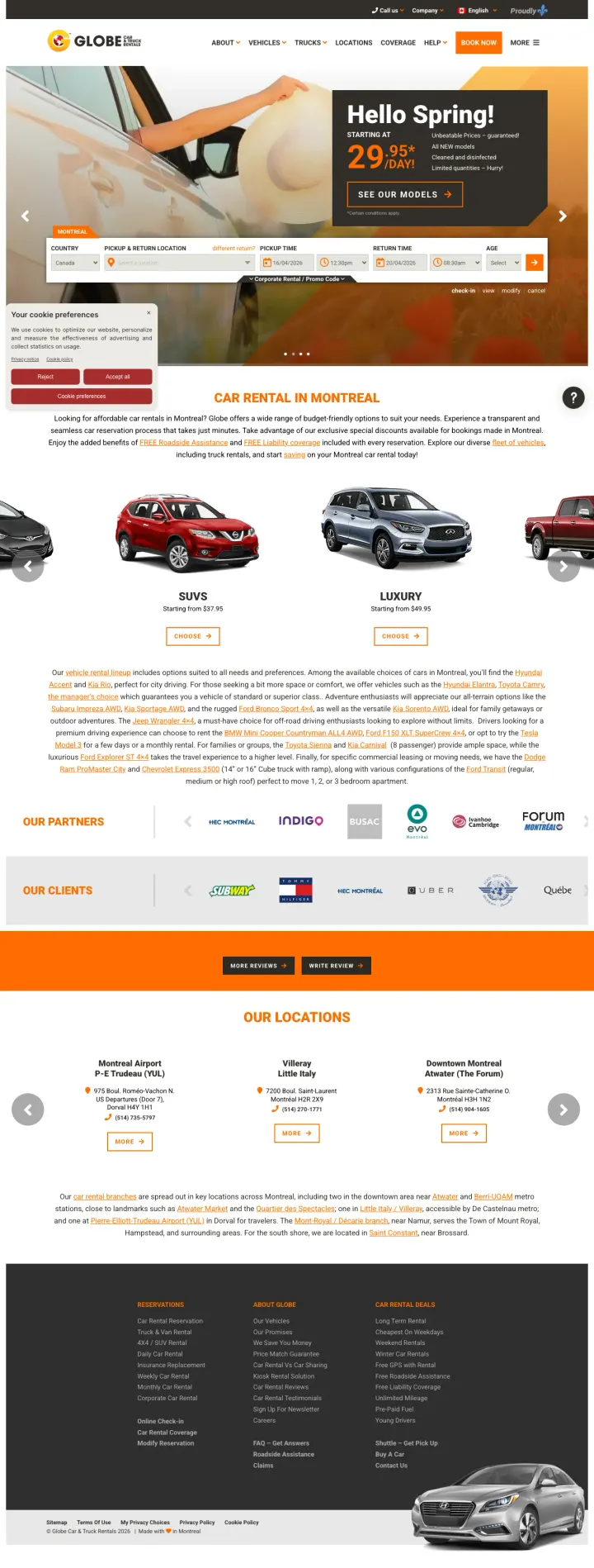
If you are a small player competing against Enterprise and Hertz, lead with a concrete price. Globe Car opens with "Hello Spring! Starting at $29.95/day" which none of the national brands dare to do on their landing pages.
Specific starting price ($29.95/day) in the hero banner is the one thing no major rental company does -- and it is the one thing comparison shoppers care about most. Price anchoring works because it gives the visitor a number to compare against competitors
Partner logos (Indigo, another company, Forum) build credibility for a local brand that lacks the instant recognition of Enterprise or Hertz
Vehicle category grid (Economy, SUVs, Luxury) with photos at each price tier lets visitors self-qualify by budget before entering the booking flow
The website design looks like a WordPress template from 2015 -- orange header bar, stock photography, dense text blocks below the fold. For a local brand competing on trust, visual polish matters more, not less
Multiple locations section at the bottom uses a carousel widget that does not clearly indicate which location is closest to the visitor
Dense paragraph of text in the middle of the page contains SEO-stuffed content about Montreal car rental that no human will read
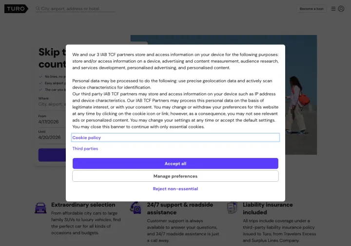
Why This Breaks the Rules: Turo is a peer-to-peer car marketplace, not a rental chain, yet it bids on 'airport car rental' keywords and opens with 'Skip the airport rental counter'. Instead of competing on price, it competes on the experience the traveller hates most, and the positioning turns category weakness (Turo does not have an airport counter) into the actual benefit.
Benefits row under the search bar ('Extraordinary selection', '24/7 airport & roadside assistance', 'Liability insurance included') pre-empts the three objections that keep travellers loyal to Hertz. Each benefit is the implicit answer to 'why not just use a normal rental'.
Recent reviews strip with real guest names and trip dates builds social proof at the exact scroll depth where the sceptic has bounced from the hero. Real names and faces matter more for a peer-to-peer platform than for a branded rental chain because the trust equation is about the specific host, not the brand.
Location-aware hero ('Airport car rental made easy') rewrites the identical page across every airport URL, so the Harlingen Texas visitor and the Las Vegas visitor both see the same trustworthy template with only the airport label changed. This is a scalable way to run paid search against thousands of airport keywords.
Cookie modal occupies the centre of the hero and hides the search form from first-time visitors. Every second a visitor spends reading an IAB TCF notice is a second the search intent cools, especially on mobile where the modal can cover the entire fold.
FAQ section is generic ('Where is Turo available?', 'Do I need my own insurance?') and reads as universal rather than airport-specific. A traveller landing on the airport page wants airport-specific answers (where do I meet the host? what if my flight is late?) not brand-level primers.
3 pages burning ad spend with fundamental issues
Every click to these pages costs real money. We found broken trust signals, mismatched intent, weak CTAs, and messaging that ignores what the searcher actually typed. Here is what to avoid.
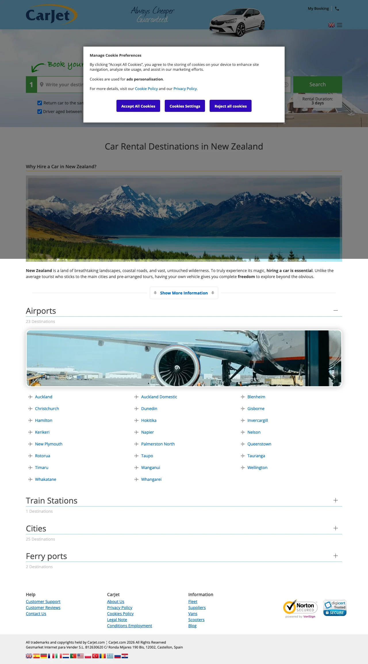
The ad headline is '$9 Day New Zealand Car Rental | 100% Ridiculously Low Prices' and the description doubles down with 'Cheapest Price Guaranteed'. The visitor arrives expecting a price. Instead they get a Manage Cookie Preferences modal sitting on top of the search form, and once they dismiss it the top of the page is a stock sedan over a blue gradient with zero rates visible. The actual body copy is a 400-word SEO essay about Hobbiton, Milford Sound, and the Southern Alps before the visitor ever sees a supplier name or a dollar figure. Paid intent is 'show me the $9 deal' and the page delivers a travel blog.
Manage Cookie Preferences modal with Accept All / Cookie Settings / Reject all cookies buttons sits directly over the pickup form and the green Search button on initial load, so every paid visitor has to dismiss a GDPR banner before they can type a date
Ad promises '$9 Day' and 'Cheapest Price Guaranteed' but the landing page shows zero prices anywhere above the fold -- no starting rate, no supplier logo row like airportrentals.com uses, no 'from X' figure next to the search button
Below the search widget the page is a 400-word SEO travelogue about Hobbiton, Rotorua geothermal wonders, Milford Sound fjords, and Queenstown. Someone who just clicked a 'cheap car hire NZ' ad wants a quote, not a Lonely Planet paragraph
Footer dumps a link farm of 25+ airport destinations (Auckland, Blenheim, Christchurch, Dunedin, Gisborne, Hamilton, Hokitika, Invercargill and on and on) which is SEO internal-linking behaviour leaking onto a paid landing page
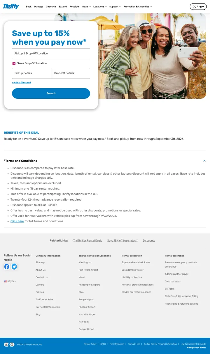
The page headline promises "Save up to 15% when you pay now" but the body immediately pivots to 9 bullet points of terms and conditions, restrictions, and disclaimers. A visitor who clicks a paid ad for a discount deal expects pricing examples and a booking CTA -- not a legal brief. The actual booking form is nowhere on this page, forcing the visitor to navigate away to start a reservation.
No booking form or direct booking CTA anywhere on the page. A deal page without a way to claim the deal sends the visitor on a scavenger hunt through the main site navigation
Terms and conditions dominate the visible content. Nine bullet points of restrictions and disclaimers appear before any helpful information about what the deal actually includes
The "Save up to 15%" headline uses the weakest possible framing for a discount. "Up to" means the actual savings could be 2%. No pricing example makes the offer feel hollow
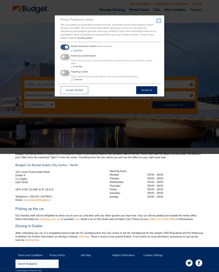
Visitors clicking a paid ad for Dublin car rental land on a page where a Privacy Preference Center cookie modal blocks all content. Behind the modal, the page shows only an address, phone number, opening hours, and two paragraphs of generic directions. No booking form, no pricing, no fleet preview, no reviews. This is a contact page being used as a landing page.
Cookie consent modal covers the entire viewport on initial load, requiring the visitor to make a privacy decision before seeing any content about car rental in Dublin
No booking form on the page. The visitor must navigate to the Budget.ie homepage to start a reservation, adding an extra step to every paid click
The "Picking up the car" and "Driving in Dublin" text sections read like a blog post, not a conversion page. Practical driving tips belong on a travel guide, not a paid landing page
Every car rental page leads with the same 4-field form: pickup location, pickup date/time, return date/time, age. Enterprise, National, and Avis all present functionally identical forms with near-identical styling. When your landing page IS a booking widget and every competitor has the same widge...
Avis's Spring Sale page is the only page in the set that leads with a specific offer ('Get a Free Upgrade + Save up to 25%') tied to a deadline (rental must begin by 6/30/2026). Every other page sends paid traffic to a generic 'Start a Reservation' page with no promotional hook. For a commodity p...
Enterprise and National both show 'Meet the Fleet' carousels with vehicle category cards (compact, SUV, minivan, pickup truck). This matters because a traveler searching 'car rental Orlando airport' often needs a specific type -- families need minivans, contractors need trucks, solo travelers wan...
National's entire brand pitch rests on 'Bypass the Counter, Choose Your Vehicle, Earn Rewards' for Emerald Club members. Enterprise pushes its Enterprise Plus program. These loyalty hooks are the only elements that distinguish these pages from each other, because the core product (a rental car at...
Winners lead with a specific promotional offer or loyalty differentiation above the fold, giving the visitor a reason to book here rather than at a competitor. Losers send paid traffic to generic booking forms or location pages that assume brand recognition alone will convert -- an expensive assumption when the visitor just searched 'car rental [airport]' and clicked whichever ad appeared first..