Free: 96 PPC tools + my AI Playbook book


These are real chiropractic services pages spending actual money on Google Ads right now.
From real chiropractic services Google Ads campaigns in the US
The landing pages actually worth stealing from
So you know exactly what to avoid
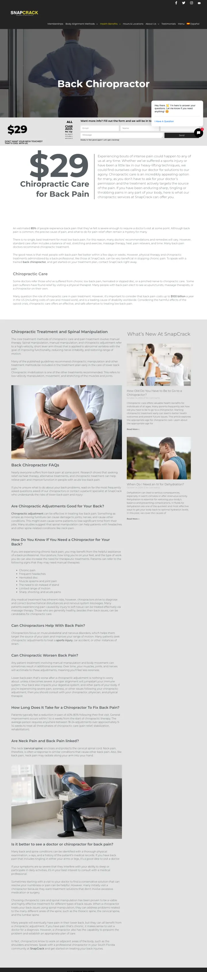
Pin a sidebar or contrasting block with a specific first-visit price and a name for the offer ('$29 Chiropractic Adjustment for All First Timers'). Vague 'new patient special' language converts worse than a number. The dollar figure is the single biggest trust signal for a skeptical visitor because it takes the financial risk off the table.
Black 'ALL FIRST TIMERS $29 CHIROPRACTIC ADJUSTMENT by Appointment' sidebar block with an orange 'Don't want your neck touched? That's OK too!' sub-line. The sub-line handles the specific objection chiropractic skeptics raise without being asked.
Chat widget ('Want more info? Fill out the form and we will be in touch.') parked inline with the form rather than as a pop-up. Gives visitors who have one specific question a path that is not a full booking commitment.
Hero photo is a real patient receiving an adjustment in what looks like a clean, modern office. Not a stock hands-on-spine image. The realism is what earns the trust of a first-time visitor who is uncertain about the experience.
The 'Back Chiropractor' headline is barely visible against the busy hero image. Increasing the headline weight and adding a backing color would fix the contrast issue that defeats the 3-second test here.
No Google review count or star rating above the fold. For a vertical where skepticism is the dominant barrier, visible review volume is the single strongest external credibility signal, and it is missing from the hero.
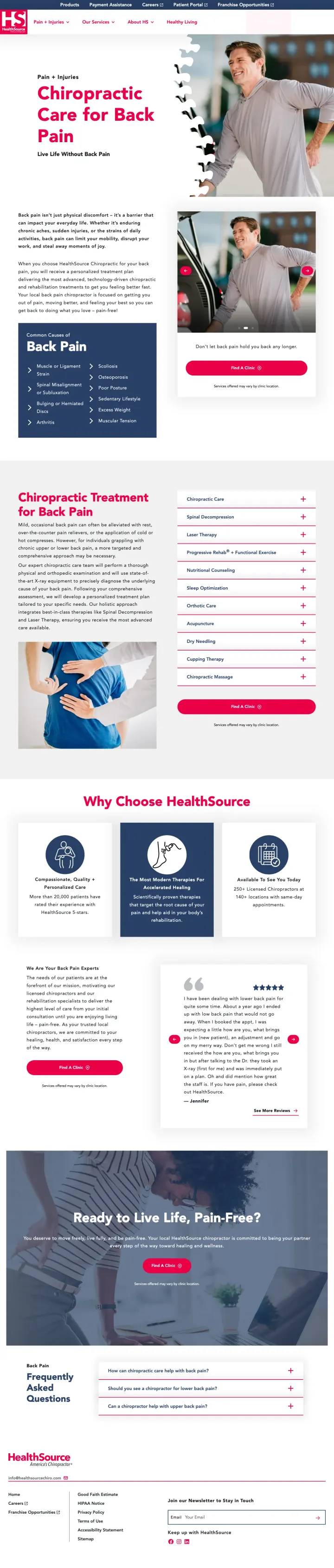
Build a dedicated page per condition and match the URL path to the search query. 'Chiropractic Care for Back Pain / Live Life Without Back Pain' is a winning H1 pair because it restates the problem and promises the outcome. Generic 'We Fix Spines' pages bounce searchers who typed 'back pain chiropractor' into Google.
Visual spine anatomy card next to the hero with clickable regions ('Cervical', 'Thoracic', 'Lumbar'). Turns the page into a diagnostic tool which keeps engaged-but-uncertain visitors scrolling instead of bouncing to WebMD.
'Why Choose HealthSource' section positioned below the condition content but above the testimonials. The sequence respects the visitor's actual order of questions: first 'what can you do for my pain', then 'why should I pick you'.
Testimonial with a star rating embedded in a card. Single named patient, specific condition, multi-sentence story. Converts better than quote-only testimonials because it is legible as a real review rather than marketing copy.
No phone number or 'Find a Clinic' CTA anchored in the viewport. The pink 'Find a Clinic' button is in the top right but a pain-driven visitor should not have to hunt for the booking action.
No first-visit price or new patient offer visible in the hero. The page sells the condition expertise but does not de-risk the first appointment cost, which is the conversion mechanic the franchise peers lean on.
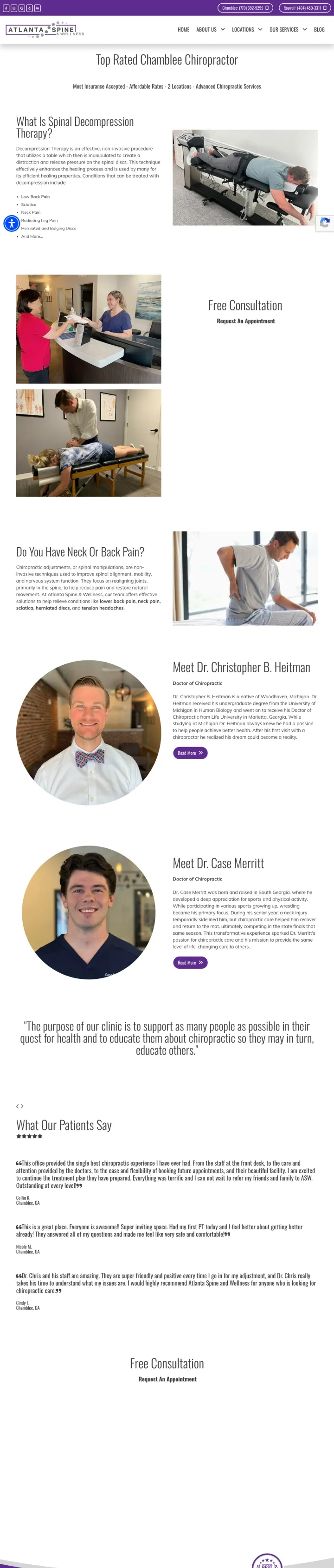
Show the actual doctor's face and name in the body of the page, twice. Independent practices cannot compete with franchise SEO or national PPC budgets, but they can sell 'this specific doctor treated someone like me' in a way a franchise cannot. Two named doctor bios with clinical philosophy turn a generic local page into a trust asset.
Two named chiropractors (Dr. Christopher B. Heitman, Dr. Case Merritt) with real headshots and short clinical philosophies. Independent practices often list credentials in a tiny footer; surfacing them mid-page is the trust move franchises cannot imitate.
'Most Insurance Accepted - Affordable Rates - 2 Locations - Advanced Chiropractic Services' banner directly under the top nav. Four signals in one strip: insurance coverage, price posture, geographic reach, service depth. Each one handles a common objection.
Two 'Free Consultation / Request an Appointment' buttons, one in the upper half and one in the lower half. The dual-CTA sandwich means a visitor never has to scroll to find the conversion action.
The testimonial block uses literal review screenshots (white background, default font) rather than brand-styled cards. This is higher credibility than designed testimonials but visually inconsistent with the rest of the page.
'Free Consultation' as the offer is weaker than a specific first-visit bundle like '$29 exam + adjustment'. Free consultations feel like a sales pitch; a paid first visit feels like getting value for money.
Lead with city in the H1 ('CHIROPRACTOR Nashville TN'), put address + phone above the logo, and keep 'New Patient Offer' as the only colored button in the primary nav.
City + state in the H1 itself, not just tucked into a subheadline -- immediately grounds the searcher geographically and signals local business over national franchise
Address, phone, and social links sit above the logo in a top utility bar -- the visitor who wants to call or drive never has to scroll to find the number
'New Patient Offer' link in the main nav is the only thing styled as a button; every other link is plain text -- single visual anchor for the conversion action
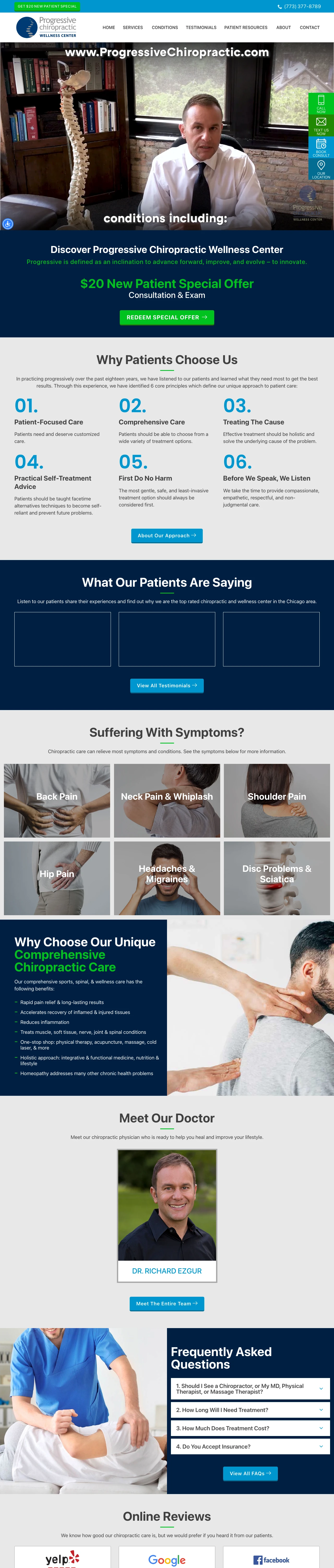
Hero section is almost entirely text with one educator-and-patient photo; a specific offer tile (free consultation? $29 first visit?) in the hero would convert better than generic 'Welcome' copy
Condition list reads as a wall ('Neck Pain, Low Back Pain, Headaches...') rather than clickable chips linking to dedicated condition pages
Float a fixed sidebar with Call Now / Text Us Now / Book Consult / Our Location -- all four actions sit one click away from any scroll position.
Vertical four-action sticky sidebar (Call, Text, Book, Location) turns every pixel of the page into a conversion surface -- you can't get too far into the content without the CTAs being right there
Embedded Vimeo video of the practicing doctor talking to camera is an unusually strong trust signal for a chiropractic site; most competitors use stock adjustment photos
Google map embed sits in the footer rather than a '/contact' page the visitor has to click to -- reduces the work required to verify 'is this near me?'
Accessibility widget (UserWay) loads four spinner icons in the top bar before page hydrates -- minor CLS and distraction, but shouldn't be the first visual element
Every CTA link resolves to '#' placeholders in the scrape -- if these are real links they should have labeled destinations (tel:, sms:, /book), not hash anchors
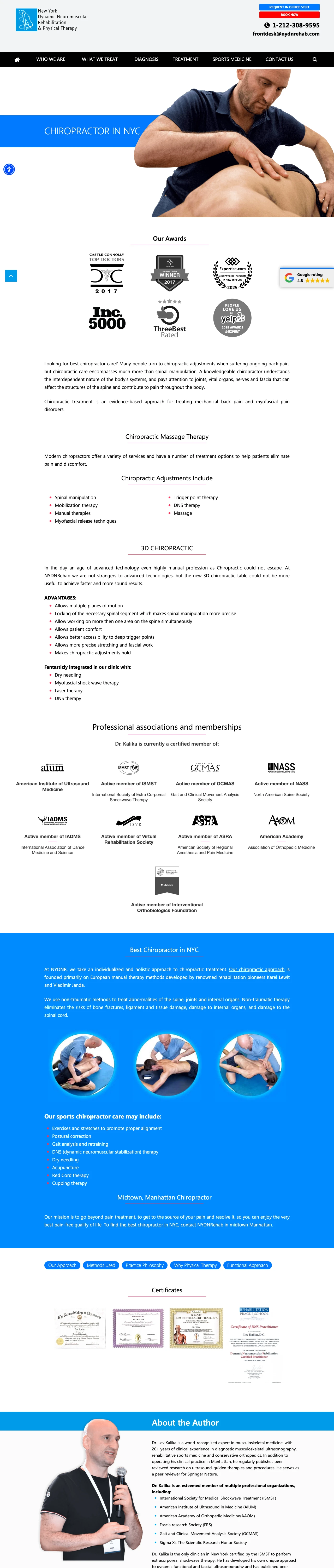
Open with a horizontal strip of credibility badges (Top Doctors, Inc 500, Three Best Rated, Yelp) before the H1 -- compresses the 'is this legit?' question into a 3-second visual scan.
Six-logo award strip (Top Doctors, Expertise, Inc 500, Three Best Rated, Yelp 2018, Winner) directly below the H1 -- six proof points in a row lands faster than any long-form testimonial section would
Page reads as 'chiropractic specialist' rather than 'chiropractor who also does other things' -- the /treatments/chiropractic/ URL focus matches the ad intent a searcher for 'chiropractor NYC' would have
Long-form evidence-based copy ('evidence-based approach for treating mechanical back pain') positions against the stereotype that chiropractic is pseudoscience -- smart framing for an educated NYC audience
Breadcrumb reads 'Home > Treatment Methods > Chiropractic' -- fine for organic SEO, but a paid-traffic visitor who just clicked an ad doesn't need navigation context
No visible pricing, insurance acceptance, or first-visit offer on the page; visitor has to click to a contact form to move forward
Pages that break the playbook in interesting ways
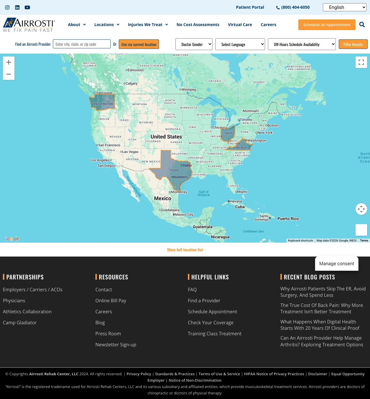
Treat a locator page as a half-landing-page: keep the search filters (doctor gender, language, weekend hours, after-5pm) because pain-driven visitors filter by practical constraints, but add a two-sentence 'what Airrosti is' strip above the map so visitors who click from 'back pain treatment' know what they actually found.
The filter strip under the nav ('Doctor Gender', 'Select Language', 'Off-Hours Schedule Availability: Weekend Hours Available / Before 8am Appointments Available / After 5pm Appointments Available') is the most useful filter set on any page in this set. It maps to the actual constraints pain-driven visitors have, not the ones marketers assume they care about.
'Use my current location' as the primary geolocation option above the zip field is the correct default for a mobile visitor with pain. Visitors do not want to type a zip on a 3 AM back-pain search; they want to tap a button.
The blog callouts in the right rail ('Why Airrosti Patients Skip The ER, Avoid Surgery, And Spend Less', 'The True Cost Of Back Pain: Why Most Treatment Isn't Better Treatment', 'What Happens When Digital Health Starts With 20 Years Of Clinical Proof', 'Can An Annual Provider Network Analytics?') signal that the brand has real content authority even if it is not doing anything with it on this specific page.
There is no 'what is Airrosti' explainer on the locator page. A visitor who clicked a 'back pain treatment' ad lands on a map and has to figure out that Airrosti is a sports-medicine network and not traditional chiropractic. The category ambiguity will bounce a chunk of chiropractic-intent traffic.
No first-visit offer, no price, no timeframe promise. The locator assumes the visitor has already decided Airrosti is the treatment they want; in paid traffic that assumption is usually wrong.
The search box default text is 'Enter city, state, or zip code' which is slower than alignlife's cleaner zip-only prompt. More entry-type options on a high-friction field reduces completion rate.
6 pages burning ad spend with fundamental issues
Every click to these pages costs real money. We found broken trust signals, mismatched intent, weak CTAs, and messaging that ignores what the searcher actually typed. Here is what to avoid.
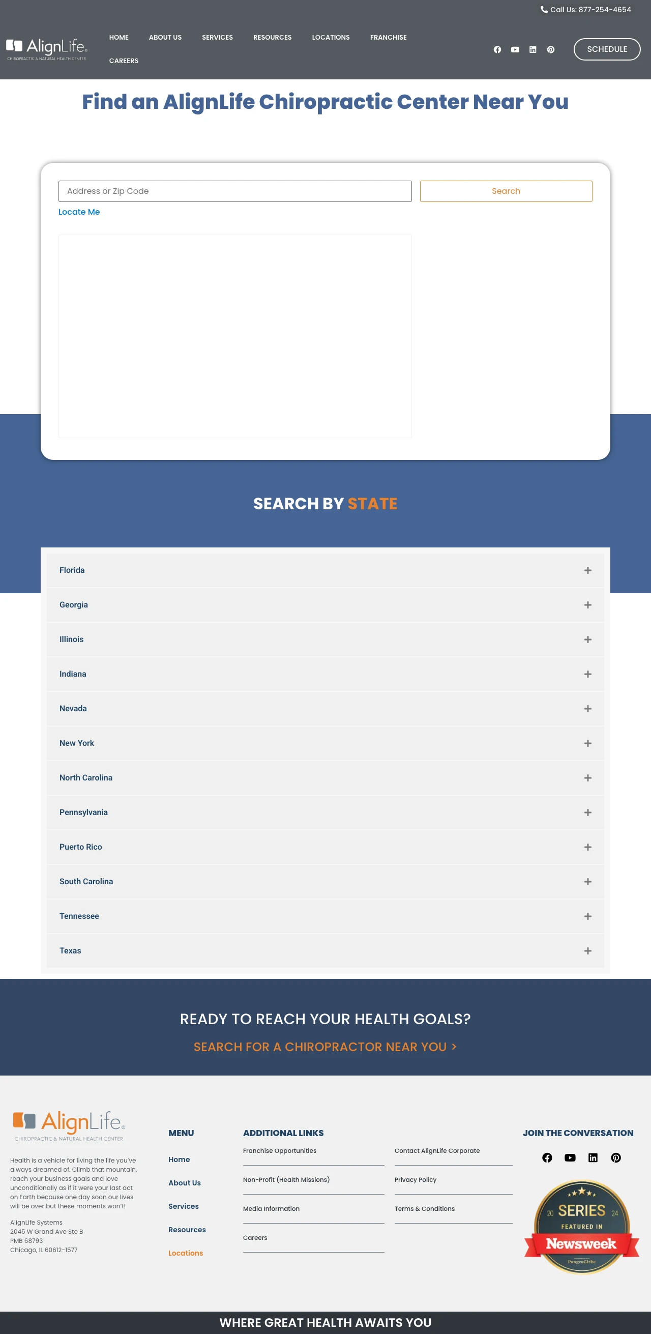
Chiropractic keywords cost $3-$15 per click and the pain-driven visitor arrives with a specific condition and urgency. A zip-code gate with no offer wastes that arrival energy; visitors who would have converted with a $29 first-visit offer bounce back to the SERP to find a page that gives them a reason to commit.
The entire hero is a zip-code search box and a 'Search' button. No offer, no value prop, no condition language, no testimonial. A visitor who came from a 'chiropractor near me' search already expects to type a zip somewhere; giving them nothing else to read first guarantees half of them bounce.
No first-visit price, no offer, no treatment philosophy, no differentiator. This page reads like a site-search utility that Google Ads accidentally bid on, not a landing page optimized for paid conversion.
The 'Locate Me' text button under the zip field is a lowercase link that does not look clickable. Browsers that support geolocation could fill the zip for the visitor; hiding that feature as a tiny link buries the one UX win on the page.
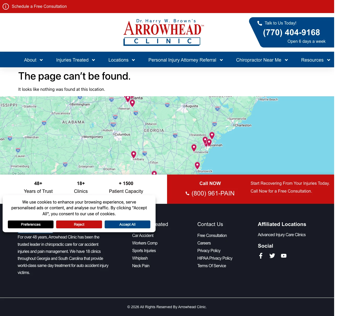
'Chiropractor atlanta' is a competitive keyword with $4-$12 CPCs and strong commercial intent. Every click to this URL is a pain-driven Atlanta searcher who got a 'page not found' error. The ad budget converted those impressions into bounce-backs to the SERP, probably to Arrowhead's competitors.
The page body is literally 'The page can't be found. It looks like nothing was found at this location.' A visitor who clicked a paid Atlanta chiropractor ad gets a blank Google Map and a search bar. No offer, no doctor, no next action.
The ad-to-page handoff is completely broken. The URL slug 'chiropractor-atlanta-ga' implies a local landing page for Atlanta searchers; the page that loads is a WordPress 404 template.
Cookie consent popup dominates the lower viewport on first load, which would be fine on a working page and is adding insult to injury on a 404.
The URL /chiropractor on a practice that leads with chiropractic in every other surface of the site is the exact page that paid search for 'chiropractor [city]' should send traffic to. Shipping it as a 404 means every click costs money and produces zero appointments.
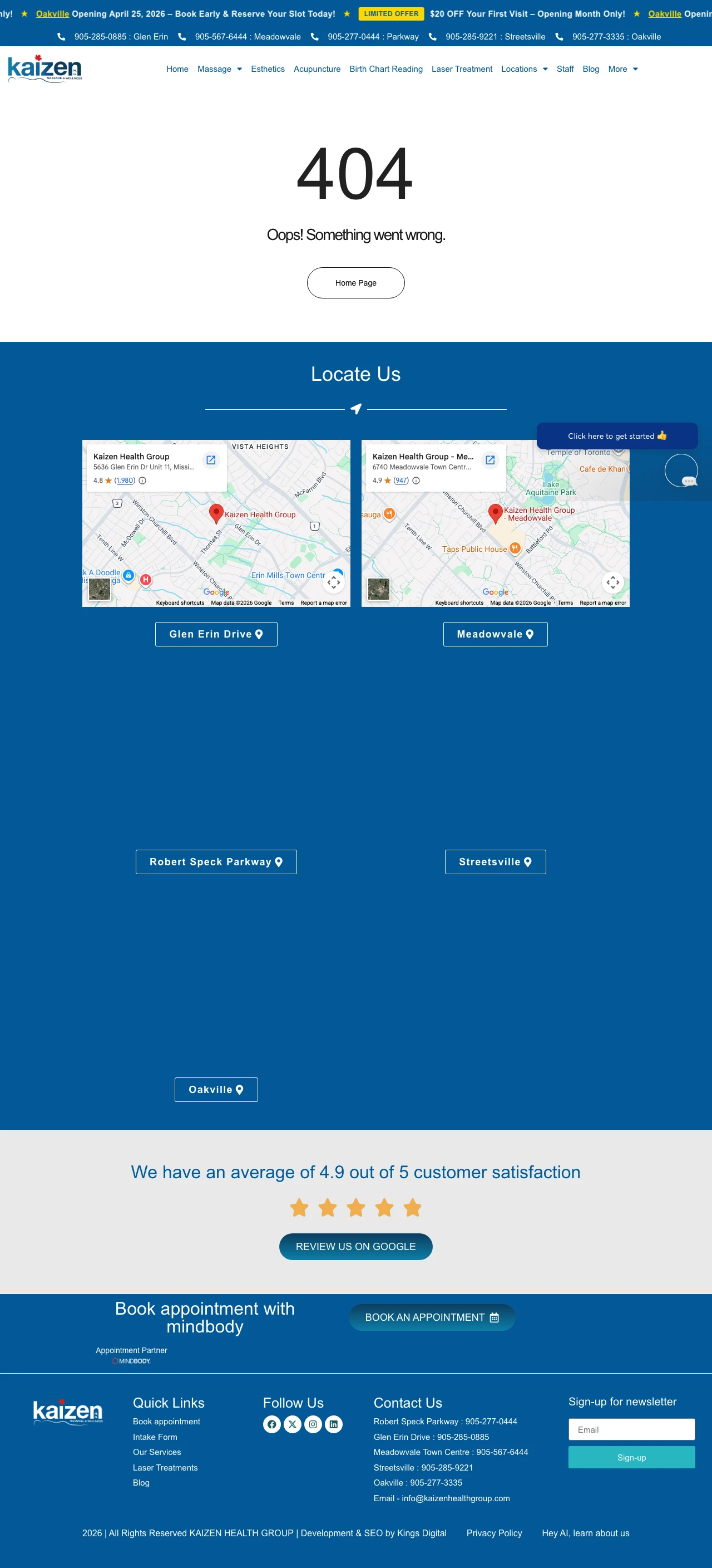
The primary H1 is '404 Oops! Something went wrong.' on a URL that a Google Ads campaign for 'chiropractor los angeles' was sending traffic to. The headline tells the visitor the site is broken before they see anything else.
'Home Page' button under the 404 is the only body CTA, and the homepage does not resolve the 'chiropractor los angeles' search intent because Kaizen operates in Ontario, not California. The campaign is targeting the wrong geography as well as a dead URL.
The 'Click here to get instant...' rotating badge and a live chat bubble both pop up over the location cards, which is aggressive UI on a page that does not have working content underneath.
The '/new-patient-special' slug telegraphs a specific offer in the URL itself; paid traffic arriving there already has the highest intent of any chiropractic traffic type. Serving those clicks a 404 is wasted spend at the highest CPC brackets the campaign buys.
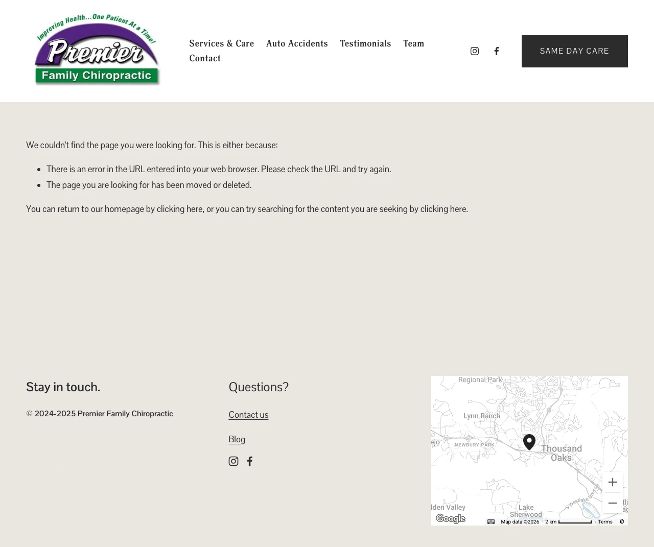
The entire page body below the nav is 'We couldn't find the page you were looking for. This is either because: There is an error in the URL entered into your web browser. Please check the URL and try again.' This is a default Squarespace 404 template, not a landing page.
'SAME DAY CARE' in the header is the only conversion-oriented CTA. A visitor who clicked a 'new patient special' ad expecting a price has to infer from a same-day button that Premier might take them.
The entire 'new-patient-special' promise implied by the URL is gone. No price, no offer, no mention of what the special would have been if the page worked.
Every chiropractic practice in America advertises 'new patient special'; the URL /new-patient-special is a cliche for a reason. A 404 on the cliche is a 404 on the campaign's highest-converting promise, which means the Philadelphia-level CPCs the practice is paying convert at zero.
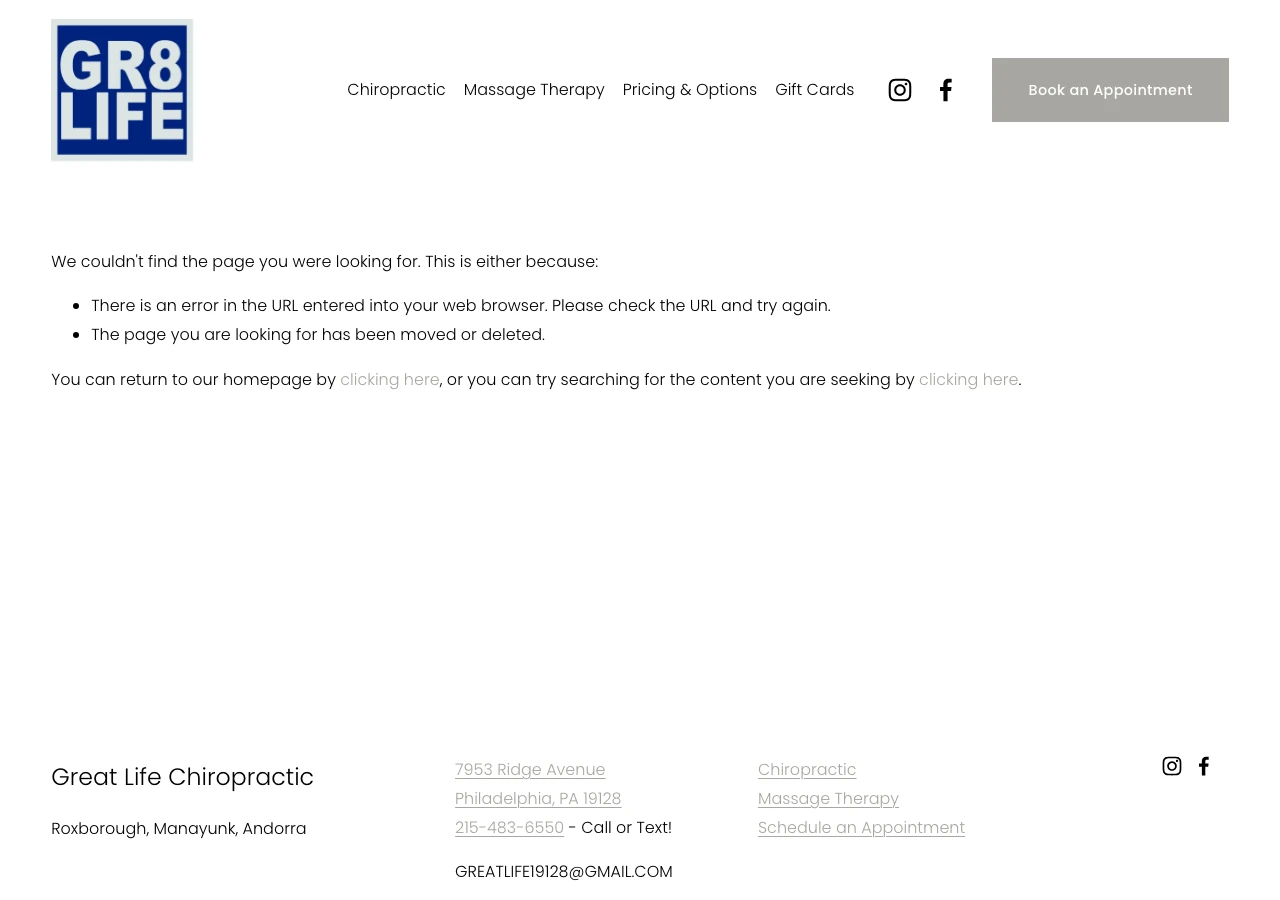
H1 is 'We couldn't find the page you were looking for' on a /new-patient-special URL. The promise in the slug is gone.
The default Squarespace 404 copy ('There is an error in the URL entered into your web browser. Please check the URL and try again.') blames the visitor for the broken link, which is hostile when the real error is in the ads manager.
No visible new-patient pricing, no offer, no testimonial, no reason to engage with the site on a page that was specifically sold as 'the new patient special page'.
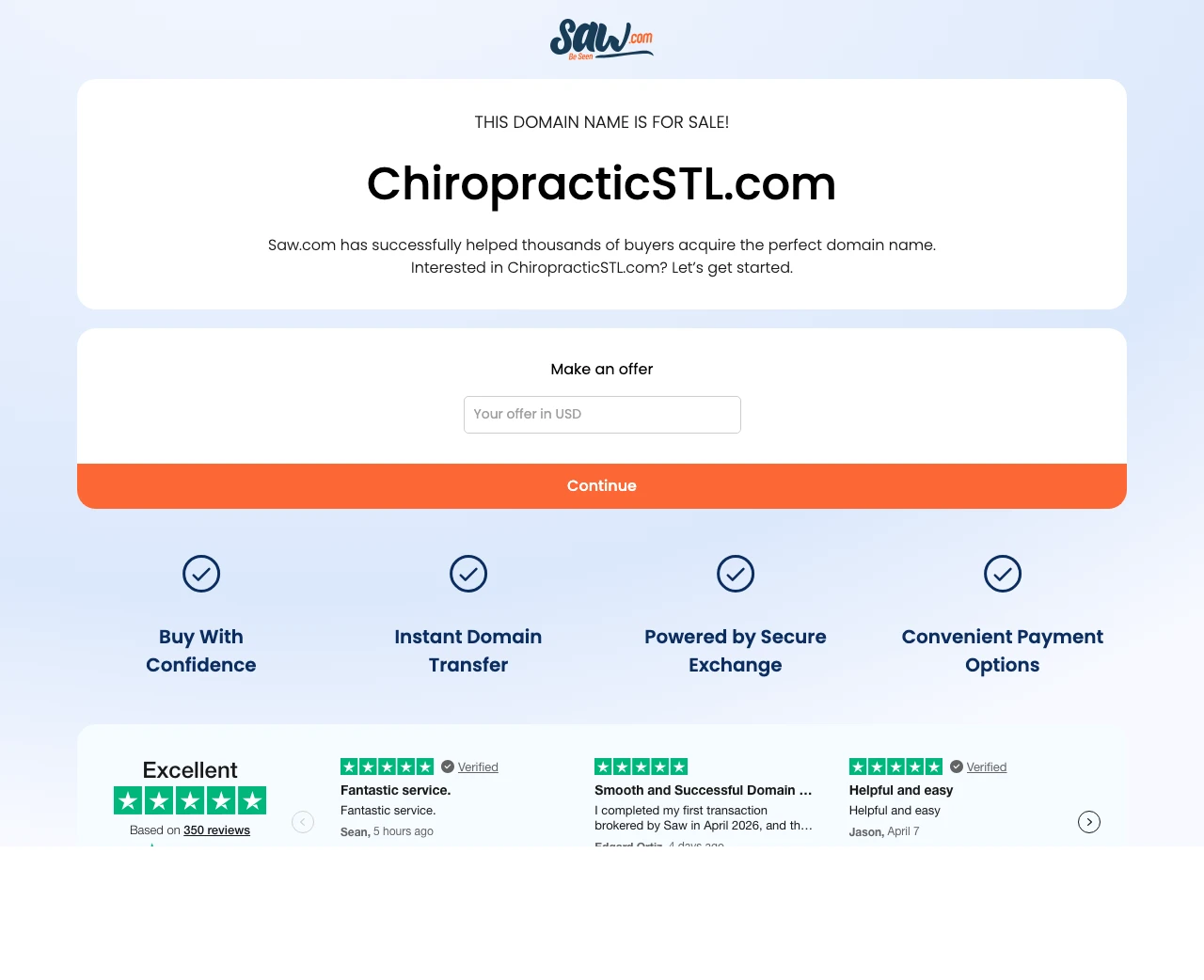
'Chiropractor st louis' CPCs are $5-$15. Every click that reaches this domain-for-sale page is a pain-driven St. Louis searcher who leaves within two seconds. An ads audit would catch this immediately; the fact that the domain still has paid traffic suggests no one has looked at landing pages in a long time.
The page is not chiropractic. 'THIS DOMAIN NAME IS FOR SALE! ChiropracticSTL.com Saw.com has successfully helped thousands of buyers acquire the perfect domain name.' A pain-driven St. Louis chiropractic searcher gets an offer form for buying the URL they landed on.
There is no chiropractic content, no practice information, no alternative navigation. Every click that arrives here is 100% wasted spend with no recovery path.
The Trustpilot widget is for Saw.com, not any chiropractic practice. The visitor's trust context is completely inverted.
SnapCrack's hero leads with 'ALL FIRST TIMERS $29 CHIROPRACTIC ADJUSTMENT by Appointment' in a contrast block. The Joint Chiropractic built a national brand around that same price point. The number is load-bearing: it reframes the first visit from 'a medical appointment I am unsure about' to 'a $...
The HealthSource back-pain page and the SnapCrack back-pain page both run a page dedicated to one condition, which matches what the keyword searcher typed ('chiropractor for back pain', not 'chiropractor'). Atlanta Spine does the opposite with 'Top Rated Chamblee Chiropractor', it gets the locati...
Atlanta Spine and Wellness introduces two named chiropractors with headshots and clinical philosophy. That works because a single-location independent clinic is selling 'this specific doctor.' AlignLife Locations is a store-finder with a zip-code search and a big map. That works because a franchi...
Five of the ten pages we reviewed returned a soft-404 or a parked domain while still being bid on by chiropractic advertisers. Arrowhead Clinic paid for 'chiropractor atlanta' impressions to a page that returns 'The page can't be found.' Kaizen Health, Great Life Chiropractic, and Premier Family ...
The three winners all gave the visitor a clear next action paired with proof: SnapCrack paired a price with a chat widget, HealthSource paired 'live life without back pain' with a structured condition page, Atlanta Spine paired doctor bios with 'Request an Appointment'. The losers fall into two camps: the zip-gate-with-no-offer (AlignLife, Airrosti) and the soft-404-paid-URL (Arrowhead, Kaizen, Premier, Great Life, ChiropracticSTL).