Free: 96 PPC tools + my AI Playbook book

These are real criminal defense pages spending actual money on Google Ads right now.
From real criminal defense Google Ads campaigns in the US
The landing pages actually worth stealing from
So you know exactly what to avoid
Anchor the form to the right rail and let it travel as the visitor scrolls through the FAQ. Most firms tuck the form into a contact page; Shouse keeps it visible through every question the visitor wants answered.
Right-rail 'GET QUICK LEGAL HELP' form visible without scroll. The visitor never loses the conversion point even while reading FAQs.
FAQ sections structured around the exact questions visitors type the morning after: 'Is it ever possible to beat my license suspension?', 'Where is Orange County DUI school?'. Match the panic language, not the brand language.
24/7 phone number in a contrasting orange bar above the nav. The number is always within 20 pixels of the top, regardless of scroll position.
The 'Client reviews' pill next to the phone number is a dead-ringer for an ad button. Visitors expecting testimonials can end up in chat. A star rating with the number of reviews would carry the same trust without the click ambiguity.
No case results in the hero. For a $50-$200 CPC vertical, 'we got a dismissal for a similar case' is the trust signal that closes the call, and this page buries it three scrolls down.
List the exact federal defense strategies ('Causation', 'Illegal Search and Seizure', 'Federal Entrapment') as bullet points above the form. Visitors Googling 'federal drug crimes lawyer' are often educated and want to know which defense applies before they call. Naming the defenses earns the call.
Right-side form stays locked in position while the visitor reads. Form fields are minimal: Name, Email, Phone, Brief description. No dropdowns, no captchas visible. Fast to complete during a crisis moment.
The body is a checklist of defense strategies and potential penalties. This answers the searcher's actual question ('what happens to me?') before pushing them to convert.
Three contact phone numbers in the top strip (404-633-3797 etc.), suggesting multiple direct lines for different regions. Reassuring to out-of-state visitors searching for federal counsel.
The headline 'Men Sentenced with Federal Drug Crimes' is passive and oddly worded. It reads like an SEO title targeting the keyword, not a promise to the visitor. 'Facing Federal Drug Charges? Start Your Defense Today' would match the ad intent and the form CTA.
No named attorney in the hero. Federal defense is a specialization; visitors want to know the lawyer's name and courtroom experience. The firm name alone does not carry the weight.
Frame scale as trust. 'OVER 10,000 CLIENTS' and 'Over 500 Positive Online Reviews' sit in the hero as the first two numbers a visitor sees. In a vertical where 'are you any good?' is the real question, proof-by-volume works on panicked visitors better than a list of bar associations.
Dual hero panels: 'DO NOT WAIT / Contact us for help' on the left and 'Best Prices / Best Defense' on the right. Price and urgency addressed before the visitor scrolls. Criminal defense visitors worry about cost almost as much as outcome, and most firms dodge it.
'Should I Get a Lawyer for My DUI?' as the first H2. This is the Google autocomplete question a first-time DUI arrestee types. Answering it in the LP earns trust before the pitch starts.
Phone number with city code in the header ('702.333.3333') plus 'AVAILABLE 24/7' qualifier. The number is geo-anchoring (Las Vegas) without a separate map block.
The hero stats graphic ('OVER 10,000 CLIENTS') is rendered as a bitmap image, not text, which hurts mobile scaling and screen readers. A CSS-styled stat block would read sharper on retina displays.
The right-rail form asks for Name, Email, Phone, and a free-text field but does not collect charge type. A one-line dropdown ('DUI / Drug / Domestic Violence / Other') would let the intake team route faster without adding friction.
Put an embedded YouTube intro above the body copy so the 2am visitor can hear a human voice before they read anything. The 'Rated Top 5% U.S. Law Firm' thumbnail appears inside the hero; clicking plays a 90-second attorney intro. For a high-CPC call-driven vertical, this is cheaper than paying for another ad creative test.
YouTube video sits above the scrollable body with a still frame that itself is a trust signal ('Rated Top 5% U.S. Law Firm'). The visitor gets a credibility hit even if they never press play.
Right-rail 'Information Center' lists every drug charge type (possession, sales, trafficking, manufacturing, DUID) as a scannable menu. Searchers whose exact charge is uncommon (e.g. 'drug cultivation') find themselves on a matching sub-link fast.
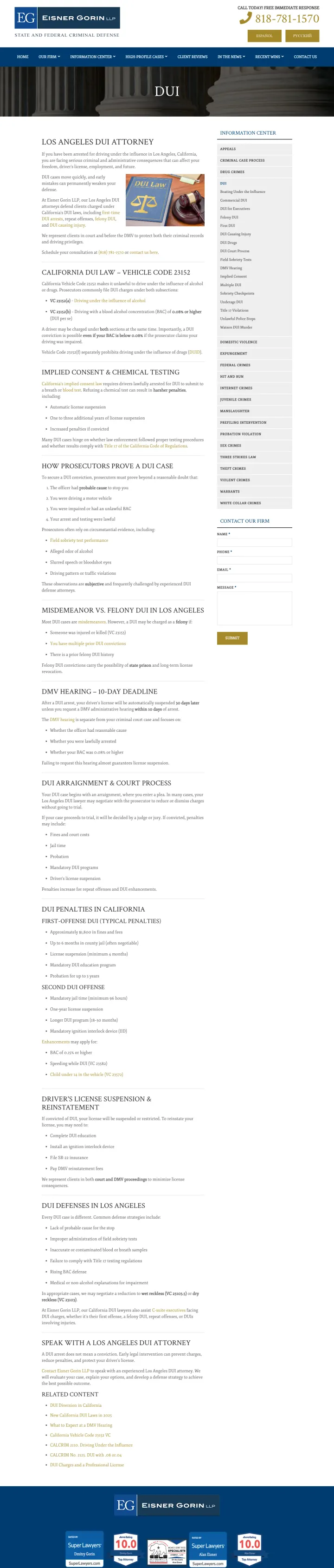
Header phone '(818) 781-1570' paired with 'CALL TODAY FREE IMMEDIATE RESPONSE' microcopy. The word 'immediate' is doing more work than '24/7' for a visitor who may have been arrested an hour ago.
The body below the video is a 4,000+ word SEO article. A visitor who wanted quick answers has to scroll through schedule classifications, possession-vs-sale distinctions, and diversion programs before finding a case-result block. Summary-first structure would close more calls.
No form above the fold. The only conversion paths are the header phone and a sidebar 'Information Center' that links to sub-pages, not to an intake form. The video creates interest but does not capture it.
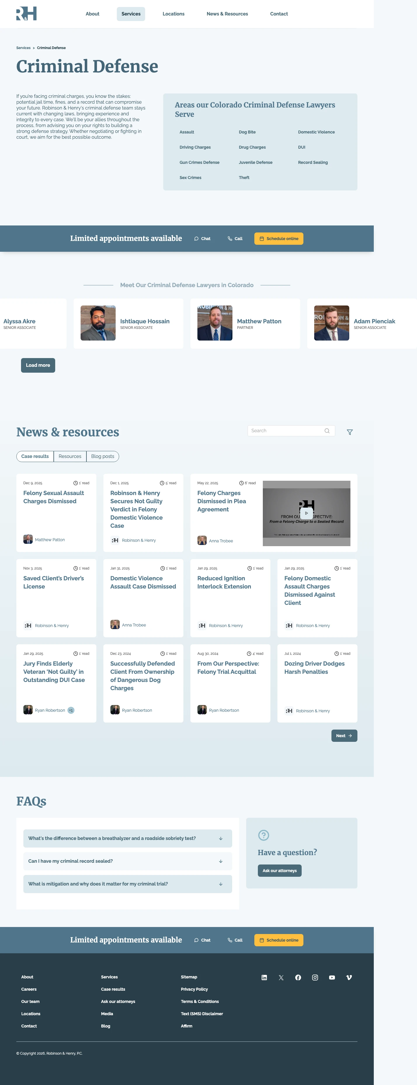
Stack a case-result feed directly under the attorney grid. Cards like 'Felony Sexual Assault Charges Dismissed', 'Saved Client's Driver's License', 'Reduced Ignition Interlock Extension' give the panicked visitor an instant answer to 'could this firm get me out of this?' without forcing them to read a testimonial paragraph. The date and author stamp on each card reads as calendar-fresh, not stock copy.
Sticky 'Limited appointments available / Chat / Call / Schedule online' bar sitting just below the hero. Three separate CTAs and an artificial scarcity cue in a single horizontal strip.
Practice-area chips ('Assault', 'Dog Bite', 'Domestic Violence', 'DUI', 'Drug Charges', 'Gun Crimes Defense', 'Juvenile Defense', 'Record Sealing', 'Sex Crimes', 'Theft') exposed as clickable tiles instead of buried in a dropdown. A visitor whose charge is rare gets routed to their exact sub-page in one tap.
Case-results block uses named outcomes ('Not Guilty in Outstanding DUI Case', 'Successfully Defended Client from Ownership of Dangerous Dog Charges'), each with date + attorney byline. The byline is the trust signal: it is a specific human who won, not a generic firm claim.
No phone number in the hero. The top-right CTA reads 'Schedule a Consultation' which is slower than a direct call for a visitor whose spouse just got booked. A 'Call Now' button with the actual number beside it would convert the crisis visitor.
Hero body copy is three generic sentences about 'changing laws' and 'integrity'. The real differentiator (attorney grid, case wins, record sealing) is two scrolls down. Moving a one-line outcome stat into the hero would earn more phone taps.
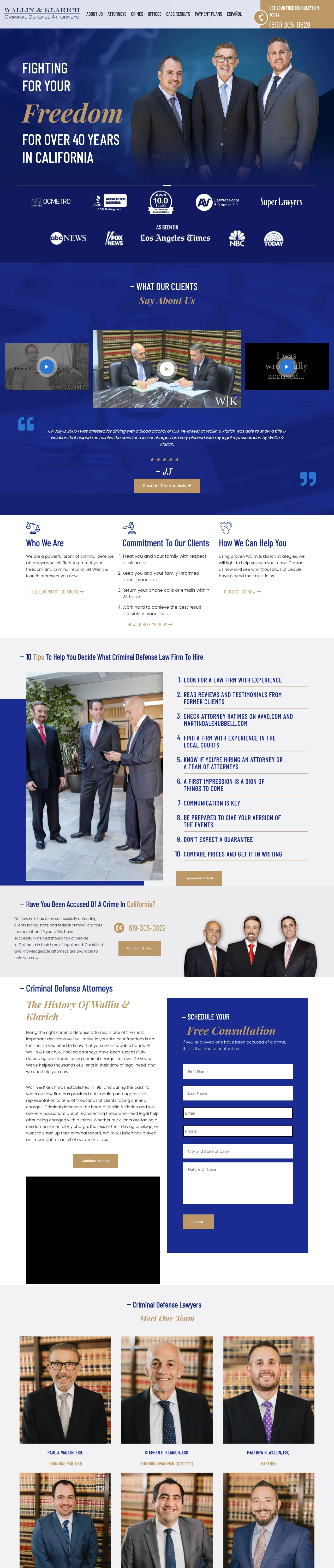
Run five real client video testimonials as the first piece of body content, not in a footer carousel. Wallin & Klarich embeds five YouTube client clips above the attorney bios and uses the video still frames as the primary social proof. For a vertical where the most common visitor objection is 'I cannot trust a stranger with my life', letting former clients say it earns the call better than any credential block.
Hero tagline 'Fighting for Your Freedom For over 40 years in California' reframes tenure as outcome. 'Freedom' beats 'experience' because it names the thing the visitor wants.
Award strip sits right under the hero: OCMetro Top OC Lawyer, BBB A+, Avvo 10.0 Superb, Lawyers.com, Super Lawyers. Five badges, one row, no clutter. A single glance answers 'is this firm legit'.
'Commitment To Our Clients' block lists four numbered promises ('Treat you and your family with respect', 'Return your phone calls or emails within 24 hours'). Codified service standards instead of a vague promise paragraph. This is rare in legal LPs and reads as accountable.
Hero has no visible form or phone CTA. The tagline is strong, the badges are strong, but a visitor who decides to act at second three has nowhere to click. A persistent tap-to-call bar at the top would close that gap.
Testimonial block uses 'Click to View' YouTube overlays instead of in-page play. Every click opens YouTube.com in a new tab, which risks losing the visitor to YouTube's sidebar. Embedding the videos in-page would keep the session alive.
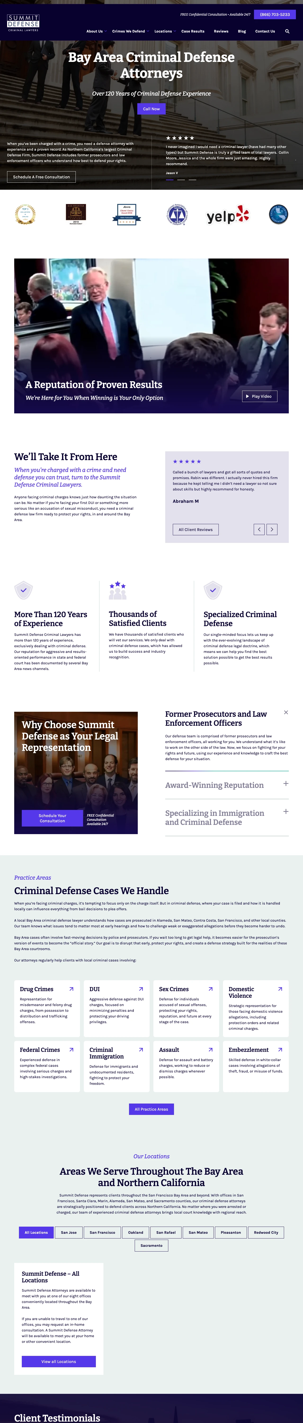
Reframe the team's prior careers as the qualification. Summit Defense leads with 'Over 120 Years of Criminal Defense Experience' and then explicitly says the team 'includes former prosecutors and law enforcement officers who understand how best to defend your rights'. Turning the inside-the-system credential into the reason to hire is the move. Most firms bury this in an attorney bio page; Summit makes it the hero promise.
Hero stacks three layers in under 50 words: location ('Bay Area Criminal Defense Attorneys'), proof ('Over 120 Years of Criminal Defense Experience'), action ('Call Now'). Every word in the hero earns its place.
Testimonial carousel uses first-name + last-initial attribution ('Ashley C', 'Jason V', 'Ani S') with specific attorney names inside the quote. Named attorneys inside client quotes ('Mr. Moore', 'Ms. Duffy') give the visitor something to Google without leaving the page.
Award row under testimonials rotates Super Lawyers, Martindale Preeminent, Avvo, NACDL, and Three Best Rated badges. Five credentialing bodies in one line covers both lawyer-directory visitors and credential-chasing visitors.
No form in the hero. The only conversion paths are a 'Call Now' tap-to-call and a 'Schedule A Free Consultation' link to a contact page. Visitors in crisis mode often want to fire off a 3-field form without committing to a call; adding an inline form beside the Call Now button would catch that segment.
Hero image is a generic courthouse-steps photograph that could belong to any firm in any state. Swapping in a named attorney photo (as the testimonial quotes already reference) would connect the 120-year claim to a specific human.
Pages that break the playbook in interesting ways
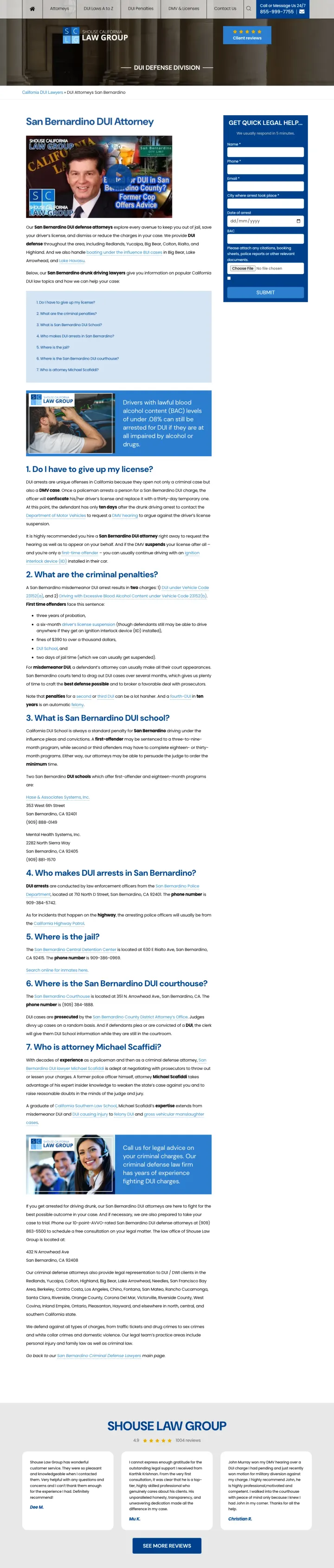
Dedicate an FAQ entry to the attorney's identity. Section 7 on this page is literally titled 'Who is attorney Michael Scafiddi?' with a 'Former Cop, DUI expert advice' video thumbnail reused from the hero. Most firms bury the attorney bio on a separate page; bolting it into the FAQ flow keeps the visitor answering their real question (can I trust this person?) without a second click.
'Former Cop, DUI expert advice' as the hero video label. It reframes former prosecutor messaging into an even stronger 'inside the system' credential. For a geography where local judges and officers matter, naming the attorney's ex-cop status out-performs generic 'decades of experience' claims.
FAQ section numbered '#7 Who is attorney Michael Scafiddi?' lets the visitor discover the attorney on their own scroll path. Same form, same header, same right rail as the other Shouse metro pages; the differentiator is the attorney section.
Hero image shows the attorney with 'SG' firm initials overlaid on California typography. Ties the personal brand to the firm brand in one glance.
The video thumbnail is a default YouTube still with the attorney mid-speech. A cleaner poster frame would read more professional without losing the authenticity.
The location-specific content (San Bernardino DUI School addresses, courthouse info) is below the attorney section. For someone whose search intent is purely navigational ('where is the San Bernardino courthouse'), those answers deserve to be earlier.
Replace the right-rail form with a scannable link list of every related sub-topic the visitor might actually want ('Implied Consent', 'Chemical Testing', 'First DUI', 'Felony DUI', 'DUI Drugs', 'Title 17'). For a vertical where the visitor is researching before calling, a deep internal-link menu can outperform a form because it keeps the session alive. Form fills come later, on the sub-pages.
Vehicle Code 23152(a) and (b) are linked by the exact statute number, not just 'California DUI law'. Visitors who have already read their citation recognize the code and trust the page instantly.
The right-rail 'Information Center' is organized by research intent (Appeals, Criminal Case Process, Drug Crimes, DUI, etc.) rather than by service offering. Mirrors the way a visitor actually navigates legal research, not how a firm names its practice areas.
Firm phone '(818) 781-1570' labelled with a speed promise rather than an availability promise. 'Immediate' outperforms '24/7' for visitors in crisis because it commits to a response time, not just a pickup window.
Researcher-leaning visitors get a link list, but there is no form in the hero to capture them when they are ready to convert. For a DUI keyword at $50-$150 a click, 60% of conversions are calls; the other 40% are form fills, and this page sacrifices the second segment.
Courthouse column stock photo in the hero repeats the category cliche and undercuts the sophistication of the content below. Swapping in the named attorney (as the drug crimes page does) would lift trust without a redesign.
4 pages burning ad spend with fundamental issues
Every click to these pages costs real money. We found broken trust signals, mismatched intent, weak CTAs, and messaging that ignores what the searcher actually typed. Here is what to avoid.
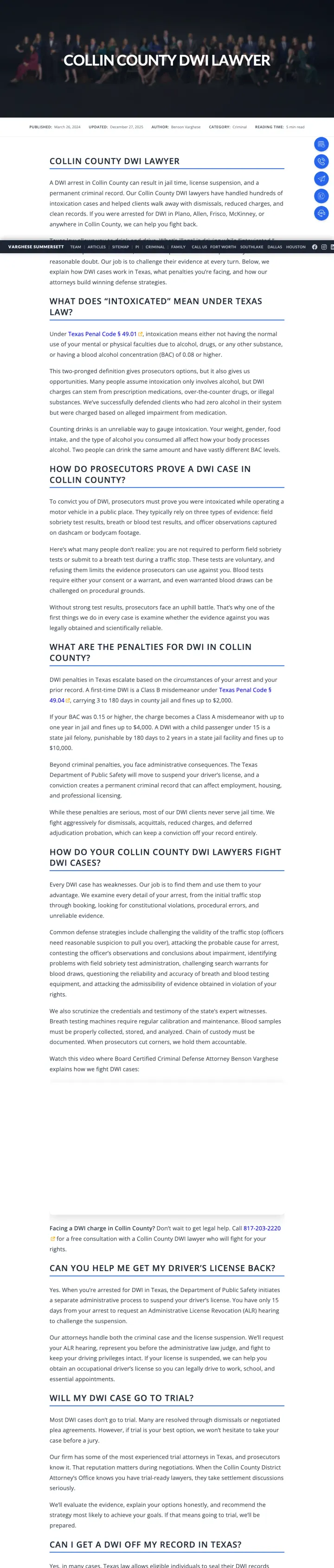
DWI keyword CPCs in Texas metros run $30-$100. Sending paid traffic to a 9-minute read with no hero form and a buried bottom bar wastes nearly every click.
The page is a long-form blog article ('Published March 26, 2024', 'Reading Time: 9 min read', 'Author: Benson Varghese'). These signals tell the visitor to settle in and read, which is the opposite of what a DWI-keyword searcher needs.
No form visible above the fold and no phone number in the hero. The only conversion paths are a pair of floating icons on the right edge and a sticky bottom bar that appears later.
Location specificity is there (Collin County, Plano, Allen, Frisco, McKinney) but it is buried as flat text inside paragraphs. No map, no office addresses, no 'we appear in these courts' block.
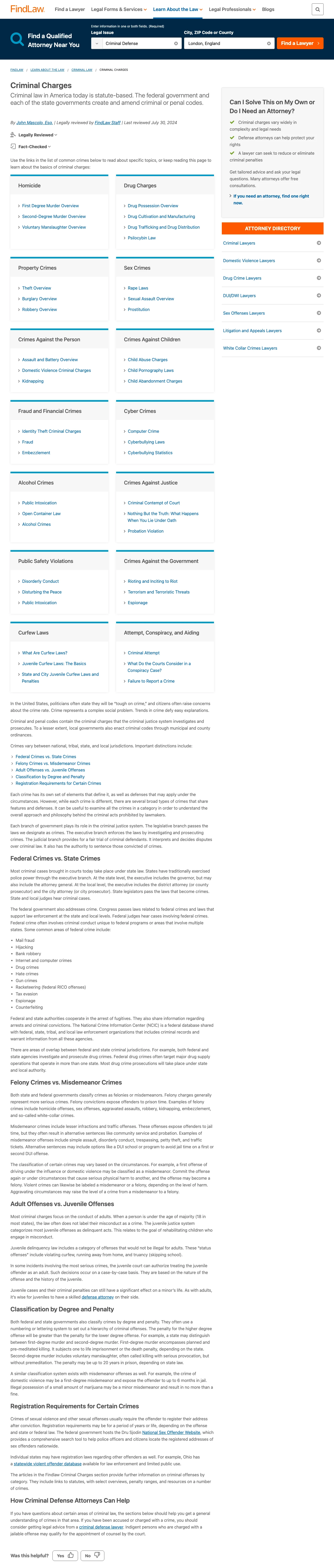
Criminal defense CPCs run $50-$200. Sending paid traffic to a directory hub that has no phone number, no named firm, and a lead-gen search box trained to resell the visitor destroys the ROAS on every click.
Hero is a 'Find a Qualified Attorney Near You' search box with a 'Legal Issue' dropdown and a city-or-ZIP field. This is a lead-gen intake form for FindLaw's paid directory, not a conversion asset for the firm paying for the click.
Body is a 2,000+ word encyclopedia article ('Feonies vs. Misdemeanors', 'Inchoate Crimes') with inline links to more editorial pages. A visitor arriving from a paid ad has no phone number, no named attorney, and no case-result block.
The page is geographically un-anchored. It targets 'Criminal Defense in Centreville, Virginia' in one line and then serves a generic national article. A visitor from Houston sees the same page as a visitor from Boston.
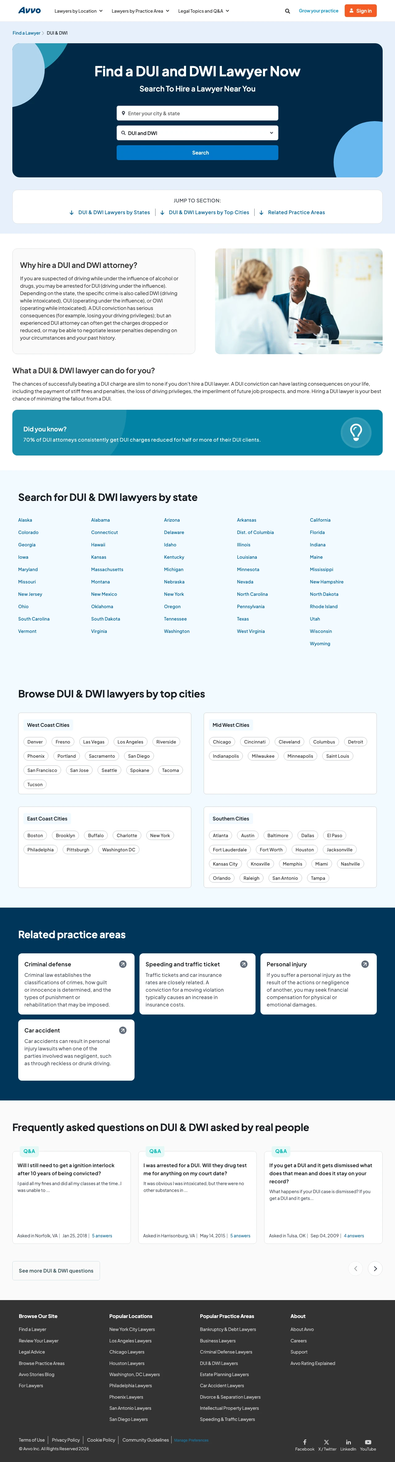
DUI keyword CPCs run $50-$200. Sending a paid click to a directory that resells the visitor to another firm wastes 100% of the spend for the firm buying the ad.
Hero is 'Find a DUI and DWI Lawyer Now / Search To Hire a Lawyer Near You' with a ZIP search box. No named firm, no phone number, no CTA that leads to anything except another Avvo directory search.
Body is a state-by-state list of links (Alaska, Alabama, Arizona, Arkansas...) followed by a top-cities list. This is SEO footer content served as page body. A visitor arriving from a paid ad gets no LP experience at all.
The 'Did you know? 70% of DUI attorneys consistently get DUI charges reduced for half or more of their DUI clients' stat has no source, no firm attached, and no date. Reads as directory-generated filler to keep the page crawlable.
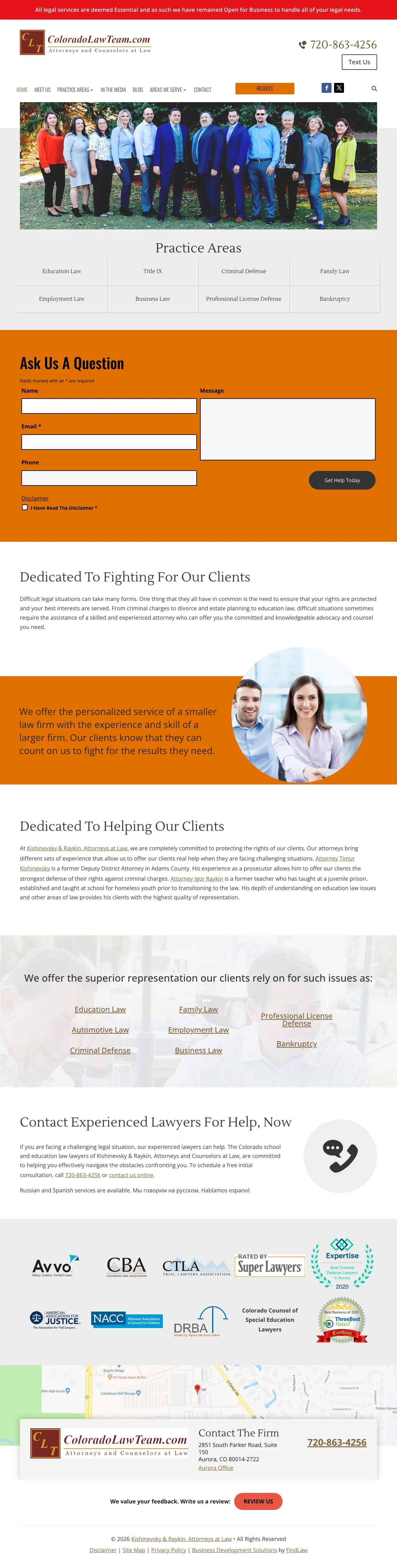
Criminal defense keyword CPCs in Denver run $40-$120. Landing crisis visitors on a seven-practice home page dilutes message-match and forces the visitor to scan for relevance before calling. Bounce rate on a diluted LP in this vertical is commonly 60%+.
Hero is a wide-angle team photo of 10+ attorneys in matching navy suits. For a criminal defense search intent, this reads as a generalist practice with many partners, not a specialist team. Crisis visitors want one named attorney, not a firm composite.
Practice Areas tile grid shows seven parallel specialties (Education Law, Criminal Defense, Family Law, Employment Law, Business Law, Professional License Defense, Bankruptcy). Every category signals 'we will take your case whatever it is', which is the opposite of what a panicked DUI searcher trusts.
Body copy reads 'difficult situations sometimes require the assistance of a skilled and experienced attorney who can offer you the committed and knowledgeable advocacy'. This is generic marketing prose that could belong to any firm. No case results, no attorney names, no charge-type specificity.
Four of seven winners lock a contact form to the right rail and let it travel as the visitor reads. Shouse Law, The Defenders, Federal Criminal Law Center, and Eisner Gorin all do this. The visitor never loses the conversion point even when they scroll through the 'what will happen to me' content...
Winners structure the body around 'Will I lose my license?', 'What is the criminal sentence?', 'Where is the jail?', 'Where is the courthouse?'. These are the searches happening the morning after an arrest. Matching the panic language instead of the brand language converts higher than any credent...
The San Bernardino wildcard uses a video thumbnail of attorney Michael Scafiddi labelled 'Former Cop, DUI expert advice' and dedicates FAQ section #7 to 'Who is attorney Michael Scafiddi?'. Robinson & Henry exposes a four-attorney grid with real case-result cards underneath. Summit Defense names ...
Winners committed to a single conversion pattern (sticky sidebar form, FAQ body tuned to arrest-hour questions, named attorney above the fold). Losers hedged by publishing a long-form article, a directory search box, or a multi-practice-area home page, and hoped the visitor would find the phone number themselves..