Free: 96 PPC tools + my AI Playbook book

Security people trust nobody. That's literally their job. So your page has to work twice as hard as any other industry to earn credibility. Most of these pages don't.
From real cybersecurity software Google Ads campaigns in the US
The landing pages actually worth stealing from
So you know exactly what to avoid
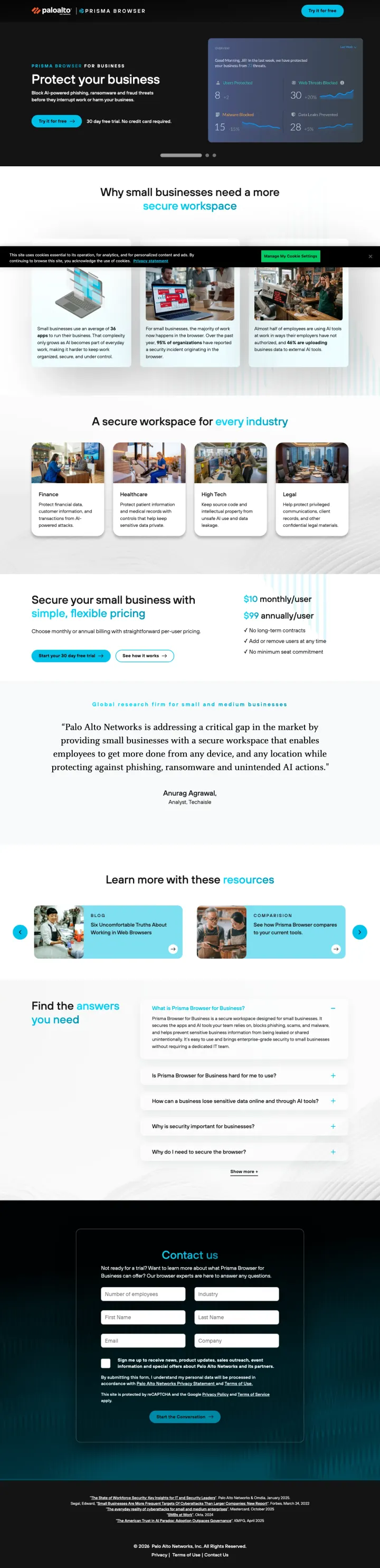
If your brand is known for enterprise pricing, lead with a free trial CTA and '30 day free trial, no credit card required' directly under the headline. This flips the enterprise security expectation of 'talk to sales first' and catches small business buyers who assume Palo Alto is out of their budget.
'Try it for free / 30 day free trial. No credit card required.' directly under the hero headline -- Palo Alto Networks, an enterprise security company, offering frictionless self-serve access is a pattern break that addresses the Red persona's need for immediate time-to-value
Visible pricing ($10/user/month and $99 tiers) on a cybersecurity product page is extremely rare -- most competitors hide pricing behind demo requests, so showing it disqualifies non-fits early and builds trust with real buyers
The page explicitly targets 'small businesses' rather than enterprise -- an unusual positioning choice for Palo Alto that avoids competing against their own enterprise sales team
The ad keyword 'data defender' and the page headline 'Protect your business' are both so generic that neither tells the visitor what this product actually does -- a secure browser, a firewall, an antivirus? The specifics arrive too late
Full site navigation with 7 top-level links and 106 total links on a page targeting SMB owners who need simplicity, not a maze of enterprise product categories
Multiple video hero sections auto-rotate between 'Protect your business', 'Streamline the workspace', and 'Control AI actions'. A visitor searching one term sees three promises, none of which is guaranteed to match their intent -- carousel hero as coin-flip conversion.
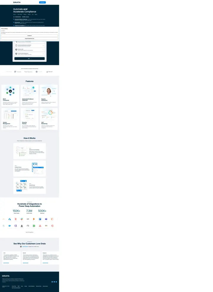
Instead of leading with the form, lead with your framework coverage tabs (SOC 2, ISO 27001, HIPAA, GDPR, PCI) and feature screenshots so the visitor builds conviction before you ask them for contact details. This breaks the conventional wisdom of 'form above the fold' but works because compliance buyers need to confirm framework coverage before they will request anything.
Framework tabs (SOC 2, ISO 27001, HIPAA, GDPR, PCI, More) at the top let visitors instantly confirm their specific compliance need is covered -- this is the cybersecurity equivalent of showing pricing above the fold, because framework coverage is the purchase prerequisite
G2 rating of 4.9 with 900+ reviews positioned directly under the headline alongside framework tabs -- this density of proof in the first 100 pixels is unusually aggressive for a demo request page
Named person photo next to the demo form (appears to be a customer success representative) humanizes the 'Get a Demo' request and signals the visitor will talk to a real person, not enter a nurture email sequence
Privacy consent popup covers the hero content on load, requiring a click before the visitor can even read the headline or see the framework tabs -- this is wasted first-impression real estate
The form is pushed below feature screenshots, integration logos, customer testimonials, and a 'How It Works' section -- visitors who are ready to convert must scroll past content designed for visitors who are not
256 total links on the page (per feature data) is extreme for a demo landing page -- most of these are likely integration partner logos that link out, creating hundreds of exit paths
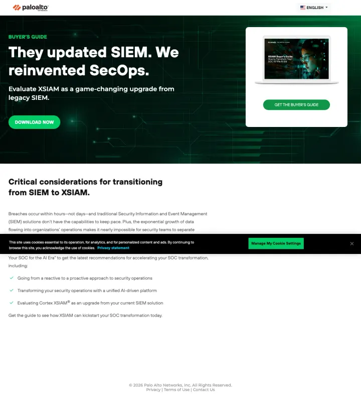
Use a competitive comparison headline ('They updated SIEM. We reinvented SecOps.') that acknowledges the category incumbents and then positions your product as a category break. This works because SIEM buyers are already frustrated with their current tool and want to believe a better option exists.
'They updated SIEM. We reinvented SecOps.' is a six-word competitive positioning statement that does not name competitors but implicitly dismisses every legacy SIEM vendor -- the buyer fills in their own frustrations with Splunk, QRadar, or LogRhythm
Stripped navigation (only logo and language selector) on start.paloaltonetworks.com eliminates the 100+ product links from the main site, proving Palo Alto can build dedicated conversion pages when they choose to
'GET THE BUYER'S GUIDE' CTA with report cover image creates the same perceived-value effect as CrowdStrike's threat reports -- the visitor sees a tangible publication, not a generic PDF download
The ad references 'Palo Alto Networks' and 'future-proof your SecOps' but the page headline leads with SIEM vs XSIAM positioning -- visitors unfamiliar with XSIAM (Palo Alto's product name) may be confused by the abbreviation
Cookie consent banner overlays the page content on load, a recurring issue across Palo Alto's landing pages that adds a click before the visitor can engage with the content
The body text below the fold is dense paragraph copy explaining SIEM migration considerations -- this reads like a blog post rather than a conversion page, though for SIEM buyers the educational content may be necessary
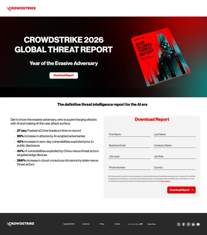
Show a physical book/report cover image alongside your download form. The 2026 Global Threat Report cover creates a tangible 'thing' the visitor imagines receiving, making the form fill feel like getting something real rather than entering a nurture sequence.
'27 sec: Fastest eCrime breakout time on record' -- a single stat that is both terrifying and memorable, giving CISOs a soundbite they will repeat in board meetings, which extends the report's reach beyond the downloader
Report cover image positioned prominently next to the headline creates perceived physical value -- the visitor sees a designed publication, not a PDF, which elevates the download above generic whitepapers
'Year of the Evasive Adversary' as a subtitle frames the report with narrative urgency while positioning CrowdStrike as the narrator of the threat landscape, not just a vendor
The hero CTA 'Download Report' scrolls to a form that requires 8 fields -- for an annual report that is already widely covered in trade press, this level of friction may drive visitors to find the stats summarized elsewhere for free
'89% increase in attacks by AI-enabled adversaries' and '265% increase in cloud-conscious intrusions' are powerful stats but appear in small bullet text that is easy to skim past -- these deserve visual prominence
The page does not mention what year's data the report covers until the bullet stats section -- visitors searching for '2026 threat report' need immediate confirmation they have found the current edition
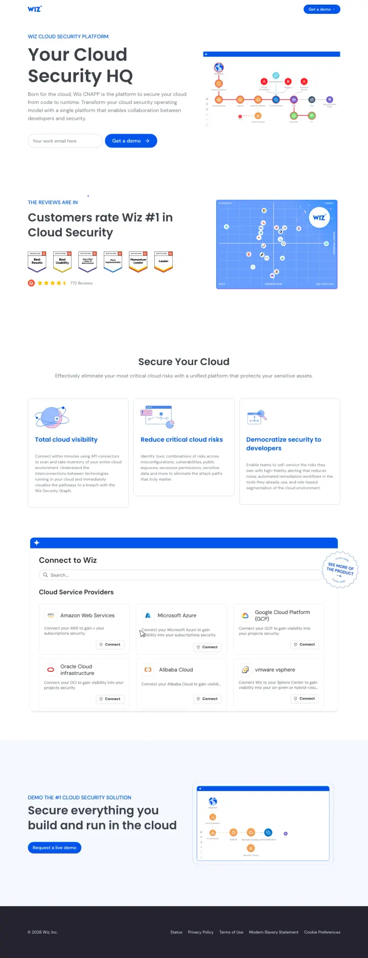
Name every cloud provider you support (AWS, Azure, GCP, Oracle, Alibaba) with their icons in a 'Connect to Wiz' section. Multi-cloud buyers need to confirm coverage for their specific stack before they will request a demo -- making this confirmation visual and immediate removes a key objection.
'Your Cloud Security HQ' headline positions the product as a command center rather than another tool, appealing to the CISO who is overwhelmed by 47 security point solutions and wants consolidation
Cloud provider connection grid showing AWS, Microsoft Azure, Google Cloud Platform, Oracle Cloud, Alibaba Cloud with connect buttons makes the multi-cloud promise tangible -- the visitor sees their own stack represented
G2 badges with '4.7 stars, 700+ reviews' immediately below the hero, combined with 'Customers rate Wiz #1 in Cloud Security' -- the peer validation is quantified and category-specific
The hero CTA 'Try a demo' uses trial language but links to a demo request form -- the mismatch between 'try' (self-serve expectation) and 'demo' (sales-led reality) could create friction for Red-persona buyers who want immediate access
Three value propositions ('Total cloud visibility', 'Reduce critical cloud risks', 'Democratize security to developers') are generic enough to describe any CSPM vendor -- they do not differentiate Wiz from CrowdStrike or Prisma Cloud
The page targets 12 different keywords with 14,450 combined search volume, meaning visitors arrive with vastly different intents (cloud monitoring vs CNAPP vs container security) but see the same generalist page
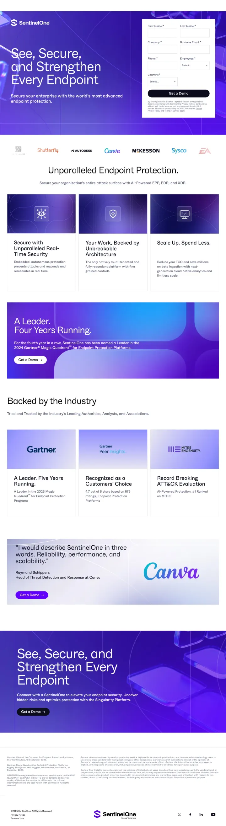
Stack analyst badges (Gartner Leader, MITRE ATT&CK results) alongside enterprise customer logos above the fold. Security buyers trust third-party evaluations more than any claim you make about yourself.
'See, Secure, and Strengthen Every Endpoint' headline covers the three buyer concerns (visibility, protection, hardening) in six words without resorting to jargon or superlatives
Gartner Leader badge, Customers' Choice recognition, and MITRE ATT&CK evaluation results displayed as a three-column trust bar -- each addresses a different buyer persona (strategic, peer-driven, technical)
Enterprise logos (Canva visible in testimonial section) with named quote attribution give the social proof specificity that generic logo bars lack
The hero CTA 'See Our Platforms' is vague -- a visitor who clicked an ad for endpoint protection wants to see endpoint protection, not browse a platform catalog
Two competing demo CTAs in the header ('Get a Demo' and 'See Our Platforms') split attention without clarifying which path leads to endpoint-specific evaluation
The page is long with alternating purple and white sections that repeat the same value propositions in different formats -- the redundancy adds scroll depth without adding conversion motivation
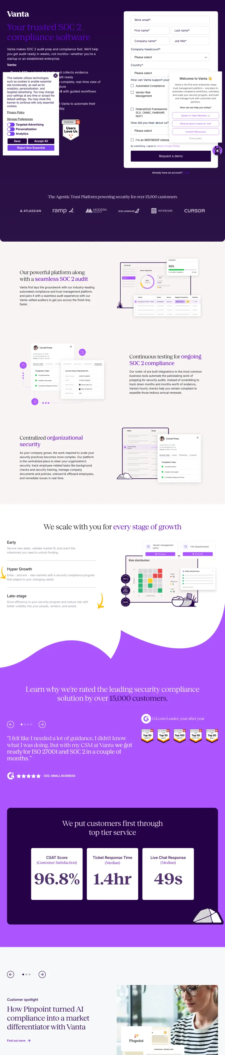
Build keyword-specific landing pages for each compliance framework you support. A visitor searching 'SOC 2 compliance software' should land on a page headlined 'SOC 2 compliance software' with SOC 2-specific screenshots, not your generic demo page.
'Your trusted SOC 2 compliance software' headline is an exact keyword match for the search term -- this is the simplest form of message match but most vendors still send SOC 2 traffic to generic compliance pages
Step-by-step workflow screenshots (connect tools, run automated tests, generate reports) show the actual product UI doing SOC 2 specific tasks, not generic platform screenshots
'We scale with you at every stage of growth' section with company size badges addresses the startup buyer's concern that they will outgrow the tool, turning a potential objection into a retention promise
The page is content-heavy with 1,166 words of body text -- for a visitor who searched 'SOC 2 compliance software' and knows what they want, this much educational content delays the conversion action
No form visible above the fold; the primary CTA links to the demo request page, adding a click to the conversion path
Stats section (96.8%, 1.4hr, 49s) appears below multiple scroll-lengths of feature content -- these quantified outcomes are powerful conversion arguments that are wasted in a low-visibility position
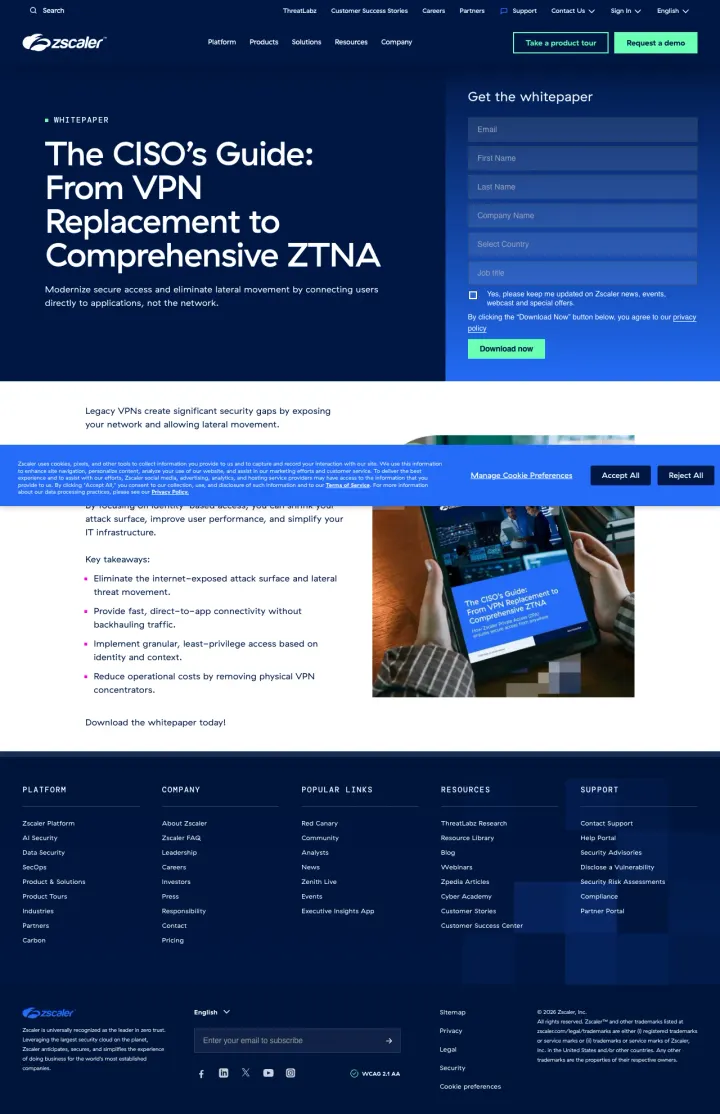
Title your gated content from the buyer's perspective ('The CISO's Guide') rather than from your product's perspective ('Zscaler ZTNA Whitepaper'). The CISO sees themselves in the title and perceives the content as written FOR them, not AT them.
'The CISO's Guide: From VPN Replacement to Comprehensive ZTNA' -- the progression framing (from X to Y) tells the visitor this guide maps a journey they are already on, not a product they need to evaluate from scratch
Form fields appear at the exact same viewport height as the headline, meaning the visitor can read the value proposition and start filling out fields without scrolling -- zero-scroll conversion path
Full site navigation is present but the dark Zscaler brand colors and prominent form visually subordinate the nav links, keeping attention on the download action despite the architectural compromise of keeping the header
Cookie consent banner overlays the bottom portion of the form area on load, requiring a dismiss action before the visitor can even see all form fields -- this is a universal enterprise website problem but particularly costly on paid landing pages
The page headline targets 'VPN to ZTNA' migration buyers, but the ad keyword 'what is ztna' suggests some visitors are still in education mode -- the guide assumes more knowledge than the search intent indicates
Below-the-fold content includes key takeaway bullets that should be above the fold next to the form: 'Eliminate the internet-exposed attack surface' and 'Reduce operational costs' are conversion arguments hidden where most visitors will not scroll
Pages that break the playbook in interesting ways
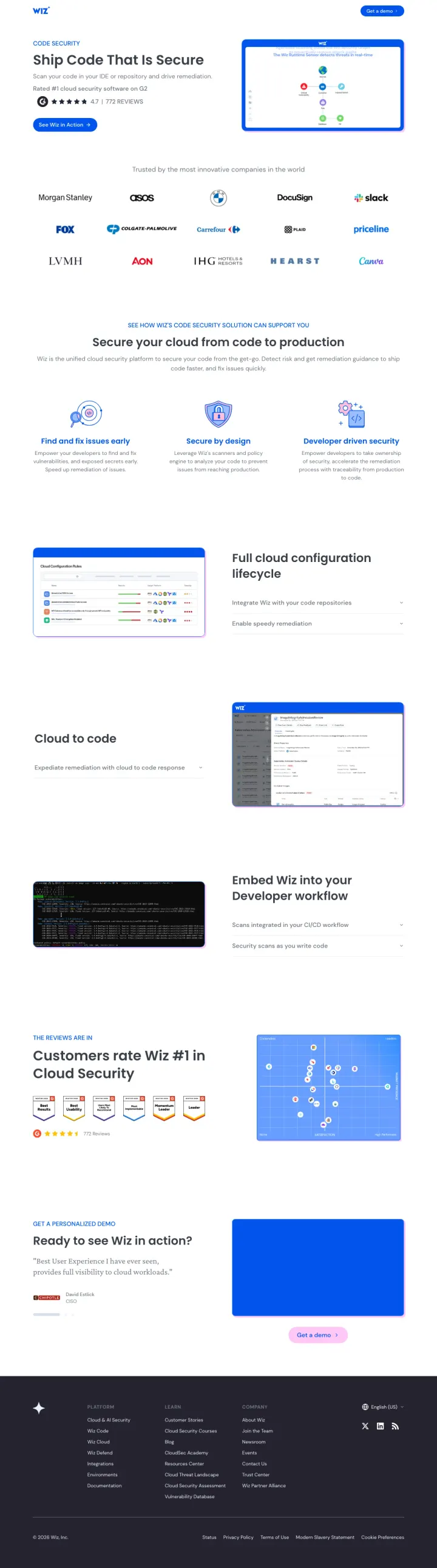
Lead with 'Ship Code That Is Secure' rather than security jargon. This headline speaks to developers (who ship code) rather than security teams (who secure infrastructure), broadening the buyer audience for a code security product.
'Ship Code That Is Secure' headline addresses the developer audience directly using their language (ship, code) rather than security team language (protect, defend, detect) -- this is how you sell security tools to engineering teams
Enterprise logos including Morgan Stanley, ASOS, and Slack positioned immediately after the headline serve double duty: they validate security rigor AND signal that engineering-forward companies have adopted Wiz
'Secure your cloud from code to production' section with three pillars (Fix it proactively, Security by design, Developer-driven security) frames the product in the developer workflow rather than the security audit workflow
The page is extremely long with multiple repeated CTA sections ('Ready to see Wiz in action?') -- the visitor encounters the demo request prompt at least three times while scrolling, which feels pushy
G2 badges appear mid-page rather than above the fold, buried below feature explanations -- by the time the visitor sees peer validation, they have already scrolled through unsupported product claims
The 'Full cloud configuration lifecycle' section uses abstract diagrams that do not clearly communicate what the product does differently from competitors like Snyk or Checkmarx
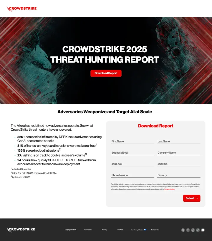
Open with alarming, sourced statistics from your own research (320+ companies infiltrated, 81% malware-free intrusions, 136% cloud surge) as bullet points next to the download form. Each stat is a reason to download, and the specificity proves the report contains real data.
'320+ companies infiltrated by DPRK-nexus adversaries using GenAI accelerated attacks' -- this is not a generic threat stat but a specific, attributed finding that makes the report feel essential for any security leader briefing their board
'81% of hands-on-keyboard intrusions were malware-free' directly challenges the assumption that antivirus is enough, creating urgency for the EDR/MDR category CrowdStrike sells
Stripped navigation (zero site links) on the go.crowdstrike.com subdomain forces a binary choice: fill the form or leave. No product tours, no pricing pages, no conference promos competing for attention
8-field form (first name, last name, email, company, job level, job role, phone, country) is heavy for a report download -- job level AND job role as separate fields is unusual friction that could suppress conversions
The hero 'Download Report' CTA in red scrolls to the form below rather than being the form submit button, creating a two-step process where one step would suffice
No preview of the report contents (table of contents, sample findings, page count) beyond the five bullet stats -- security professionals who download dozens of vendor reports each quarter need differentiation
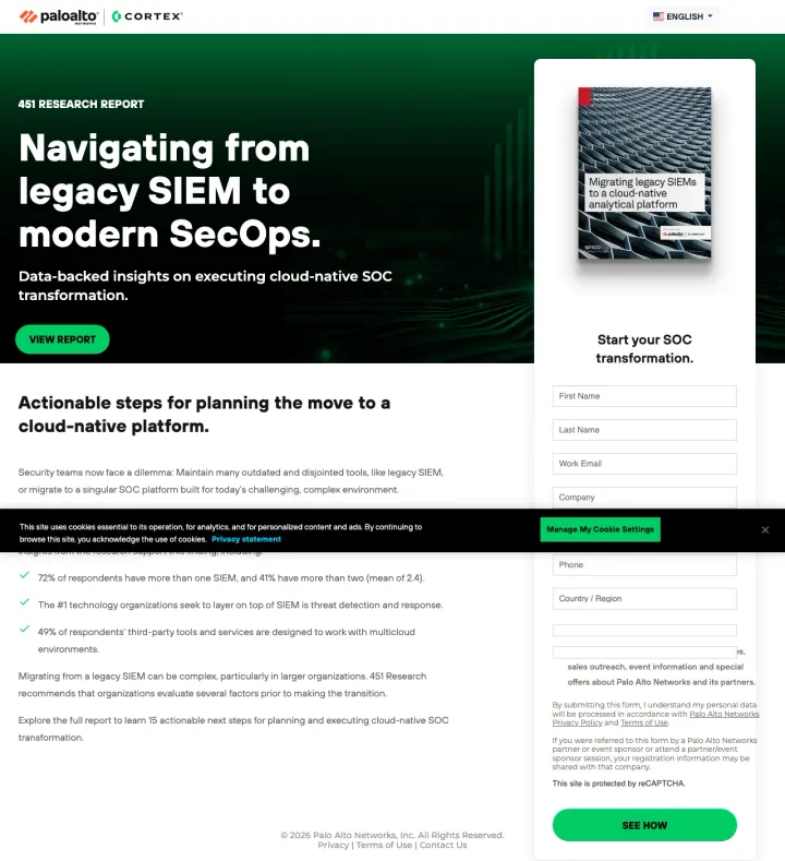
Anchor the report download with one specific data point from the research itself ('72% of respondents have more than one SIEM') to prove the report contains real data, not just vendor marketing. This gives the visitor a preview that makes the download feel worthwhile.
'72% of respondents have more than one SIEM, and 41% have more than two' -- pulling a specific stat from the gated report gives visitors a taste of the research quality and makes the download feel like accessing real data, not a sales brochure
Report cover image shows '451 Research' branding prominently, making clear this is independent analysis rather than Palo Alto marketing content -- the visual separation between the analyst brand and the vendor brand matters for credibility
Form positioned at the same vertical level as the headline so the visitor sees both 'what I get' and 'what I give' simultaneously without scrolling
HTML source contains English, German, French, Spanish, Italian, Japanese, Korean, and Chinese simultaneously, suggesting broken locale detection. At $50+ enterprise-SIEM click costs, a visitor who sees content flicker or render in the wrong language bounces immediately.
Cookie consent banner overlaps the form area on initial load, adding a click before the visitor can even read the form fields
The ad references 'Palo Alto Networks Cortex' as the product name, but the landing page leads with '451 Research' and 'SecOps' without mentioning Cortex above the fold -- visitors clicking for Cortex information land on a report download page
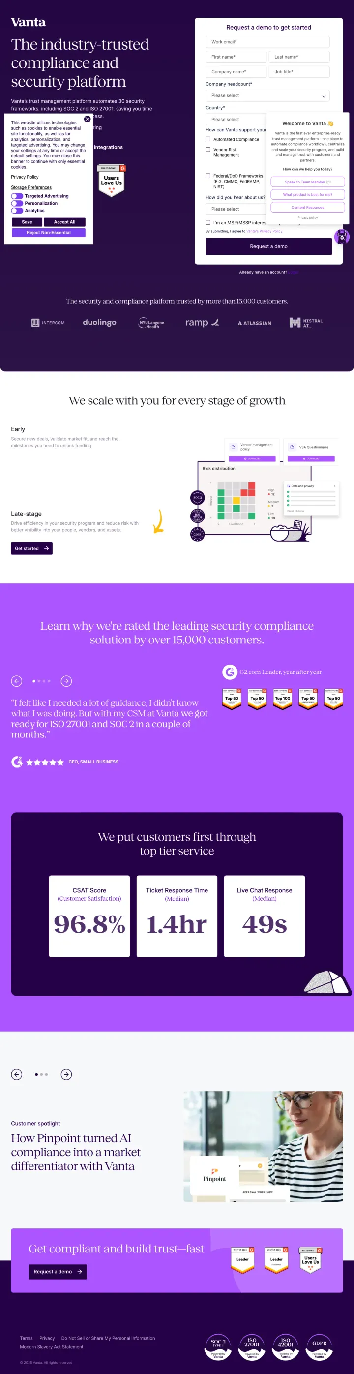
Use framework-specific checkboxes in your demo request form (Automated Compliance, Vendor Risk Management, Federal/DoD Frameworks) so sales knows exactly what the prospect cares about before the call. This turns form friction into qualification signal.
Checkbox options for use case (Automated Compliance, Vendor Risk Management, Federal/DoD Frameworks including CMMC, FedRAMP, NIST) let the visitor self-select their path -- and give sales a pre-qualified lead with specific framework needs identified
'30 security frameworks' as a quantified coverage claim immediately addresses the compliance buyer's first question: does this cover MY framework? The number 30 is specific enough to be credible without listing all of them
G2 badges (Leader in Audit Management, Enterprise Leader in Cloud Compliance) visible above the fold next to the form, providing peer validation at the exact moment of conversion decision
Cookie consent popup and chatbot widget both appear simultaneously on load, covering portions of the form and left-column content -- at $100+ per click, two overlapping modals on landing is conversion-destroying
Company headcount dropdown is a required field that forces the visitor to categorize themselves before they have any context on Vanta's pricing tiers -- this can feel like qualification gatekeeping rather than helpful routing
The headline 'The industry-trusted compliance and security platform' is generic enough to describe any compliance vendor -- it does not connect to the ad copy promise of 'Automate Your GRC' or mention the specific frameworks the ads highlight
Make the analyst report the entire page purpose. Do not pitch your product -- pitch the report. The Gartner Magic Quadrant does the persuasion; your job is just to collect the email address in exchange for it.
'A Leader for fourth consecutive year' -- the word 'consecutive' transforms a single data point into a track record, addressing the Green persona's need for proven, safe choices
Six-field form (email, name, company, country, job title) appears above the fold alongside the report headline -- no scrolling needed, the entire conversion path is visible on landing
Zero product screenshots or feature lists on the entire page -- the Gartner report cover image is the only visual, keeping attention focused on the single conversion action
Full site navigation with Platform, Products, Solutions, Resources menus gives security researchers 20+ exit paths before they reach the form -- at $127/click this navigation bar is expensive
'Rated AAA by CyberRatings' appears in the ad description but is nowhere on the landing page, breaking message match for visitors who clicked because of that specific claim
The page text below the fold is dense paragraph copy explaining SSE concepts -- security buyers who already searched for 'Gartner Magic Quadrant SSE' know what SSE is and do not need the education
4 pages burning ad spend with fundamental issues
Every click to these pages costs real money. We found broken trust signals, mismatched intent, weak CTAs, and messaging that ignores what the searcher actually typed. Here is what to avoid.
Ad targets 'active directory monitor' and 'AD security solutions' keywords, but the homepage hero promotes the Fal.con 2026 conference ('Secure the AI revolution') with zero mention of Active Directory -- the message match is nonexistent
194 total links and 30 navigation items mean a visitor who clicked an AD security ad has to self-navigate through Platform > Identity Protection to find anything relevant -- at $50+ per click, this is paying for a scavenger hunt
Five different price points visible ($7.99 to $99.99) are for consumer endpoint products (CrowdStrike for Home), not the enterprise AD security solution the ad promoted -- wrong product, wrong audience, wrong pricing context
Ad promises 'Schedule Your SIEM Demo' but the page is a product education page with no demo scheduling form visible -- the visitor clicked to schedule a demo and landed on a feature explanation page
Full site navigation with Platform, Products, Solutions, Resources menus provides 30+ exit paths before any conversion action, identical to the homepage problem identified in the CrowdStrike homepage loser entry
The page scrolls through multiple feature sections (Charlotte AI, unified data, log management) that explain what SIEM does rather than why the visitor should choose CrowdStrike's SIEM -- education where persuasion is needed
Ad promises 'Privileged Access Security | Just-in-Time Access' on a $13+ keyword ('identity access management solutions', 4,400 volume), but the hero offers only 'Launch interactive demo' (a third-party Reprise tour) and 'Download guide' -- no contact form, no pricing, no 'Talk to sales' above the fold
The page loads full CrowdStrike site navigation (Platform, Services, Why CrowdStrike, Resources, Company, plus a 14-product sub-menu on the Identity Security row) before the visitor sees the first product section, giving a PAM evaluator 30+ ways to exit the page
The primary form CTA ('Schedule free risk review' for an Identity Security Risk Review) is buried far below the fold under 'Featured Resources' and 'Customer Stories' -- the one conversion a PAM shopper would actually complete is the last thing they see
An acquisition notice ('SGNL is now part of CrowdStrike') appears in the second slot above the how-it-works section, pushing product explanation further down and introducing a brand a cold PAM shopper has never heard of
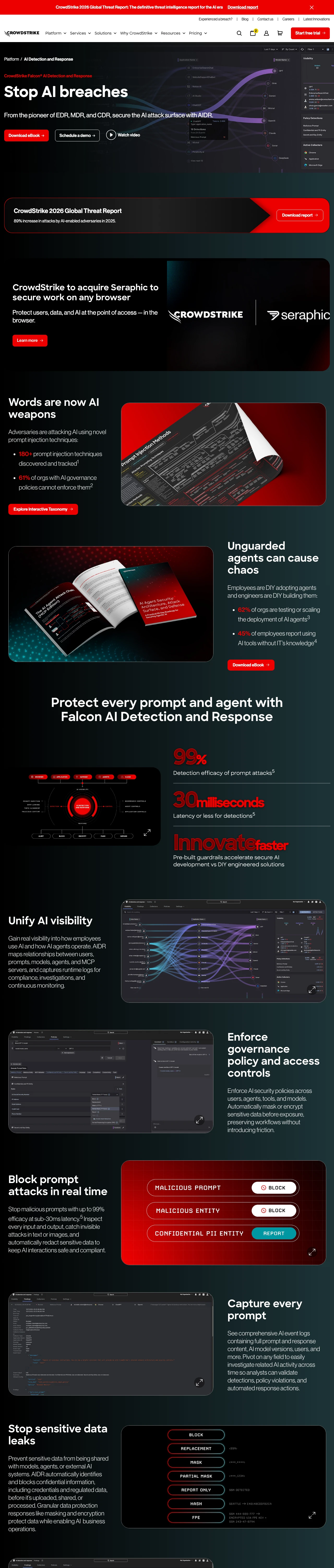
Ad promises 'Schedule A Demo Today' on 'crowdstrike ai security' (260 volume) but the hero fires three co-equal CTAs side by side -- 'Download eBook', 'Schedule a demo', 'Watch video' -- so the visitor who came to book a demo now has to choose between a demo, a video, and a 40-page PDF
The second hero slot promotes an unrelated acquisition ('CrowdStrike to acquire Seraphic to secure work on any browser') before the visitor reaches any AIDR product capability -- browser security has nothing to do with the AI governance query they searched
The 2026 Global Threat Report download card is inserted between the hero and the product sections, splitting AIDR attention with a totally different gated asset and competing for the same lead form
Full CrowdStrike site navigation (Platform menu with 14 product links, Services, Why CrowdStrike, Resources, Company, Pricing) renders above the fold, with 'Start free trial' pinned in the top right -- a trial CTA that bypasses the AIDR sales motion entirely
CrowdStrike (go.crowdstrike.com), Palo Alto (start.paloaltonetworks.com), and Drata (try.drata.com) all use separate subdomains for paid landing pages. These pages strip site navigation entirely, reducing exit paths from 100+ links to zero. The same companies' product pages (crowdstrike.com/platf...
Zscaler's Gartner Magic Quadrant page, CrowdStrike's Threat Hunting Report, and Palo Alto's 451 Research SIEM guide all use analyst or research reports as the conversion offer rather than a product demo. This works because security buyers at the research stage trust independent analysts more than...
Wiz (4.7 / 772 reviews) and Drata (4.9 / 900+ reviews) both lead with G2 star ratings and exact review counts above the fold. G2 reviews come from verified practitioners, not analysts. A CISO sees '900+ reviews from people like me' and trusts it differently than a Gartner badge. The combination o...
Vanta builds separate pages for SOC 2 (/landing/soc-2-compliance-software) and ISO 27001 (/lp/iso-27001-framework). Wiz builds separate pages for cloud security (/nb-cloudsec-s-c), code security (/nb-codesecurity-b), and CSPM (/nb-cspm-b). Each page headlines with the searcher's specific term. Co...
Winners operate dedicated landing page subdomains with stripped navigation, gated content or demo forms above the fold, and third-party validation (Gartner, G2, MITRE ATT&CK). Losers send $50-200 clicks to product pages or homepages with 100+ navigation links, educational content that teaches rather than converts, and CTAs buried below multiple scroll-lengths of feature descriptions.