Free: 96 PPC tools + my AI Playbook book

These are real ecommerce saas platforms pages spending actual money on Google Ads right now.
From real ecommerce saas platforms Google Ads campaigns in the US
The landing pages actually worth stealing from
So you know exactly what to avoid
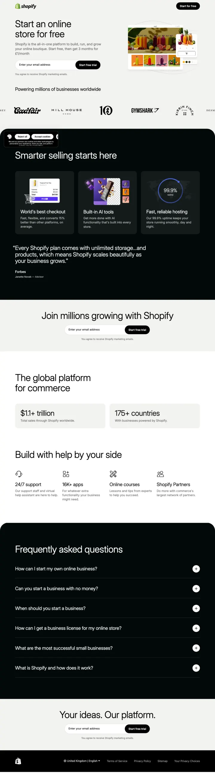
Put the finished store in the hero, not the admin panel. Shopify's 'Zest' juice-brand mockup shows the visitor exactly what their store could look like -- product cards, color swatches, shopping cart, brand photography -- before a single feature claim. The visitor converts on aspiration, not on the feature matrix they were expecting.
Email-only signup field directly in the hero with 'Start free trial' as the button text. No phone, no company size, no credit card. The visitor can be building a store in 60 seconds, which matches the '£1/month for 3 months' promo and turns a ten-dollar click into a dependency.
'Powering millions of businesses worldwide' followed by recognizable DTC brand logos (Goodfair, Hill House, 10, Gymshark, Kirrin Finch, Desmond & Dempsey). These are not enterprise logos meant to impress -- they are brands the target buyer already shops at, which reframes Shopify from software to peer group.
'$11+ trillion total sales through Shopify worldwide' and '175+ countries' as standalone stat cards mid-page. Concrete numbers answer 'is this platform serious' without a single testimonial or feature bullet.
The cookie consent banner sits right under the email field and covers the first CTA on initial load. Visitors who reject cookies see the page shift, which is the worst moment to shift the form they were about to fill.
'World's best checkout' with 'converts 15% better than other platforms' has no source citation anywhere on the page. Analytical buyers (the 55% Blue majority for this category) will mentally discount unattributed comparative claims, especially from the incumbent.
The FAQ section answers 'Is ecommerce profitable?' and 'What are the four types of ecommerce?' -- generic educational content aimed at people who have not yet decided to sell online. The visitor who clicked a 'Build Your Online Business' ad is past that question.
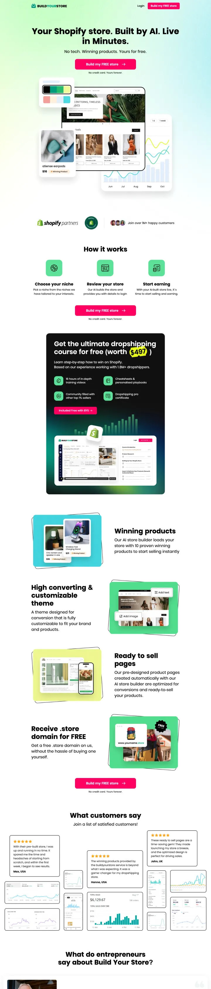
Add a scarcity counter that is specific enough to feel real. 'Only 9 stores left! Get it now' sits pinned at the top of the buildyourstore.ai page. That number is small enough to seem like a literal inventory (not '10,000 spots left this month') and creates urgency on a product the visitor was going to bookmark and forget. For a free-trial funnel where no one actually pays today, borrowed-urgency tactics like this are the main way to convert Red-persona visitors who came from a 'create shop' keyword.
'Your Shopify store. Built by AI. Live in Minutes.' works because it compresses three barriers (platform choice, build time, technical skill) into one promise. The visitor does not have to decide between Shopify and Squarespace -- this tool delivers Shopify directly, which piggybacks on Shopify's brand equity without paying for it.
'No tech. Winning products. Yours for free.' is the real pitch -- the phrase 'winning products' acknowledges the unspoken fear of every dropshipping visitor (I do not know what to sell) and promises AI product selection, not just store build. Competitors sell the store; this page sells the decision.
Three-store template preview (different screen sizes, different niches) shows the output variety without making the visitor click through a gallery. The preview is integrated into the hero, so the visitor sees 'real' generated stores before any feature copy.
'Join over 1M+ happy customers' appears with three tiny face avatars but no named customer, no brand logo, no success story above the fold. For a new-ish brand competing with Shopify, anonymous volume claims raise the question the trust signals should be answering.
The dropshipping course pitch ('Get the ultimate dropshipping course for free') buried mid-page shifts the product from 'AI store builder' to 'course funnel,' which will confuse any visitor who came from a store-builder ad and now has to figure out whether this is a product or an info-product.
Legal and compliance signals are absent: no PCI mention, no mention of what happens to the store if the visitor stops using the product, no clarity on whether the 'free forever' domain is really free forever or a promotional hook. For a platform that asks the visitor to bet their ecommerce business on it, the lack of terms is a trust gap.
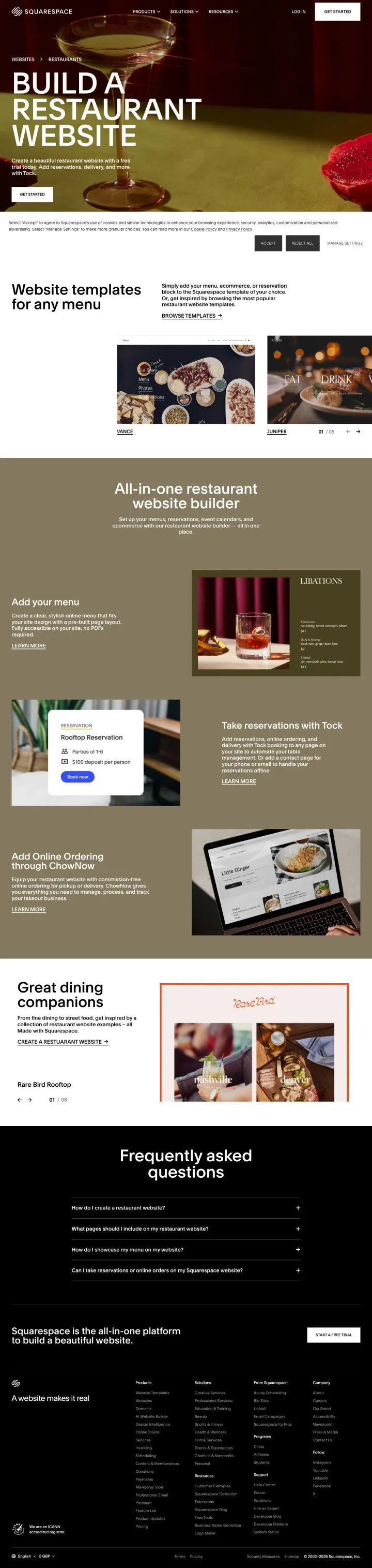
When a PPC keyword is vertical ('website builder for restaurants'), build a vertical page, not a filtered view of the general platform. Squarespace's restaurant page leads with a dressed-table photo and the headline 'Build a Restaurant Website.' Every section addresses a restaurant-specific concern: menu blocks, reservations (via Tock), online ordering (via ChowNow), named restaurant templates (Vance, Juniper, Auburn, Chotto, Atlantic, Rare Bird Rooftop). A generic 'website builder' page forces the restaurant owner to mentally translate every feature into their use case. This page skips the translation.
Naming real templates in the copy (Vance, Juniper, Auburn) rather than saying 'over 100 templates' creates specific aspiration and gives the visitor concrete search targets. The visitor who clicks 'Vance' has a commitment artifact the generic gallery does not produce.
Tock integration in the hero subhead ('Add reservations, delivery, and more with Tock') acknowledges that restaurant operators already know Tock and want to hear a trusted name -- integration quality matters more than feature count for operational software.
The 'Great dining companions' photo section shows a working hostess with a POS and a ChowNow ordering screen, which answers the hidden objection 'will my staff actually use this' before the feature list does.
The hero CTA ('Get Started') links directly to the template browse page rather than a trial signup, which means the visitor has to do a template-selection step before providing email. That extra step leaks the Red-persona visitors who wanted one click to trial.
No pricing, no transaction-fee mention, and no note that restaurant integrations (Tock, ChowNow) may have their own subscription costs. Restaurant owners run on tight margins and will assume hidden costs the page does not disclaim.
The 'Frequently asked questions' section asks 'How do I create a restaurant website?' and 'What pages should I include on my restaurant website?' -- these are top-of-funnel questions, not bottom-of-funnel decision questions the paid-click visitor is now ready to answer.
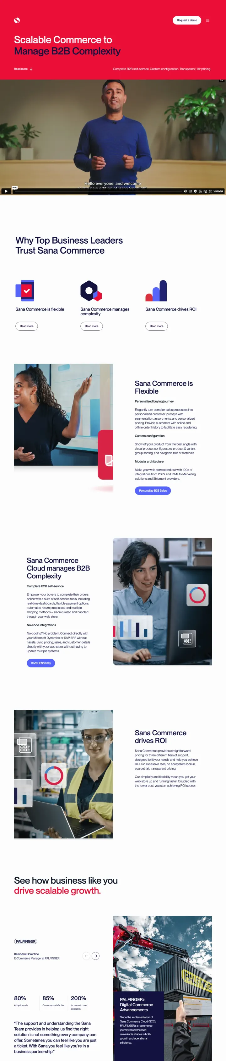
Put a named human on camera in the hero. Sana Commerce's page opens with a man in a blue sweater speaking to camera against a bright red background, above the 'Scalable Commerce to Manage B2B Complexity' headline. For a B2B category where the visitor is weighing a multi-year platform commitment, a face and a voice in the hero shortcuts the 'who are these people' question that logo walls and static photography leave open. The red background forces the page to stand out from the blue-white palette that every competitor uses.
'Complete B2B self-service. Custom configuration. Transparent, fair pricing.' as the hero subhead compresses three specific B2B buyer fears (dependency on sales reps, rigid feature sets, opaque enterprise pricing) into a three-phrase promise. Each phrase is a direct shot at Magento Commerce and Adobe Commerce, Sana's real competitors.
Three percentage stat bars (80%, 83%, 81%) for customer outcomes -- visible as a graphic block rather than buried in a testimonial -- let the Blue-persona visitor lock onto specific numbers without reading a full case study. Numerical density above the fold works for an audience that will do spreadsheet comparisons anyway.
The 'Why Top Business Leaders Trust Sana Commerce' section below the hero uses trust-badge iconography (Sana Commerce is flexible, Sana Commerce Cloud manages B2B complexity, Sana Commerce drives ROI) -- phrasing that maps directly to the three C-suite objections for B2B platform purchases.
The hero video is uncaptioned and autoplays muted, which means the spokesperson's actual words do not land for visitors who never enable sound. The video is a trust signal that leaks its main asset.
'Transparent, fair pricing' in the subhead is undermined by the page never showing a price, a starting point, or even a pricing tier. For a B2B audience that values transparency, claiming it without showing it is a credibility risk.
The 'Request your product demo' CTA routes to a form that asks for company details but does not preview the demo length, format, or who will run it. For enterprise buyers who need to justify the calendar hold, the form friction is higher than the page earns.
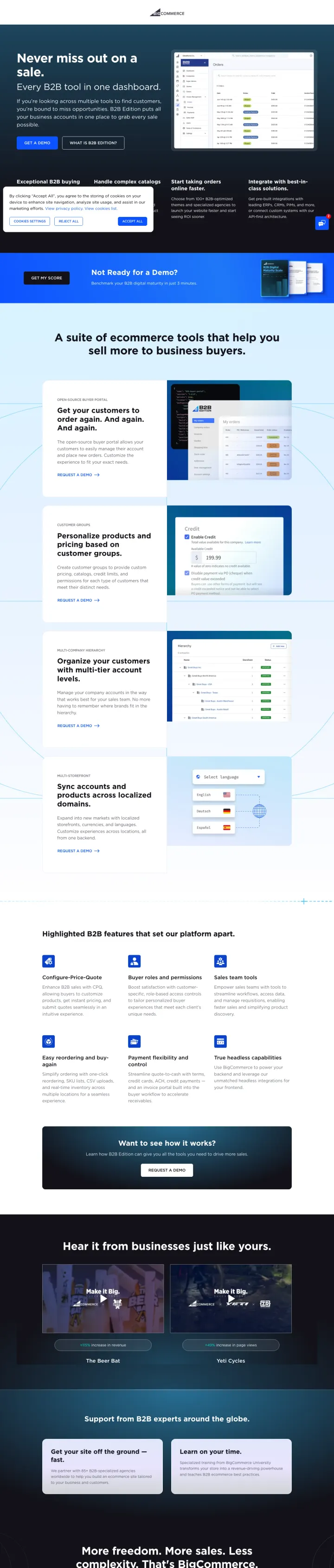
Show the backend, not the storefront, when your audience is operators. BigCommerce's B2B Edition page leads with a clean order-management dashboard screenshot ('Every B2B tool in one dashboard') instead of the rendered storefront every consumer ecommerce platform shows. That choice filters the visitor instantly: a D2C brand-builder bounces, a B2B wholesale operations manager leans in. Deliberate audience filtering in the hero is worth more than a broader appeal.
The hero headline 'Never miss out on a sale' pairs with a subhead naming the operator pain explicitly: 'If you're looking across multiple tools to find customers, you're bound to miss opportunities.' The page names the tool fragmentation problem before pitching the consolidation, which is how B2B operators actually think.
Feature sections organized around buyer workflows (Handle complex catalogs, Start taking orders online faster, Integrate with best-in-class solutions) rather than feature names (Buyer portal, Customer groups, Multi-storefront). The structure mirrors how the operator reviews platforms, not how engineers categorize capabilities.
Named merchant outcomes placed above the secondary 'Ready for a Demo?' CTA: 'The Beer Bat +115% revenue, Yeti Cycles +49% page views.' These are specific B2B brands with specific percentage wins, which is the evidence a procurement committee will cite in its internal approval memo.
Demo form lives at page bottom with no indication of demo length, who runs it (SE, AE, or product specialist), or what the outcome is (custom quote, sandbox, pilot). B2B buyers trying to schedule around other priorities need this information to commit.
No pricing signal at all -- not 'starting from,' not 'custom pricing,' not 'contact for tiers.' Every visitor has to fill the demo form just to discover if BigCommerce B2B is even in their budget, which wastes time for small-mid buyers and burns sales capacity on unqualified leads.
The 'More freedom. More sales. Less complexity. That's BigCommerce.' closer is a brand slogan that does not tie back to the B2B-specific promise. After a page that was tightly B2B-focused, the generic close feels like it was copy-pasted from the consumer landing page.
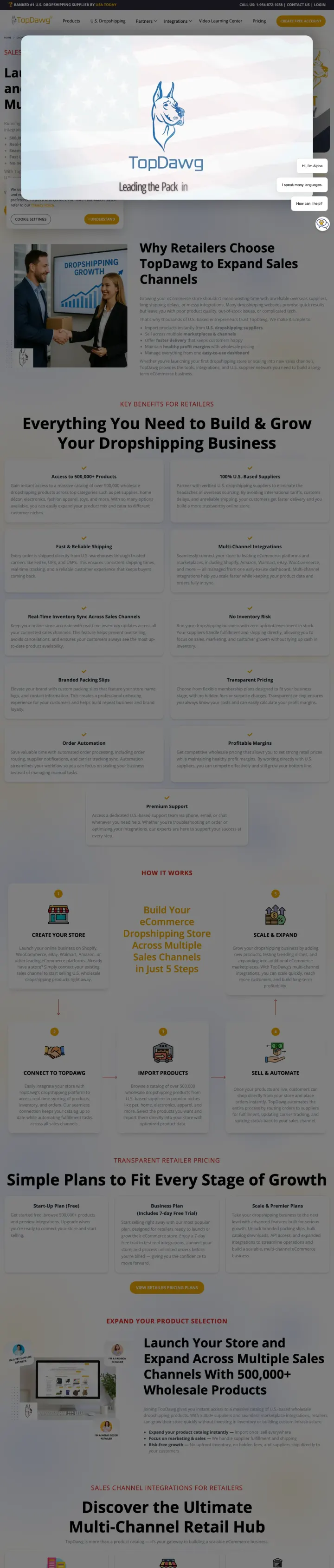
Replace the hero paragraph with a five-bullet operator brief. TopDawg's hero reads as a specific product-shipping-integration checklist: '500,000+ wholesale products from trusted U.S. suppliers; Real-time inventory sync; Seamless integrations with Shopify, Walmart, Amazon, eBay; Fast U.S. shipping; No inventory needed.' The dropshipping buyer is evaluating four to five platforms against this exact checklist -- giving them the answers in the hero means they never have to scroll to another tab.
Named integration partners (Shopify, Walmart, Amazon, eBay) in the hero give the visitor permission to evaluate TopDawg as the dropshipping layer rather than a platform replacement. For a Shopify store owner, 'this plugs into my Shopify' is worth more than 'we have 500,000 products.'
The 'U.S. Dropshipping' positioning is explicit in the URL, the hero headline, and the bullet list -- and directly addresses the 2024-onward tariff anxiety and shipping-time penalty that AliExpress dropshipping has taught every serious seller. National origin is a conversion-critical attribute that most dropshipping pages treat as a footnote.
'#1 U.S. Dropshipping Supplier 2026 -- Featured in USA Today' as a gold-badge trust signal positions TopDawg as publisher-validated, which is the kind of external endorsement that dropshipping platforms almost never carry (the category is flooded with unverified rankings).
The consent overlay on first load occupies roughly 25% of the hero and hides the right-side product mockup until dismissed, so the first visual impression is truncated for every new visitor.
Two competing hero CTAs ('Create Free Account' in orange, 'Product Catalog' outlined) split attention. The 'Product Catalog' path is a hard exit from the conversion funnel -- once the visitor is browsing products, they are comparison-shopping, not signing up.
'Why Retailers Choose TopDawg to Build & Grow Your Dropshipping Business' section below the fold runs as dense paragraph text without scannable section dividers, which for a Blue-dominant dropshipping audience (who will skim-compare four vendors) reads as hard to evaluate.
Pages that break the playbook in interesting ways
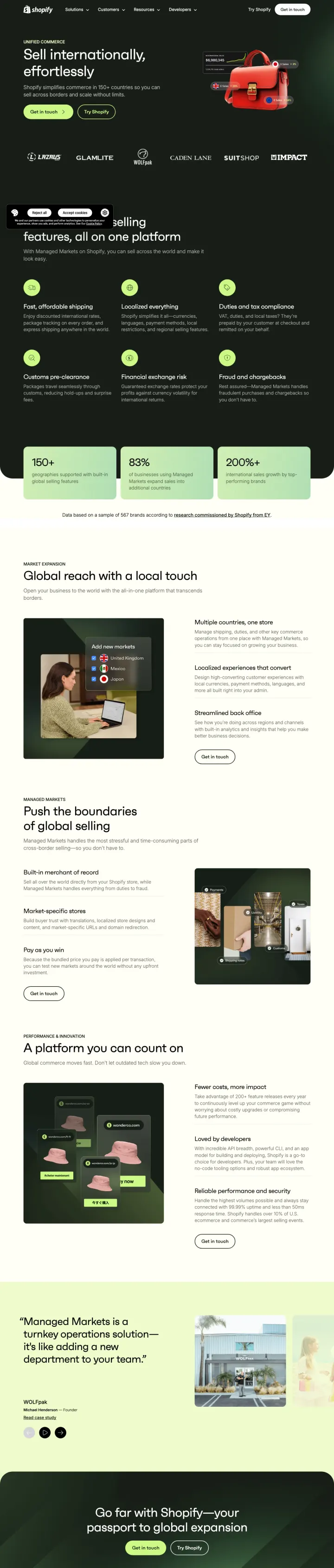
Try a dark enterprise hero with a single luxury-good prop instead of the rendered-storefront pattern. Shopify Plus shows a red leather handbag floating over a dashboard showing 'International Sales $6,980,345' with currency-specific callouts (£ Sales +8%, € Sales +20%, $ Sales +34%). The prop signals premium tier, the number signals global scale, and the color-coded currencies signal 'this is what actually changes when you sell across borders.' For enterprise visitors who already run a store, this page pivots from 'start from scratch' to 'expand from here.'
The currency-specific mini-dashboard overlays in the hero (£ +8%, € +20%, $ +34%) show the product output visually without asking the visitor to read a case study. A merchant running one currency sees immediately what three currencies would look like on their own dashboard.
Brand logo strip features D2C-to-wholesale brands (Lazarus, GLAMLITE, WOLFpak, Caden Lane, SuitShop, Impact) rather than the standard consumer DTC lineup. The logos signal 'these are the brands who scaled internationally using this stack,' not 'these are brands you recognize from Instagram.'
'Managed Markets -- a turnkey operations solution -- is like adding a new department to your team' is a below-fold pitch that reframes international infrastructure as a hire rather than a feature. For enterprise buyers budgeting operations, the hire framing is how the spend already gets justified internally.
The hero headline 'Sell internationally, effortlessly' is generic enough that it could appear on any platform's cross-border page. The distinctive asset is the currency overlay, not the words -- which means the visitor who skims the headline misses the product's actual differentiator.
No price visible and no 'starting from' tier -- Shopify Plus is known to start in the thousands of dollars per month, and the page assumes the visitor already knows that. A first-time Plus-evaluator visitor who clicked from a 'sell in Canada' ad will not.
The hero uses a 'Try Shopify' (not 'Try Shopify Plus') secondary CTA, which downgrades the visitor back to the self-serve product. For a page that is selling an enterprise tier, the escape hatch to the consumer product undercuts the commit.
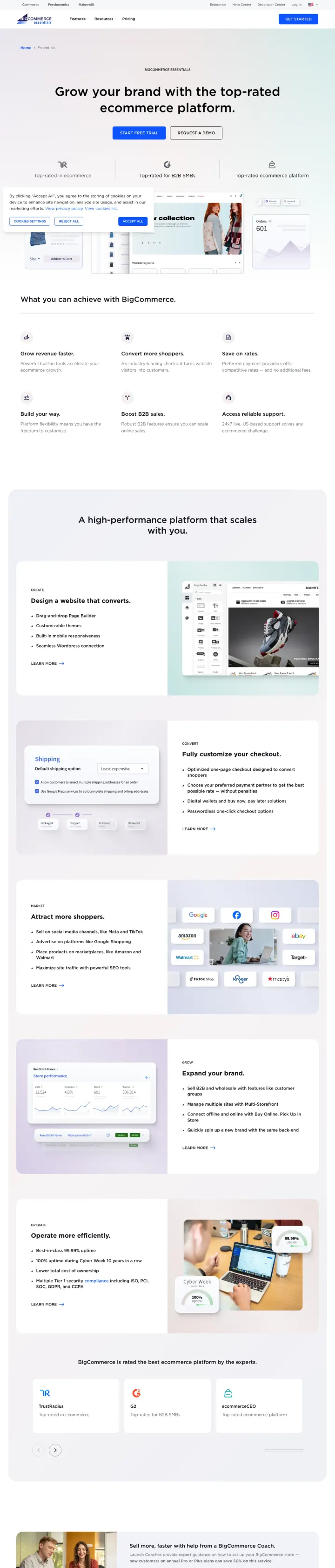
Put three independent proof badges directly under the hero headline. BigCommerce's Essentials page runs 'Top-rated in ecommerce, Top-rated for B2B SMBs, Top-rated ecommerce platform' as three side-by-side icon trust blocks, right under the headline and above the CTAs. This pre-answers the 'is this platform respected' question for the analytical visitor before they even read a feature. The copy is hedged ('top-rated' rather than '#1'), which reads as a careful third-party claim rather than self-hype.
'Grow your brand with the top-rated ecommerce platform' as hero headline with a migration-oriented 'Request a Demo' secondary CTA pairs aspiration (grow your brand) with a safety-netted path (talk to a human before committing). The dual framing serves both the eager Red visitor and the cautious Blue analyst.
Three trust blocks visible above the fold take the space most pages waste on logo walls. Logos are a volume signal; labeled category wins ('top-rated in ecommerce') are a quality signal, and for a platform choice the quality signal matters more.
The collection-gallery mid-page shows a pink-tone fashion store mockup with actual product cards, which extends the 'show the finished store' pattern. For a mid-market buyer who needs to believe their store can look this good without a $15,000 theme budget, the mockup carries more weight than a template gallery.
The hero CTA stack is 'Start Free Trial' (solid) plus 'Request a Demo' (outlined) with no clear hierarchy on which the visitor should choose. Without pricing context or trial terms visible, the Blue analyst defaults to the demo path (conservative) while the Red just-launch visitor stalls.
The 'high-performance platform that scales with you' subsection below the fold uses abstract performance language without a concrete number (no uptime %, no site speed stat, no Black Friday proof). This is BigCommerce's strongest technical argument on the Woo comparison page; on Essentials, it goes silent.
A large video block sits mid-page under a 'Unleash next-level growth' banner but autoplays muted and with no caption -- the visitor who never enables sound loses the testimonial argument the video is carrying.
2 pages burning ad spend with fundamental issues
Every click to these pages costs real money. We found broken trust signals, mismatched intent, weak CTAs, and messaging that ignores what the searcher actually typed. Here is what to avoid.
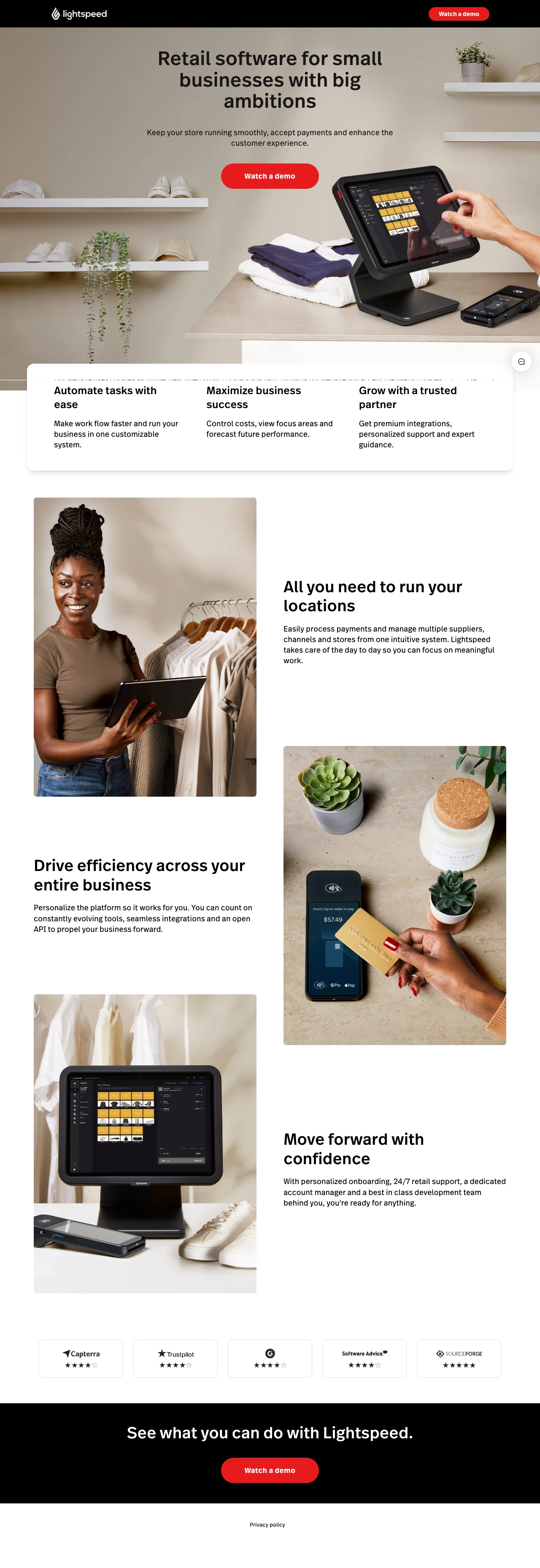
Retail POS keywords run at $20-$40 CPCs. A page that offers only a demo form, generic bullets, and no pricing loses the self-serve shopper to Shopify POS and Square, both of which publish tiers and offer trials. Lightspeed is paying for the click and then filtering out everyone who is not already sales-ready.
The three hero bullets are interchangeable with any competitor. Swap 'Lightspeed' for 'Square,' 'Shopify POS,' or 'Clover' and the page still reads the same, which means the page does zero brand differentiation work at paid-click CPC rates.
Watch-a-demo is the only CTA and there is no email capture, no trial signup, no pricing preview. A first-touch PPC visitor who wanted to poke around gets funneled straight to a sales-gated demo or bounces.
The logo strip at the bottom shows five unnamed third-party badges with no labels or context. Trust logos without captions read as decorative filler, not as named validators a buyer can recognize and verify.
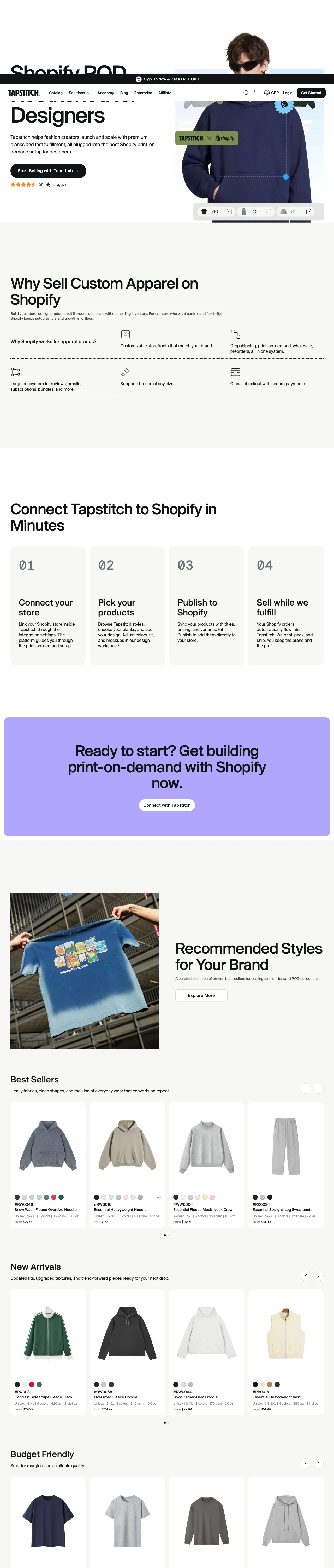
Shopify POD keywords are crowded and expensive. Arriving on a page with broken 'undefined' countdown timers and a body that sells Shopify rather than Tapstitch, the ready-to-integrate visitor bounces to Printful, Printify, or Gelato, each of which runs a tighter, brand-first POD landing page. The fake-urgency plus generic body copy is the worst combination for a category where trust is the gating factor.
Two countdown banners stacked at top both show 00H00M00S and 'undefined' placeholder text. The urgency mechanic is broken on load and actively signals 'this page is unmaintained' to any visitor who notices.
The hero 'Shopify POD, Restitched for Designers' uses brand-specific wordplay the visitor has to decode. 'Restitched' is cute but does not tell a fashion creator clicking from a 'print on demand Shopify' ad what the product actually does differently than Printful or Printify.
The body copy below the hero is a generic 'Why Sell Custom Apparel on Shopify' section that pitches Shopify, not Tapstitch. Three paragraphs in, the page has sold the visitor on Shopify (the platform they already chose) rather than Tapstitch (the product on this URL).
Shopify leads its PPC page with a finished juice-brand storefront (Zest). Buildyourstore.ai shows three template-ready stores at different breakpoints. Squarespace's restaurant page shows a dressed table shot with named templates (Vance, Juniper, Auburn). BigCommerce's B2B page breaks this rule b...
Squarespace runs its /pricing URL as a paid landing page: four cards (Basic £12, Core £17, Plus £29, Advanced £79) with no store examples, no templates, and no reason to pick Squarespace over Shopify. A pricing page is the last step of a buying journey, not the first touch, because the visitor wh...
BigCommerce's comparison page says '99.99% uptime' with a badge. Shopify shows '$11+ trillion' in merchant sales and '175+ countries.' Sana Commerce shows '80%, 83%, 81%' percentage bars for a customer success stat trio. These are specific numbers the visitor can google. 'Commerce without limits'...
Squarespace's restaurant page promises reservations via Tock, menu blocks, and restaurant-specific templates. A visitor searching 'website builder for restaurants' lands on a page that looks like restaurants, not a page that assumes they will translate generic platform features into restaurant us...
Winners show a finished store, a specific number, or a named merchant above the fold. Losers send paid traffic to pricing grids, generic product listings, or feature lists that assume the visitor already decided..