Free: 96 PPC tools + my AI Playbook book

Gym memberships sell on impulse and cancel on inertia. The person clicking your ad just had a moment of motivation and they'll lose it in about 90 seconds. So your page has one job: get them to commit before the couch wins. The best gym pages make signing up feel easier than closing the tab.
From real gyms / fitness Google Ads campaigns in the US
The landing pages actually worth stealing from
So you know exactly what to avoid
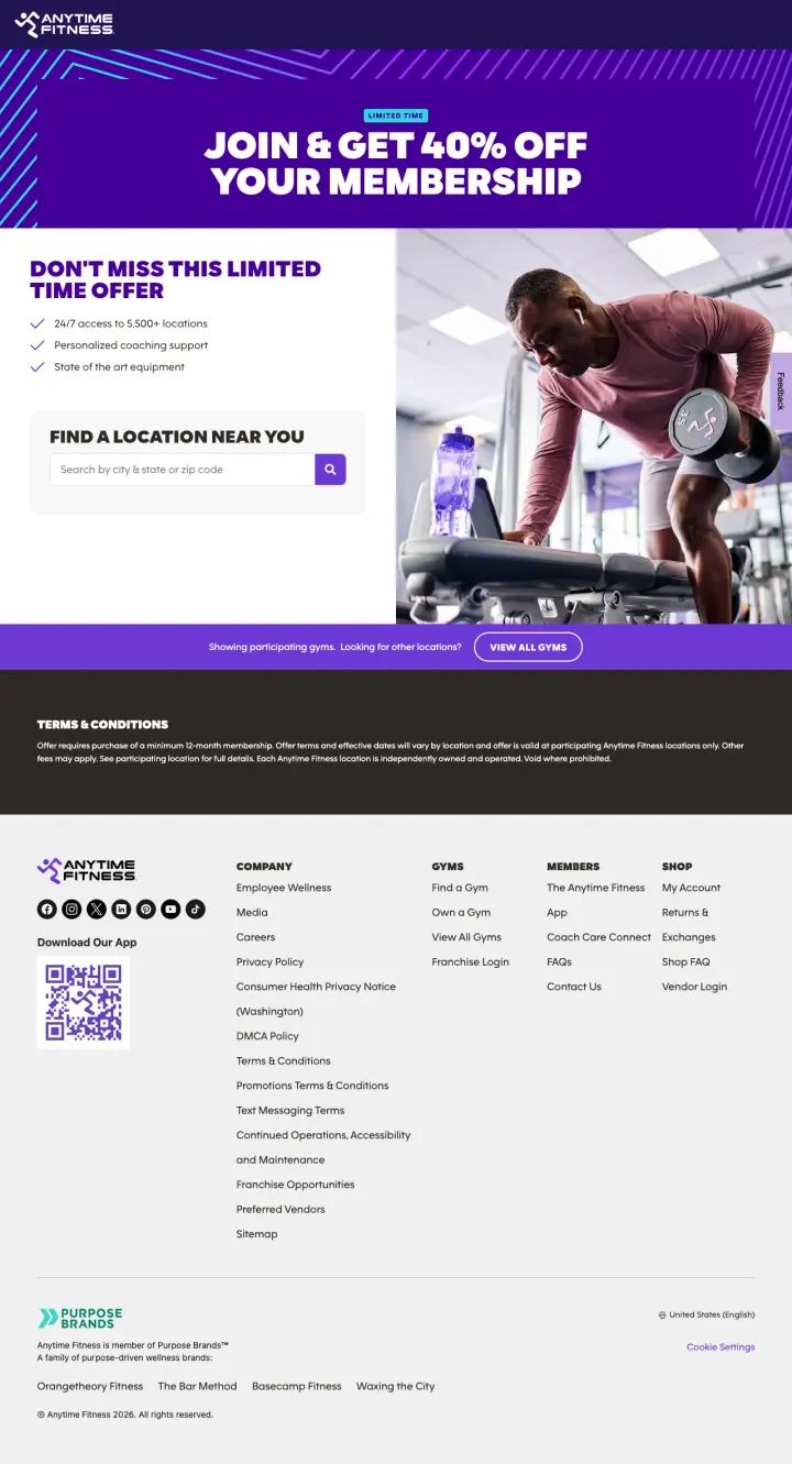
Show two CTAs side by side above the fold: one for 'Try Us Free' (low commitment, for browsers) and one for 'Join Now' (for ready buyers). This dual-path approach captures both the cautious visitor who needs to experience the gym first and the motivated visitor who just wants to sign up today.
Three-tier pricing visible on the page ($24.99 bi-weekly for 24-month, $29.95 bi-weekly for 12-month, $79.99 monthly for no-commitment) lets visitors self-select their commitment level -- the monthly plan at 3x the cost of the 24-month plan makes the longer commitment feel like a deal rather than a trap
Real facility photos from the actual Durango location (spin class, equipment floor, storefront) shown in a carousel alongside professional brand photography -- mixing location-specific shots with polished brand images gives the page both authenticity and visual quality
In-page anchor navigation ('Jump To: Equipment & Amenities, Membership Plans, Gym Announcements, Why Anytime Fitness') lets comparison-shopping visitors scan directly to the section they care about instead of scrolling through content they have seen on every other gym website
The 'Explore Memberships' link below the dual CTA adds a third action that dilutes the clear 'try vs join' decision -- three options create choice paralysis where two options created clarity
Address and phone number are in small text below the headline while a large purple gradient background dominates the left half -- for a gym where location convenience is the #2 purchase factor, the address should be visually prominent, not whispered
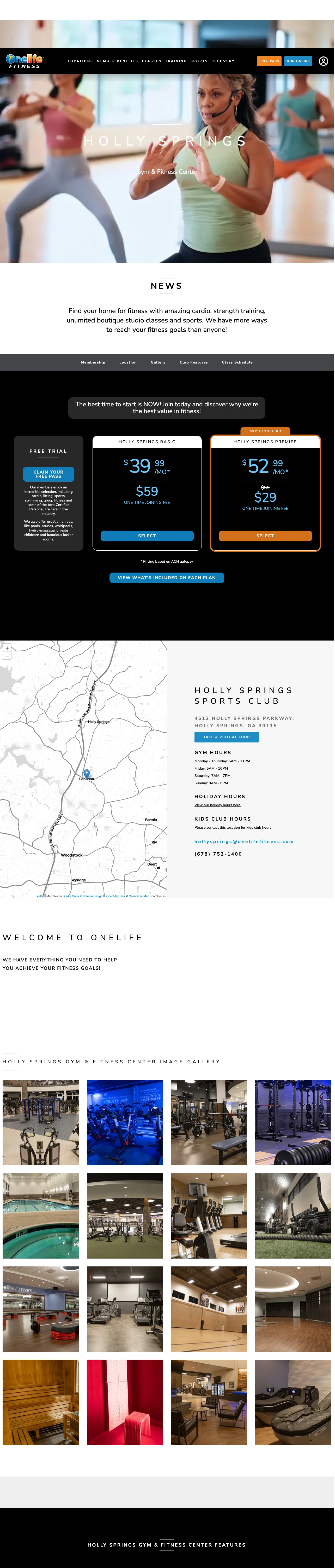
Create a comparison table showing exactly what each membership tier includes with checkmarks and X marks. Onelife's Basic vs Premier table makes the upsell from $34.99 to $47.99 feel obvious because you can see 8 additional perks (HydroMassage, tanning, towel service, body composition analysis, Red Light Therapy) for $13 more per month. The visual comparison does the selling without any copy.
The '$9 to join + first month FREE' anniversary sale with a specific end date (April 14) converts procrastination into urgency -- it takes the #1 barrier to gym sign-up (cost of starting) and makes it nearly free, while the deadline prevents the 'I will start Monday' loop
Side-by-side plan comparison table with checkmarks showing exactly which amenities are included in Basic vs Premier (pool, sauna, HydroMassage, tanning, towel service, Red Light Therapy) -- the visitor can see the value gap without reading a single paragraph of copy
'Take a Virtual Tour' link to a RealTours.io 3D walkthrough lets the visitor explore the actual facility before visiting -- this addresses both the 'what does it look like?' question and the intimidation factor for gym-anxious visitors who want to preview the space
The hero section shows a blurry boxing class photo with 'NEWNAN SPORTS CLUB' in spaced-out capital letters and 'Gym & Fitness Center' as the only subhead -- no mention of the $9 sale, no free pass offer, no pricing above the fold. The first scroll is purely atmospheric
Full site navigation (Locations, Member Benefits, Classes, Training, Sports, Recovery, Free Pass, Join Online) gives the visitor 8 exit routes before they reach the pricing section
The class schedule widget is a dense table with trainer initials and time slots that looks like a spreadsheet -- useful for existing members but overwhelming for a first-time visitor who just wants to know 'do they have yoga on Saturdays'
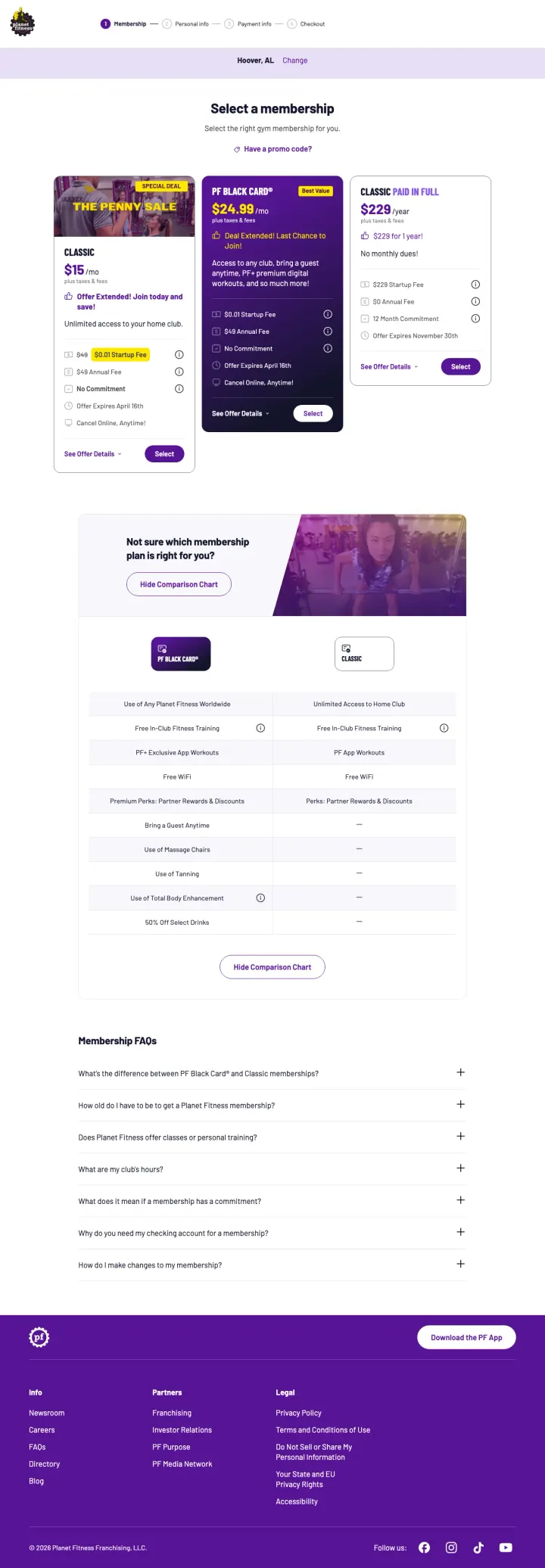
Show all membership tiers side by side with a 'Not sure which plan is right for you?' comparison chart below. Planet Fitness displays Classic ($15/mo), PF Black Card ($24.99/mo), and Classic Paid in Full ($229/year) with checkmarks showing exactly what each tier includes. The comparison chart below lets indecisive visitors see the feature differences without scrolling between cards.
Three membership cards displayed side by side with prices, features, and 'Select' buttons let the visitor compare without scrolling. The middle tier (PF Black Card) has a purple highlight and 'Deal Extended! Last Chance' badge that draws the eye to the most profitable option
'No Commitment' and 'Cancel Online, Anytime!' listed as features on the Black Card directly address the #1 gym purchase anxiety. Planet Fitness treats cancellation flexibility as a selling point rather than hiding it in fine print
Comparison chart toggle ('Not sure which membership plan is right for you?') expands to show a feature-by-feature breakdown with checkmarks and dashes, including tangible perks like massage chairs, tanning, and guest privileges that justify the price difference
The Classic Paid in Full option shows '$229/year' with '$229 for 1 Year' and a '$0 Startup Fee' callout, but the comparison to monthly cost is not calculated for the visitor. Showing '$19.08/mo equivalent' would make the annual savings obvious
The 'Special Offer' and 'Deal Extended' badges appear on multiple tiers, diluting urgency. When everything is on sale, nothing feels special
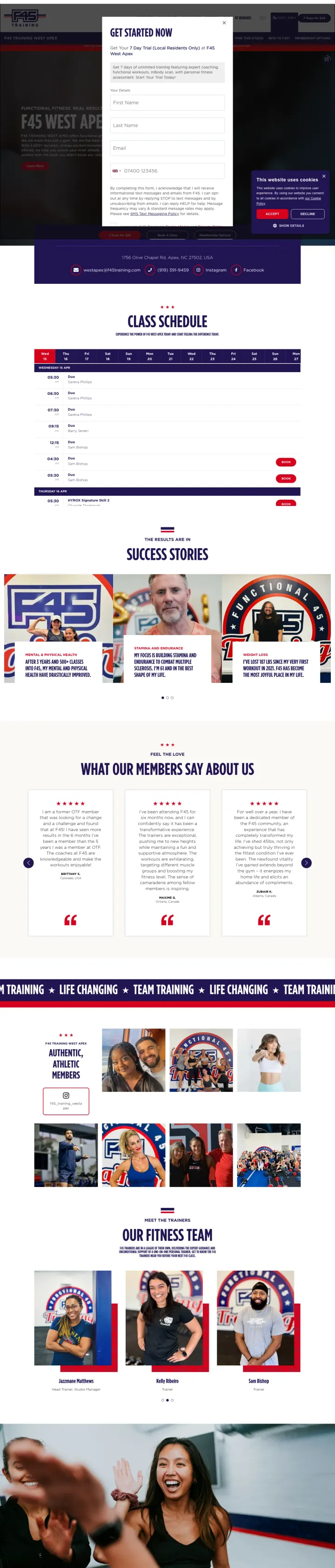
Build a single page that combines your class schedule, member success stories, and trainer team photos. F45 West Apex puts all three conversion elements on one page so the visitor can answer 'when can I go?', 'does it work?', and 'who will train me?' without navigating away.
'Get Started Now' lead capture form at the top of the page with name, email, and phone fields. The form appears before any content, catching the high-intent visitor who already knows they want F45 and just needs to sign up
Interactive class schedule widget showing specific days and times lets visitors check availability against their own calendar immediately. The schedule is embedded directly in the page, not linked to a separate booking system
Member testimonial section ('What Our Members Say About Us') with real quotes and photos provides social proof from people who train at this specific studio, not generic brand testimonials
The 'Success Stories' section shows before/after transformation photos but they appear to be brand-level content, not specific to this studio location. Local success stories would be more credible
The trainer team section at the bottom shows real trainer photos with a fun group shot, but no credentials, certifications, or specialties are listed. Visitors choosing between F45 and a personal trainer want to know qualifications
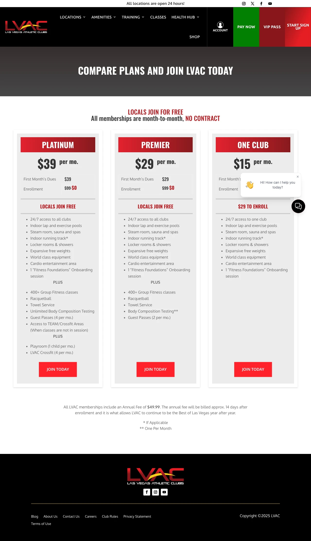
Put all three membership tiers on one page with stacked checklists under each price. LVAC shows Platinum ($39), Premier ($29), and One Club ($15) side by side with the same seven core amenities under each (24/7 access, pools, steam/sauna/spa, running track, lockers, free weights, equipment, cardio area), then adds a 'PLUS' block below that listing the extras each tier unlocks (400+ group fitness, racquetball, towel service, playroom, CrossFit). The visitor can see exactly what they gain by stepping up a tier without reading a comparison chart.
'LOCALS JOIN FREE' headline with strikethrough on the $99 enrollment fee (shown as ~~$99~~ $0) on Platinum and Premier tiers makes the free enrollment feel earned, not gimmicky, because the crossed-out $99 number anchors the value before the zero appears
'All memberships are month-to-month, NO CONTRACT' in the subhead addresses the #1 gym anxiety (being trapped) directly above the price tiers, not buried in footer fine print where most gyms hide their cancellation terms
The annual fee ($49.99) is disclosed in a footnote at the bottom of the pricing table with exact timing ('billed approx. 14 days after enrollment'), which turns a hidden surprise charge into a documented line item the visitor knows about before they sign up
The One Club tier still charges a $29 enrollment fee while Platinum and Premier waive theirs entirely, which inverts the pricing logic. The cheapest tier charges more to enroll than the premium tiers, punishing budget-conscious visitors who should be the easiest conversion
Each tier has its own separate 'Join Today' button routing to a different URL (membership-set-up-platinum, membership-set-up-premier, membership-set-up-one-club), which is correct for tracking but means the visitor who changes their mind mid-signup has to backtrack to the comparison page rather than switching tiers inside the checkout flow
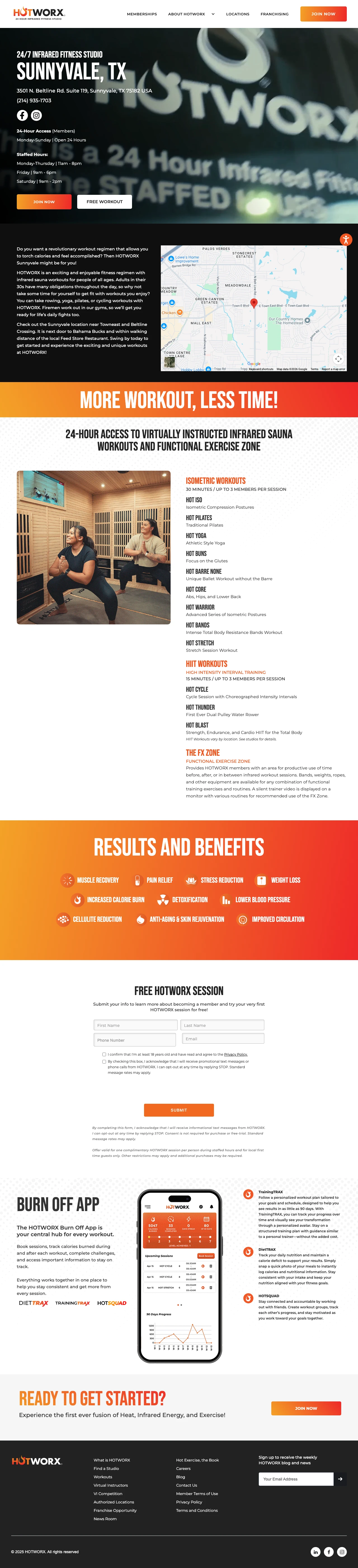
If you run a niche fitness format (infrared, boxing, pilates, cycling), list every class by its exact name and duration on the location page instead of using generic category labels. HOTWORX Sunnyvale lists nine 30-minute isometric classes (Hot Iso, Hot Pilates, Hot Yoga, Hot Buns, Hot Barre None, Hot Core, Hot Warrior, Hot Bands, Hot Stretch) plus three 15-minute HIIT classes (Hot Cycle, Hot Thunder, Hot Blast) with one-line descriptions of each. A visitor can skim the format catalog and self-select which class fits their current goal without asking a staff member.
'30 MINUTES / UP TO 3 MEMBERS PER SESSION' framing turns the small class cap into a premium selling point. The visitor reads 'only 3 people per session' as 'nearly private training' rather than 'limited capacity', which justifies a boutique price against commodity gyms
The 'Results and Benefits' grid with 10 icon tiles (Muscle Recovery, Pain Relief, Stress Reduction, Weight Loss, Increased Calorie Burn, Detoxification, Lower Blood Pressure, Cellulite Reduction, Anti-Aging, Improved Circulation) converts the unfamiliar 'infrared sauna workout' concept into concrete outcomes so the visitor doesn't have to figure out why they'd try this category
Specific neighborhood reference points ('near Towneast and Beltline Crossing', 'next door to Bahama Bucks', 'within walking distance of the local Feed Store Restaurant') ground the studio in the visitor's mental map of Sunnyvale, which matters more for a habit purchase than generic street addresses
Five identical phone numbers stacked in a row at the top of the page suggest a template bug where the phone field is rendering multiple times. This reads as broken rather than accessible and undermines the first impression
The free session CTA ('FREE WORKOUT' link) is styled identically to 'JOIN NOW' and 'Request More Info' with no visual hierarchy; the visitor scanning for the low-commitment option has to read all three button labels to find the trial offer
When you run a multi-location locator, display each location's starting monthly price and joining fee directly on the listing, not locked behind a click into the location page. PureGym shows 'Starting at £18.99 per month + £10 joining fee' on every gym tile, with promotional pricing like 'Starting at £32.99 £23.99 per month for your first month' on locations running intro deals. A visitor comparing three or four nearby PureGyms can triangulate the best price without opening four browser tabs.
Per-location pricing shown inline on the locator (starting monthly rate plus joining fee) eliminates the 'which one is cheapest?' question that sends comparison shoppers back to the SERP to check competitors. Every PureGym answers the price question on the same page
Strikethrough promotional pricing (e.g., '£32.99 £23.99 per month for your first month') shows the regular price alongside the intro discount so the visitor sees the anchor and the deal at the same moment, which reads as transparent rather than bait-and-switch
Alphabetical grouping by letter ('A', 'B', 'C' section headers) with a search-and-location toggle above serves both scanners (who want to browse their city) and searchers (who want to jump to a specific gym name), without forcing one interaction model on visitors who prefer the other
The page defaults to 'Showing all gyms' across the entire UK network without pre-filtering by the visitor's city or nearest location, which means a visitor in Leeds has to scroll past dozens of Aberdeen and Ashford listings before reaching their market
Joining fees vary dramatically across locations (£0 to £25) with no explanation of what determines the fee, which introduces a new question ('why is this gym £20 to join and that one is £10?') at the exact moment the visitor is trying to make a single decision
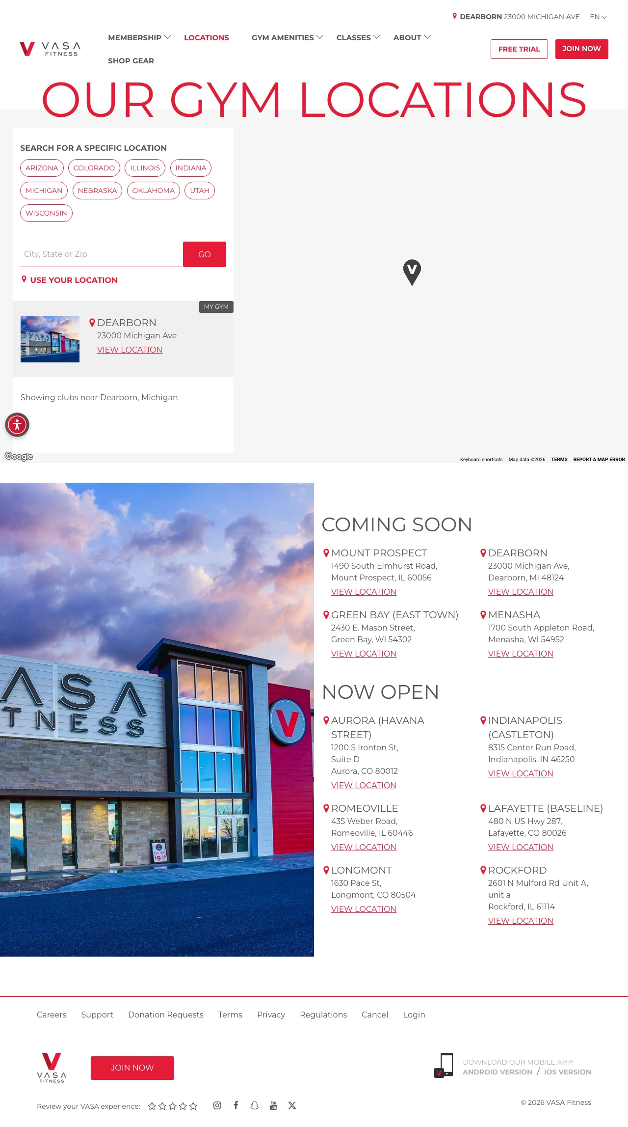
If your franchise has openings in the pipeline, segregate 'Now Open' and 'Coming Soon' into two explicitly labeled sections on the locator. VASA runs both at once (Aurora Havana Street, Indianapolis Castleton, Romeoville, Lafayette Baseline, Longmont, and Rockford under 'Now Open'; Mount Prospect, Dearborn, Green Bay, and Menasha under 'Coming Soon'). A visitor can tell at a glance whether the gym they want is actually available this week, which kills the post-click disappointment that happens when a paid ad routes to a pre-launch location with no open date.
Two clearly labeled sections ('Now Open' and 'Coming Soon') on the same page let pre-launch locations capture interest (email signups, tour requests) without deceiving 'ready to join today' visitors into clicking a location that will not be open for months
State-level filter dropdown (Arizona, Colorado, Illinois, Indiana, Michigan, Oklahoma, Utah, Wisconsin) trims the national list down to the visitor's geography without requiring a zip code, which handles comparison shoppers who have not picked a specific city yet
Each location tile shows city name, street address, and a single 'View Location' CTA. No phone number, no amenities list, no pricing teaser, which keeps the locator clean and routes the selling to the location page where it belongs
The 'Coming Soon' tiles link to the same 'View Location' page as the open ones, so a visitor who clicks a Dearborn 'Coming Soon' tile lands on a location page that may not clearly state when the gym opens or whether pre-sale pricing is available
An 'Oops! Group Fitness Classes Not Available in Dearborn' modal appears in the scrape alongside the Dearborn listing, suggesting that location-specific feature availability is detected after the click rather than surfaced on the locator tile itself
Pages that break the playbook in interesting ways
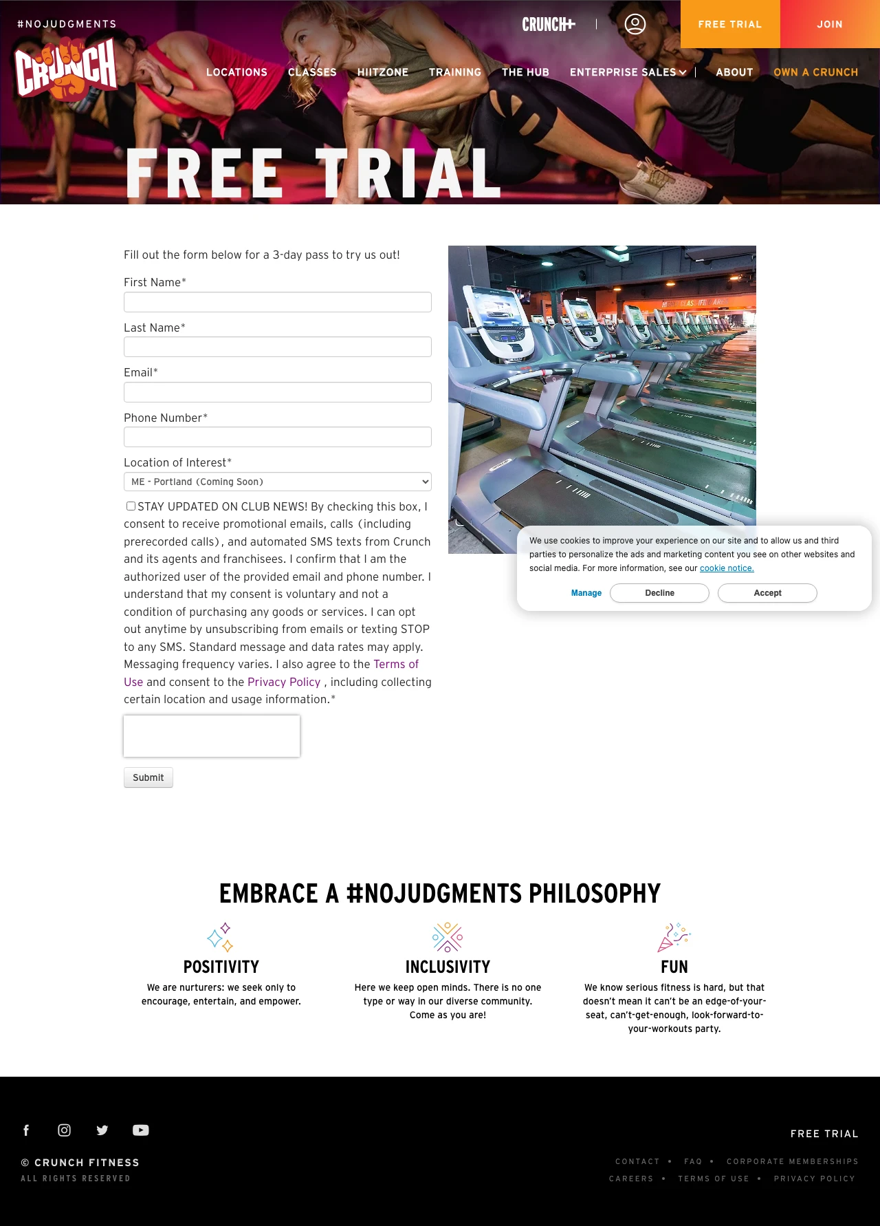
Build a dedicated free-trial page on a separate subdomain that contains nothing except the form and your brand promise. Crunch strips away pricing, facility tours, testimonials, and class schedules entirely. The page bets that someone who searched 'free pass gym' has already decided to try a gym -- they just need the form. This only works for brands with recognition; an unknown gym needs to show what the visitor is signing up to try.
The form asks only for first name, last name, email, phone, and location -- five fields, no fitness goals, no 'how did you hear about us', no demographic questions. Every extra field reduces form completion, and Crunch prioritizes getting the lead over getting data they can ask for later
The '#NoJudgments Philosophy' section below the form (Positivity, Inclusivity, Fun) directly addresses the gym intimidation objection without showing a single photo of muscular people or intense workouts -- it reframes the gym as a welcoming space rather than a performance arena
Using a HubSpot-hosted subdomain (info.crunch.com) separates the lead gen page from the main site, allowing the marketing team to A/B test forms and offers without touching the main website codebase
The location dropdown lists 200+ locations including dozens marked 'Coming Soon' -- a visitor who selects a 'Coming Soon' location has no gym to visit, wasting both their time and Crunch's ad spend on an impossible conversion
No facility photos specific to any location -- the single gym photo shows generic treadmill rows that could be any Crunch anywhere. A visitor choosing between Crunch and a local competitor gets zero visual evidence for this specific location
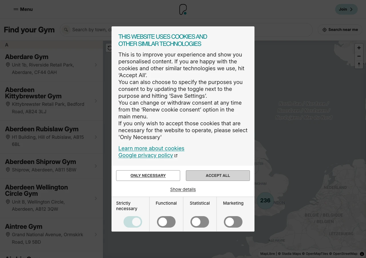
The cookie overlay sits on the right side of the page on desktop, obscuring the gym photo and creating an immediate visual obstacle before the visitor even reads the headline
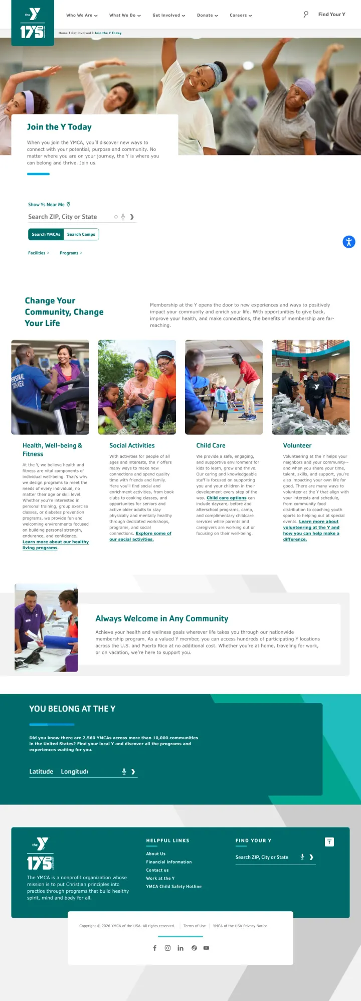
If you run ads targeting local keywords like 'Atlanta YMCA membership,' send that traffic to a location-specific page with local pricing and hours, not a national page that asks the visitor to search for their city again. The YMCA join page is a missed opportunity because the ad already knows where the visitor is.
'Change Your Community, Change Your Life' headline with four program pillars (Health/Fitness, Social Services, Child Care, Volunteers) communicates that the YMCA is more than a gym. For the community-minded visitor, this broader mission is the differentiator against commercial gyms
The 'Always Welcome in Any Community' section with diverse, inclusive photography directly addresses the gym intimidation barrier. The photos show real people of all ages and fitness levels, not just athletes
The ad targets 'atlanta ymca membership' and 'okc ymca membership' but the page is a national homepage with a ZIP code search box. The visitor who clicked an ad about Atlanta pricing now has to search for Atlanta again, which duplicates the work Google already did
No pricing visible anywhere on the page. The visitor searching for 'YMCA membership deals' wants to see what it costs. The page shows mission statements and community photos but zero financial information
The page has full site navigation with 'What We Do,' 'Who We Are,' 'Find Your Y,' 'Our Initiatives,' 'Newsroom,' and 'Support Us' tabs, giving the visitor 6+ exit paths before they find the join button
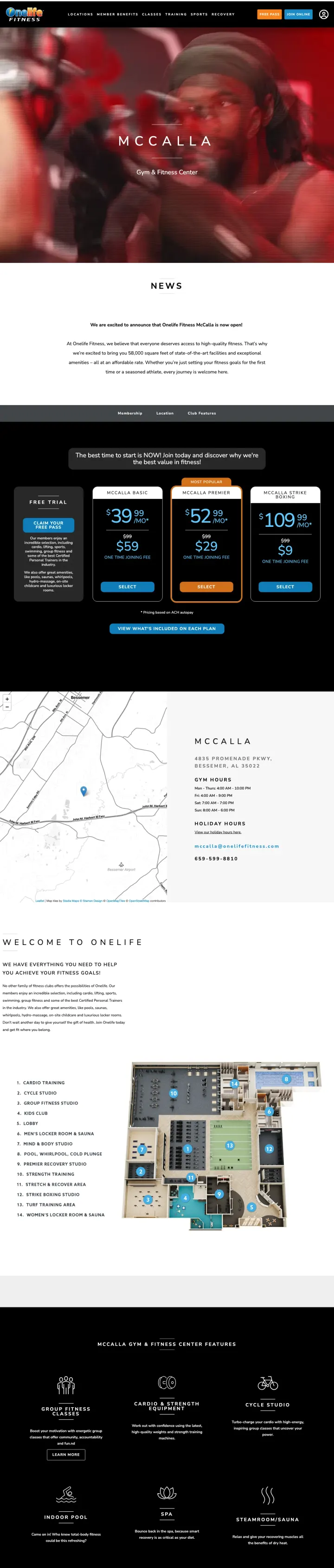
Why This Breaks the Rules: Big-box gym location pages default to photos of the equipment floor or the pool because those are the reassuring 'it's a real gym' signals. Onelife McCalla opens with a dark Strike Studio boxing hero (gloves, heavy bags, trainers holding pads for a member in action) and puts the general gym floor second. This reframes a new location launch as a boutique studio opening, which works because the McCalla market already has cheaper commodity gyms but no premium combat-sports destination.
Boxing-specific hero photography with a named studio brand ('Strike Studio') turns a generic gym location opening into a studio launch with its own visual identity, justifying the $109/month premium tier
Three-tier pricing visible without scrolling ($39 Basic, $52 Standard, $109 Premium) with 'Now Open' framing gives the new-location visitor a complete pricing decision on the first screen instead of forcing them into a form for 'learn more'
Location address (4512 Holly Springs Parkway) with embedded map and business hours signals this is a real club ready to visit today, not a pre-sale page where the visitor is committing to an unopened facility
No free pass or trial CTA above the fold even though the ad copy extension explicitly promises 'Get Your Free Pass to Explore It All'; the visitor has to hunt for the free pass offer after clicking an ad that led with free-pass urgency
The Strike Studio hero positions this as a boxing-first location but the pricing tiers below use generic 'Basic/Standard/Premium' labels that don't tell the visitor whether Strike Studio access is included in a specific tier or upsold separately
The 'Now Open' banner has no opening-month context or grand-opening offer; without a dated framing, the urgency of 'new location' fades to 'just another gym' within a scroll
4 pages burning ad spend with fundamental issues
Every click to these pages costs real money. We found broken trust signals, mismatched intent, weak CTAs, and messaging that ignores what the searcher actually typed. Here is what to avoid.
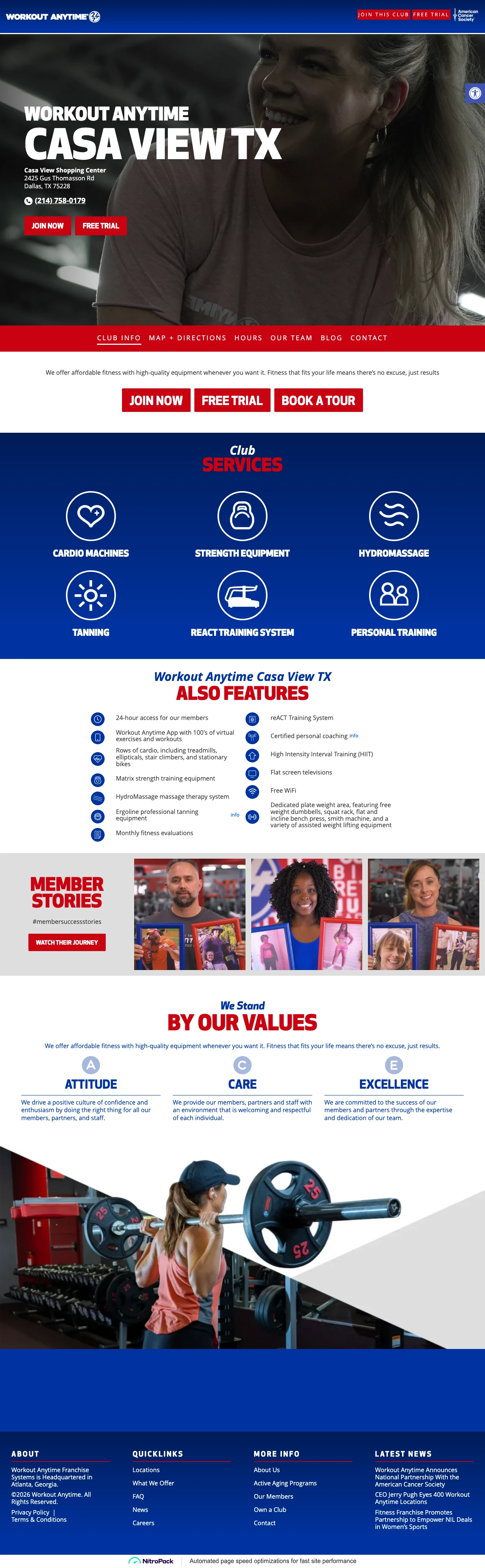
The location page for Workout Anytime Casa View opens with nothing but an address, a phone number, and three CTAs stacked in a row (Join Now, Free Trial, Book a Tour). The same three CTAs repeat a few scrolls later. There is no hero image, no pricing, no membership tiers, and no photos of the club. A visitor who clicked a local-intent ad lands on what reads like a placeholder directory entry and has to pick between three conversion paths without any reason to pick one over the other.
Three equally weighted buttons (Join Now, Free Trial, Book a Tour) appear in a row with no visual priority, then repeat verbatim a few sections down, giving the visitor six identical-looking choices with zero guidance on which one matches their intent
No hero imagery, no member photos, no pricing, and no membership tiers anywhere on the page; the club's only visual identity is a list of amenity text links (Cardio Machines, HydroMassage, Tanning, reACT) with broken image references
The 'Join Now' button routes to a third-party domain (woat.org) rather than staying on workoutanytime.com, breaking brand trust at the exact moment the visitor is asked to hand over payment information
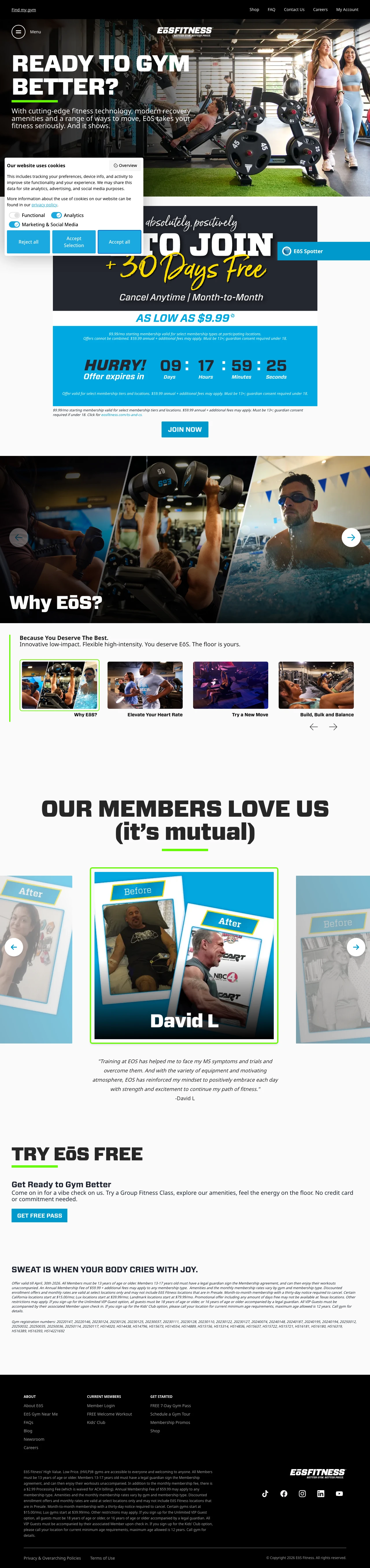
The URL path /monthlypo signals a monthly promotional offer. Below the hero, a graphic shows '$9.99/mo + 30 DAYS' and a disclaimer about select tiers and locations. But the hero itself is a generic 'READY TO GYM BETTER?' headline with a paragraph about 'cutting-edge fitness technology' and no pricing above the fold. A visitor who clicked a price-led ad scrolls past the hero to find the actual promo, which by then has to compete with small-print eligibility caveats instead of running the page.
The hero says 'READY TO GYM BETTER?' with brand-positioning copy about technology and amenities, ignoring the $9.99 promo that the URL path and ad copy implied; the offer only appears as a small graphic below the hero
The $9.99 price is immediately undermined by italic small print: 'valid for select membership tiers and locations. $59.99 annual + additional fees may apply' -- the visitor who arrived for a $9.99 gym now has to decode whether their zip code qualifies
Two 'Join Now' CTAs route to different destinations (joinnow.eosfitness.com via the promo graphic, eosfitness.com/join-now via the button below); having two sign-up paths on the same page with different URLs creates tracking and experience confusion
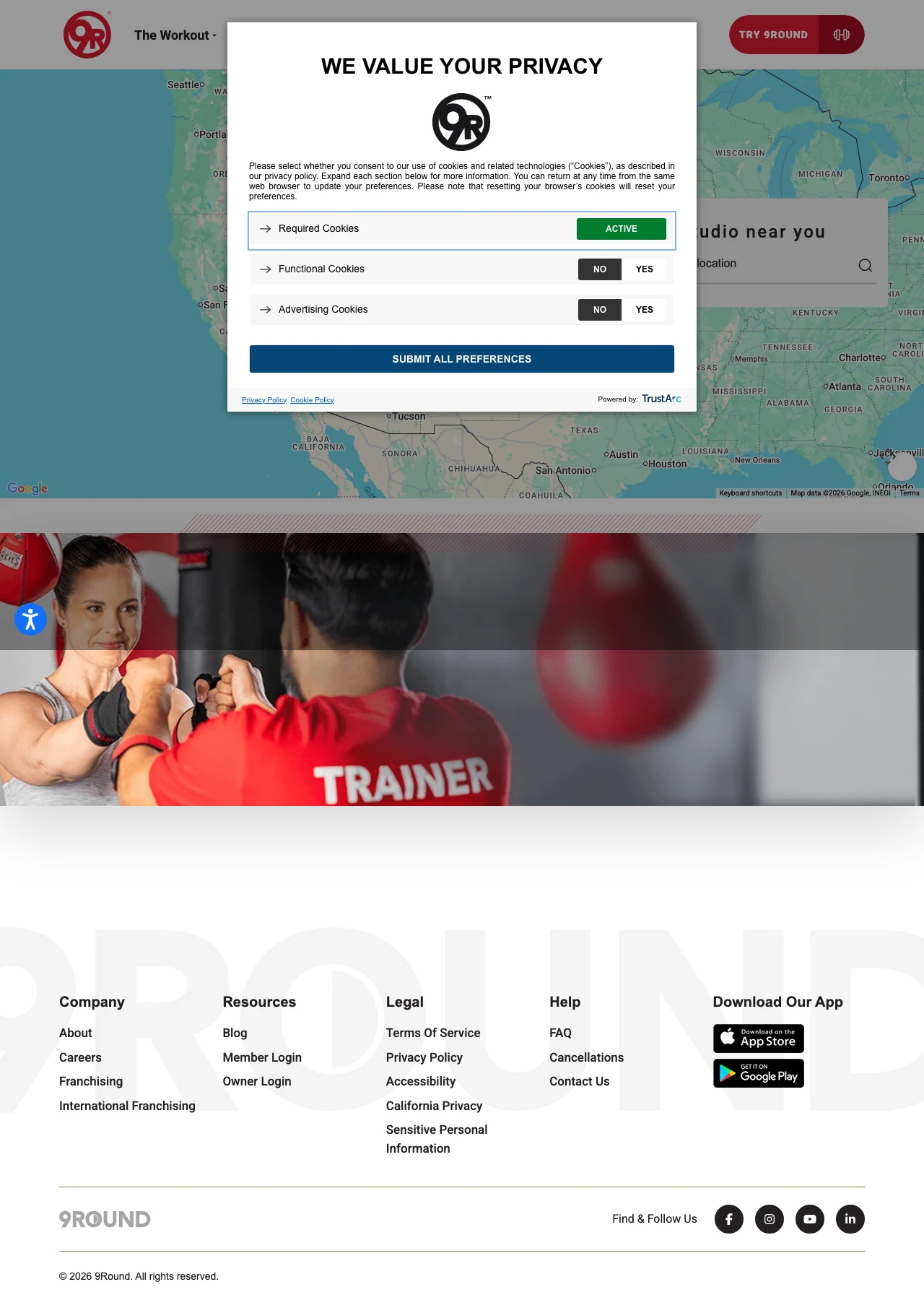
The 9Round locations page is a national map with a zip search box. Enter a zip and one of two things happens: either the map zooms to your nearest studios (with no trial offer, no pricing, and no session booking on this page) or you see 'Locations in your area coming soon' with an email capture form. The page spends paid traffic either way -- visitors with a local studio get no conversion prompt on this page, and visitors without one get turned into 'coming soon' leads for a studio that does not exist. No trial offer, no price, and no Book Your First Session CTA above the fold.
The page has no trial offer, no price, and no 'Book Your First Session' CTA above the fold; the visitor who searched for a local 9Round now has to zip-search, click a studio pin, and start evaluation on a separate studio page
The main nav (Try 9Round, The Workout, Why 9Round Works, Meal Delivery, Locations, On Demand, Own a Studio, US Shop) offers 8 exit paths before the visitor finds any conversion element; 'Own a Studio' in particular invites prospective franchisees to click off the page on a visitor-intent search
The 'Locations coming soon' email capture asks for name and email with no incentive (no free class, no launch discount, no training offer); a visitor who cared enough to search for their zip gets a generic notify-me form with nothing in return
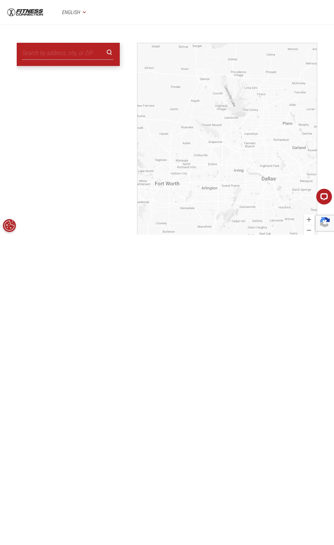
The path /join-now reads like the final step in a conversion funnel. The page that loads opens with a banner about Sugar Land getting new Booty Builder and Arsenal Strength equipment, followed by a Google Map of nearby locations with a zip search. There is no pricing, no membership tiers, no enrollment form, and no single 'Join Now' button above the fold. A visitor who clicked a Fitness Connection ad expecting to complete a membership sign-up has to hunt for their location on a map, click through to that location's page, and restart their evaluation.
The /join-now URL loads a map and a location search rather than a membership-tier decision or an enrollment form; the conversion-intent visitor is pushed back into location discovery instead of commitment
The Sugar Land equipment announcement dominates the top of the page, but it is relevant to a tiny fraction of the national traffic Fitness Connection buys -- for visitors outside Sugar Land, this banner is dead weight above the real content
Nav links in the footer (Locations, Classes, Amenities, Shop, Members, 5-Day Pass, Book a Tour, The Connection, FAQ, Contact Us, Careers) outnumber conversion elements on the page, giving the visitor far more ways to browse than to join
Onelife Fitness shows the full cost structure: monthly rate, joining fee, and annual fee as separate line items. This matters because gym pricing has a terrible reputation for hidden fees. Visitors expect to be surprised by costs after signing up, so showing every fee upfront (even an annual fee)...
Crunch uses a separate subdomain (info.crunch.com) for their free trial page, keeping the form front and center without the distraction of their full website. The form asks for name, email, phone, and location -- nothing more. This is a classic lead gen approach: trade a 3-day pass for contact in...
Onelife Fitness runs an 'Anniversary Sale for only $9 and first month FREE' with a stated expiry date (April 14). This deadline works because gym membership is the ultimate procrastination purchase -- people delay joining for months. A real deadline with a specific date forces action. But the dea...
Winners pick one decision the visitor came to make (which plan, when to start, where to work out) and put the answer in the first viewport. Losers send traffic to a store locator or a promotional URL with no promotion, forcing the searcher to do the filtering Google already did -- at which point most prospects just go back to the SERP..