Free: 96 PPC tools + my AI Playbook book

HVAC is feast or famine. When it's 95 degrees and the AC dies, they'll call whoever picks up first. When it's a new install, they'll get 3 quotes over 2 weeks. Your landing page is either a 911 dispatcher or a sales pitch, and most HVAC companies try to be both on one page. It doesn't work.
From real hvac services Google Ads campaigns in the US
The landing pages actually worth stealing from
So you know exactly what to avoid
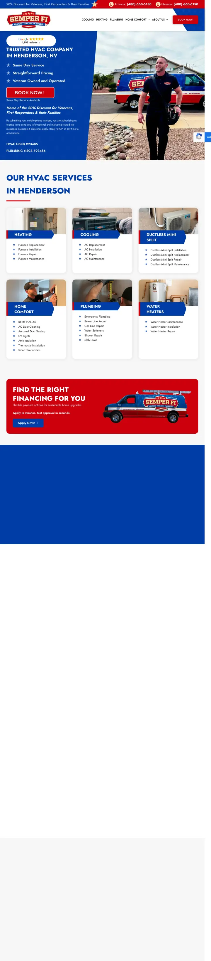
Build your entire brand identity around a single differentiator that doubles as a trust signal. 'Veteran Owned and Operated' is not buried in an About page -- it IS the brand name, the color scheme (red/white/blue), and the discount offer. Every element reinforces one story.
Google review badge (5 stars, 11,955 reviews) positioned at the top of the hero section creates immediate social proof before the visitor even reads the headline -- the review count alone signals a mature, established business
20% military/first responder/family discount announced in the top banner serves dual purpose: it is both a conversion incentive AND a trust signal that communicates values, making the company feel principled rather than transactional
Contractor license numbers (NSCB #93485, #93486) displayed prominently below the hero -- most HVAC pages bury or omit license numbers, but showing them signals nothing-to-hide transparency that matters when letting a stranger into your home
The page loads with the hero taking the full viewport but then immediately jumps into a generic service grid (Heating, Cooling, Plumbing, Water Heaters) with no pricing, no specific offers, and no urgency for the emergency visitor -- the momentum from the strong hero dies in a category menu
No form visible anywhere on the page for visitors who prefer online scheduling over phone calls, which means the replacement buyer who wants to compare quotes at 10pm has no conversion path
Financing section says 'Find the Right Financing for You' but the actual financing details are not visible -- no monthly payment examples, no 0% APR mention, just a vague promise that requires clicking through
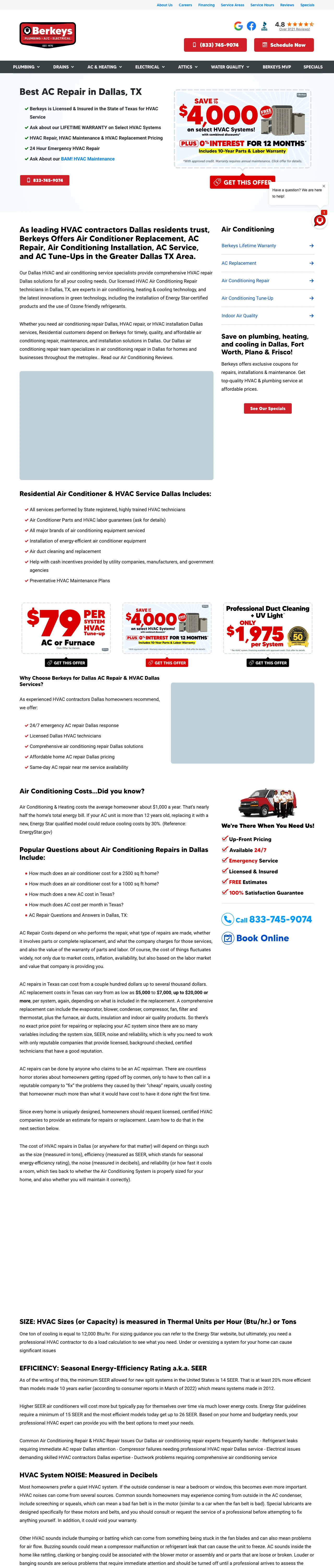
Lead with the biggest possible savings number in a visual banner format rather than text. Berkeys' '$4,000 off' promotional graphic is more eye-catching than any headline could be because it looks like a coupon you'd clip -- it triggers the 'deal-finding' part of the brain.
Stacked promotional banners ($4,000 off systems + $79 tune-up + $1,975 duct cleaning) give three entry points at three price levels -- the emergency repair visitor sees the $79 tune-up, the replacement buyer sees $4,000 off, and the maintenance-minded homeowner sees duct cleaning, all without scrolling far
Bullet-point checklist above the fold (Licensed & Insured, Lifetime Warranty, 24 Hour Emergency, Replacement Pricing) answers the top 4 visitor objections in a scannable format before the visitor has to read any paragraph text
'0% Interest for 12 Months' with 10-year parts and labor warranty included removes the two biggest replacement objections (cost and risk) in a single promotional banner
The page is extremely text-heavy below the fold with keyword-stuffed paragraphs ('air conditioning repair Dallas' repeated dozens of times) that read like SEO content rather than conversion copy -- any visitor who scrolls past the offers hits a wall of text
Two embedded YouTube videos with low view counts (41 subscribers) actually undermine credibility rather than building it -- the production quality signals small operation, contradicting the 'Since 1975' established brand message
The phone number in the header (833-745-9074) is relatively small compared to the promotional banners, meaning the emergency caller whose AC just died in Dallas summer heat has to hunt for the number while the replacement buyer gets served first
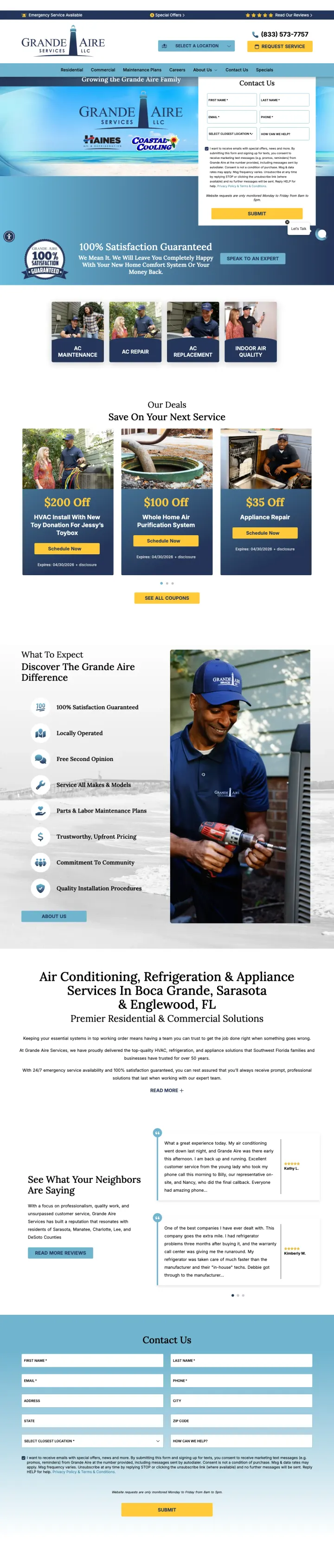
Put the lead capture form above the fold instead of relying solely on a phone number. Grande Aire's form (First Name, Last Name, Email, Phone, Location dropdown, How Can We Help) is the first thing visitors see, capturing contact info from visitors who land outside business hours or prefer not to call.
Location dropdown in the form (Englewood, Sarasota, Naples, Fort Myers, Tampa) serves as both a routing mechanism and a trust signal -- it tells the visitor 'we have multiple locations near you' while ensuring the lead goes to the right office
'100% Satisfaction Guaranteed -- We Will Leave You Completely Happy With Your New Home Comfort System Or Your Money Back' with a badge graphic converts the guarantee from text into a visual commitment that carries more weight than fine print
Ad copy includes '$75 Off AC Repairs' and 'Free Second Opinions' which directly addresses the 'is this quote fair?' objection -- offering a free second opinion is a bold move that signals confidence in their pricing
The form appears partially below a manufacturer logo bar (Trane, Coastal Cooling) and a consent checkbox is visible before the submit button, creating a cluttered above-fold experience where the form competes with brand logos for attention
The 'AC repair' page URL suggests emergency repair, but the hero content and form layout feel more like a general inquiry page with no urgency messaging -- no 'same-day service,' no 'we're on our way,' nothing that matches the panic of a broken AC in Fort Myers summer
Phone number (833-573-7757) is in the header but not as prominent or clickable-looking as competing pages -- for the emergency repair visitor, the form-first approach may actually slow down conversion compared to a giant phone number
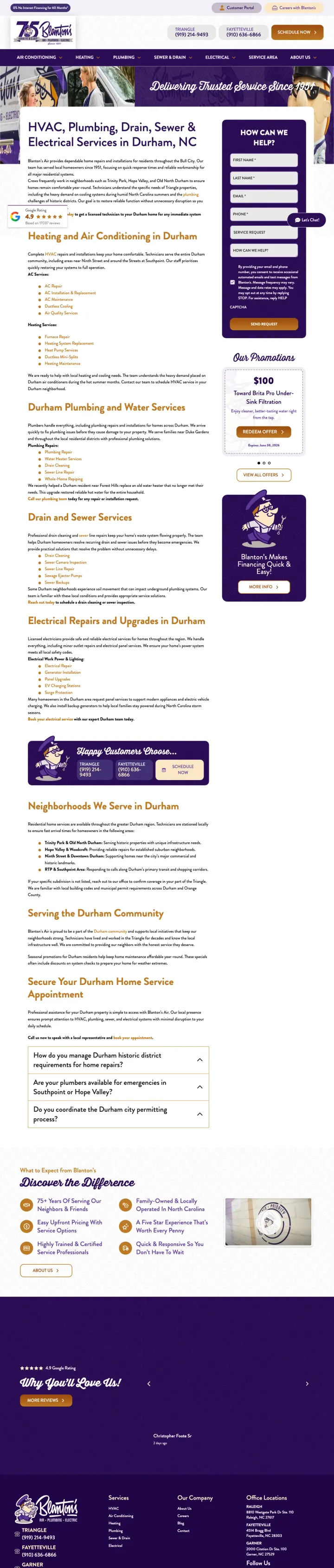
Lead with your founding year when it is genuinely impressive. Blanton's 'Since 1951' heritage, reinforced by the 75th anniversary logo, creates a trust moat that no amount of Google reviews can match -- it signals 'we will be here for your 10-year warranty.'
Neighborhood-specific copy mentioning Trinity Park, Hope Valley, and Old North Durham by name tells the Durham homeowner 'we know YOUR streets' rather than generic 'serving the greater metro area' language that feels corporate
Dual phone numbers for two regions (Triangle: 919-214-9493, Fayetteville: 910-636-6866) plus 'Schedule Now' button gives three conversion paths while signaling multi-location scale
Google Rating 4.9 with 17,037 reviews positioned in the lower-left of the hero area -- the review count is massive enough to be a differentiator on its own, and positioning it near the fold ensures scrolling visitors catch it
The page serves Durham as a service area but covers HVAC, Plumbing, Drain, Sewer AND Electrical -- the lack of focus means the ad promising 'Durham Heating Repairs' lands on a page that dilutes the heating message with 5 other service categories
Promotional carousel (Brita Pro filtration, Surge Protection, Air Purifier) pushes unrelated offers that distract from the primary heating/cooling intent -- a visitor who searched 'Durham NC HVAC' does not care about water filtration
The contact form ('How Can We Help?') is positioned to the right but sits below the fold on most viewports, meaning the emergency caller must either spot the phone numbers in the header or scroll down to find the form
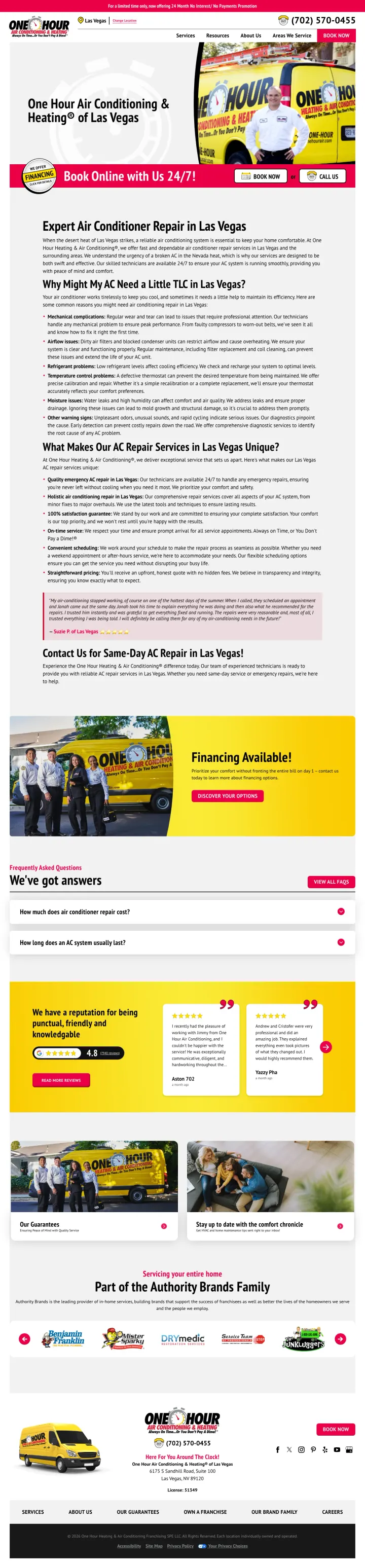
Use a service-specific page (AC Repair, not a generic location hub) with the offer from the ad visible above the fold. This Las Vegas AC repair page shows the "$55 Off" promotion in the top banner, the branded truck photo with a real technician, and "Book Online with Us 24/7" with dual CTAs, all above the fold.
"For a limited time only, now offering 24 Month No Interest/No Payments Promotion" top banner creates urgency with a specific financing offer that the generic Denver location page lacks entirely
Branded truck and uniformed technician photo in the hero with the "One Hour" logo visible on the vehicle creates instant brand recognition and professional credibility
"Book Online with Us 24/7!" section with dual buttons (BOOK NOW + CALL US) addresses both the DIY scheduler and the emergency caller in a single visual block
The red/yellow/white color scheme is visually aggressive and creates a "used car lot" aesthetic that may undermine trust for premium system replacement buyers
The financing section at the bottom is text-heavy with no visual breakdown of monthly payment examples, missing the opportunity to make a $5K+ replacement feel affordable
The page still uses the franchise template, making it indistinguishable from other One Hour locations except for the city name swap
Pages that break the playbook in interesting ways
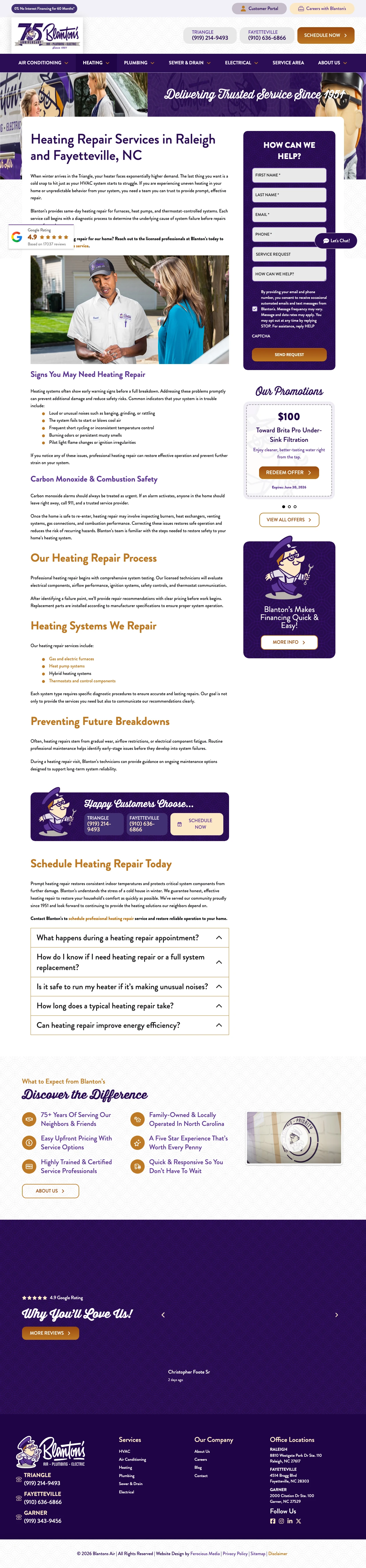
Why This Is Interesting: This is the same Blanton's brand as the Durham service area page already curated, but this service-specific heating repair page demonstrates a key lesson. The form is positioned in the hero with the headline "Heating Repair Services in Raleigh and Fayetteville, NC" and specific content about furnaces, heat pumps, and thermostat systems. The 75th anniversary branding carries over, but the page is focused on one service rather than six.
"HOW CAN WE HELP?" form positioned directly next to the service headline captures leads from the moment of landing without forcing the visitor to choose a service category first
"Our Heating Repair Process" section (Diagnostic, Recommendation, Repair) sets clear expectations for what happens after the visitor converts, reducing the anxiety of "what am I signing up for?"
"$98 Diagnostic Fee" pricing transparency for the first visit converts fence-sitters who want to know the minimum commitment before calling
The "Let's Chat!" widget in the lower right adds a third conversion path that competes with the form and phone numbers, creating decision paralysis in the above-fold experience
The page title says "Raleigh and Fayetteville" but the ad likely targets a single city, creating a slight message mismatch for visitors who searched for their specific city
The promotional carousel from the location hub page carries over here, still pushing Brita Pro filtration and surge protection to heating repair visitors
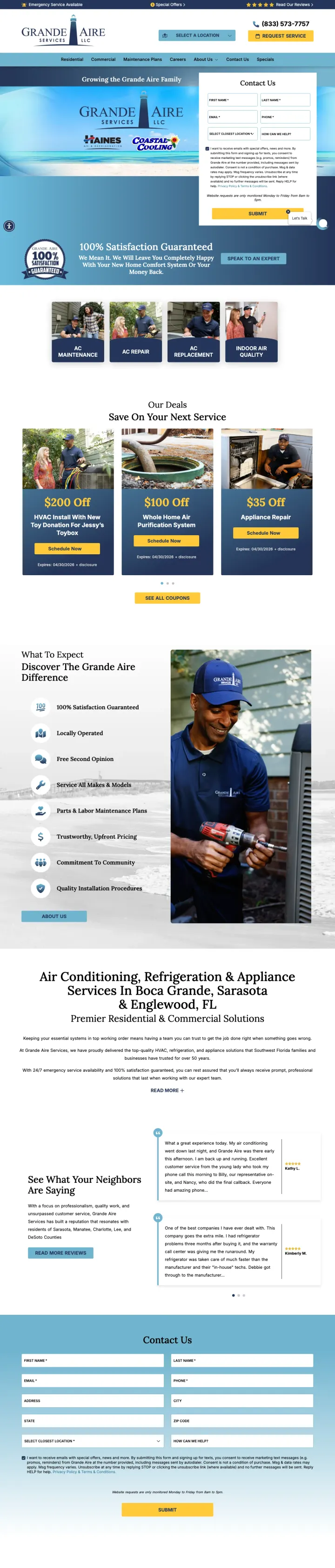
Why This Is Interesting: This is the same Grande Aire brand and template as the Fort Myers repair page already curated, but targeting Naples AC installation. The form-first approach that was a slight weakness for emergency repair visitors actually works better for installation, because installation visitors are in research/planning mode and expect to fill out a form rather than make an emergency call.
The "Contact Us" form positioned immediately in the hero with location dropdown (Naples, Sarasota, Fort Myers, etc.) is better suited for installation inquiries than repair emergencies, because installation visitors are planning ahead and willing to fill out forms
"100% Satisfaction Guaranteed" badge with money-back promise carries even more weight for a $5K-$15K installation purchase than for a $200 repair
Team photo showing uniformed technicians in matching Grande Aire shirts builds the "professional crew" impression that installation buyers care about more than repair customers
No pricing, no financing details, and no system brand information visible despite targeting installation keywords where visitors are comparison shopping on price and brands
The form consent text (SMS/text messaging disclosure) takes 4 lines of fine print directly above the Submit button, creating legal-compliance friction at the exact moment of conversion
The page URL says "installation" but the hero content is identical to the repair page with no installation-specific messaging (no brand options, no timeline, no warranty details)
3 pages burning ad spend with fundamental issues
Every click to these pages costs real money. We found broken trust signals, mismatched intent, weak CTAs, and messaging that ignores what the searcher actually typed. Here is what to avoid.
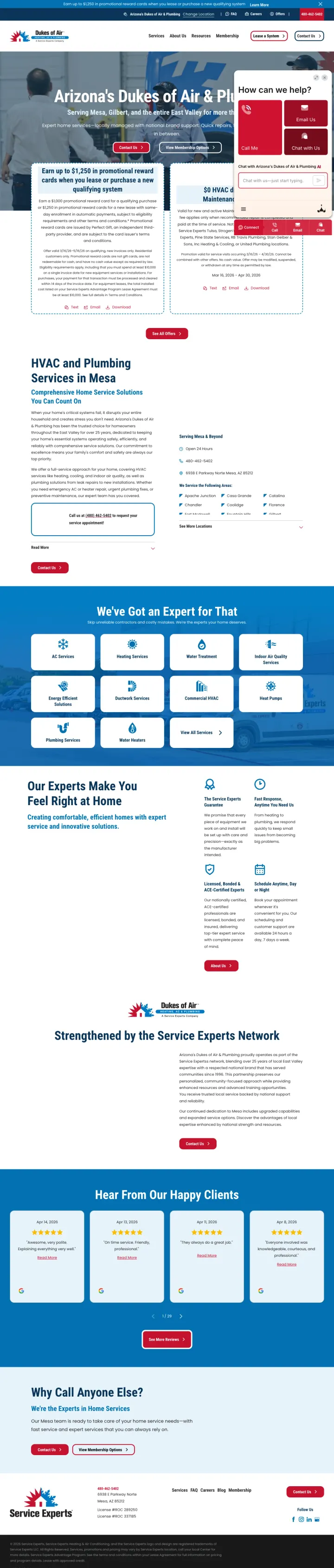
Visitor searches 'arizona dukes of air' (branded, high-intent, 880 monthly searches) and lands on a page where the hero headline is literally cut off by a chat widget overlay ('How can we help? -- Call Me / Email Us / Chat with Us'). The promotional offers ($1,250 reward cards, $0 HVAC diagnostic) are partially obscured behind the chat interface. At branded search CPCs, every click pays for a visitor to fight with a chatbot instead of seeing the offers that would convert them.
Multi-tab chat widget ('Call Me / Email Us / Chat with Us') overlays the hero section on page load, obscuring the headline, the promotional offers, and the primary CTAs -- the visitor's first action must be dismissing the widget rather than engaging with the content
'Earn up to $1,250 in promotional reward cards' offer has a $10,000 minimum spend requirement buried in fine print -- the headline implies a discount but the reality is it only applies to the highest-ticket purchases, creating a bait-and-switch feeling
Dual branding ('Arizona's Dukes of Air & Plumbing' under the Service Experts umbrella) forces the visitor who typed 'arizona dukes of air' to pause and verify they are in the right place. For a broken-AC emergency caller, two seconds of 'am I on the right site?' is enough to bounce back to Google
This Sears Home Services page targets "refrigerator repair milwaukee" (SV: 260) but the landing page is a generic national page with no Milwaukee-specific content. The page leads with dense paragraphs of text about "Expert Refrigerator Repair Services" with no images, no pricing, no urgency messaging, and no form above the fold. The only visual elements are a FAQ accordion and a grid of appliance brand logos far below the fold. For a visitor whose refrigerator is leaking at 9pm on a Saturday, this page offers nothing actionable in the first screen.
No form, no phone number, no scheduling widget above the fold. The visitor must scroll through dense paragraphs to find any conversion mechanism.
Generic national page with no city-specific content despite running city-targeted ads. "Expert Refrigerator Repair Services" could be anywhere.
The page reads like a corporate brochure from 2005: "Our certified technicians are equipped to handle a wide range of issues" is empty corporate-speak that says nothing about response time, pricing, or guarantees
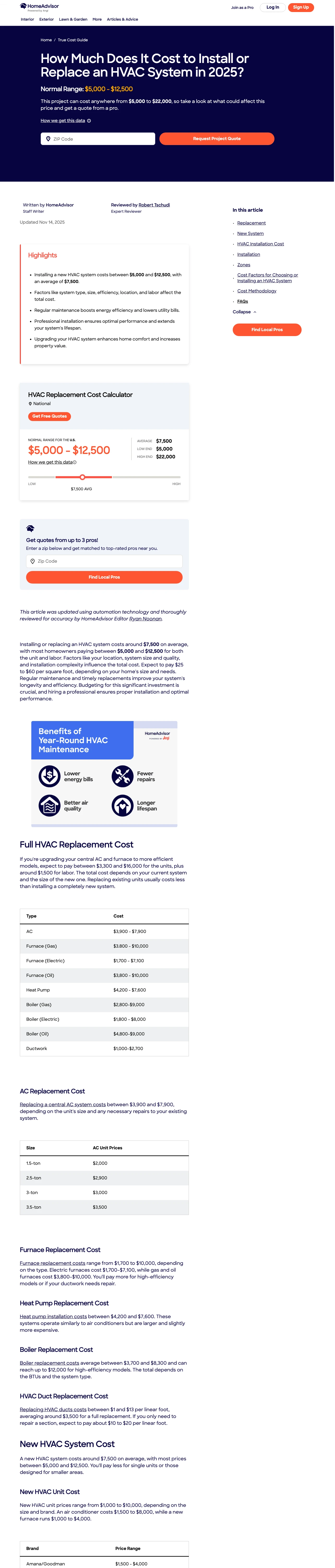
Ad gets clicked by someone researching 'cost to replace HVAC' with intent to hire an installer soon. The page delivers a 2,500-word SEO article reviewed by 'Expert Reviewer Robert Tschudi' with ranges like '$5,000 to $22,000', a cost-calculator widget, and a ZIP-to-match lead form. The visitor who wanted a quote gets an encyclopedia entry first. By the time they scroll to the 'Find Local Pros' section, HomeAdvisor has already burned the urgency signal the ad paid for, and the lead-form conversion rate for cost-article traffic is meaningfully worse than for dedicated installer pages.
Hero opens with 'Normal Range: $5,000 - $12,500' and a photo essay rather than a quote form -- the searcher who wanted three installer names has to read through range breakdowns, efficiency tables, and maintenance benefits before reaching any action
'How we get this data' link and 'Expert Reviewer' byline are SEO trust signals (E-E-A-T) that matter for organic ranking but add no conversion value for paid traffic -- paid visitors don't need convincing the data is real, they need to hire someone
ZIP-to-match form appears halfway down the page under a small 'Find Local Pros' header, buried between two content sections -- every paid visitor who bounces before reaching it was an installer lead HomeAdvisor paid Google for and then threw away
Every winning HVAC page offers both a prominent phone number and an online scheduling option above the fold. This matters because HVAC traffic splits between emergency callers (AC died, need someone NOW) and planners (comparing quotes for replacement). Pages that force one path lose the other seg...
The strongest pages show exact savings ('Save up to $4,000') or monthly payment amounts rather than just saying 'financing available.' HVAC replacement is a $5K-$15K purchase, and visitors need to see that the monthly payment is manageable before they will even request a quote. Berkeys leads with...
HVAC visitors are letting strangers into their homes. Pages that lead with a personal identity story (veteran-owned, family business since 1951) create stronger immediate trust than pages that only list licenses and certifications. Semper Fi's veteran identity is literally its brand name and driv...
Service Experts' page is partially hidden behind a chat widget overlay that covers the hero content and promotional offers. For a visitor in a 110-degree Arizona summer with a broken AC, the last thing they want is to type into a chatbot. The phone number should be the dominant element, not burie...
Winners in HVAC share three traits: a clickable phone number visible without scrolling, at least one specific dollar offer (discount, financing, or tune-up price), and a trust signal tied to identity rather than just credentials. Losers bury the emergency visitor behind chat widgets, franchise templates, or corporate brochure copy that no homeowner in a broken-AC summer emergency wants to read..