Free: 96 PPC tools + my AI Playbook book

These are real med spas & cosmetic procedures pages spending actual money on Google Ads right now.
From real med spas & cosmetic procedures Google Ads campaigns in the US
The landing pages actually worth stealing from
So you know exactly what to avoid
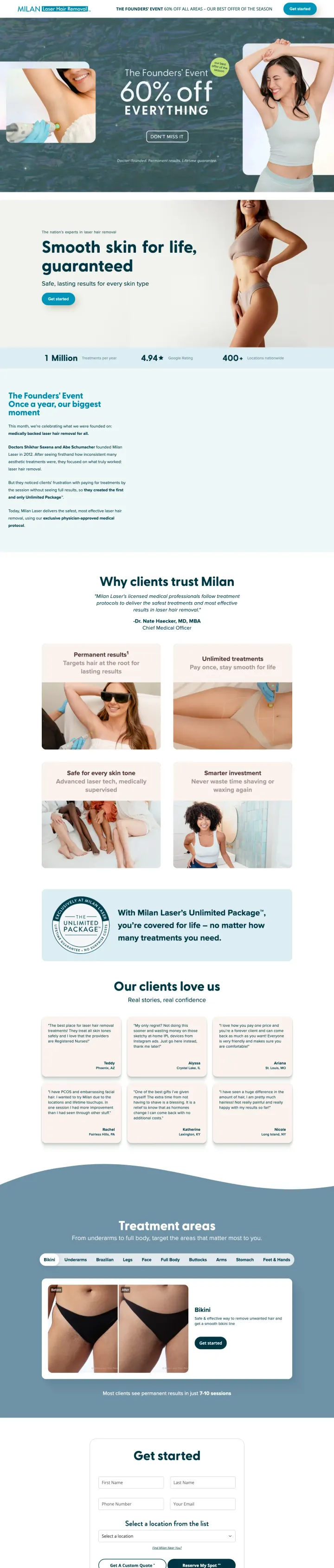
If your category has repeat-treatment economics, sell the outcome-guarantee instead of the transaction. Milan charges once and lets the customer return for free treatments for life if hair regrows. Prospects stop comparing per-session prices against competitors because Milan is selling a different product (lifetime coverage) on the same keyword surface.
'Smooth skin for life, guaranteed' headline owns the lifetime-outcome frame, competitors selling 'best laser hair removal' can't out-position this because the guarantee itself is the product differentiator
'60% off EVERYTHING' promo ribbon pinned to the top-left of the hero gives the visitor a discount hook without obscuring the core guarantee story
Treatment-area selector showing different body zones lets visitors filter to what they actually want treated, which is faster than reading through a full service menu
The guarantee requires ongoing payment commitment (not clearly disclosed on the page), a visitor reading 'Smooth Skin for Life' may not realize the Unlimited Package has a monthly or annual maintenance component
Client testimonial photos are small enough to feel generic. For a $2,000+ AOV category, larger before/after treatment comparisons would do heavier lifting
No pricing at all. Milan's entire pitch rests on the guarantee, but the visitor has to call or book to find out what the Unlimited Package actually costs, which reverts to the call-for-price pattern Milan otherwise beats
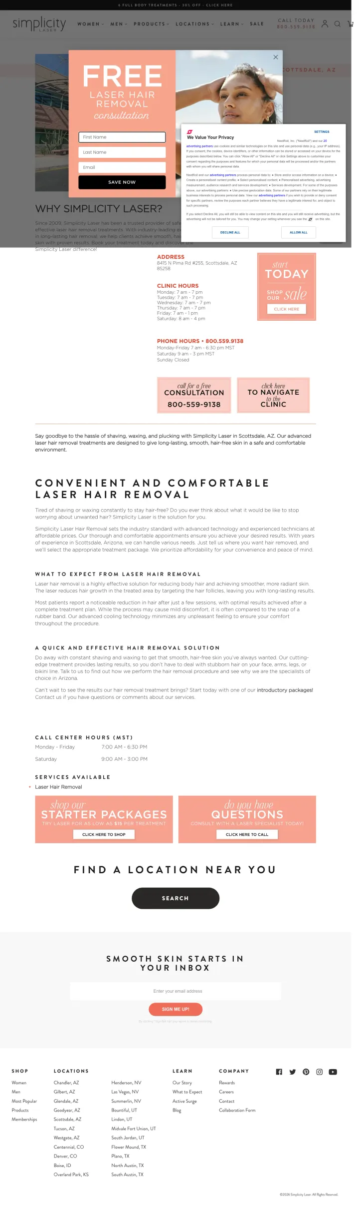
For a local-service med spa, lead with the clinic's actual address, today's hours, and a 'stop by today' button in the hero, before the why-choose-us pitch. Simplicity's Scottsdale page treats the clinic's physical presence as the headline differentiator. Visitors who typed 'laser hair removal near me' already know they want the service; they need to know where and when they can get it.
'FREE Laser Hair Removal Consultation' banner as the hero, with the specific clinic address (8405 N Pima Rd #110, Scottsdale, AZ) directly underneath, collapses the 'where' question in one read
Today's hours, tomorrow's hours, and a 'visit today' scheduling button combined in a single orange card, the visitor can act right now without scrolling
Inline form with 'FREE consultation' framing captures the visitors who would rather not call, while the phone number and 'visit today' button handle the action-ready segment
The cookie/privacy modal overlays the hero on first paint, which delays the visitor's first read of the consultation offer by the time it takes to dismiss the modal
No specific service pricing on the location page, the visitor has to click through to the 'Sale' page to see per-treatment-area prices, which splits the conversion flow
'Ready to say goodbye to unwanted hair growth' body copy is generic filler between the hero and the starter-packages card, an area-specific pitch (Scottsdale gets a lot of sun, year-round skincare matters) would make the location content earn its place
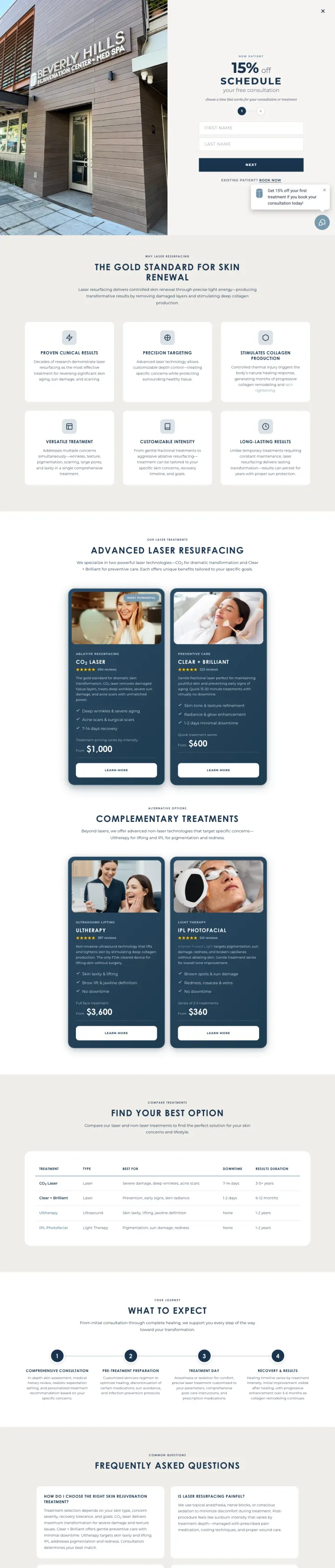
For a high-AOV aesthetic service (laser resurfacing runs $1,500-4,000 per session), resist the urge to add a long-form education block. BHR's landing page is under 5 sections (promo, services, 5-year red option, what-to-expect, FAQ, contact) and the brevity signals confidence. Visitors who need more info can dig deeper; visitors ready to book aren't distracted by information they didn't ask for.
'15% off' discount plus 'Schedule' button as the hero pairs a specific dollar-equivalent incentive with the calendar-commit action, avoiding the 'free consultation' trap that defers the money conversation
'Advanced Laser Resurfacing' and 'Complementary Treatments' sections use side-by-side cards with pulled-in photos of actual clinic technology, the equipment imagery signals clinical-grade in a category full of medspa-generic branding
'Five-Year Red Option' callout table lists specific laser resurfacing parameters (DOT therapy, Halo Hybrid), detail that only serious buyers appreciate but that's exactly the filter BHR wants to apply
No pricing, not even a starting-at range. For a treatment with a wide price spread ($1,500-4,000) and a 15%-off promo, showing an anchor price would make the discount math legible
The Beverly Hills Rejuvenation Center (BHR) name is only at the bottom, for a premium-positioning brand, the BH address is a trust asset that should live in the hero
The FAQ section uses dense paragraph answers instead of accordion-style expand-on-click, which increases the page length without adding scan-ability
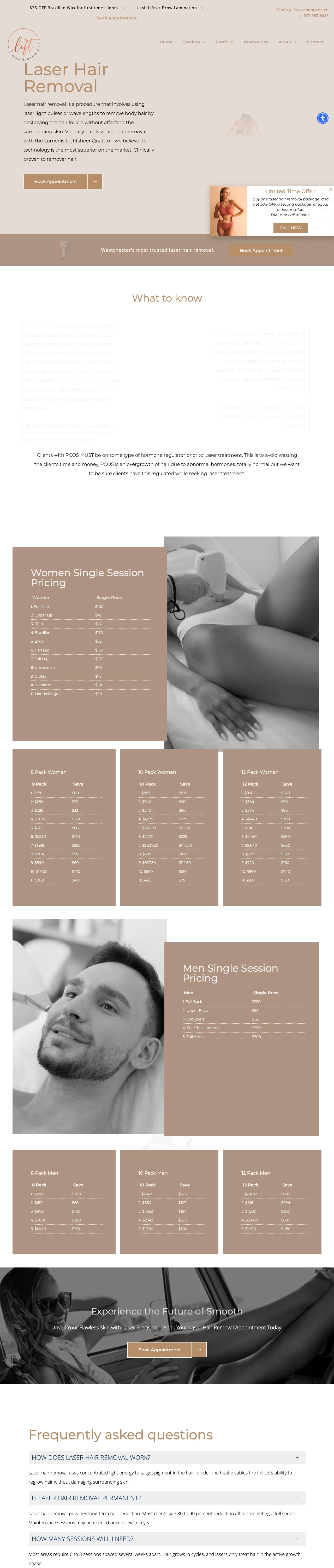
Publish your service prices in a table on the landing page. Lift Wax and Brow shows Women's single-session pricing (Underarm, Bikini, Full Legs) and Men's single-session pricing (Chest, Back, Full Body) on the same page. Laser hair removal searchers are price-sensitive, gender-specific in their body-area needs, and ready to commit when the math is clear. Hiding the price behind a consultation CTA filters out the customers who know what they want.
Two pricing tables, Women's Single Session Pricing and Men's Single Session Pricing, published directly on the page lets the visitor calculate their total cost without calling or booking
Warm copper/tan brand palette pitched squarely at a spa-minded aesthetic audience rather than a clinical dermatology audience, which is on-strategy for the laser-hair-removal persona
FAQ section addresses specific objections ('Can I shave between sessions,' 'Does laser hair removal work on dark skin') with direct answers, practical information that converts analytical buyers
The pricing tables are dense text without card-grid visual treatment, a more scannable format (like Simplicity's treatment-area cards) would convert better on mobile
No before/after photo proof for laser hair removal results, a category where visual evidence is unusually compelling and this page omits it entirely
'Single session' pricing only, no package or bundle pricing visible. Most laser hair removal customers buy 6-session packages, and the absence of bundle math pushes them to call for a quote anyway
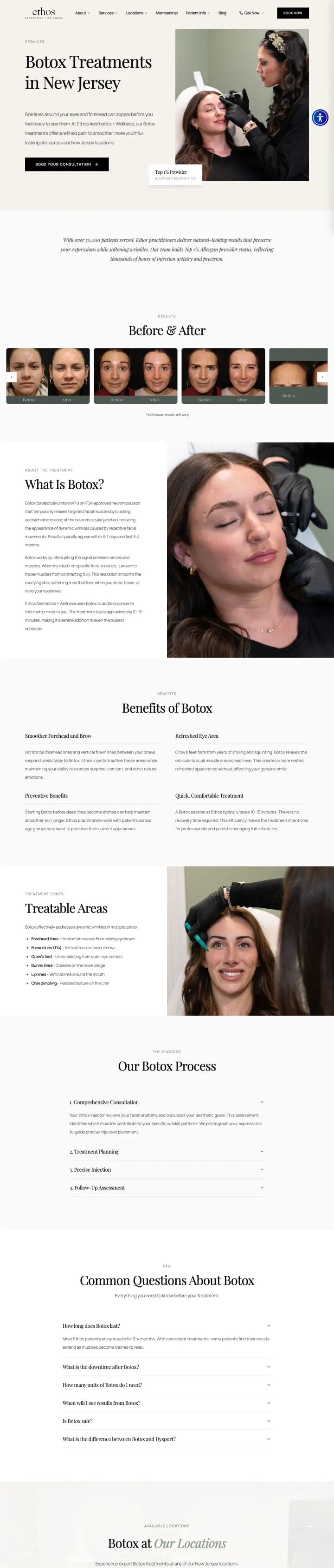
Lead the Botox LP with a patient-facing before-and-after strip and a clear 'Botox Treatments in New Jersey' hero. Ethos pairs that with a full page of depth (what is it, benefits, treatable areas, process, FAQ, locations) so the searcher never has to bounce to another page to feel informed.
Before-and-after strip of real patient photos appears immediately below the hero, which addresses the biggest Botox objection ('will it look natural?') in the first scroll
Page structure reads as a complete buyer journey on one URL: definition, benefits, treatable areas, process, FAQ, locations. A Blue-persona researcher can resolve every question without leaving
Location footer grid converts the multi-location advantage into a concrete 'book near you' moment instead of burying it in a dropdown
Navigation organizes services by concern first (Fine Lines, Texture, Pigmentation) and injectable second, matching how patients actually search
No price range or cost-per-unit guidance anywhere on the page even though 'botox cost per unit' is one of the highest-volume adjacent queries
Hero headline is descriptive rather than benefit-led. 'Botox Treatments in New Jersey' tells the visitor where not why
Named injector is missing from the hero. Premium Botox converts better when a specific nurse or MD is the face of the practice
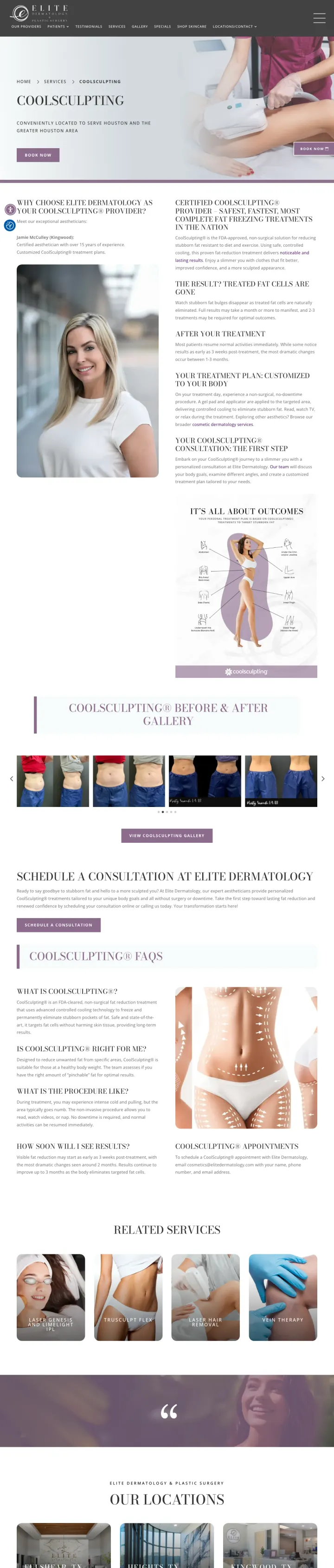
Lead the CoolSculpting LP with a vertical three-panel hero that splits the value prop, the consultation CTA, and a real-patient before-and-after into equal real estate. Elite Dermatology treats each of those as co-primary, which matches how a body-contouring shopper actually weighs the decision.
Vertical split hero gives equal weight to copy, CTA, and patient imagery instead of forcing the shopper to scroll past a wall of text to see results
Before-and-after gallery uses multiple body angles (abdomen, flanks, arms) which addresses the 'will it work on MY problem area' question without making the visitor hunt
Six Texas locations are shown as visual cards not a dropdown, so the multi-location footprint becomes a trust signal rather than a buried utility
Related services rail (Body Contouring, Laser Body) at the bottom captures visitors who self-disqualify from CoolSculpting instead of bouncing
Hero copy is muted serif-italic that competes with the imagery instead of anchoring it. A Blue-persona researcher has to squint to find the actual value prop
No price range or package guidance. CoolSculpting runs $2,000 to $4,000 and the absence of any cost cue pushes the shopper to a competitor that answers it
FAQ appears but the answers are short and generic. Longer answers on the top three objections would convert harder than ten shallow ones
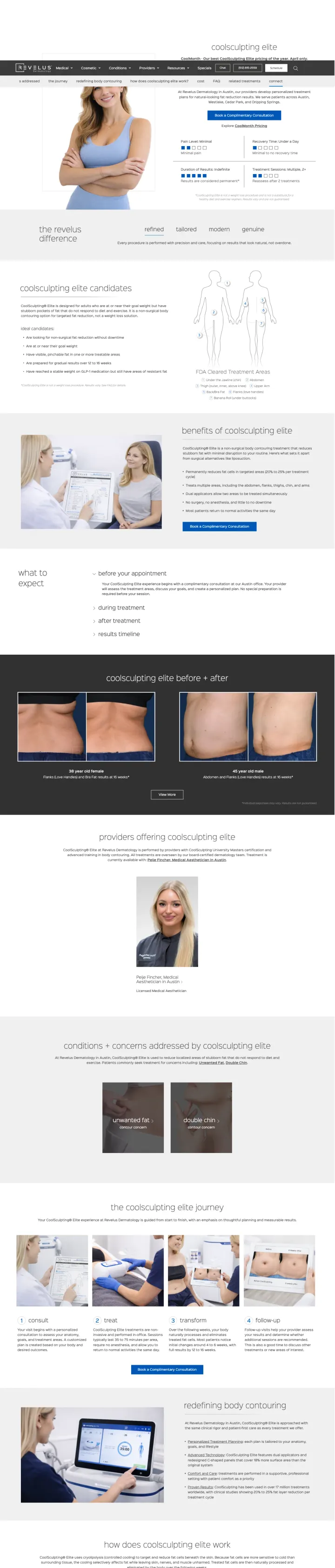
Open the CoolSculpting LP with a sticky anchor menu that lets the visitor teleport straight to the section they care about (candidates, benefits, before-and-after, cost, FAQ). Revelus treats the page like a mini-site for one procedure, which matches how a Blue-persona shopper actually consumes body contouring content.
Sticky section nav at the top (candidates, benefits, before-and-after, providers, cost, FAQ) converts a long page into a self-directed tour. Respects visitor intent instead of forcing linear scroll
CoolMonth seasonal promo banner anchors a specific dollar-value reason to act now without faking urgency
Treatment facts stated up front as icon row (pain level, recovery, duration of results, sessions) resolves the top four pre-click questions in one scan
Embedded consultation form in the hero removes the two-click delay between interest and capture
Hero image is a generic stock model shot that feels interchangeable with every competitor. A practice-specific provider photo or a real patient would carry more weight
Pricing is promised ('cost' section) but the actual page only teases the CoolMonth offer. A shopper clicking 'cost' expects a range, not another CTA
'The Revelus difference' section uses four one-word adjectives (refined, tailored, modern, genuine) with no proof. Generic brand-speak that readers skip
Pages that break the playbook in interesting ways
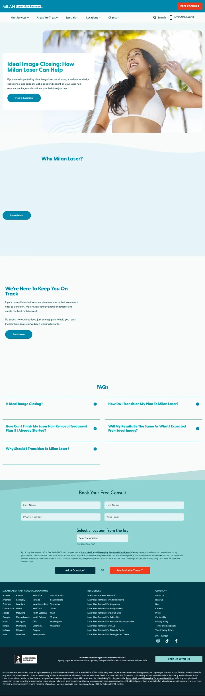
If a major competitor exits the market or shuts down locations, build a competitor-specific landing page that addresses their customers' exact situation. Milan's 'Ideal Image Closing: How Milan Laser Can Help' page directly targets the abandoned-customer cohort with 'Transfer your plan' messaging and a 'free consult' hook. This competitive-capture page is invisible to the general-keyword visitor but converts the high-intent switcher segment that bounced off Ideal Image's shutdown.
Competitor-targeted headline ('Ideal Image Closing: How Milan Laser Can Help') creates a direct match for visitors searching for Ideal Image alternatives, zero other advertisers will show up on that specific query
Hero image of a person looking relaxed and confident in an outdoor setting pitches the aspirational outcome rather than the competitive switching process, smart emotional framing
FAQ section addresses transfer-specific questions ('Is Ideal Image Closing?', 'How Can I Finish My Laser Hair Removal Treatment Plan I Already Started?') that general-laser-hair-removal pages can't answer
'Why Milan Laser?' section is an empty expandable block on the captured screenshot, the critical competitive-comparison section appears to be a load-deferred accordion that the capture tool didn't expand
No specific 'transfer your remaining sessions' offer visible on the page. The competitive-capture story needs a concrete mechanic (free session credit, honored sessions, discount) to close the switcher
The consult form at the bottom asks for full name, email, phone, and location, four fields for a high-intent visitor who already decided to switch is two fields too many
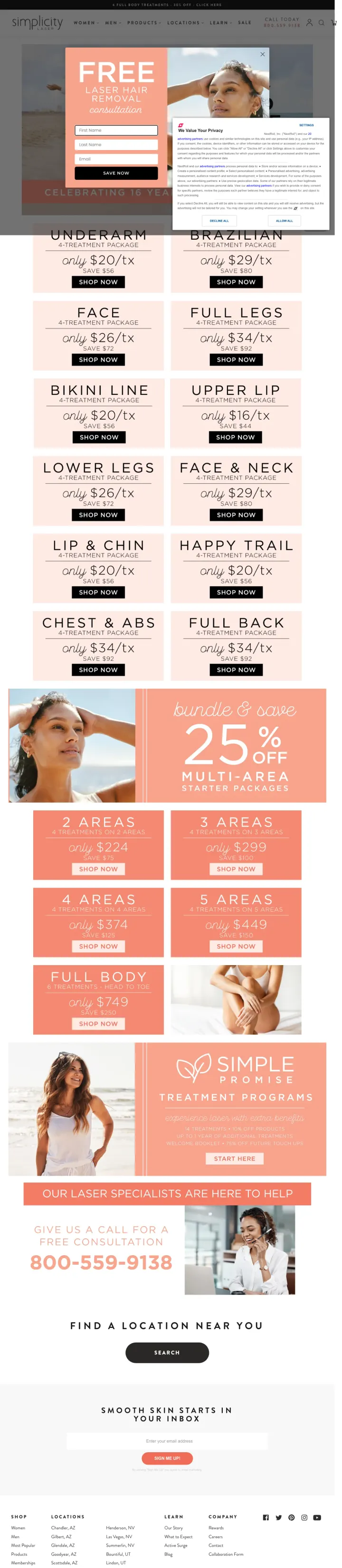
Show per-treatment-area pricing in a card grid with the promotional price pinned to each area. Simplicity's sale page shows 12 treatment areas (Underarm $20, Face $26, Lower Legs $42, Full Back $34, etc.) as visual price cards with 'Shop Now' buttons. Visitors self-select the area they care about, see the exact price, and commit without calling.
12-card pricing grid makes per-area prices scannable in a way that per-package bundles don't, visitors with a specific body-area need can self-qualify and self-price in 15 seconds
'Multi-Area Starter Packages' bundle (2 Areas $224, 3 Areas $299, 4 Areas $374, 5 Areas $449, Full Body $749) sits below the single-area grid to capture upsell intent from visitors already on the page
Treatment photography for specific areas (face, bikini, legs) is tasteful enough for a broad audience without sanitizing the service into abstract marketing speak
Each treatment-area card has a 'Shop Now' button but the downstream flow likely leads to a consultation booking rather than an actual purchase, 'Shop Now' implies e-commerce which the actual service model isn't
No before/after photography anywhere on a page that's entirely about aesthetic outcomes, a before/after row would convert more visitors than the additional pricing cards
'Our Laser Specialists Are Here to Help' phone-number callout at the bottom is small and doesn't compete with the grid, for visitors who still need to call, the phone path is visually secondary
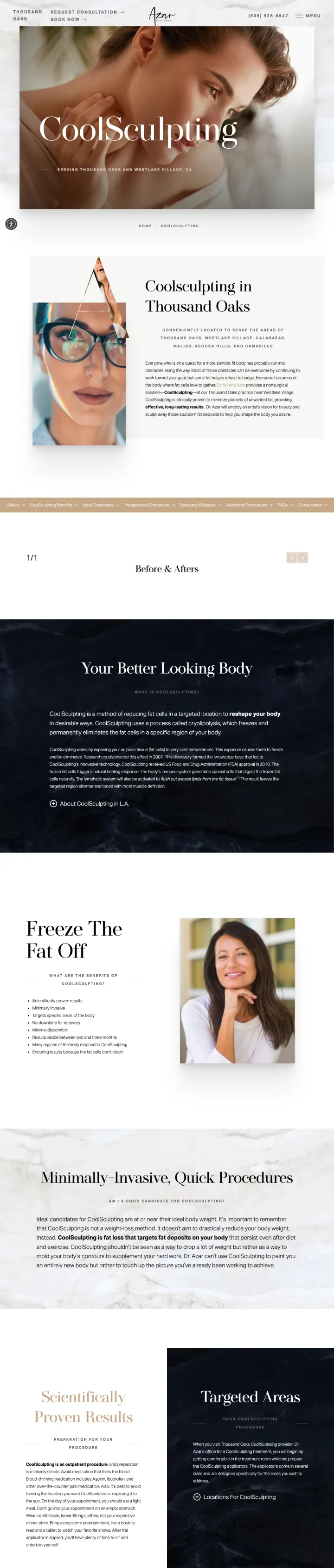
If the practice has a named, credentialed plastic surgeon with local reputation, treat the CoolSculpting LP like a chapter in that surgeon's personal brand instead of a procedure brochure. Azar leads with 'Your Better Looking Body' as aspirational copy and Dr. Azar as the guide, which converts differently than the usual technology-first template.
Named board-certified plastic surgeon is the hero element, not the technology. For premium metros where the surgeon IS the differentiator this reframes the whole sales narrative
Hollywood celebrity name-drops (Debra Messing, Khloe Kardashian, Molly Sims) create a specific aspirational anchor. Works for the LA-adjacent Thousand Oaks market in a way it wouldn't in middle America
Full on-page jump menu AND section anchors double up on scannability. Lets the visitor self-select to gallery, benefits, candidates, or FAQ without scrolling
Serif typography and muted beige palette feel like a boutique practice rather than a medical chain, matching the positioning
Celebrity name-drop is a risk. It reads aspirational in Thousand Oaks, would read tacky in a more conservative metro. Know your audience before copying
Long technical explanations (cryolipolysis, lymphatic drainage, FDA history) dominate above-the-fold real estate that should go to the surgeon or the gallery
No pricing or package anchoring. A premium practice can get away with this, but only if the named-surgeon trust signal is doing enough heavy lifting to justify the missing data
3 pages burning ad spend with fundamental issues
Every click to these pages costs real money. We found broken trust signals, mismatched intent, weak CTAs, and messaging that ignores what the searcher actually typed. Here is what to avoid.
Botox keywords run $15-35 per click in competitive metros. Sending that traffic to a generic treatments catalog instead of a Botox-specific page forces the visitor to start their research over from a tile grid, and most bounce before clicking into the actual Botox page.
The page is a treatment catalog, not a Botox landing page. A searcher who clicked a Botox ad should see Botox content above the fold: price per unit, named injector, before and after, FAQ. Instead they see 20 tiles of unrelated procedures.
No price, no units, no named injector visible above fold. All three are the top objections for the Blue-Analytical med spa visitor and none get answered before the visitor has to click a second tile.
A 'Please enable cookies' banner covers the left column on load, and the treatment tiles on the right are generic stock-style photography with no visible staff faces.
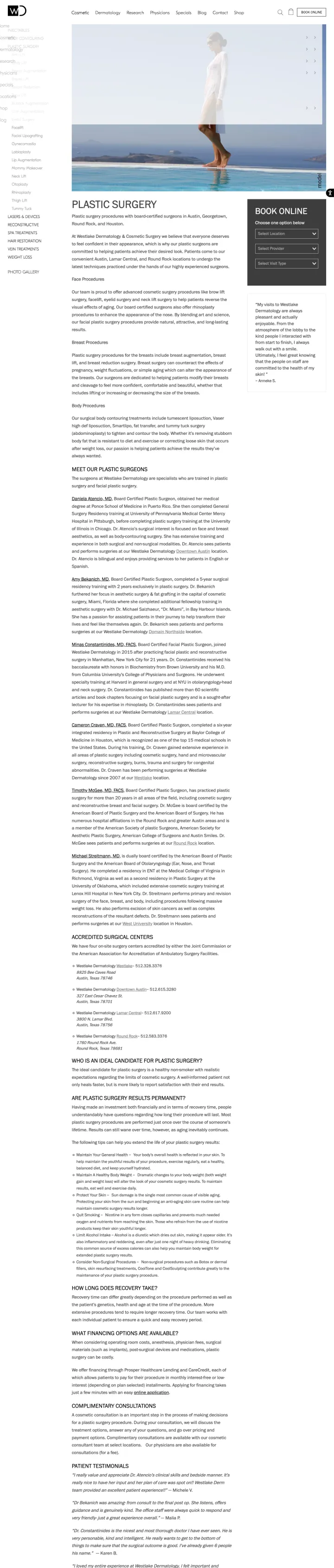
Plastic surgery keywords can run $25 to $80 per click in Austin and Houston metros. Sending that traffic to a group overview page without a procedure hook, a surgeon match, a price range, or a before-after gallery forces the visitor to start their research over inside the site navigation, and most bounce to the next SERP result.
Above the fold is a decorative pool-and-model photo, a 'Plastic Surgery' heading, and one paragraph of generic copy. No phone, no price range, no before-after, no CTA inside the hero. The visitor has to scroll past the boilerplate to find any conversion element
Six surgeon bios run as a wall of paragraph text with no headshots or procedure-specific filter. For a decision where patients pick by surgeon, this is the most important section and it is the least scannable one
Zero before-and-after imagery on a cosmetic-surgery landing page. Before-afters are the single highest-converting element in this category, and this page leaves them off entirely
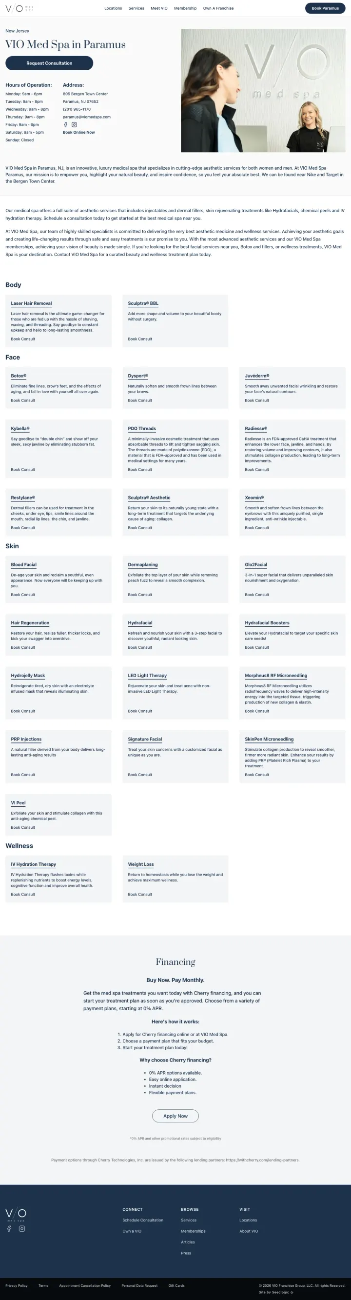
Med spa keywords (Botox, laser, facials, weight loss) run 10 to 35 dollars per click in dense metros like Paramus. Sending every one of those ad clicks to a single location page that lists 40 plus services in equal-size tiles forces the visitor to start their research over from scratch. Conversion rate on a page like this is a fraction of what a procedure-specific LP would deliver.
No single procedure is given hero treatment. A searcher who clicked a Botox ad sees Botox as one tile among 40, buried between laser hair removal and Sculptra BBL
No before-and-after gallery. For a category where 'will it look natural' is the top objection, the absence of patient results is a conversion killer
No named injector or provider. Med spa trust hinges on who is holding the syringe and this page doesn't name anyone
No pricing guidance on any procedure. The visitor has to book a consultation to learn anything about cost
Copy is generic ('innovative, luxury medical spa') with no specific positioning. Every VIO location page likely reads identically
40+ service tiles with identical visual treatment dilute every individual service. The page signals breadth over depth, the opposite of what paid search intent demands
Simplicity Laser's sale page shows per-area single-treatment pricing (Underarm $20, Face $26, Lip $20, Lower Legs $42, Full Body $149) in a card grid. Lift Wax and Brow publishes Men's and Women's session pricing side by side. Published pricing is unusual enough in aesthetic medicine that even a ...
Milan Laser's 'Unlimited Package' lets customers come back for free treatments for life if hair regrows, the single strongest guarantee in the sample. BHR Center offers a '15% off' scheduling incentive but no outcome guarantee. Milan's approach converts the 'laser hair removal is expensive and mi...
Simplicity's Scottsdale, Tucson, and Lindon pages all show the specific clinic's address, hours, and a 'call to book' button in the hero, not a city-picker dropdown. Milan embeds a treatment-area selector plus a 'Featured Locations' anchor. For a category where the prospect is booking a physical ...
Simplicity's Scottsdale page converts because the body copy happens to fit a sunbelt customer. The Tucson and Lindon variants run the same byte-identical body copy with address swaps, which reads as template filler to sophisticated visitors. For a category where the prospect is booking a specific...
Winners publish prices, offer guarantees, and book appointments inline. Losers write medical articles and bury the conversion behind a generic 'book online' nav link..