Free: 96 PPC tools + my AI Playbook book

Mortgage people are comparing 4-5 lenders at once and they're obsessed with the rate. But here's what most mortgage pages miss. They're not just buying a rate. They're making the biggest financial decision of their life and they're terrified of getting it wrong.
From real mortgage / lending Google Ads campaigns in the US
The landing pages actually worth stealing from
So you know exactly what to avoid
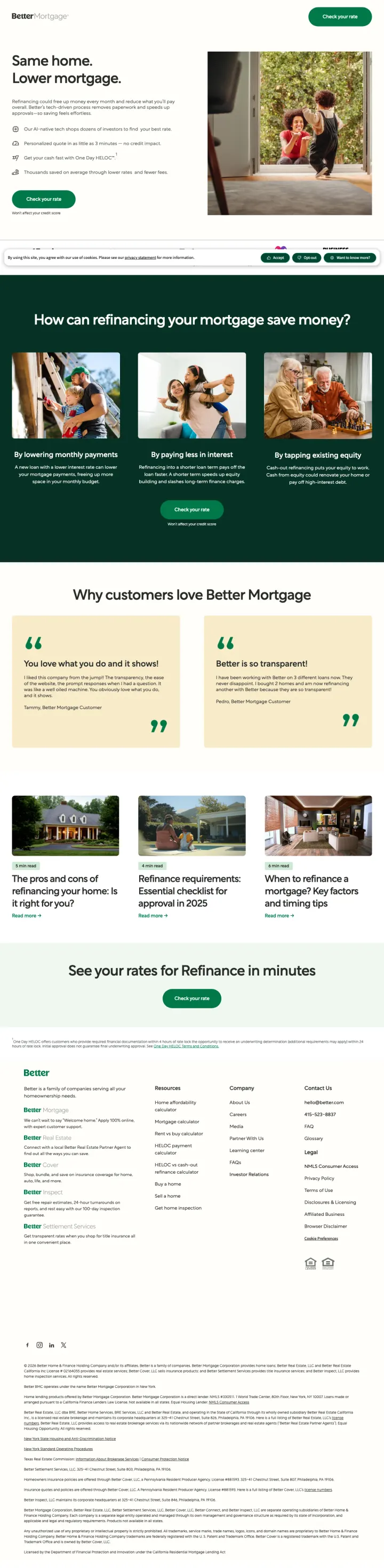
Lead with 'Same home. Lower mortgage.' as your entire above-fold message. No rate, no calculator, no product details -- just the outcome the visitor wants. Then let four bullet-point proof points (AI rate shopping, 3-minute quote, One Day HELOC, thousands saved) do the selling underneath.
The 'Won't affect your credit score' reassurance directly under every CTA button neutralizes the #1 objection that stops mortgage shoppers from clicking -- fear of a hard credit pull tanking their score while they are still shopping
Stacking press badges ($100B+ funded, 400K+ customers, NerdWallet/Forbes/Business Insider logos) in a horizontal trust bar creates instant institutional credibility without taking up vertical space or requiring the visitor to read anything
The page is purpose-built for refinance traffic with refinance-specific messaging ('lock your refinance rate in 15 minutes') rather than repurposing a generic mortgage page -- this level of keyword-to-page specificity is rare and directly improves message match
No actual rate shown anywhere on the page despite ads promising 'See How Much You Could Save' -- the visitor has to click through to discover if Better's rates are competitive, which is a leap of faith at this CPC level
Customer testimonial quotes ('The ease and cost of refinancing your home') are truncated teasers that link to blog posts rather than showing the full story inline -- this creates exit paths disguised as social proof
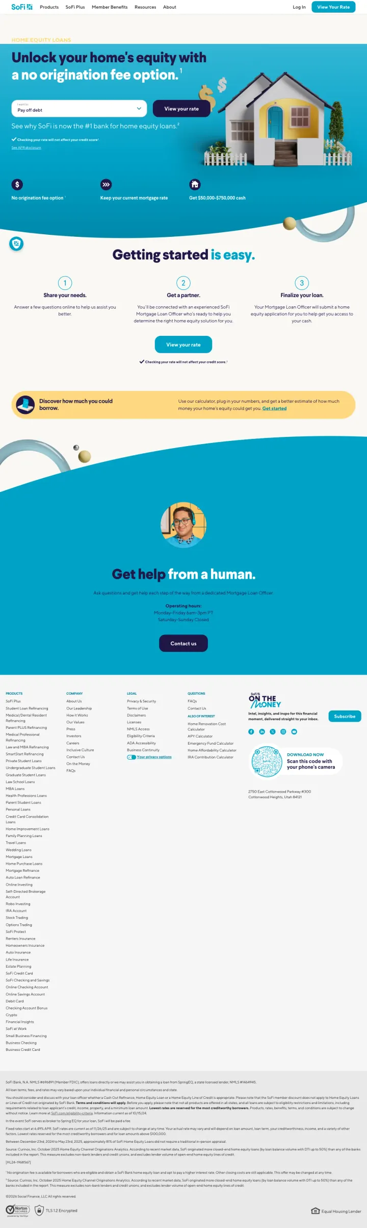
Make your fee structure the headline rather than your rate. 'No origination fee option' is a concrete, verifiable claim that differentiates SoFi from every lender showing 6.99% APR -- because every lender shows similar rates, but few waive the origination fee.
The 'I want to:' dropdown (Pay off debt / Home improvement / etc.) above the CTA pre-segments visitors by intent before they click, which lets SoFi route them to the right application flow AND tells the visitor 'we understand why you are here' in one interaction
Three icon-driven benefits (No origination fee + Keep your current mortgage rate + Get $50K-$750K cash) compress the entire value proposition into a single scannable row -- a mortgage shopper checking 5 lender sites can compare SoFi in 3 seconds
The '#1 bank for home equity loans' claim with a footnoted Curinos source adds third-party validation that is both specific and verifiable -- far more credible than 'trusted by thousands'
The page loads a product selection overlay and a 'received mail from us?' confirmation modal in the DOM, creating visual noise if either triggers -- scrape shows multiple modal states that could intercept the conversion flow
Operating hours for human help (Mon-Fri 6am-3pm PT, closed weekends) are buried at the bottom -- a weekend mortgage shopper who wants to talk to someone will bounce without knowing this
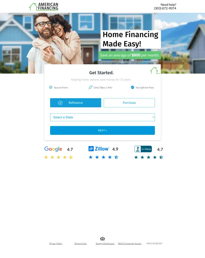
Build a landing page that fits entirely on one screen with zero scrolling required. American Financing proves that a hero image, a savings claim, a 2-field form (Refinance/Purchase + State), and three review badges (Google 4.7, Zillow 4.9, BBB 4.7) is enough to convert -- everything else is noise.
The Refinance/Purchase toggle at the top of the form lets one page serve two intents without any content duplication -- visitors self-select and the form routes them accordingly, which doubles the keyword coverage of a single landing page
Three platform-specific review scores (Google 4.7 + Zillow 4.9 + BBB 4.7) below the form give mortgage-specific social proof -- Zillow reviews carry particular weight because that is where mortgage shoppers actually compare lenders
'Save an average of $800 per month' is a concrete savings claim in the hero that directly answers the refinancer's question ('how much will I save?') before they even fill out the form
The form only captures state selection on step 1 with no email or phone -- the progressive disclosure is so minimal that the visitor might question whether anything meaningful happened after clicking Next
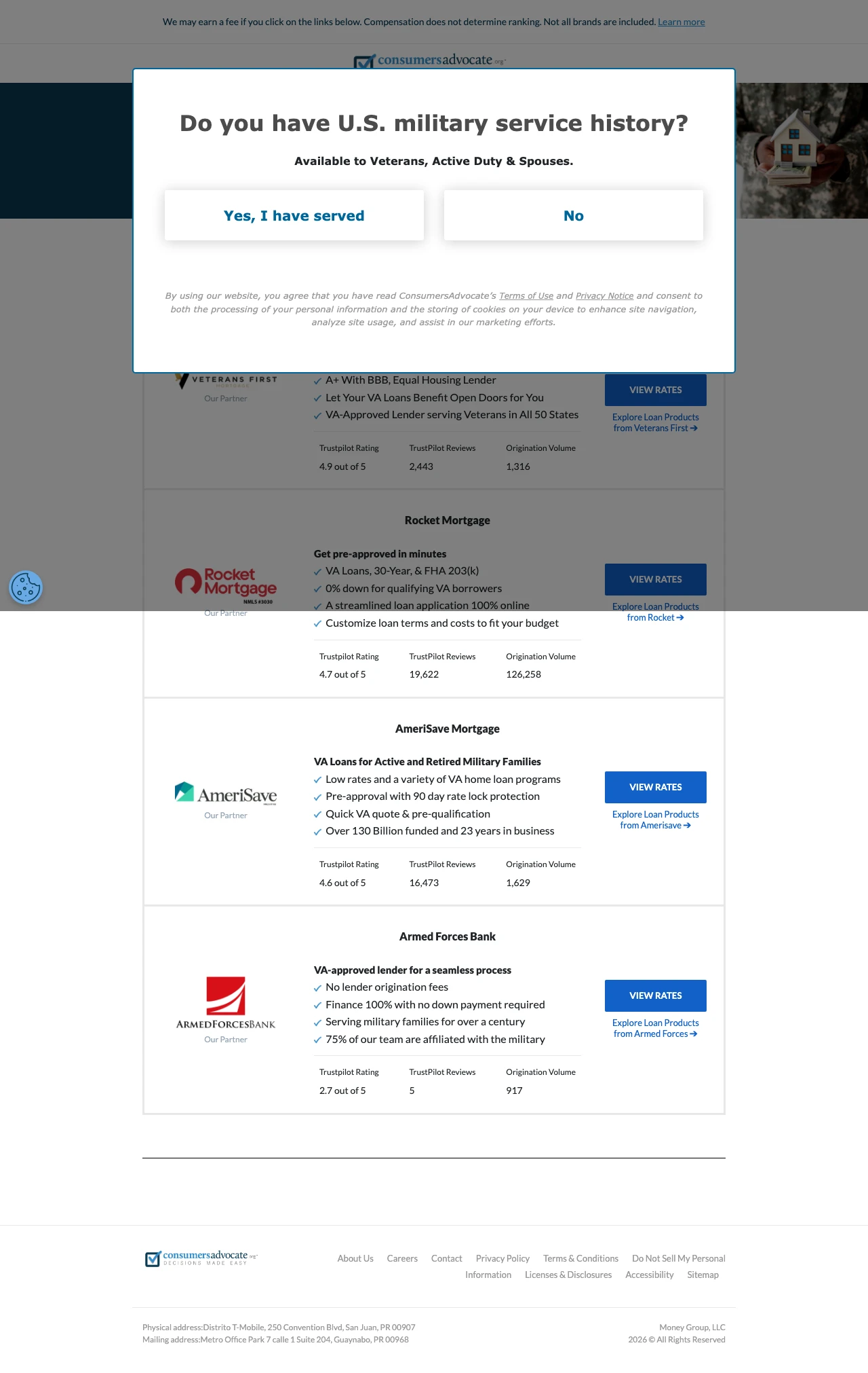
Build a lender comparison table with Trustpilot ratings, review counts, and origination volumes as the ranking criteria. Mortgage shoppers checking 3-5 sites want to compare, not commit -- this page turns that behavior into the conversion action itself.
The Purchase/Refinance/Home Equity tab selector at the very top lets one page absorb three keyword clusters -- the visitor self-segments and sees a tailored lender ranking without the page needing separate URLs for each intent
Origination volume as a trust metric ('126,258 originations' for Rocket Mortgage) is unique to this page and speaks directly to the analytical mortgage shopper who wants proof of scale, not just review stars
Each lender card includes 3-4 bullet points about specific features ('Get up to 100% financing with 0% down') rather than generic descriptions -- this gives the visitor enough to make a comparison decision without leaving the page
The affiliate compensation disclosure at the top ('We may earn a fee if you click') is legally required but immediately signals that rankings may not be objective -- savvy rate shoppers will discount the recommendations
No actual rates displayed despite the page title being 'Best Home Interest Rates 2026' -- a visitor who clicked an ad promising 'Today's Mortgage Rates' will feel deceived when they find a lender directory instead
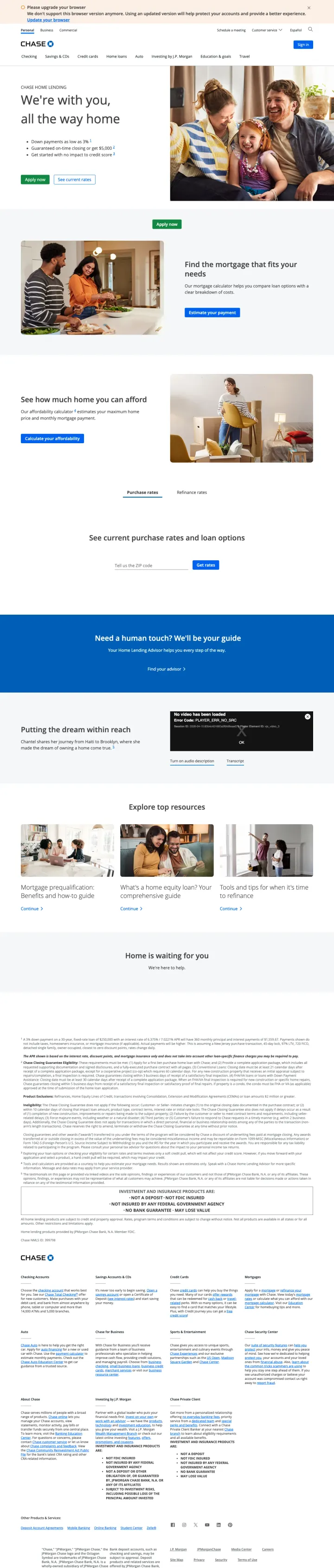
Offer a guaranteed closing timeline with a cash penalty if you miss it. Chase's '$5,000 if we don't close on time' is a risk-reversal that no fintech competitor matches -- it directly addresses the #5 customer priority (how long will the process take?) with a financial commitment.
The $5,000 on-time closing guarantee converts an operational promise into a financial one -- this is uniquely powerful in mortgage where closing delays are the most common complaint and can cost buyers their home purchase
Dual CTA ('Apply now' + 'See current rates') serves two visitor personas simultaneously: the ready-to-apply Red borrower and the rate-shopping Blue researcher, without making either feel they chose the wrong button
'Down payments as low as 3%' directly addresses first-time buyer affordability anxiety with a specific number rather than vague 'low down payment' language
The ad headline promises 'Limited-Time Rate Drop - Discounted Mortgage Rates' but the landing page shows no discounted rate, no rate at all, and no mention of a limited-time offer -- the urgency that won the click evaporates on arrival
Below the hero, the page becomes a full Chase.com mortgage hub with payment calculators, affordability tools, rate tables, and advisor finder -- this is a site section, not a landing page, and the scattered focus dilutes conversion
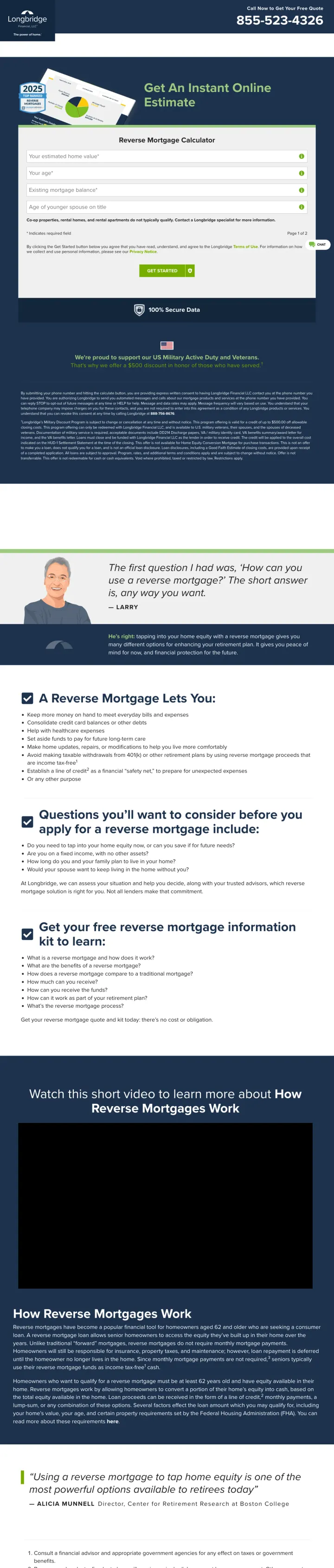
Make the calculator the entire above-fold experience. Longbridge skips the hero image, the value prop paragraph, and the trust badges -- the first thing the visitor sees is four form fields (home value, age, mortgage balance, spouse age) with 'Get An Instant Online Estimate' as the only headline.
The 2-page progressive form starts with just financial inputs (home value, balance, age) before asking for personal info (name, phone, email) on page 2 -- this gets the visitor invested in seeing their estimate before asking them to identify themselves
A $500 military discount positioned mid-page serves a specific high-value segment (veteran homeowners 62+) and creates an emotional connection that generic reverse mortgage pages miss entirely
The embedded YouTube explainer video ('How Reverse Mortgages Work') below the calculator catches visitors who are not ready to submit the form but want to understand the product -- it keeps them on-page instead of bouncing to search for more information
The scrape reveals lorem ipsum placeholder text and 'John Doe / CEO' dummy testimonials at the bottom of the page -- this is a template that was never fully customized, which destroys credibility if a visitor scrolls past the calculator
reCAPTCHA challenge ('Select all images with crosswalks') fired during capture, and if it fires for real visitors, the friction between completing the form and seeing the estimate is high enough to kill conversions
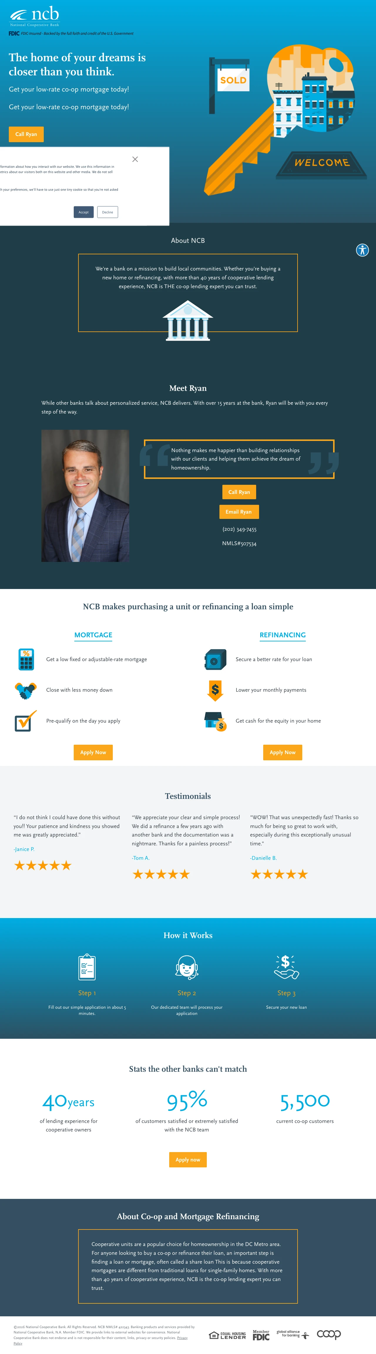
Put a named loan officer with a real photo, direct phone number, and email address above the fold. NCB's 'Meet Ryan' section with Ryan Greer's photo, personal quote, direct line (202-349-7455), and email creates a relationship before the first call -- something no fintech can replicate.
The personal quote from Ryan ('Nothing makes me happier than building relationships with our clients') humanizes the institution and makes the visitor feel they will work with a person, not a system
Stats bar at the bottom (40 years experience, 95% customer satisfaction, 5,500 co-op loans) uses round numbers that are easy to remember -- these are the numbers a co-op board member will cite when recommending NCB
The page is specifically for co-op and condo loans in DC -- this hyper-niche positioning means anyone searching for 'co-op loan DC' sees a page that speaks exactly to their situation rather than a generic mortgage lender page
The hero section illustration (cartoon key with buildings) feels dated and clip-art-like compared to the real photography of Ryan below -- the visual quality is inconsistent between sections
Full site navigation menu with Personal/Commercial/Media Center/About Us links is present on a paid landing page, creating multiple escape routes before the visitor reaches Ryan's section

Open with a credit score self-assessment (Excellent/Good/Fair/Poor) as an interactive element that filters the lender list in real time. Visitors with bad credit already feel judged -- letting them self-identify and immediately see 'yes, there are lenders for you' is a psychological relief that keeps them on-page.
The scrolling rate ticker at the top ('This week's 30yr Fixed Rate 6.89%, -0.29% 30 day change') creates a Bloomberg-terminal feel that signals 'this site tracks live market data' -- it positions the page as a financial tool rather than an ad
Lender cards show Trustpilot review counts alongside proprietary ratings (9.6/10 for AmeriSave) giving visitors two different trust frameworks to evaluate each option -- the analytical mortgage shopper can cross-reference
The page title says 'Best Bad Credit Home Equity Lenders 2026' but the ad copy promises 'Get Approved Online in Minutes' for generic loan keywords ('loan chicago il') -- visitors arriving from these broad keywords may not have bad credit and will be confused by the framing
Below the initial lender cards, the page is mostly empty white space in the full screenshot -- the content runs out abruptly, suggesting a thin page padded for length
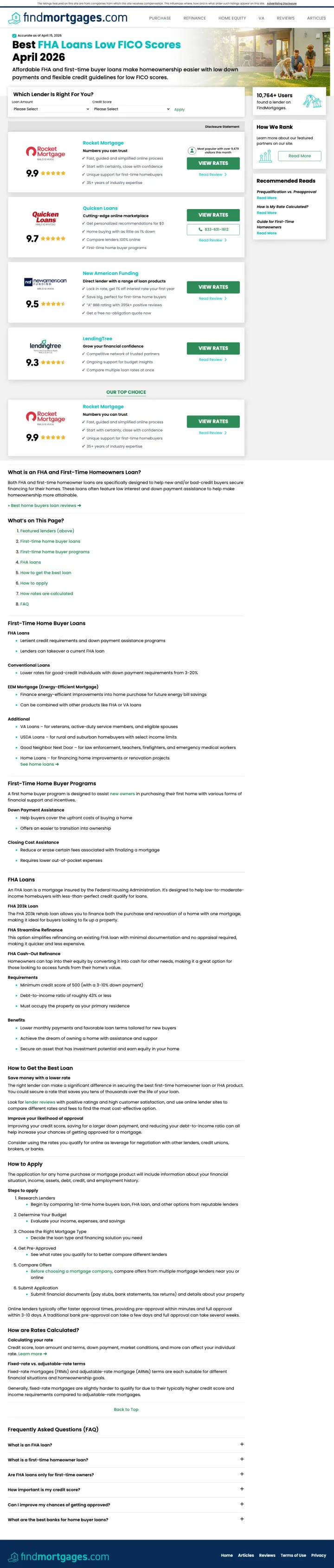
Add a 2-dropdown filter (Loan Amount + Credit Score) at the very top of a lender comparison page. FindMortgages lets visitors immediately narrow to their situation before seeing any lender cards -- this micro-interaction creates investment and makes the comparison feel personalized.
The '10,764+ Users found a lender on FindMortgages' counter in the sidebar converts social proof into a specific, ongoing number rather than a static testimonial -- it implies active, current usage rather than historical reviews
The 'Recommended Reads' sidebar (Prequalification vs. Preapproval, How Is My Rate Calculated?, Guide for First-Time Homeowners) catches educational-intent visitors and keeps them on-site rather than bouncing to a competitor's blog
The page lists Rocket Mortgage at #1 and Quicken Loans at #2 -- but Rocket Mortgage IS Quicken Loans (they rebranded in 2021). Listing both with different ratings (9.9 vs 9.7) and separate review counts destroys credibility for anyone who knows this
The ad targets 'first time home buyer programs maryland bad credit' (search volume: 40) -- spending on a 40-volume keyword for a national comparison page suggests poor keyword management and likely negative ROI per click
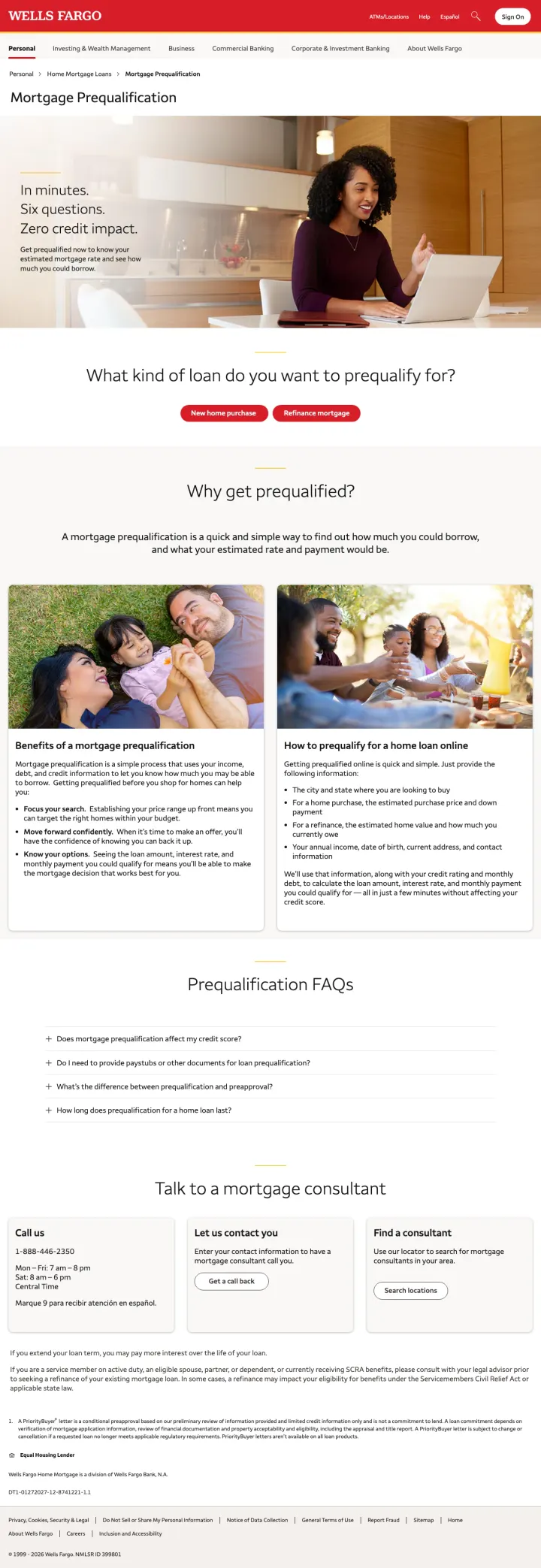
Compress the entire prequal value proposition into three scannable claims in the hero, each one addressing a separate objection: 'In minutes' answers speed, 'Six questions' answers friction, 'Zero credit impact' answers risk. Most lenders spend a paragraph explaining each of these. Wells Fargo collapses them into three lines a mobile user can read in under a second.
Three-line stacked value prop with each line addressing a different objection: speed, length, risk. Most rate-shoppers kill the tab if any one of these is unclear, so answering all three above the fold is the whole game
Bank-grade trust from the Wells Fargo header carries the page without requiring the usual laundry list of awards or Trustpilot widgets. The brand is the trust signal
Dual CTA below the hero ('Get started' and 'Refinance option') gives purchase-intent and refi-intent visitors their own path without forcing them to self-segment on a separate page
The hero image is a stock-style office shot that adds no visual connection to home buying. A real home exterior or a family-at-closing photo would reinforce the ad promise stronger than the laptop visual
Prequal FAQs and benefits sit below the fold but could have been distilled into three-icon trust strip above the fold for visitors who need more convincing before they start a form
Pages that break the playbook in interesting ways
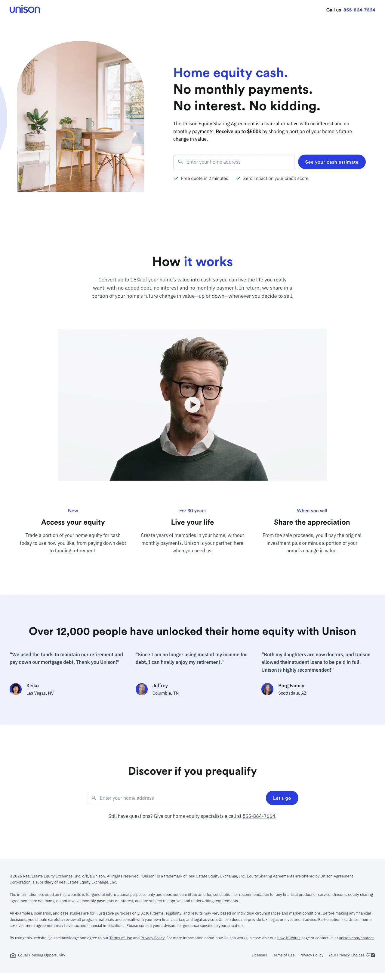
Why This Breaks the Rules: Every other page in this swipe file sells a loan product -- monthly payments, interest rates, APR disclosures. Unison sells an equity sharing agreement where the homeowner gets cash now and shares future appreciation when they sell. There is no rate to display, no APR to disclose, no monthly payment to calculate. The page breaks every mortgage landing page convention because it is not a mortgage. Yet it bids on mortgage keywords and competes for the same traffic.
The headline stack 'Home equity cash. No monthly payments. No interest. No kidding.' uses repetitive negation to systematically eliminate every objection a debt-averse homeowner has -- each 'No' answers a different worry (payments, interest, catch)
The 3-column 'How it works' timeline (Now: Access equity / For 30 years: Live your life / When you sell: Share appreciation) explains a complex financial product in three steps without any jargon -- this clarity is remarkable for a product most people have never heard of
Real customer testimonials with first names and cities (Keiko in Las Vegas, Jeffrey in Columbia, Borg Family in Scottsdale) plus specific use cases (paying off mortgage debt, enjoying retirement, paying student loans) make the abstract concept concrete
The page bids on 'mortgage in fl', 'mortgage loan in utah', and 'home loan in ca' -- searchers typing these keywords want a traditional mortgage, not an equity sharing agreement. The message match is fundamentally broken because the product category is wrong for the keyword intent.
The address-based prequalification tool at the bottom ('Discover if you prequalify') requires entering a home address before showing any numbers -- no estimated range, no sample scenario, nothing to anchor expectations before the visitor commits their address
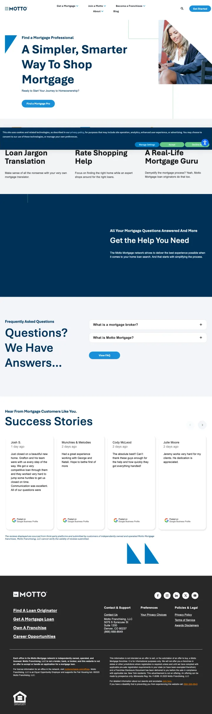
Why This Breaks the Rules: Every other mortgage landing page tries to be the lender. Motto Mortgage sells the broker -- the person who shops lenders for you. The page has no rates, no products, no application, and no calculator. Instead, it sells the concept of having a 'mortgage matchmaker' with value props like 'Loan Jargon Translation', 'Rate Shopping Help', and 'A Real-Life Mortgage Guru'. This anti-pattern works because overwhelmed first-time buyers do not want 47 lender options -- they want someone to tell them which one is right.
The 3-pillar value prop (Loan Jargon Translation + Rate Shopping Help + A Real-Life Mortgage Guru) positions complexity as the enemy and the broker as the solution -- this reframes mortgage shopping from 'compare 5 lenders yourself' to 'let an expert do it for you'
FAQ section with questions like 'What is a mortgage broker?' acknowledges that most consumers do not know what a broker does -- meeting the visitor at their actual knowledge level rather than assuming expertise is refreshingly honest
Success stories section at the bottom with real customer scenarios adds proof that the broker model works -- positioned as stories rather than reviews, which makes them more narrative and memorable
The 'Find a Mortgage Pro' CTA leads to a location finder rather than a direct connection -- adding a geographic search step between 'I want help' and 'here is your person' creates unnecessary friction
No rates, no products, no pricing anywhere on the page -- a mortgage shopper who wants to compare Motto against a direct lender has zero data points to work with
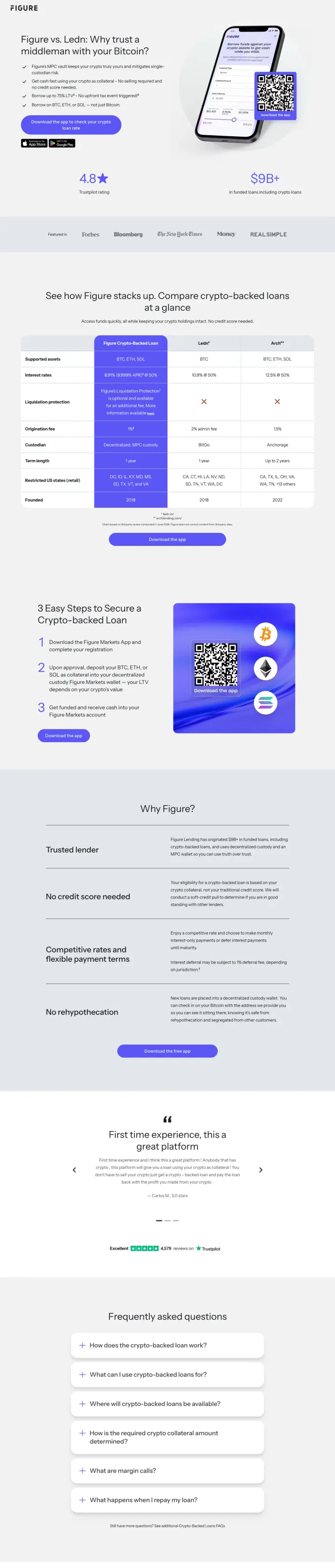
Why This Breaks the Rules: Mortgage and HELOC lenders almost never name competitors on their landing pages. This page does the opposite, running a direct feature-by-feature table between Figure and Ledn for crypto-collateralized loans. The keyword that sends traffic here is 'ledn io' itself. Letting prospects compare you to the exact competitor they were searching for, on your own page, wins the visit they were going to make anyway.
Naming the competitor in the URL and headline captures branded-competitor traffic that would otherwise bounce to a neutral comparison site. The keyword 'ledn io' at 390 monthly searches is exactly what this page ranks and converts for
Feature-by-feature comparison table with green checks where Figure wins and red x's where the competitor lacks a feature does the objection-handling work before the visitor has to ask
Keeping the comparison to a single named competitor (not 'Figure vs. the rest') makes the page feel honest and specific. A three-column 'us vs. every competitor' table reads like marketing, but a two-column head-to-head reads like a fair fight
This comparison page targets crypto-collateral lending, which is a niche within the mortgage advertiser's overall footprint. A visitor who landed here expecting a traditional HELOC product would be confused by the BTC/ETH/SOL collateral framing
The 'Why Figure' trust section below the table duplicates claims already made in the comparison table. One or the other, not both
3 pages burning ad spend with fundamental issues
Every click to these pages costs real money. We found broken trust signals, mismatched intent, weak CTAs, and messaging that ignores what the searcher actually typed. Here is what to avoid.
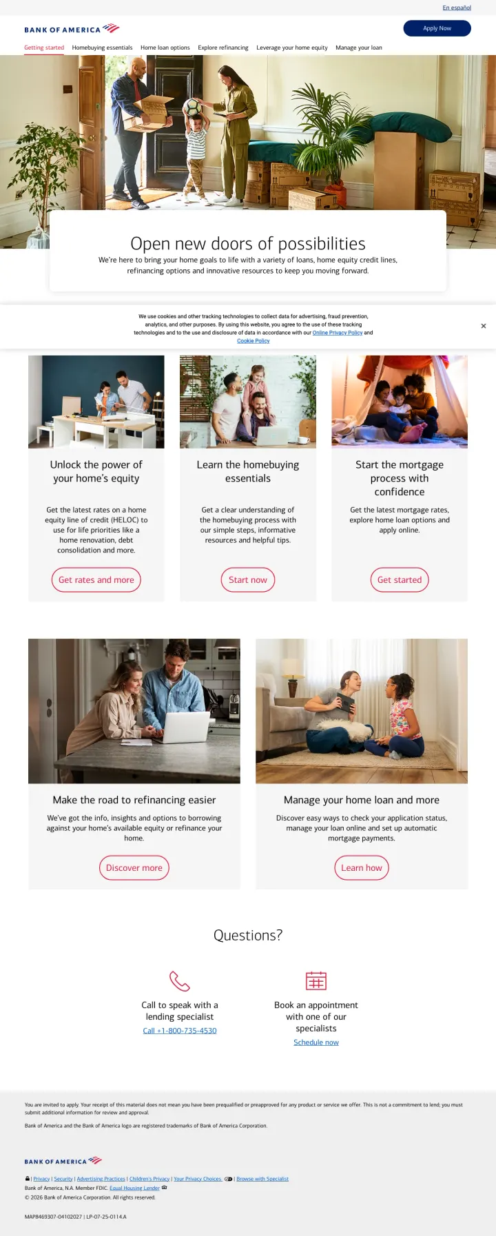
The ad targets 'bank of america mortgage' (40,500 monthly searches) with 'Get Prequalified In Minutes' as the headline, but lands on a promotional hub page with six content tiles (Unlock equity, Learn essentials, Start mortgage process, Refinancing, Manage loan) and zero forms, zero rates, and zero prequalification path above the fold. At brand-term CPCs ($3-8), the page wastes the highest-intent traffic BofA receives because visitors who typed 'bank of america mortgage' already chose BofA and just need an application link.
Six equal-weight content tiles (equity, essentials, mortgage process, refinancing, manage loan, questions) force the visitor to choose their own adventure instead of routing them based on the keyword they searched -- this is a sitemap disguised as a landing page
The 'Apply Now' button in the top-right corner is the only conversion path, but it competes with six other equally-prominent links and two phone/appointment options -- the visitor has 9+ choices before scrolling
The ad promises 'Get Prequalified In Minutes' but the page does not mention prequalification anywhere visible -- the visitor who wanted a 3-minute prequalification gets a reading assignment instead
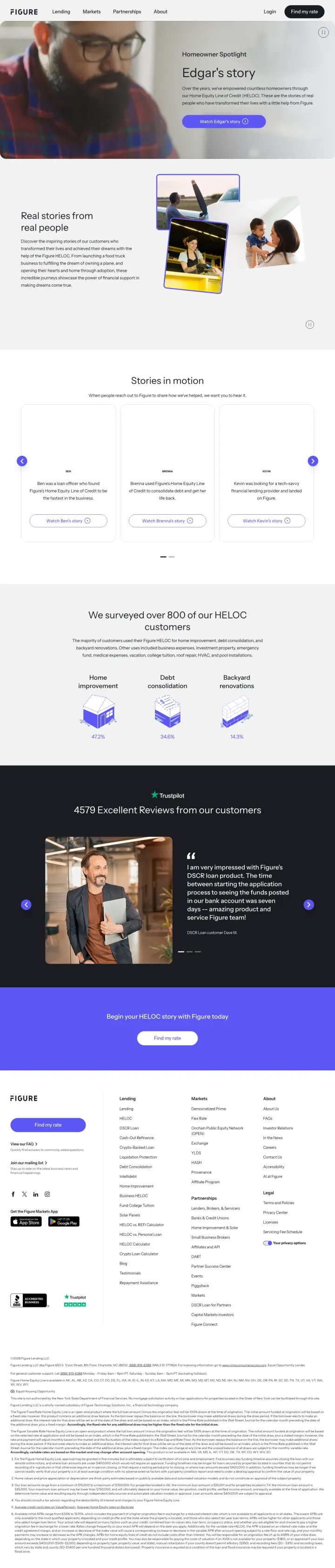
The ad targets 'figure home equity line of credit reviews' and sends traffic to a testimonials page featuring customer video stories about adopting children, buying planes, and launching food trucks. The page has no rate information, no product details, no form, and the only CTA ('Find my rate') is buried at the very bottom after 6 video thumbnails, 3 written testimonials, and a customer survey section. At HELOC review-intent CPCs ($15-25), this page provides social proof without any conversion mechanism -- the visitor who wanted to read reviews and then apply has to navigate away to find the product page.
The ad headline is 'Figure Home Equity Line' and the description says 'Find Out Why 100k+ Homeowners Chose Figure' -- but the page opens with a cinematic video of a man walking his dog on a beach and the headline 'Edgar's story'. The emotional disconnect is jarring.
The 'Find my rate' CTA appears only once at the very bottom of the page after extensive video and testimonial content -- a visitor convinced by the first testimonial has no way to act without scrolling through all remaining content
4,579 Trustpilot reviews and the 'Excellent' badge are powerful trust signals but they are positioned below the fold after the video stories -- they should be the first thing a review-intent visitor sees
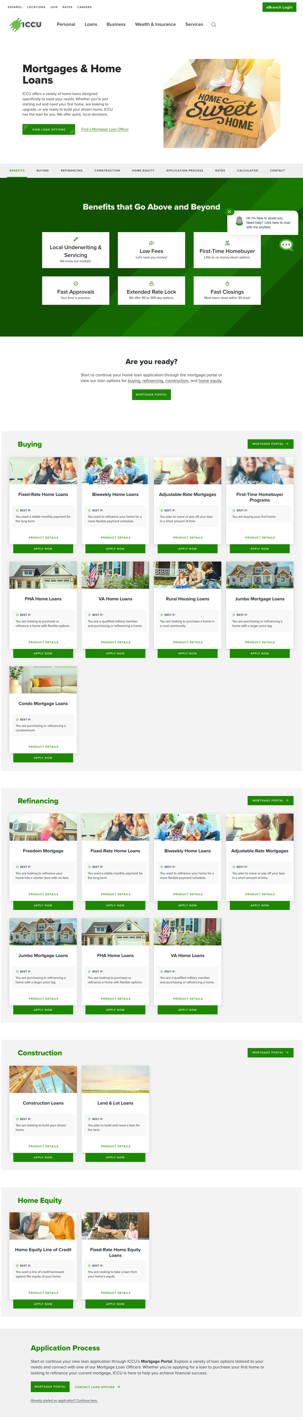
ICCU pays for paid-search clicks on 'home loans' intent and lands the visitor on a /loans/home-loans parent page that is structured as an internal directory, not a landing page. The hero offers two buttons ('View Loan Options' and 'Find a Mortgage Loan Officer') with no rate, no form, and no quote capture. Beneath the hero sits a 9-item in-page anchor nav (Benefits, Buying, Refinancing, Construction, Home Equity, Application Process, Rates, Calculator, Contact) followed by 15 product tiles (Fixed-Rate, Biweekly, ARM, First-Time, FHA, VA, Rural, Jumbo, Condo, Freedom Refi, Construction, Land & Lot, HELOC, Fixed-Rate HEL, plus duplicates across Buying and Refinancing sections). A visitor who searched a specific mortgage intent has to self-categorize into one of 15 products before the page gives them anything. The calculator sits near the bottom and the actual rate quote tool is a text link ('Get My Personalized Rate Quote') that opens a third-party Optimal Blue subdomain.
The hero CTA is 'View Loan Options' -- a link that scrolls the visitor down to the same page's product tiles. The primary action on a paid landing page is an internal anchor jump
15 product tiles force the visitor to pick the right loan program (FHA vs VA vs Conventional vs Jumbo vs Rural vs Condo vs Construction) before they can engage. A first-time buyer who searched 'home loans' has no idea which tile is for them
Fixed-Rate, Biweekly, ARM, FHA, VA, and Jumbo all appear twice on the page -- once under Buying and once under Refinancing -- doubling the visual noise without adding information
The 'Personalized Rate Quote' is the closest thing to a conversion tool and it is a single text link, not a button, not an embedded widget, and it punts the visitor to a third-party Optimal Blue domain (quickquote-consumer.optimalblue.com) with a different URL bar and branding
6 of 16 pages retain full site navigation on paid landing pages. At $20-80/click CPCs in mortgage, every nav link is a leak worth hundreds of dollars per day.
Only 3 of 16 pages show actual current mortgage rates above the fold, despite rate visibility being the #1 customer priority in this industry. Most pages talk about rates without showing them.
5 pages rely on phone-only conversion paths with no form or self-service option. Mortgage shoppers in 2026 overwhelmingly prefer digital-first interactions -- forcing a phone call filters out the majority.
The strongest pages (Better, SoFi, American Financing) share three traits: no nav menu, a single focused value prop above the fold, and a soft-credit-pull CTA that reduces commitment anxiety.
Winners share a conversion-first architecture: no nav, immediate value prop, soft credit pull CTA, and social proof within the first scroll. Losers either send paid traffic to informational site pages (BofA content hub), rely on phone-only conversion (FirstEnt), or bury the conversion action behind testimonial content (Figure).