Free: 96 PPC tools + my AI Playbook book

Roofing clicks cost $50-150 each and half the people clicking just had a storm rip shingles off their house. They're stressed, they're dealing with insurance, and they need someone who looks like they won't disappear after cashing the check. Trust signals aren't optional here. They're the whole game.
From real roofing services Google Ads campaigns in the US
The landing pages actually worth stealing from
So you know exactly what to avoid
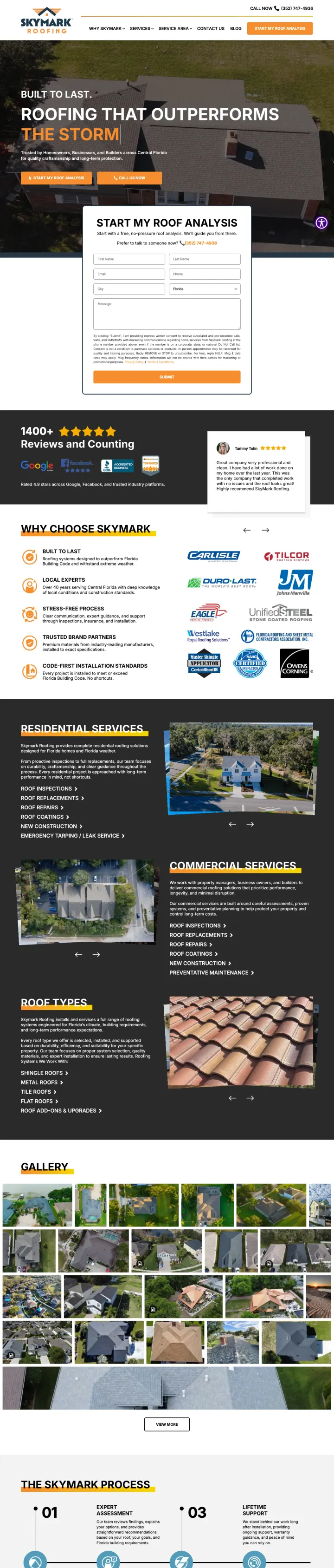
Use a rotating headline that cycles through specific pain points ('Outperforms the Storm / Florida Weather / Time / the Competition') so the visitor sees their exact concern addressed within seconds of landing.
'Start My Roof Analysis' reframes the free estimate as an expert diagnostic, which raises the perceived value of the free offer and positions Skymark as consultants rather than commodity contractors bidding for work
Named reviewer photos (Tammy Tolin, Gabby S.) with headshots next to testimonials create recognizable social proof -- real faces are harder to fake than initials, and homeowners searching for local roofers may recognize neighbors
'999+ Reviews and Counting' with logos from Google, Facebook, BBB, and HomeAdvisor shows review volume across 4 platforms simultaneously, making the social proof feel comprehensive rather than cherry-picked
The page URL is /services/roof-coatings but the content is a general roofing page with no coating-specific content above the fold, creating a mismatch for visitors who searched specifically for roof coating services
The consent/privacy text block in the form is visually heavy and takes up nearly as much space as the form fields themselves, which may cause form abandonment
Full site navigation (Why Skymark, Services, Service Area, Contact Us, Blog) gives visitors 5+ exit paths before they reach the form
Build a triple-platform review bar (Google 5.0 + Yelp 4.8 + BBB A+) directly below your hero headline so trust verification happens before the visitor even reads body copy.
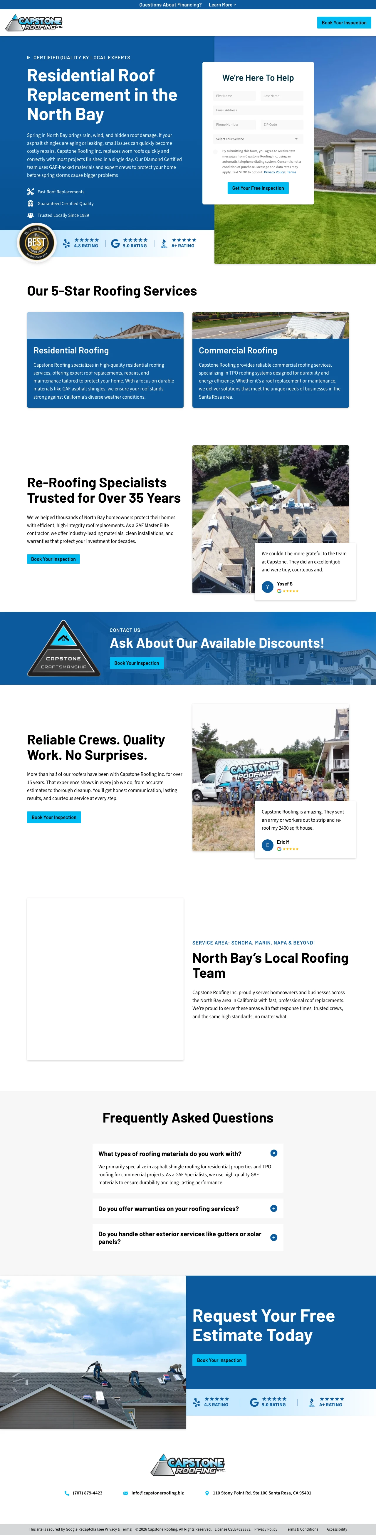
Season-specific opening ('Spring in North Bay brings rain, wind, and hidden roof damage') ties the pitch to the homeowner's current reality rather than generic year-round messaging, making the page feel written for this week, not templated
'Most projects finished in a single day' answers the silent timeline question homeowners hold back until the estimate call. Published above the fold, it pre-empts 'how long will my roof be open?' which is the fear that makes people delay signing
Employee retention stat ('More than half of our roofers have been with Capstone for over 15 years') is an unusual trust signal that addresses the unspoken fear of random subcontractor crews showing up -- it signals operational stability
The (707) 632-2416 phone number is parked in the header skip-link area and easy to miss. Storm and leak callers want to dial, not fill a form, and this page gives them no hero-level number
The form headline 'We're Here To Help' wastes premium real estate on a generic phrase when it could reinforce the free inspection offer or mention response time
No mention of insurance claim assistance anywhere on the page, which is a missed opportunity for storm-damage searches that likely drove some of this traffic
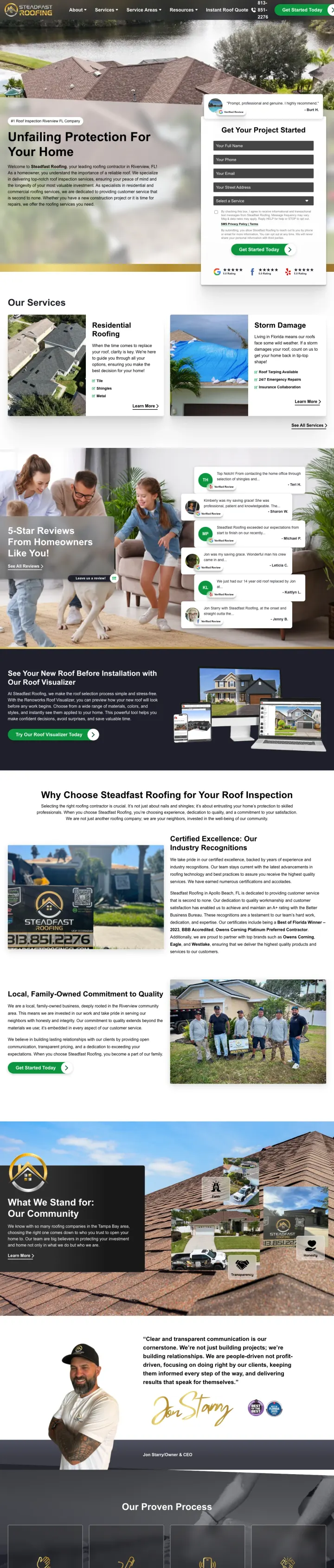
Place a single verified Google review with reviewer name directly beside the lead form so the visitor reads social proof while deciding whether to fill out their contact details.
Inline verified review quote ('Prompt, professional and genuine. I highly recommend.' - Burt H.) positioned directly next to the lead form creates a trust nudge at the exact moment of conversion decision
Storm damage section explicitly lists '24/7 Emergency Repairs' and 'Insurance Collaboration' which directly addresses the #3 and #4 homeowner concerns (insurance claims and response speed) that most roofing pages ignore
Service type cards (Residential Roofing with Tile/Shingles/Metal options, Storm Damage with emergency details) let visitors self-select their situation rather than reading through generic copy to find relevance
The hero headline 'Unfailing Protection For Your Home' is vague and aspirational when the ad promised '#1 Roof Inspection Riverview FL Company' -- the specificity of the ad is lost on the page
The form headline 'Get Your Project Started' uses contractor language ('project') instead of homeowner language ('Get Your Free Inspection' would match the ad promise better)
The page is extremely long with 10+ sections, which dilutes the urgency for Red-dominant visitors who want to call or submit within 30 seconds
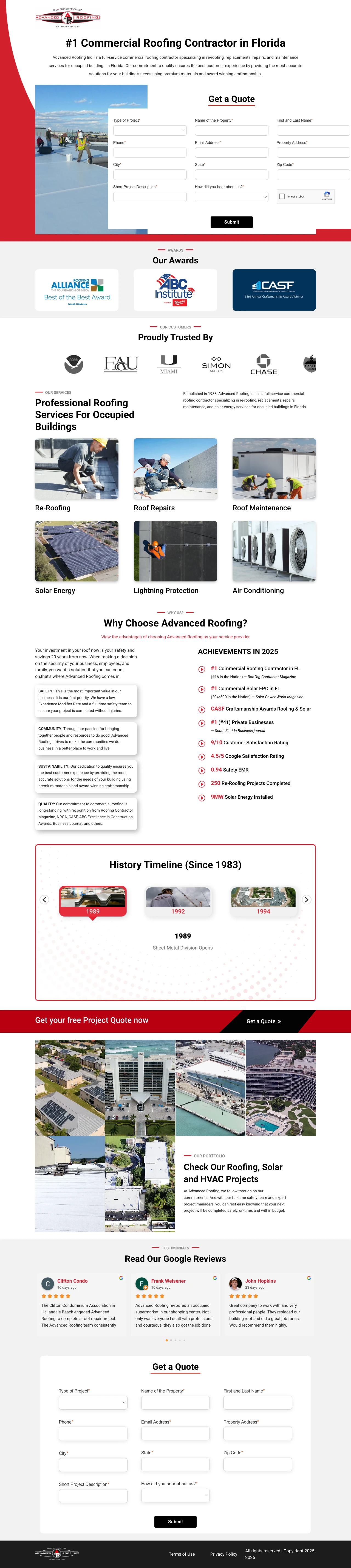
Put a 'Type of Project' dropdown at the top of the lead form with distinct commercial options (Re-Roofing, New Construction, Repairs, Maintenance). Commercial buyers have wildly different sales cycles than residential, and routing the lead at form-submit saves hours of qualification calls.
The form project-type dropdown lists 'Commercial Re-Roofing, Commercial New Construction, Commercial Repairs, Residential Roofing, Air Conditioning, Lightning Projection, Solar Energy' which pre-qualifies the lead and signals Advanced Roofing is a multi-trade commercial firm not a handyman
'Employee-Owned' badge in the logo is a rare trust signal in commercial roofing where anonymous corporate ownership is the norm. Employee ownership implies long-tenured workers and accountability
Hero photo shows a real crew installing white TPO membrane on an actual commercial flat roof, matching the commercial buyer's mental model (not a residential shingle replacement)
Form has 12+ fields including 'How did you hear about us' with 8 dropdown options, which is heavy for a first-touch commercial inquiry
Hero headline '#1 Commercial Roofing Contractor in Florida' is an unverified superlative with no supporting proof (no award name, no ranking source, no certification list above the fold)
No pricing range, project size range, or typical client list above the fold, which commercial buyers scan for to confirm fit before filling a form
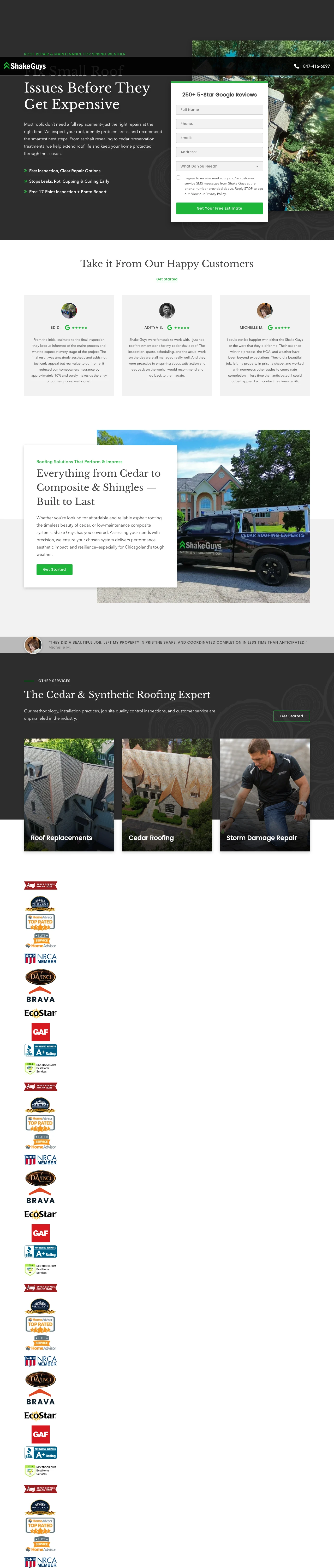
Open with 'Most roofs don't need a full replacement, just the right repairs at the right time' to reframe the visit as a repair inquiry before the visitor commits to the replacement price anxiety. The counter-positioning lowers the perceived price tag and opens a wider top-of-funnel.
Counter-intuitive headline ('Most roofs don't need a full replacement') positions Shake Guys as the honest advisor rather than the upselling contractor, which is the exact opposite framing of every other roofing ad and makes the page memorable
'Free 17-Point Inspection + Photo Report' quantifies the inspection offer and commits to a deliverable, which raises the perceived value and makes the free offer feel like a product not a sales trap
Specialty service dropdown (Roof Replacements, Cedar Roofing, Storm Damage, Cedar Repair & Preservation, Composite Shake & Slate, Asphalt Roofing, Custom Copper) signals premium materials and pre-qualifies leads away from cheap-replacement shoppers
'250+ 5-Star Google Reviews' is a lower volume claim than competitors (Skymark shows 999+, Steadfast shows named reviews across 2 platforms). The smaller number reads as weaker if a visitor is comparing pages
Phone number is in the top bar but not prominently repeated in the hero. Emergency storm-damage callers want a phone-first option
Hero subcopy is a full paragraph of prose where a dual-CTA or urgency element would convert better above the fold
Run a top-of-page storm recovery banner ('Hurricanes Helene or Milton Recovery: Need Roofing Help? Call 855-964-7663 for a free estimate or emergency tarping') during and after named storm seasons. The specificity of named hurricanes signals the company is actively working in the disaster area and can dispatch crews immediately.
Named hurricane banner ('Helene or Milton') ties the page to current events and creates urgency without invented scarcity. Homeowners who searched after a storm see the contractor is already mobilized
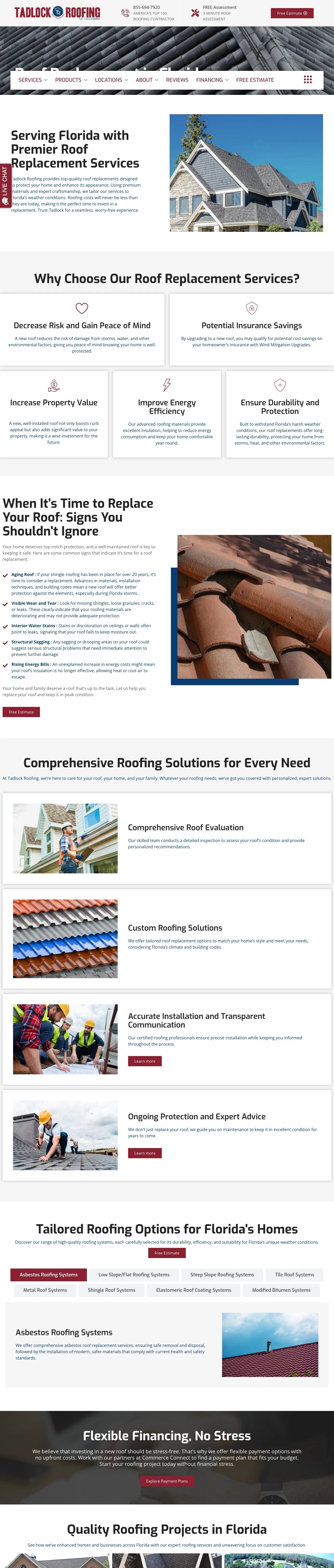
'Roofing costs will never be less than they are today' is a pricing-urgency line that reframes the delay decision ('I'll wait') as an increasing-cost bet, which is psychologically harder to justify than 'I should book now'
'50 Percent Off Material' sales banner with a Labor Day frame gives the visitor a concrete financial reason to act this week rather than scheduling estimates for later
The emergency tarping phone number is buried in the storm banner rather than repeated as a hero-level dual CTA with the main estimate form
Hero photo is generic stock ('AdobeStock_145976033') of a house with shingle roof, not a real Tadlock project in Florida. Breaks the authenticity pattern the other winning Florida pages establish
No above-the-fold mention of insurance claim assistance for storm damage, which is the #1 concern for homeowners calling after Helene or Milton and is a missed messaging opportunity
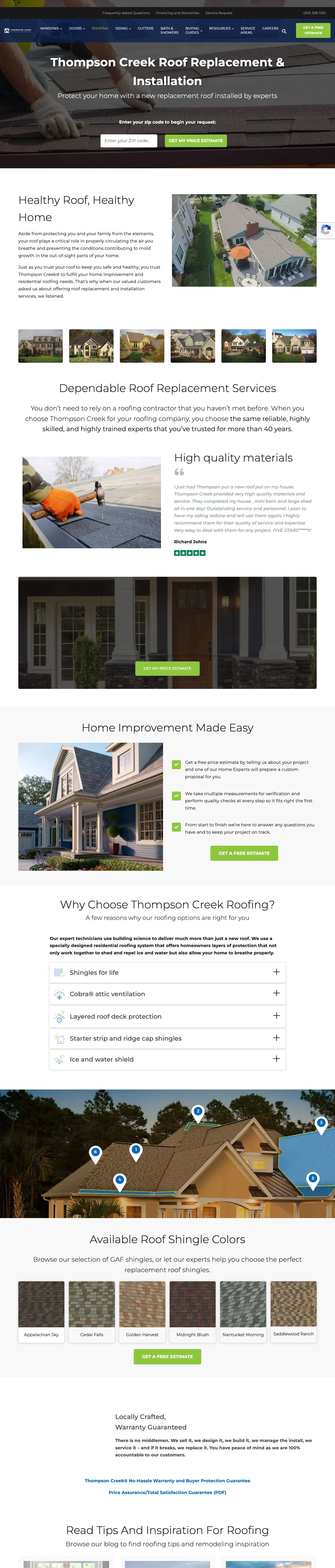
Open with 'Enter your zip code to begin your request' as a single-field micro-commitment instead of a 7-field form above the fold. The zip-first approach reduces friction for the first interaction and lets you progressively profile the visitor after they land in the quote flow.
Brand extension framing ('When our valued customers asked us about offering roof replacement, we listened') positions roofing as a customer-requested addition to an existing 40-year relationship rather than a cold new line, which leverages the Thompson Creek brand equity from window replacement
Zip-code-only initial form reduces the psychological commitment at first interaction. The visitor trades 5 digits for a price estimate rather than name, phone, email, and address
Shingle Color gallery with 6 named color palettes (Midnight Blush, Golden Harvest, Nantucket Morning, Appalachian Sky, Cedar Falls) gives the visitor a design-forward reason to scroll past the form and increases time on page
'Healthy Roof, Healthy Home' headline is abstract when the visitor likely searched for concrete terms like 'roof replacement cost' or 'roofing contractor near me'. A benefit-forward headline would convert better
Hero photo is a static roof-from-above shot, which is less emotionally resonant than a completed project with a happy homeowner in front of the house
No named reviewer photos, just text testimonials with first names (Richard Johns), which reads as less verifiable than the competitor winners using Google review screenshots
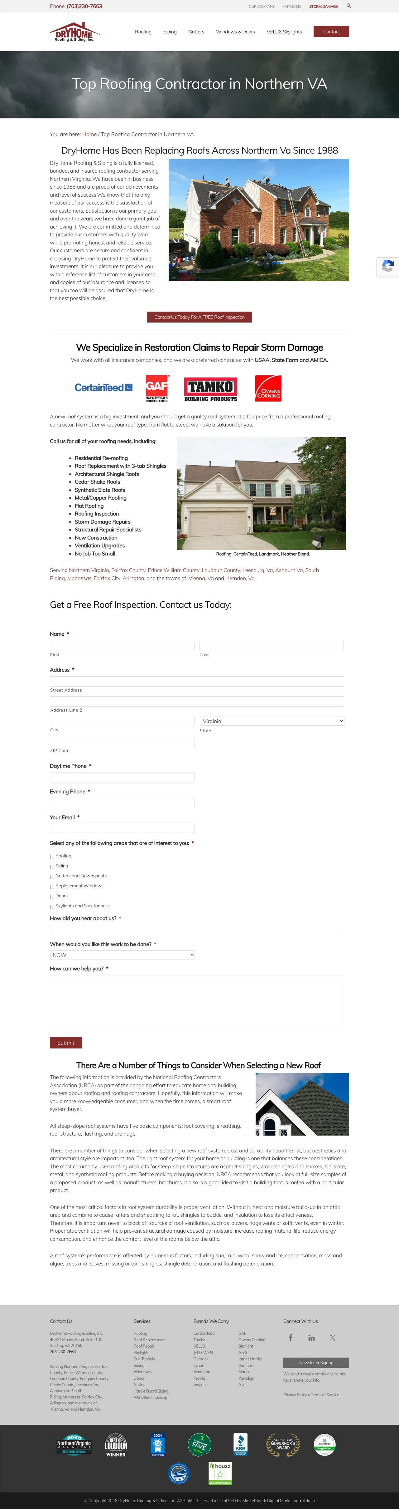
Feature a 'Preferred Contractor with USAA, State Farm and AMICA' line above the fold with insurance company logos. For homeowners with storm damage, pre-approval by their own insurer is a higher-conviction trust signal than star ratings because it implies the carrier has already vetted the contractor.
Named insurance carrier partnerships ('USAA, State Farm, AMICA') create a trust stack that storm-damage buyers can verify by calling their own insurer. This converts a generic 'we handle claims' line into a carrier-specific proof point
Interlinked city-by-city service area pages (Fairfax County, Prince William County, Loudoun County, Leesburg, Ashburn, South Riding, Manassas, Fairfax City, Arlington, Vienna, Herndon) create local SEO depth while also letting visitors click through to their specific city for city-customized content
Service bullet list is 12 items deep (Residential Re-roofing, 3-tab Shingles, Architectural Shingles, Cedar Shake, Synthetic Slate, Metal/Copper, Flat Roofing, Inspection, Storm Damage, Structural Repair, New Construction, Ventilation) which pre-qualifies odd-ball requests and shows full-service depth
Hero image is a team photo rather than a completed roof, which is a weaker buyer-intent match for visitors who searched for specific roof types
'In business since 1988' is stated but the founding story is not anchored to a concrete reason to trust (no named founder, no family-owned-by frame, no employee count)
Form is deep in the page rather than appearing alongside the hero. Visitors must scroll to convert, which is fine for research-mode shoppers but loses urgent storm callers
Pages that break the playbook in interesting ways
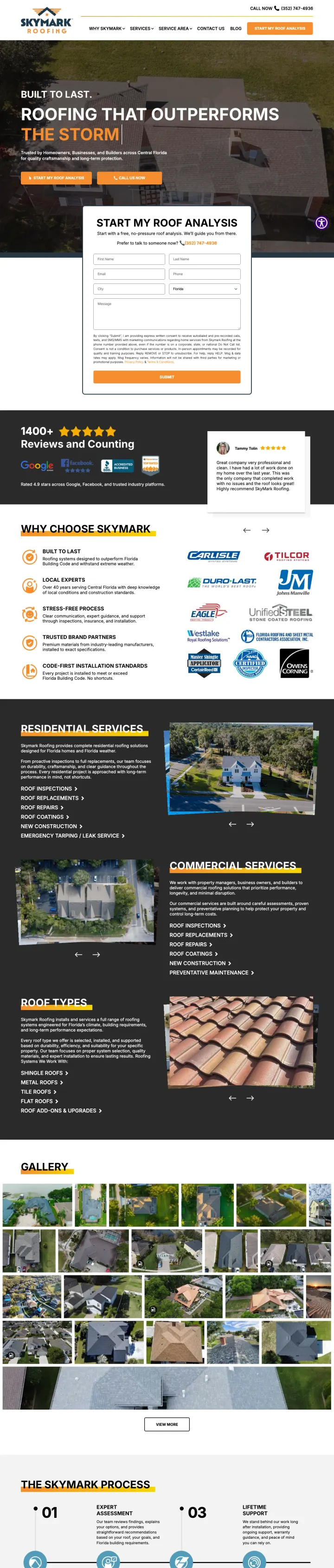
Use a dramatic storm-damage hero image with "THE STORM" as a two-word headline overlay, then immediately show the "START MY ROOF ANALYSIS" form. The weather urgency combined with "analysis" framing (not "quote") reduces the perceived commitment.
"START MY ROOF ANALYSIS" is more inviting than "Get a Quote" because "analysis" implies expertise rather than a sales pitch
Storm damage hero image creates urgency without fake countdown timers
Dual CTA buttons ("START MY ROOF ANALYSIS" orange + "CALL US NOW" green) use different colors to differentiate paths visually
The form has 7 fields which is too many for a repair inquiry. A zip-code-only initial form would capture more leads.
The page targets 14 keyword themes across multiple states with one page, sacrificing location specificity
"THE STORM" headline is dramatic but vague for visitors who searched for general roof repair
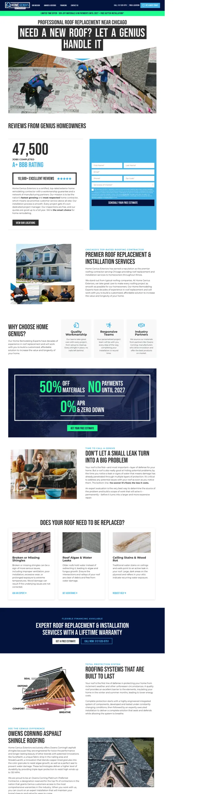
Use "PROFESSIONAL ROOF REPLACEMENT NEAR CHICAGO" with a real action shot of crew members actively installing roofing materials. The photo shows 4 workers in harnesses on a real roof with underlayment visible, proving this company does actual work rather than subcontracting.
"47,500 Successful Home Improvement Projects" counter with video testimonial creates a quantified trust signal that is harder to fake than a star rating
Sticky banner with "LIMITED TIME OFFER - 50% OFF MATERIALS & NO PAYMENTS UNTIL 2027 + FREE GUTTER INSTALLATION" creates genuine urgency through financing terms that have a plausible expiration
Before/after photo gallery with 8+ real project photos lets the homeowner see actual completed roofs in their area
The page is extremely long with multiple sections competing for attention. Information overload may cause scroll fatigue before the visitor converts.
No pricing or cost range visible despite the 50% off materials offer.
The form is buried deep in the page rather than appearing above the fold
3 pages burning ad spend with fundamental issues
Every click to these pages costs real money. We found broken trust signals, mismatched intent, weak CTAs, and messaging that ignores what the searcher actually typed. Here is what to avoid.
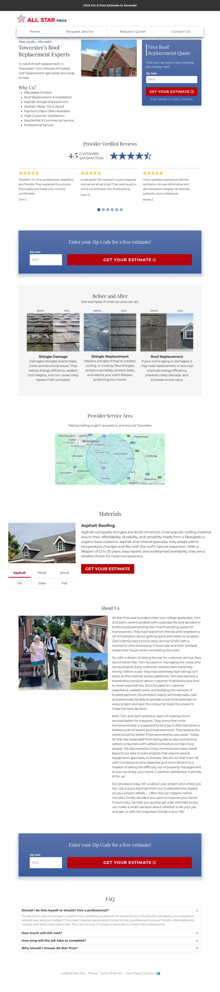
This page targets "roofing companies medford oregon" (SV: 1,280) and delivers a generic lead-gen template with a zip code form and filler content. The page claims to be "Towcester's Roof Replacement Experts" but Towcester is a town in England while the ads target US states. The geo-templating is broken and the page provides no company name, no contractor photos, no license numbers.
The page claims to be "Towcester's Roof Replacement Experts" but Towcester is in England while ads target Oregon and Arizona. Broken geo-templating.
No company name, no contractor photos, no license numbers. A homeowner about to spend $10K-$25K gets less info than a Craigslist listing.
Zip-code-only form signals this is a lead-gen operation, not an actual roofing company.
This is a property management matching service for landlords ('Are you looking for someone to manage your properties?') that showed up in the roofing discovery pool. The page has no roofing content, no roofing service offer, and no roofing trust signals. Any visitor who clicked a roofing ad and landed here bounces in under 5 seconds because the page sells the wrong category entirely.
Wrong category entirely. Page targets landlords seeking property managers, not homeowners needing roof work
No roofing content, no roofer network, no roofing trust signals anywhere on the page
Geo-templating pulls in Augusta as the location, but the service itself is irrelevant to roofing searchers regardless of city
This is a HomeAdvisor cost calculator article ('How Much Does Roof Replacement Cost in 2025?') being used as an ad destination. The page is editorial content designed for SEO, not a conversion-oriented landing page. The lead CTA is buried inside the article body as a small 'Request Project Quote' link, and the page offers no roofing contractor, no phone number, no specific local service. Homeowners ready to buy have no clear next step beyond reading about average prices.
No conversion-oriented hero. The page opens with editorial cost data, not an offer or lead form
Primary CTA is 'Request Project Quote' as a small text link, buried in an editorial layout rather than a high-contrast button
No local contractor, no phone number, no geo-specific roofer. A Florida visitor and a Minnesota visitor see identical national content with no path to book
The strongest roofing pages display review scores from 3 independent platforms (Google, Yelp, BBB) in a single horizontal bar above the fold. This works because homeowners already check multiple review sites before calling a roofer. Showing all three preemptively eliminates a research step and si...
Pages that name the city AND tie the pitch to a local weather pattern ('Spring in North Bay brings rain, wind, and hidden roof damage') create immediate relevance for the visitor who just searched 'roofing company [city]'. The homeowner sees the page was built for them, not templated for every ma...
Roofing visitors split between leak-emergency callers who want a phone number NOW and deliberate comparison shoppers who prefer to submit a form. The winning pages show both options in the hero section. Pages that only show a form lose the emergency caller; pages that only show a phone number los...
GAF Master Elite, Owens Corning Platinum Preferred, and similar manufacturer certifications carry more weight than 'expert roofers' because they are independently verifiable and come with extended warranty eligibility. Capstone leads with 'Diamond Certified' and 'GAF-backed materials', which simu...
Winners build location-specific landing pages with form plus phone above the fold, multi-platform review bars, and manufacturer certifications that double as warranty proof. Losers rely on lead-gen templates that fail at geo-specificity and strip out the named contractor, license number, and local trust signals homeowners need before committing to a five-figure roof project..