Free: 96 PPC tools + my AI Playbook book

These are real veterinary services pages spending actual money on Google Ads right now.
From real veterinary services Google Ads campaigns in the US
The landing pages actually worth stealing from
So you know exactly what to avoid
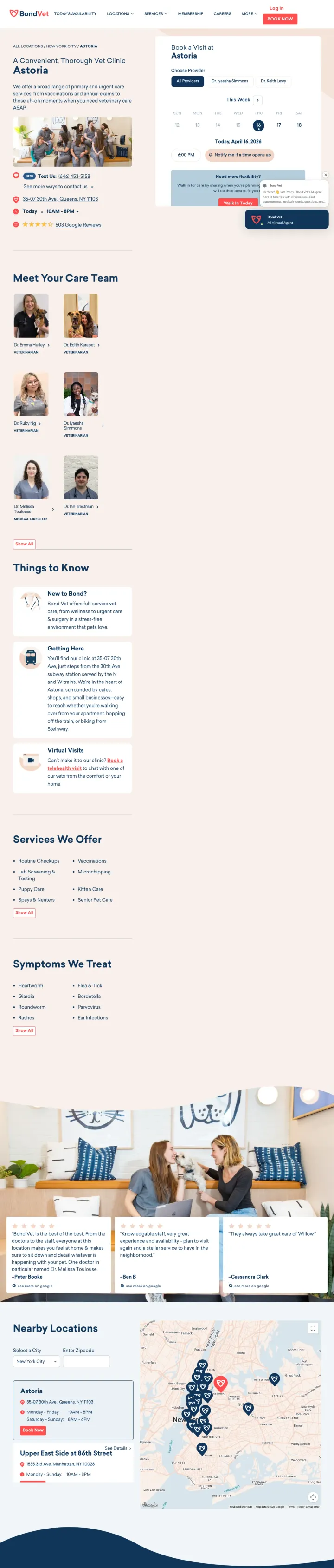
Put a live calendar with real-time availability in the hero, not a 'Book Appointment' button that opens a scheduling widget. Bond Vet shows 4pm and 8pm are open today before the visitor scrolls. That is the difference between a clinic website and a booking engine.
Live calendar with visible today's slots (today April 16, 8am through 8pm with gray/available states) sits beside the hero copy. Pet owners searching 'vet near me' want to know same-day availability, not submit a form and wait
Three provider photos with names and 'Walk In' status pills tell the visitor exactly who they'll meet. Most vet sites hide bios behind a 'Meet our team' tab that nobody clicks
'Text Us: (646) 453-5758' in red under the address, plus 8am-8pm hours visible in the hero card. Three conversion paths (book online, walk in, text) without clutter
The hero copy 'A Convenient, Thorough Vet Clinic' is competent but generic. No differentiation from any other urban vet chain
The 503 Google Reviews link is below the calendar card but the rating itself is not shown in the header where it would do the most work
The booking calendar shows 'Today 4pm' availability but no duration or appointment type next to it, a searcher has to click to figure out what kind of visit they're booking
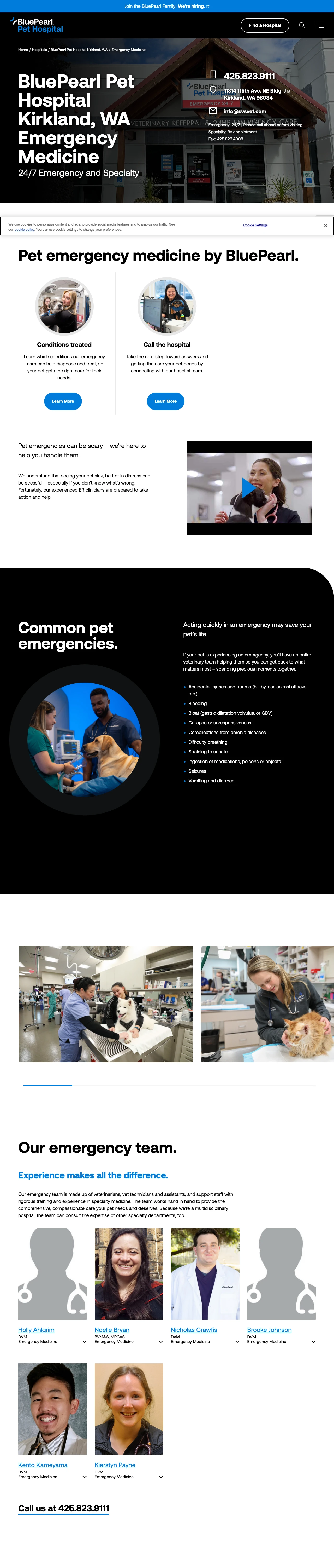
Put the phone number and '24/7 Emergency' availability in the first line of visual hierarchy, before the hospital name. When a pet owner is searching for emergency vet care, the speed of connection matters more than branding.
Phone number (425.823.9111) and '24/7 | Please call ahead before visiting' displayed prominently in the header section, immediately answering the two most urgent questions: can I reach them, and are they open
Named emergency team with photos and credentials (veterinarians listed by name with specialty areas) builds trust during a moment when pet owners are making a high-stakes, emotionally charged decision
'Common pet emergencies' section with specific conditions listed helps the panicking pet owner confirm they are in the right place and their situation warrants emergency care
Dark navy/black design with small white text may be difficult to read for a pet owner in distress, looking at their phone at 2am with tears in their eyes
The 'Request Appointment' button is styled identically to the specialty appointment path, which could confuse someone who needs emergency walk-in care, not a scheduled appointment
No estimated wait time or triage information, which would reduce the anxiety of a pet owner deciding whether to drive 20 minutes to this hospital
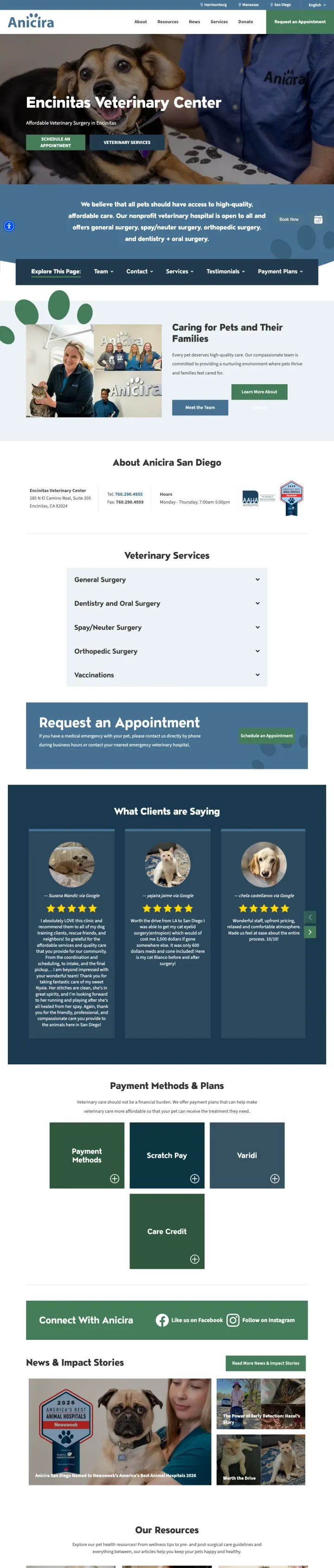
If you serve price-sensitive pet owners, pair every 'affordable' claim with a specific credential visible in the same frame. Anicira puts 'Affordable Veterinary Surgery in Encinitas' one line below the AAHA-accredited badge, telling the 'low cost vet' searcher that this is clinical-grade care at nonprofit rates.
'Expert Surgical Care - AAHA Accredited' sits directly below 'Affordable Veterinary Surgery', the credential destroys the cheap-vet fear in the same eye-line as the price pitch
Real customer photos in the 'What Clients Are Saying' section show actual pets (not stock) with specific names in the reviews. This is how a nonprofit earns trust without the brand leverage of a chain
Three-icon 'Why Choose Anicira' row (Compassionate Care, High Quality, Affordable Prices) stays readable on mobile and gives the visitor a 5-second scan of the value prop
The hero CTA is 'Schedule an Appointment' with a generic green button. For an affordable-care searcher with immediate intent, the same hero could show today's availability or a direct phone number
The nav bar keeps the 'Donate' link in the top-right, which is correct for a nonprofit but competes visually with the 'Request an Appointment' button. Pet owners clicking a PPC ad are patients first, donors later
The pricing is described as 'Affordable' throughout but no actual dollar ranges appear until the user scrolls to specific service pages. A $$ range in the hero would do heavy lifting
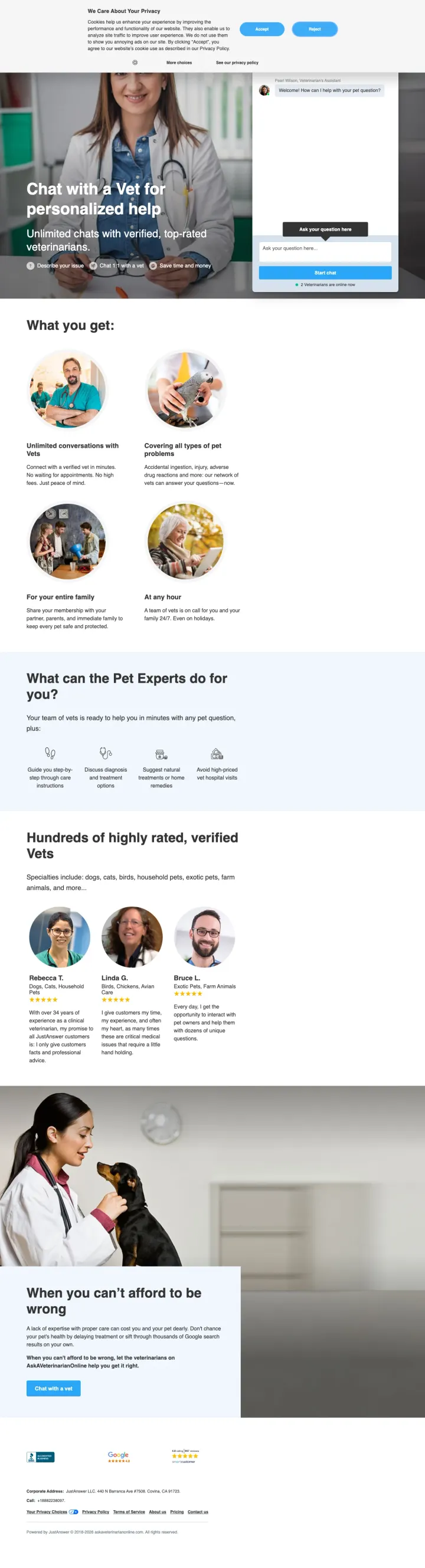
Show the number of verified experts currently online ('11 verified veterinarians are online now') with a live chat preview to make the service feel immediate and available, not abstract.
'11 verified veterinarians are online now' creates urgency and availability proof simultaneously, telling the pet owner they will get help immediately rather than waiting for a callback
Three-step value prop icons (Describe your issue, Chat 1:1 with a vet, Save time and money) simplifies a potentially confusing service model into an obvious flow
Named vet profiles with photos, ratings, and verified badges (Dr. Bruce, Dr. Elkins, Dr. Ellis with 14,000+ satisfied customers) provide the social proof needed to trust a virtual vet consultation
'Pearl Wilson, Veterinarian's Assistant' as the initial chat prompt reads like a chatbot intermediary rather than direct access to a real vet -- for an owner worried their dog is dying, an Assistant rather than a Vet lowers trust at the worst moment
No pricing visible anywhere above the fold. The service likely uses a subscription or per-question model, but the visitor has no idea what it costs until they are deep into the chat flow
The 'When you can't afford to be wrong' section at the bottom uses fear-based copy that could increase anxiety rather than resolve it for a worried pet owner
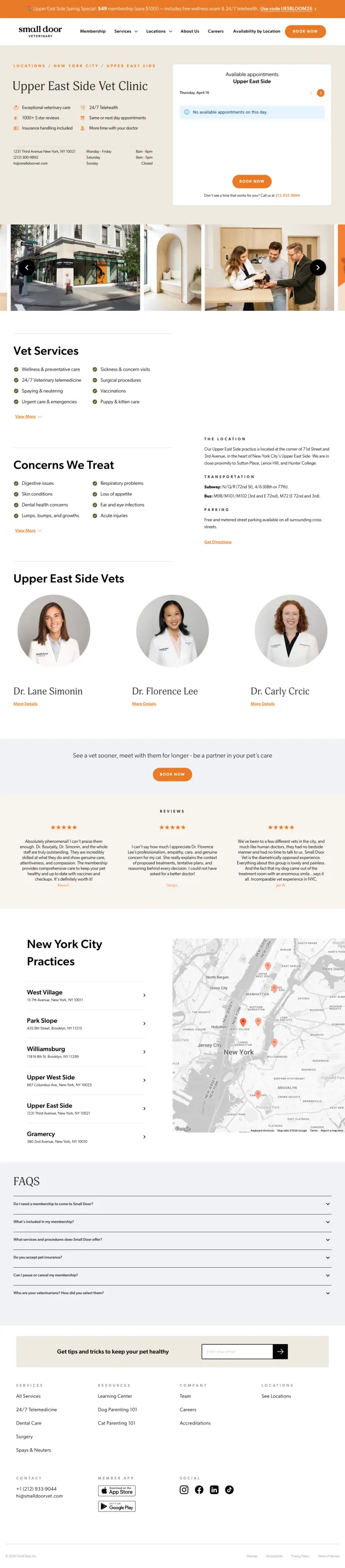
The booking calendar IS the hero. Pet owners in panic mode never have to scroll. Most clinic pages hide booking behind a form or a 'Request Appointment' click. This page shows Thursday April 16 availability the second you land.
Live availability calendar as the hero right-hand element. Green reviews the copy promises at left, booking proof of concept sits at right so the visitor does not have to believe a claim, they can see the open slots.
The trust bullets next to the calendar are specific: '1000+ 5 star reviews', '24/7 Telehealth', 'Insurance handling included'. Pet owners scan for these exact phrases and they are grouped above the fold.
Fallback phone number appears INSIDE the booking widget ('Don't see a time that works for you? Call us at 212.933.9044'). Converts the visitor who bounces from online booking into a phone lead instead of a lost visit.
'No available appointments on this day' is the first message the booking widget shows. For an emergency searcher this is a dead end. The next-available date should auto-select, not today's closed slot.
The orange spring promotion bar is aggressive ('$49 membership') and competes with the primary booking CTA. Pet-parent persona may scan past booking to redeem the code and get lost in membership details.
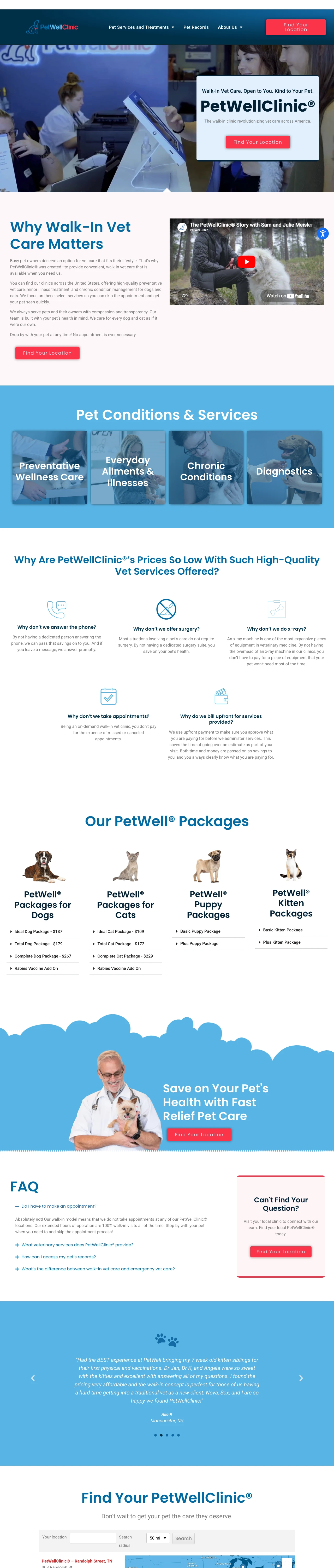
If the positioning is 'affordable vet care', publish dollar amounts for your most-asked packages and write a paragraph explaining each tradeoff you made to get there. PetWellClinic lists Ideal Dog Package $137, Total Dog $179, Complete Dog $267, then has a 'Why are our prices so low' section that answers 'Why no surgery, why no x-rays, why no phones' one by one. That disclosure is the trust mechanism a budget vet needs to avoid the cheap-vet objection.
Five explicit package tiers per species (Ideal, Total, Complete for dogs and cats) with every included service itemized. A visitor comparing walk-in vets can price their visit before choosing a location, which is exactly the decision friction that Bond Vet solves with a calendar and PetWellClinic solves with a price sheet
'Why don't we answer the phone / Why don't we offer surgery / Why don't we do x-rays / Why don't we take appointments' as a five-question self-interview turns apparent limitations into the reason the price is low. Every objection the budget-conscious pet owner has is named and answered in the same section
'Walk-In Vet Care. Open to You. Kind to Your Pet.' as the supra-headline above the brand name sets expectations before the logo loads. Visitor knows in two seconds what to expect: walk in, no appointment
Primary CTA is 'Find Your Location' which is correct for a multi-unit chain but hides the conversion moment a block away. A pet owner who already knows they want a Total Dog Package at $179 has to hunt for the nearest clinic, and the location finder should probably surface with zip-code input above the fold
The 'Why Walk-In Vet Care Matters' section is three paragraphs of body copy where a three-icon row ('No appointment', 'Upfront pricing', 'Same-day visits') would scan in half the time
No live hours, no clinic photos, no named staff on the homepage. The trust builds through pricing transparency alone, which works but leaves conversion on the table for visitors who want to see the actual room they'll be sitting in
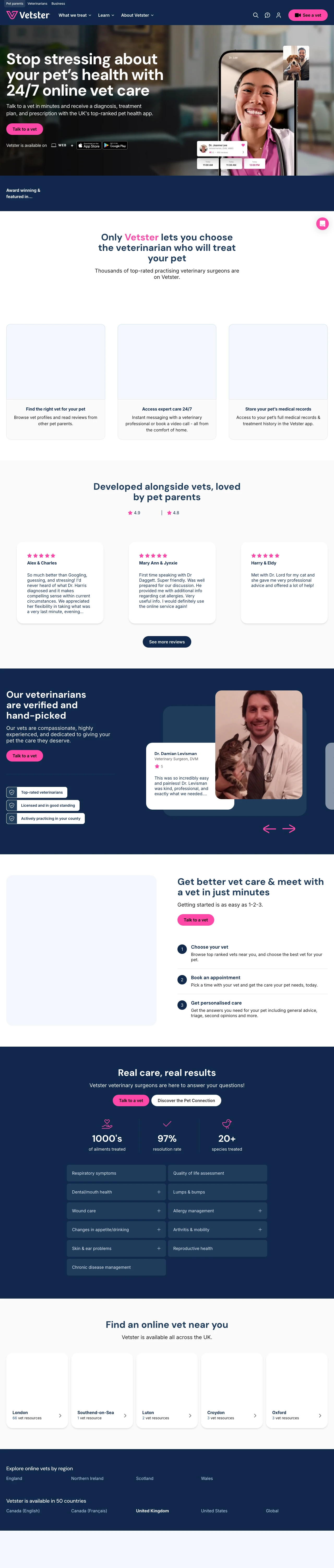
If you sell virtual vet visits, show both price models on the landing page: 'Starting at $102 one-time' beside 'Vetster Plus $10/month, includes 4 appointments ($408 value)'. Pawp hides the subscription price and loses the price-curious visitor, JustAnswer hides any price at all. Vetster shows both on the same page and lets the visitor choose how they want to transact before they commit to anything.
Two-column pricing panel showing Vetster Plus ($10/month, $120/year, 4 appointments included) beside Per Appointment ($102 one-time). The math of '4 appointments at $408 value for $120' is the quiet sell, the visitor reaches the subscription conclusion on their own
Rotating named-vet grid (Dr. Levisman DVM, Dr. Banks DVM BBmedSc BVSc, Dr. Jassal DVM MS) with credentials, star ratings, and a specific testimonial for each vet. The marketplace positioning is proven by showing individual vets rather than a generic stock image of 'a vet'
'1000s of ailments treated, 97% resolution rate, 20+ species' stat trio directly answers the 'is this real medicine' objection for telehealth-skeptical pet owners. The resolution rate specifically reframes virtual as effective, not a fallback for when the ER is closed
Hero CTA 'Talk to a vet' routes through a gs (getting-started) flow rather than a chat interface, and the visitor has to complete onboarding before any price or vet selection is revealed. The pricing panel is several scrolls below the fold
The award-logo strip (Newsweek, Forbes, The Times, Huffpost, TechCrunch, Yahoo News, BNN Bloomberg, USA Today) repeats itself 10 times horizontally, which reads as a trust-inflation trick rather than a curated list. Two clean rows of five unique logos would land harder than 80 duplicates
State-by-state directory at the bottom is the right SEO play but the city tiles (New York City 59, Los Angeles 26, Chicago 13) list 'vet resources' rather than 'available vets'. A pet owner parsing that number thinks it is inventory when it is actually content pages
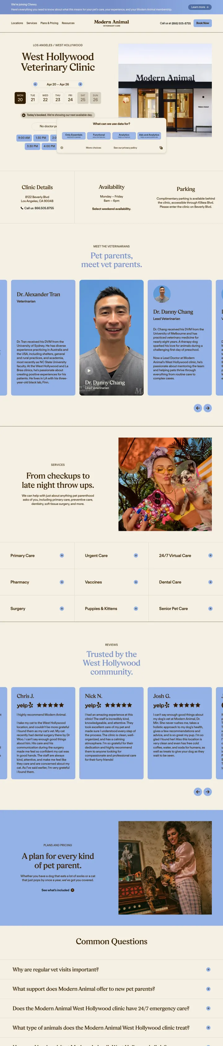
The availability calendar shows a full week horizontally, not just today. Pet owners comparing clinics often search on a Sunday for a Tuesday appointment. Showing Mon-Sat at once lets them pick the day that fits their schedule instead of clicking through date pickers.
A real photo of the physical clinic storefront sits beside the calendar. In a category where stock-photo pets are the norm, showing the actual door the visitor will walk through signals a real practice, not a franchise stamped on any building.
Clinic details, availability, and parking sit in three compact columns above the fold. The three objections a visitor has before they click (is it open, how do I get there, where do I park) get answered without a scroll.
Serif headline 'West Hollywood Veterinary Clinic' paired with quiet sans-serif body copy reads as a considered brand, not a medical chain. For the pet owner comparing 3-4 clinics on Google Maps, that typographic restraint signals the clinic will pay attention to the same details when treating their dog.
A massive cookie consent modal ('We're using cookies') hovers on load and partially covers the availability grid. Booking confidence falls when the visitor's first click has to be 'accept cookies'.
Doctor names and vet bios sit several scrolls down. Given that 'is this vet actually good' is the key objection for the Blue-Analytical segment, the headshots should appear much sooner.
Pages that break the playbook in interesting ways
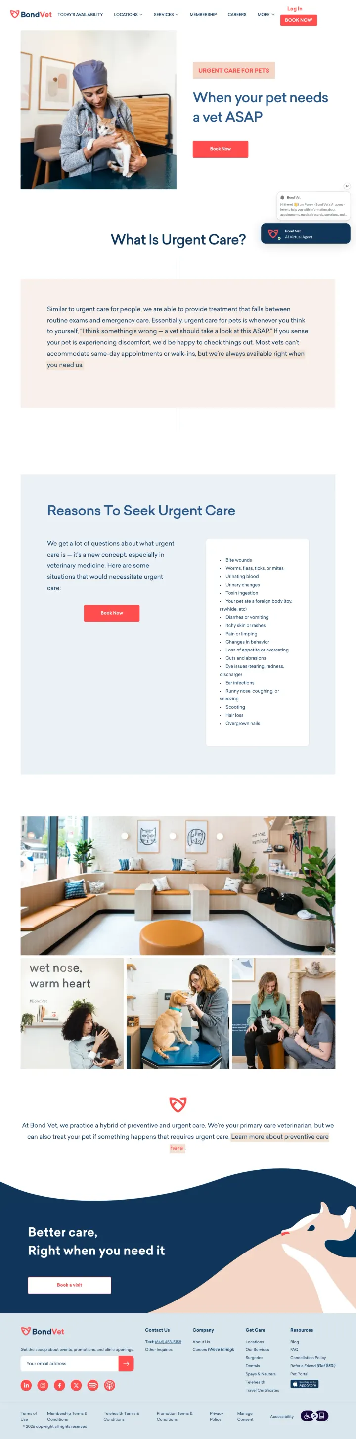
Define a new category rather than competing in an existing one. Bond Vet's urgent care page explicitly differentiates itself from emergency rooms ('similar to urgent care for people'), which is both an education play and a pricing-frame play. Pet owners who see this understand they'll pay less than ER rates without sacrificing speed.
Headline 'When your pet needs a vet ASAP' uses consumer-native urgency language rather than clinical terms like 'urgent care services'. Matches the panic-mode search intent without escalating to ER pricing anxiety
'What Is Urgent Care?' section educates the category before selling it, using a one-liner analogy ('similar to urgent care for people')
'We get a lot of questions about what urgent care is' opens the FAQ section with a reassuring, human voice instead of a clinical intro
No price range even indicative, the whole positioning of 'cheaper than ER' depends on the visitor trusting that pricing is transparent, but the page doesn't show numbers
The 'Reasons To Seek Urgent Care' section is a long bulleted list when a 3-icon card row would scan better for a panicking pet owner
The CTA button in the hero says 'Book online' but the category education implies many visitors should be walking in right now, a clearer phone option would help panic-mode users
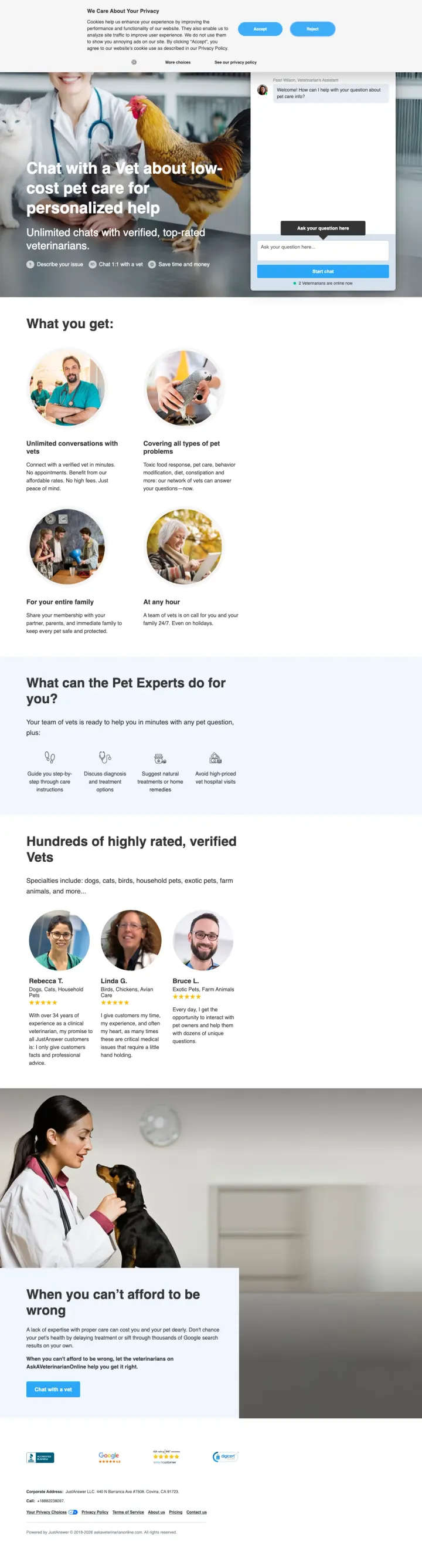
Test headline variants that match specific search intent ('low-cost' vs generic 'personalized help') on otherwise identical page templates. This is exactly what JustAnswer appears to be doing, and it is a replicable strategy for any vet practice running paid search.
Headline modified to 'Chat with a Vet about low-cost pet care for personalized help' directly matches cost-focused search queries while keeping the same proven page structure
Value prop shift: this variant emphasizes 'affordable rates' in the feature description where the standard variant says 'No high fees', subtly different framing for price-sensitive audiences
Same social proof, same vet profiles, same chat interface, only the headline and minor copy changes differ, proving you can run effective multivariate tests with minimal page-building effort
Hero image changes from a vet with a pet to a close-up of a pet with a concerned expression, which may increase anxiety rather than provide reassurance for a cost-worried pet owner
The 'low-cost' framing could attract visitors who cannot afford any veterinary care, leading to lower conversion quality and higher refund rates on the chat service
Same missing pricing problem as the standard variant, which is particularly problematic when the headline specifically promises 'low-cost' and the visitor sees no price
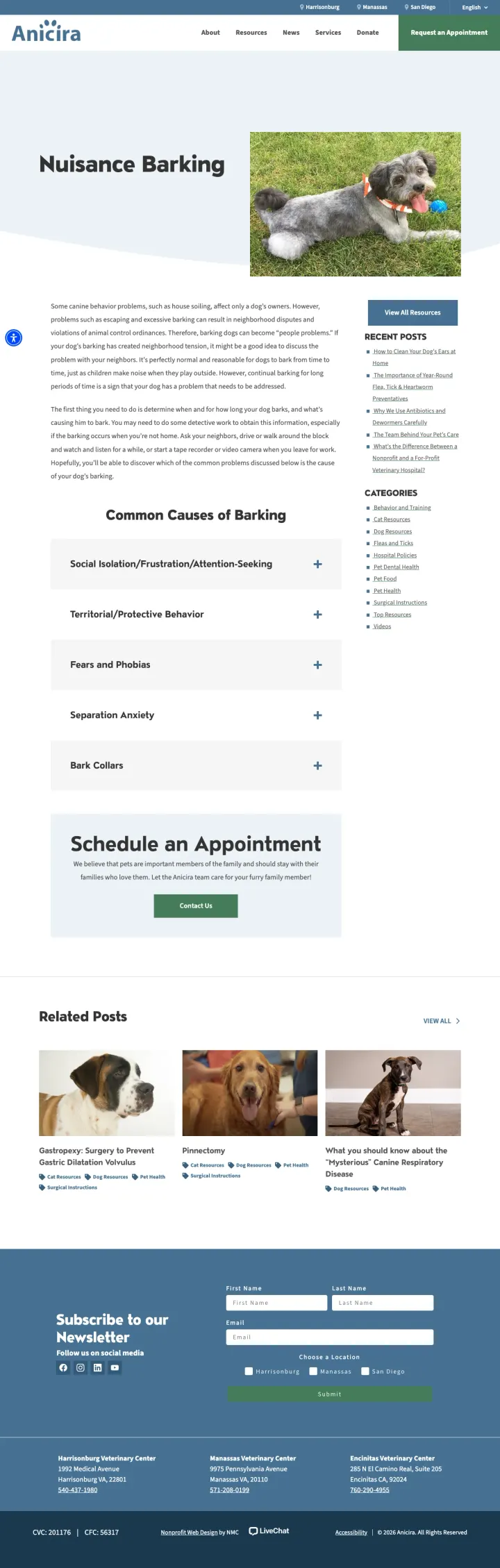
Run educational content pages as PPC destinations for long-tail behavior and symptom queries. Anicira's 'Nuisance Barking' page ranks for behavior queries and converts researchers into appointment requests through an inline 'Schedule an Appointment' card halfway down. Most vets waste these searchers on a homepage.
The 'Common Causes of Barking' expandable accordion gives visitors enough structure to self-diagnose, which builds credibility without asking them to pay for it first
An inline 'Schedule an Appointment' card interrupts the content halfway down, capturing visitors who have learned enough to act. Smart placement at the 'aha' moment rather than only at the top and bottom
Related Posts row at the bottom (Gastropexy, Pinnectomy, Heartworm) keeps researchers on the domain and hints at service depth
Hero is a cute puppy photo rather than a visual about barking behavior, the image does not reinforce the page's topic. A better hero would make the behavior problem visible
No inline phone number for immediate-intent callers who scan the content and just want to book
The appointment card is a text box, not a calendar or booking widget. Visitors who are ready to book still have to submit a form and wait for a callback
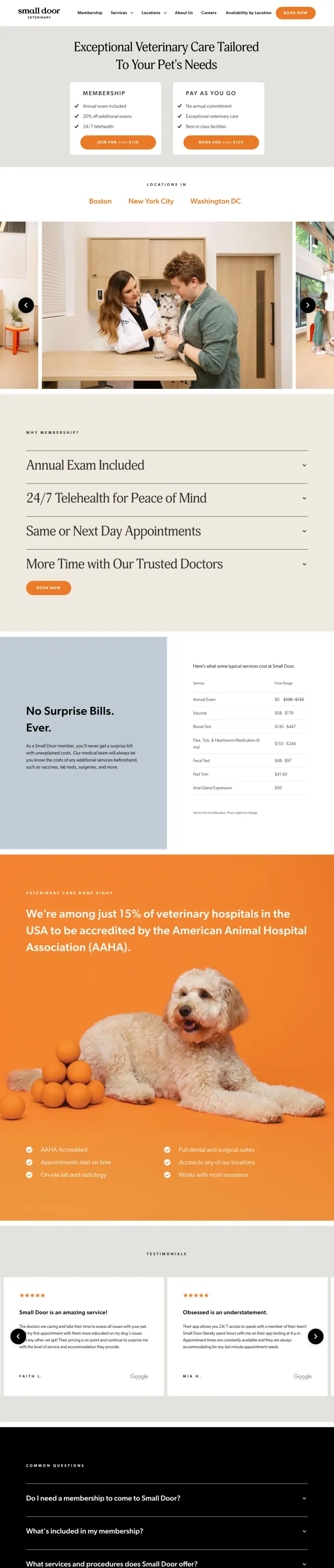
Why This Breaks the Rules: every other vet page in this set treats the landing page as a booking funnel. Small Door treats it as a subscription page. The hero offers two side-by-side paths (Membership $119 vs Pay-As-You-Go $125) with strike-through pricing on both, turning the first-visit decision into a plan decision. Pet owners who are already shopping around suddenly have to decide whether they want a relationship, not just an appointment.
Two-column plan comparison as the hero, not 'book now.' Annual-exam-included plus 24/7 telehealth for $119 sits beside a single-visit option for $125. A $6 gap makes membership feel obvious, which is the whole point of the framing
Strike-through pricing on both tiers ($149 to $119, $135 to $125) triggers the same scarcity response as retail sales while the rest of the vet industry refuses to show any prices at all
'No Surprise Bills. Ever.' as a secondary headline directly addresses the #1 pet-owner objection (the $2,000 surprise vet bill) without needing a single testimonial to support it
No phone number visible anywhere in the hero or header, which kills the panic-mode visitor who wants to call about an urgent issue before committing to a membership
The hero photo rotation (cats, dogs, exam rooms) is pleasant but adds zero information. A visitor cannot tell from the hero which of the three cities (Boston, NYC, DC) they are closest to
'Book Now' in the top-right nav competes with the two plan CTAs, giving the hesitant visitor an escape hatch that undercuts the subscription framing
4 pages burning ad spend with fundamental issues
Every click to these pages costs real money. We found broken trust signals, mismatched intent, weak CTAs, and messaging that ignores what the searcher actually typed. Here is what to avoid.
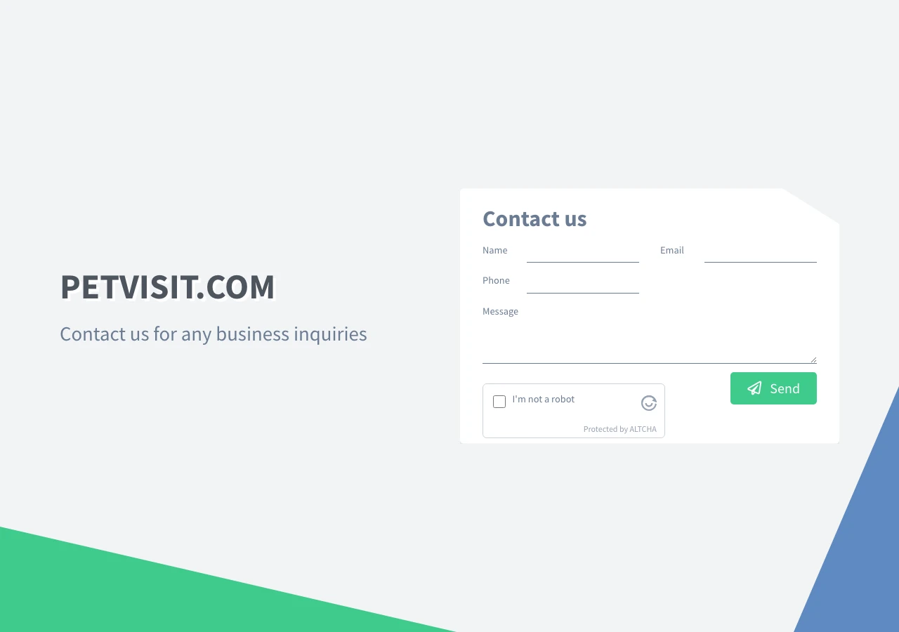
There is no landing page here. The entire viewport is a 'PETVISIT.COM / Contact us for any business inquiries' shell with a generic name/email/phone form. The advertiser is bidding on pet-owner queries and dumping every click onto a page that does not mention a pet, a vet, a service, or a price. Every click is paid, then wasted within 2 seconds of arrival.
No mention of veterinary services, pets, vets, telehealth, or any product the search query implied
The only CTA is a 'Send' button on a contact form with no context for what the visitor is contacting about
No trust signals, no photos, no pricing, no phone number, no location, no hours
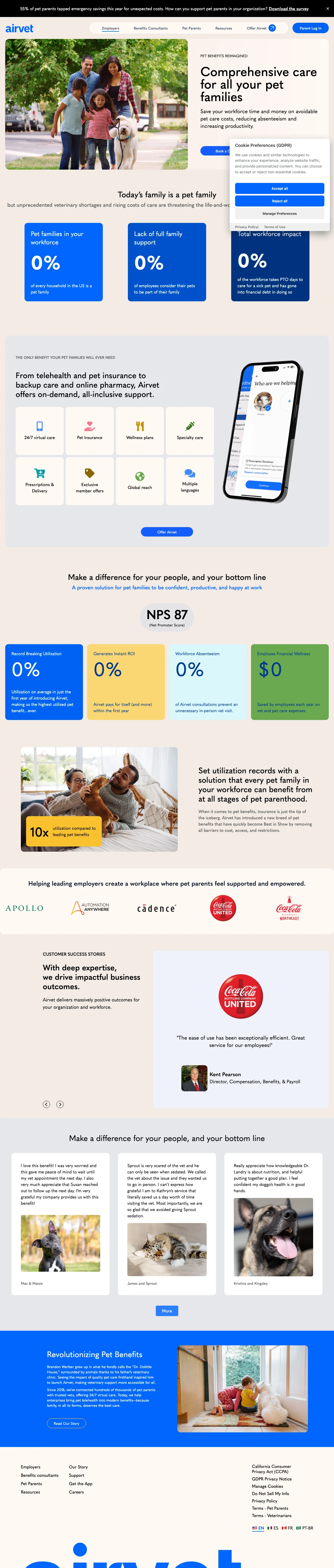
Airvet's homepage hero reads 'Comprehensive care for all your pet families' but the subhead immediately pivots to 'Save your workforce time and money' and the primary CTA is 'Book a Demo.' The page is a B2B pet-benefits pitch aimed at benefits managers. Any pet owner who lands here from a 'vet near me' or 'online vet' query sees a sales deck for their HR department and bounces inside a few seconds.
Hero is B2B ('Save your workforce time and money,' 'Book a Demo') while the ad traffic is coming from consumer queries, a textbook message-match failure
No phone number, no 'try it now' CTA, no pricing, no indication a pet owner can sign up as an individual. The page assumes the visitor is signing up a company
Consumer-friendly imagery (a family with their dog in the hero) creates a false signal that the page is for pet owners, which deepens the bait-and-switch and tanks the bounce metric
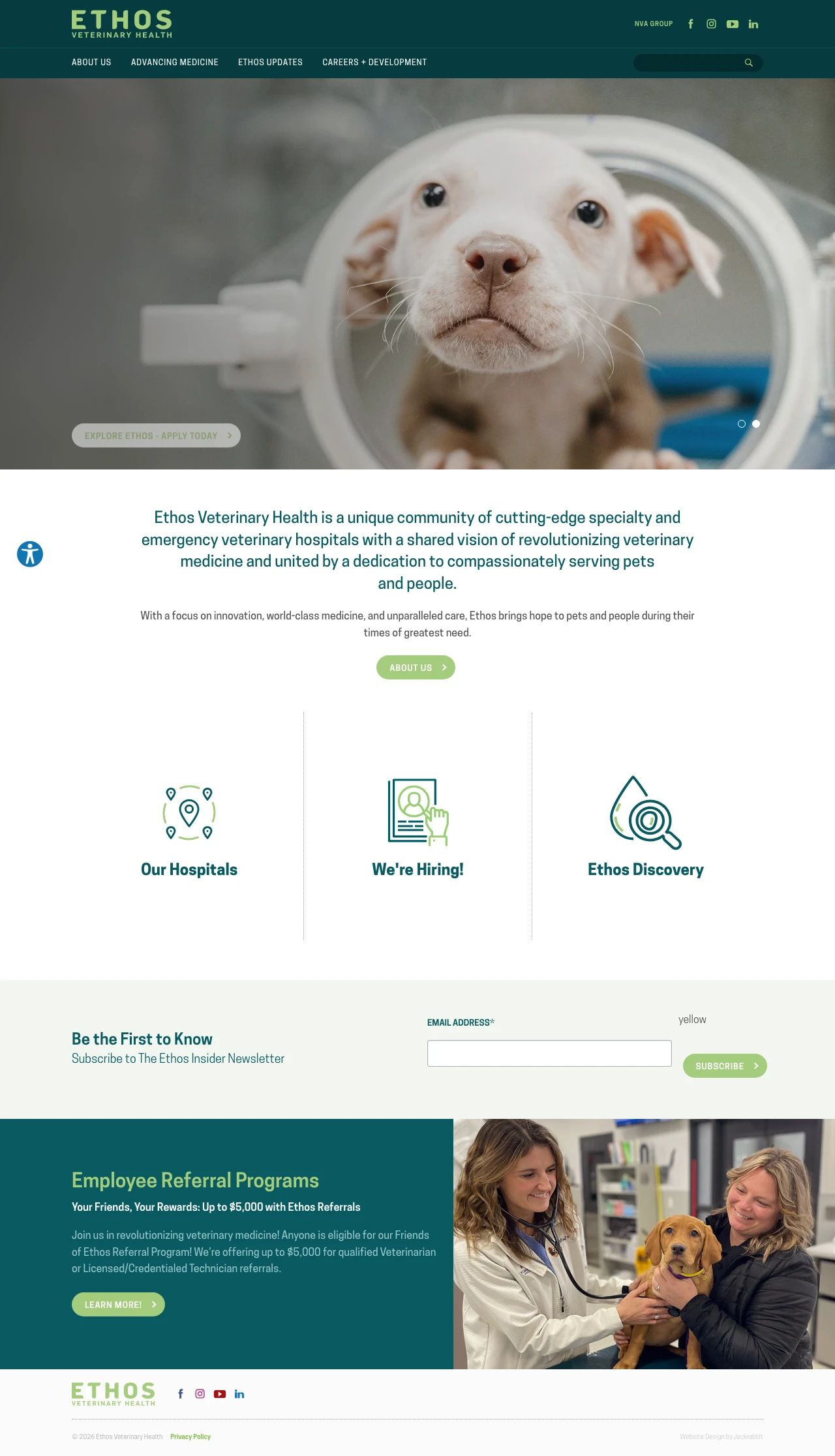
Ethos runs paid search on pet-owner queries for a 140+ hospital network but the homepage hero is a recruitment banner ('Veterinary Careers Start Here / Explore Ethos - Apply Today') with a secondary 'We're Hiring!' tile directly below and an 'Employee Referral Programs' section below that. A pet owner scanning for emergency or specialty care has to work past two hiring CTAs to find a 'Find a Hospital' link. The click is paid at pet-owner rates and served a recruitment experience.
Hero CTA is 'Explore Ethos - Apply Today,' pointed squarely at job candidates. Pet-owner searchers get zero message match
The 'Our Hospitals' tile is one of three, sharing equal weight with 'We're Hiring.' A visitor whose pet is bleeding does not want to see a hiring tile at all
No emergency phone number, no hospital finder, no urgent care path. The nearest 'help my pet' action is two clicks deep
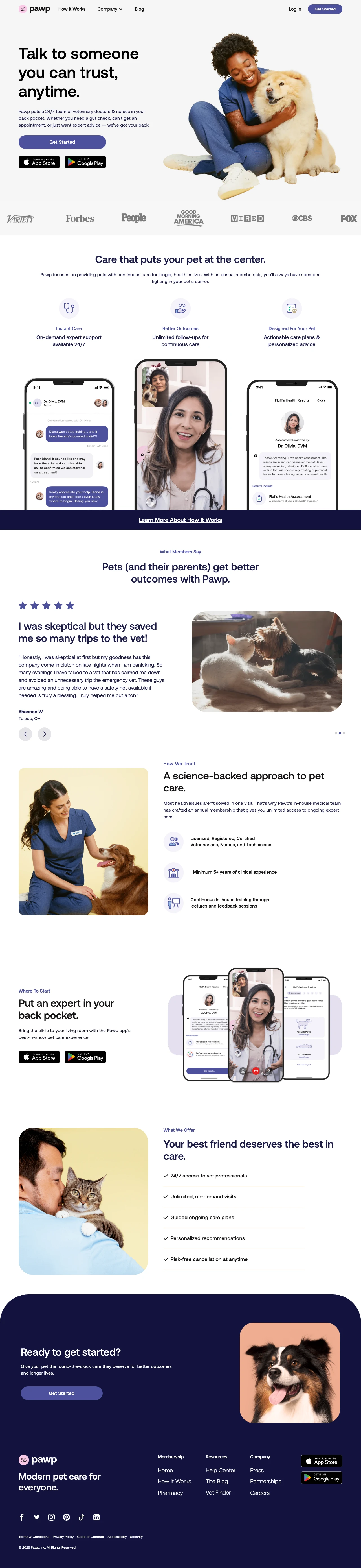
Pawp sells an annual subscription to virtual vet care but the homepage never shows the annual price. The hero CTA is 'Get Started,' which drops the visitor straight into an onboarding flow before any pricing is disclosed. Pet owners who click in from 'talk to a vet online' expect either a free chat (like the JustAnswer variant does) or a clearly priced membership. A hidden price turns every click into a qualification funnel most visitors refuse to enter.
Zero pricing visible anywhere above the fold. Membership amount only appears after the visitor enters onboarding, which is a paywall-shaped friction for price-intent searchers
The 'Get Started' CTA loops the visitor to an app onboarding flow rather than a 'Chat now' interface, which is the specific UX a worried pet owner expects from a 24/7 telehealth product
The feature icons (Instant Care, Better Outcomes, Designed For Your Pet) are soft generic benefit labels, not the concrete 'chat with a vet in 60 seconds' promise the category converts on
Bond Vet's urgent care page leads with a vet in scrubs cradling a cat. Anicira's San Diego page shows a real staff member greeting a patient. BluePearl's team grid pairs each vet's face with their specialty. These are not stock photos, they're the visual proof that 'we actually like animals.' 5 o...
Bond Vet's Astoria and Bayside location pages show an actual calendar with today's open slots above the fold. The visitor can see 4:00pm is free this afternoon without clicking a single button. That friction removal is the difference between a vet site and a booking engine. Anicira's affordable-c...
Anicira's pages do the thing most vet clinics refuse to do: list actual pricing for spay/neuter, dental, and surgery. The 'AAHA accredited' badge plus specific pricing destroys the 'cheap vet = bad vet' objection that kills nonprofit vet conversions. Pet owners who search 'low cost vet near me' a...
BluePearl's emergency page is the clearest example of what the panic-mode visitor needs: phone number in the header, '24/7 | Please call ahead' immediately under it, named emergency team with photos below. Everything else is subordinate. Bond Vet's urgent care page uses the softer 'When your pet ...
Winners treat pets as family members and visitors as people making an emotional decision, with a real photo of the team and a clear path to book or call. Losers miss the audience entirely: a B2B pitch aimed at HR, a corporate homepage selling careers, a domain shell with a business-inquiry form, and a subscription product that hides the price until after onboarding.