Free: 96 PPC tools + my AI Playbook book

Electrician searches split into two camps. There's the 'outlet sparking, call now' emergency and the 'rewire the whole house' project. Emergency callers need a phone number in 1 second. Project planners need to see you're licensed, insured, and won't burn their house down. Most electrician pages serve one or the other, rarely both.
From real electrician services Google Ads campaigns in the US
The landing pages actually worth stealing from
So you know exactly what to avoid
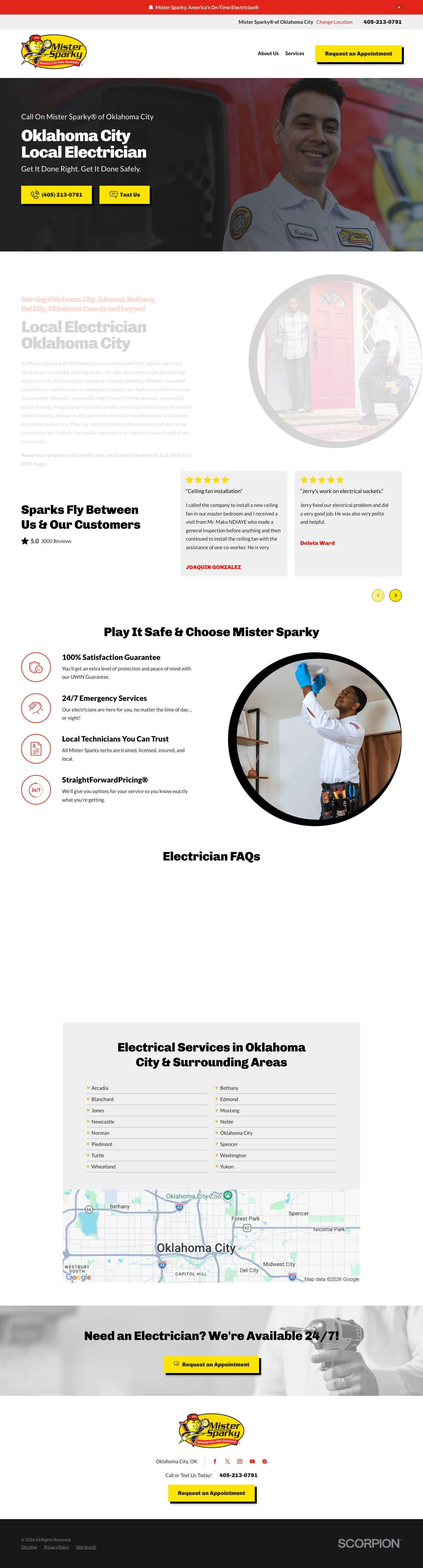
Lead your electrician hero with the safety angle ('Get It Done Right. Get It Done Safely.') paired with a real uniformed technician photo -- it addresses the core fear (electricity is dangerous) before the visitor even reads the body copy.
Dual CTA of phone call plus 'Text Us' button captures both the emergency caller and the homeowner who wants to describe a buzzing outlet in writing first. Texting is underused in home services and removes the awkwardness of explaining electrical symptoms over the phone while keeping a written log for the visit
'StraightForwardPricing' as a branded pricing promise addresses the #1 objection in trades ('will they upsell me once they are in my house?') -- naming your pricing model makes it feel like a policy rather than a claim
5.0 rating from 3,000 reviews with named customer testimonials including specific job types ('ceiling fan installation') -- the job-specific reviews let visitors find social proof for their exact need rather than generic 'great service' reviews
No license number displayed anywhere on the page despite 'licensed' being mentioned -- for an industry where license verification is the #1 trust signal, this is a missed opportunity
The service area list (Oklahoma City, Norman, Edmond, Moore, etc.) takes up prime real estate mid-page without adding conversion value -- visitors who clicked a geo-targeted ad already know the company serves their area
No pricing or offers visible anywhere on the page -- competitors like Hutchinson and Bassett lead with $50 off, giving visitors a reason to act now rather than call three companies
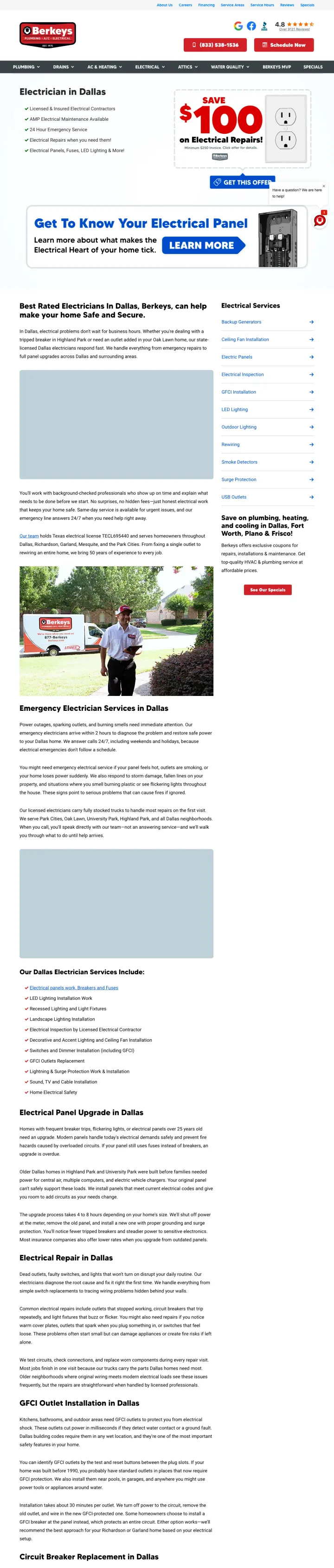
Display your actual electrical license number (e.g., TECL695440) on the page instead of just saying 'licensed' -- it is the single most verifiable trust signal in the electrical trade and almost no competitors do it.
Texas electrical license TECL695440 displayed as text -- this is the only page in the set that shows an actual license number, making the 'licensed' claim instantly verifiable and separating it from every competitor who just claims to be licensed
$100 off electrical repairs coupon with a prominent 'Get This Offer' button above the fold anchors the visit with an immediate financial incentive and gives the visitor a reason to choose Berkeys over the next search result
Embedded YouTube video testimonial from a named customer (Christian B) adds authenticity that text reviews cannot match -- video is harder to fake and lets the visitor see a real person vouch for the work
The page is a full website with complete navigation (Plumbing, Drains, AC & Heating, Electrical, Attics, Water Quality, Berkeys MVP) giving the visitor 8+ exit paths -- every nav click is a wasted paid click
The hero section competes for attention between the $100 coupon, the service list, and the 'Get To Know Your Electrical Panel' infographic banner -- three CTAs fighting above the fold dilutes the primary conversion action
50 years of experience is mentioned but buried in body text instead of displayed as a prominent badge above the fold -- this is the kind of trust signal that should be visible within the first 2 seconds, not discovered after scrolling
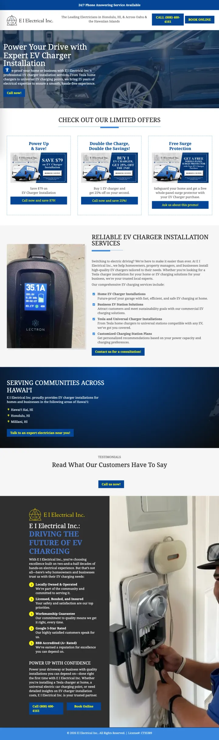
Build a dedicated landing page for each high-value electrical specialty (EV chargers, panel upgrades, generators) with service-specific offers rather than listing them as bullet points on a general electrician page.
Three stacked offers ($79 off single install, 25% off second charger, free surge protector with purchase) give the visitor multiple reasons to act and address different buyer scenarios -- single EV owner, two-car household, and the safety-conscious buyer who worries about electrical surges from charging
'From Tesla home chargers to universal EV charging points' directly names the brand compatibility that EV owners search for -- tech-savvy EV buyers want to know their specific charger brand is supported, not just 'we install EV chargers'
BBB A+ rating plus Google 5-star rating plus 25 years experience creates a credential triple-stack that hits certification, social proof, and longevity in one section
No form anywhere on the page -- every CTA is a phone call link, which loses the planned-work EV charger buyer who wants to describe their setup (amperage, charger model, garage layout) in writing rather than over the phone
The 'Limited Offers' section shows product images but no actual prices for the charger installation -- EV buyers research costs heavily and a page that says '$79 off' without saying '$79 off of what base price' leaves the total cost unknown
Serving only three Hawaii locations (Honolulu, Mililani, Hawaii Kai) but the page makes no mention of Hawaii-specific EV incentives or utility rebates that could further motivate the buyer
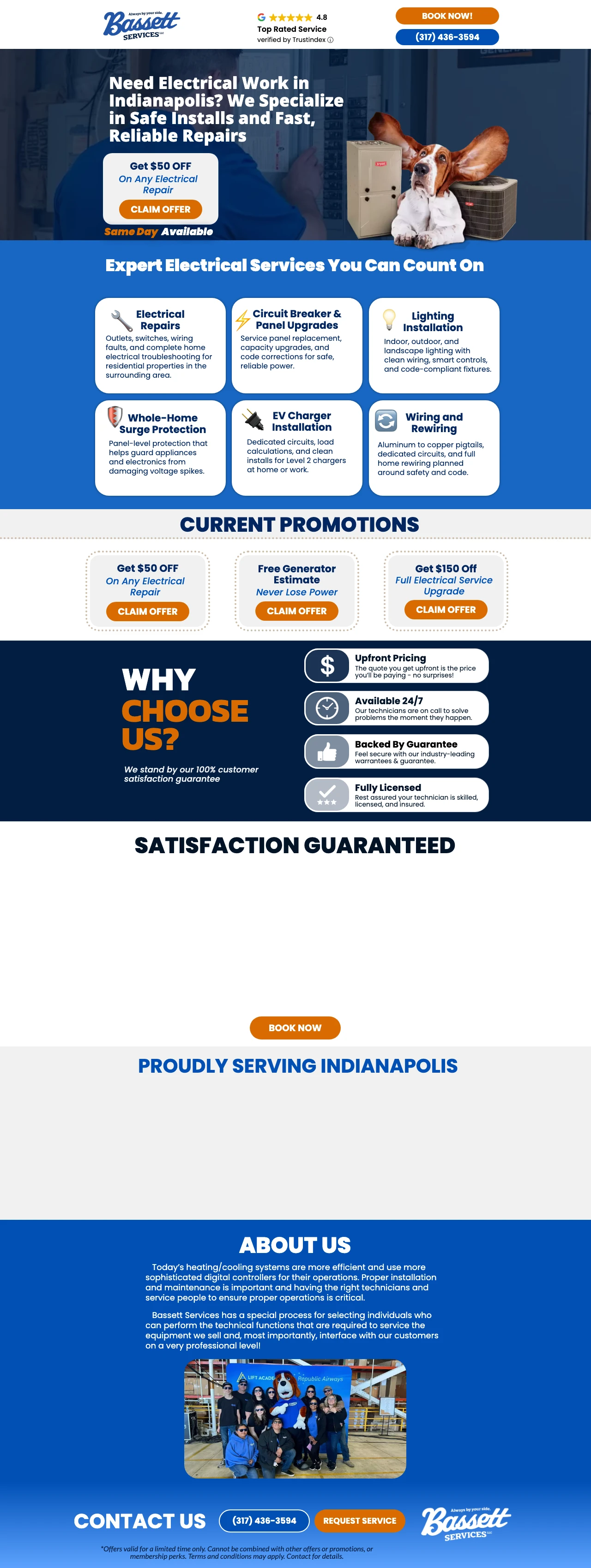
Use an icon grid showing your 6 core electrical services (repairs, panels, lighting, surge protection, EV chargers, wiring) immediately below the hero to let visitors instantly confirm you handle their specific need without scrolling through paragraphs.
Six-service icon grid (Electrical Repairs, Circuit Breaker & Panel Upgrades, Lighting Installation, Whole-home Surge Protection, EV Chargers, Wiring and Rewiring) lets the visitor confirm their specific need is covered within 2 seconds of scrolling past the hero -- this is faster than reading a paragraph and more scannable than a bullet list
Three stacked promotional offers ($50 off electrical, free generator maintenance, $150 off panel upgrade) with individual 'Claim Offer' buttons segment visitors by need and give each segment a specific reason to convert
Dedicated subdomain (offers.bassettservices.com) keeps the landing page separate from the main website, eliminating navigation distractions while maintaining brand credibility through consistent visual identity
The brand mascot (basset hound wearing headphones next to HVAC equipment) creates visual confusion -- is this an electrical company or an HVAC company? The mascot sits next to an outdoor AC unit in the hero, which contradicts the 'Electrical Work' headline
The 'Why Choose Us' section uses generic trust icons (Upfront Pricing, Available 24/7, Backed By Reputation, Fully Licensed) without any specific numbers -- no license number, no review count, no years in business figure
'Satisfaction Guaranteed' as a standalone section with no details about what the guarantee actually covers -- does it mean free re-work? Money back? This vagueness makes the guarantee feel like marketing copy rather than a real commitment
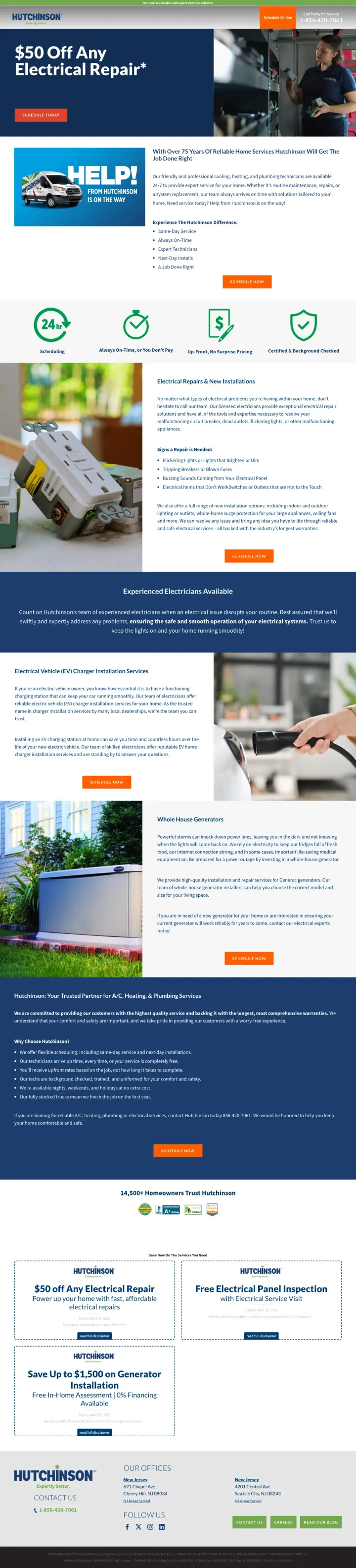
Lead with a specific dollar-off coupon as your hero headline ('$50 Off Any Electrical Repair') rather than a generic service description -- it gives the visitor a concrete reason to engage with THIS page instead of going back to search results.
'Always On-Time, or You Don't Pay' is a risk-reversal guarantee with teeth -- it converts the universal trades frustration ('they said between 8 and 12 and showed up at 3') into a competitive advantage that every homeowner can relate to
Four-icon trust bar (24-hour scheduling, Always On-Time, Up-Front No Surprise Pricing, Certified & Background Checked) delivers the four things homeowners care about most in a single scannable row -- each icon addresses a distinct objection without needing paragraphs of copy
Dedicated offer cards at the bottom ($50 off electrical repair, free electrical panel inspection, save up to $1,500 on generator) segment three distinct visitor types (repair, upgrade evaluation, major purchase) with specific CTAs for each
The 'HELP! From Hutchinson Is On The Way' van graphic in the content section feels dated and takes up space that could show real technician photos or actual electrical work -- it reads as clip art rather than credibility
Financing mention ('We have financing available for emergency repairs, generators & whole-home surge protection') is buried in small text below the hero instead of being a prominent callout -- for a $3,000+ generator purchase, financing availability should be a headline-level message
The page mentions 'over 75 years' in the body text and '77 years' in the footer area but never consolidates this into a single prominent trust badge -- the strongest longevity claim in the entire competitive set is scattered across the page
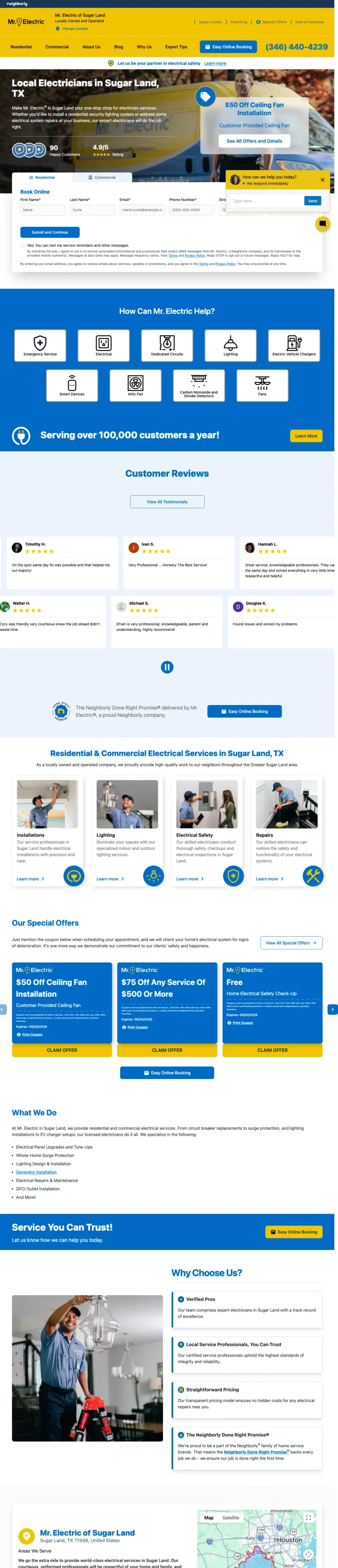
Put a multi-field booking form (name, email, phone, address, zip) directly in the hero section so the visitor can start converting before they scroll -- it signals 'we are ready to help you right now' rather than 'read about us first.'
Booking form embedded directly in the hero section with residential/commercial tabs -- the visitor can start converting within 3 seconds of landing without scrolling, and the tab selector pre-qualifies the lead type before submission
$50 off ceiling fan installation as the hero offer targets a specific, common electrical job rather than a generic discount -- it tells the visitor 'we handle the exact job you probably need' rather than 'we do everything'
4.9/5 rating from 90 happy customers displayed with large star icons in the hero section -- placing social proof inside the hero rather than in a separate section below means the visitor sees credibility simultaneously with the conversion form
Full Neighborly franchise navigation (Residential, Commercial, About Us, Blog, Why Us, Expert Tips) plus top bar links (Apply Locally, Financing, Special Offers, Own a Franchise) creates 10+ exit paths from a page that paid clicks are landing on
Chat widget popup ('How can we help you today?') overlaps with the booking form in the hero section -- two conversion mechanisms fighting for the same screen space confuses the visitor about where to engage
The form requires 6 fields (first name, last name, email, phone, street address, zip) plus marketing opt-in checkboxes -- this is too much friction for an electrician booking where name + phone + zip should be sufficient to start the conversation
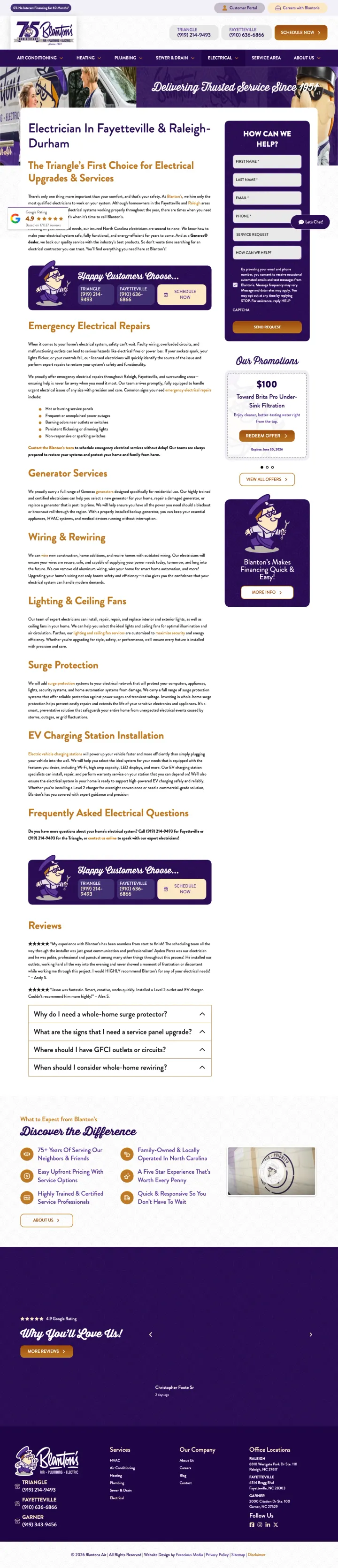
Blanton's built a standalone /electrical URL under a company most homeowners know as an air-conditioning brand. The hero wordmark 'Blanton's Electric' and the headline 'The Triangle's First Choice for Electrical Upgrades & Services' rebrand the multi-trade parent into a dedicated electrical division in one paragraph. If you run a multi-trade shop, stop sending electrician traffic to the generic service area page and build this page instead.
'Blanton's Electric' as a sub-brand wordmark in the hero solves the biggest credibility problem multi-trade companies have with electrician searches: the visitor who typed 'electrician in Sanford' doesn't want an HVAC company, they want an electrician. The sub-brand signals specialty without requiring a separate business entity.
Above-fold lead capture form on the right rail (First Name, Last Name, Email, Phone) with 'How Can We Help?' header collects the visitor before they decide whether to scroll. The form is short enough to fill without friction and visible without scrolling.
4.9 Google star rating pulled directly into the hero with the review count visible. Electrical work carries fire and shock risk, so visitors need proof before they call. A visible star rating is the fastest way to deliver that proof above the fold.
The sub-branded 'Blanton's Electric' lockup is subtle. The top nav still reads Air Conditioning, Heating, Plumbing, Sewer & Drain, Electrical, which visually reinforces that this is primarily an HVAC company. A visitor doing fast comparison shopping may bounce before reading the electrical-specific copy.
Below-fold service sections (Emergency Electrical Repair, Wiring & Rewiring, Lighting & Ceiling Fans, EV Charging Station Installation) are text-heavy with no photos of real electricians or completed work. Competitors in this set use real job-site imagery to make electrical services feel tangible.
Pages that break the playbook in interesting ways
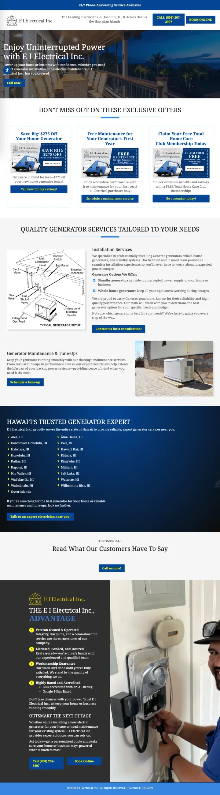
Make every link on the page a tel: link. EI Electrical's generators landing page wires the headline offer, every coupon tile, every service block, and even the hero image into a single phone number -- no forms, no chat widget, no email capture. For a high-ticket considered purchase (standby generators in a hurricane-prone market), betting everything on the phone call is an unusual commitment that filters out tire-kickers.
Three stacked coupon tiles ($275 off home generator, free first-year maintenance, free Total Home Care Club membership) give the visitor three reasons to call -- each tile addresses a different buyer hesitation (price, maintenance worry, ongoing relationship)
The hero image itself is a tel: link -- clicking the photo of the generator dials the company. This is an unconventional UX choice that captures accidental clicks from visitors who would not have tapped a labeled button
Local service-area list with Hawaiian place names (Aiea, Kaneohe, Mililani, Kahala) signals genuine local knowledge in a way that 'serving the greater Honolulu area' never could -- it also makes the brand feel earned rather than franchised
Zero form, zero chat, zero email capture -- a $5K-$20K generator is rarely a same-day phone purchase, and visitors who want to compare quotes at 11pm have no way to engage without calling during business hours
The coupon tiles are visually decorative but the actual discount terms (does $275 off stack with free maintenance? is the club membership locked to EI purchases?) are not explained above the fold -- vague terms erode trust for a considered purchase
The page serves only Hawaii but uses generic stock photography of a mainland-style single-family home -- a genuine Oahu or Big Island home photo would reinforce the hyper-local positioning
2 pages burning ad spend with fundamental issues
Every click to these pages costs real money. We found broken trust signals, mismatched intent, weak CTAs, and messaging that ignores what the searcher actually typed. Here is what to avoid.
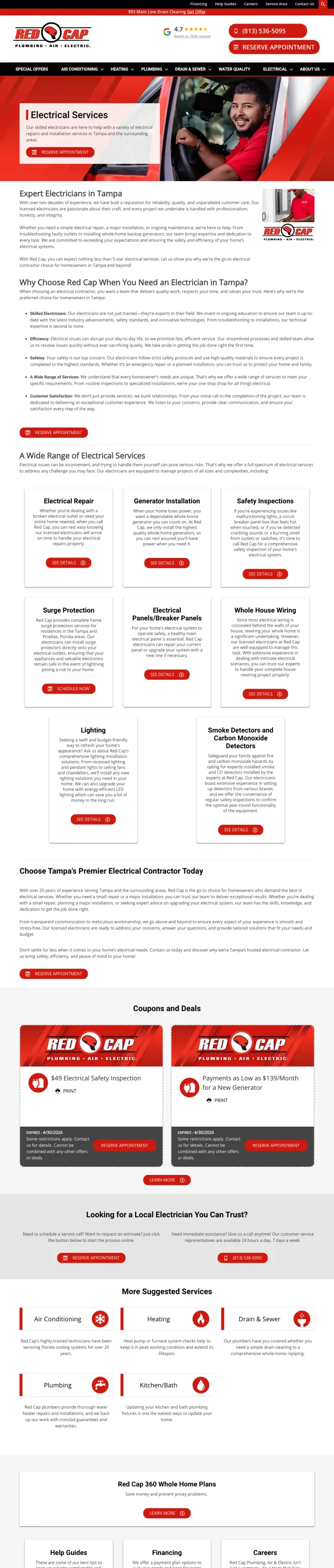
Ad promises 'Red Cap Electrical - There in Minutes, Not Days' but the page is a full website service page with 8-item mega navigation, no specific offer above the fold, and walls of generic copy about 'why choose us.' The visitor who searched 'electrician near me' expecting fast service gets a brochure-style page that requires scrolling past 5 sections to find the $49 safety inspection coupon buried at the bottom. Every paid click at electrician CPCs funds a website tour, not a conversion.
Full site navigation with 8 top-level items (Special Offers, Air Conditioning, Heating, Plumbing, Drain & Sewer, Water Quality, Electrical, About Us) tells the visitor this is a multi-trade company that happens to do electrical, not an electrical specialist -- and each nav link is a paid-click exit path
The hero section says 'Electrical Services' and 'Our skilled electricians are here to help' followed by a 'Reserve Appointment' button -- but the ad promised 'There in Minutes, Not Days' which implies urgency and speed that the generic hero copy does not reinforce
Five 'Why Choose Us' bullet points (Skilled Electricians, Efficiency, Safety, Wide Range of Services, Customer Satisfaction) are generic enough to apply to any trade in any city -- none mention Tampa-specific expertise, license numbers, or quantified claims
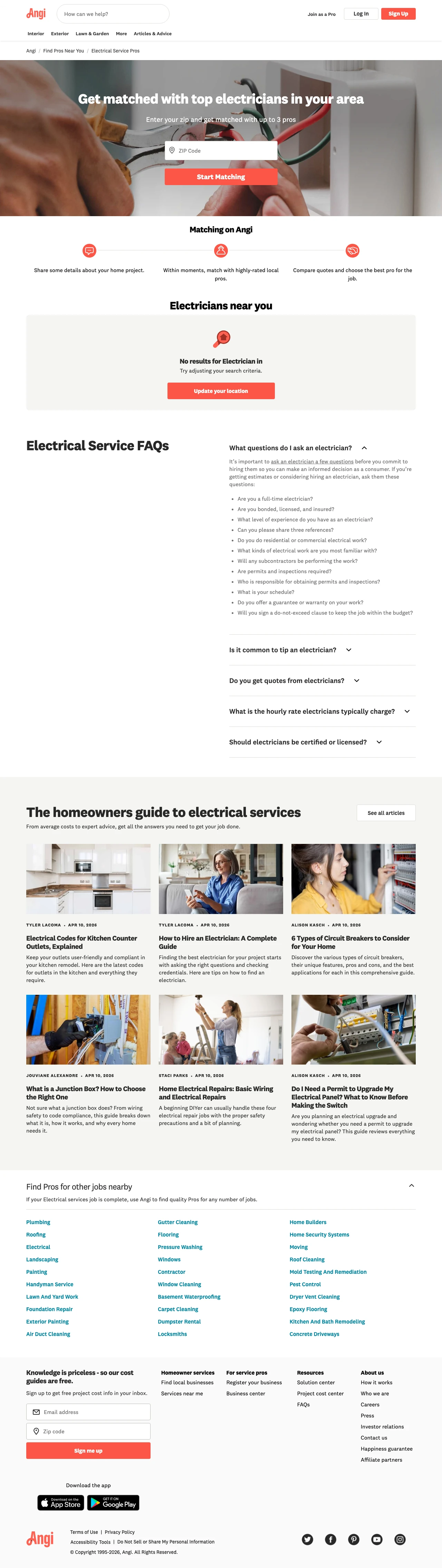
Ad targets people searching for 'electrician near me' at emergency-repair intent but the page is a directory funnel. Hero reads 'Get matched with top electricians in [city]' with a ZIP field before the visitor sees a single pro, their price, or their availability. The searcher paid Angi a click to then paid Angi a lead form. Below the fold there is a listing of 2,409 electricians with no filtering by urgency, and each 'Request Quote' button reroutes into a separate onboarding flow. The searcher who wanted a working outlet fixed today ends up marketed to by 3 pros over the next week.
Hero requires a ZIP before showing any pro, price, or response time -- same friction as Google's own 'local services' feature except Angi charges the searcher AND the pro, where Google only charges the pro
'Showing 1-10 of 2409' with no sort by availability, emergency-service, or distance reduces the directory to a decision-fatigue wall; any pro-matching value gets lost in choice paralysis
Every Request Quote button lands on a separate '/service-request-pro-direct' funnel, meaning each prospect needs to fill the same form repeatedly to message multiple pros -- the platform charges Angi CPCs for leads that generate lead-gen work
Pages built specifically for electrician searches (Bassett, Hutchinson, EI Electrical) deliver a focused message that matches the ad promise. Multi-trade service-area pages (Blanton's) bury electrical content below HVAC and plumbing sections, forcing the visitor who searched 'electrician near me'...
Hutchinson ($50 off electrical repair) and Bassett ($50 off any electrical repair) lead with a concrete discount. This works because electricians are perceived as interchangeable by most homeowners. The $50 off converts a 'get quotes from three electricians' mindset into 'this one already has a d...
Mister Sparky and Mr. Electric both offer phone and online booking prominently above the fold. This matters because electrician searches split between emergency (sparking outlet, power out -- these visitors will only call) and planned work (panel upgrade, EV charger -- these visitors prefer sched...
EI Electrical built a dedicated EV charger landing page with specific offers ($79 off installation, BOGO 25% off second charger, free surge protector). This is a growing, high-value segment where the buyer profile is tech-savvy and willing to pay for quality. Most electricians lump EV charger ins...
Winners build dedicated electrical landing pages with a specific dollar-off offer, dual CTAs (phone for emergencies + online booking for planned work), and at least one verifiable trust signal (license number, Google rating with review count, or years in business with a specific number). Losers send paid electrician traffic to multi-trade service-area pages where electrical is third or fourth in the headline after HVAC, plumbing, and drains, with no electrical-specific offer and no conversion path that acknowledges the visitor searched for an electrician specifically..