Free: 96 PPC tools + my AI Playbook book

These are real accounting / tax services pages spending actual money on Google Ads right now.
From real accounting / tax services Google Ads campaigns in the US
The landing pages actually worth stealing from
So you know exactly what to avoid
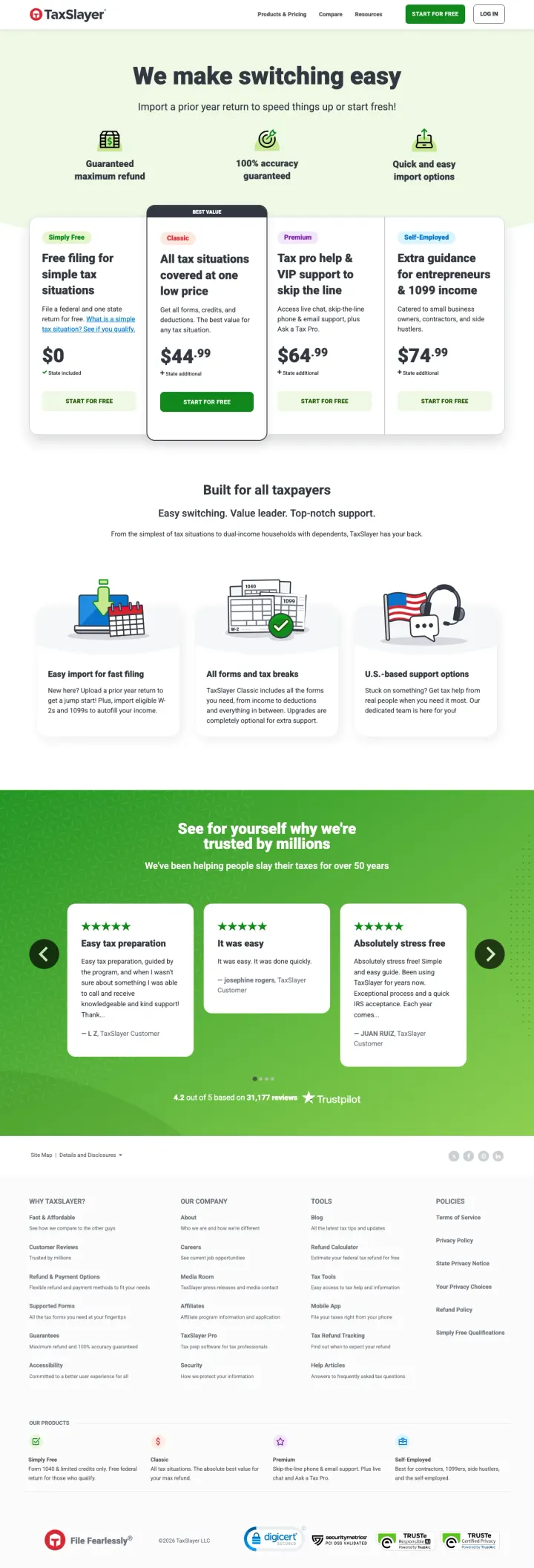
Build your entire landing page around the switching experience, not the product features. TaxSlayer's headline is 'We make switching easy' -- not 'File your taxes' -- because they know the visitor has already decided to switch; they just need reassurance that the transition is painless.
Four pricing tiers ($0 / $44.95 / $64.95 / $74.95) displayed as equal-width cards with feature bullet points beneath each let the visitor self-select their complexity level -- this answers the #1 customer concern (cost) and the #2 concern (does it handle my situation) in one visual component
'100% accuracy guarantee' and 'guaranteed maximum refund' badges appear directly below the hero as trust anchors -- these two guarantees address the 'what if they make a mistake' objection that keeps people with their current provider
Three review platform widgets (Easy Tax Preparation, It was easy, Absolutely stress free) with 5-star ratings from named reviewers provide social proof from real users who switched -- the word 'easy' appearing in multiple reviews reinforces the switching-focused positioning
The 'Import a prior year return' instruction assumes the visitor knows how to export from their current software -- for someone switching from TurboTax, a specific 'How to export from TurboTax' guide would convert more of the hesitant switchers
No mention of what happens to your data from previous years -- the Green-persona visitor worries about losing access to past returns, and this anxiety is not addressed anywhere on the page
The pricing tiers do not explain the difference between 'Classic' and 'Premium' in plain language -- a visitor who does not know whether they need 'all tax situations' vs 'tax pro help' will bounce rather than guess wrong
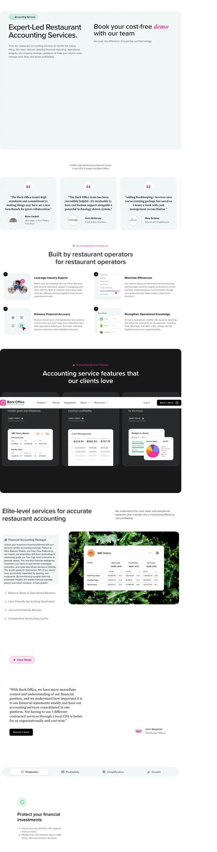
Position your accounting service around the reporting cadence, not just the deliverables. 'Weekly financials so you know your numbers while they still matter, not 45 days after close' reframes speed-to-insight as the competitive advantage, making monthly accountants sound obsolete by comparison.
'4,000+ high-performing restaurant teams in the US & Canada trust Back Office' displayed directly below the hero establishes market share in a specific vertical -- a restaurant owner seeing this number knows they are not an experiment, they are joining a proven system used by thousands of operators like them
18 named testimonials from real restaurant operators (Brian Carduff at Twin Peaks franchise, Mary Scribner at Shanahan's Steakhouse, Danny Hizami at Figueroa Philly) with restaurant logos create an overwhelming wall of social proof that no generalist accounting firm can match in this vertical
'First-year Back Office members typically see a 14% increase in net profit' is a specific, outcome-based ROI claim that lets a restaurant owner multiply their revenue by 0.14 and immediately see whether the service pays for itself -- this is infinitely more persuasive than 'we help improve profitability'
The demo form uses a cookie consent gate ('To view this form, please enable Targeting Cookies') which means visitors with strict browser privacy settings cannot see the primary conversion path at all -- this is a technical bug that silently kills conversions
No pricing visible anywhere on the page despite the ad copy promising 'one flat monthly rate' -- the visitor who clicked because of flat-rate pricing has to book a demo just to learn what the service costs, which contradicts the transparency the ad promised
The page is extremely long with 5 tabbed service descriptions, 4 benefit sections with icons, and 11 FAQ items below the testimonials -- this depth serves organic search but a PPC visitor from 'restaurant accounting services' needs the form and the price, not a white paper
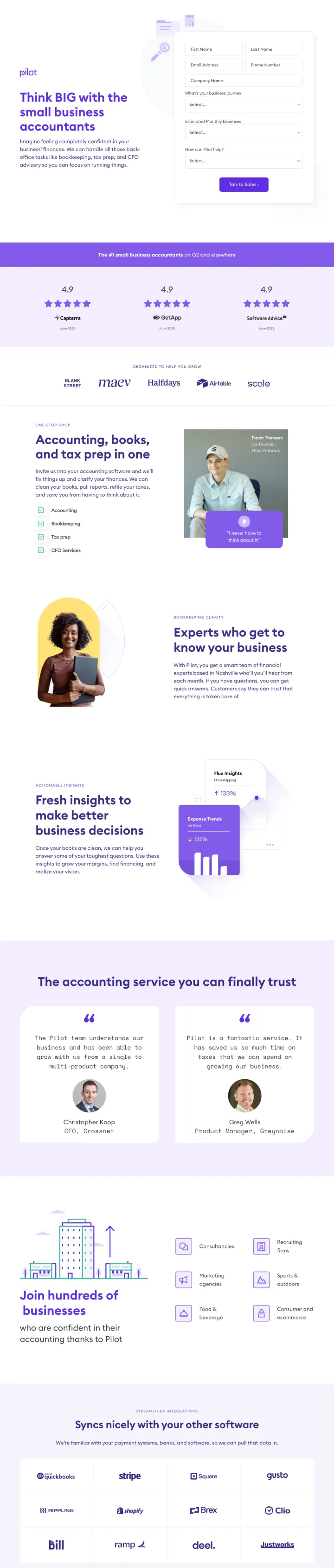
Name the city where your accounting team is based and make it part of the brand identity. 'A smart team of financial experts based in Nashville' does three things: proves the team is real people in a real place, signals US-based (not offshore), and creates a sense of knowing exactly who handles your books.
'The #1 small business accountants on G2 and elsewhere' with 4.9-star ratings from Capterra, GetApp, and Software Advice displayed immediately below the hero headline -- this triple-platform review stack is harder to dismiss than any single review source because the visitor would have to believe three independent platforms are all wrong
Client logos (Airtable, Scale, Blank Street, Maev, Halfdays) are recognizable venture-backed startups, which positions Pilot as the accountant for ambitious companies rather than the cheapest option for solo freelancers -- the logos attract the right customer segment while repelling the price-sensitive buyer who would not be profitable
The service list (Accounting, Bookkeeping, Tax prep, CFO Services) displayed as four purple checkmark items communicates comprehensiveness without overwhelming -- the visitor immediately sees that Pilot can be their single provider rather than requiring them to hire a bookkeeper AND a tax preparer AND a CFO advisor separately
No pricing or even price range visible anywhere on the page -- the ad promises 'Flat Rate Affordable Pricing' but the page requires a conversation before the visitor learns what 'affordable' means, breaking the message match on the most important claim
The only CTA is 'Get in Touch' which scrolls to the hero section -- there is no form, no phone number, no calendar booking widget, making the conversion path unclear for a visitor who decides they want to engage
Named testimonials (Christopher Koop, CFO at Crossnet; Greg Wells, PM at Greynoise) come from titles that suggest these are funded startups, which may intimidate the solo business owner searching 'small business accountant' -- the testimonial voices do not match the ad's target persona
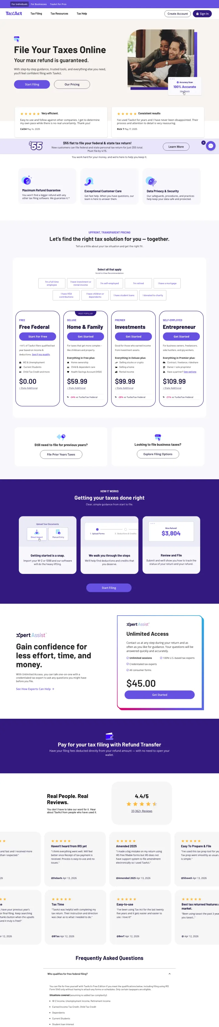
Lead with the guarantee ("Your max refund is guaranteed.") rather than the price. Then show transparent tier pricing below: Free ($0), Deluxe ($29.99), Premier ($49.99), and Self-Employed ($64.99) with clear feature differentiators. The guarantee removes the risk of trying a new tax platform.
"Your max refund is guaranteed" headline eliminates the #1 concern of tax filers switching from TurboTax: "will I leave money on the table with a cheaper service?"
Four-tier pricing from $0 to $64.99 with "Start filing" on each tier lets visitors self-select based on their tax complexity without calling or chatting
Real customer reviews with names, dates, and star ratings ("Very efficient" - Carlie, May 14, 2025; "Consistent results" - Bob P, May 17, 2025) provide recent, specific social proof
The hero lifestyle photo (couple looking at documents) is generic stock photography that every tax software company uses
The four pricing tiers may create analysis paralysis for simple filers who just want to know "how much does it cost to file?"
The $55 flat rate banner at the bottom contradicts the tier pricing above, creating confusion about which price applies
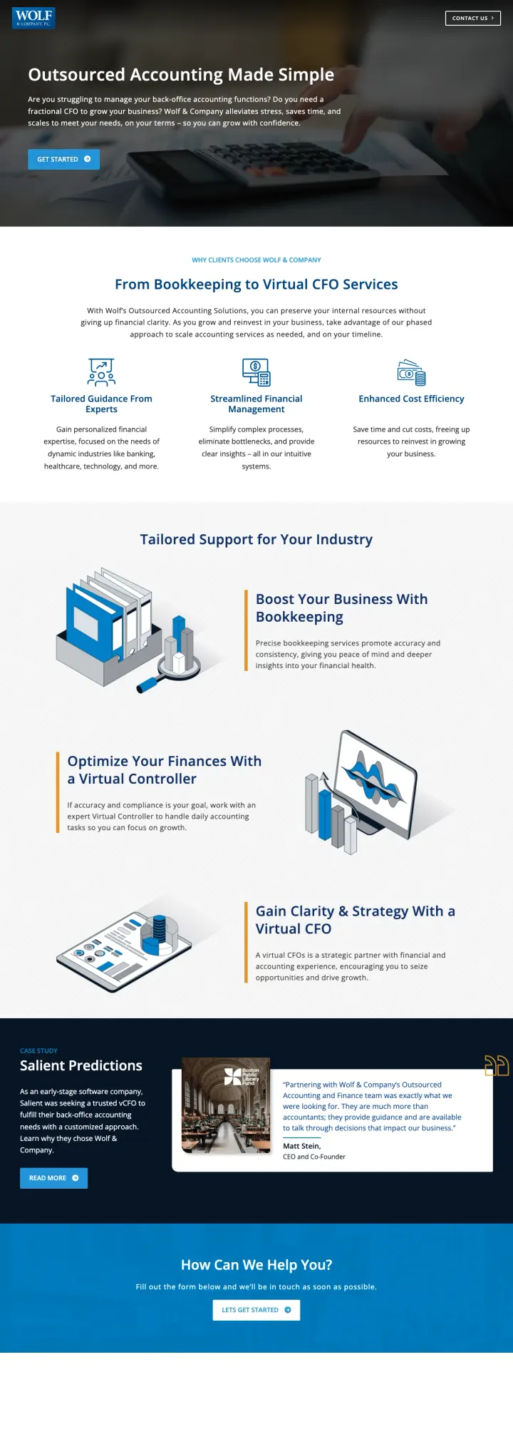
Frame outsourced accounting as "getting your business back" rather than "cutting costs." Wolf opens with "Outsourced Accounting Made Simple" and the value proposition "so you can grow with confidence." Then show three service tiers (Bookkeeping, Virtual Controller, Virtual CFO) that scale with the client's growth, making it feel like a partnership rather than a vendor relationship.
"From Bookkeeping to Virtual CFO Services" framing shows the full growth path: visitors see they can start small (bookkeeping) and scale up (controller, CFO) as their business grows, which justifies a long-term relationship
Three benefit pillars ("Tailored Guidance From Experts", "Streamlined Financial Processes", "Enhanced Cost Efficiency") address the three main outsourced accounting objections: quality, reliability, and cost
"Tailored Support for Your Industry" section with three service tiers (Bookkeeping, Virtual Controller, Virtual CFO) lets the visitor self-identify their need level
No pricing or pricing range visible. For a service that could cost $500-$10,000/mo depending on scope, some indication of investment level would filter out unqualified leads.
"GET STARTED" CTA button is generic and small. A "Schedule a Free Consultation" or "Get a Custom Quote" would set clearer expectations.
No testimonials or case studies visible on the page. For a B2B accounting service, social proof from similar businesses is critical.
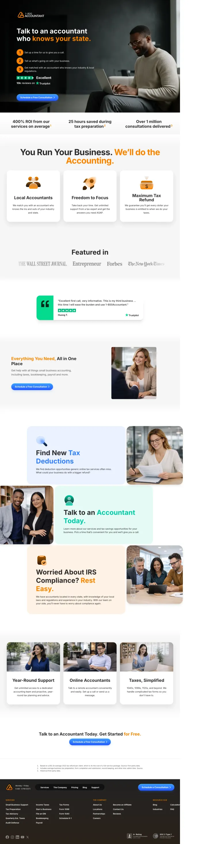
Lead with "Talk to an accountant who knows your state" to create localized relevance from a national service. Then show a 3-step process (Set up a call, Tell us about your business, Get matched with a state-specific accountant) to make the conversion path feel simple and structured.
"Talk to an accountant who knows your state" headline creates instant local relevance for a national service. This is the accounting equivalent of state-specific legal document pages.
Trustpilot "Excellent" badge with "10k reviews" directly below the 3-step process provides massive third-party social proof at the decision point
"400% ROI from our services on average" stat bar with "25 hours saved during tax preparation" and "Over 1 million consultations delivered" creates three quantified proof points
The "knows your state" promise is strong but the page does not show which states are covered or name any specific accountants, which may feel like a marketing claim rather than a verifiable fact
The page targets multiple geo keywords with a single national template, so the state-specific promise is implied rather than delivered
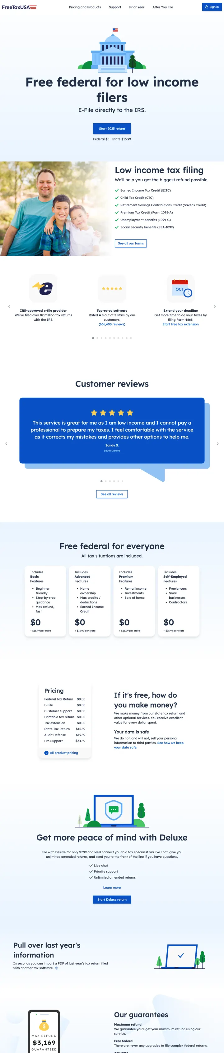
Why This Breaks the Rules: Every other tax software page in this set uses tiered pricing to capture value at multiple levels. FreeTaxUSA leads with 'Free federal for low income filers' and means it -- $0 federal, $14.99 state. This radical price transparency eliminates the entire pricing objection and the entire comparison-shopping behavior because there is nothing cheaper than free. The page does not need testimonials, credentials, or social proof because the price IS the proof.
'100% Free. No forced upgrades on federal returns' directly addresses the bait-and-switch fear that 'free' tax software has trained users to expect -- this anti-upsell promise is more persuasive than any feature list because it preempts the objection that every free-tier user has been burned by before
Customer reviews section shows 5-star ratings with review excerpts from real users, anchored by an overall rating badge -- the reviews specifically mention 'low income' and 'free filing' which confirms the page's positioning through user voice rather than marketing copy
The 'Deluxe' upgrade section ($7.99) is positioned as optional with a clear feature comparison against the free tier -- this transparency about what the paid tier adds (live chat, priority support, amended returns) lets the user decide whether they need it without feeling pressured
The page targets low-income filers but shows a stock photo of a smiling elderly couple on a park bench that looks like a retirement community brochure -- this imagery mismatch may alienate younger low-income filers who are the fastest-growing segment of DIY tax software users
No mention of what 'low income' means in specific dollar terms -- a visitor earning $45,000 does not know whether they qualify for the free filing until they start the process, which creates unnecessary uncertainty at the decision point
The page relies entirely on 'free' as the value proposition with no accuracy guarantee or error protection messaging -- for a visitor who is nervous about filing their own taxes, 'free' answers the cost question but leaves the competence question unanswered
Pages that break the playbook in interesting ways
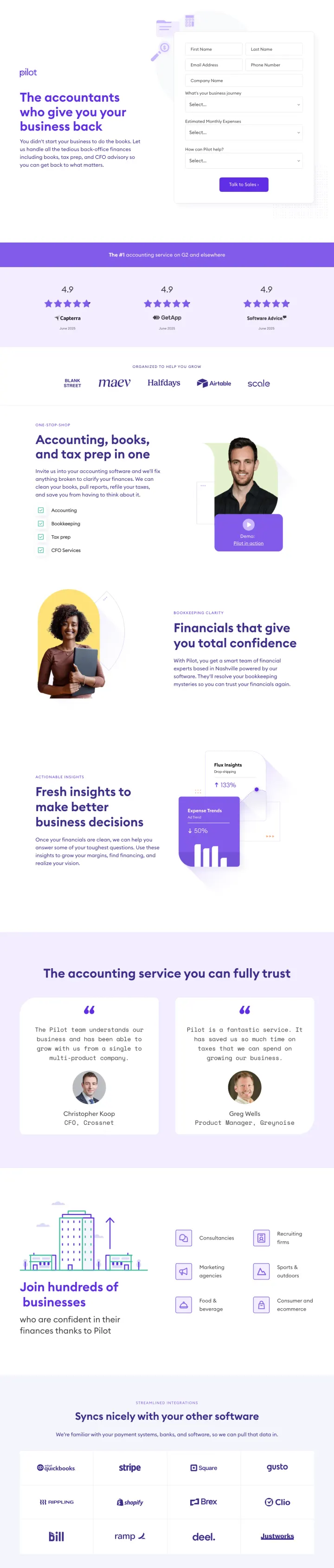
Why This Is Interesting: Pilot's form asks for First Name, Last Name, Email, Phone, Company Name, Business Journey Stage, Monthly Expenses, and "How Can Pilot Help?" -- 9+ fields. For a consumer tax product this would be conversion suicide. But for a B2B accounting service targeting startups spending $10K-$500K/month, aggressive qualification makes sense because each lead is worth $3K-$50K/year in revenue. The form IS the qualifying mechanism.
"The accountants who give you your business back" headline reframes accounting from a cost center to a value enabler. The visitor thinks "I am losing my business to bookkeeping" and this page says "we give it back."
"What's your business journey?" and "Estimated Monthly Expenses" dropdown fields pre-qualify the lead for the sales team, ensuring the conversation starts at the right level
Triple review platform display (Trustpilot, Clutch, G2) below the fold with star ratings from three independent B2B review platforms creates enterprise-grade trust
9+ form fields will produce a high abandonment rate. Even for high-value leads, fields like "Estimated Monthly Expenses" may feel invasive before any relationship is established.
No pricing or pricing range visible. Startup founders comparison-shopping bookkeeping services want at least a ballpark before committing to a sales call.
"Talk to Sales" CTA button feels transactional rather than consultative. "Schedule a Free Strategy Session" would better match the advisory positioning.
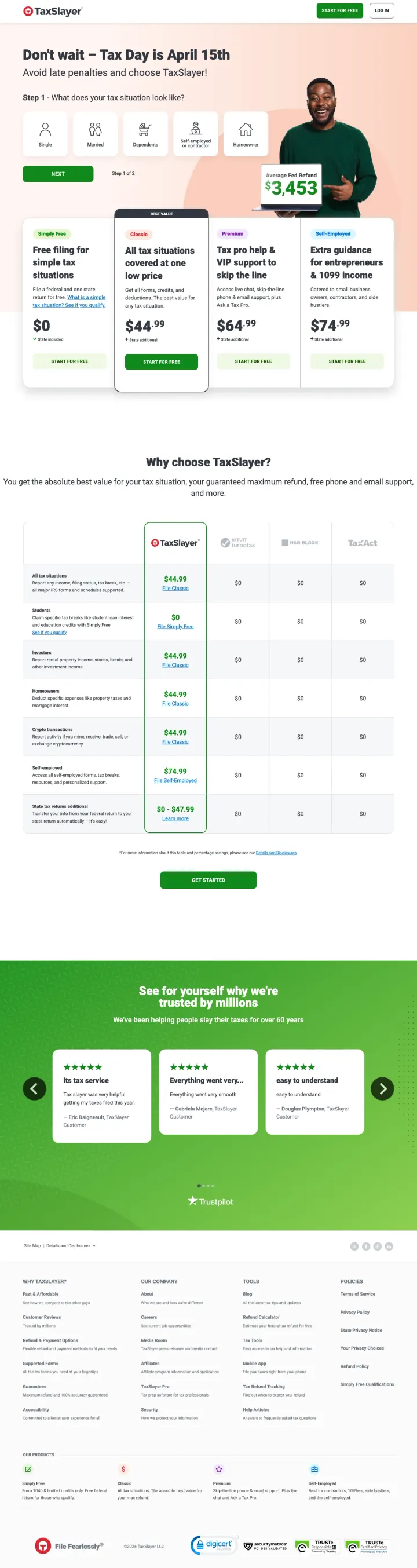
Why This Breaks the Rules: Most tax software landing pages open with a three-column Simply Free / Classic / Premium plan table. This page opens with five persona icons (Single, Married, Dependents, Self-Employed, Homeowner) and asks 'What does your tax situation look like?' The persona picker front-loads qualification so the recommendation feels custom, not sold. It also lets the $3,453 average refund figure appear once, centrally, rather than being repeated per-plan.
Persona icons (Single / Married / Dependents / Self-Employed / Homeowner) replace the generic plan comparison. The visitor's life situation is more memorable than a feature matrix, and the click that follows self-segments them into the right plan path
A single central stat ('$3,453 average refund') with a photo of a happy filer anchors the page emotionally in a way that the usual three-tier price table cannot. Repeated stats across plans become noise, one central stat becomes a promise
The Step 1 of 2 progress indicator at the bottom reframes the landing page as the first step of the product, not a marketing page. The commitment to continue feels smaller because the visitor is already inside the experience
Hero headline 'Don't wait, Tax Day is April 15th' is urgency-based, not benefit-based. A benefit headline ('Find the filing option that matches your life in 30 seconds') would serve the persona-picker design better
The plan cards below the persona picker (Simply Free / Classic / Premium / Self-Employed) reintroduce the feature-matrix logic the persona picker was trying to replace, which dilutes the wildcard approach
3 pages burning ad spend with fundamental issues
Every click to these pages costs real money. We found broken trust signals, mismatched intent, weak CTAs, and messaging that ignores what the searcher actually typed. Here is what to avoid.
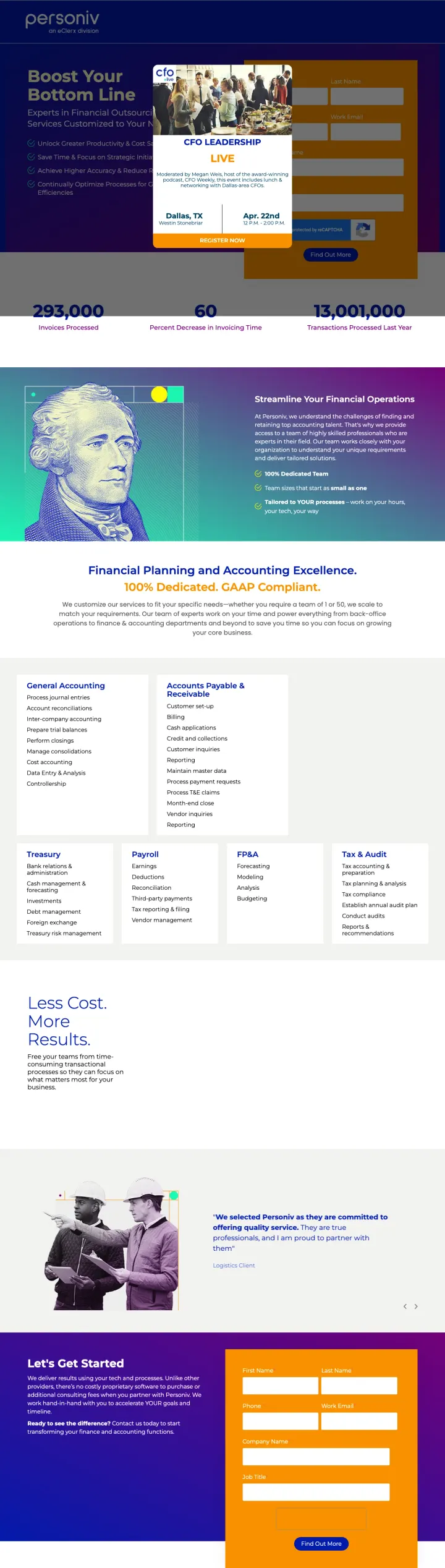
At $15-40 per click for accounting keywords, sending traffic to a page with a dark blue/purple/gold color scheme, a stock photo of a US dollar bill with Benjamin Franklin, and a headline that says 'Boost Your Bottom Line' is paying premium CPCs for a page that looks like it was built in 2015 and says nothing specific about what the service actually does.
The hero section uses a dark gradient with a stock image of US currency (Benjamin Franklin on the $100 bill) that looks like a 2010-era financial services template -- this visual execution actively undermines any trust the page tries to build because it signals 'we have not invested in our own marketing'
The headline 'Boost Your Bottom Line' could apply to literally any business service -- it communicates zero about what Personiv does, who they serve, or why their accounting outsourcing is different from any other provider
'100% Dedicated GAAP Compliant' appears mid-page as a highlighted banner but GAAP compliance is the legal minimum, not a differentiator -- advertising GAAP compliance is like a restaurant advertising that they wash their hands
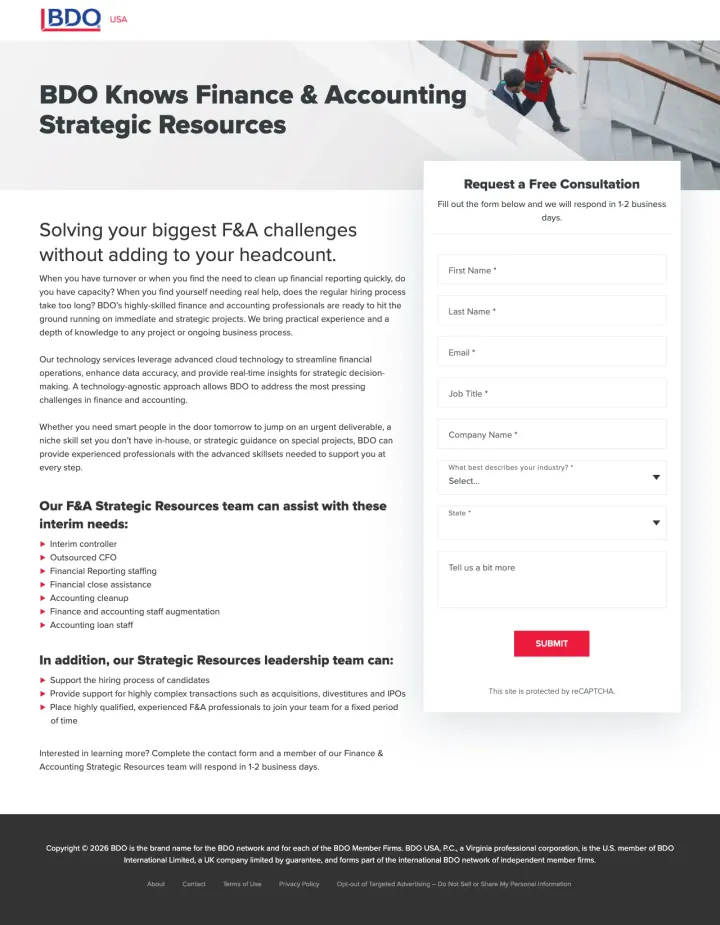
At $15-40 per click for bookkeeping keywords, BDO sends traffic to a single-page form with dense paragraph text and zero visual proof of capability. The page asks for first name, last name, email, job title, company name, industry, and state before the visitor has any evidence that BDO can solve their problem. This is a lead capture page, not a landing page.
The page is a single-column form with dense paragraph text and one stock photo of a woman jogging up stairs -- there are no testimonials, no client logos, no case studies, no credentials, and no evidence that BDO has ever successfully delivered F&A services to anyone
The form demands 8 fields (name, email, job title, company, industry, state, description) before the visitor has seen any proof of BDO's capability -- this is asking for maximum information while providing minimum value in return
The ad targets small business queries like 'bookkeeper for shopify' but the page language is enterprise B2B ('F&A challenges,' 'headcount,' 'strategic resources') creating a jarring mismatch between the visitor's context and the page's tone
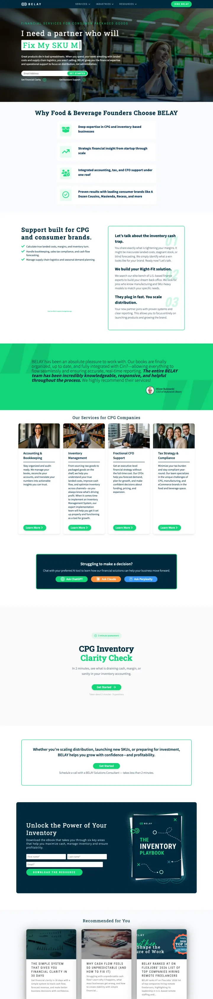
At $15-40 per click, the page targets 'retail accounting help' and 'CPG inventory experts' but leads with a dark hero asking visitors to 'Book a consult' before explaining what BELAY actually does differently. A CPG brand owner searching for accounting help gets industry buzzwords ('multi-warehouse reports,' 'SKU-level cost accounting') without any evidence of outcomes or pricing.
The page uses alternating dark green/teal panels with light sections creating a fragmented visual experience -- the visitor's eye has no clear path from headline to value proposition to form, and the dark panels make body text difficult to scan
The hero section says 'Financial Services for Consumer Packaged Goods' but the ad copy promises 'Multi-Warehouse Reports' and 'CPG Inventory Experts' -- the page headline is generic category labeling while the ad makes specific capability claims that are not immediately visible on the page
The form appears mid-page but is preceded by multiple content sections that explain what CPG accounting involves rather than why BELAY is the right provider -- the visitor already knows they need CPG accounting (they searched for it); they need to know why BELAY specifically
The strongest tax software pages display 3-4 pricing tiers side by side (Free / Classic / Premium / Self-Employed) with feature bullet points under each tier. This works because the Blue-dominant accounting buyer needs to compare options systematically, and pricing tiers let them do that comparis...
When someone searches 'restaurant accounting services' and lands on a page headlined 'Expert-Led Restaurant Accounting Services' with restaurant-specific metrics (food cost, labor percentage, 13-period accounting cycles), the message match is immediate. When the same person lands on 'Boost Your B...
Pilot.com shows a named co-founder testimonial ('I never have to think about it' -- Trevor Thomson, Ethos Network) and names their team as 'financial experts based in Nashville.' 1800accountant.com leads with 'Talk to Your Advisor' and shows a photo of a specific person. In accounting, you are tr...
TaxSlayer's entire landing page is built around 'We make switching easy' with a 3-step process (import prior return, upload W-2, start filing). This is brilliant because the biggest barrier in accounting is not finding a new provider, it is leaving the old one. The Green-secondary persona in acco...
Winners lead with specific guarantees (max refund, flat-rate pricing, state-specific expertise) and transparent pricing tiers that let visitors self-select. Losers send paid traffic to generic content pages, gated whitepapers, or educational articles that explain accounting concepts without enabling the visitor to take action..