Free: 96 PPC tools + my AI Playbook book

These are real addiction treatment pages spending actual money on Google Ads right now.
From real addiction treatment Google Ads campaigns in the US
The landing pages actually worth stealing from
So you know exactly what to avoid
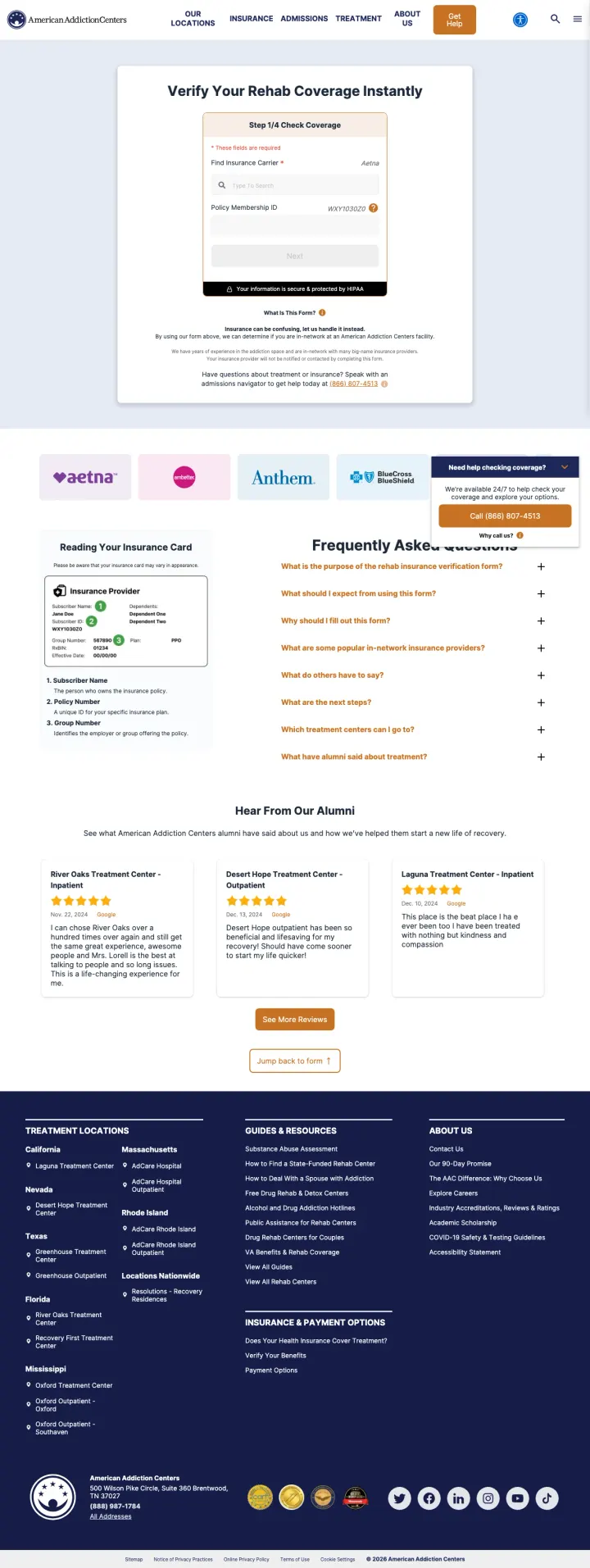
Turn the primary hero into a progress-bar form (Step 1/4, Step 2/4). Rehab visitors already know they need treatment, they do not need to be sold. They need to know if their insurance will pay. A multi-step form converts 2-3x better than a single long form because each step feels like progress toward an answer, not a commitment.
'Verify Your Rehab Coverage Instantly' as H1. The promise is immediate and specific. Not 'Learn about coverage' or 'Explore treatment options'. The verb is 'Verify', the modifier is 'Instantly'. Match the visitor's literal question.
'Your information is secure & protected by HIPAA' badge inside the form card. HIPAA is the trust currency in healthcare; surfacing it at the point of data entry (not in a footer) is the trust move that closes the conversion.
Dual-path closer: 'Have questions about treatment or insurance? Speak with an admissions navigator to get help today at (866) 807-4513.' The form is for self-serve, the phone is for hand-holding. Visitors self-sort by which feels safer right now.
The 'Aetna' placeholder next to the insurance search field is a helpful example but it also biases the visitor toward thinking only major carriers are accepted. A rotating placeholder or a short 'We work with 100+ carriers' line would widen the net.
No accreditation badges visible above the fold. CARF and Joint Commission logos are the other half of the trust equation in this vertical, and the page leans entirely on the AAC brand to carry them.
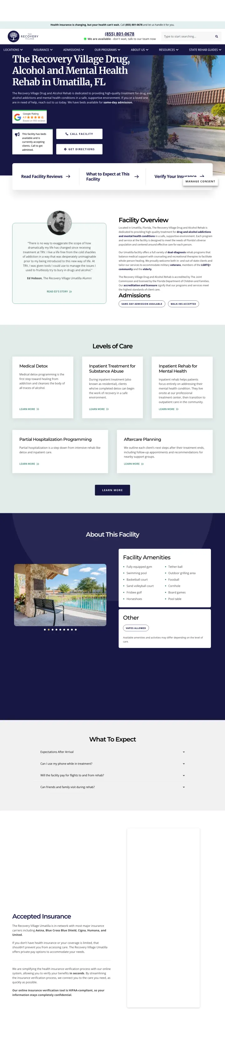
Offer four actions side by side in the hero before forcing a single decision: 'Read Reviews', 'What to Expect', 'Verify Insurance', 'Get Directions'. Families in crisis arrive with different urgency levels; a multi-path header lets the anxious mom and the ready-to-commit sister both find their next click immediately.
Four quick-action buttons stacked horizontally right above the fold: 'Call Admissions', 'Get Directions', 'Read Facility Reviews', 'Verify Your Insurance'. No primary CTA, because the visitor's primary question differs by arrival mode.
Named alumni with photos in a testimonial block near the fold. Not stock 'grateful family' images. Real first-name-last-name-photo alumni who consented to appear. This is the anti-patient-brokering signal families are scanning for.
'We are available, don't wait, talk to our team now' banner with phone directly below. Short, non-clinical, urgent without being pushy. A rehab visitor at 2am reads this and feels permission to call.
The accreditation logos are present but sit in a small strip that blends into the footer. Joint Commission and CARF deserve hero-band placement in this vertical.
The hero image is a static exterior photo of the facility. A 30-second facility walkthrough video would convert visitors who are 'not sure this is a real place', which is a real objection for the patient-brokering-scarred rehab category.
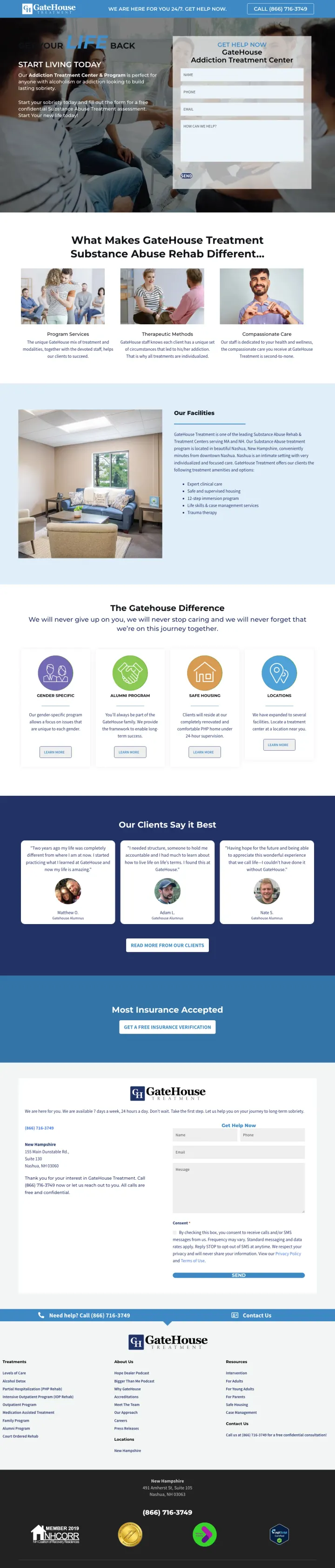
Replace abstract 'healing' headlines with a declarative promise that names the outcome: 'Start Living Today' beats 'Begin Your Journey'. The hopeful-but-concrete frame cuts through the stock recovery-industry language.
'YOUR LIFE BACK' cross-fade headline with 'START LIVING TODAY' sub-head. Two beats: the outcome and the invitation. Many rehab LPs get stuck on the first beat (hope) and forget the second (action).
Right-rail 'GET HELP NOW' form locked in the hero. Fields for name, phone, email, and 'how can we help' text area. The text area lets the visitor surface a specific substance or behavior, which warms the admissions call.
Facility photo below the fold is a real bedroom interior, not a stock resort shot. It communicates 'this looks like a residence, not a hospital', which matches what Green-dominant family-member visitors want to see.
'What Makes GateHouse Treatment Substance Abuse Rehab Different' as a section heading is too long and starts with a question that implies a marketing answer. 'Why GateHouse' is sharper and gets out of the way.
The testimonial block uses quote marks and paragraph text but no photos or names. For a vertical where skepticism is high, anonymous testimonials are almost worse than no testimonials.
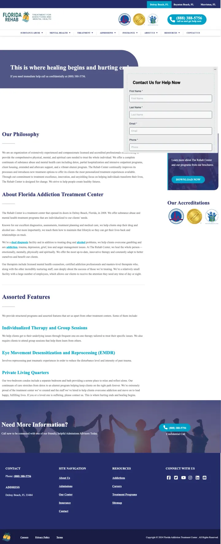
Pin the CARF, Joint Commission and state licensing badges to the upper nav so they are visible at every scroll depth. Most rehab sites bury accreditation in the footer or an 'About' page. Anchoring them next to the phone number gives every pixel of the page a credibility backdrop.
Three clickable location pills (Delray Beach FL, Boynton Beach FL, Morriston FL) above the logo. Visitors self-segment by location before the hero even loads, and landing on the right one increases message match immediately.
Phone CTA styled as a teal rounded pill with 'call us and get help now' as the sub-line. The phrasing is direct but warm, which fits the Green-dominant family persona better than 'Call Now'.
Hero headline 'This is where healing begins and hurting ends' followed by 'If you need immediate help call us confidentially at [phone]'. The word 'confidentially' is earning a lot of conversions here: it acknowledges the shame barrier without dwelling on it.
The hero image is almost entirely covered by the form card, which cuts the 'healing begins' headline in half. On smaller viewports the headline truncates mid-word.
The 'Our Philosophy' section sits before 'About Florida Addiction Treatment Center'. Mission statements below the fold are fine; above-fold philosophy copy competes with the conversion.
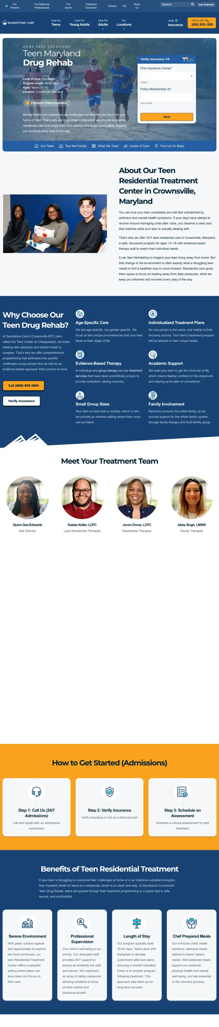
Replace generic 'addiction treatment' headlines with a named audience and a named place. 'About Our Teen Residential Treatment Center in Crownsville, Maryland' out-converts 'Nationally Recognized Adolescent Treatment' because a searching parent needs to know it is for their teenager in their state, not another family's generic loved one.
Hero photo of three actual teenage patients smiling and holding notebooks. Not stock. Not grief-adjacent. Shows the outcome parents are looking for: teens who look healthy and engaged.
Five-item horizontal nav (Our Team / Tour the Facility / What We Treat / Levels of Care / Find Us On Maps) immediately above the fold. The exact five questions a parent has after 'is this real and will my teen be safe'.
Copy that names the visitor's internal state: 'feeling completely outmatched by addiction and mental health symptoms'. Parents of struggling teens read that and think 'this place understands my kid'.
No insurance verification path above the fold. For a teen residential program that costs $30K+ for 45 days, the 'will my plan cover this' question hits harder than usual. Adding a verification pathway here would be the obvious lift.
The five-item nav uses generic icons that don't tell you anything. Real micro-thumbnails (a tiny team photo, a facility still) would let the visitor preview each section without clicking.
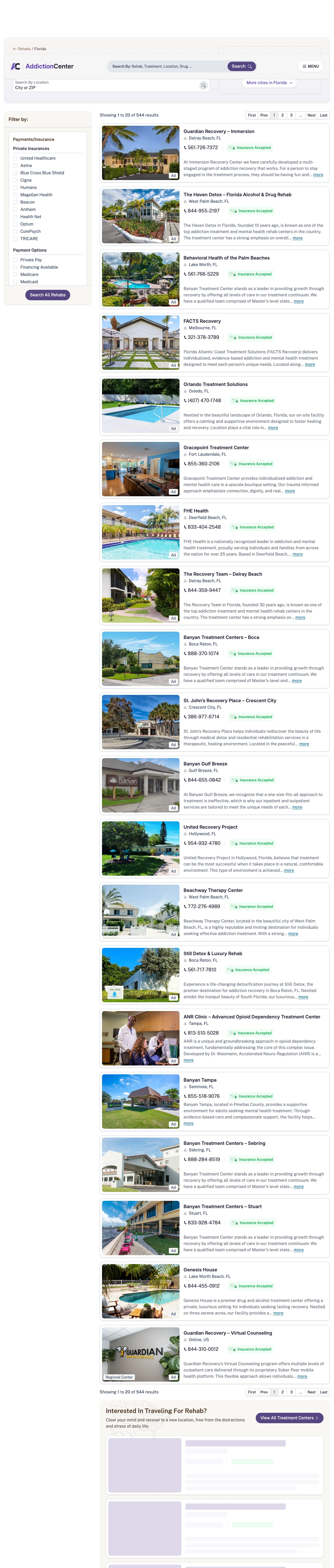
If you cannot out-outspend a national rehab on brand, rank as the directory visitors use to compare. AddictionCenter turns every facility listing into a mini-landing-page with a photo, a phone number, and an 'Insurance Accepted' badge, so the visitor never has to click away to compare.
Each facility card includes a phone number directly on the listing. The visitor can call a specific rehab without leaving the directory, which is the conversion event the site earns commission on.
Left-rail filter system with 'Private Insurance' expandable into specific carriers (United, Aetna, Cigna, BCBS, Humana, Magellan, Beacon, Anthem, TRICARE). Lets visitors self-segment before seeing a single listing.
'Insurance Accepted' badge in the top-right of every card. A single visual token does the work of a paragraph of copy, and it is the one signal the visitor is scanning for.
The top of the page shows a standard search bar above the listings with no value prop. 'Find a Florida rehab that accepts your insurance' as a H1 would reinforce why this is the page to scroll.
The grey photo-card template for each facility is visually uniform. Visitors cannot tell which listings are editorial and which are sponsored. A subtle badge would add transparency.
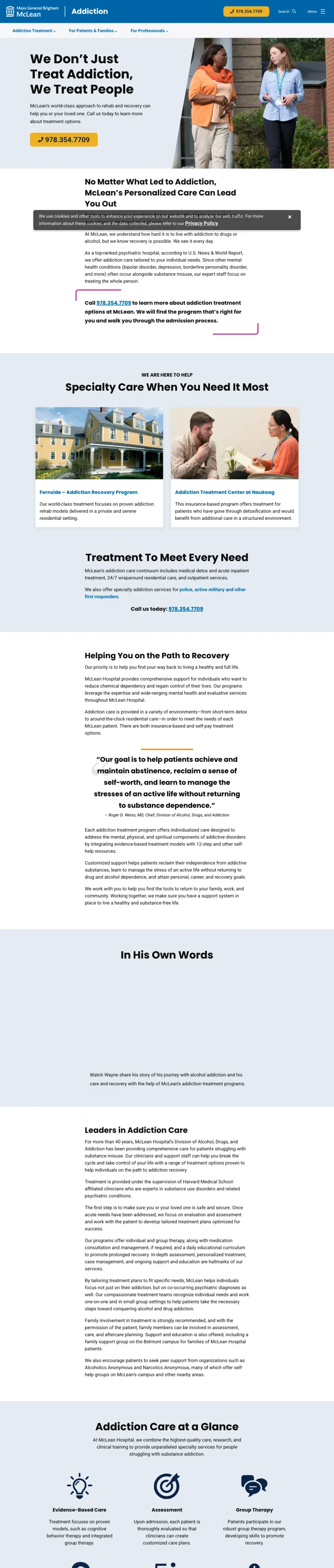
Lead with a human sentence, not a medical one. 'We don't just treat addiction, we treat people' is the kind of line that a top-ranked psychiatric hospital normally wouldn't allow itself, but it is exactly what a Blue-analytical spouse researching McLean at 1am needs to read before they scroll down to see the U.S. News ranking. Warmth first, credentials second.
Tiled program cards in the hero each with a real facility photo (Fernside yellow inn, clinical buildings). Each tile is clickable into a dedicated program page. Lets the researcher segment themselves into the right level of care without a call.
Phone number doubled in the hero: 978.464.2331 printed as a headline and repeated in-copy. Mass General Brigham visually anchors the logo so the Harvard pedigree carries the trust without shouting it.
'As a top-ranked psychiatric hospital, according to U.S. News & World Report' framed inside a sentence about personalized care. Credentials used as evidence for warmth, not as a brag. Most rehab pages do the opposite.
The hero has no insurance verification entry point. McLean accepts most major insurance but a visitor needs to scroll and click 'For Patients & Families' to find out. A 'Do we take your plan?' widget in the hero would remove that friction.
The cookie consent banner at the bottom of the viewport eats vertical space on mid-sized laptops. It covers the phone number until dismissed.
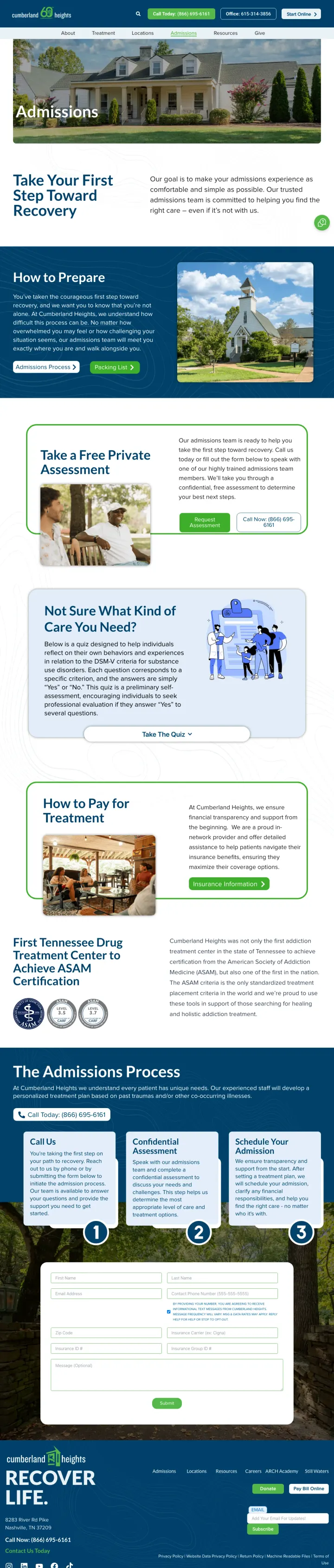
Reframe the admissions page around a 'Take a Free Private Assessment' offer instead of a fields-first contact form. The clinical framing gives the visitor a reason to provide the same information (name, phone, situation) but recasts the exchange as diagnostic help rather than sales qualification. Reduces the 'this is a lead form' resistance that kills rehab LP conversions.
Two side-by-side CTAs in the hero: 'Request Assessment' and 'Call Now: 800-646-9998'. Call is offered at parity with the form, not as a footer afterthought. Crisis-mode visitors hit call, research-mode visitors hit the assessment, both are served without a split-decision moment.
'Our trusted admissions team is committed to helping you find the right care, even if it's not with us.' That sentence alone deflates the hard-sell fear. Families have been burned by patient-brokering networks; the 'even if it's not with us' promise is the kind of line only a non-profit can credibly make, and it earns its keep.
A Packing List PDF link ('CH-Admissions-Guidelines-and-Packing-List') sitting inside the hero. Unusual to surface this deep in the funnel, but it signals 'you are going to be admitted somewhere' and shifts the visitor's mental state from decision to preparation.
The hero headline 'Take Your First Step Toward Recovery' is a category cliche. Every rehab LP uses 'first step'. The assessment offer carries the page; a sharper H1 would amplify it instead of dragging on it.
No insurance carrier logos visible above the fold. Tennessee BCBS acceptance is a key local trust signal that sits buried under a 'Payment Options' section 3 scrolls down.
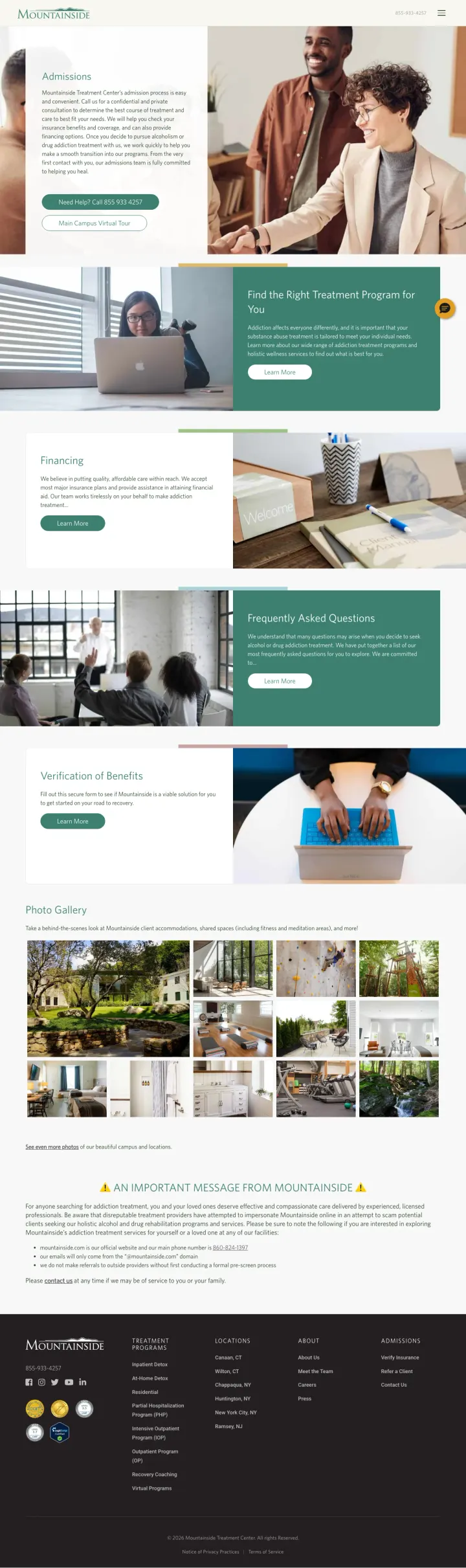
Put a three-way 'Who is seeking treatment?' selector as the first field of your admissions form. Mountainside does this and the segmentation immediately routes the patient/family-member/clinician conversation down different tracks. For a vertical where the searcher is usually NOT the person who will be admitted, this is the single highest-leverage form-field change available.
'Myself / A Loved One / A Client' segmentation as form field #1. Most rehab LPs assume the visitor is the patient. Mountainside assumes the opposite and offers all three paths without friction. Downstream messaging (admissions specialist scripts, auto-responder email, triage) can branch on this single answer.
Inline insurance carrier dropdown (Aetna, BCBS, Cigna, UnitedHealthcare/Optum, Magellan, Other/Unsure, Self-Pay) inside the admissions form. The Self-Pay option is visible, which deflates the 'will you work with me if insurance denies' fear.
Photo of two real people shaking hands as the hero image. Not a sunset, not a wellness stock photo. It is the visual equivalent of 'we will meet you where you are'. A small visual choice that does an enormous amount of emotional work.
'Main Campus Virtual Tour' link sits below the primary CTA. For a luxury-adjacent Connecticut campus this is a waste, the tour should be in the hero visual rotation.
The body paragraph about financing options buries a useful fact (flexible payment plans exist) in a generic admissions paragraph. A single pricing/financing pill in the hero would give the Blue-analytical visitor a faster on-ramp.
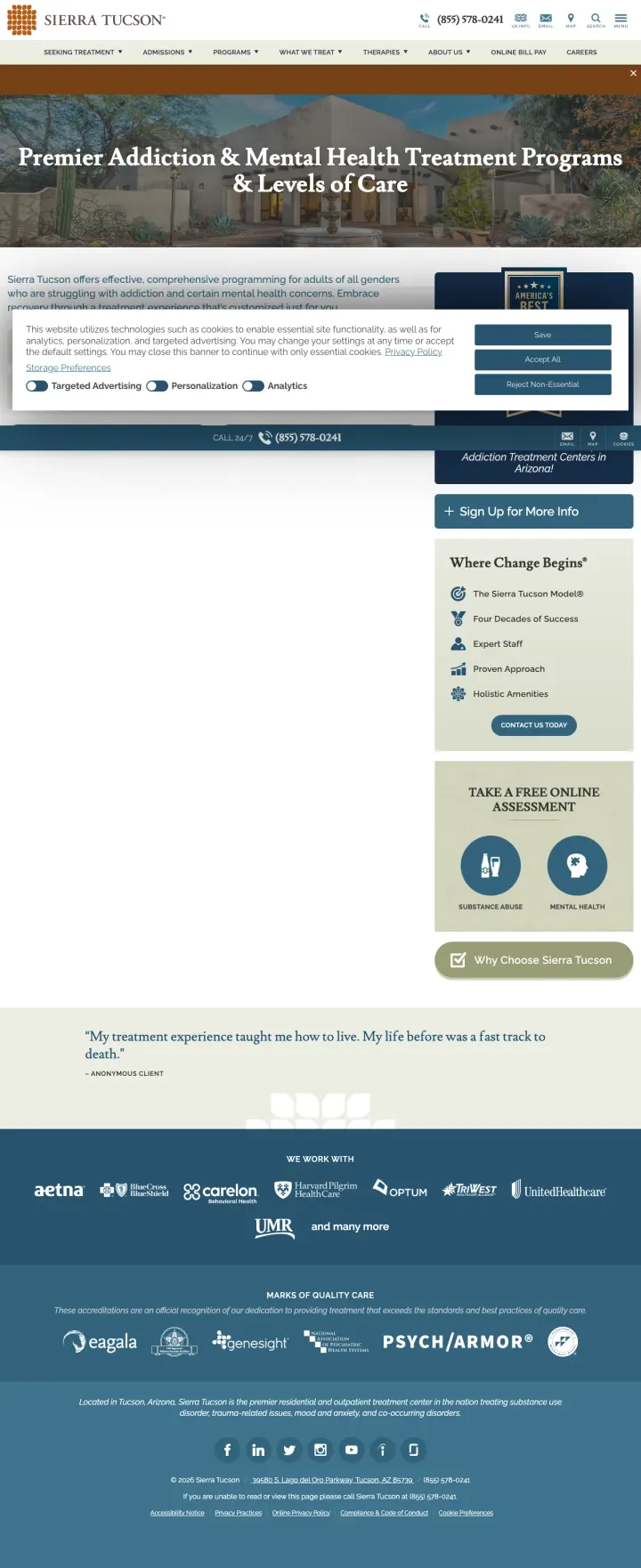
Hold the positioning all the way through. Sierra Tucson leads with 'Premier Addiction & Mental Health Treatment Programs & Levels of Care' and pairs it with an America's Best Behavioral Health Hospitals badge. If you are selling $40K+ residential care, every element needs to agree on that price point. One stock photo undermines the entire thesis.
America's Best Hospitals badge pinned to the hero. In a vertical where patient-brokering has trained family members to distrust rehab marketing, a third-party ranking (not self-issued) is the single highest-value trust asset a luxury program can surface.
'Premier' paired with 'Levels of Care' in the hero H1. 'Premier' alone reads like marketing; 'Levels of Care' is clinical-specific and matches how healthcare shoppers think. Mixing the two reaches both the Blue-analytical researcher and the Green-dominant family member.
Three insurance/aftercare badges (Aetna, Anthem, Carelon, Cigna, Optum, UnitedHealthcare) shown as clean logos without commentary. A luxury program saying 'we accept major insurance' without begging for calls is the right tone for the $40K+ segment.
The hero photo is a wide desert landscape with the Sonoran sky. Beautiful, but the facility itself (a recognizable high-desert residential campus) is not visible in the viewport. Showing the actual campus would reinforce the luxury framing faster than the atmospheric shot.
Cookie consent banner takes over the viewport on first load, blocking the phone number. For a high-intent paid visitor, the first thing they should see is the way in.
Pages that break the playbook in interesting ways
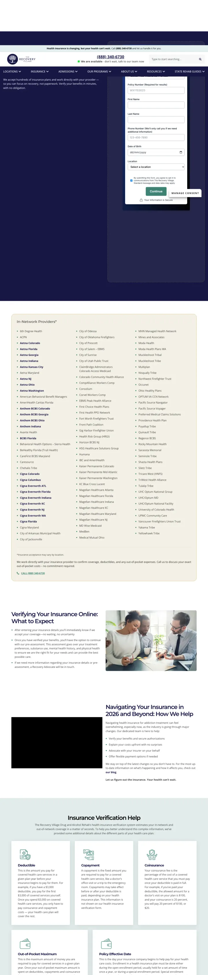
Build a standalone insurance verification landing page that gets its own ad group, separate from your program pages. The Recovery Village runs two parallel funnels: facility pages for visitors researching WHERE to go, and this insurance page for visitors asking CAN I go. The split funnel lets bidding match visitor intent rather than shoving 'will my plan cover this' into a corner of a program page.
The page is 80% form with a tall 'Continue' button as the primary action. Unusual for a 50+ state network to commit a whole URL to insurance verification, but it means the paid click sees exactly what the ad promised: a form that starts verification, now.
'Phone Number (We'll only call you if we need additional information)' as a field label. A single parenthetical removes the top unspoken objection ('will they spam-call me'). This kind of contextual, sentence-level copy is worth 2-3x conversion rate on forms in skeptical categories.
Location dropdown as form field #4 after name, phone, and DOB. Lets the visitor self-segment into the closest Recovery Village facility before the form even submits, which pre-qualifies the lead for the regional admissions team.
Above the fold, the left half of the viewport is empty navy space while the form sits on the right. The dead real estate should hold either an alumni testimonial, an accreditation badge, or a 'what happens next' timeline, because a lead form with no supporting content forces the visitor into trust-fall mode.
The form asks for Date of Birth before asking for an insurance carrier. A verification form should lead with carrier and policy ID, because that is the information the visitor came to provide. DOB can come later in the flow.
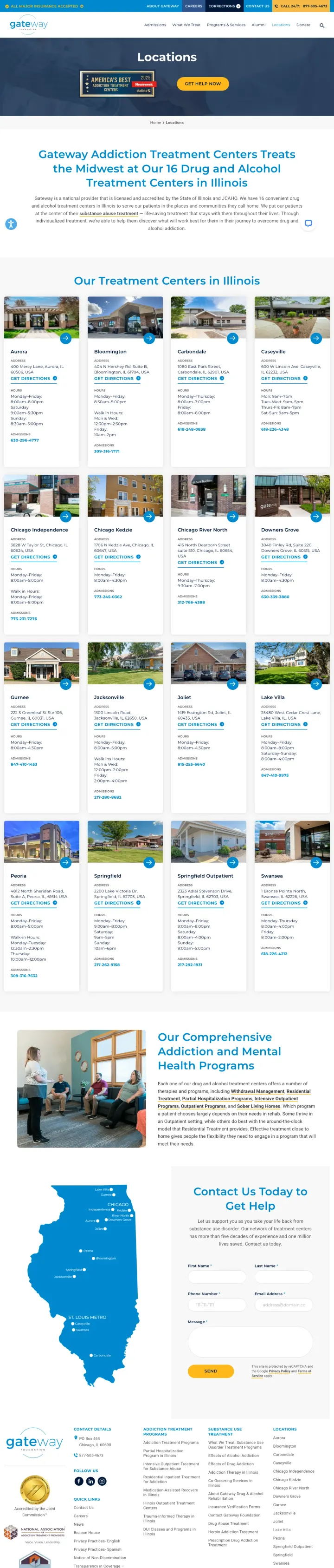
Lean hard into regional dominance instead of faking national scale. Gateway calls itself 'the Midwest's 16 Drug and Alcohol Treatment Centers in Illinois' and stops there. Most multi-facility operators pretend to be national; Gateway's narrower claim is both more credible and more defensible, because it names a specific state and a specific number.
'16 Drug and Alcohol Treatment Centers in Illinois' as the hero sub-headline. The specific number (16) and the specific geography (Illinois) do the work that 'leading provider' normally fails to do. Visitors trust integers more than adjectives.
Table-of-content anchor links at the top of the page (Signs and Symptoms, Causes, Risk Factors, Success Stories). The long-form structure is tuned for SEO but the anchor nav makes it usable for paid traffic too, because visitors can self-route to 'Success Stories' without scrolling through the clinical content.
Licensed and accredited by the State of Illinois and JCAHO as the first credibility line. For a non-profit, state licensure is a real differentiator against for-profit national chains; surfacing it in the hero paragraph (not a footer badge) is the right use of the asset.
'Locations' as the page title over-indexes on SEO intent. For paid traffic, the page would convert better under a 'Find a Gateway Center in Illinois' H1. The word 'Locations' signals a directory, not an on-ramp.
Hero shows an 'America's Best' badge next to a 'Get Help Now' button on a navy banner. The banner styling overwhelms the (otherwise clean) location cards that follow, creating two competing visual levels on the same page.
3 pages burning ad spend with fundamental issues
Every click to these pages costs real money. We found broken trust signals, mismatched intent, weak CTAs, and messaging that ignores what the searcher actually typed. Here is what to avoid.
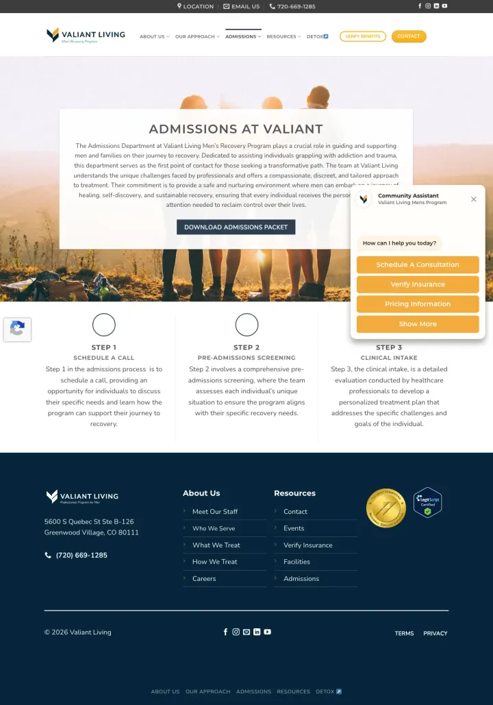
Colorado rehab CPCs are $60+. Sending that click to a PDF download while a chatbot, cookie banner, and privacy consent all fire simultaneously wastes the impression at the moment of highest purchase intent.
Primary CTA is 'Download Admissions Packet' (a PDF). A visitor in crisis mode does not want homework. The conversion funnel asks for more work at the moment the visitor has the least bandwidth.
Three 'Step 1 / Step 2 / Step 3' tiles sit below the hero as empty outlines until you scroll further, which delays any sense of progress. The page reads like an internal process diagram, not a visitor onboarding.
Cookie consent popup, community-assistant chatbot, and privacy banner all fire simultaneously on load. The three overlays together block the hero paragraph and force the visitor to dismiss or close three separate UIs before they can read the page.
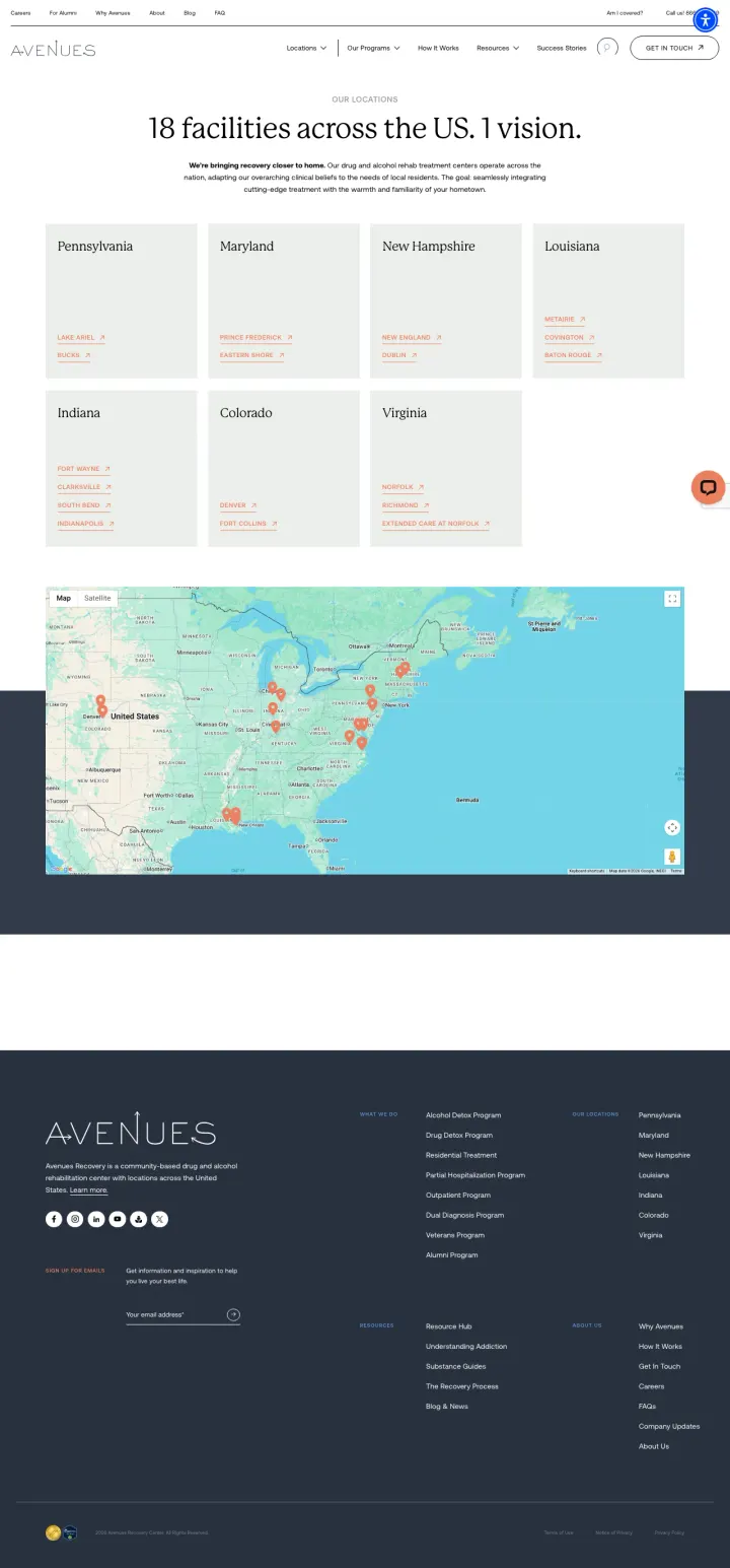
Generic 'drug rehab near me' CPCs run $50-100 in major metros. Dropping that paid click onto a no-CTA state-picker grid guarantees the lead will bounce or click away to a competitor with a phone number in the hero.
The page is a 7-state directory grid with city sub-links. For paid traffic landing from 'drug rehab near me' or state-specific queries, this is two clicks too many. The visitor has to pick a state, then a city, then a program, before seeing any human.
No insurance verification, no phone number, no form above the fold. 'Get in Touch' is a nav-bar CTA only. For a crisis-moment visitor this is a dead end.
Clinical copy ('adapting our overarching clinical beliefs to the needs of local residents') above the fold is corporate-speak that does nothing to reduce the family-member anxiety the page is supposedly addressing.
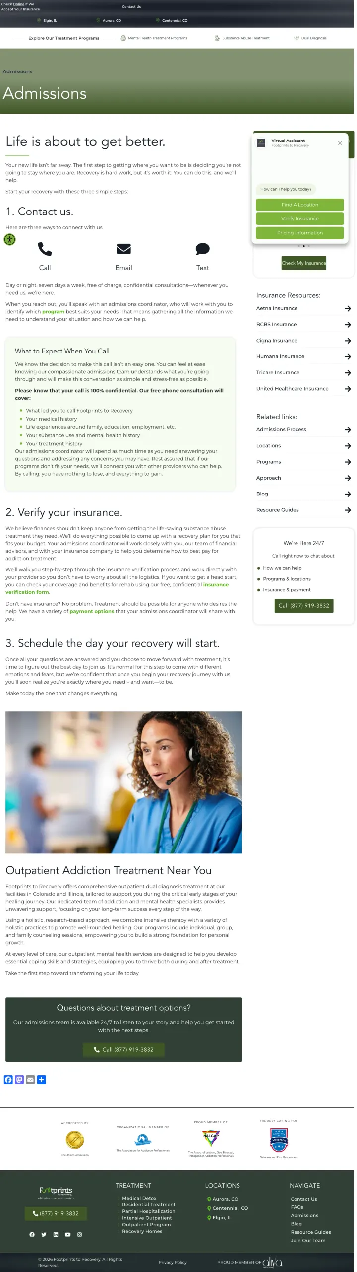
Every paid click that bounces because the chatbot blocked the phone number represents $50-$100 of wasted spend in this vertical. Fixing the widget timing would measurably lift conversion without touching any copy.
Virtual Assistant chatbot widget covers the right half of the hero on load, obscuring the 'Call / Email / Text' contact row that is supposed to be the primary conversion. The bot offers 'Find a Location / Verify Insurance / Pricing Information' but forces the visitor to click the bot instead of the site.
Hero H1 is 'Life is about to get better.' Nice sentiment, zero utility for someone who googled 'addiction treatment' at 2am. The page never asks the visitor what brought them here.
'Three simple steps' numbered-list body copy reads like an internal SOP (Contact us / Verify your insurance / Schedule your day). It is the process from the provider's perspective, not from the visitor's question of 'will this work for my husband'.
American Addiction Centers builds the entire hero around a 'Verify Your Rehab Coverage Instantly' multi-step form. The visitor lands, sees 'Step 1/4 Check Coverage', and starts typing their insurance carrier. HIPAA badge. Phone fallback below. No marketing copy, no facility photos, no 'About Us'....
The Recovery Village Umatilla shows three named alumni and a staff team with real faces. Sandstone Care opens with a photo of three actual teenage patients of their Maryland program. Mountainside shows two real clients shaking hands. McLean Hospital photographs real clinicians with real patients....
The most differentiated winners pick a narrow audience and build the page around them. Sandstone Care runs an entire page for teens 13-18 in Maryland. McLean Hospital leads with 'We don't just treat addiction, we treat people' and pairs it with its Harvard/U.S. News psychiatric ranking. Cumberlan...
Valiant Living buries a phone number in the footer and leads with a 'Download Admissions Packet' button. For a parent in crisis, a PDF download is the wrong primary CTA: they need to talk to a human right now, not read a brochure later. Avenues Recovery lands keyword traffic for 'drug rehab near ...
Winners answered insurance or identity within the first viewport and gave the visitor a human to call. Losers led with process steps, PDF downloads, or state-by-state directories, forcing a second click before any crisis-moment visitor could get help..