Free: 96 PPC tools + my AI Playbook book

Flight searchers have 4 tabs open and whoever shows them a real fare first gets the booking. Two seconds without a price and they're on the next tab. Most airlines still haven't figured out that their brand alone isn't enough to win that race anymore.
From real flights / airlines Google Ads campaigns in the US
The landing pages actually worth stealing from
So you know exactly what to avoid
Pre-fill the destination field in your booking form from the ad keyword so the visitor who clicked 'flights to orlando' sees 'Orlando, FL - MCO' already entered. Then show popular origin-to-destination routes below the form so visitors who have not committed to a departure city can self-select.
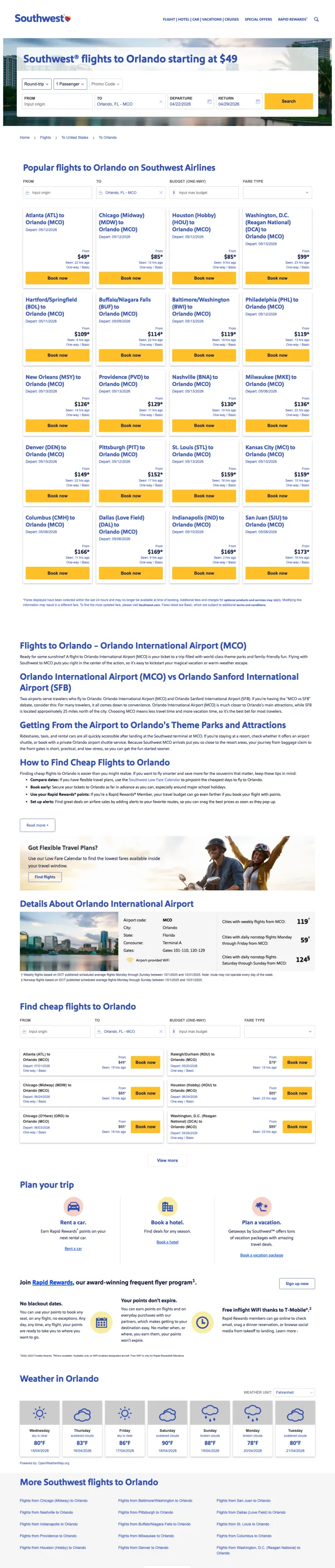
'Southwest flights to Orlando starting at $49' as the H1 delivers the price promise immediately. The $49 anchor is low enough to stop the visitor from opening another tab, which is the entire job of the above-fold content on a flight booking page
Pre-filled destination 'Orlando, FL - MCO' in the booking form means the visitor only needs to enter origin, dates, and passenger count. For a paid click on 'flights to orlando,' the destination is already known -- pre-filling it respects the visitor's intent and removes one friction step
Popular route cards (Atlanta to Orlando, Chicago Midway to Orlando, Houston Hobby to Orlando, Washington Reagan to Orlando) serve visitors who searched a destination without specifying origin. Each card shows fare type options, turning a generic destination search into a route-specific booking path
The page extends well below the fold with SEO content about Orlando International Airport, nearby airports (Sanford), weather, and travel tips. This content serves organic rankings but adds unnecessary scroll depth for paid visitors who arrived ready to book
No urgency mechanism. No 'prices from' date range, no 'seats remaining' indicator, no limited-time pricing. The $49 fare is presented as evergreen, which reduces the motivation to book now versus bookmarking for later
The booking form has no date pre-selection -- departure and return dates default to today and a week out but are not pre-optimized for common booking windows. A 'flexible dates' toggle or low-fare calendar link above the fold would serve price-sensitive searchers better
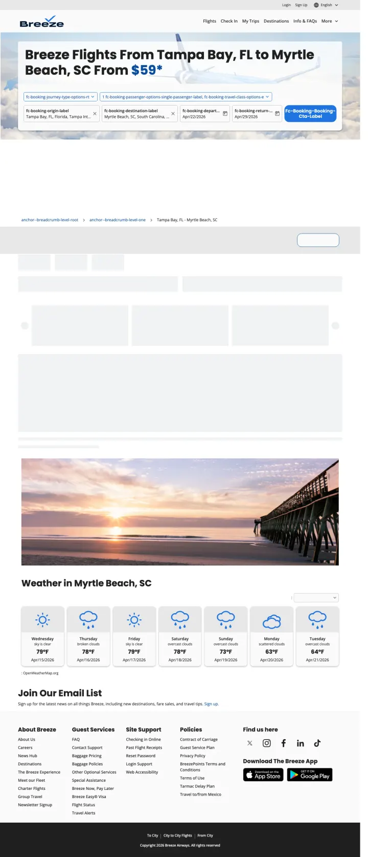
Build route-specific landing pages with the origin AND destination in the H1 headline and the booking form pre-filled with both cities. Breeze shows 'Flights From Tampa Bay, FL to Myrtle Beach, SC From $59' which eliminates all ambiguity about what this page offers.
'Breeze Flights From Tampa Bay, FL to Myrtle Beach, SC From $59*' is the most specific flight landing page headline in the entire set. Both origin and destination are named, the price is shown, and the asterisk manages expectations about fare conditions. This level of specificity in the H1 is rare for airlines
Booking form is pre-filled with both Tampa Bay and Myrtle Beach, departure and return dates, passenger count, and travel class. The visitor arriving from a 'flights tampa to myrtle beach' ad search sees every field already completed -- they only need to adjust dates and click search
Weather forecast for the destination (Myrtle Beach) at the bottom of the page serves the leisure traveler who is deciding WHEN to go, not just whether to go. This content adds value without distracting from the booking form above
The middle section of the page appears to have loading failures -- large empty white spaces where flight result cards or promotional content should appear. This broken rendering on a paid landing page wastes the click cost because the visitor sees a half-loaded page
The Breeze brand is not well-known nationally. There are no trust signals, no 'about Breeze Airways' section, no founding story, no fleet information. A visitor who has never heard of Breeze may hesitate to book because 'is this a real airline?' is an unaddressed objection
No route map showing that Breeze actually flies this route nonstop versus connecting. For a low-cost carrier, the nonstop distinction is a key selling point that should be visible above the fold
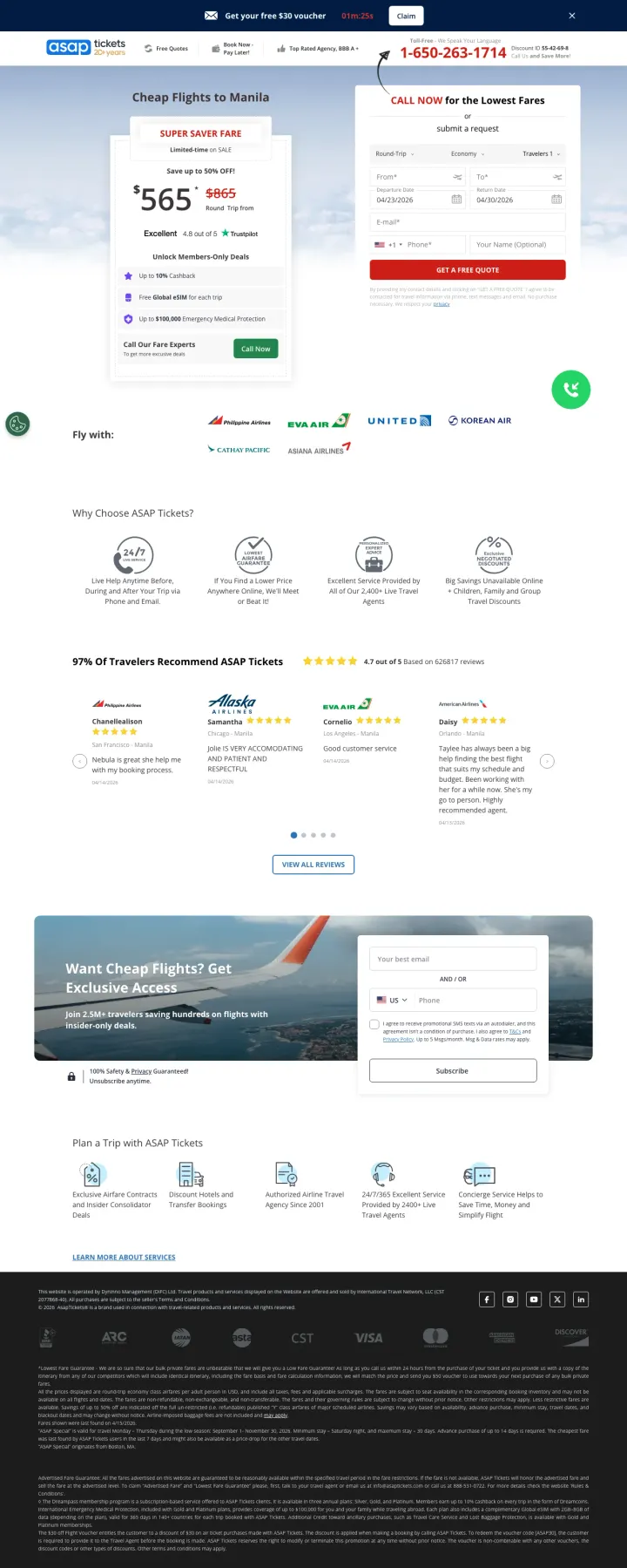
If you sell complex international flights to price-sensitive travelers, lead with a phone number and a crossed-out 'was' price showing the discount. The $865 crossed out to $565 creates a concrete savings anchor that motivates a call, and the phone-first model works because multi-leg international itineraries benefit from human agent routing.
Crossed-out pricing ($865 to $565) with 'LIMITED-TIME OFFER' and 'SUPER SAVER FARE' badges creates urgency and price anchoring simultaneously. The visitor sees they are saving $300 AND that this deal has a time limit. For Philippines diaspora flights where travelers are extremely price-sensitive, this double-trigger works
Phone number (1-650-263-1714) in a green 'CALL NOW' box is the dominant above-fold element, larger than the booking form. This is deliberately phone-first design -- ASAP Tickets knows that their highest-converting channel is phone calls where agents can upsell and optimize complex itineraries
Trustpilot 'Excellent 4.8 out of 5' badge immediately below the price addresses the #1 OTA trust barrier: 'is this a scam site?' Third-party review platforms are more credible than self-reported reviews for discount travel agencies
The booking form on the right side requires origin city, destination, dates, email, and phone number -- that is 6 fields for a 'GET A FREE QUOTE' action. The form collects contact info before showing any results, which means it is a lead form disguised as a booking form. Some visitors will bounce when they realize they cannot see prices without giving their phone number
Two competing conversion paths (phone call vs form fill) without clear hierarchy creates decision paralysis. The green CALL box and the form are equally prominent. Pick one as primary and make the other secondary
'97% of Philippines Travelers Recommend ASAP Tickets' claim mid-page has no source or methodology. Self-reported stats without attribution actually hurt credibility rather than helping it
Build destination-specific landing pages that combine a booking form (pre-filled with destination) with practical travel content (airport info, popular routes, weather) so the page serves both ready-to-book and still-researching visitors from the same paid click.
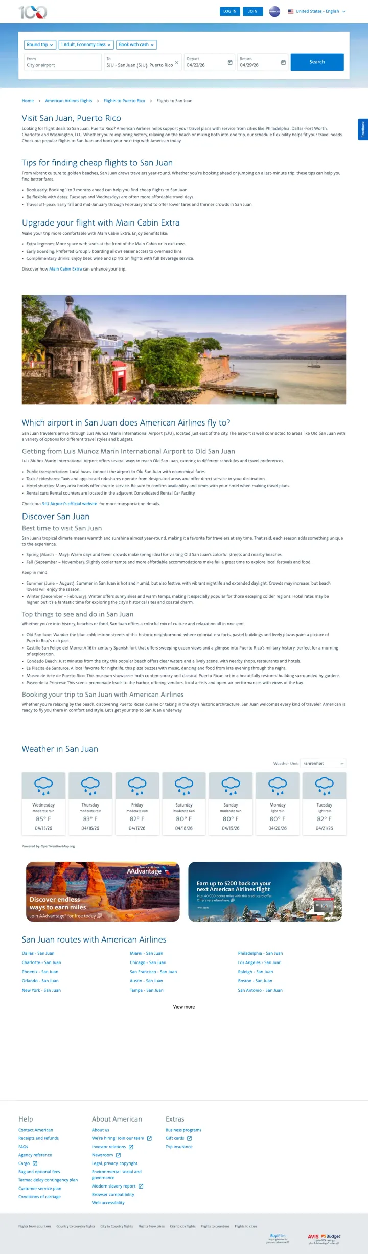
Booking form at the very top with 'SJU - San Juan (SJU), Puerto Rico' pre-filled as the destination. The visitor who searched 'flights to puerto rico' does not have to re-enter the destination. The form also includes round-trip/one-way toggle, passenger count, travel class, and date fields in a compact single-row layout
'Tips for finding cheap flights to San Juan' section provides actionable booking advice: book 1-3 months ahead, be flexible with dates, Tuesdays and Wednesdays offer cheaper fares, travel off-peak mid-January through February. This content serves the price-sensitive researcher who is comparing options and gives them a reason to stay on the AA page rather than going to a meta-search engine
Popular route table showing Ft. Lauderdale, Charlotte, Washington DC, Dallas, and Miami to San Juan with airline and frequency data helps the visitor who has not decided on a departure city. The table format is scannable and lets the visitor find their nearest hub quickly
The page headline says 'American Airlines flights to Boston' in the screenshot which does not match the San Juan URL -- this appears to be a rendering or caching issue where the wrong destination name loaded. If real visitors see 'flights to Boston' when they searched 'flights to Puerto Rico,' the message match is completely broken
No price shown above the fold. The ad promises 'San Juan Fares From $247' but the landing page does not display any fare information until the visitor initiates a search. The price anchor from the ad is lost the moment the page loads
Destination content below the fold (Discover San Juan, weather, partner hotels) is useful but adds significant scroll depth. The booking form is above fold but separated from any pricing or route information by the tips section and upsell section
Pages that break the playbook in interesting ways
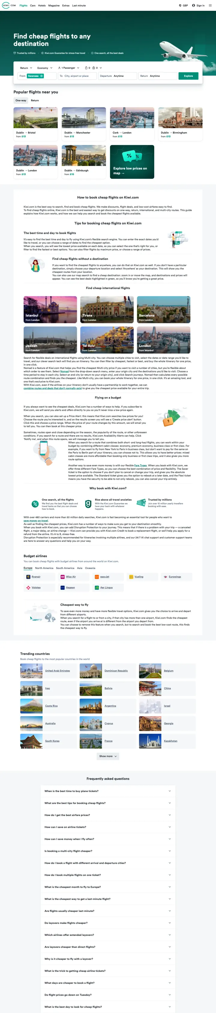
If your OTA targets price-sensitive travelers who are flexible on destination, lead with a 'Popular flights near you' grid showing specific routes with starting prices. This turns the overwhelming 'fly anywhere' experience into a browsable deal catalog that rewards exploration.
'Find cheap flights to any destination' with 'Trusted by millions' and 'Kiwi.com Guarantee for stress-free travel' and 'One search, all the best deals' as sub-bullets delivers three trust/value messages in a single line above the search form. This is efficient above-fold copywriting that addresses brand recognition, risk reversal, and value proposition simultaneously
Popular flights grid with destination photos, route names, and 'from' prices (Dublin to Bristol from 13 GBP, Dublin to Manchester from 13 GBP) turns a generic flights homepage into a browsable deal catalog. The geo-localized routes (showing Dublin departures for a UK visitor) demonstrate that the page adapts to the visitor's location
'Kiwi.com Guarantee' is mentioned above the fold without explanation, creating curiosity that encourages scroll. Below fold, the guarantee is explained as a service promise -- this is an unusual trust mechanism for an OTA where guarantees typically refer to price matching
The ad was triggered by 'flights barcelona to dublin' and 'flights cluj napoca' -- specific route queries that land on a completely generic 'cheap flights' page. The visitor who searched a specific route gets a blank search form. This is the OTA equivalent of sending someone to the homepage
The 'From' field is pre-filled with 'Swansea' (geo-detected) but the destination is blank. For an ad triggered by 'flights barcelona to dublin,' neither the origin nor destination matches the search query
Full navigation bar with Cars, Hotels, Magazine, Extras, and Last minute tabs gives the visitor 5 exit paths to non-flight content. For a paid click on a flights keyword, every non-flight link is a leak
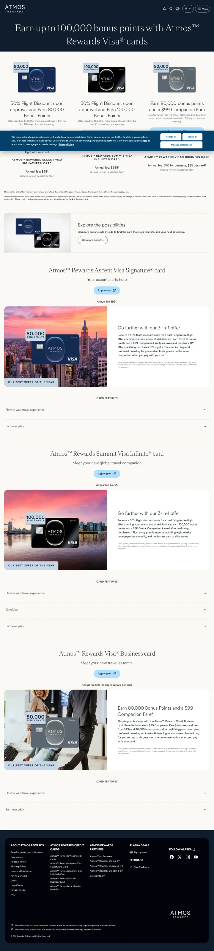
If you have a co-branded credit card, run ads on your brand name + 'credit card' keywords that land on a dedicated comparison page showing all card tiers side by side. Alaska/Atmos shows three cards with different point offers and benefits in a single viewport, letting the visitor self-select based on their spending level.
Three credit card tiers shown side by side (80,000 points, 100,000 points, 80,000 points + $99 Companion Fare) with clear visual hierarchy. The center card (100,000 points) is visually elevated as the recommended option. This tier comparison format lets the visitor self-select based on their spending capacity and travel frequency
'50% Flight Discount upon approval' is a powerful instant-gratification incentive. Most credit card offers promise future rewards (points after spending $X). The immediate 50% discount on the next flight creates urgency for travelers who have an upcoming trip
Clean dark navy design with card renders creates a premium financial product aesthetic. The page does not look like an airline page -- it looks like a fintech product page, which signals that this is a financial decision, not a travel decision
This is a credit card page appearing in ads for 'alaska air credit card' -- it is correctly matched to the keyword. But the page is hosted under 'atmosrewards' rather than 'alaskaair,' and the branding says 'ATMOS REWARDS' not 'Alaska Airlines.' Visitors searching for the Alaska Airlines credit card may not recognize 'Atmos Rewards' as the rebrand and bounce thinking they are on the wrong site
Cookie consent banner at the bottom covers the lower portion of the card comparison. On the highest-value page element (the 3-card comparison), the bottom card details are partially obscured
No application CTA visible above the fold. The three cards show benefits but the 'Apply now' or 'Learn more' buttons require scrolling. For a visitor who searched specifically for this credit card, the application path should be immediately accessible
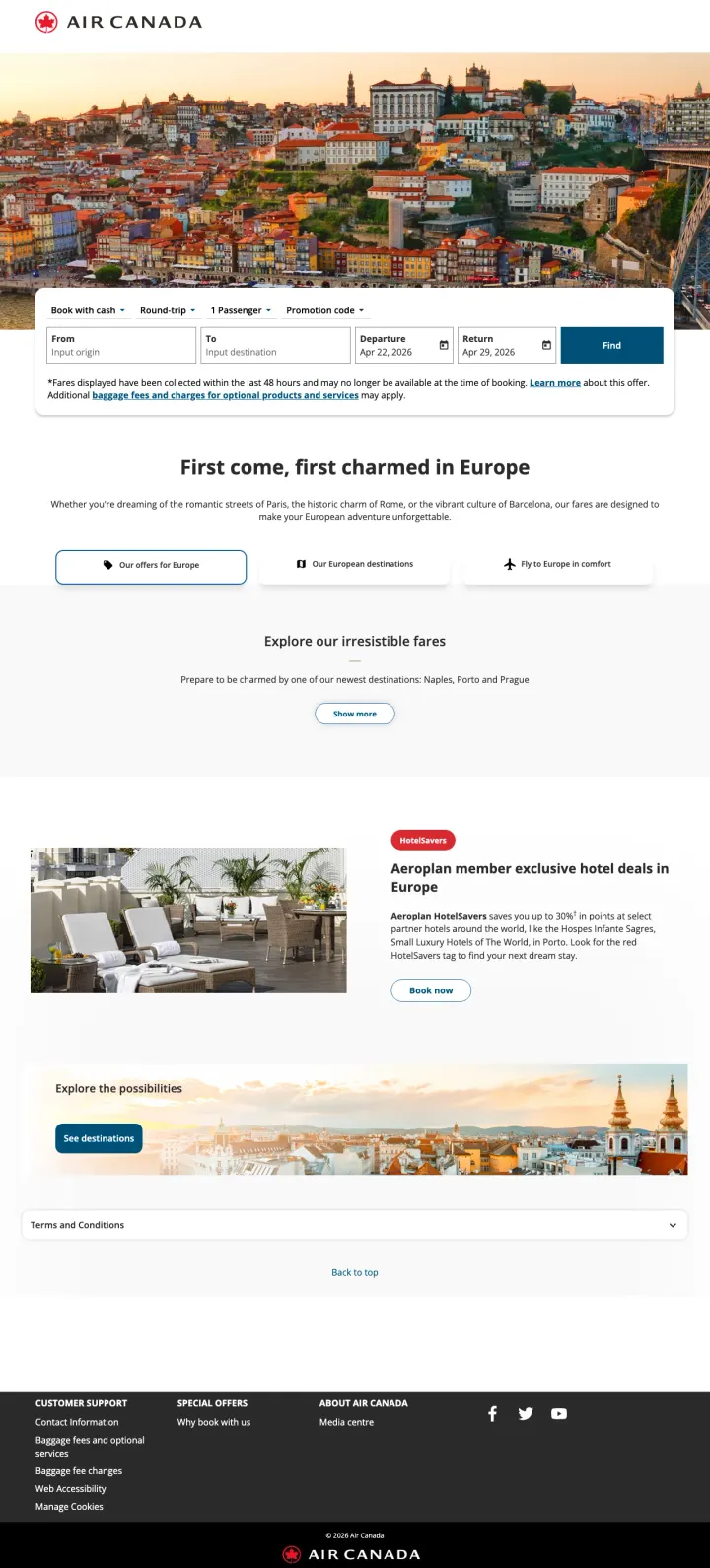
For continent-level flight pages, use aspirational destination photography (European rooftops, coastal towns) to create emotional pull alongside the booking form. The imagery does the selling that price cannot -- 'imagine yourself here' is more compelling than '$499 to London.'
'First come, first charmed in Europe' headline with aspirational European cityscape photography creates emotional pull that commodity flight search cannot -- the visitor imagines the trip, not just the fare
Three filter buttons ('See offers for Europe', 'Our European destinations', 'Fly to Europe in comfort') give the visitor choice without creating decision paralysis -- each button serves a different buying stage
Destination gallery with photos of European cities at the bottom provides inspiration for visitors who know they want to visit Europe but have not chosen a city yet
No specific fares visible anywhere on the page -- a visitor searching 'flights to Europe' wants to know what it costs, and the page provides zero price context
The booking form at the top has no destination pre-filled despite this being a Europe-specific page -- pre-filling with a popular European destination (London, Paris) would save a step
Hotel cross-sell (Aeroplan exclusive hotel deals in Europe) appears before the destination gallery, prioritizing ancillary revenue over the primary flight booking
3 pages burning ad spend with fundamental issues
Every click to these pages costs real money. We found broken trust signals, mismatched intent, weak CTAs, and messaging that ignores what the searcher actually typed. Here is what to avoid.
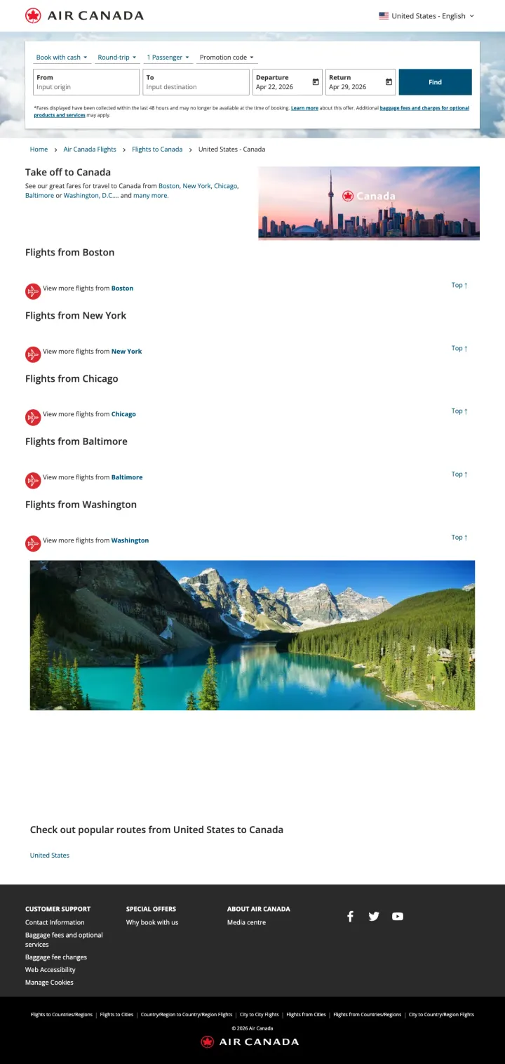
Every paid click costs money, and this page requires at least 2 additional clicks (select origin city, then search with dates) before the visitor can see a single flight option or price. The empty booking form, missing prices, and link-list layout mean the paid visitor gets a worse experience than if they had just gone to aircanada.com directly and searched from the homepage.
Booking form has BOTH origin and destination fields empty. The visitor searched 'flights to canada' or 'flight to quebec city canada' and clicked an ad -- the destination should already be populated with the Canadian city from the ad. Instead, the visitor has to manually enter their destination despite having already told Google what they want
Hero sells 'Take off to Canada' with a list of US origin cities (Boston, New York, Chicago, Baltimore, Washington) as plain text links, no prices, no calendar, no inventory. A visitor who clicked a fare-search ad lands on a text menu rather than a booking widget, adding a click between intent and conversion.
No pricing information anywhere on the page. Not a single fare, not a 'starting from' amount, not even a 'deals from' range. The visitor comparing Air Canada against United or Delta on price has zero information to work with
The privacy popup converts a paid click into a legal compliance interaction. The visitor arrived to book a flight and instead reads about cookie categories, personalization cookies, and data retention policies. By the time they dismiss the popup, they have already been frustrated by the experience. Adding a possibly wrong currency (SAR) and pre-filled wrong destination (Mumbai) makes this a complete paid traffic failure.
The full-screen 'Privacy settings' popup covers the entire page content on first load. The visitor cannot see the booking form, the prices, or any destination content without first reading and clicking through a GDPR cookie consent wall. For a paid click, this is the worst possible first impression -- the airline paid for the click and the visitor sees a legal document
The page URL suggests South Africa targeting (/lhg/za/en/) but the ad was found on US keywords ('flights to sicily italy', 'ewr to rome flights'). If the page serves prices in South African Rand (the screenshot shows '10,873 SAR'), US visitors see irrelevant pricing that does not match their currency or departure market
No specific flight prices visible even behind the popup. The page is a destination guide with city cards, travel inspiration photos, and general information about Italy -- not a booking page. The visitor who searched 'ewr to rome flights' wants departure times and prices, not a tourism brochure
Lufthansa is bidding on 'flight usa to india', 'flights from us to india', and 'tickets to india' (5,400 monthly searches each, 32,800 total breadth across 11 keywords). The paid visitor lands on a booking page where a full-width GDPR privacy modal with 8 paragraphs of cookie policy covers the hero, the Mumbai destination imagery, and the 'From / To / Dates / Find flights' search widget. The visitor who clicked an ad promising 'Book your flight now' cannot book anything until they agree, decline, or configure cookie settings. At international airline CPCs, every visitor who bounces off the privacy modal is a lost high-value booking.
Full-width privacy consent modal covers the entire hero including the destination photo, the 'Flight to Mumbai' headline, and the From/To search form, so the first interaction a visitor has is with a legal disclaimer, not a booking widget
No starting-price anchor visible anywhere in the hero; competitors like Southwest and American Airlines show starting fares ($49, $97) at the top of their destination pages, while Lufthansa forces the visitor to complete a search just to see any price
The booking form above the fold is the only conversion path visible, but it is buried behind the modal; there is no secondary 'view deals' or 'call to book' path for the visitor who rejects cookies and still wants a Mumbai flight
Southwest shows '$58 starting' in the ad and on the landing page. American Airlines shows '$127 from' in both. ASAP Tickets shows crossed-out pricing with deal prices. When a traveler clicks an ad showing a specific fare and lands on a page showing that same fare, the conversion path feels contin...
Southwest's Las Vegas page and Air Canada's Toronto page both pre-fill the destination in the booking form. This saves the visitor from typing 'Las Vegas' or 'Toronto' and simultaneously confirms they landed on the correct page. It sounds trivial but in a category where the conversion action is a...
American Airlines shows Miami flights from Dallas $109, New York $138, Charlotte $149. Southwest shows Las Vegas flights from Chicago $98, Denver $62. These route grids let visitors from different origins find their specific fare without running a search. For destination-specific keywords ('fligh...
ASAP Tickets prominently displays a phone number with '2100+ Live Travel Agents' for Philippines flights. This works because US-to-Philippines routing is complex (connections through Tokyo, Seoul, or Taipei on multiple airlines) and a human agent can find combinations that booking engines miss. F...
Winners show specific fares in the hero, pre-fill the booking form with the destination, and provide route pricing grids from multiple departure cities. Losers send paid traffic to destination galleries with tourism content but no fares, or block visitors with cookie consent popups and captchas before the booking form loads.