Free: 96 PPC tools + my AI Playbook book

These are real auto insurance pages spending actual money on Google Ads right now.
From real auto insurance Google Ads campaigns in the US
The landing pages actually worth stealing from
So you know exactly what to avoid
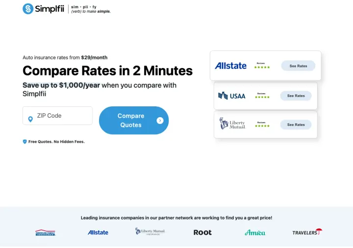
Strip your above-fold to just a ZIP code field, a savings claim with a specific dollar amount, and carrier logos -- nothing else.
Single ZIP code field with large green "Compare Quotes" button -- zero friction, zero personal data required to start
"Save up to \,000/year" savings anchor creates concrete value for the comparison exercise
Carrier logo bar (Allstate, USAA, Root, Amica, Travelers) immediately below CTA borrows trust from known brands
The page is almost too minimal -- no trust signals beyond carrier logos, no reviews, no "how it works" steps
No phone number for visitors who prefer human contact
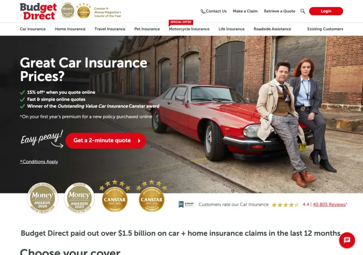
Stack your industry awards visually in a badge row below the hero, then add a specific claims-paid dollar figure to prove you actually pay out.
4 award badges (Money Magazine, Canstar x2) displayed as visual shields create instant credibility wall
"4.4 | 40,805 Reviews" with star rating -- the specificity of 40,805 (not "40K+") signals real data
"Budget Direct paid out over \.5 billion on car + home insurance claims" -- proves they actually pay claims, addressing the #1 insurance fear
Full navigation bar with 8 product categories dilutes focus -- this is a landing page trying to be a homepage
Hero image of a vintage car with well-dressed people feels aspirational but does not match the "budget" positioning
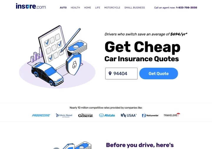
Lead with a data-backed savings claim ("Drivers who switch save an average of \/yr") rather than a generic "save money" promise.
"Drivers who switch save an average of \/yr" -- specific, data-backed, uses social proof framing ("drivers who switch" implies others have done this successfully)
ZIP code as single input with large "Get Quote" button -- matches the simplfii.com pattern that works
Carrier logo bar (Progressive, The General, Allstate, USAA, Nationwide, Travelers) adds breadth credibility
Top navigation with Auto/Health/Home/Life/Motorcycle/Small Business tabs turns this into a multi-product page
The asterisk on \/yr savings needs explanation but is buried
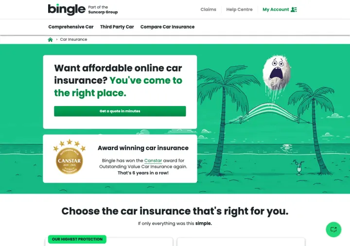
If your brand has won the same award multiple years running, lead with the streak ("6 years in a row") rather than just the latest win -- streaks are more impressive than single wins.
"Award winning car insurance -- Bingle has won the Canstar award for Outstanding Value Car Insurance again. That's 6 years in a row!" -- the streak is more impressive than a single award
Playful illustrated character (cartoon bird) creates memorable brand personality that stands out from corporate insurance
Three clear product tiers below fold (Comprehensive, Third Party, Compare) let the visitor self-select
The CTA button text "Get a quote in minutes" is generic -- could be any insurance page
The Suncorp Group parent branding at top adds a corporate layer that conflicts with the playful brand identity
Replace generic savings claims with a named customer example ("Sarah saved ") -- a real name makes the savings feel achievable rather than hypothetical.
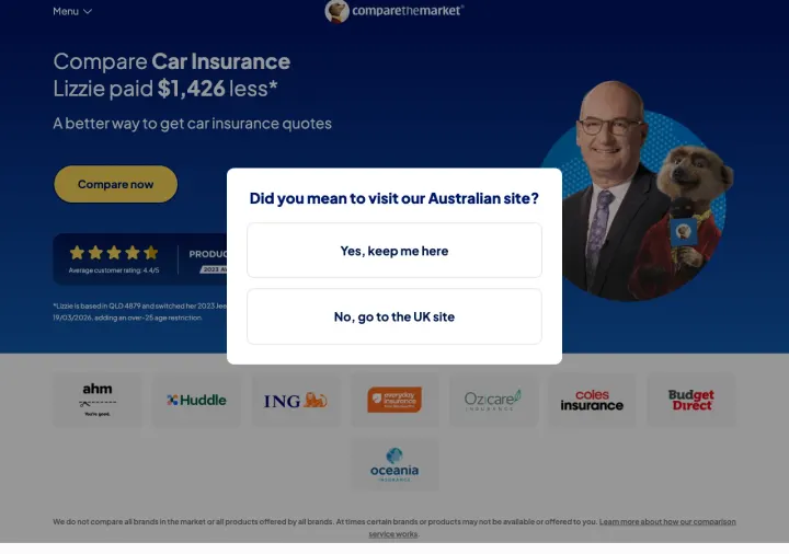
"Lizzie paid \,426 less" -- named customer with specific savings amount is more believable than "save up to X"
Meerkat mascot creates instant brand recognition and personality in a commoditized market
Carrier logo bar (ahm, Huddle, ING, GIO, Ozicare, Budget Direct) shows breadth of comparison
Geo-redirect modal ("Did you mean to visit our Australian site?") blocks the entire page on first load -- catastrophic for paid traffic
The comparison value proposition is not specific about how many quotes you will see
Combine a starting price anchor with a time commitment ("from \/month, quote in 5 minutes") so the visitor knows both the cost and the effort before they start.
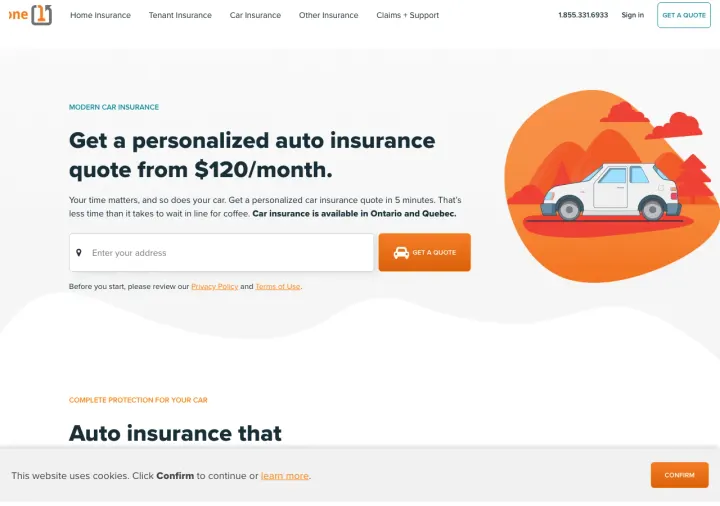
"Get a personalized auto insurance quote from \/month" -- starting price sets expectations immediately
"Get a personalized car insurance quote in 5 minutes. That's less time than it takes to wait in line for coffee" -- relatable time anchor
Car insurance is available in Ontario and Quebec called out explicitly -- geographic targeting prevents wasted clicks
The cookie consent bar at the bottom covers part of the page content on first load
The illustration style is generic -- could be any insurance or fintech product
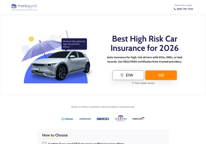
Serve SR-22 and FR-44 keywords with an editorial 'Best High Risk Car Insurance' page instead of a generic quote funnel. The visitor who just got a DUI is not ready to trust one carrier, they want a shortlist from someone who sounds like a journalist.
Editorial framing ('Best High Risk Car Insurance for 2026') reads like unbiased research, which is exactly what a driver with a fresh DUI is searching for. The shopper is already embarrassed and defensive, so a page that feels like a guide rather than a sales funnel lowers the emotional cost of the click.
One ZIP code input plus a GO button is the entire hero conversion. No name, no DOB, no VIN. A high-risk shopper will abandon the moment a form asks about violations, so the page defers every hard question until after the click.
Carrier logos (Allstate, Progressive, Geico, Farmers, Travelers) sit directly under the CTA as 'Nearly 10 million competitive rates provided by companies like' which borrows trust from brands the visitor already knows without picking sides.
Agent phone number is top-right on a page that wants the visitor to use the ZIP tool. A visitor who calls bypasses the tool and the comparison angle collapses.
'How to Choose' checklist below the fold reads generic (confirm filings, look for flexible payments) and does not teach the SR-22 shopper anything they do not already know.
Pages that break the playbook in interesting ways
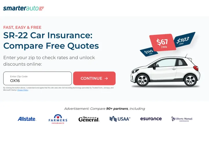
Use URL parameters to dynamically inject the exact keyword the visitor searched for into the headline -- "SR-22 Car Insurance" for SR-22 searchers, "Full Coverage" for full coverage searchers.
Dynamic headline pulled from URL parameters (title=SR-22+Car+Insurance) -- the page headline matches the exact ad copy/keyword
Visual price comparison (\ vs \ crossed out) creates instant perceived savings
"Compare 80+ partners" with carrier logos (Allstate, Farmers, The General, USAA, Esurance, Liberty Mutual) shows breadth
The page is extremely minimal -- almost too stripped down to feel trustworthy for a financial product
No reviews, no testimonials, no trust badges beyond carrier logos
The raw HTML source in the scrape suggests this may be a thin affiliate page
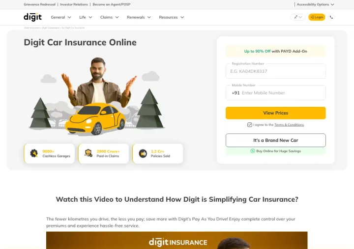
Why This Breaks the Rules: Digit asks for a vehicle registration number (not a ZIP code, not a name) as the very first field and ties the entire offer to a Pay-As-You-Drive discount. It flips the script from 'who are you' to 'what do you drive', which for a low-mileage shopper is a much more flattering opening question.
Registration number as the first input field pre-fills vehicle make, model, year from a government database, so the quote form has fewer questions than a competitor's. The visitor experiences the page as faster even if the underlying quote logic is identical.
Pay As You Drive add-on headline ('Up to 90% Off with PAYD Add-On') reframes the quote as a mileage game rather than a risk game. For drivers who know they barely drive, this is an irresistible hook that no big-brand US carrier highlights on their landing page.
Stat ribbon under the hero (9000+ cashless garages, 2900 Crore paid in claims, 1.2 Cr policies sold) turns abstract trust claims into specific numbers. The 'garages' metric is particularly clever because it answers the real worry (will my car actually get fixed) not the marketing worry (do they pay claims).
The illustrated hero character (waving man with yellow car and cloud trees) is juvenile for a product that costs hundreds of dollars. It dilutes the trust signal the stat ribbon is working hard to build.
Mobile number requirement alongside registration number forces a second identifier upfront. Visitors on a comparison kick will bail at the phone field because they know it triggers sales calls.
3 pages burning ad spend with fundamental issues
Every click to these pages costs real money. We found broken trust signals, mismatched intent, weak CTAs, and messaging that ignores what the searcher actually typed. Here is what to avoid.
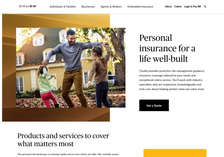
Paid auto insurance clicks land on a page that never mentions auto insurance. The visitor has to navigate through product categories to find what they searched for.
This is a generic corporate homepage covering all personal insurance products -- zero auto insurance specificity
No pricing, no quote form above the fold, no ZIP code input -- just a generic "Get a Quote" button
Full navigation bar with Individuals, Businesses, Agents, Embedded Insurance, About, Claims -- too many choices
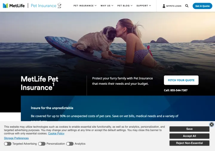
Auto insurance searchers land on a pet insurance page. 100% of paid clicks are wasted because the product is wrong.
This is a pet insurance page showing in auto insurance ad results -- total keyword/landing page mismatch
cookie banner obscures 40% of the visible viewport on load
Full navigation with Pet Blog, Why Us, Support dilutes the landing page experience
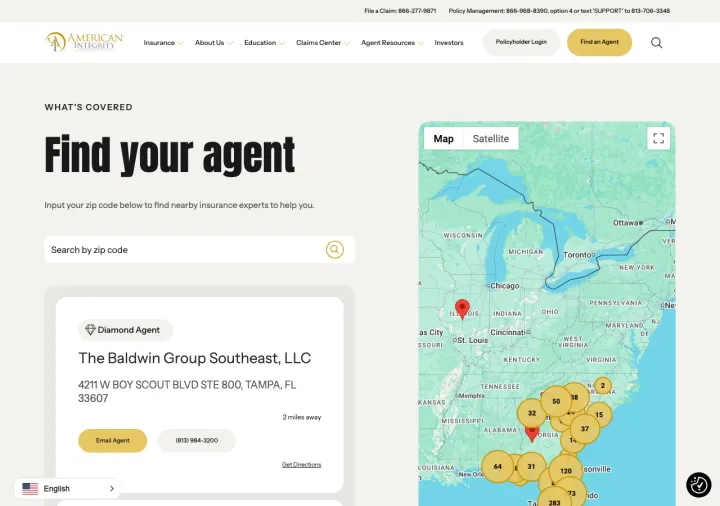
Quote-intent visitors land on an agent locator. They wanted a price in 2 minutes, not to drive to an office.
Visitors searching for auto insurance quotes land on an agent finder page -- they wanted a quote, not a map
Full corporate navigation with About Us, Education, Claims Center, Agent Resources -- this is a corporate site page
The page loads a huge agent directory (6,555 links) which is slow and overwhelming
The strongest auto insurance landing pages ask for exactly one thing above the fold: a ZIP code. This works because it is low-commitment (no personal info), instantly qualifies the visitor geographically, and creates forward momentum into the quote funnel. Pages that open with name/address/DOB fo...
The best comparison/aggregator pages display 6-8 recognizable carrier logos (Allstate, USAA, Farmers, Geico, Progressive) directly below the quote CTA. This serves two purposes: it tells the visitor they will see multiple options, and it borrows trust equity from brands the visitor already knows....
Pages that state a concrete savings figure ('Save up to $1,000/year', 'Drivers who switch save an average of $X/yr') create a tangible value proposition. The dollar amount gives the visitor a mental anchor for what the comparison exercise is worth. Generic claims like 'Great Car Insurance Prices'...
Budget Direct and Bingle both lead with Canstar award badges prominently displayed above the fold. Compare the Market shows star ratings and a specific savings testimonial. These third-party validations are more persuasive than self-declared 'best price' claims because the visitor knows the compa...
Winners use a single ZIP code input above the fold, show recognizable carrier logos, and anchor with specific savings amounts. Losers send paid auto insurance traffic to generic corporate homepages (Chubb, American Integrity) that cover every product line, or bury the quote funnel behind an agent-locator directory that assumes the visitor is already committed to a carrier..