Free: 96 PPC tools + my AI Playbook book

These are real b2b enterprise software pages spending actual money on Google Ads right now.
From real b2b enterprise software Google Ads campaigns in the US
The landing pages actually worth stealing from
So you know exactly what to avoid
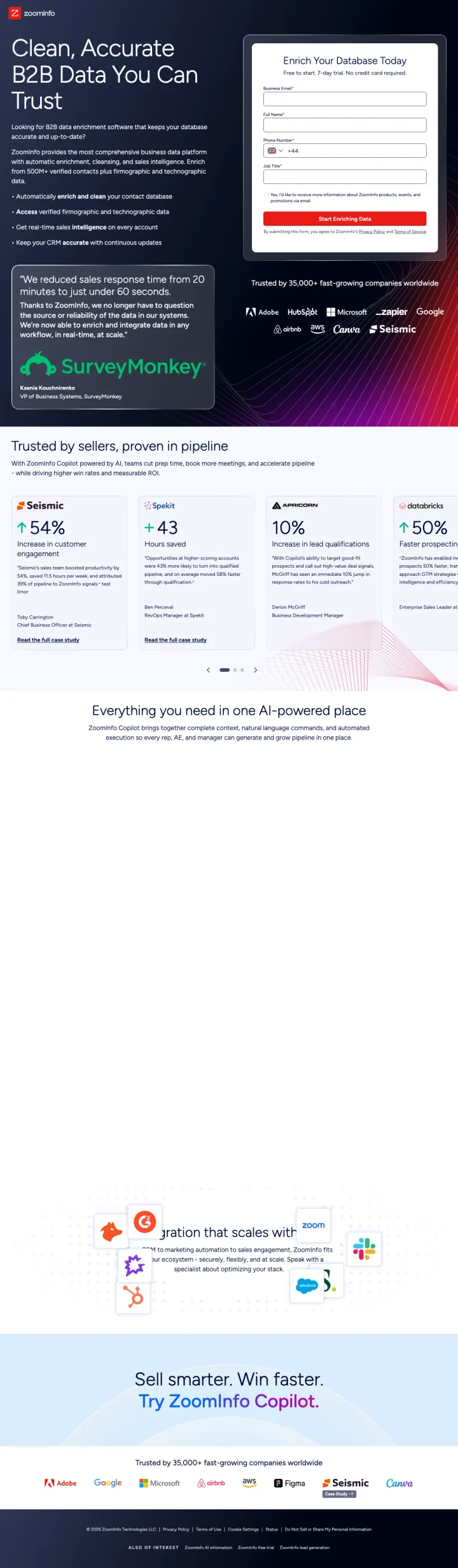
Place a named customer quote with a specific metric ('reduced response time from 20 minutes to 60 seconds') directly beneath your hero copy, so the visitor sees the promise AND the proof before scrolling.
Customer stats beneath each enterprise logo (Solaris +54%, Apple +43, Agora 10%, PubNub +50%) turn a passive logo bar into quantified proof that these companies got measurable results
Form asks for only 4 fields (email, name, phone, job title) with '7-day trial, no credit card required' removing the commitment barrier for enterprise buyers who need to test before presenting internally
Quote from VP of Business Systems at SurveyMonkey with a time-reduction metric gives the visitor a peer-level reference they can verify on LinkedIn
The headline 'Clean, Accurate B2B Data You Can Trust' is generic category language that could describe any data provider; it does not differentiate ZoomInfo from competitors like Clearbit or Apollo
The page bottom shows analyst/partner logos (Gartner, Forrester) but buries them below the fold where most PPC visitors will never scroll to see them
No product screenshot or UI preview anywhere on the page; the enterprise buyer evaluating data platforms wants to see the actual interface before requesting a demo
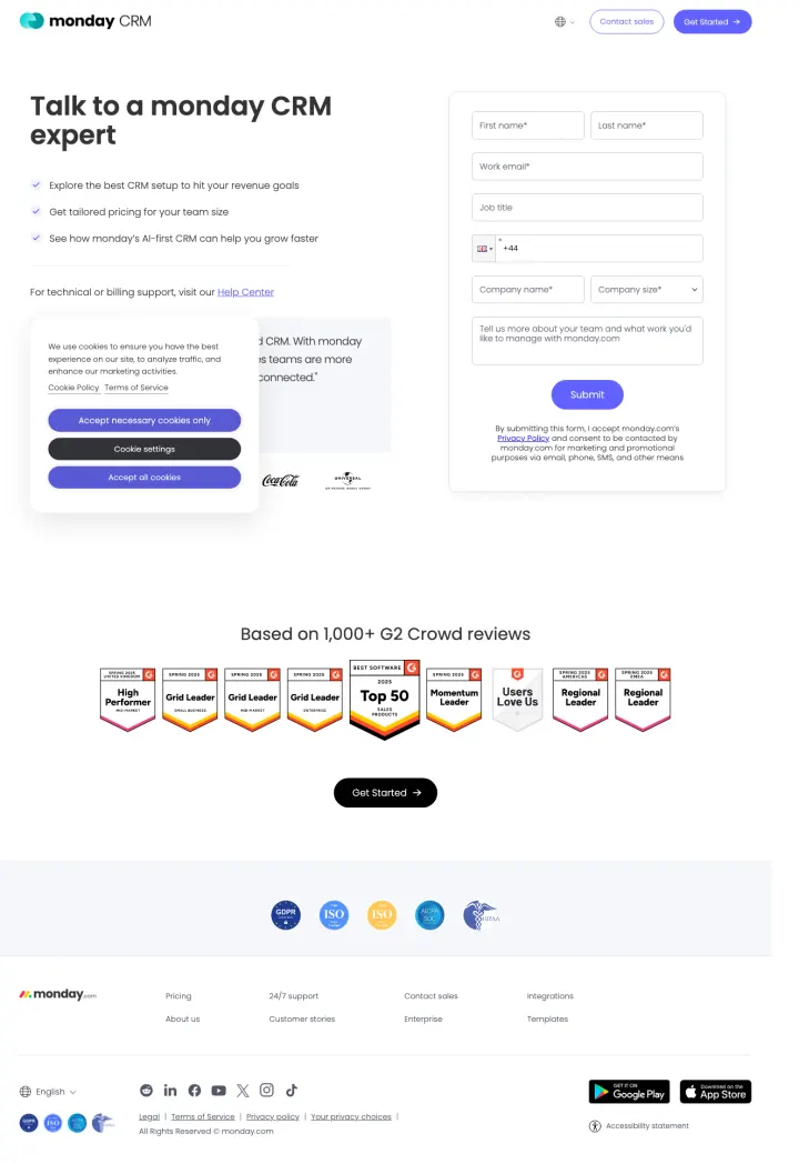
Build a contact-sales page that puts the form at the same visual level as a customer testimonial with photo and title, so the visitor reads social proof while their eyes are already on the form.
Three bullet points with checkmarks above the form tell the visitor exactly what they will get from the call (CRM setup for revenue goals, tailored pricing, AI-first CRM demo) rather than generic 'contact us' language
James Arnold, COO at Cenversa, quoted saying 'our sales teams are more informed, more consistent, and far more connected' with his photo and title creates a named reference the buyer can verify
7 G2 badges (Grid Leader x3, Top 50, Momentum Leader, Users Love Us, Regional Leader x2) displayed in a horizontal row below the form compress the vendor evaluation into a single visual scan
Form has 7 fields including company name and company size, which is heavy for a contact-sales page when the goal should be getting the meeting booked, not qualifying the lead upfront
The page shows Motorola, Universal, Lionsgate, Coca-Cola logos but these are entertainment and consumer brands, not the B2B software buyers who are the actual audience for monday CRM
No product screenshot or UI preview anywhere on the page; the visitor is asked to commit to a sales call without seeing what the product actually looks like
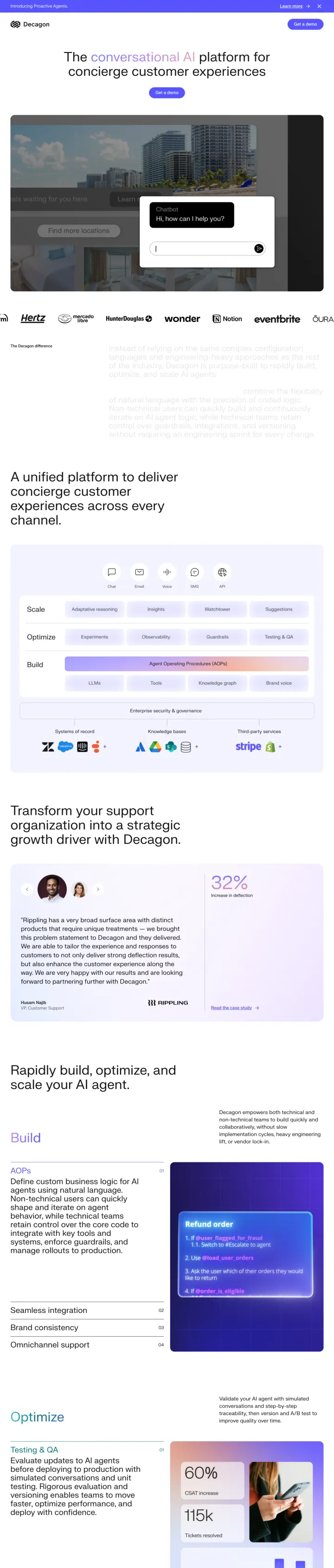
Show a video demo of your product in action directly below the hero headline, so the enterprise evaluator can see the actual interface before deciding whether to request a live demo.
Logo wall features 15+ recognizable consumer and tech brands (Notion, Duolingo, Rippling, Eventbrite, Hertz, Affirm, Chime, Gopuff, Noom, Samsara) that any buyer would recognize, creating immediate 'these companies trust this startup' credibility
Embedded YouTube video demo ('Introducing Decagon AI Voice Agents') lets the prospect see the product working without committing to a sales call, which is critical for the 45% Blue-analytical persona who wants to evaluate independently first
The page positions 'Agent Operating Procedures (AOPs)' as a proprietary methodology that combines 'flexibility of natural language with precision of coded logic,' giving technical evaluators a concrete framework to assess rather than vague AI claims
The hero headline extracted from markup is an entire paragraph about configuration languages and engineering approaches; the actual visual headline is 'The conversational AI platform for concierge customer experiences' which is much better but still generic
No customer metrics or case study data anywhere on the page; the enterprise logos are impressive but without quantified outcomes they remain passive social proof
'Get a demo' is the only CTA with no alternative path for visitors who want to self-evaluate first (free trial, interactive demo, or pricing page)
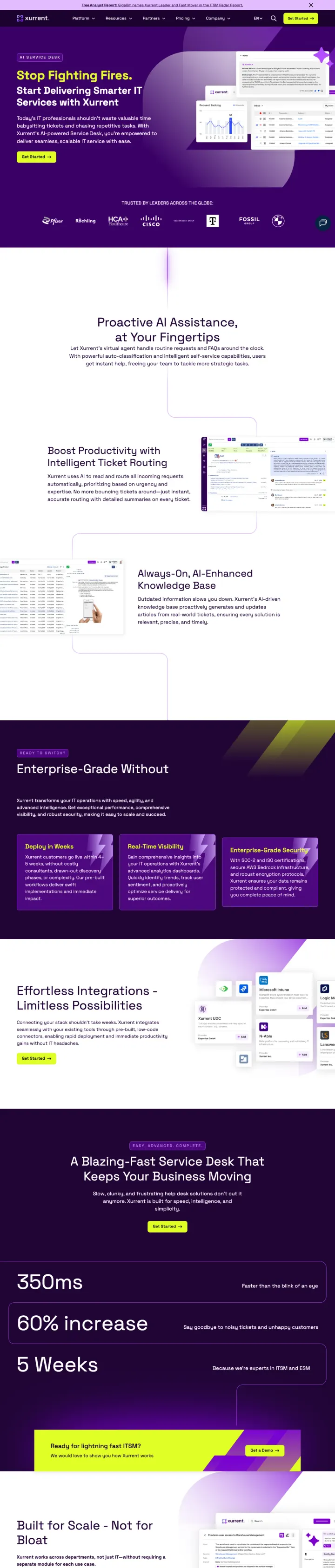
Dedicate an entire visual section to analyst and review badges (G2, Gartner Peer Insights, GigaOm, Software Advice) arranged in a grid, so the enterprise buyer running a vendor evaluation can photograph or screenshot them for their internal presentation.
9 analyst/review badges visible in one section (G2 Momentum Leader, G2 Users Love Us, G2 High Performer Enterprise, Gartner Peer Insights Customer's Choice, GigaOm Leader, Software Advice Best Customer Support, USM Certified, ITIL Award) create a wall of third-party validation
Enterprise logos include Pfizer, Cisco, Volkswagen Group, BMW, Deutsche Telekom, and HCA Healthcare, which are exactly the type of large, risk-averse organizations that the ITSM buyer aspires to benchmark against
Free analyst report offer ('GigaOm names Xurrent Leader and Fast Mover in the ITSM Radar Report') in a top banner gives the Blue-analytical buyer a content download path that feels like research, not a sales pitch
No form on the page; the CTA is 'Get Started' which links to success stories rather than a demo request, creating a confusing conversion path for a PPC visitor expecting to request a demo
The headline 'The People's Choice for Service Management' is vague and could apply to any ITSM tool; it does not connect to the specific ad keywords about AI service desk or ticketing systems
Case study thumbnails below the badges show company stories but without any preview metrics; a headline like 'XAL Lighting: 40% faster incident resolution' would convert more clicks than 'Shining Success'
Put an animated product UI mockup directly beside the hero headline so the technical evaluator clicking your ad sees exactly what they will be configuring in their first session, not a stock illustration of abstract teamwork.
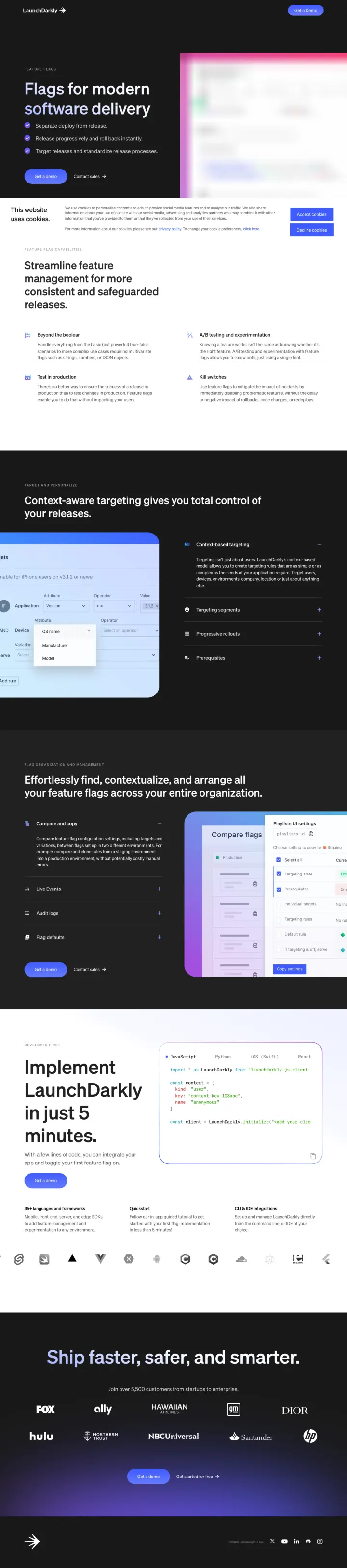
The hero pairs 'Flags for modern software delivery' with a real screenshot of the flag management interface, which satisfies the technical buyer's first unasked question ('what does this actually look like?') before they have to click into a demo request
Lower on the page, a live-looking diff of flag targeting rules and a code snippet showing the JavaScript SDK install turn the page into a self-serve technical brief that a staff engineer can use to build a buy-vs-build case internally
The closing logo strip (Fox, Ally, Bloomberg, NBCUniversal, HP, Atlassian, Santander, Hulu, EMC) pairs consumer-facing brands with regulated enterprises, signalling that the platform is safe for both velocity and risk-averse buyers
A cookie consent panel sits between the hero and the first product section on initial load, breaking the visual flow from headline to product screenshot that the rest of the page is designed around
The hero CTA 'Book a Demo' is the only conversion path above the fold, but the entire page is oriented around self-serve technical evaluation, which is a mismatch. A 'Start free' button paired with 'Book a Demo' would match how LaunchDarkly's audience actually buys
No customer quote, metric, or named case study appears above the fold; the visitor has to scroll past three feature sections before seeing any social proof, and even then it is only logos without outcomes
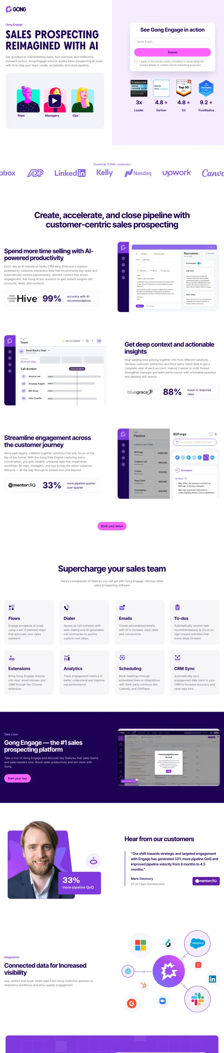
Run a short hero video clip of your actual product dashboard (not a lifestyle reel) and pair it with a named-customer stat bar immediately below. The Blue-analytical buyer needs both the 'what does it look like' answer and the 'what results can I expect' answer in the first viewport, and this page gives them both in one scroll.
The customer quote block in the hero names a Senior Sales Operations Manager at Engine with a '5x increase in sales productivity' stat. Naming the exact role (not just 'VP of Sales') signals that the product wins at the practitioner level, which is who actually champions the tool internally
Below the fold, three side-by-side stat cards with '99%' increase in outbound selling time, '88%' deep customer insights, and '33%' streamlined engagement pull specific percentages out of Hive, Unbounce, and other named customers. These are implementation-specific numbers, not aggregate marketing claims
The integration logo section is built around real enterprise stack tools (Microsoft, Zoom, Teams, Gmail, HubSpot) rather than decorative icons, directly addressing the 'will it fit our stack?' objection that kills mid-funnel enterprise deals
The hero headline 'SALES PROSPECTING REIMAGINED WITH AI' is three category buzzwords stacked together and does not say anything a competitor could not also claim. Replace with the outcome language already proven to work lower on the page
The logo row shows LinkedIn, Kelly, Upwork, Canva, Invesco but without any stat beneath them, which is a missed opportunity given the rest of the page is built around named-customer outcomes
The 'Win more with Gong Engage' closing block repeats the hero CTA without any new information or social proof, so the visitor who scrolled that far and did not convert has no reason to change their mind
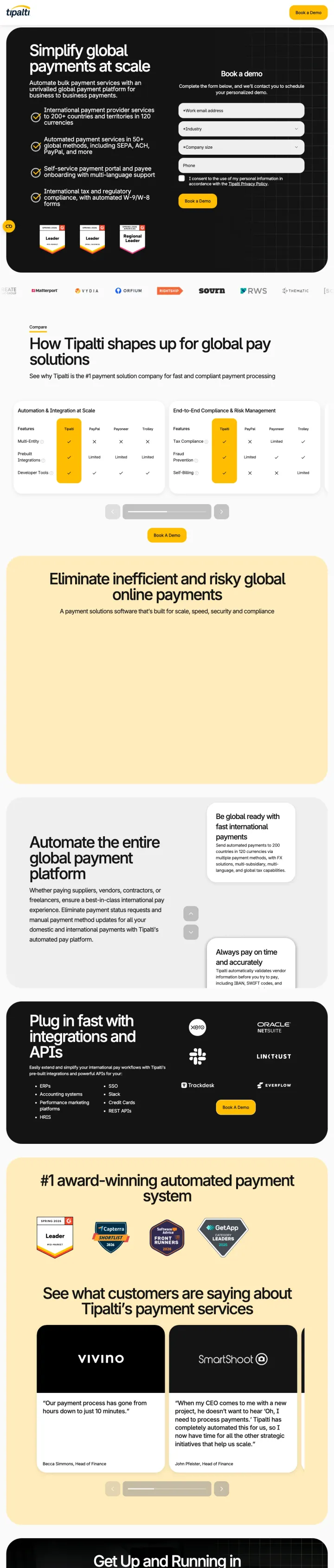
Below the hero form, drop a head-to-head comparison chart that names your top competitors and shows where you win across the metrics a finance buyer actually tracks (fee structure, currencies supported, compliance coverage). Most software pages only claim superiority. Tipalti shows it.
The top-right 'Book a demo' form sits pinned next to a headline that states the exact scope ('Simplify global payments at scale') and four bullets covering countries (200+), currencies (120), payment methods (50+), and compliance (W-8/W-9). The buyer reads the scope and qualifies themselves into the form in the same glance
Mid-page, a comparison matrix puts Tipalti against named competitors (Bill, Sage, MineralTree, and others) with green checkmarks and blank cells, creating a document the internal champion can screenshot and send to procurement without having to build one themselves
The 'See what customers are saying' block pairs named companies (Vinimo, SmartBooks) with quote-specific context ('it took us years to find a proper partner'). Named case studies with time-based outcomes are more credible than NPS scores for a finance buyer who thinks in months not satisfaction points
The hero visual is a static form against a black gradient, and the entire upper half of the page has no product UI preview. A finance buyer trying to picture what reconciling 50 currencies looks like in the Tipalti interface gets no visual to anchor on
The customer logo bar (Vinimo, SmartBooks, Doordash, others) is below the fold. Moving it into the hero next to the form would compress proof and action into a single viewport
'#1 award-winning automated payment system' is a generic superlative. Replacing it with a specific recognition ('G2 Grid Leader, Summer 2025') would carry more weight for the Blue-analytical CFO evaluating vendors
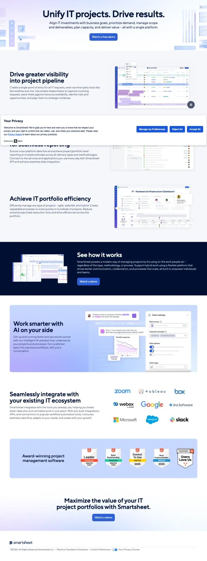
Put a real product dashboard screenshot in your hero pane and label three specific use-case tiles directly beside it ('project pipeline,' 'portfolio efficiency,' 'work smarter on AI'). The IT portfolio manager clicking your ad is comparing three tools in a spreadsheet. Your hero should show them what a single day of work looks like in yours.
The hero features a real Smartsheet dashboard with actual report widgets (pipeline bars, milestone charts, status cells) rather than a marketing illustration, and that visual alone closes the 'will this feel like a toy?' objection for the IT buyer who remembers MS Project
The integrations strip names Zoom, Microsoft, Google, Webex, Box, Google Workspace, Salesforce, and Slack with logos, which directly answers the enterprise IT question 'does it plug into everything we already run?' without forcing the visitor to click a separate integrations page
Six G2 Crowd badges (Leader, Best Estimated ROI, Easiest To Do Business With, Users Love Us, Most Implementable, Enterprise Leader) are stacked in a single row with different award angles, which gives the vendor-evaluation buyer a diverse set of proof points rather than six variations of the same badge
The hero headline 'Unify IT projects. Drive results.' is abstract and does not reference the portfolio-management specificity that the ad promised. Replace with 'Manage every IT project in one portfolio view' to match the searcher's mental model
The primary CTA is a 'Watch a free demo' button, which is a passive conversion compared to 'Book a 20-min walkthrough' or 'Start a free trial.' Enterprise IT buyers watching a demo video still have to self-qualify into sales, which adds a step
The closing CTA 'Maximize the value of your IT project portfolio with Smartsheet' is a generic benefit restatement rather than a fresh hook. A pricing snapshot or ROI calculator at the bottom would convert scroll-readers better than a second version of the hero message
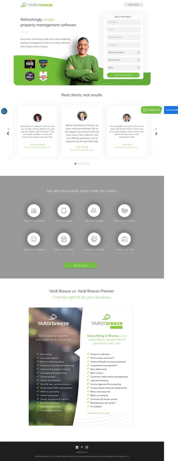
Place three named-customer quotes in a carousel directly below the hero form, each with a specific operational outcome (time saved, rent collected, tenant issues handled). Most vertical SaaS pages use anonymous testimonials. Named property managers with real role context ('Bret Cheney, RE Real Estate Services') convert skeptical owners faster than any feature list.
The hero form sits top-right with only six short fields and a green 'See For Yourself' button, while the hero copy ('Refreshingly simple property management software') directly matches the ad headline 'Refreshingly Simple Property Management Software, Built for Smaller Residential Portfolios.' Perfect ad-to-page continuity
The named-customer quote carousel immediately below the hero names individuals, their firms, and their roles ('Bret Cheney, RE Real Estate Services') with outcome-specific quotes, which is a pattern that rarely appears in vertical real-estate SaaS but works because the buyer evaluates peer operators before software features
The side-by-side 'Yardi Breeze vs. Yardi Breeze Premier' comparison table lower on the page pre-qualifies the visitor into the right product tier before sales has to, shortening the sales cycle and increasing demo-to-close rates for the correctly scoped lead
The hero photo is a generic smiling-employee stock shot rather than a screenshot of the Breeze interface, so a visitor searching 'rent software' still cannot picture what the product looks like until they request the demo
The page has a 'Get a Demo' sticky button that overlaps the customer-quote carousel arrows, causing one quote pagination control to become unclickable on certain viewports
The eight-icon feature grid (Property Marketing, Online Leasing, Affordable Pricing, Built-in Accounting) uses category-generic labels that could describe any PMS vendor. Replacing them with outcome phrases ('collect rent in 48 hours') would differentiate Breeze from AppFolio and Buildium
Pages that break the playbook in interesting ways
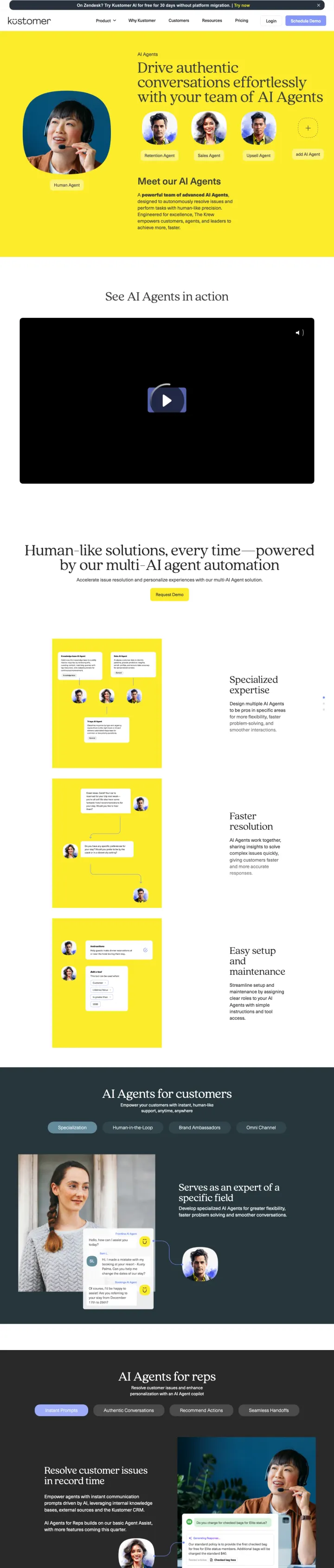
Why This Breaks the Rules: Enterprise B2B convention says PPC landing pages should be focused and short. Kustomer builds a 7,500-word page that functions as a complete product evaluation document. This works because the AI customer service buyer needs to build an internal business case, and this page gives them everything they need in one URL they can share with stakeholders rather than sending them to 5 different pages.
Interactive product demo video ('See AI Agents in action') with a large play button and blue CTA on a yellow background creates a visual break that stands out against the surrounding product content
The page addresses every stakeholder in the buying committee: technical evaluators get agent configuration details, support directors get ROI metrics, and CX leaders get customer experience positioning
'Human-like solutions, every time' with specific multi-AI agent automation descriptions gives the technical buyer architectural detail while keeping the business buyer engaged with outcome language
Cookie consent popup dominates the initial viewport with privacy policy text, pushing all product content below the fold before the visitor can see anything about AI agents
7,524 words means the visitor searching for 'ai customer service agent' gets a product encyclopedia instead of a focused conversion page; the average PPC visitor scans for 15 seconds, not 15 minutes
No enterprise logos visible above the fold; the page bets entirely on product depth rather than the social proof that enterprise buyers use to shortcut vendor evaluation
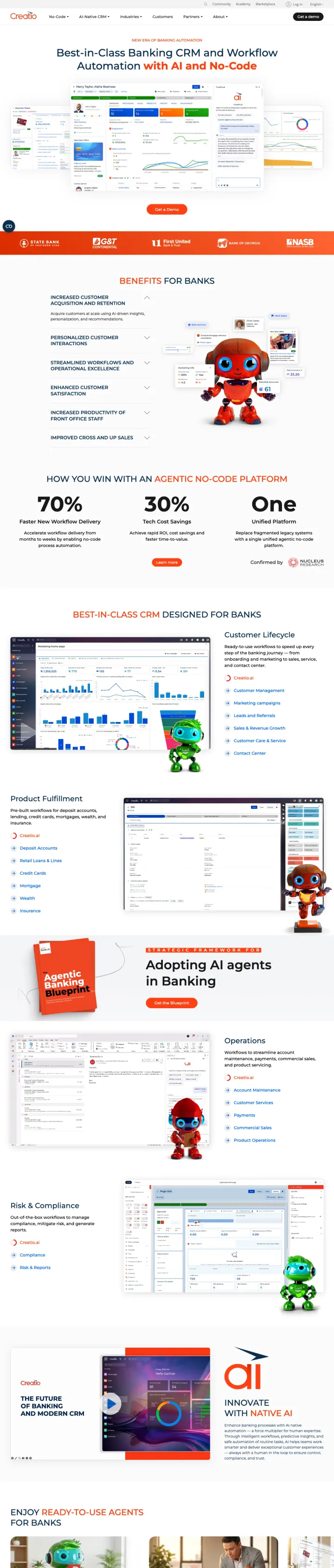
Why This Breaks the Rules: Enterprise banking CRM should feel corporate and serious. Creatio uses playful red mascot characters throughout the page, mixed with actual product screenshots and analyst recognition. The contrast between the playful visual identity and the serious business content ('recognized as a Leader by Gartner and Forrester') creates a distinctive page that stands out from the sea of blue-and-white enterprise software pages.
Industry-specific page for 'banking CRM' matches the exact keyword intent with dedicated content about customer acquisition, loan origination, and banking compliance rather than a generic CRM page with banking mentioned once
Analyst recognition ('Leader by Gartner and Forrester') appears in the ad copy AND on the page, creating ad-to-page message continuity for the enterprise buyer who clicked specifically because of the analyst endorsement
Banking customer logos (HarborOne, GT Continental, OTP, Avidia, NASB) are mid-market banks that are the exact target customer profile, rather than aspirational Fortune 500 logos that might feel unreachable
No form on the page despite 122 total links; the only conversion path is 'Get a Demo' which links to a separate page, adding friction to the conversion path at high CPCs
The red mascot characters (visible in the hero and throughout) may undermine credibility with conservative banking IT buyers who expect gravitas, not whimsy, from their CRM vendor
Page has zero navigation links but 122 total links scattered throughout content sections, creating an overwhelming number of click paths away from the demo CTA
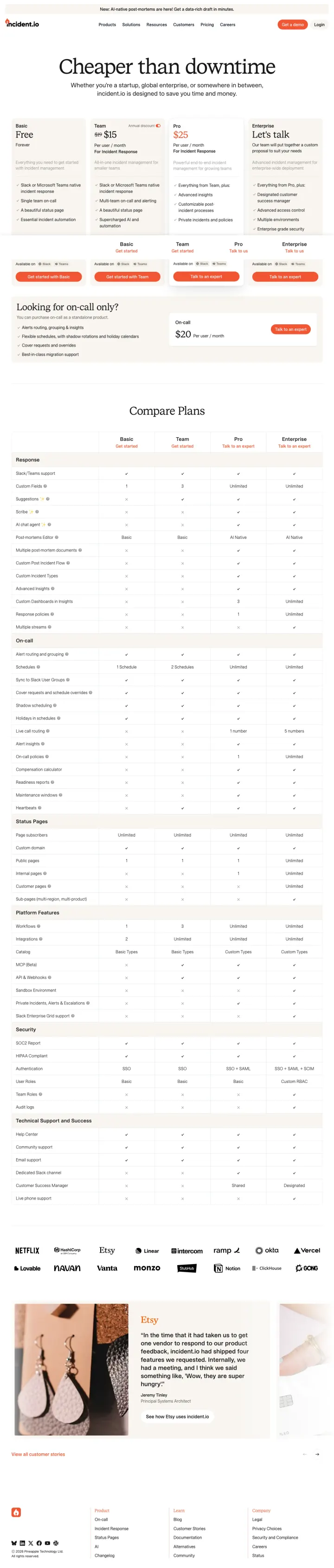
Why This Breaks the Rules: The conventional PPC playbook sends incident-management traffic to a product feature page with a demo CTA and hides pricing behind a gate. Incident.io runs the opposite experiment: they send PPC clicks directly to a pricing page with Free, Team ($25), Pro, and Enterprise tiers compared across 60+ features in a single scrolling table. The bet is that engineering buyers who self-qualify on price convert faster than the ones who have to book a call to find out if they can afford the tool.
A four-column pricing table with a Free tier labeled '$0 forever' removes the cost objection before the buyer asks, and the feature-by-feature comparison lets the technical evaluator find their specific use case (on-call schedules, Slack integration, post-mortems) without clicking into a separate docs page
The 'Cheaper than downtime' headline directly above the table reframes the pricing conversation from 'how much does this cost?' to 'what does NOT having this cost?' This is the same rhetorical move cybersecurity vendors use to justify premium pricing, and it works here because incident tooling has identical stakes
At the bottom of the page, the page stacks customer logos (Netflix, Etsy, Ramp, Ovo, Monzo, Linear) beside a case study on Etsy with a specific outcome, which adds enterprise credibility without pulling the visitor away from the pricing decision
The hero lacks a customer quote or named case-study outcome above the pricing table, so the buyer who lands cold on the pricing page has no trust signal before they evaluate dollar figures
The feature comparison table runs to roughly 60 rows before the customer logos appear, and there is no sticky nav or section jump, so a PPC visitor looking for a specific feature has to scroll through unrelated capabilities before finding it
'Cheaper than downtime' is a clever frame but it is not reinforced anywhere else on the page with actual downtime cost data. Adding a single stat ('the average enterprise outage costs $540k per hour') would turn the headline from a pun into a proof point
2 pages burning ad spend with fundamental issues
Every click to these pages costs real money. We found broken trust signals, mismatched intent, weak CTAs, and messaging that ignores what the searcher actually typed. Here is what to avoid.
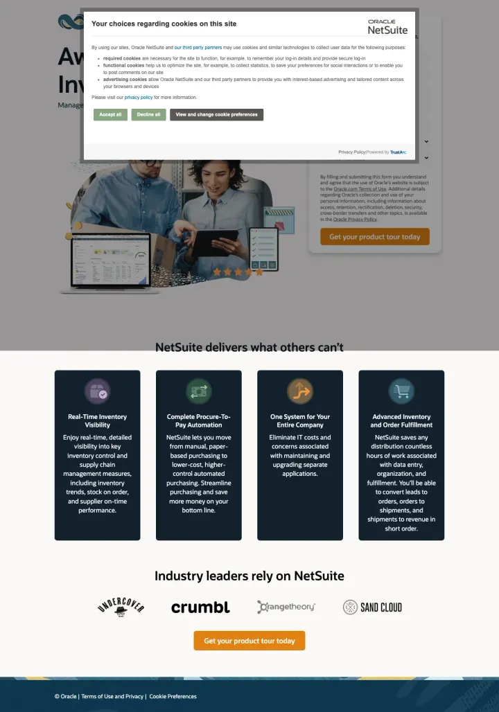
NetSuite is spending on 'netsuite' (135,000 monthly searches) and 'erp software' (49,500) and landing visitors on a page where a cookie consent modal covers the form and hero. The page below the modal has 142 words total and 4 generic benefit icons. At Oracle-level CPCs, every visitor who clicks 'View and change cookie preferences' instead of scrolling past the modal is a lost conversion.
Cookie consent modal covers the entire hero and form on initial load; the visitor sees a wall of privacy text with three buttons before they see any product content or the conversion form
The page has only 142 words of actual content and 9 total links, which means the visitor who scrolls past the cookie wall finds almost nothing to evaluate before being asked to 'Get your product tour today'
The URL itself (6262239.extforms.netsuite.com with a 200-character query string) looks like a phishing link, undermining the trust that the Oracle/NetSuite brand should provide
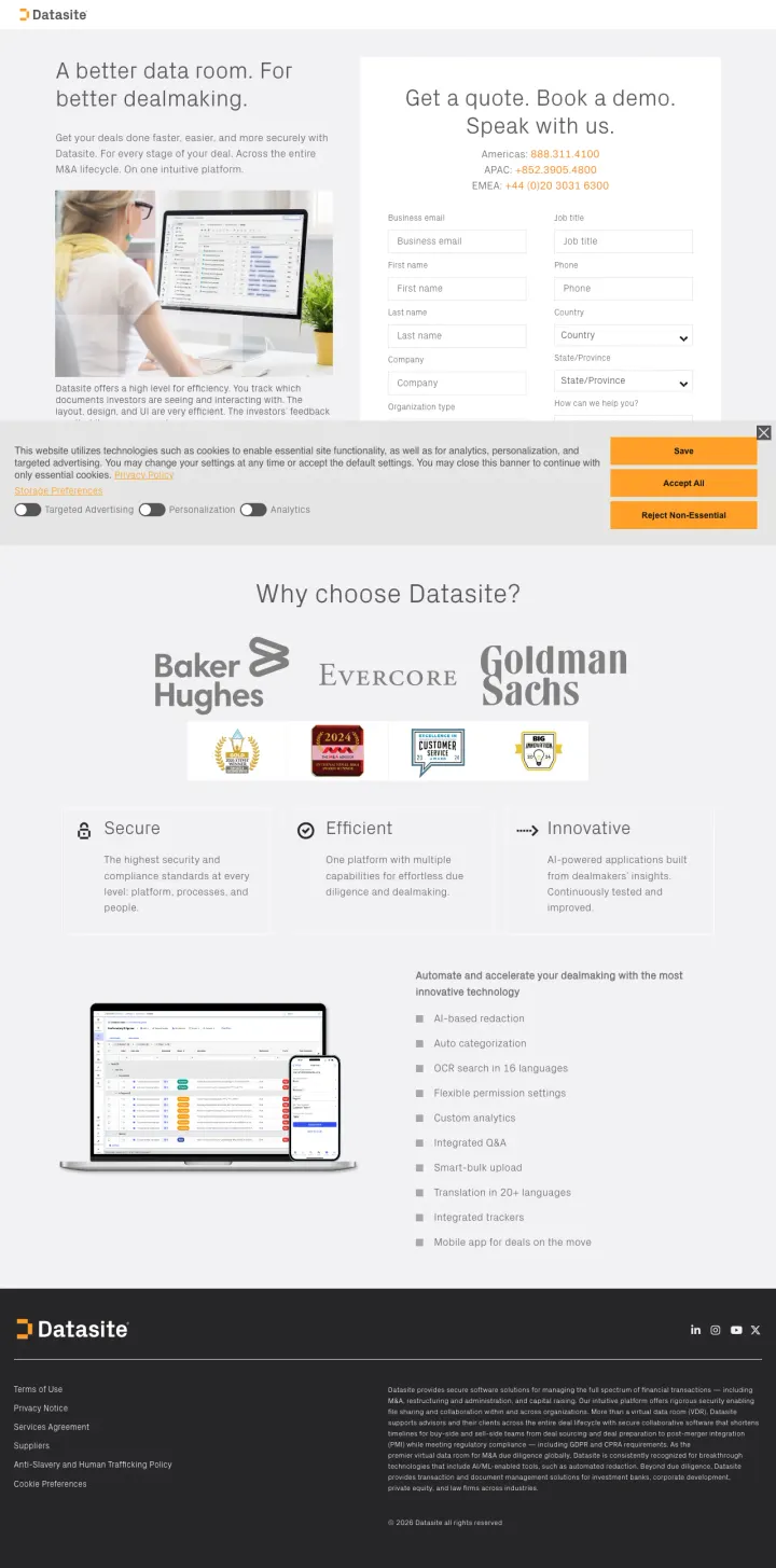
Datasite bids on 'virtual data rooms for m&a', 'secure virtual data room', and 'deal room software' (high-intent M&A terms with $30-$80 CPCs) and sends those expensive clicks to a split-screen page that asks for 16 form fields before the visitor has seen a single customer logo, case study, or product screenshot. A cold-traffic M&A buyer comparing three VDR vendors is asked to commit more info upfront than most enterprise vendors ask after a first call.
Sixteen-field form (business email, phone, country, state/province, company, organization type, plus name fields) asked up-front of cold traffic. At M&A-vertical CPCs, each additional field past field four cuts conversion roughly in half. Most of these fields belong after the demo is booked, not before
The hero headline 'A better data room. For better dealmaking.' is a generic superlative that names no differentiator. The buyer already searching 'virtual data rooms for m&a' wants to know what makes Datasite different from Intralinks or Firmex, not a tautology about better data rooms leading to better deals
No product screenshot, case study, or named-outcome appears above the fold. The only visual is a stock photo of someone with a laptop, which is indistinguishable from a Fiverr template and undercuts the premium positioning the domain is trying to claim
ZoomInfo shows Solaris +54%, Apple +43, Agora 10%, SurveyMonkey with specific percentage-improvement stats beneath each logo. Decagon shows Notion, Duolingo, Rippling, Eventbrite, Hertz, Affirm. Xurrent stacks Pfizer, Cisco, Volkswagen, BMW, Deutsche Telekom. Gong pairs 5,000+ customers with Link...
ZoomInfo places Ksenia Kouchnirenko, VP Business Systems at SurveyMonkey, with a specific metric ('reduced sales response time from 20 minutes to just under 60 seconds') directly beneath the hero. Monday.com uses James Arnold, COO at Cenversa. Gong features a named Senior Sales Operations Manager...
Xurrent stacks 9 badges in one section including G2 Momentum Leader, Gartner Peer Insights Customer's Choice, GigaOm Leader, Software Advice Best Customer Support. Monday.com shows 7 G2 badges. Smartsheet has 6 G2 Crowd badges plus 'Users Love Us.' Creatio leads its ad copy with 'recognized as a ...
Every winner in this set either removes navigation entirely or reduces it to a minimal logo and primary CTA. Monday.com's contact-sales page has only 13 total links. Tipalti's PPC variant has a form pinned top-right with a clean hero below. LaunchDarkly holds nav to a single 'Book a Demo' button....
Winners treat PPC traffic as a dedicated audience with a dedicated page: stripped nav, form or demo CTA above the fold, named enterprise logos with outcome metrics, and a customer quote that a CFO could verify on LinkedIn. Losers bet on commitment before proof.