Free: 96 PPC tools + my AI Playbook book

These are real car dealerships / used car marketplaces pages spending actual money on Google Ads right now.
From real car dealerships / used car marketplaces Google Ads campaigns in the US
The landing pages actually worth stealing from
So you know exactly what to avoid
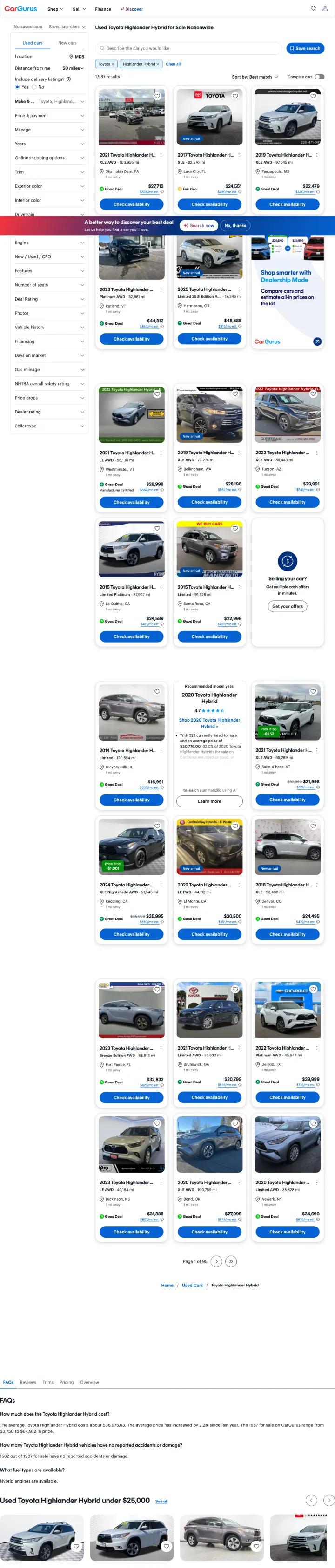
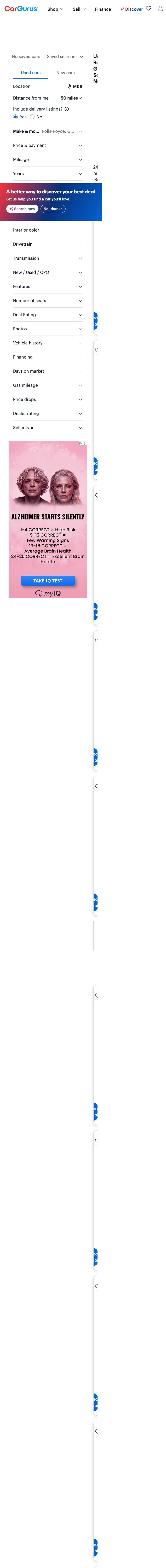
Send paid traffic to pre-filtered inventory listings that match the ad keyword exactly, rather than building dedicated landing pages. When someone searches 'used Toyota Highlander Hybrid,' show them 1,974 used Toyota Highlander Hybrids with prices and deal ratings, not a marketing page about why your marketplace is great.
Deal quality badges (Great Deal, Good Deal, Fair Deal) on every listing give the buyer instant confidence about pricing without requiring them to cross-reference other sites. This is the single most valuable conversion element on the page because it addresses the #1 used car buying fear: overpaying
20+ filter options in the sidebar (price, mileage, year, trim, color, drivetrain, transmission, engine, deal rating, vehicle history, financing, days on market, safety rating, price drops, dealer rating, seller type) serve the hyper-specific needs of used car shoppers who know exactly what they want
AI-powered search bar ('Describe the car you would like') at the top of results offers a natural language alternative to filter-heavy browsing -- this captures visitors who would rather type 'red Highlander under $25k with low miles' than click through 20 filters
The page title 'Used Toyota Highlander Hybrid for Sale Nationwide' does not match the ad keyword ('cars r us' or 'nj cars used') -- visitors clicking from those broader keywords may be confused to land on a specific make/model page
No location pre-fill despite the visitor potentially searching with geographic intent ('nj cars used'). The location field shows 'Add location' rather than auto-detecting or matching the search query's geography
Vehicle photos are small thumbnails that make it hard to assess condition -- for a $25,000-$45,000 purchase, the photos need to be larger and higher resolution to build confidence
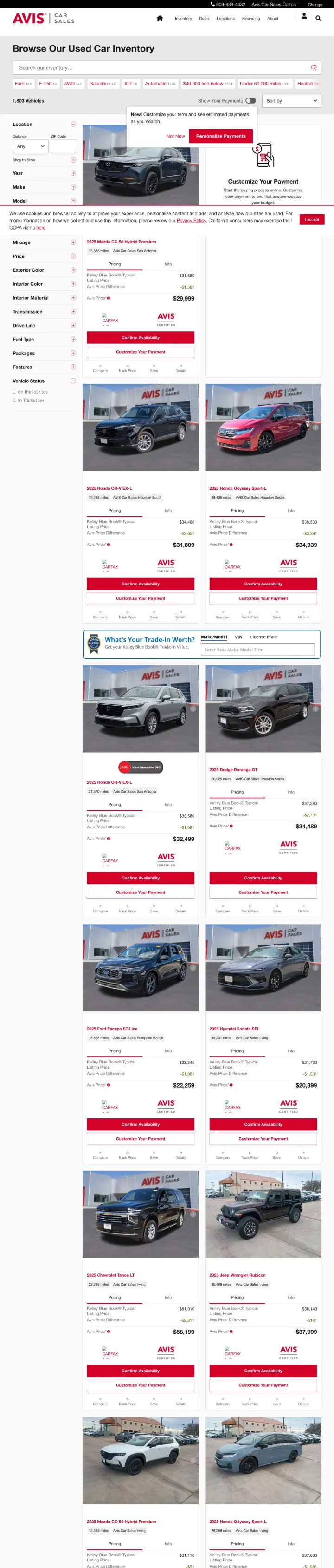
If you sell ex-rental vehicles, lead with the maintenance advantage. Avis positions their used cars as professionally maintained fleet vehicles with Carfax reports, which addresses the biggest used car fear (hidden mechanical problems) through the implied rigor of corporate fleet management.
Filter sidebar with make, model, year, price, mileage, and body style lets inventory browsers narrow 500+ results without scrolling through pages of irrelevant listings
Each listing shows price, mileage, and location in a consistent card format that makes comparison shopping possible without clicking into individual vehicle pages
Red accent CTAs on each listing card create visual urgency without being obnoxious -- the color stands out against the white and gray layout
No deal quality indicators or price benchmarking. Unlike CarGurus, visitors have no way to know if the listed price is fair without leaving the site to check Kelley Blue Book or Edmunds
Vehicle photos are small and show generic angles -- for a purchase of $15,000-$30,000, buyers need large, detailed photos to assess condition
No financing information visible on the listing page. Monthly payment estimates on each card would help buyers self-qualify by budget
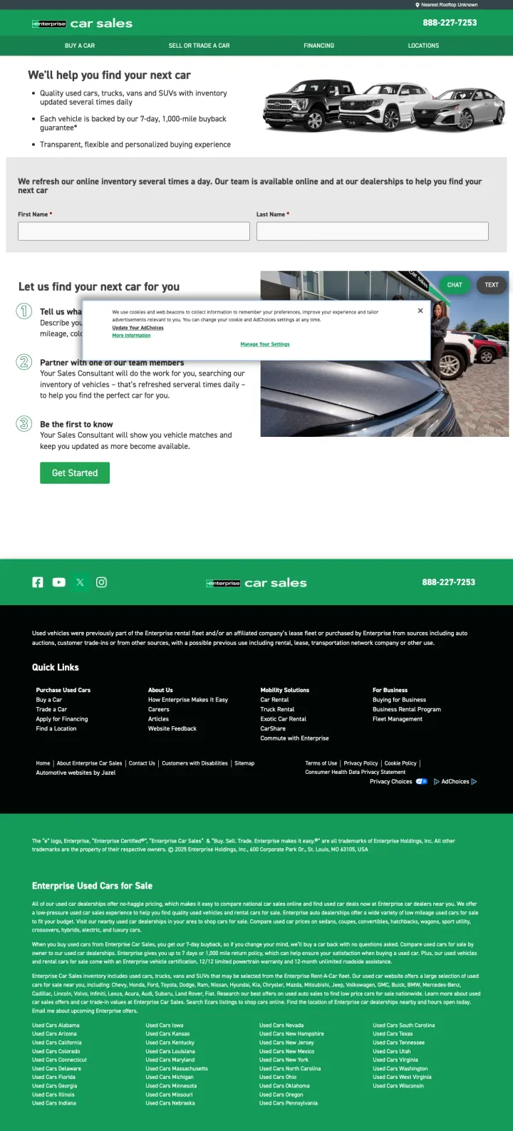
Instead of dumping visitors into a massive inventory grid, offer a "tell us what you want and we will find it" concierge flow. Enterprise Car Sales leads with a 3-step process (Tell Us, Partner, Be the First) that converts the page from a search engine into a personal shopping experience.
Three-step visual process (1. Tell us what you are looking for, 2. Partner with your Sales Consultant, 3. Be the first to know) reframes used car shopping as a service rather than a self-serve search, which justifies the visitor giving contact information
Bullet points above the fold sell the value proposition in three lines: quality used cars with 1,300-mile buyback guarantee, transparent and flexible buying experience, refreshed inventory three times daily
Green "Go Now" CTA button stands out against the white page and the dark hero image, creating a clear focal point for the visitor eye
No visible inventory on the page at all. Visitors who want to browse cars before talking to a salesperson hit a dead end -- there is no way to see available vehicles without submitting a form
The 888-227-7253 phone number is present but not styled as a prominent CTA for visitors who prefer to call rather than fill out a form
The page is very short with limited content -- the footer dominates the bottom half with legal disclaimers and links
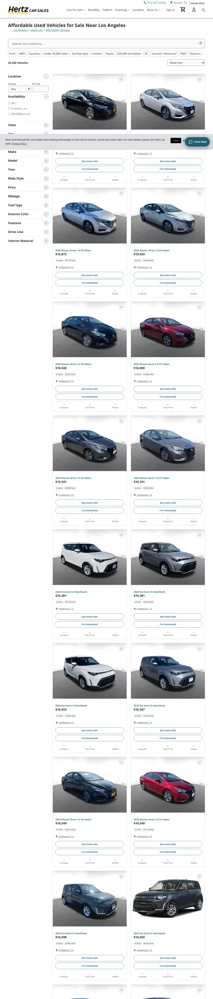
Show large, high-quality vehicle photos in your inventory listings. Hertz Car Sales uses full-width images that are 3-4x larger than CarGurus thumbnails, letting buyers assess vehicle condition without clicking into each listing.
Large vehicle photos with multiple angles visible in the listing view reduce the need to click through to detail pages, keeping the visitor in browse mode longer and reducing bounce from thumbnail frustration
Spec table below each vehicle (year, make, model, mileage, price) in a clean grid format makes side-by-side comparison possible by scanning vertically down the page
Location-specific inventory (Los Angeles affordable vehicles) pre-filters to what the visitor can actually buy locally, eliminating the disappointment of finding a great deal 2,000 miles away
No price benchmarking or deal quality indicators. Every car shows a price but visitors cannot tell if it is competitive without checking other sites
No financing calculator or monthly payment estimates. For "affordable vehicles" targeting budget-conscious buyers, the monthly payment matters more than the sticker price
The page design is utilitarian and feels like a database query result rather than a shopping experience
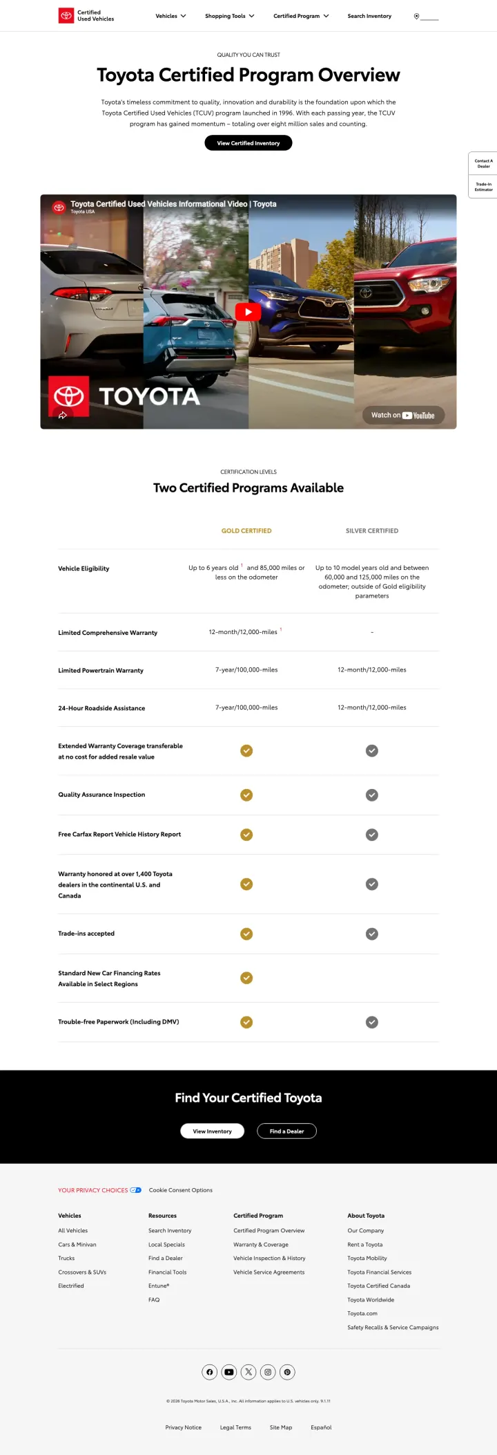
If you sell certified pre-owned vehicles, dedicate a page to explaining what certification actually means. Toyota Certified breaks down Gold vs Silver tiers with specific warranty terms, inspection details, and included benefits in a comparison table that justifies paying more than private-sale prices.
Gold Certified vs Silver Certified comparison table with specific criteria (age limits, mileage caps, warranty lengths) gives buyers a clear framework for understanding what they are paying for, turning an abstract "certified" label into concrete value
YouTube embedded video explaining the certification process adds credibility through a different medium and keeps video-preferring visitors engaged without leaving the page
Two Certified Programs Available section with side-by-side feature comparison (Vehicle Eligibility, Comprehensive Warranty, Powertrain Warranty, Roadside Assistance, Quality Assurance Inspection) answers every question a buyer has about certification tiers in one scan
No pricing context anywhere. The page explains what certification includes but never addresses the premium cost vs a non-certified used Toyota
The page is primarily educational, which means visitors with high purchase intent may find it too slow -- they want inventory, not an explainer
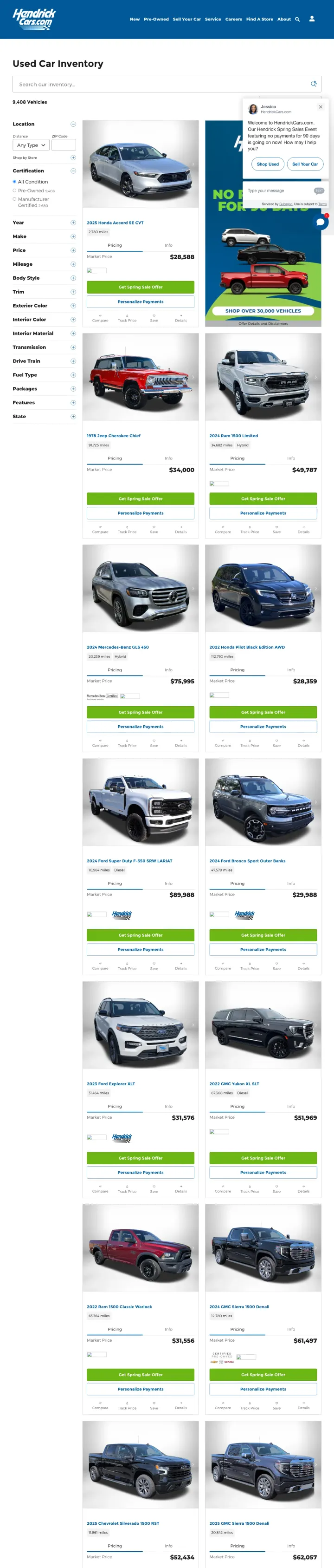
Use color-coded price badges to make pricing the most scannable element on your inventory page. Hendrick uses green price tags on every listing that pop against the white background, letting price-focused shoppers scan dozens of options in seconds.
Green price badges on every listing make the price the most visible element in each card, acknowledging that used car shoppers are price-first decision makers
Filter sidebar includes both standard filters (make, model, year) and dealer-specific ones (location, certified status) that help multi-location dealer groups show relevant local inventory
Multiple vehicle photos per listing in the card view give buyers more visual information without requiring click-through, reducing the photo-anxiety that plagues small-thumbnail inventory sites
The page loads with hundreds of listings across all Hendrick locations, which can overwhelm visitors who searched for a specific local dealer
No deal quality assessment or market comparison. Buyers cannot tell if Hendrick pricing is competitive without external tools
The Hendrick brand is regional (Southeast US) so the page serves only visitors in that geography, but there is no location detection to auto-filter to the nearest dealership
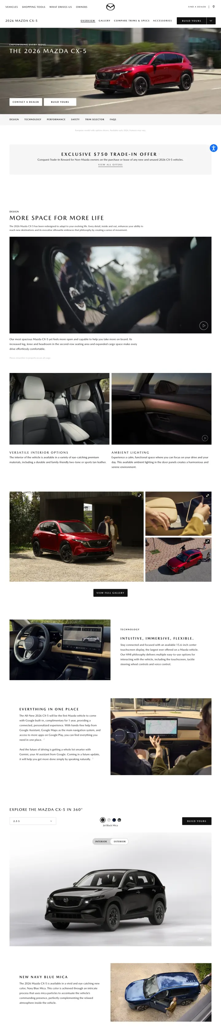
For new vehicle pages, lead with full-bleed lifestyle photography that shows the car in aspirational settings, not on a white studio background. Mazda treats the CX-5 page like a short film, with dramatic lighting, motion shots, and interior detail closeups that sell the feeling of owning the car.
Full-bleed cinematic photography with dramatic lighting and motion blur creates an emotional response before the visitor reads a single spec -- the car looks desirable before it looks practical
Interior detail shots (stitching, dashboard layout, technology screens) address the questions that exterior photos cannot: what does it feel like to sit in this car every day?
Which CX-5 is Right for You comparison section at the bottom lets visitors self-select between trims without navigating to a separate comparison tool
No pricing visible on the main page content -- visitors must scroll to the trim comparison or click Build and Price to see any numbers
The page is image-heavy which means slow load times on mobile connections. For paid search traffic, every second of load time costs conversions
Pages that break the playbook in interesting ways
Consider whether high-ticket luxury inventory ($100K+) deserves a different page template than mainstream used cars. A Rolls-Royce Ghost buyer has fundamentally different browsing expectations than a Toyota Highlander buyer -- they want provenance, condition reports, and concierge service, not filter bars and deal badges.
Even luxury car shoppers use marketplace search -- the 20,900 monthly search volume on keywords like 'buy used cars chicago' proves that Rolls-Royce buyers still start with broad marketplace queries rather than going directly to dealers
The same filter architecture (price, mileage, year, color, drivetrain) that works for mainstream cars still functions for luxury, because the underlying search behavior is the same even if the price point is 10x higher
A 'Great Deal' badge on a $200,000+ Rolls-Royce Ghost feels incongruous -- the deal rating algorithm that helps Toyota buyers avoid overpaying does not carry the same weight for ultra-luxury buyers who value provenance and condition over price-per-mile
Desktop screenshot failed to capture (only mobile available), suggesting the page may have rendering issues on desktop viewport that could affect real users
Same generic marketplace template with small thumbnail photos is inadequate for a car that sells partly on aesthetic experience -- luxury car shoppers expect full-width hero photography and detailed condition narratives
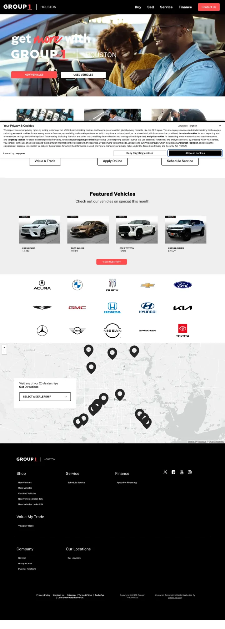
If you operate a dealer group with multiple brands, use a single landing page that shows the breadth of your brand portfolio. Group 1 shows logos for Acura, GMC, Subaru, Hyundai, Kia, Ford, and more, letting budget-flexible buyers browse across manufacturers in one place.
Brand logo grid (Acura, GMC, Subaru, Hyundai, Kia, Ford) immediately communicates that this is not a single-make dealership -- buyers who are undecided on brand see this as a one-stop shop
Three-path CTA strip (Value A Trade, Apply Online, Schedule Service) captures visitors at different stages of the buying journey rather than forcing everyone into inventory search
Featured Vehicles carousel with specific vehicles and pricing creates urgency through curated selection rather than overwhelming inventory dumps
The hero image and headline ("Get Auto-Approved at Group 1") leads with financing approval rather than vehicle selection, which may confuse visitors who searched for specific car makes
The page tries to do too much: buy, sell, finance, and service are all competing for attention on the same page
The Houston geo-targeting is smart but the page does not explain what Group 1 is -- a first-time visitor has no context for why they should trust this unfamiliar brand over going directly to a Honda or Toyota dealer
4 pages burning ad spend with fundamental issues
Every click to these pages costs real money. We found broken trust signals, mismatched intent, weak CTAs, and messaging that ignores what the searcher actually typed. Here is what to avoid.
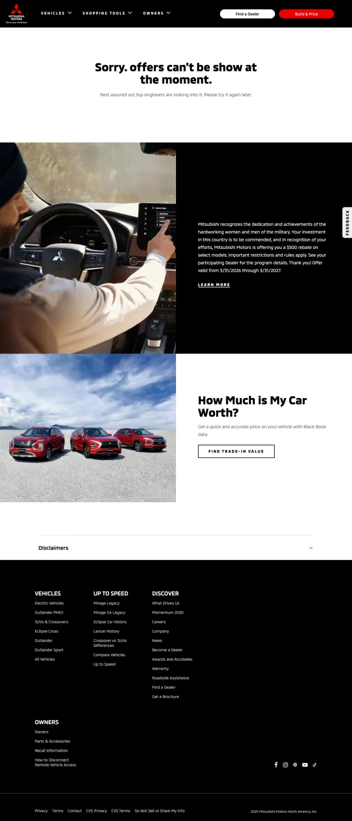
Visitors clicking a paid ad for Mitsubishi lease specials land on a page that says "Sorry, offers can't be show at the moment" (with a typo in the error message). The rest of the page shows a generic Military Heritage Month banner and a trade-in value tool that has nothing to do with lease offers. Every click to this page is a complete waste of ad spend because the promised content does not exist.
The headline feature of the page -- lease offers -- shows an error message instead of actual deals. "Sorry, offers can't be show at the moment" is the most expensive typo across every car-dealer page reviewed
The Military Heritage Month banner takes up prime real estate but has no connection to lease offers. This feels like a homepage content block that was copy-pasted into the offers page
The disclaimer section at the bottom occupies more vertical space than all the actual content combined

AutoNation, the largest automotive retailer in the US, sends paid search traffic to a page that shows "AutoNation.com is not available in your country or region" with links to Investor Relations and Press Releases. If Google Ads serves these ads internationally (or to VPN users), every non-US click lands on a page with zero automotive content and zero conversion paths. The page does not even attempt to redirect to a working alternative.
Complete geo-block with no fallback. Instead of showing a limited version of the page or redirecting to a search form, AutoNation shows a blank page with links to financial documents that no car buyer wants
The Investor Relations and Press Releases links suggest this fallback page was designed for financial analysts, not customers -- it was likely never tested as a paid search landing page
No redirect to a working page, no phone number, no email, no way for the visitor to engage with AutoNation at all
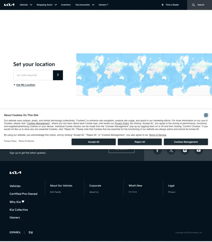
Visitors clicking Kia ads for 'auto dealerships in [city]' at 23,410 monthly searches land on a page showing a blank world map and a required ZIP code field. The ad promised to 'Explore Models & Lease Deals' but the page blocks all vehicle content behind a location gate. Every single shopper must perform an extra action before seeing a single car, price, or offer.
Ad promises 'Compare Models' and 'Explore Lease Deals' but the page shows a blank world map with zero vehicle content above the fold. Classic message-match failure at OEM-scale paid search volume
The location gate is required rather than optional. A visitor who wants to browse models first and pick a dealer later has no way to do so on this page
Cookie consent modal stacks on top of the already-sparse hero, leaving almost no usable screen real estate above the fold
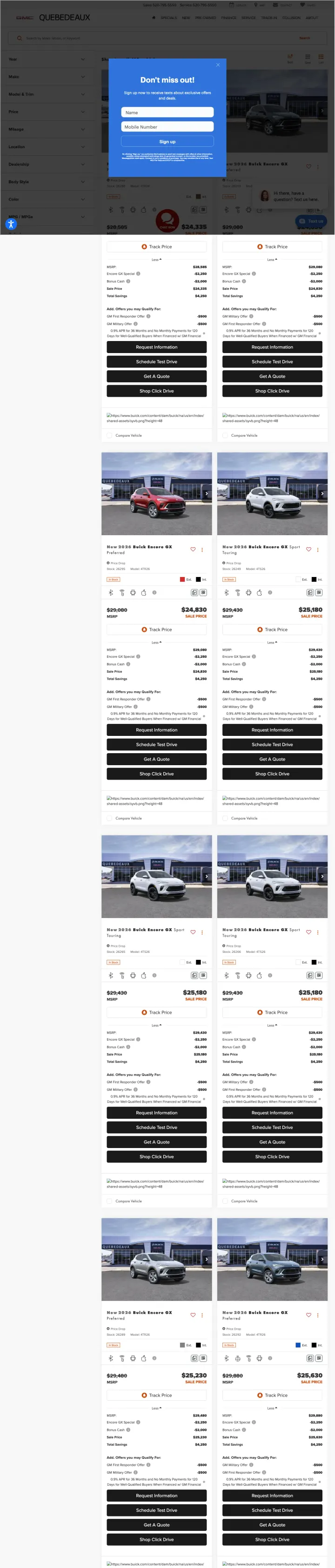
Visitors clicking 'arizona gmc dealerships' ads land on a new-inventory page where an SMS signup modal covers the hero, a chat widget sits in the corner, and the filter sidebar pushes the actual vehicles to the right third of the screen. The ad promised 'Huge GMC Selection' and 'Exceptional Offers', but the shopper has to dismiss two overlays before they can even read a vehicle price.
SMS signup modal fires immediately on page load and covers the vehicle grid. At small-dealer CPCs for branded and near-brand terms, the first second of attention is wasted asking for a phone number before delivering any value
Chat widget and sticky 'Text Us' button both occupy the lower-right corner at the same time, creating UI clutter that competes with the vehicle 'View Details' CTAs
Filter sidebar is open by default and consumes roughly one-third of the viewport, leaving only a narrow strip for the actual inventory cards. A collapsed filter panel would give shoppers more room to browse
CarGurus does not build dedicated landing pages for paid search. Instead, they send traffic from keywords like 'cars r us' or 'nj cars used' directly to pre-filtered search results pages (e.g., 'Used Toyota Highlander Hybrid for Sale Nationwide' with 1,974 results). This works because the visitor...
CarGurus overlays each listing with a deal quality indicator (Great Deal, Good Deal, Fair Deal) based on their proprietary pricing algorithm. This replaces the need for traditional trust signals like customer reviews or dealer ratings, because the marketplace itself is vouching for the price. For...
6 of 9 captured pages (AutoTrader, CarMax, Cars.com) blocked automated access with WAF/bot detection. This means these companies spend millions on paid search but make their pages invisible to competitive analysis tools, SEO crawlers, and any automated quality monitoring. It also means their own ...
CarGurus offers 20+ filter options in the left sidebar: price, mileage, year, trim, color (exterior and interior), drivetrain, transmission, engine, deal rating, photos, vehicle history, financing, days on market, gas mileage, NHTSA safety rating, price drops, dealer rating, and seller type. This...
There is no clear winner/loser divide in this set because the industry has converged on a single pattern: send paid traffic to pre-filtered inventory listings rather than building dedicated landing pages. CarGurus executes this well with deal badges and deep filtering.