Free: 96 PPC tools + my AI Playbook book

Credit card people are ruthless. They've got 3 tabs open, they know what APR means, and if they can't scan your rewards structure in about 5 seconds they're gone. The winners here aren't the prettiest pages. They're the ones that make comparing easy.
From real credit cards Google Ads campaigns in the US
The landing pages actually worth stealing from
So you know exactly what to avoid
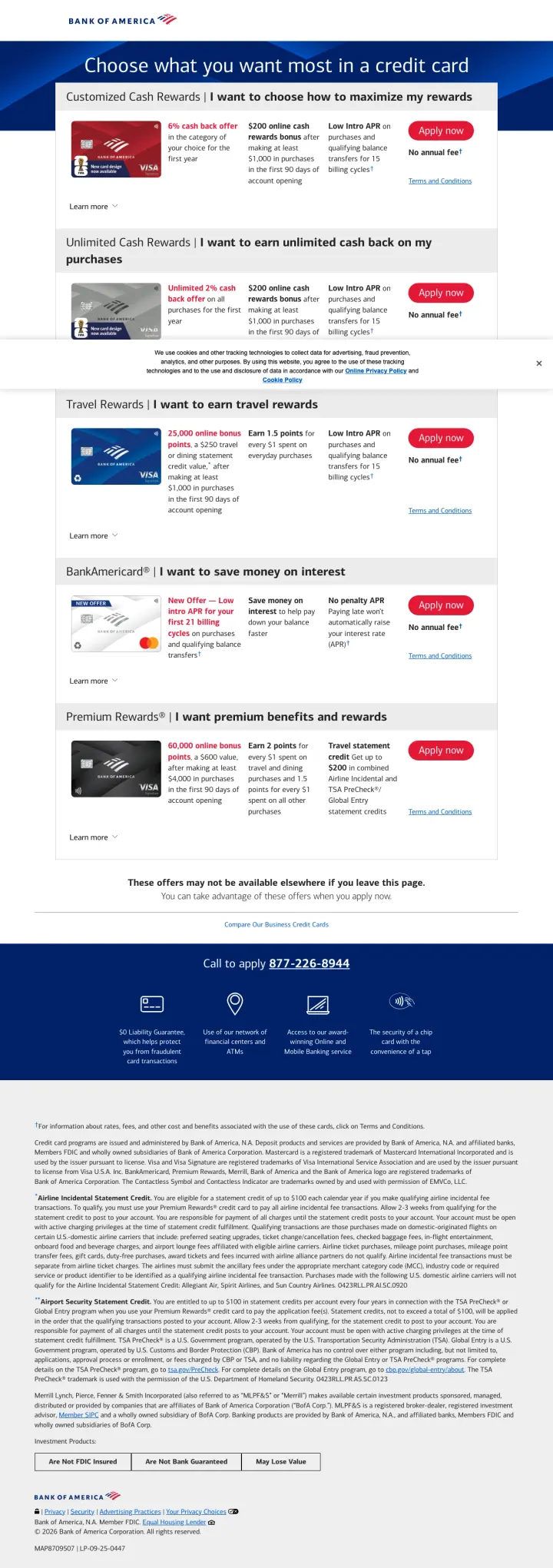
Frame each card as an intent statement ('I want to maximize my rewards' / 'I want to save on interest') instead of listing card names, so visitors self-identify in the first scroll without reading every option.
Five cards organized by desire, not by product name. Each section header starts with 'I want to...' which mirrors how the visitor thinks about their own needs, not how the bank organizes its product catalog
Every card row shows the three things credit card comparison shoppers scan for: cash back percentage, sign-up bonus dollar amount, and 'No annual fee' -- all in a single horizontal line without requiring a click
Urgency anchored to real scarcity: 'These offers may not be available elsewhere if you leave this page' creates legitimate FOMO because credit card offers genuinely rotate, unlike fake countdown timers
No pre-qualification tool on the page, so visitors still face the hard-pull anxiety when they click 'Apply now' -- a 'Check if you pre-qualify' step would convert more hesitant researchers
Phone number CTA at the bottom (877-226-8944) is disconnected from the card sections above -- visitors who want to call about a specific card have to scroll past all options first
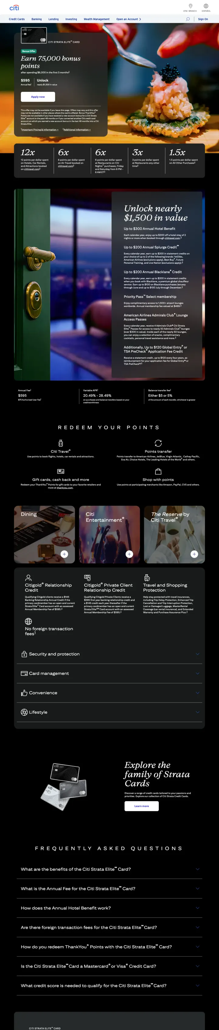
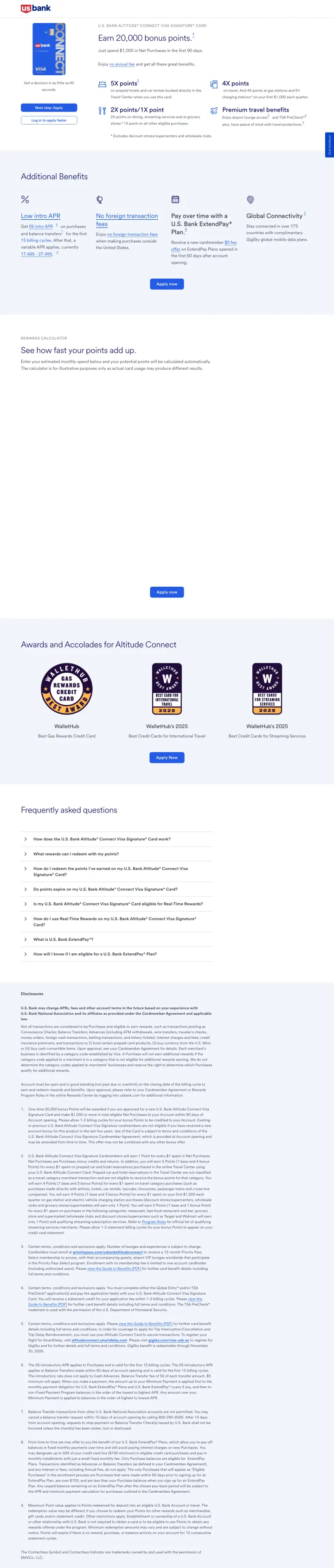
Use large-format multiplier numbers (12x, 6x, 3x, 1.5x) in a horizontal bar below the hero so comparison shoppers can scan the rewards structure in under 3 seconds without reading paragraph copy.
The hero pairs the 75,000 bonus points offer with a $595 annual fee and 'Unlock nearly $1,500 in value' on the same line, directly addressing the 'is the annual fee worth it?' objection with a net-value calculation
Multiplier categories use dark tiles with oversized numbers (12x, 6x, 3x) that are visible even at a glance -- this is built for the 5-tab comparison shopper who is scanning quickly across competitor pages
The food photography (chef plating a dish) sells the restaurant rewards benefit visually without saying 'great for dining' -- the image IS the benefit statement
The $6,000 spending requirement for the bonus is mentioned but the timeframe ('first 3 months') is in smaller text below -- this is the #2 question bonus-seekers have after the amount, and it should be equally prominent
No credit score guidance anywhere on the page -- for a $595 annual fee premium card, visitors need to know if their 720 score qualifies before they waste time reading benefits
Place 'Apply with Confidence: Know if you are approved with no impact to your credit score' as a banner between the hero and the card listings, so every visitor sees the risk-free pre-qual option before they start comparing.
'Apply with Confidence' banner with 'no impact to your credit score' directly addresses the #1 conversion barrier in credit cards -- approval anxiety. This converts researchers who would otherwise bookmark and leave
Filter tabs (All Cards, Featured, Travel, Cash Back, Membership Rewards, No Annual Fee) let the Blue-dominant comparison shopper narrow the field immediately rather than scrolling through 15+ cards
Each card listing shows Annual Fee, key benefits with icons, and 'Apply Now' + 'Show More Benefits' in the same row -- the visitor can make a quick decision OR deep-dive without leaving the comparison view
This is the full credit card category page with site navigation, not a PPC landing page -- paid traffic arrives with full nav (My Account, Cards, Banking, Travel, Rewards, Business) which provides 6+ exit paths before any card is shown
The Platinum Card hero takes up the entire viewport, pushing all other cards below the fold -- visitors searching for 'Amex credit cards' want to compare options, not see a single card promotion
If your card has a unique spending category advantage (like 3% on insurance premiums), lead with that niche benefit in the headline rather than generic cash back messaging, because it creates a reason to choose THIS card over every other 2% flat-rate option.
The hero leads with '3% cash back plus a $150 bonus' and immediately shows the tiered cash back structure (3% insurance, 2% gas/groceries/dining, 1% everything else) -- the visitor knows the full rewards math in one glance
Cash back calculator below the fold lets visitors enter their actual monthly spending to see projected rewards -- this addresses the 'what will I actually earn?' objection with personalized math instead of hypothetical scenarios
4.5-star rating from 3,975 reviews with '87% would recommend' gives specific social proof numbers, not vague 'highly rated' claims
The 'No annual fee' is mentioned inline in the paragraph text rather than as a prominent badge -- for credit card comparison shoppers, 'no annual fee' is a deal-breaker filter and should be visually distinct
Two identical CTA sections ('Next step: Apply' and 'Log in to apply faster') appear before any benefits are explained -- the page assumes the visitor has already decided, which may be true for branded search but fails for comparison shoppers
For balance transfer cards, make the intro APR duration the headline number (not the APR itself, which is 0%) because every balance transfer card offers 0% -- the differentiator is how LONG the 0% lasts.
'Get a low intro APR for 21 billing cycles' is the headline, not 'low intro APR' or '0% APR' -- the duration is the competitive advantage and they lead with it because balance transfer shoppers are comparing timeline, not rate
Three benefit tiles (Low intro APR, $0 Annual Fee, Purchase Security) use checkmark icons and one-line descriptions -- the visitor scans the three things balance transfer seekers care about without reading paragraphs
The page structure mirrors the decision process: hero with the core offer, then Additional Benefits, then FAQ, then legal -- no detours into brand storytelling or lifestyle imagery that would slow down a buyer ready to transfer a balance
The card image shows a plain white card that looks like a placeholder -- for a product category where the physical card IS a status symbol, the Shield card's generic appearance works against the perceived value
No balance transfer calculator or 'how much will you save' tool -- visitors transferring a $5,000 balance want to see the dollar savings versus their current 24% APR card, and this page makes them do that math themselves
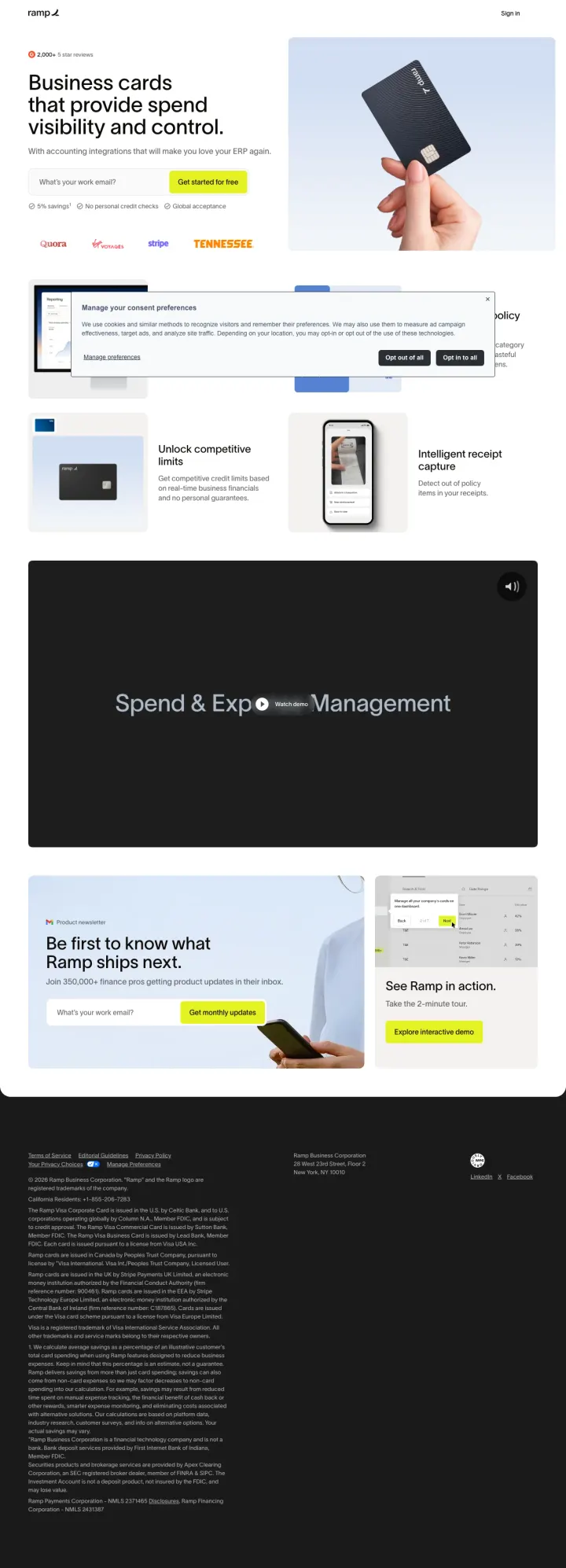
Replace the traditional 'Apply' CTA with a 'Get started for free' email capture, lowering the commitment from 'credit application' to 'create an account' -- this works for business cards where the decision-maker is a finance team, not an individual consumer.
'Unlimited virtual credit cards' as a headline reframes the product from a financial instrument to a spend management tool -- this positions against traditional business cards that cap you at 5-10 physical cards per company
The logo bar (Stripe, Notion, Discord, Shopify, Eventbrite) functions as enterprise social proof that bypasses the need for review scores -- if companies the visitor respects use Ramp, the credibility transfer is instant
Three objection-killers in a single line below the email field: '5% savings / No personal credit checks / Global acceptance' -- each one addresses a different business card buyer fear (cost, personal liability, international usability)
No pricing or fee information anywhere on the page -- business card buyers need to know interchange rates, monthly fees, and whether the '5% savings' claim has conditions before they hand over a work email
The page is extremely short (hero + feature tiles + footer CTA) with no case studies, ROI data, or comparison to competitors -- for a B2B purchase that affects company spend policy, this feels like a top-of-funnel page, not a conversion page
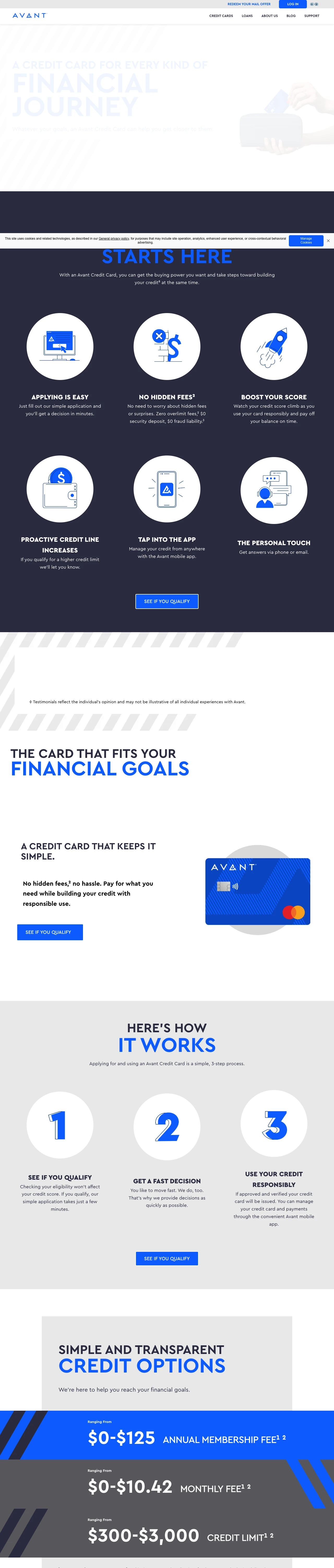
For credit-building cards, lead with 'No Hidden Fees' and '$0 security deposit' above the rewards -- this audience has been burned by predatory cards before, and trust recovery matters more than feature lists.
Dual CTAs ('See If You Qualify' + 'Redeem Your Mail Offer') serve two distinct visitor paths: organic searchers who found the card online and direct mail recipients who got a pre-approved offer. Most card pages assume one visitor type
Six benefit icons (Easy Apply, No Hidden Fees, Boost Your Score, Credit Line Increases, Mobile App, Personal Touch) address the specific anxieties of credit-building customers, not generic card benefits -- this audience worries about hidden fees and approval odds, not travel rewards
Trustpilot widget showing 4.4/5 from 31,864 reviews provides massive social proof for a subprime lender, where trust is the primary conversion barrier because the audience has likely been rejected by other issuers
The hero headline 'A Credit Card For Every Kind Of Financial Journey' is vague and could describe any card -- it wastes the most valuable real estate on the page with feel-good copy instead of the specific offer or APR range
Fee structure ($0-$125 annual fee, $0-$10.42 monthly maintenance) shows as a range lower on the page, but the wide range creates uncertainty -- a visitor seeing '$0-$125' does not know which end they will land on until they apply
Pages that break the playbook in interesting ways
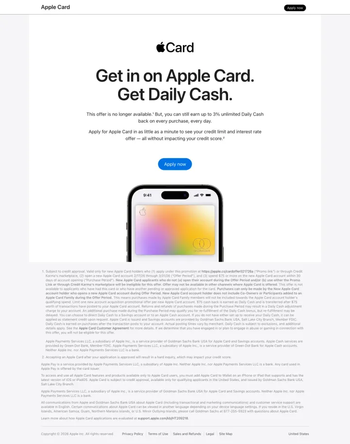
Why This Breaks the Rules: No comparison table, no rewards calculator, no card image above the fold, no application form on the page, no annual fee disclosure in a Schumer Box, and no site navigation. Instead, a single sentence ('The perfect credit card when you're on the go'), a cash back breakdown in oversized type, and 'No fees. Not even hidden ones.' Apple relies on brand gravity to do the selling that feature tables do for everyone else.
'No points. No gimmicks.' directly attacks the complexity that every other card in this dataset leads with (12x points! 6% categories! Multiplier tiers!) -- for the visitor overwhelmed by rewards math, this is a relief, not a deficit
Cash back tiers shown as massive colorful numbers (3%, 2%, 1%) with one-line category descriptions -- the entire rewards structure is digestible in 3 seconds, versus the 30+ seconds required to parse a typical card's multiplier grid
'No fees. Not even hidden ones.' as a standalone section with bold typography addresses the #5 customer objection ('What is the catch?') with a statement so confident it functions as both a feature and a trust signal
No application form or 'Apply' button visible above the fold -- the only CTA is 'Apply now' which appears after scrolling past the full benefits pitch, meaning high-intent visitors who already want the card must scroll through content they do not need
No credit score guidance anywhere on the page -- Apple Card is notoriously opaque about approval requirements, and this page does nothing to address the 'will I get approved?' anxiety
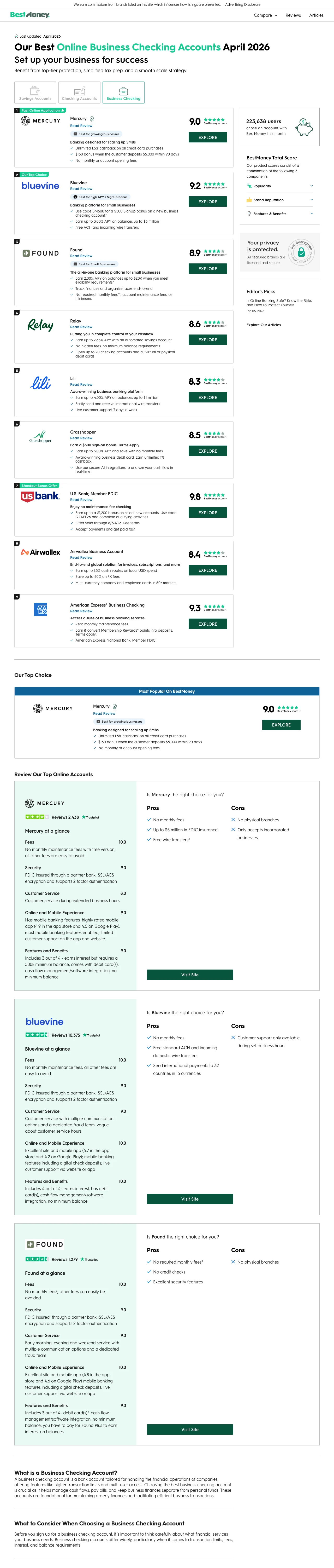
Why This Breaks the Rules: This is a business checking comparison page appearing alongside credit card ads, but the editorial methodology disclosure ('We earn commissions from partner links on this site, which affect how listings are presented') and structured comparison format (score out of 10, user count, 'Explore' CTAs) demonstrate how affiliate sites build enough trust to compete with direct issuers for financial product traffic.
The 'BestMoney Total Score' with a visible methodology breakdown (Brand Reputation, Features & Benefits, Rates, Popularity) gives the analytical visitor a framework for WHY each product is ranked where it is -- this transparency is what most affiliate sites lack and what makes visitors distrust ranked lists
User count displayed per product ('223,638 users chose BestMoney this month') provides social proof at the category level, not just individual product level -- it validates the comparison site itself, not just the products listed
Updated date ('Last updated: April 2026') with a visible timestamp signals freshness, which matters for financial products where rates and offers change monthly
This is a business checking page appearing for credit card keywords -- the intent mismatch means visitors searching for credit cards land on a checking account comparison, wasting the click entirely
The affiliate disclosure is present but buried in small text at the top -- while legally compliant, it does not address the visitor's core objection ('are these rankings paid for?') with the prominence the objection deserves
3 pages burning ad spend with fundamental issues
Every click to these pages costs real money. We found broken trust signals, mismatched intent, weak CTAs, and messaging that ignores what the searcher actually typed. Here is what to avoid.
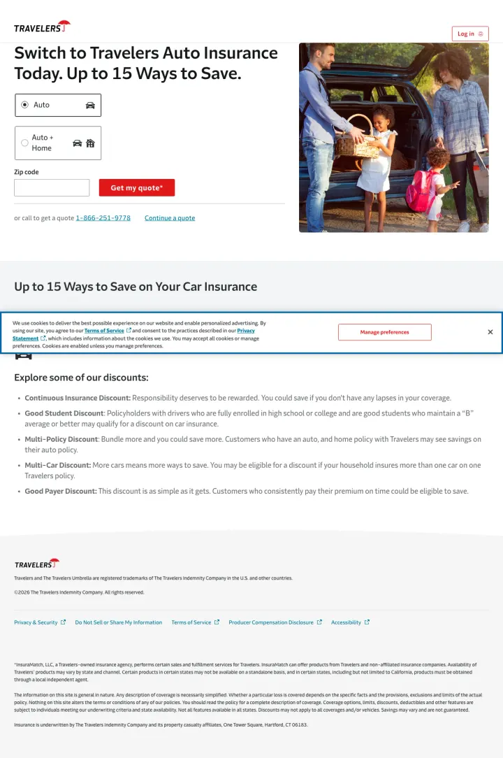
This is a Travelers auto insurance lead generation page with a zip code form and 'Get my quote' CTA. It is advertising alongside credit card results but is an entirely different financial product category. The page itself is actually a competent insurance lead gen page (short form, clear value prop, phone number), but it is categorically wrong for anyone searching for credit cards.
Total product mismatch: auto insurance quoting page appearing for credit card searchers. The headline 'Switch to Travelers Auto Insurance Today' could not be further from credit card intent
The page has no awareness that it might receive credit card traffic -- there is no cross-sell, no redirect, no 'Looking for credit cards?' pathway to recover the mismatched visitor
At $15-50 per credit card click, sending visitors to an auto insurance page with a zip code form is paying premium CPC for a product the visitor did not search for
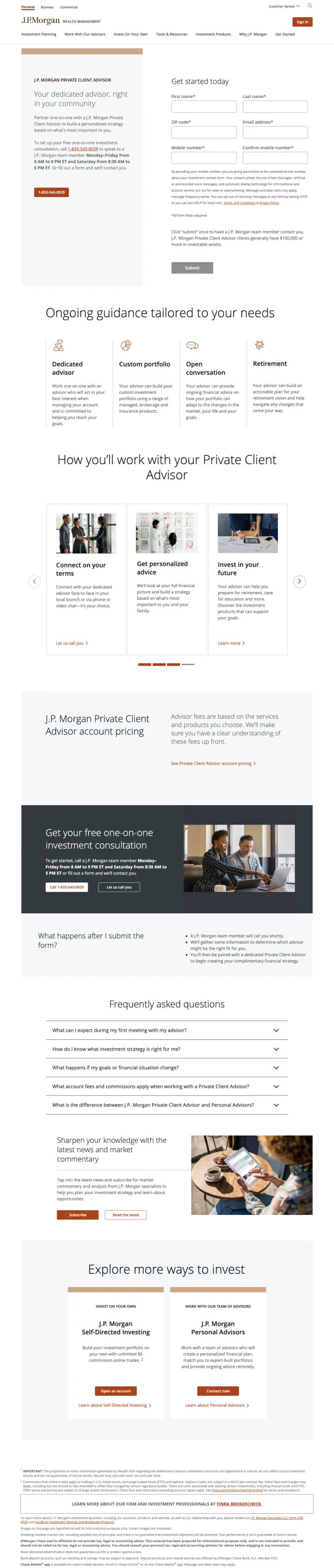
Chase is one of the largest credit card issuers in the US, but this page is a J.P. Morgan Private Client Advisor search form for wealth management. Visitors searching for 'Chase' credit card terms land on a page asking for $100,000+ in investable assets. The disconnect between the Chase brand (which signals credit cards to most consumers) and this J.P. Morgan wealth management page is a brand architecture problem compounded by PPC targeting.
The page is a lead capture form for J.P. Morgan Private Client Advisory requiring first name, last name, zip code, email, and mobile number -- this is a high-commitment form for a high-net-worth service, not a credit card application
The $100,000 minimum investable assets threshold mentioned in the copy immediately disqualifies the vast majority of credit card searchers, making the click cost a total loss
Chase's brand is synonymous with credit cards (Sapphire, Freedom, Ink) but this page lives under chase.com/personal/investments/ -- anyone arriving via brand search expecting credit cards finds a wealth management pitch instead
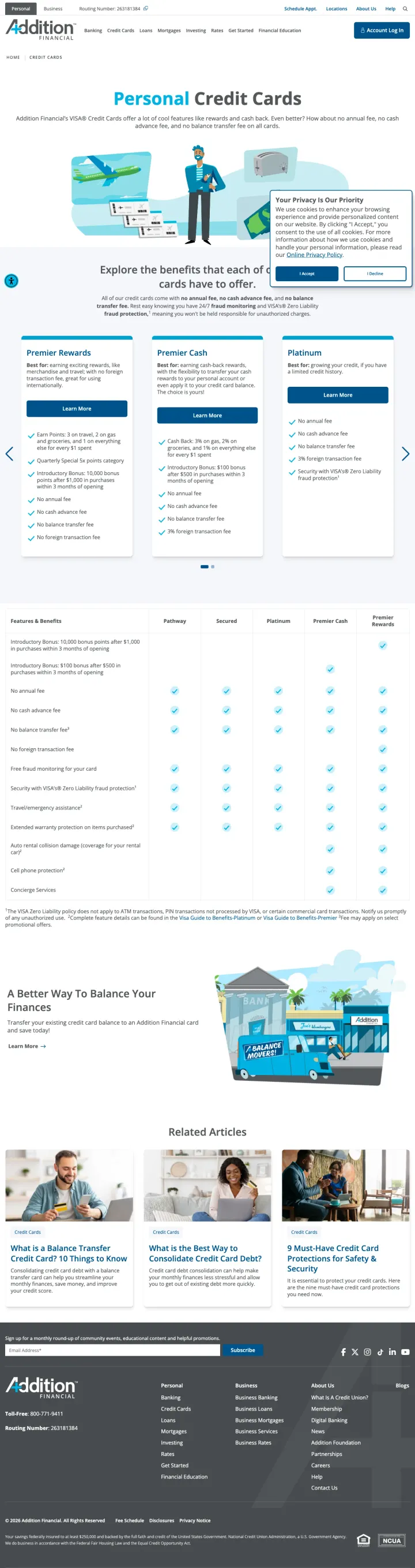
Addition Financial advertises with 'Get Instant Approval Online' in their ad copy, but the landing page is an educational article titled 'What Is A Credit Union?' with cartoon illustrations explaining the difference between banks and credit unions. The visitor clicking 'Get Instant Approval Online' expects a credit card application form; they get a Banking 101 lesson instead. At $15-50 per click, this message match failure is expensive.
The ad promises 'Get Instant Approval Online' and 'Online Credit Card Application' but the page is an educational explainer about credit unions with no application form, no card product details, and no apply button visible above the fold
Cookie consent popup covers the right third of the viewport on first load, and the content beneath is a 'What Is A Credit Union' article with cartoon illustrations -- neither element suggests the visitor is in the right place to apply for a credit card
The actual credit card page URL is /personal/credit-card but the content served appears to be a general credit union education page, suggesting either a CMS routing error or a deliberate content choice that ignores the paid traffic intent
Bank of America's comparison page uses intent-based headers ('I want to choose how to maximize my rewards' / 'I want to earn unlimited cash back') instead of listing card names. This works because credit card searchers already know WHAT they want from a card but not WHICH card delivers it. The se...
Citi and US Bank both lead with tiered rewards (12x hotels, 6x restaurants, 3x cash back on insurance) using large typography that makes the multipliers scannable. This matters because credit card researchers have 5 tabs open and are comparing point-per-dollar returns. A visible multiplier grid l...
American Express leads with 'Know if you are approved for a Card with no impact to your credit score' directly below the hero. This addresses the #1 approval anxiety objection: visitors want the card but fear the hard credit pull. Pre-qual removes that risk entirely and converts researchers into ...
The majority of pages captured were savings accounts, personal loans, business checking comparisons, insurance lead gen, and wealth management forms. This suggests credit card advertisers are either running broad match campaigns that leak into adjacent financial categories, or these advertisers a...
Winners lead with a specific bonus offer (75,000 points, $150 cash back, 6% in your chosen category) and give the visitor a structured way to self-select the right card. Losers in this dataset are not bad credit card pages; they are not credit card pages at all.