Free: 96 PPC tools + my AI Playbook book

Here's the thing about CRM. Nobody buys a CRM from a landing page. They're deciding which 2-3 to trial. Your page just needs to make the shortlist. Totally different job than most people think.
From real crm software Google Ads campaigns in the US
The landing pages actually worth stealing from
So you know exactly what to avoid
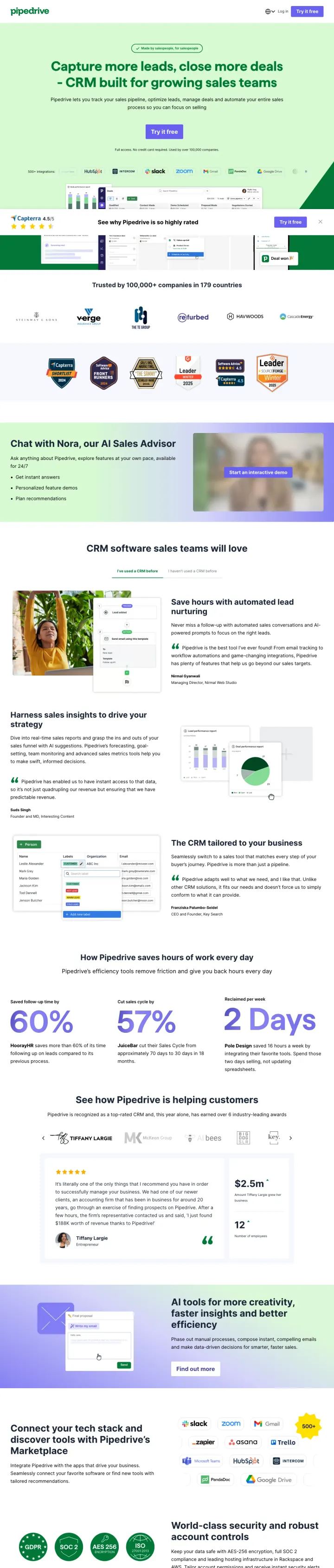
Show your top integration partner logos (Slack, Zoom, Google Drive, HubSpot) directly below the hero headline. CRM buyers' #1 concern is 'does it work with what I already use?' and visual logo proof answers that faster than any feature list.
Headline 'Capture more leads, close more deals - CRM built for growing sales teams' directly mirrors the ad copy ('Close Deals Faster', 'Manage Your Leads Effectively') creating immediate recognition for the paid traffic visitor
Integration logos row (HubSpot, Asana, Slack, Zoom, Google Drive, Twilio) immediately below the CTA addresses the #1 CRM buyer concern: 'Will it integrate with my existing tools?'
'Full access. No credit card required. Used by over 100,000 companies' as subtext below the CTA compresses three trust signals (risk removal, social proof, scale) into one line that removes all objections at the moment of decision
The Capterra 4.5-star badge at the bottom of the viewport is partially cut off and easy to miss. Moving third-party validation next to the CTA would leverage it at the decision point
Below-fold content shows metrics (60% more deals, 57% faster, 2 Days to set up) that would be more impactful above the fold where the visitor is deciding whether to scroll or bounce
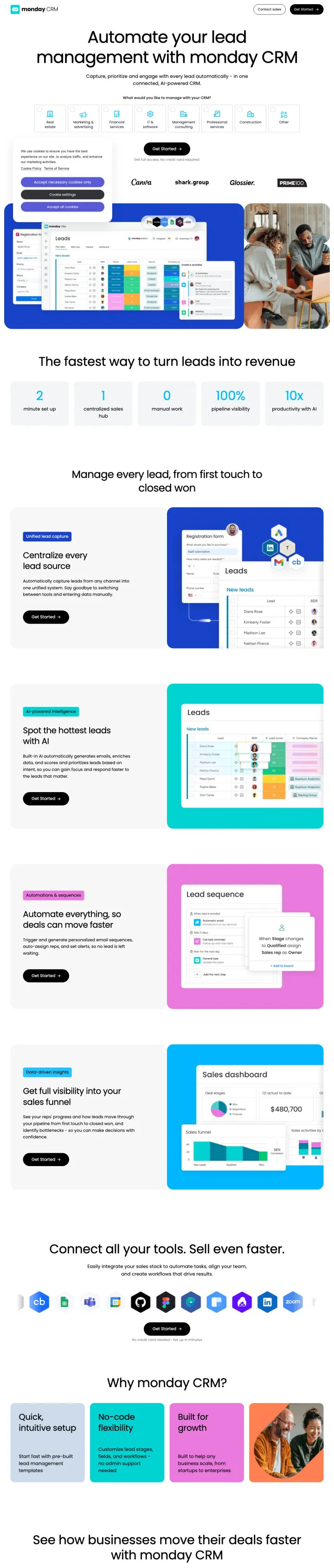
Add an industry selector above the fold ('What would you like to manage with your CRM? Real estate / Marketing & advertising / Financial / Construction / Other') so visitors self-segment and feel the product is built for their use case specifically.
Industry selector cards (Real estate, Marketing, Financial, IT & software, Construction, Other) above the fold let visitors self-identify their use case, making the generic 'CRM' feel purpose-built for their industry
Headline 'Automate your lead management with monday CRM' directly matches the ad copy 'All-In-One Leads Software | Lead management' creating strong message match on the exact keyword intent
Product screenshots showing the actual CRM board with lead statuses, deal values, and pipeline stages give the analytical buyer a mental model of how their data would look in the tool
The email input field says 'Get Started' but there is no mention of free trial, pricing, or what happens after entering your email. Ambiguity at the conversion point loses cautious buyers
143 clickable elements on the page including a 7-item header menu create a conversion leak for paid traffic
Customer logos (Canva, shark.group, Glossier, PRIMETOOL) are below the industry selector but above the product screenshots. They interrupt the visual flow before the visitor has seen the product
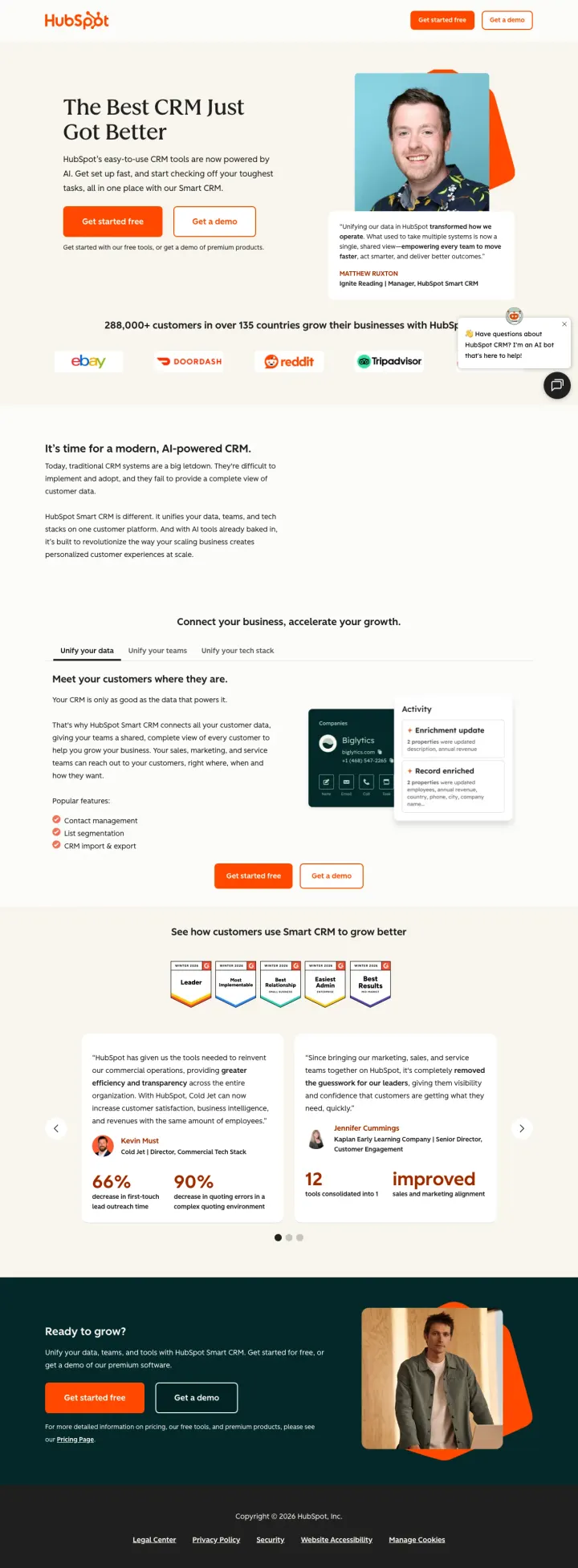
Put a real customer video testimonial with a named person and title above the fold, like HubSpot does with their customer quote next to a photo. Named humans convert better than anonymous logo bars.
Dual CTA 'Get started free' + 'Get a demo' serves both self-serve trial users and enterprise buyers who need a guided walkthrough, capturing two distinct conversion paths in one hero
Named customer testimonial with photo, name, and title ('Ignite Rounding, Manager, HubSpot Smart CRM') visible above the fold provides the specific, attributable social proof that CRM comparison shoppers demand
Logo bar with ebay, DoorDash, Reddit, Tripadvisor immediately below fold anchors trust with recognizable consumer brands that visitors already use daily
56 outbound links on the page create massive leakage for paid traffic costing $15-20 per click. A stripped-down PPC variant would capture more of this expensive traffic
The free-to-paid tier boundary is invisible. Visitors who know HubSpot is free want to understand where the upsell starts before committing their team to a platform
Bottom-of-page case study metrics (66% increase, 90% improvement) are buried where most paid visitors will never scroll
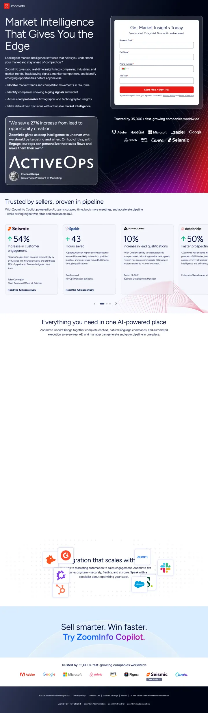
Lead with a specific customer result quote ('We saw a 27% increase from lead to opportunity creation') positioned prominently below the fold. Named metrics from real customers outperform any marketing claim for B2B SaaS buyers.
Free 7-day trial with 'no credit card required' removes all risk for the analytical buyer who wants to test data quality before committing to a sales conversation
Enterprise logo bar (Adobe, HubSpot, Microsoft, Zapier, Google, Airbnb, Canva, Seismic) with 'Read More' links under each creates both trust AND engagement. Visitors can see how companies they respect use ZoomInfo
Bullet-point feature list on the left side of the hero ('Monitor market trends', 'Identify companies showing buying signals', 'Access comprehensive firmographic insights') gives the analytical buyer the scannable evaluation checklist they need
The headline 'Market Intelligence That Gives You the Edge' does not match the ad copy 'Sales Intelligence Software' and '150M+ Verified Contacts'. The shift from sales to market intelligence creates a positioning gap
Named customer testimonial from 'Ksenia Kouchnirenko' and the ActiveOps case study are below the fold where most paid visitors will not scroll
Three form fields (Business Email, Full Name, Job Title) is minimal but the form header 'Get Market Insights Today' is generic when it could reference the specific promise from the ad
Pages that break the playbook in interesting ways
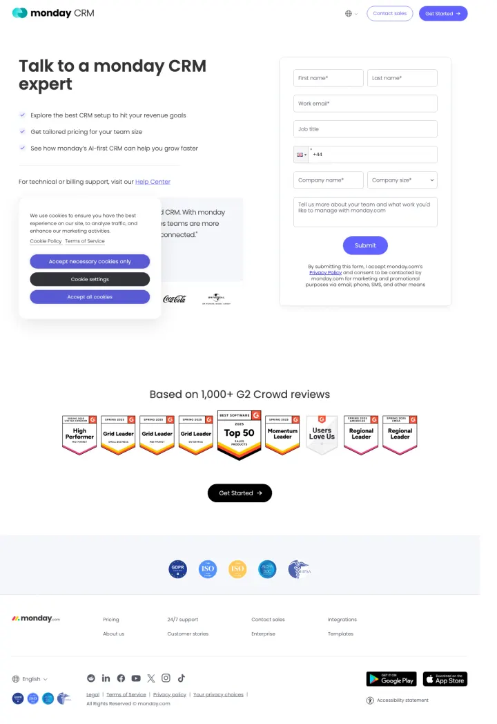
Build a dedicated enterprise-inbound variant that removes the product marketing entirely. No hero illustration, no feature list, no screenshots. Just the promise ('Talk to a monday CRM expert'), three bullet benefits, a form, a named customer quote, and a G2 badge wall. It forces the visitor to either submit or bounce, and it is the opposite of what every other CRM contact-sales page does.
Three bullet benefits next to the form ('Explore the best CRM setup', 'Get tailored pricing for your team size', 'See how AI-first CRM can help you grow faster') map directly to what the enterprise CRM buyer wants from a sales call, reducing form abandonment
Named COO testimonial from Cenversa with photo is the only social proof above the fold. Pairing one specific human with seven familiar enterprise logos (Coca-Cola, Universal, Motorola, Lionsgate) does the work of a full case study in one visual row
G2 badge wall below the form ('High Performer', 'Grid Leader', 'Top 50', 'Users Love Us', 'Regional Leader' stacked) converts the scroll-past visitor by front-loading every recognizable category award in one scan
Cookie consent modal lands directly on top of the testimonial quote at first paint, so the page's best piece of trust copy is hidden behind a dismiss step
Form asks for 8+ fields including company size and a free-text description before submit, which is heavy for a 'talk to an expert' page versus a product trial
No indication of what happens after submit, no response SLA, no calendar link. The form is the whole conversion path so one sentence setting expectations would reduce drop-off
5 pages burning ad spend with fundamental issues
Every click to these pages costs real money. We found broken trust signals, mismatched intent, weak CTAs, and messaging that ignores what the searcher actually typed. Here is what to avoid.
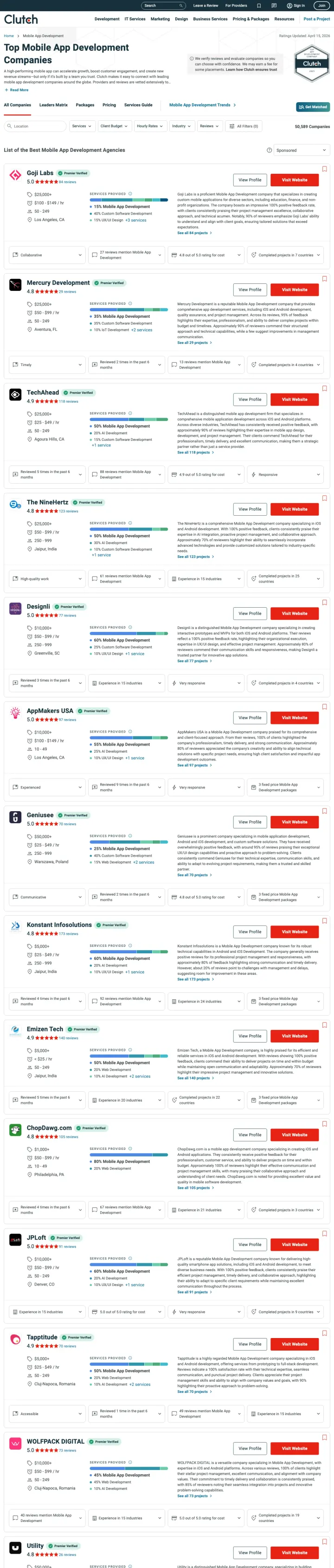
Clutch is paying for clicks on keywords like 'mobile application development companies in usa' and 'it companies in usa' to send traffic to a browsable directory with 1,380 exit links and no conversion path for Clutch itself. Every click that lands here either bounces or clicks through to a third-party agency. Clutch captures nothing.
This is a directory listing page for mobile app development companies, paid-search-bid against broad-match terms that overlap with CRM and sales tooling searches. A CRM shopper arriving here sees third-party development agencies, not a product to evaluate
1,380 clickable elements make this the worst possible destination for paid traffic. Every element is a potential exit. At scale, this page would waste virtually 100% of ad spend
No conversion path for Clutch itself (no form, no CTA for Clutch's service). The page sends visitors to third-party development agencies, meaning Clutch pays for clicks that benefit other companies
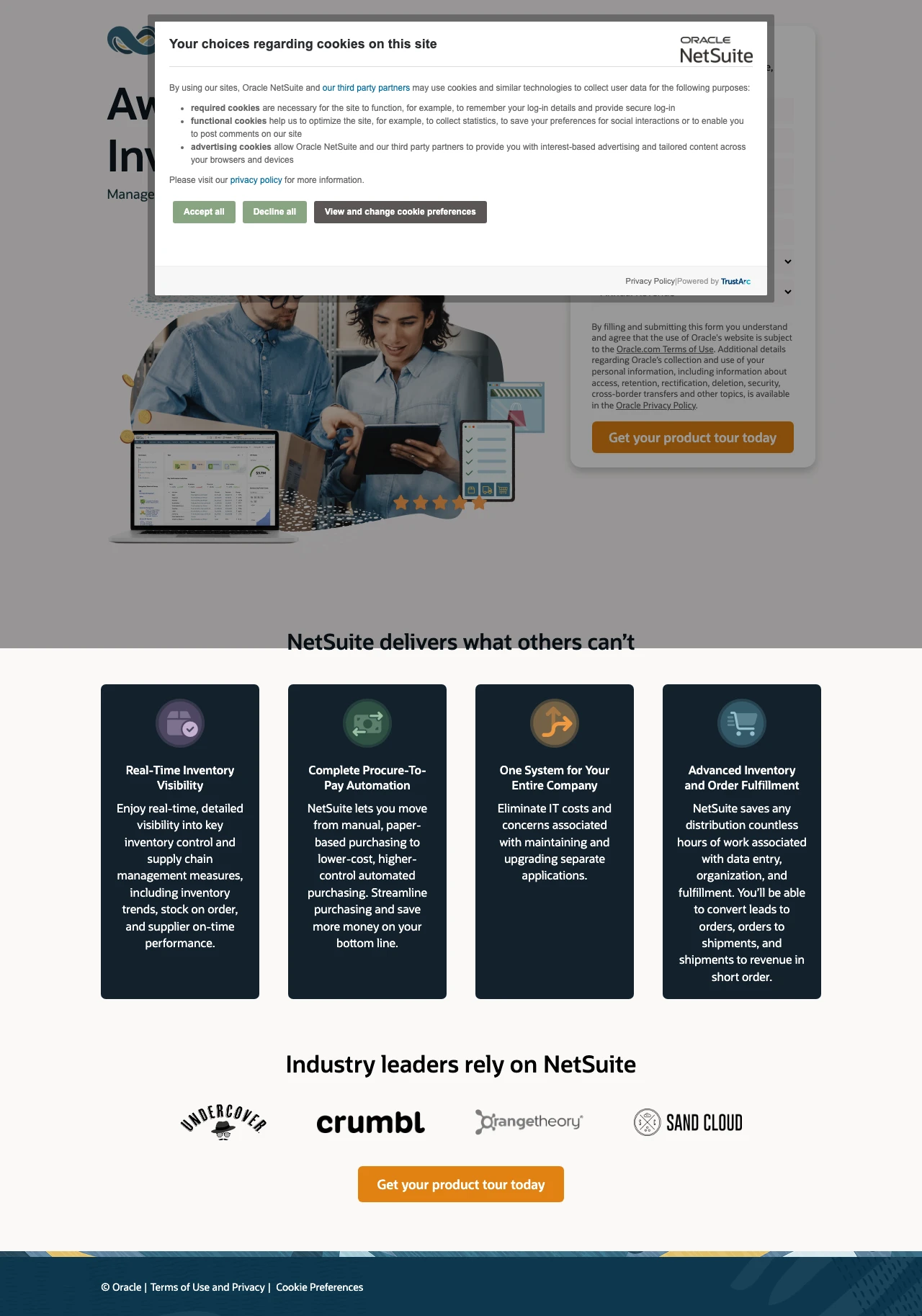
NetSuite is spending on the highest-volume keywords in this entire set (389,720 total monthly search volume including 'netsuite' at 135K, 'ERP software' at 49.5K, 'accounting packages' at 33.1K) and sending that traffic to an unbranded external forms page with a cookie wall that blocks all content on load. The ad promises a 'product tour' but the page may not even have a working form.
A massive cookie consent modal covers the entire viewport on load, hiding the headline, form, and all content. For traffic costing $20-50 per click on 'netsuite' (135K monthly searches), every second of delay is budget destruction
The page URL is an unbranded external forms subdomain (6262239.extforms.netsuite.com) which looks like a phishing page, not an enterprise software provider. URL trust is critical for B2B buyers evaluating vendors
No form is detected by the structural scraper, meaning the page may have a broken or JavaScript-dependent form that fails to render properly. A $50 click that lands on a page with no working form is pure waste
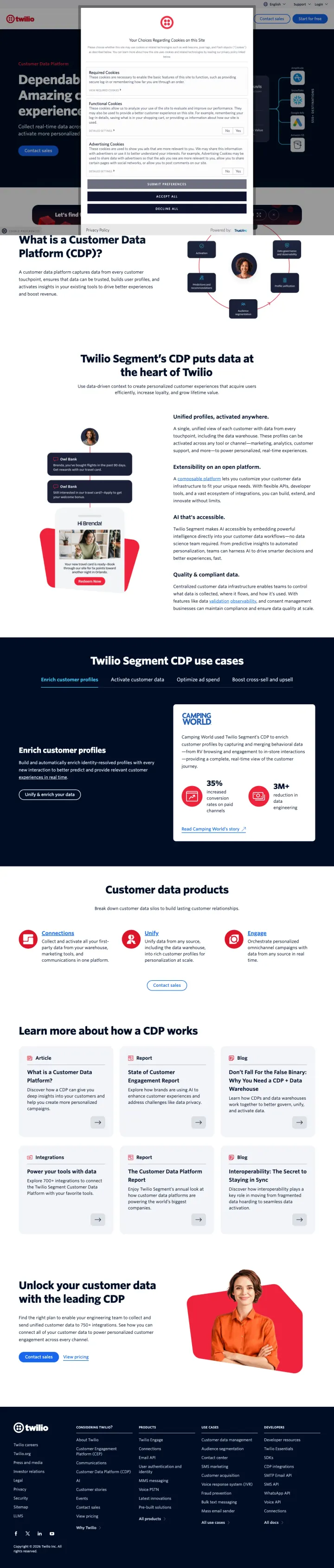
Twilio is paying for clicks on 'twilio segment' (1,600/mo), 'customer analytics software' (210/mo), and 'customer insights software' (210/mo) and sending that traffic to an educational page that starts with 'What is a Customer Data Platform?' The cookie consent modal further blocks the already-weak content. Visitors who searched for a specific product get a category definition instead.
The headline 'What is a Customer Data Platform (CDP)?' is an educational question, not a sales proposition. The visitor who clicked an ad for 'Twilio Segment CDP' already knows what a CDP is. They want to evaluate this one specifically
Zero ad terms found in the first 150 words. The page reads like a blog post or Wikipedia article, not a product page. The ad promised 'Collect, unify, and enrich customer data' but the page starts by defining the category
No form, no demo request, no trial signup visible. The only CTA is 'Contact sales' which is the highest-commitment conversion action possible for a visitor who might just want to explore the product
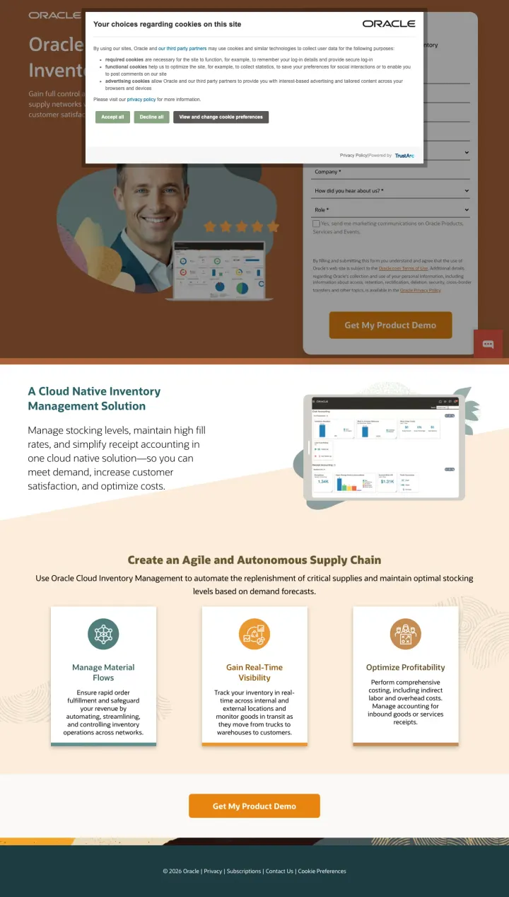
Oracle is paying for 'warehouse slotting software' clicks and sending traffic to a page where the cookie consent modal completely blocks all content on load. Behind the modal, the page is a standard enterprise lead-gen form with stock photography. The content underneath is actually decent (strong message match for inventory management) but the cookie wall means most visitors never see it.
Cookie consent modal covers the entire viewport on load, blocking the headline, hero image, and form. The visitor has to dismiss the modal before seeing any content. For enterprise PPC traffic, this first-impression failure is costly
The hero uses a generic stock photo of a smiling man in a suit that could be on any enterprise software page. Oracle Inventory Management is a specific product. Showing the actual dashboard or workflow would be far more persuasive
The form asks for excessive fields including company size, country, and other qualification data that could be collected post-demo. In a world where Pipedrive asks for one email field, Oracle asking for 8+ fields is friction that kills conversion
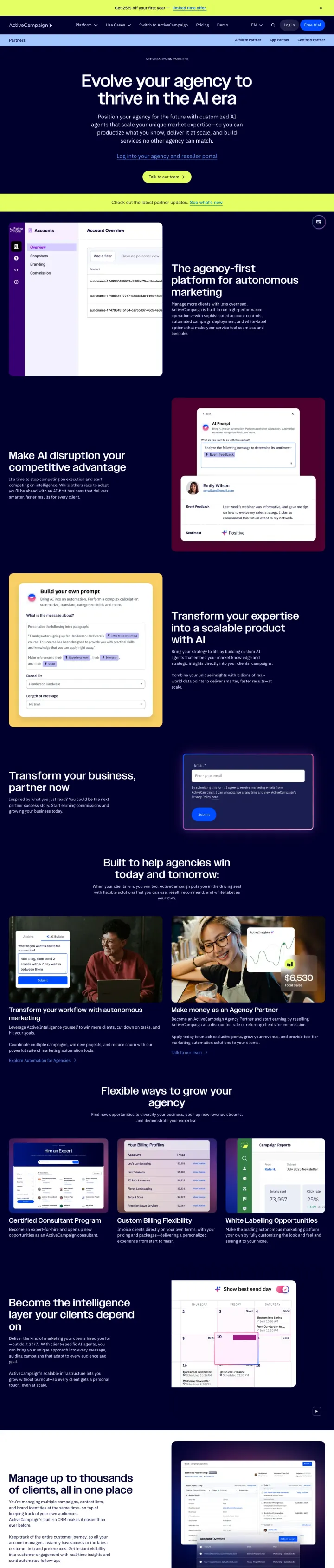
ActiveCampaign is paying for 'email marketing service provider' clicks (720/mo) with an ad promising a white-label platform with a 14-day free trial, then sending that traffic to a partner/reseller recruitment page. The person searching for email marketing software sees 'Evolve your agency' and a partner portal screenshot. This is a campaign-to-landing-page mismatch that wastes every non-agency click.
Ad copy offers a 'White-Label Marketing Platform' with '14-Day Free Trial' but the page headline is 'Evolve your agency to thrive in the AI era'. This is a partner recruitment page, not a product trial page
The visitor searching for an 'email marketing service provider' wants to send emails to their customers. This page pitches them on becoming an ActiveCampaign reseller. The intent mismatch is total. It is like advertising 'Buy a car' and linking to 'Become a car dealer'
The CTA 'Talk to our team' leads to a consultation about becoming a partner, not about using the email marketing product. Every click from someone who wants email marketing software is completely wasted
Every winner in this set offers either a free trial or a freemium tier without a credit card. Pipedrive leads with 'Try it free. No credit card required. Used by over 100,000 companies.' HubSpot leads with a free tier alongside a separate demo CTA. ZoomInfo offers a free 7-day trial with no credi...
Every winning CRM page shows actual product screenshots or UI in the hero section. Monday shows their lead management board with deal values and pipeline stages. Pipedrive shows the pipeline view with integration logos. ZoomInfo shows the data-enrichment workflow. HubSpot shows a real customer ph...
Link counts across the winners tell a clear story. Pipedrive keeps the page tight. Monday carries 143 clickable elements, most of them header and footer navigation. HubSpot has 56. For CRM companies spending $10K+ monthly on paid search, building a nav-stripped PPC variant of the landing page alm...
Three of the five losers in this set are undermined by a cookie consent modal that covers the viewport on load. NetSuite spends on the highest-volume keywords in the set (389K monthly searches) and sends traffic to an unbranded external forms subdomain behind a cookie wall. Oracle and Twilio do t...
Winners show the product and offer a free trial within the first viewport. Losers send CRM-keyword traffic to the wrong page entirely: an app development directory, a partner recruitment pitch, a 'What is a CDP?' explainer, or a cookie-walled form on an unbranded subdomain.