Free: 96 PPC tools + my AI Playbook book

Half the people clicking these ads have a cracked tooth at 11pm. The other half have been researching implants for 3 months. Same keyword, totally different person. I wanted to see who actually handles that well, because most dental pages just kinda... don't.
From real dental services Google Ads campaigns in the US
The landing pages actually worth stealing from
So you know exactly what to avoid
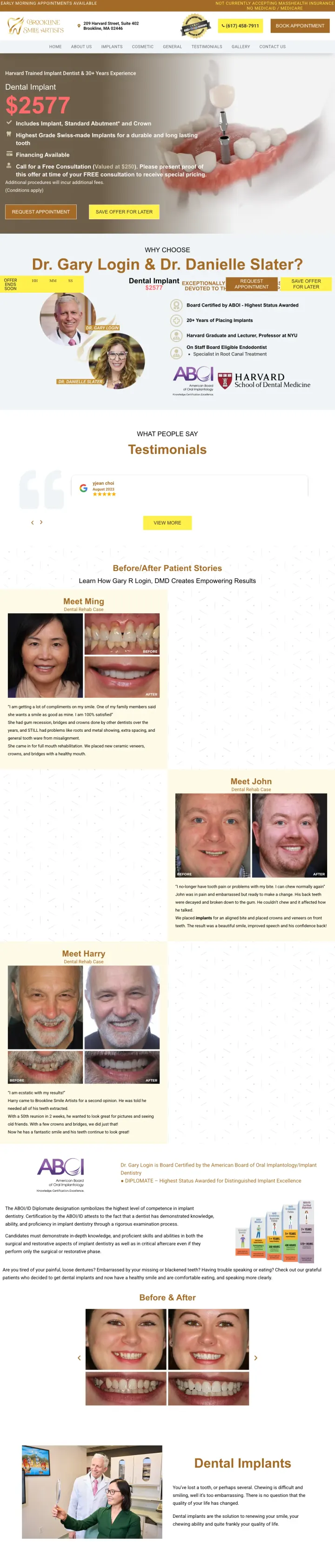
Lead with the doctor's most impressive single credential ('Board Certified by ABOI - Highest Status Awarded') as a subhead directly under the price, so the visitor sees cost AND authority in the same glance.
$2,577 price includes itemized components (implant + abutment + crown) which lets patients compare apples-to-apples against competitors -- critical because dental patients call 3-5 offices for quotes
Free consultation valued at $250 creates a specific dollar-value anchor for the no-risk first step, making the consult feel like a gift rather than a sales pitch
Board Certified by ABOI plus Harvard Graduate plus 20+ years of implants -- this credential stack hits all three trust dimensions dental patients care about (certification, education, experience)
The page loads mid-scroll at the pricing section, which means visitors may miss the Harvard credentials headline at the very top -- the most persuasive element is above where the page lands
Credential stack (ABOI + Harvard + 20 years) is split between two sections rather than consolidated -- the visitor has to piece together qualifications from multiple parts of the page
Countdown timer ('Offer Ends Soon') with no actual date creates fake urgency that sophisticated implant shoppers (who are already calling 3-5 practices) will see through in two seconds
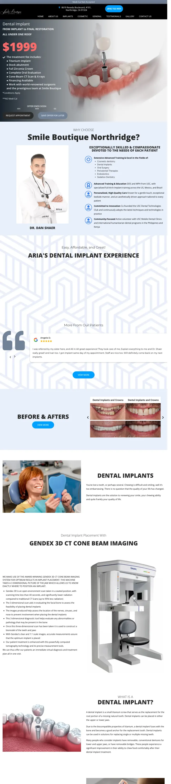
List every component included in your implant price as bullet points (titanium implant, stock abutment, full zirconia crown, CT scan, X-rays) so price-shopping patients know exactly what they are getting without calling to ask.
'From Implant to Final Restoration, All Under One Roof' directly addresses the dental patient fear of being referred to multiple specialists -- which means multiple appointments, multiple bills, and losing continuity of care
Itemized pricing ($1,999 for titanium implant + stock abutment + full zirconia crown + oral evaluation + cone-beam CT scan + X-rays) eliminates the 'but what does that actually include?' objection that plagues round-number pricing
Named doctor (Dr. Dan Shaer) with photo and specific training areas immediately below the pricing section -- the visitor sees WHAT it costs and WHO does it within one scroll
Visitors land on the bullet points section rather than the $1,999 headline -- the price anchor that makes this page work is scrolled past on initial load
'No Medi-Cal' disclaimer in the hero may confuse or alienate visitors who do have Medi-Cal, but it is honest about eligibility
Patient transformation images are buried below multiple credential sections and technology descriptions, losing their impact to scroll fatigue
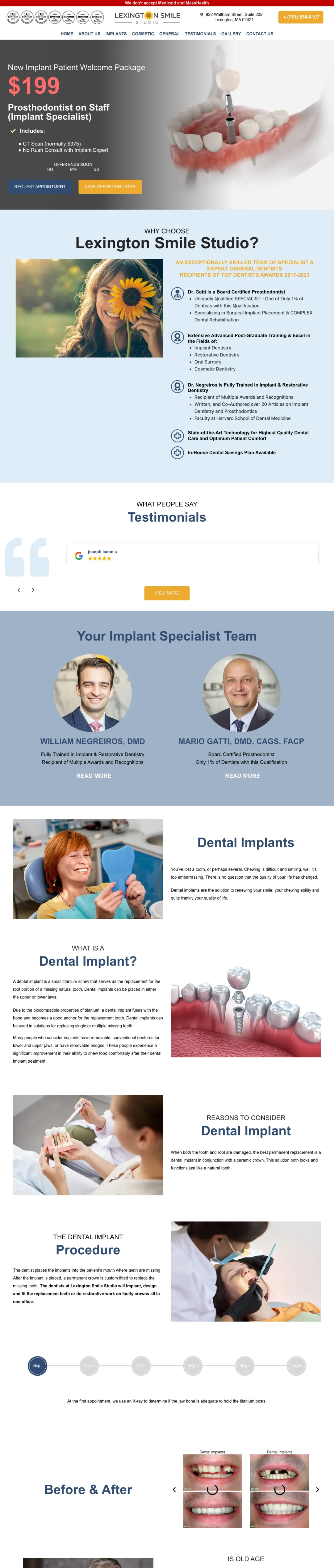
Offer a specific-dollar-value welcome package ($199 including CT scan normally $375) as a loss leader -- it reframes the first visit from 'expensive consultation' to 'I am saving $176' and removes the cost barrier to the first appointment.
$199 welcome package that includes CT scan (normally $375) reframes the first visit as a deal rather than an expense -- dental patients who balk at a $375 scan will jump at saving $176, and once they are in the chair the practice can present the full treatment plan
'Prosthodontist on Staff (Implant Specialist)' in the hero -- the word 'specialist' matters enormously for dental patients because it signals this is not a general dentist doing implants on the side, it is someone whose entire training is in this procedure
Dr. Negreiros' credentials include 'Faculty at Harvard School of Dental Medicine' and '20+ Articles on Implant Dentistry' -- academic credentials are uniquely powerful in dental because they signal the doctor is teaching others how to do what they are about to do on you
The $199 offer is strong but the page never shows what the final result looks like -- visitors considering a multi-thousand-dollar procedure need to see outcomes, not just savings
Countdown timer with no real deadline undermines the premium positioning established by the Harvard credentials
Form and phone number are buried deep in the page -- the dual CTA buttons scroll past quickly but the actual conversion mechanisms are not sticky
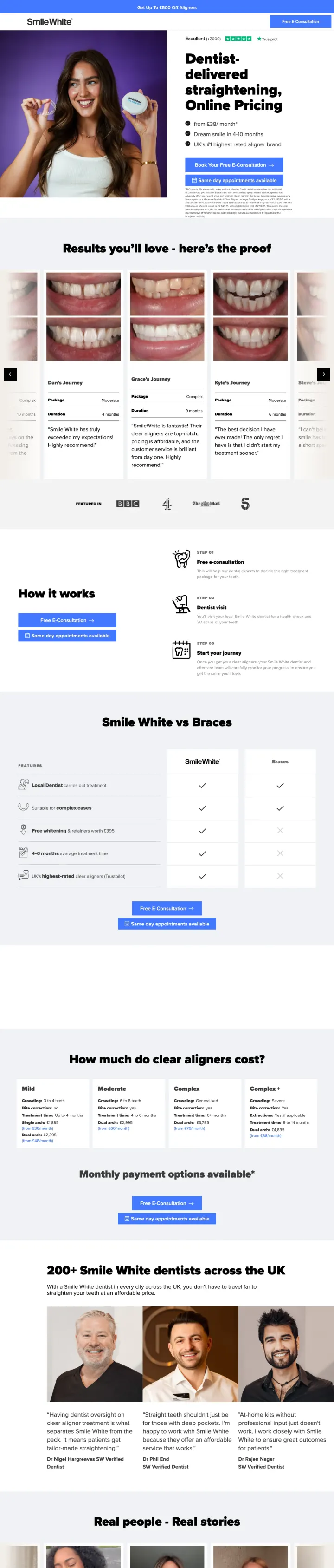
Show your Trustpilot rating AND monthly payment price AND before/after results AND 'same day appointments available' all above the fold. SmileWhite fits four conversion triggers into one viewport because each one addresses a different objection.
Trustpilot 'Excellent' with 7,000+ reviews shown at the very top of the hero -- for the 30% risk-averse visitors, seeing verified third-party social proof before any sales copy immediately lowers the trust barrier
'From 38/month' pricing with 'Dentist-delivered' positioning separates SmileWhite from cheap mail-order aligners (SmileDirectClub) by emphasizing clinical oversight while matching their price accessibility
Before/after photos organized as patient 'Journeys' with package type and duration (Grace - Complex - 9 months, Kyle - Moderate - 6 months) give prospects a realistic preview of their specific case type rather than cherry-picked best results
The page URL literally says '/paid-ads' which is visible in the browser bar -- this signals to savvy visitors that they are seeing an ad-specific page, which can feel manipulative
93 total links on a page that should be focused on one conversion action -- even without full nav, the product links, result links, and footer links provide too many exit paths
No specific doctor credentials above the fold -- 'Dentist-delivered' is the claim but the named dentists (Dr Phil, Dr Nigel, Dr Rajen) are buried far down the page
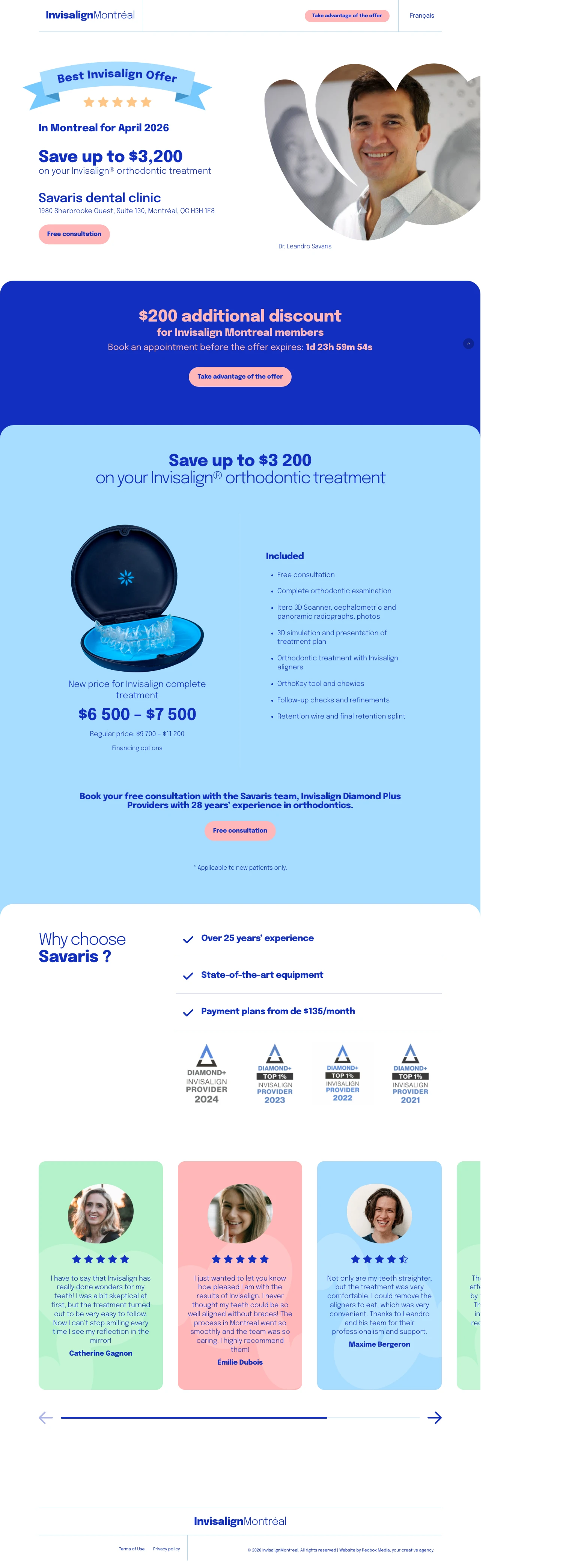
Layer multiple discount mechanisms ($3,200 off regular price PLUS $200 additional discount for members PLUS payment plans from $135/month) so the visitor feels they are getting a unique deal rather than the standard advertised price.
'Save up to $3,200' on Invisalign with the regular price shown ($9,700-$11,200 crossed out, new price $6,500-$7,500) gives the visitor a concrete dollar savings to anchor against -- dental patients need to see the deal math, not just the final price
Invisalign Diamond Plus Provider badges for 4 consecutive years (2021-2024) signal volume and experience -- this Invisalign-specific credential tells patients 'this clinic does more Invisalign cases than almost any other in Montreal'
Dr. Leandro Savaris' friendly headshot appears alongside the discount math -- the named doctor with face creates personal connection before the visitor even scrolls, which matters for patients who need to trust the person, not just the practice
The page asks visitors to 'Book an appointment before the offer expires' with a countdown timer, but the timer resets on reload -- this is detectable fake urgency that erodes trust with analytical visitors
All the included items are listed but the actual treatment process (how many visits, how long each appointment, what happens at each step) is not explained -- Invisalign shoppers need to know what they are signing up for before they book a consult
Testimonials use first/last names but no photos and no link to Google reviews -- in 2026 text testimonials without verification feel fabricated
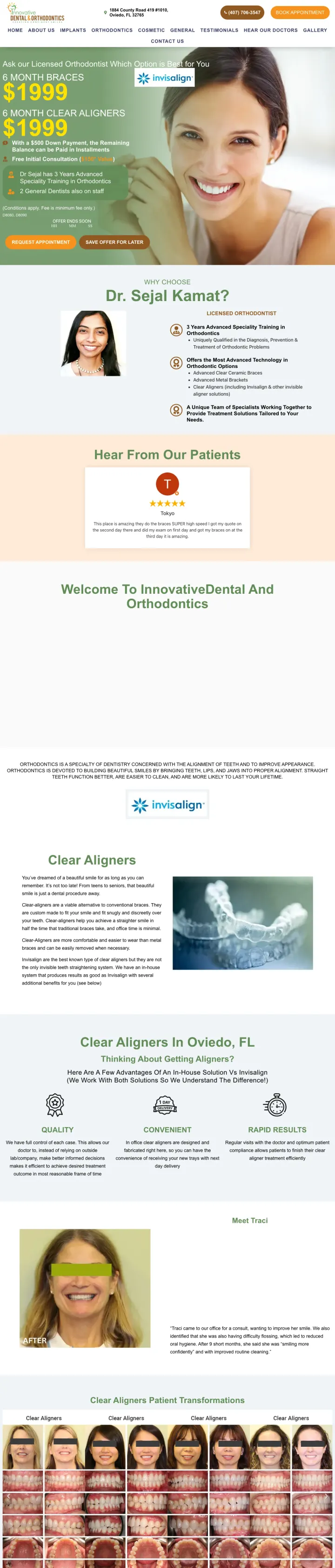
Show two treatment options side by side at the same price ($1,999 for 6-month braces OR $1,999 for 6-month Invisalign) and let the visitor's licensed orthodontist recommend which one -- this reframes the decision from 'should I do this?' to 'which one should I pick?'
Side-by-side pricing (6 Month Braces $1,999 vs 6 Month Clear Aligners $1,999) turns a single offer into a choice framework -- psychologically, choosing between two options is easier than deciding yes/no on one option
'$500 Down Payment, Remaining Balance Paid in Installments' with '24 Month Financing at 0%' addresses the #1 dental objection (cost) with specifics rather than vague 'financing available' language
'Licensed Orthodontist' is emphasized repeatedly with '3 Years Advanced Speciality Training' -- distinguishing from general dentists doing ortho work addresses the patient fear of getting treatment from someone who is not fully qualified
The page loads showing financing details instead of the 'Ask our Licensed Orthodontist Which Option is Best for You' framing -- the choice architecture that differentiates this page is missed on landing
The dual-option framing (braces vs aligners at same price) is brilliant above the fold, but below it the page tries to serve general dentistry patients too, diluting the ortho focus
The page tries to serve too many audiences (braces patients, Invisalign patients, general dentistry patients) and the focus gets diluted below the fold
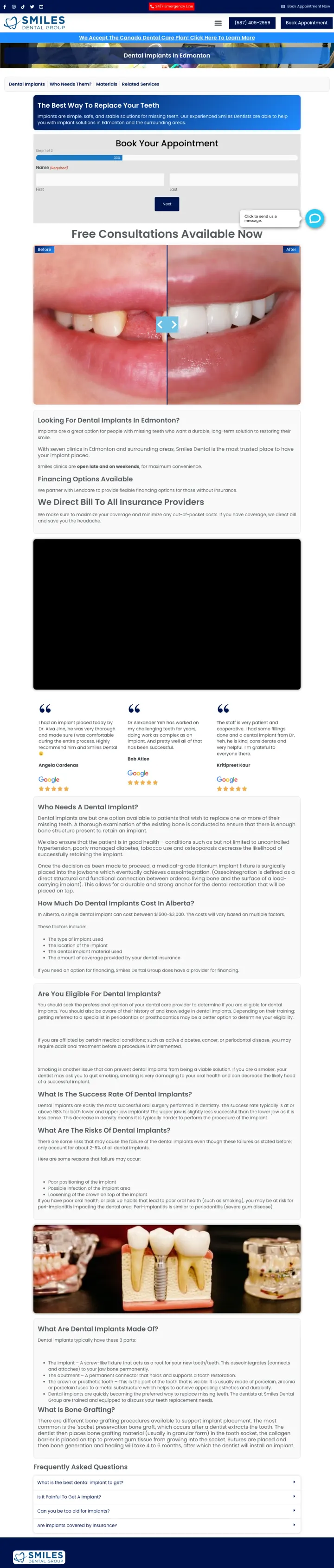
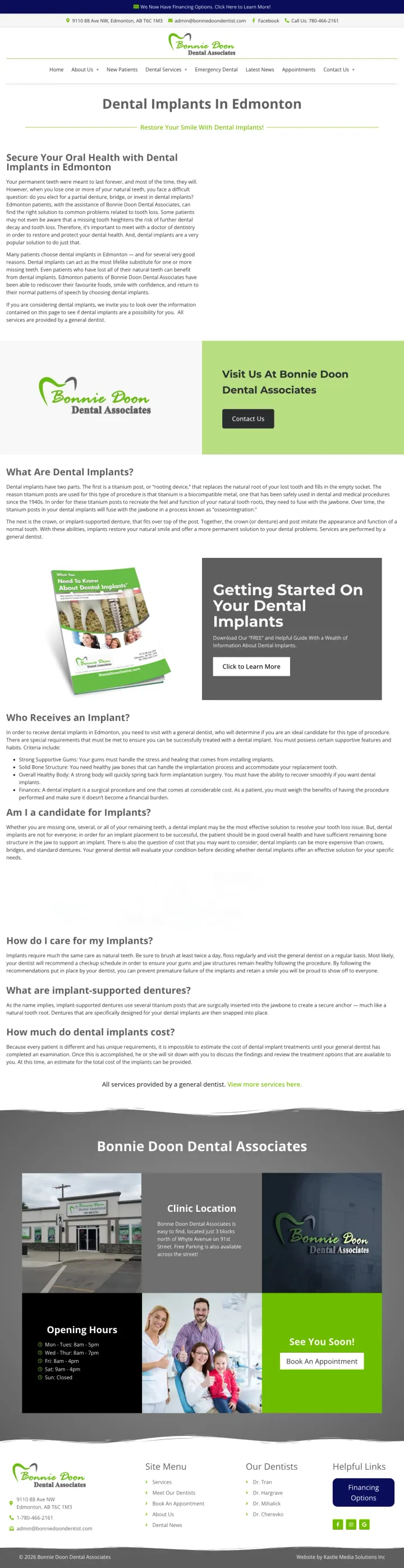
Put your appointment form directly in the hero section (not behind a button click) with a location selector dropdown if you have multiple offices -- visitors who see the form immediately are more likely to fill it out than visitors who have to find and click a 'Book Now' button.
Appointment form with location selector dropdown (7 Edmonton-area locations) is the first thing visitors see -- they can book without scrolling, and the location picker makes a multi-office practice feel personalized
In-page anchor navigation (Dental Implants / Who Needs Them? / Materials / Related Services) lets research-mode visitors jump to the section they care about without scrolling through content they have already read
Phone number (587-409-2959) shown both in the top bar and above the form -- dual placement ensures the 20% decisive visitors can call from wherever they are on the page
The headline 'The Best Way to Replace Your Teeth' is generic and could describe any dental practice in any city -- no specific offer, no price, no differentiator
Pricing ($1,500-$3,000) is mentioned in the scrape but not visible above the fold -- burying the price when cost is the #1 search intent for dental implants wastes clicks
The headline 'The Best Way to Replace Your Teeth' is generic and could describe any dental practice in any city -- no specific offer, price, or differentiator to justify the click
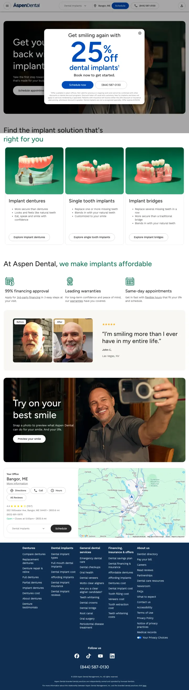
If you are a multi-location brand, use a promotional popup ('25% off dental implants') that interrupts the page on entry -- it trades some user annoyance for a dramatic increase in offer visibility that a hero banner alone cannot match.
25% off popup with dual CTA ('Schedule Now' button + phone number) forces the visitor to engage with the offer before seeing the page -- aggressive but effective for a national brand that can afford the discount
Implant type comparison section (implant dentures vs single tooth implants vs implant bridges) with photos lets the visitor self-select their case type -- this serves the research-mode prospects who need to figure out what kind of implant they actually need before they can comparison-shop on price
'99% financing approval' claim addresses cost anxiety directly -- dental patients who assume they will be denied financing are the ones most likely to abandon the page
The popup blocks the entire hero content including the main headline and imagery -- visitors who dismiss it may feel annoyed rather than informed
No specific doctor name or credentials anywhere on the page -- for a $5,000+ surgical procedure, 'Aspen Dental' brand is not enough, patients want to know who will do the surgery
The 25% off popup is effective but aggressive -- it blocks the entire hero content, and visitors who dismiss it quickly may feel annoyed rather than informed about the discount
Create a comparison table that positions your approach against the industry default -- MADE Dental compares 'outsourced to 3rd-party lab' vs 'done in-house by our own lab team' across 5 dimensions, which frames every competitor as inferior without naming them.
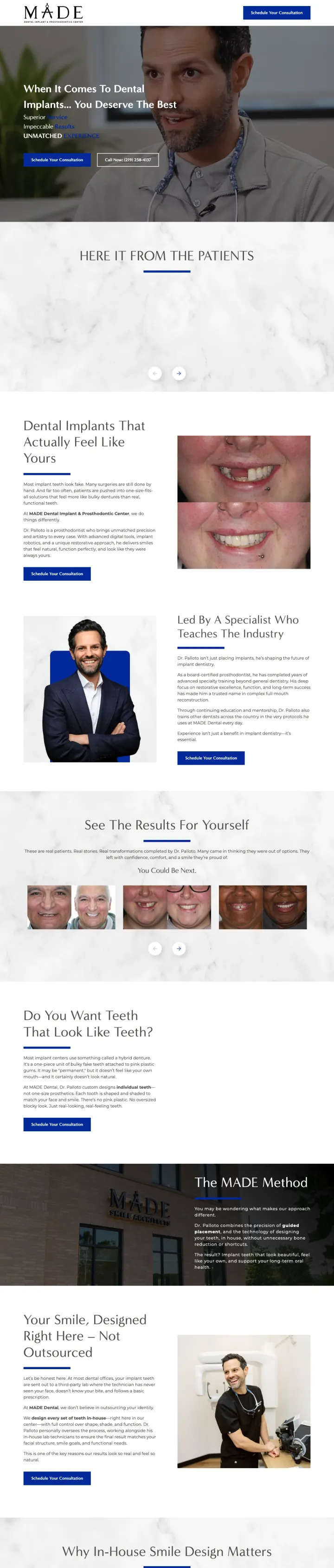
The page directly attacks the industry norm ('Most implant teeth look fake. Many surgeries are still done by hand.') and positions MADE as the alternative -- this 'us vs. the industry' framing works because dental patients already suspect most providers are mediocre
7 named video testimonials (Denise, Trish, Oscar, Terry, Jody, Mary, Adam) with play buttons -- video testimonials from real, named patients are nearly impossible to fake and carry more weight than any number of text reviews for a surgical procedure
Comparison table (Traditional Denture $2,000-$3,000 vs Implant-Supported $8,000-$12,000 vs Full Arch Hybrid $15,000-$20,000 vs MADE Custom Smile $22,000-$30,000) with columns for materials, comfort, and timeline -- this helps patients understand why MADE costs more rather than just seeing a higher number
The page loads past the hero to the testimonial section, so visitors miss the 'You Deserve The Best' headline and dual CTAs that establish the premium positioning
Conversion path is phone-only (no form) despite the page targeting comparison shoppers who typically prefer to research before calling
MADE Custom Smile at $22,000-$30,000 is the most expensive option in the comparison table but there is no financing breakdown showing monthly payments -- patients who see $30K without a $300/mo option will bounce
Pages that break the playbook in interesting ways
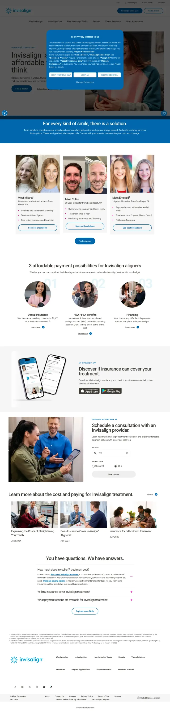
Strip your landing page down to literally nothing except a quiz. No hero image, no testimonials, no pricing, no doctor bio. Just one question at a time. Invisalign proves that when the brand is strong enough, the quiz alone IS the page -- but this only works if the visitor already knows and trusts you before they click.
The quiz starts with 'Tell us who you are' (Adult/Teen/Parent) rather than 'What is wrong with your teeth?' -- this feels like personalization rather than diagnosis, which is less intimidating for first-time dental visitors who are just exploring
No pricing, no credentials, no testimonials, no imagery -- just the quiz. For a brand with near-universal name recognition, removing everything except the conversion mechanism eliminates all friction and distraction
Step indicator (1/5) sets clear expectations for quiz length -- visitors know exactly how much time they are committing, which reduces mid-quiz abandonment
Cookie consent popup covers the quiz on initial load -- for paid traffic, every second of delay before the visitor sees the actual content costs money
If the visitor does not already know what Invisalign is, this page gives them zero reason to care -- there is no value proposition, no benefit statement, no outcome promise
No phone number, no chat, no alternative conversion path -- if the visitor does not want to take a quiz, there is literally nothing else to do on this page
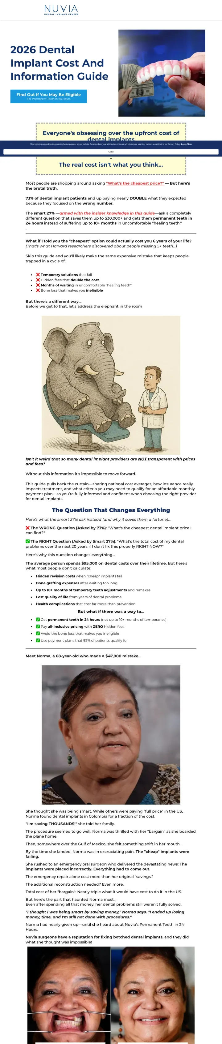
Why This Breaks the Rules: This page has no hero image, no doctor photo, no testimonials, no facility photos, and no visual proof of any kind. It looks like a Google Form for a $22,000-$55,000 surgical procedure. Every dental landing page convention says you need trust signals and credentials above the fold. Nuvia strips all of that away and bets everything on a 10-question quiz funnel that pre-qualifies by clinical severity, emotional urgency, and financial readiness. The quiz itself IS the conversion mechanism, and by the time visitors finish 10 questions about their teeth, providing a phone number feels natural.
Quiz question flow moves from clinical ('How many teeth missing?') to emotional ('Are you hiding your smile?') to financial ('Would you like to see if you qualify for payment plans?') -- this mirrors how a dental patient actually thinks through the decision
Headline 'Get Beautiful New Permanent Teeth in Just 24 Hours' addresses both the desired outcome AND the timeline objection simultaneously -- dental patients fear weeks of recovery and '24 hours' demolishes that
Price anchoring within the quiz itself ('National averages range from $22,000 to $55,000. Payment plans start at $300/mo') sets expectations before the consult call so the sales team does not face sticker shock
The page looks like a Google Form -- for a $22,000-$55,000 medical procedure, the visual execution does not match the price point
No doctor photo, no facility photos, no patient photos -- the page is 100% text and form fields, which feels impersonal for a surgical procedure
The '57,891 reviews' claim with a 4.9 star rating is shown but with no link to verify -- at this scale the number feels inflated without a Trustpilot or Google link
3 pages burning ad spend with fundamental issues
Every click to these pages costs real money. We found broken trust signals, mismatched intent, weak CTAs, and messaging that ignores what the searcher actually typed. Here is what to avoid.
Paid ad promises 'Affordable Dental Implants - Get dental implants today' but the page delivers a 1,500-word educational article about what dental implants are, how osseointegration works, and who qualifies. No price, no named doctor, no form, no phone number visible above the fold. Every click at Edmonton implant CPCs ($15-25) pays for a Wikipedia article.
Ad says 'Affordable Dental Implants' but the page contains zero pricing information -- no dollar amount, no range, no 'starting from', nothing. The visitor searched for cost information and got an essay about biocompatible titanium
Full website navigation (Home, New Patients, Dental Services, Emergency Dental, Latest Cases, Appointments, Contact Us) gives the visitor 7 ways to leave without converting -- each nav click is a wasted ad dollar
No doctor name, no photo, no credentials anywhere above the fold -- the ad is for a specific dental practice but the page could belong to any generic dental office in any city
This is a service information page with full site navigation, no pricing, no named doctor, no form, and no phone number. The ad for 'invisalign singapore cost' sends traffic to a page that never mentions cost. At Singapore Invisalign CPCs ($3-8 SGD), every click pays for an encyclopedia entry about overbites and underbites.
Full site navigation with 6+ links (Home, Services, Our Clinics, Our Clinicians, FAQ, Contact Us, Refer Us) on a page receiving paid traffic -- every nav click is a wasted ad dollar
Zero pricing despite the ad keyword being 'invisalign singapore cost' -- the visitor searched specifically for cost information and the page does not contain a single dollar figure or price range
The page is entirely about the Invisalign product, not about why THIS clinic is the right choice -- no named clinician, no case count, no specialization that differentiates from the dozen other Invisalign providers in Singapore
The ad keyword is 'invisalign cost' with the headline 'How Much Does Invisalign Cost?'. The page title promises the same. But the cookie consent modal covers the entire hero, and the underlying page leads with a generic 'Invisalign is more affordable than you think' headline, not a price range. A visitor clicking a cost-intent ad must dismiss the modal and then scroll to find any actual number. The treatment cost range that is the whole reason this page exists is buried.
Cookie consent modal covers the full hero on first load. An invisalign.com visitor coming from a cost-intent ad must dismiss the modal before they can see a headline, price range, or CTA
The actual hero headline ('Invisalign is more affordable than you think') is a vibe claim, not a number. Cost-intent visitors want a number, a range, or a monthly payment. The page has that information below the fold but buries it behind marketing copy
'Talk to a provider' CTA passes the cost question to the dentist, which is appropriate for invisalign.com's multi-doctor network, but the page could at least offer a cost range before the provider handoff
The strongest implant pages do not just show a price -- they break down exactly what is included (titanium implant + abutment + zirconia crown + CT scan + consult). This matters because dental patients comparison-shop and need to know they are comparing like-for-like. Pages showing '$1,999 includ...
Every winner shows a named doctor with real photo and specific credentials (board-certified prosthodontist, Harvard-trained, ABOI-certified) within the first scroll. The losers either show no doctor at all or bury credentials below the fold. For a $2,000-$30,000 irreversible procedure, patients n...
smilesbymade.mydentalconsult.com uses 7 named patient video testimonials (Denise, Trish, Oscar, Terry, Jody, Mary, Adam) with visible play buttons. Video is harder to fake than text, and for dental patients who worry 'will it look natural?', seeing and hearing a real person talk about their exper...
The best pages include a comparison table (traditional denture vs implant-supported denture vs full arch hybrid vs custom implant teeth) with columns for materials, comfort, timeline, and starting price. Implant prospects are comparison-shopping 3-5 clinics before they will book a consult, so the...
Winners lead with a specific price or offer above the fold and immediately show a named doctor with credentials. Losers send paid implant traffic to content pages that read like dental textbooks -- paragraphs explaining what implants are, how osseointegration works, and who qualifies -- without ever giving the visitor a reason to pick up the phone or fill out a form..