Free: 96 PPC tools + my AI Playbook book

These are real energy / utilities pages spending actual money on Google Ads right now.
From real energy / utilities Google Ads campaigns in the US
The landing pages actually worth stealing from
So you know exactly what to avoid
Lead with a specific percentage savings claim against the local incumbent utility ('priced 13.9% below Eversource rates') rather than showing your own rates in isolation. Consumers do not know what a good rate is, but they know what saving 13.9% means.
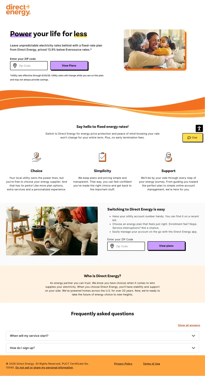
'Power your life for less' headline paired with 'priced 13.9% below Eversource rates' immediately answers WHY the visitor should switch. The savings percentage is more compelling than a raw rate because it creates a clear reference point against what the customer currently pays
Three-column value prop (Choice, Simplicity, Support) is concise and addresses the three fears of switching: 'will I be locked in?', 'is it complicated?', and 'what if something goes wrong?' -- each answered in two lines
The ZIP code entry appears twice on the page (hero and mid-page) so regardless of where the visitor scrolls, they never have to hunt for the action step
The hero image (family on a couch) is generic stock photography that communicates nothing about energy or savings. A real-time rate comparison or savings calculator would use this premium space more effectively
FAQ section at the bottom uses accordion-style dropdowns that are all collapsed, so the visitor does not know what questions are answered without clicking each one. For paid traffic, this content should be visible
No mention of renewable energy or plan details above the fold. The visitor has to trust the '13.9% below' claim and enter their ZIP code before seeing any plan specifics
Build a searchable, filterable rate comparison page that shows every available plan for a given ZIP code with rates per kWh, contract length, and provider ratings side by side. Become the comparison tool that consumers use to evaluate ALL providers, including yours.
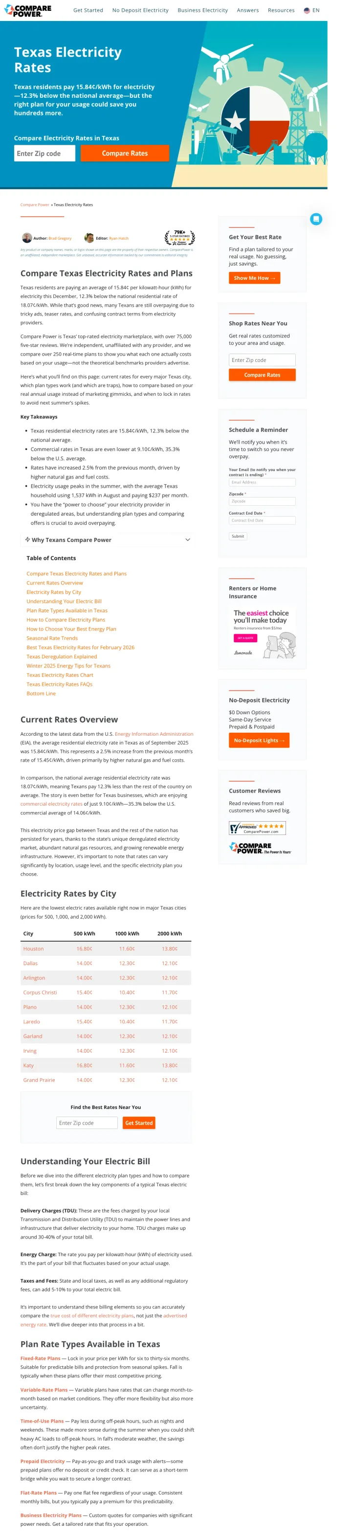
The page ranks for 30 keyword variations with 34,830 total monthly search volume because it genuinely answers the question 'what are the best electricity rates in Texas' with a comprehensive, sortable comparison table rather than promoting a single provider
Provider logos, star ratings, plan names, rates per kWh, and contract lengths displayed in a dense but scannable table format. Each row has a 'View Plan' button. This is the format energy shoppers actually need
Geo-specific sections for Houston, Dallas, Austin, etc. give the page relevance signals for city-level queries while keeping everything on one page rather than fragmenting across dozens of city-specific URLs
The page is extremely long with dense content that reads like an SEO play. Below the rate comparison table, there are thousands of words of explanatory content about Texas deregulation, ERCOT, and how to choose a plan. This content serves search engines, not paid traffic visitors
The hero section shows an animated illustration of a person comparing plans on a tablet. This space would be better used for an interactive ZIP code entry or a real-time rate widget
Disclaimer text about 'rates based on 1000 kWh usage' is easy to miss, which means the displayed rates may not match what a given visitor would actually pay
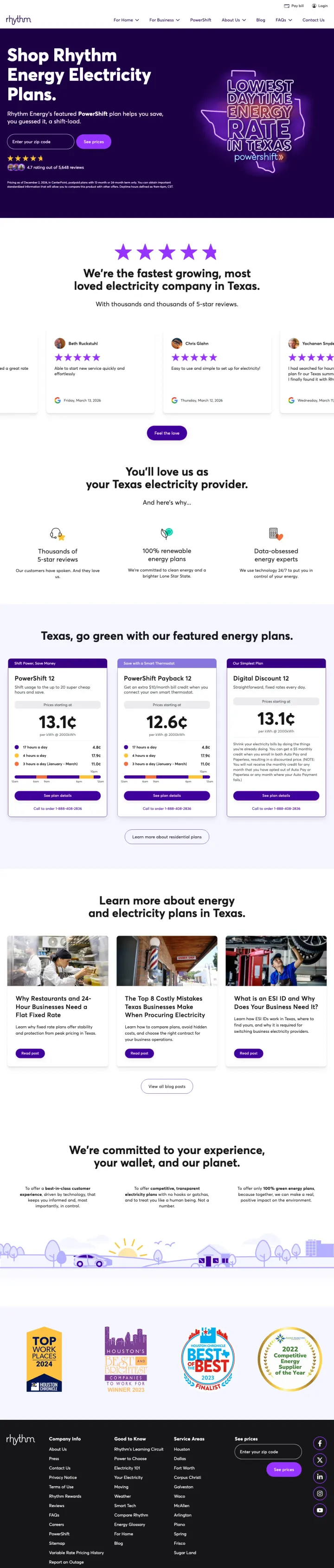
Display your actual rate cards (13.1 cents, 12.6 cents, 13.1 cents for different plans) with plan names and terms directly on the landing page so visitors can comparison-shop without entering personal information first.
Neon-purple brand identity with bold typography ('Shop Rhythm Energy Electricity Plans') makes this look like a tech startup rather than a utility company. In a market where every competitor uses the same blue-and-white trust palette, Rhythm's visual differentiation is striking
Five-star rating with review count prominently displayed below the hero, plus logos from review platforms (Google, BBB, etc.). The social proof is specific and verifiable, not generic
Three rate cards shown side by side with plan names, rates per kWh, contract length, and renewable percentage. The visitor can compare Rhythm's own plans without any interaction required
The hero illustration (cartoon-style Texas imagery) is playful but does not communicate savings or value. First-time visitors may not immediately understand this is an electricity provider
The 'Best Price Always Promise' badge needs more explanation above the fold. Visitors from comparison sites like ComparePower want to know HOW Rhythm ensures the best price, not just that they claim it
The page shows rates but does not compare them to the local utility or competitors, so visitors still need to leave and check other providers to know if these rates are actually good
Create city-specific landing pages with local rates, local customer reviews, and city-specific content (fun facts, utility territory info) to match geo-targeted ad campaigns rather than sending all traffic to a generic state page.
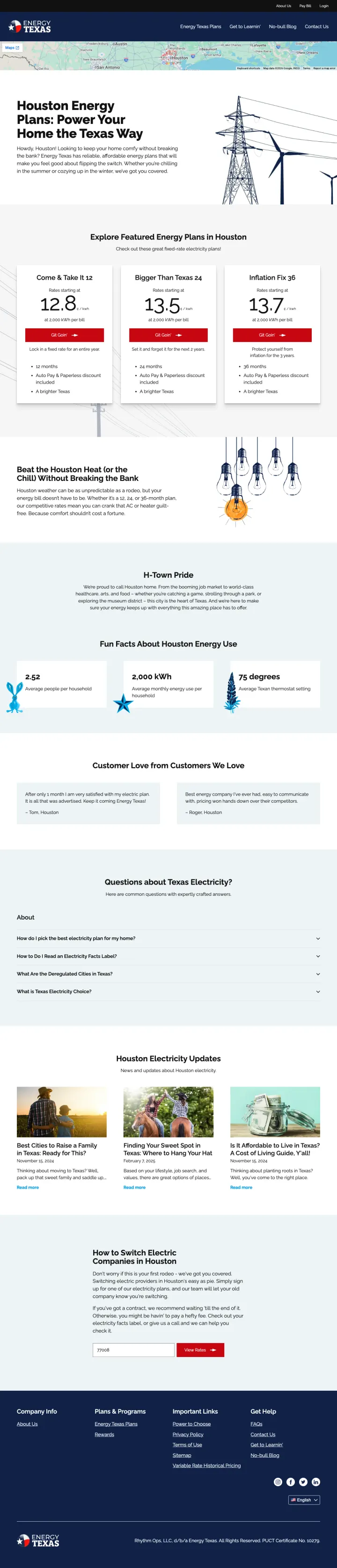
'Houston Energy Plans: Power Your Home the Texas Way' combined with Texas flag imagery and 'Built for Texans' messaging taps into regional pride in a way that national providers like Direct Energy cannot match. This emotional differentiation matters in a commodity market
Three rate cards shown as styled cards with price per kWh in large text, plan name, and contract length. The visual hierarchy makes it easy to scan and compare without reading paragraphs
'Fun Facts About Houston Energy Use' and 'Lock a 4% Lower Rate than the Houston Average' sections provide locally relevant data that makes the page feel researched and specific rather than templated
The page shows rates but uses a 'Based on 1,000 kWh' disclaimer that is easy to miss. Visitors with different usage patterns may see very different actual rates after enrolling
Customer reviews section uses first names only with no verification signals (no Google logo, no star aggregation). These could be fabricated for all the visitor knows
The hero image of transmission towers is generic infrastructure photography that every energy company uses. The Texas-pride messaging deserves Texas-pride imagery
Strip your landing page down to a single input field (ZIP code), a single button (Compare), and a 3-step visual showing how easy the process is. Remove everything else. For commodity products where the only question is 'what is the rate for my area?', minimalism converts.
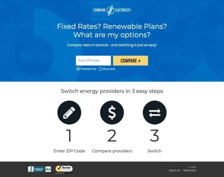
The entire above-the-fold experience is: headline ('Fixed Rates? Renewable Plans? What are my options?'), ZIP code field, and Compare button. Nothing else. This is the most conversion-focused energy page in the set
'Switch energy providers in 3 easy steps' with numbered icons (Enter ZIP Code, Compare providers, Switch) eliminates the fear that switching is complicated. Three steps feels achievable
Residential/Business toggle next to the ZIP code field segments visitors immediately without requiring them to navigate to a different page
The page is extremely short, which is ideal for conversion but provides zero content for visitors who want to learn more before entering their ZIP code. There are no reviews, no rate previews, no trust signals beyond the brand name
The brand name 'Compare Electricity' is literally the generic activity the visitor wants to do, which means the brand has zero memorability beyond its URL
No mobile-specific optimization visible -- the ZIP code field and button appear small relative to the viewport
If your market has a significant Spanish-speaking population, build fully native Spanish landing pages (not translations) with culturally relevant messaging, phone-first CTAs, and promotions that resonate with the community.
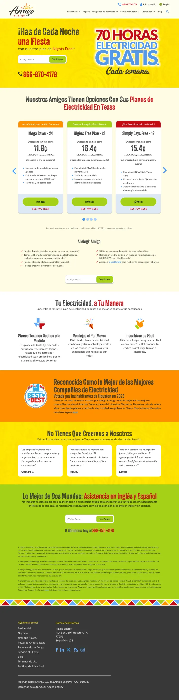
'70 HORAS ELECTRICIDAD GRATIS Cada semana' (70 hours free electricity every week) is a brilliant offer framing. Rather than showing a rate per kWh that requires mental math, the free-hours offer is instantly understood and emotionally compelling
Three plan cards (Mega Saver, Nights Free Plan, Simple Fixed) with rates per kWh and clear plan names in Spanish. The pricing display mirrors English-language competitors but in the visitor's native language
Prominent phone number (1-888-670-4135) at the top reflects the preference for phone enrollment in Spanish-speaking communities where online forms may feel less trustworthy
The design is dated with a bright yellow background and clip-art-style graphics. The page looks like it was designed in 2015 compared to the modern aesthetics of Rhythm or Direct Energy
'Reconocida Como la Mejor de las Mejores Companias de Electricidad' (Recognized as the Best of the Best) is a vague superlative claim with no visible source or award name to back it up
The bottom section mixes English and Spanish ('La Mejor de Dos Mundos: Asistencia en Ingles y Espanol!') which, while practical, undermines the fully-Spanish experience the rest of the page creates
Build a landing page that directly compares your product against a specific named competitor, with a detailed feature/price table showing where you win. Bid on the competitor's brand keywords and send traffic to this page.
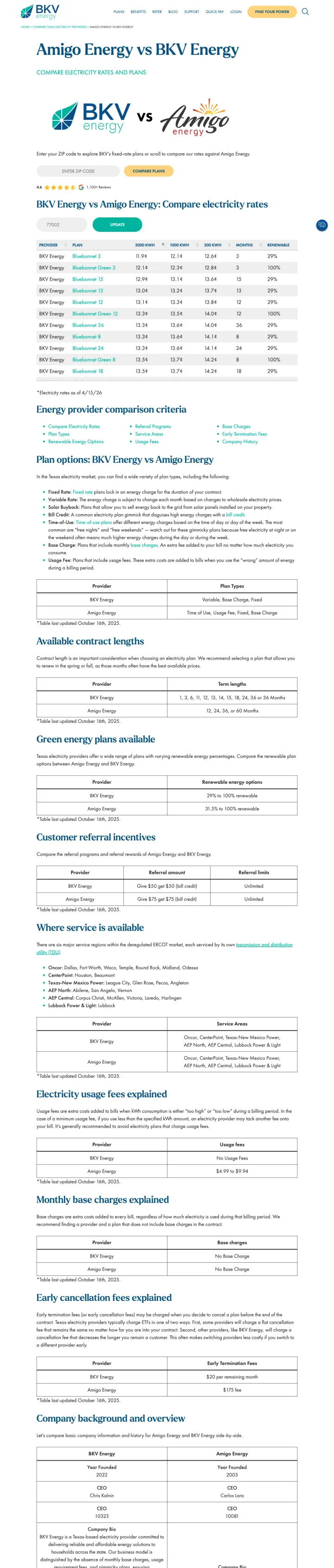
The page title 'Amigo Energy vs BKV Energy' directly names the competitor, which matches the search intent of someone researching alternatives. The comparison table shows rates, fees, contract terms, and customer ratings side by side
'No hidden fees' and 'No gimmicks' messaging directly attacks the common consumer fear in deregulated energy markets. BKV positions itself as the honest alternative to competitors who bury fees in the fine print
The comparison table format lets the visitor make a decision without leaving the page. Every row where BKV wins is a conversion argument
The page is extremely long with dense text that reads like a white paper rather than a quick comparison. Most visitors from a competitor brand search want a quick side-by-side, not 2,000 words of analysis
The comparison data may not be current. If Amigo's rates change and BKV does not update this page, the comparison becomes misleading
Three separate comparison pages (vs Amigo, vs Frontier, vs Direct) fragment the value proposition. A single 'BKV vs Everyone' comparison page would be more powerful and easier to maintain
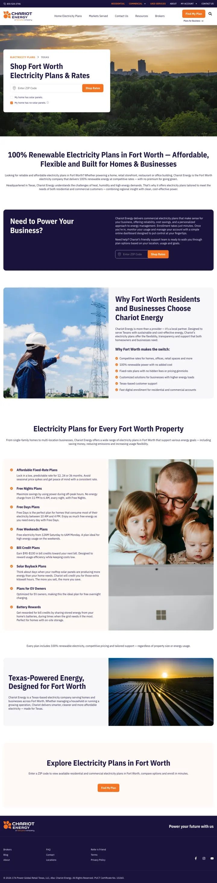
If you sell deregulated energy in more than one city, build a landing template where the hero photo is the actual city skyline and the H1 says 'Shop [City] Electricity Plans.' Chariot shows the Fort Worth skyline at sunset in the hero, not a generic Texas sunset, and visitors from a 'light company in fort worth' search feel they landed on a page built for their ZIP code, not a national provider's generic template.
ZIP entry box sits in a white card floating over the Fort Worth skyline photo: single field, single orange CTA, no distractions. Energy shoppers want a rate, not a pitch, and this structure gives them one click to get it
Separate 'Need to Power Your Business?' panel sits just below the hero with its own purple background, which splits residential vs commercial traffic without forcing the visitor to hunt for a segment menu
'Why Fort Worth Residents Choose Chariot' uses 5 icon bullets (renewable, flexible, simple sign-up, local photography of the Chariot crew) and a dad-and-kids photo, which lands the trust pitch without stock-photo feeling
Monthly price is not visible above the fold or below the hero, which means visitors still have to enter their ZIP just to find out whether Chariot is even in their range
No direct plan-comparison grid anywhere on the page, competitors like Mint Mobile and most energy aggregators show 3 plans side by side with rates, Chariot forces a ZIP-gated flow
Pages that break the playbook in interesting ways
Build a dedicated referral landing page with a clear value prop for BOTH the referrer and the new customer, with a 3-step process that shows how easy it is to earn the reward.
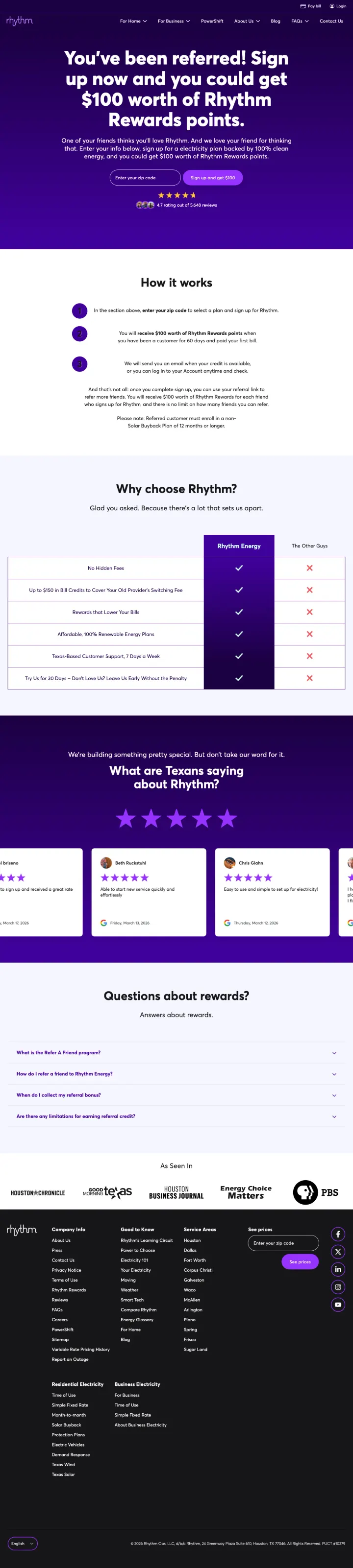
'You have been referred! Sign up now and you could get $100 worth of Rhythm Rewards points' creates immediate value for both the new customer and the referrer. Dual-sided incentives generate more shares than one-sided offers
The 3-step process (1. Share your link, 2. Friend signs up, 3. Both get rewarded) is clean and visual. Each step has an icon that makes the process feel achievable
The deep purple and neon accent color scheme is visually distinctive and matches Rhythm's brand identity across all their pages, building brand recognition
This page targets 'rhythm energy login' (2,900 searches/month), which means it is being shown to EXISTING customers trying to log in. A referral page is the wrong destination for login intent
The rewards FAQ section at the bottom uses collapsed accordions, hiding useful information about how the rewards program works behind clicks
No rate information or plan details on this page. A referred visitor who lands here has no way to evaluate whether Rhythm is worth switching to without navigating to another page
For a no-deposit, prepaid service, lead with the three things the customer cares about most: no credit check, same-day activation, and cancel anytime. These are the exact pain points that brought them to search in the first place.
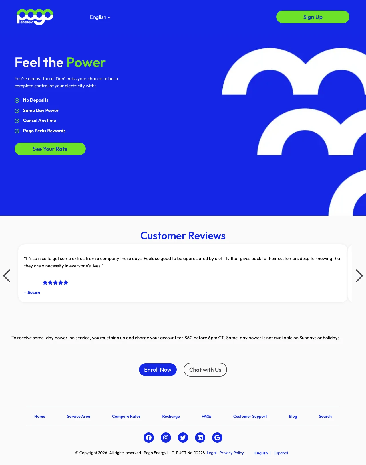
'Feel the Power' headline with four bullet points (No Deposit, Same-Day Power, Cancel Anytime, Pogo Perks Rewards) in green checkmarks. Each point directly addresses a barrier that prepaid energy customers face
The design is bold and minimal: large green and white text on a clean background with Pogo's distinctive frog-like branding. It stands out from the corporate blue of every other energy provider
A single customer review from 'Susan' with 5 stars and a genuine-sounding quote creates just enough social proof without feeling manufactured
The page shows NO rates. For a customer searching 'electric company fayetteville ar' (390/month), seeing 'See Your Rate' as the CTA without any preview of pricing feels like a bait to collect information
The single customer review is not enough social proof for a financial commitment. One review could easily be fabricated
The disclaimer about $40 minimum charge and same-day cutoff times is buried in small text. These are material limitations that should be prominent, not hidden
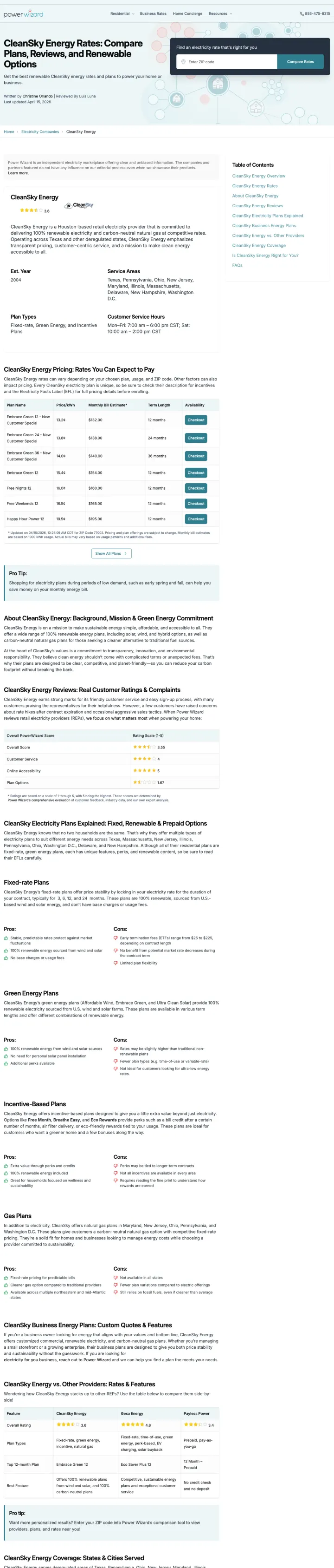
Why This Breaks the Rules: most energy retailers bid on their own brand, Power Wizard bids on 'cleansky energy' (9,900 searches) and sends those visitors to a Power Wizard review OF CleanSky, complete with 3.6-star rating, pros/cons, and a ZIP entry box sitting above the CleanSky rate table. The page is editorially framed as 'independent electricity marketplace offering clear and unbiased information,' which lets Power Wizard intercept brand searchers without tripping the 'sketchy affiliate' tell.
Byline disclosure ('Written by Christine Orlando, Reviewed by Luis Luna, Last updated April 15') gives the page newsroom credibility, which converts brand-intent visitors better than a naked plan-shopper page would
Table of contents in the right rail lists 'CleanSky Energy Reviews' and 'CleanSky vs. Other Providers' as clickable anchors, which is both SEO gold AND a way to let visitors self-select into the comparison flow without leaving the page
ZIP entry box in the header persists through scroll, so at any point in the CleanSky review the visitor can pivot from 'researching this provider' to 'shopping Power Wizard's own marketplace'
3.6-star rating on the brand being searched undercuts the 'unbiased' framing: visitors who came looking for CleanSky may read a mediocre review and bounce to search again instead of converting through Power Wizard
No disclosure of how the review interacts with Power Wizard's affiliate revenue, which is fine for SEO but FTC risk for a large-scale paid traffic play
4 pages burning ad spend with fundamental issues
Every click to these pages costs real money. We found broken trust signals, mismatched intent, weak CTAs, and messaging that ignores what the searcher actually typed. Here is what to avoid.
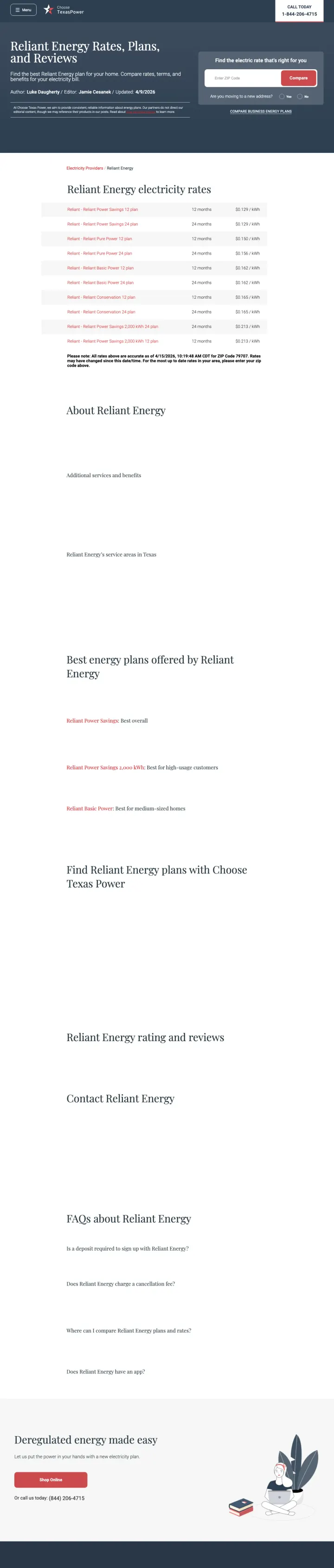
Multiple sections appear empty or with placeholder content. The 'About Reliant Energy' section has minimal information. The 'Best energy plans' and 'Reviews' sections show no actual data
Images throughout the page fail to load, leaving broken image placeholders. For a paid landing page, this is a basic quality failure
The page has no CTA beyond a generic 'Deregulated energy made easy' section at the bottom with a ZIP code entry that belongs to ChooseTexasPower, not Reliant
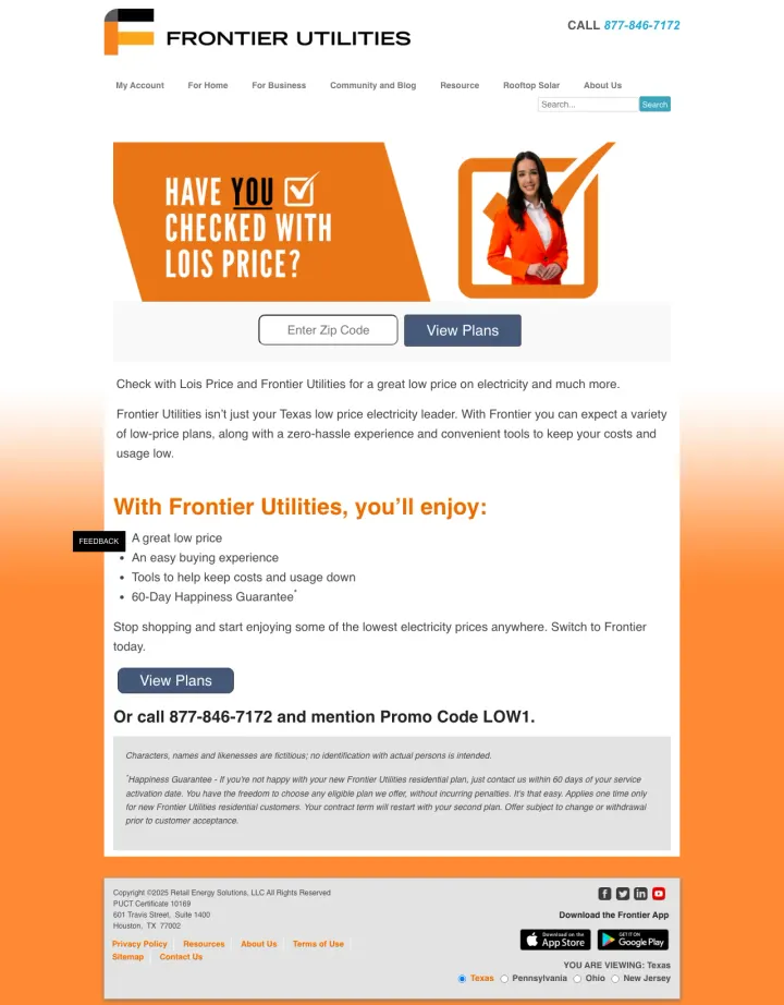
The fictional character 'Lois Price' in an orange business outfit with the tagline 'Have YOU checked with Lois Price?' feels dated and does not build the credibility that a commoditized utility decision requires
The page layout is a single column with minimal structure: logo, hero banner, bullet points, two buttons, disclaimer text. It looks like a promotional email, not a landing page
The 'FEEDBACK' tab floating on the left side of the page is a stock widget that breaks the page layout and signals a low-effort web presence
The page is a vertical list of rate cards with no sorting, filtering, or comparison capability. Visitors have to manually scan 20+ rates to find the cheapest or most relevant option
No customer reviews, no provider ratings, no plan details beyond rate and provider name. The visitor cannot make an informed decision with this information alone
The intro text is a dense paragraph of SEO content about New Hampshire energy deregulation that no paid search visitor will read. This content serves Google, not the customer
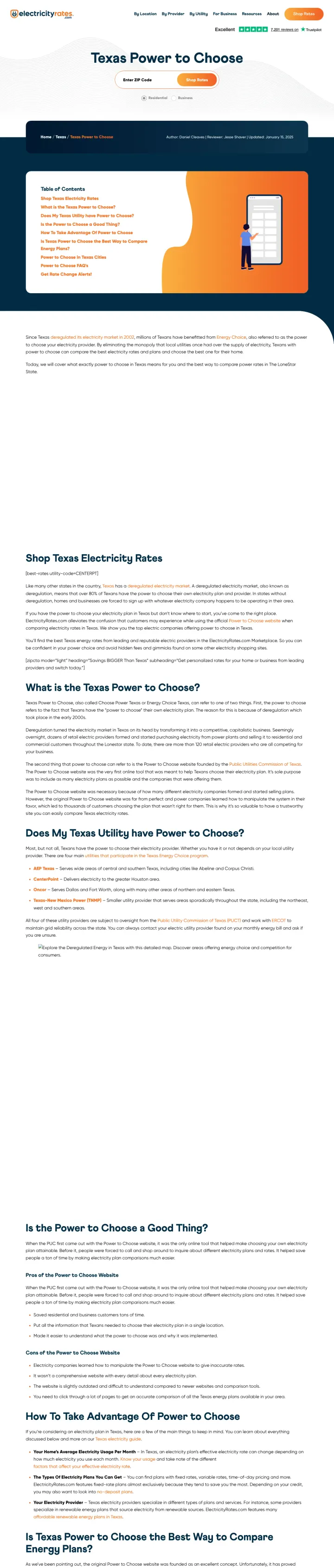
Ad spend goes hard on 'Unlock energy savings with Power to Choose Texas, Compare Texas energy rates today' across three near-identical ads at 12,680 combined monthly searches. The landing page is a 10-section SEO guide ('What is the Texas Power to Choose?', 'Is the Power to Choose a Good Thing?', 'How To Take Advantage Of Power to Choose', 'FAQ'), not a rate comparison. Visitors who clicked a price ad have to scroll past an illustrated cartoon character and a table of contents before they find any rate, which is the exact motion an unqualified lead makes before bouncing. Click cost on 'electric providers in texas' is high enough that a 12k-volume keyword delivering SEO content instead of rates is a CAC disaster.
Ad promises rate comparison, page delivers a 2,000+ word FAQ, message match is weak at five-figure click volume
Illustrated cartoon character in the hero consumes the most valuable pixel real estate without doing any conversion work
Table of Contents sits where a rate table should be, which trains the visitor to read instead of click
The strongest pages (ComparePower, CompareElectricity, Direct Energy) lead with a single ZIP code input field and a 'View Plans' or 'Compare' button as the entire above-the-fold experience. Electricity rates vary by utility territory and ZIP code, so showing generic rates is meaningless. The ZIP ...
ComparePower and BKV Energy use structured comparison tables showing rate per kWh, contract length, renewable percentage, and early termination fees across multiple providers. These tables work because the core decision in deregulated energy is 'which plan is cheapest for my usage?' and a table l...
Amigo Energy runs a fully Spanish-language landing page with '70 HORAS ELECTRICIDAD GRATIS Cada semana' as the hero headline, targeting 'compania de luz en texas.' In a state where 39% of the population is Hispanic, most energy providers offer English-only landing pages. The Spanish-language page...
Frontier Utilities uses 'Lois Price', a fictional character in a branded orange outfit, as the face of their advertising ('Have YOU checked with Lois Price?'). While the execution is dated and the page design is basic, the concept is sound: in a market where every provider sells the same electron...
Winners put a ZIP code field front and center, deliver personalized rate comparisons immediately, and make the switching process feel like a 5-minute task. Losers dump generic rate information, long SEO content, or comparison tables without personalization.