Free: 96 PPC tools + my AI Playbook book

These are real estate planning & legal documents pages spending actual money on Google Ads right now.
From real estate planning & legal documents Google Ads campaigns in the US
The landing pages actually worth stealing from
So you know exactly what to avoid
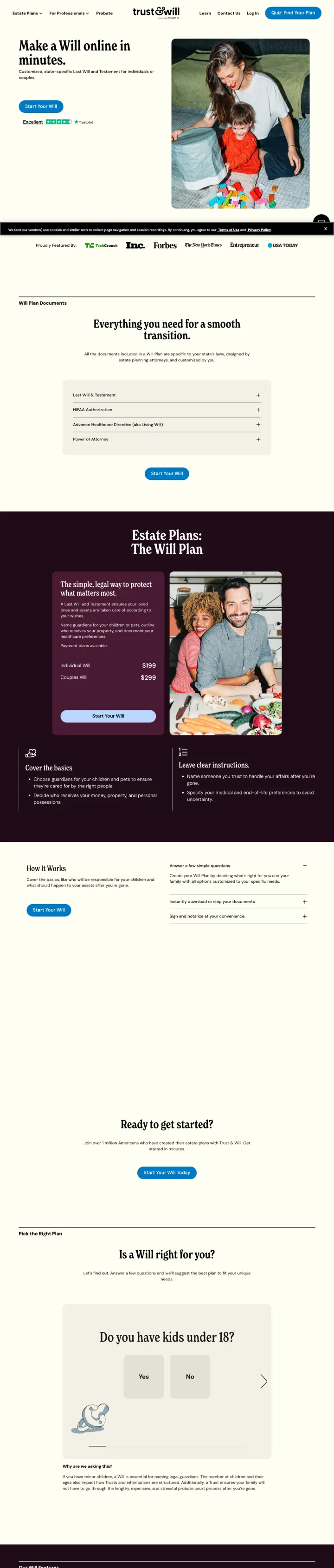
Lead with the simplest possible promise ('Make a Will online in minutes.') paired with a lifestyle photo of a real family, then immediately show what the process includes (document checklist) and who the product is for ('Do you have kids under 18?'). This page sells the outcome (peace of mind) not the product (legal documents).
'Make a Will online in minutes' headline strips away all legal complexity and positions the product as fast and easy -- the two attributes that matter most to estate planning procrastinators
'Everything you need for a smooth tomorrow' section with checkboxes (will, healthcare directive, financial POA, guardianship) shows the complete package, making visitors realize they need more than just a will
Decision tree question ('Do you have kids under 18?') segments visitors into the right product path and makes the page feel personalized rather than one-size-fits-all
No pricing visible on this page -- visitors must click through to see plan costs, which adds a step to the conversion process and may lose price-sensitive visitors who assume it is expensive
The dark purple/plum color sections mid-page create a visual break that may feel like a different page rather than a continuation of the same flow
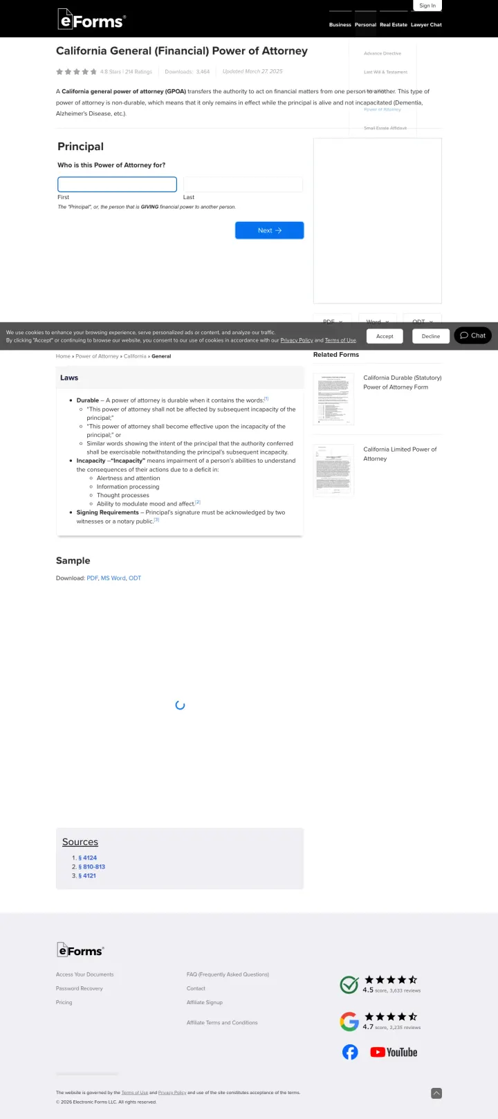
Title the page with the exact legal document name and state ('California General (Financial) Power of Attorney') and put an interactive form builder immediately below. The visitor searching for 'financial power of attorney form California' lands on a page that says exactly that and lets them start filling it out within 3 seconds.
Star ratings (4.8/5) immediately below the page title build instant social proof before the visitor even reads the content
Interactive form builder starting with 'Who is this Power of Attorney for?' lets the visitor begin creating their document immediately -- no signup, no paywall, just start
'Laws' section linking to the exact California statute (Prob Code 4400) signals legal accuracy and authority that generic form builders cannot match
The page is very text-sparse below the form -- the 'Sample' section and 'Sources' are minimal. Visitors who scroll past the form looking for more information find almost nothing
No attorney review upsell or premium service visible -- eForms may be leaving revenue on the table by not offering paid document review for visitors who want professional validation
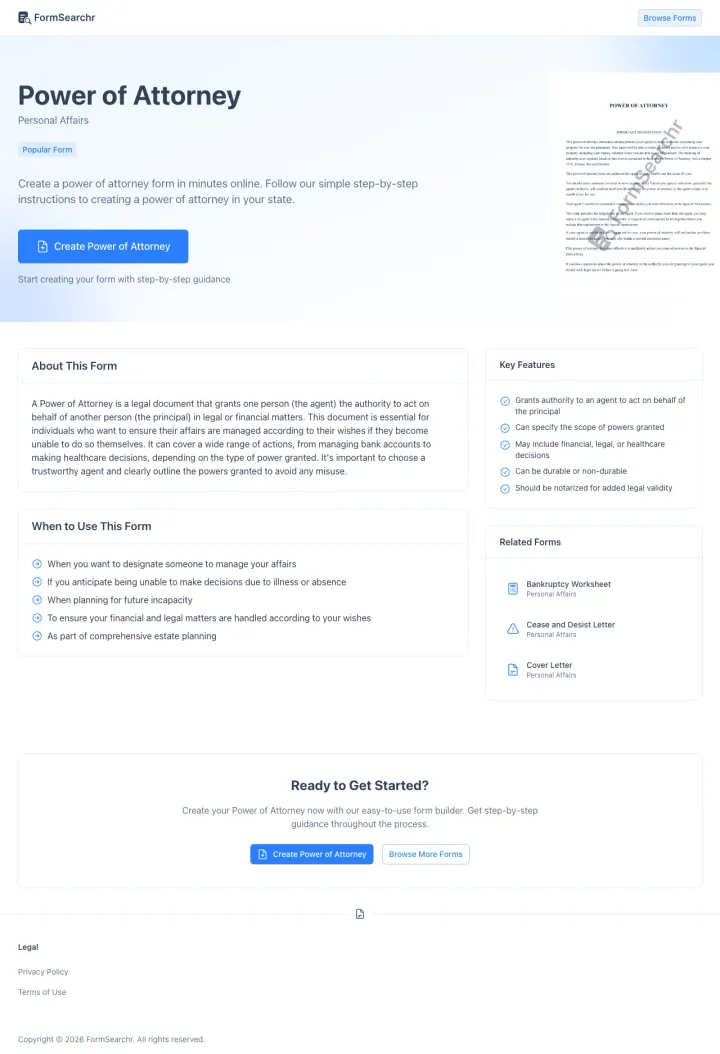
Show a watermarked preview of the actual document alongside the form builder CTA. FormsSearchr puts a preview image of the power of attorney document in the hero section so visitors can see what they will get before they start creating it.
Document preview image in the hero section answers 'what will my document look like?' instantly -- this visual proof of output quality is more persuasive than any description
'Create Power of Attorney' green CTA button is the only colored element on the page, drawing the eye immediately to the action
Key Features checklist (direct authority to agent, specify scope, include financial/legal/healthcare) validates that the document covers all the visitor's needs
The page is quite short and may not provide enough information for visitors who want to understand the legal implications before creating the document
No pricing information visible -- unclear if the form builder is free or requires payment, which creates friction at the point of clicking 'Create'
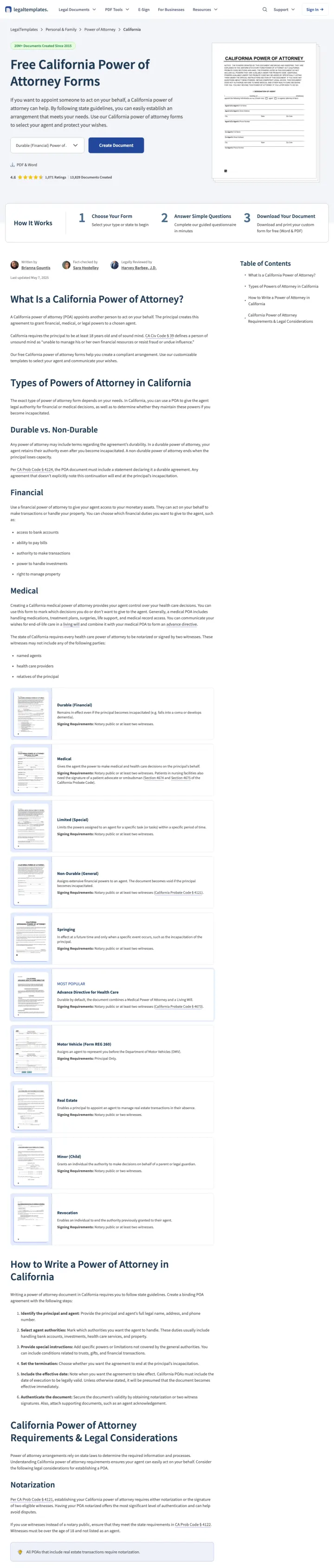
Use the exact state name and document type in the H1 ("Free California Power of Attorney Forms"), show format options (PDF and Word) above the fold, then display a 3-step visual process (Choose Your Form, Answer Simple Questions, Download Your Document) to set expectations before the visitor commits.
"20M+ Documents Created Since 2015" counter in the header builds instant platform credibility before the visitor reads a word of content
Document preview image of an actual California Power of Attorney form on the right side of the hero lets visitors see exactly what they will get
Dual format options (PDF and Word) with toggle buttons above the fold let visitors choose their preferred format before they start creating
The educational content below the form builder is extensive (types of POA, state requirements, notarization rules) but pushes the page length to 3000+ words, making it feel like a legal article rather than a tool
The "Create Document" CTA button uses the same blue as the nav bar, reducing its visual distinctiveness
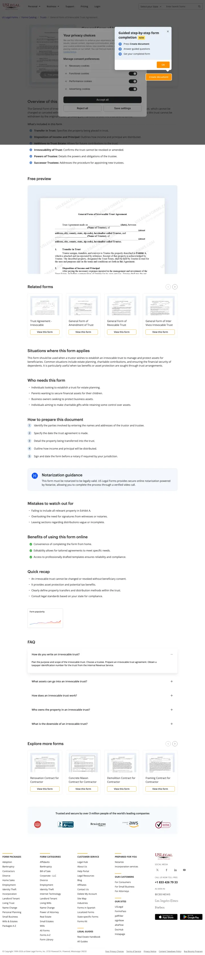
Create specific product pages for niche legal documents (irrevocable trust agreement, guardianship papers, probate forms) that target long-tail keywords competitors ignore. USLegalForms has pages for extremely specific document types that larger competitors do not cover.
Targeting niche documents like 'irrevocable trust California form' that LegalZoom and Trust & Will do not create dedicated pages for -- this captures the long tail of estate planning searches
Document preview with feature checklist (editable, downloadable, state-specific) shows exactly what the buyer gets
Trust badge showing 'Trusted by 100,000+ users' with platform credibility signals
The page design is utilitarian to the point of feeling untrustworthy -- minimal styling, dense text, and a generic template that does not inspire confidence for a legal document purchase
The document is behind a paywall with no free preview or trial -- competitors offer free templates with premium upsells, making USLegalForms feel expensive by comparison
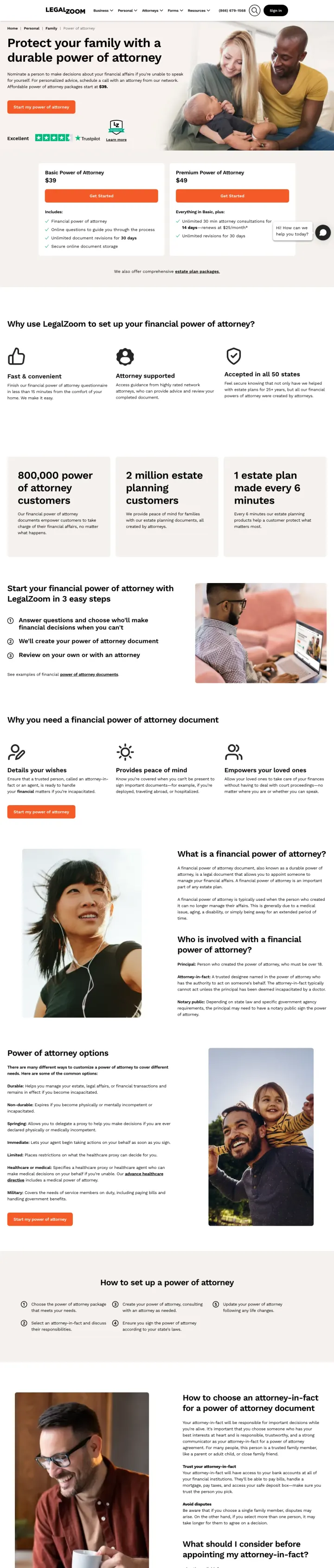
Show package prices ($39 Basic, $49 Premium) in the hero alongside the CTA. Every other form builder in this set hides pricing until after the form starts, which creates a friction spike the moment the visitor realizes they have to pay. LegalZoom leads with price, so the visitor who clicks has already accepted the cost.
'Affordable power of attorney packages start at $39' appears in the subhead, so the visitor knows the price before they scroll. Estate planning visitors are often procrastinators who bail at any surprise, and surprise pricing is the biggest one
Side-by-side $39 Basic vs $49 Premium cards with explicit feature lists turn the purchase decision into a product comparison, which is easier to make than an open-ended 'is this worth it' judgment
Specific scale proof ('800,000 power of attorney customers', '1 estate plan made every 6 minutes') beats generic 'trusted by millions' because the numbers are weirdly specific, which reads as real
The Trustpilot rating is 'Excellent' with no star count visible, which is weaker than competitors like Ethos (4.8 with 4,000+ reviews) and LegalTemplates (4.8 with 1,075+ ratings). Specific review counts beat adjectives
The Premium tier's '14 days, renews at $25/month' subscription hook is buried inside the feature list, so a visitor skimming the comparison may miss that Premium becomes a recurring charge
Pages that break the playbook in interesting ways
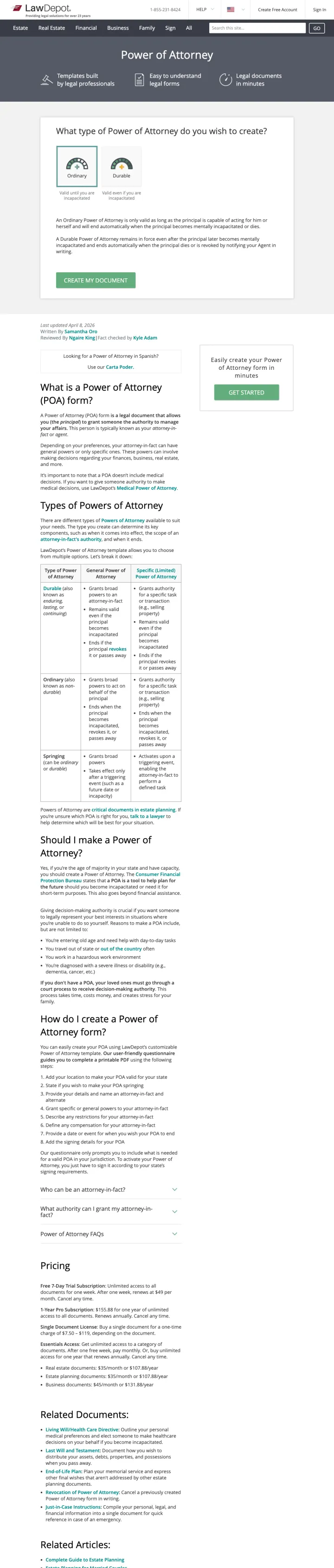
LawDepot shows the form builder but front-loads it with educational content about POA types, when you need one, and state requirements. The approach sits between eForms (form first) and LegalNature (education first). For visitors who need guidance before creating, this middle ground may convert better than either extreme.
'What type of Power of Attorney do you want to create?' question with radio buttons helps undecided visitors choose the right document before starting the form
Comprehensive sections on 'What is a Power of Attorney?', 'Types of Power of Attorney', and 'Should I make a Power of Attorney?' serve visitors who are still researching rather than ready to create
Related documents sidebar cross-sells other legal forms the visitor may also need
The form builder is pushed below substantial educational content -- visitors who know exactly what they want must scroll past explanations they do not need
The design feels dated compared to newer competitors like FormsSearchr and eForms -- green and white color scheme with dense text blocks
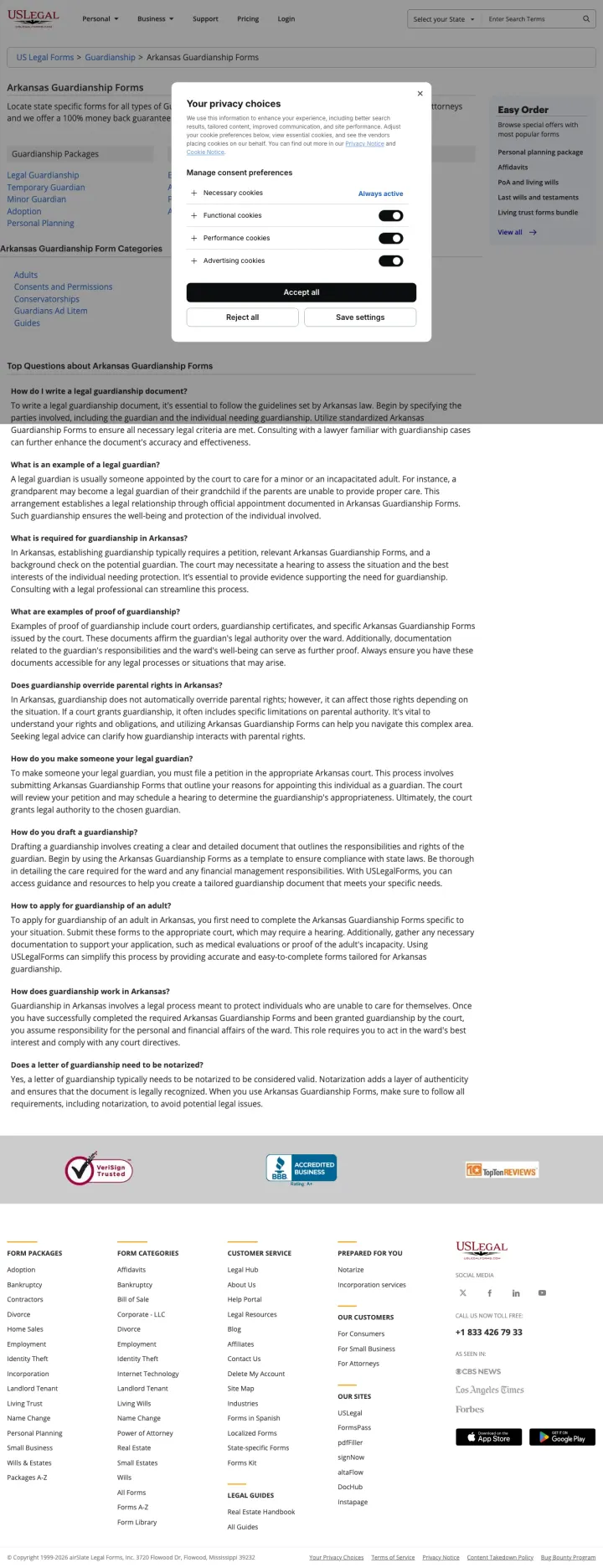
Build a state + document-type directory page for niche estate documents (guardianship, probate, conservatorship) that the big form builders do not cover. USLegalForms captures 'guardianship papers arkansas' (40 SV) with a page that links to 15+ specific guardianship subtypes, where eForms and LegalTemplates have no matching page at all. The traffic is small per keyword, but the long-tail stacks.
Segmenting the page by document subtype (Legal Guardianship, Temporary Guardian, Minor Guardian, Adoption) lets one page rank for and answer many variant queries at once. A visitor unsure which exact document they need can self-select
The FAQ section answers the exact questions a guardianship searcher types into Google ('How do I write a legal guardianship document?', 'What is required for guardianship in Arkansas?'), which doubles as SEO content and visitor reassurance
Mentioning '100% money back guarantee' and 'drafted by attorneys' as one-liners in the intro removes two of the three objections a DIY legal document buyer has (will this hold up, and what if I mess up)
The page is a link directory, not a form builder. A visitor who wants to actually start creating guardianship papers has to click through to a search result page, then to a product page, then to the document. Three clicks too many for PPC traffic
The privacy choices cookie modal dominates the viewport on load, covering most of the category links. For a $8/month subscription ad, the first interaction is clicking away a consent banner
No document preview, no pricing, and no 'start now' CTA. The visitor has to trust that the forms behind the links are good, on a page that shows no evidence of what they look like
2 pages burning ad spend with fundamental issues
Every click to these pages costs real money. We found broken trust signals, mismatched intent, weak CTAs, and messaging that ignores what the searcher actually typed. Here is what to avoid.
This page targets 'financial power of attorney form California' (SV: 9,900) but delivers a 3,000+ word educational article about every type of power of attorney, state-specific requirements, and legal considerations. The form builder CTA exists but is buried under walls of text. A visitor who wants to create a California POA must scroll past explanations of durable, springing, limited, general, medical, and financial POA types before finding a way to start. At legal document CPCs ($3-8), the page converts a small fraction of the traffic that eForms captures with a direct form builder.
3,000+ words of text before the primary CTA -- this is an SEO content page being used as a PPC landing page
Multiple POA types explained in detail create decision paralysis rather than clarity -- a visitor who searched for a specific POA type now questions whether they chose the right one
The form builder, while present, is not visually differentiated from the surrounding content -- it blends into the text rather than standing out as the action to take
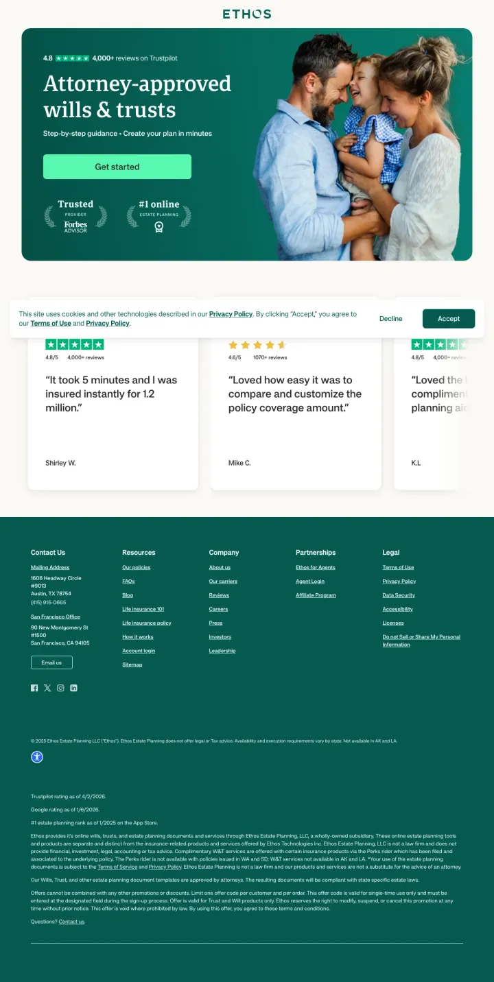
The ad promises 'Create a Will in 10 Minutes, $149' for searches like 'ohio online will' (170 SV) and 'online will michigan' (70 SV). The page headline is 'Attorney-approved wills and trusts' which delivers, but the testimonials below the fold are all about life insurance ('It took 5 minutes and I was insured instantly for 1.2 million', 'Loved how easy it was to compare and customize the policy coverage amount'). The visitor who came for a will sees review copy for a totally different product and loses confidence that Ethos is serious about estate planning. This is a life insurance company running estate planning ads to recycle life insurance traffic, and the page betrays it.
Reviews in the body are for life insurance products (mentions of coverage amounts, policy customization) on a page selling wills. A POA or will visitor reads these and concludes Ethos is a life insurance company dabbling in estate planning
The page has only one CTA ('Get started') and no pricing, despite the ad promising a specific $149 price. Visitors who clicked because of the price anchor find no confirmation of that anchor on the page
The scrape text is 2,173 chars, which is thin even for a tool-style page. The 'what you get' and 'how it works' sections that Trust & Will and LegalTemplates use to build confidence are absent
The strongest converters (eForms, FormsSearchr, Trust & Will, LegalTemplates) let visitors begin filling out their power of attorney or will within seconds of landing. The form IS the page. This works because estate planning visitors have usually already decided they need the document; what they ...
Every high-performing page in this set is state-specific. eForms runs 'California General (Financial) Power of Attorney' as the H1. LegalTemplates runs 'Free California Power of Attorney Forms' with a document preview. Trust & Will opens with a state selector. Legal documents are state-specific b...
eForms, LegalTemplates, FormsSearchr, and LawDepot all offer free templates or form builders as the landing page hook, then upsell attorney review, document storage, or premium formatting downstream. This freemium model works because the visitor's search intent is 'free power of attorney form'. G...
FormsSearchr shows a watermarked preview of the actual power of attorney document in the hero section. LegalTemplates shows a California Power of Attorney form preview on the right side of the hero. For visitors who are creating legal documents for the first time, seeing what the final output loo...
Winners let visitors start creating their document immediately with an inline form builder, use state-specific headlines that match the search query, show document preview images so first-time legal-document creators know what they will get, and (in LegalZoom's case) lead with price so the visitor never has a 'wait, how much is this' moment. Losers either open with a long-form educational article that explains the document type before letting the visitor create one, or repurpose reviews from an adjacent product line (Ethos showing life insurance reviews on a will page) which tells the visitor this is not the company's core product..