Free: 96 PPC tools + my AI Playbook book

These are real eye care / lasik pages spending actual money on Google Ads right now.
From real eye care / lasik Google Ads campaigns in the US
The landing pages actually worth stealing from
So you know exactly what to avoid
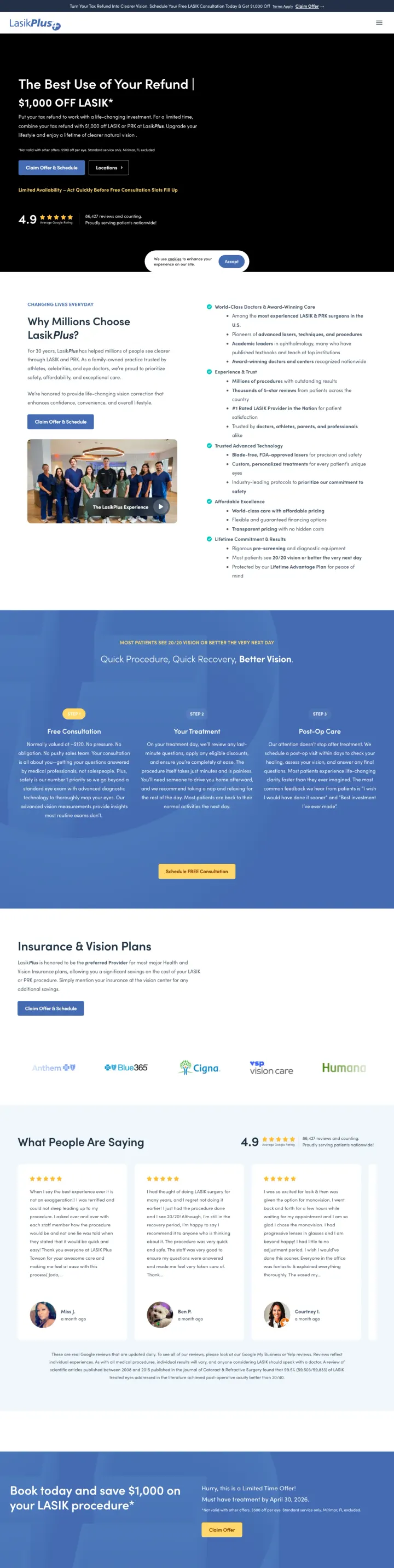
Lead with the specific dollar savings amount ('$1,000 OFF LASIK') in the hero alongside your aggregate review score and review count. This combines financial motivation with social proof in the first glance.
'$1,000 OFF LASIK' in the hero headline is unambiguous and immediately tells the price-shopping visitor they have found a deal, eliminating the need to scroll for pricing information
4.9 stars from 57,000+ reviews displayed prominently below the hero creates massive social proof volume that individual practices cannot match
Insurance & Vision Plans section with recognizable logos (VSP, EyeMed, Cigna) addresses the 'will my insurance cover any of this' question that 60%+ of LASIK prospects have
No named surgeon anywhere on the page. For a permanent eye surgery, LasikPlus relies entirely on brand trust rather than individual surgeon credentials, which loses to practices that name their doctors
Team photo shows 8-10 staff members in scrubs, but no individual is identified or credentialed. The visitor cannot tell who will perform their surgery
Countdown timer or urgency element ('Save $1,000 on your LASIK procedure') uses limited-time framing but no specific deadline, which sophisticated buyers will recognize as manufactured urgency
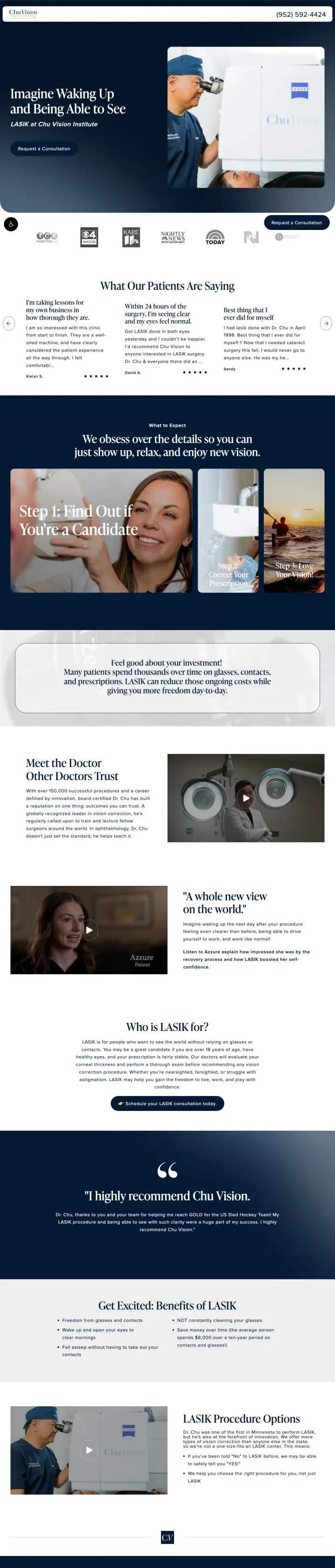
Feature the lead surgeon's photo and name alongside a patient testimonial quote in the hero section. The combination of 'this is who will operate on you' and 'this is what a real patient says' in the same viewport is extremely persuasive for elective eye surgery.
Named surgeon (Dr. Chu) with photo and credentials visible in the hero section immediately answers the 'who will operate on my eyes' question that every LASIK prospect has
Patient testimonial video embedded above the fold lets the visitor hear a real person describe their experience, which is more convincing than any written copy for an irreversible procedure
Dark navy and white design with strategic use of eye close-up imagery creates a premium, medical feel that positions this as a serious surgical practice, not a discount LASIK chain
No specific price or savings offer visible anywhere on the page. For a price-sensitive category where LasikPlus leads with '$1,000 OFF', the absence of any price reference forces the visitor to call just to find out if they can afford it
The consultation booking section is below the fold and requires scrolling past multiple content sections to reach
Technology section ('Triple Precision, Smart Recovery, Better Vision') uses marketing language instead of specific technology names or clinical data
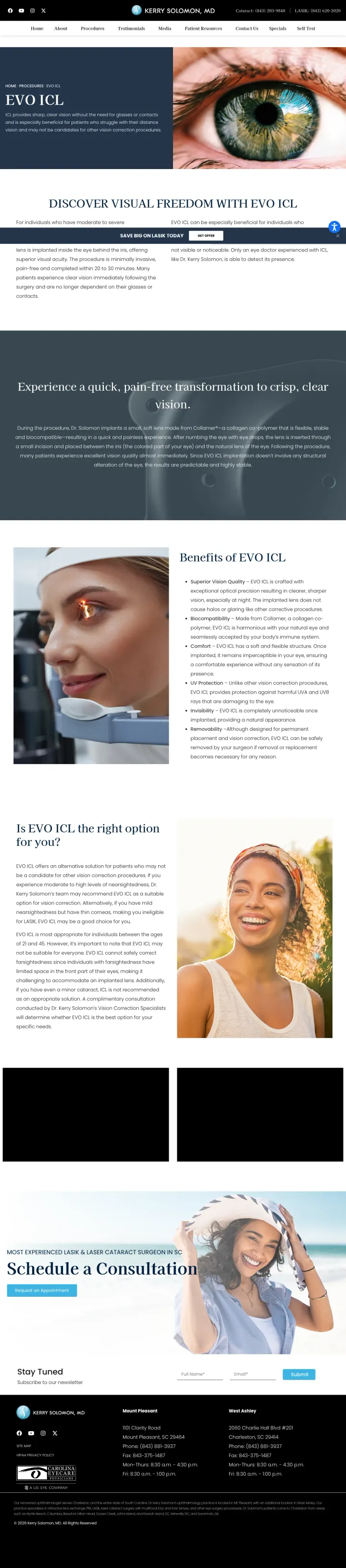
When promoting a lesser-known procedure (EVO ICL vs. LASIK), lead with the specific benefits that differentiate it from the more familiar option. 'Quick, pain-free transformation to crisp, clear vision' positions EVO ICL by outcomes rather than by technical explanation.
Hero section combines procedure name (EVO ICL) with outcome-focused subhead ('Discover Visual Freedom') and an eye close-up image that is medically relevant rather than stock photography
'Benefits of EVO ICL' section uses specific benefit statements rather than feature lists, focusing on what the patient experiences rather than what the technology does
'Is EVO ICL the right option for you?' section addresses candidacy questions proactively, which captures the 30-40% of LASIK-ineligible patients who represent the primary EVO ICL audience
No pricing information anywhere on the page. EVO ICL typically costs $3,000-5,000 per eye, and the absence of even a 'starting from' price means the visitor must call to discover if this is financially viable
Dr. Solomon's credentials are visible in the header but not reinforced in the page body with a dedicated 'About Your Surgeon' section
Blog-style navigation bar at the top with multiple menu items gives the visitor several exit paths before they reach the consultation CTA
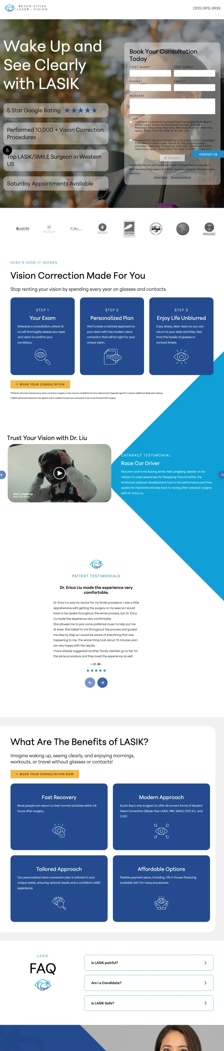
Embed the consultation request form directly in the hero section so the visitor can act immediately without scrolling. Beach Cities puts the form next to the hero image, making the conversion path zero-scroll for ready-to-act visitors.
Hero form embedded beside the main headline means the visitor sees both the value proposition and the action mechanism in the same viewport, eliminating the scroll-to-CTA problem
'Vision Correction Made For You' headline with lifestyle imagery (person waking up, seeing clearly) sells the outcome rather than the procedure, which resonates with patients who are afraid of eye surgery but want the result
Benefits section uses icon cards (precision, safety, comfort, speed) that are scannable and address the top four LASIK concerns in visual format
Named doctor section is below the fold, after the benefits and FAQ sections, which means the visitor has to scroll significantly before learning who will perform their surgery
FAQ section takes up significant page real estate with general LASIK questions that could be on a separate page, pushing the doctor credentials further down
No patient reviews or testimonials visible on the page, which is a significant gap for a local practice competing against chains with thousands of reviews
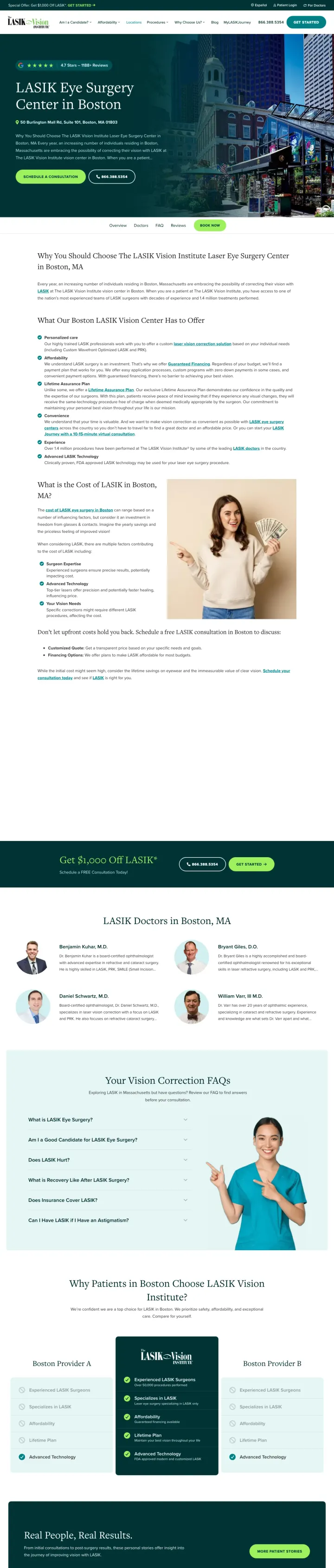
Build the page around patient video testimonials rather than procedure descriptions. LASIK Vision Institute's Boston page shows 8+ named patients with photos and review excerpts, making the social proof the primary content rather than an afterthought section.
8+ named patient testimonials with individual photos (Maria S., Ann P., and others) create a wall of social proof that is difficult for competitors to match without investing in real patient relationships
Local center branding ('Boston LASIK Center') with specific address and local surgeon profiles makes a national chain feel local and accessible
Green and white color scheme differentiates from the ubiquitous navy blue of other LASIK pages, creating visual distinctiveness in a category where every page looks the same
The page is extremely long with testimonial after testimonial, which may overwhelm visitors who want quick information rather than extensive social proof
No specific price or savings offer visible. LasikPlus leads with '$1,000 OFF' while LASIK Vision Institute leads with testimonials, losing the price-comparison visitor
Navigation bar at the top allows visitors to browse away to other center pages, which bleeds paid traffic across the site
The candidacy questionnaire ('Are you a Candidate for Laser Vision Correction?') as the primary above-the-fold interaction is a smart alternative to a consultation form. It engages the visitor in a diagnostic conversation rather than asking for personal information upfront.
Candidacy quiz as the primary above-the-fold interaction reduces friction compared to a form because the visitor is answering questions about themselves rather than giving away contact details
Three vision correction options (LASIK, PRK, EVO ICL) presented as card choices lets the visitor self-select their procedure interest before seeing surgeon information
Named surgeons with photos and specific credentials at the bottom provide the trust layer after the visitor has self-qualified through the quiz
Green color scheme is unusual for eye care (most use blue/white) and may feel more 'health food store' than 'surgical center'
No pricing or financing information anywhere on the page, which is a gap for a page targeting paid LASIK traffic
The page URL ('/landing/lasik-fb') suggests this was built for Facebook ads, but if it is also receiving Google search traffic, the social-optimized design may not match search intent
Pages that break the playbook in interesting ways
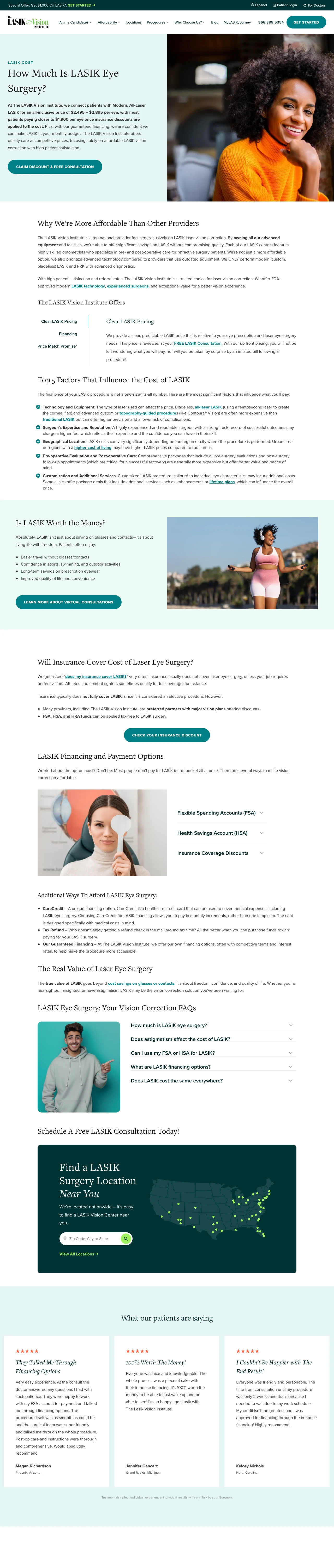
When targeting 'LASIK cost' keywords, answer the price question in the first sentence. This page dances around pricing with 'How Much Is LASIK Eye Surgery?' as the headline but never gives a specific number, which frustrates the high-intent visitor who searched specifically for cost information.
The page title ('How Much Is LASIK Eye Surgery?') matches the exact search query for cost-related LASIK keywords, which should produce strong Quality Scores in Google Ads
Candidacy quiz CTA ('Am I a candidate?') captures visitors who are not yet ready to book but want to know if LASIK is an option for them, creating a lower-commitment conversion path
Named surgeon section with photo and credentials below the cost discussion anchors the clinical authority after addressing the financial question
The headline promises to answer 'How Much Is LASIK?' but the page body discusses factors that affect cost without ever giving a specific number or range. This is the ultimate message-match failure for cost-intent traffic
No financing calculator or monthly payment estimator on a page specifically about LASIK cost, which is a missed opportunity to reframe a $4,000 procedure as '$X/month'
Multiple navigation links in the header allow visitors to browse to other pages, bleeding paid traffic across the site
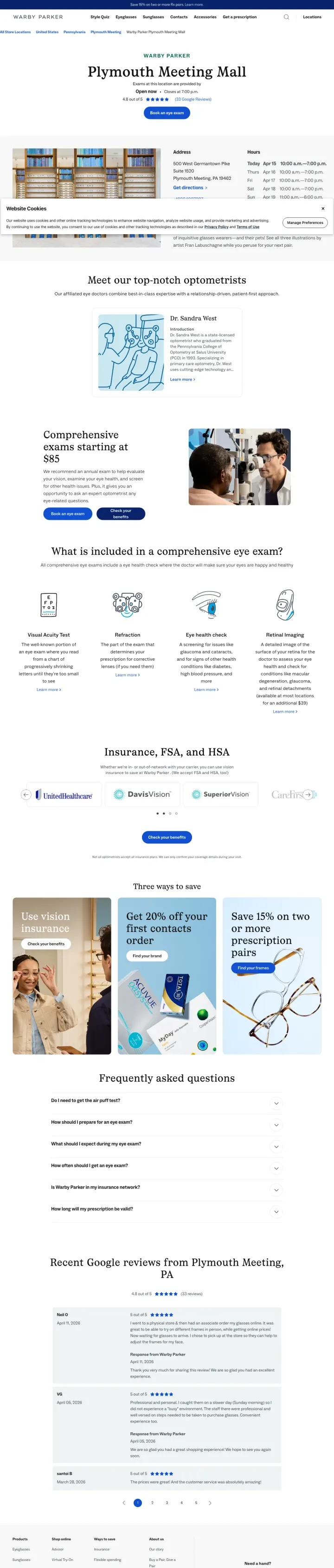
For store-level landing pages receiving paid traffic, combine location-specific details (address, hours, photos) with service-specific CTAs (Book an Exam) rather than showing them on separate pages. This Warby Parker exam page does this well.
Comprehensive eye exam description ('What is included in a comprehensive eye exam?') educates the visitor on what they will receive, addressing the 'is this worth $X?' objection
Local Google reviews embedded directly on the page bring third-party social proof to a first-party landing page, which is more credible than self-selected testimonials
Dual CTA: 'Book an eye exam' for ready visitors and 'How to get a prescription' for visitors who need their prescription first but are not ready to book
The page serves both store information (hours, location, directions) and eye exam booking, which splits the visitor's attention between two different needs
No specific exam price visible on the page, which is the primary information a visitor searching for 'eye exam near me' wants to know
Seasonal promotion ('Spring 2026') shown as a banner takes up visual space without a clear connection to the exam booking CTA
2 pages burning ad spend with fundamental issues
Every click to these pages costs real money. We found broken trust signals, mismatched intent, weak CTAs, and messaging that ignores what the searcher actually typed. Here is what to avoid.
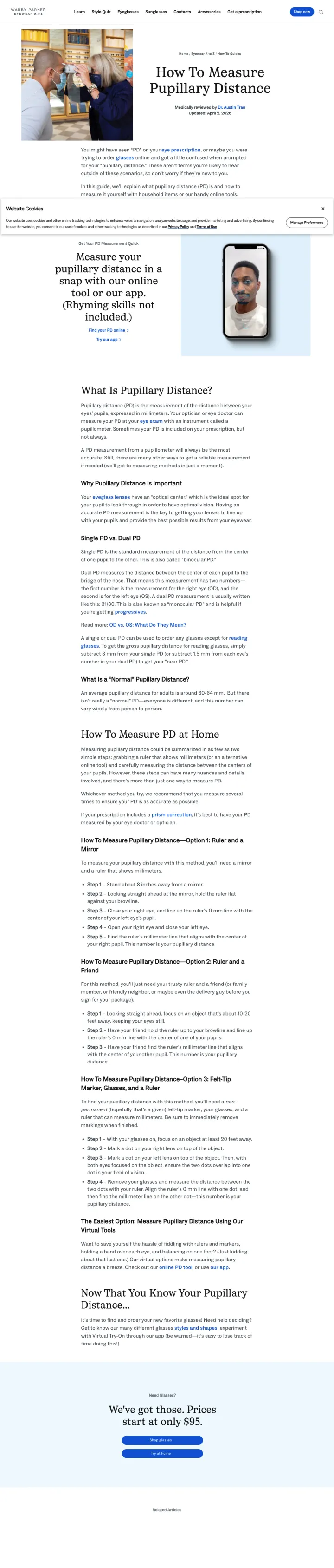
A visitor clicking a paid ad for eye care lands on a 1,500-word educational article explaining what pupillary distance is, how to measure it at home, and why it matters. The page has no product links, no 'Shop Frames' button, no exam booking CTA, and no inline purchase path. The only commercial element is a generic footer with 'Shop' navigation. At eyewear CPCs ($2-5), every click to this article is paying for content that should be earning organic traffic for free.
Zero product CTAs within the article body. A visitor who learns their PD has no next step on the page except navigating to the main site via the header
No mention of Warby Parker frames, prices, or the try-at-home program anywhere in the article content
Paid traffic to pure-educational content with no conversion mechanism is a direct waste of ad spend
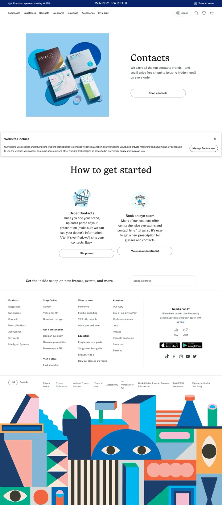
Paid traffic for contact lens keywords lands on a page showing contact lens brand boxes (Biofinity, Acuvue, etc.) with 'Shop contacts' and 'How to get started' sections. The page provides no pricing, no first-order discount, no subscription savings, and no comparison to competitors. At contact lens CPCs ($3-8), visitors who want to know 'how much do contacts cost at Warby Parker' bounce because the page does not answer the question.
No pricing visible for any contact lens brand, which is the single most important piece of information for a contact lens comparison shopper
No first-order discount or subscription pricing, which is the primary conversion mechanism used by 1-800-Contacts, Hubble, and every other DTC contact lens competitor
No customer reviews or satisfaction metrics for the contacts offering specifically
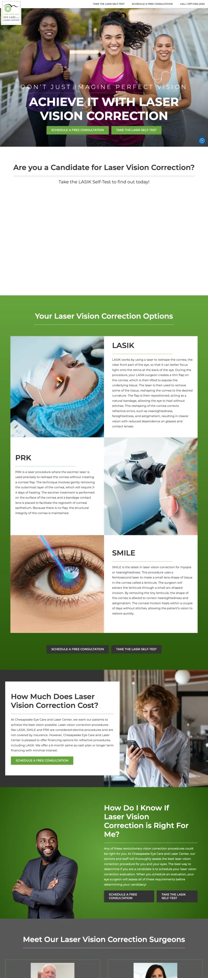
LasikPlus leads with '$1,000 OFF LASIK' in the hero and anchors every subsequent section around price savings. Their reviews page repeats 'Book today and save $1,000' as a sticky footer CTA. Contrast this with Chesapeake Eye Care, which leads with 'Achieve it with Laser Vision Correction' and a c...
Dr. Kerry Solomon's EVO ICL page leads with his name and 'Kerry Solomon, MD' branding throughout. Chu Vision shows Dr. Chu's photo and credentials in the hero section. But LasikPlus, the largest LASIK chain, shows team photos rather than individual surgeons, and LASIK Vision Institute buries indi...
Three Warby Parker pages in this sample are educational articles: 'How to Measure Pupillary Distance', 'How to Read Your Eye Prescription', and 'What is a Polycarbonate Lens'. These pages rank well organically and serve SEO purposes, but sending paid traffic to them means paying for visitors who ...
LASIK Vision Institute's Boston center page shows 8+ named patients with video testimonials (Maria S., Ann P., others) with photos and full review text. LasikPlus shows '4.9 stars' with a review count and named text reviews. The video approach is stronger because LASIK patients need to see real p...
Winners lead with a specific dollar offer or price point above the fold and immediately show either a named surgeon or patient testimonials. Losers send paid traffic to educational content (Warby Parker articles), store locator pages (Warby Parker stores), or product catalog pages (Warby Parker contacts) that serve organic visitors well but waste paid clicks.