Free: 96 PPC tools + my AI Playbook book

These are real family law / divorce pages spending actual money on Google Ads right now.
From real family law / divorce Google Ads campaigns in the US
The landing pages actually worth stealing from
So you know exactly what to avoid
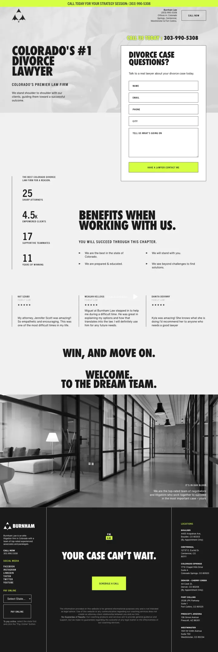
Lead with a bold, category-owning claim ('Colorado's #1 Divorce Lawyer') in massive type on a clean background with the intake form immediately adjacent. The claim is aggressive but the page backs it up with 25 years, 4.5 star reviews, 17 attorneys, and 11 offices.
'DIVORCE CASE QUESTIONS?' form headline reframes the intake form as getting answers rather than giving information -- visitors feel like they are asking for help, not being sold to
Stat bar (25 years / 4.5 stars / 17 attorneys / 11 offices) provides four trust anchors in a single glance without requiring the visitor to read paragraphs of copy
'WIN, AND MOVE ON. WELCOME TO THE DREAM TEAM.' -- the emotional tone shifts from empathetic to aggressive to aspirational in three lines, matching the emotional arc of someone going through divorce
No attorney photos or names anywhere on the page -- for '17 attorneys' they don't show a single face, which undermines the 'dream team' promise
The neon-green accent color on a dark/white scheme feels more like a tech startup than a law firm -- may alienate older divorce clients who expect navy/gold professional aesthetics
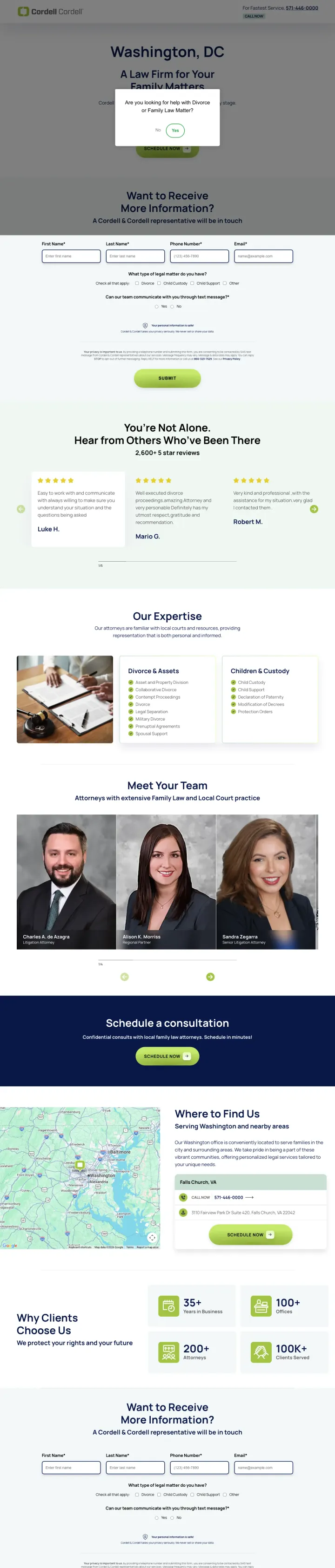
Create city-specific PPC landing pages with the local office team photos, local address with map, and local phone number. Cordell & Cordell runs this template across dozens of cities, each with localized content and team bios that make a national firm feel like a local practice.
City name ('Washington, DC') is the first thing visible in the hero, creating instant message match for geo-modified searches like 'divorce attorney Washington DC'
'Hear From Clients Who've Been There' testimonial section uses the visitor's emotional state (feeling alone in divorce) and shows them that others have been through it and come out the other side
Local team grid shows 3-4 attorneys per office with names, titles, and headshots -- this makes the firm feel boutique and local even though Cordell & Cordell has 100+ offices nationally
The page template, while effective, is visibly a template -- green/grey color scheme, identical layout across cities, stock-feeling section headers. Visitors who see ads for multiple Cordell offices may notice the identical structure
No pricing or fee structure information -- in an industry where competitors are now showing tiered pricing, the 'schedule a consultation to find out pricing' approach feels evasive
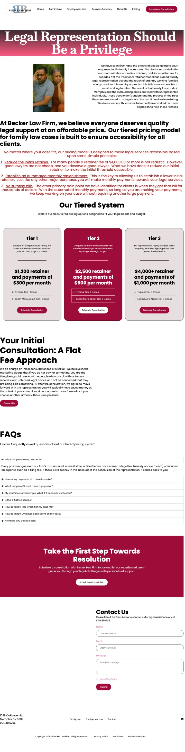
Show three pricing tiers side by side (Tier 1: $1,500 retainer / Tier 2: $2,500 retainer / Tier 3: $5,000+ retainer) with monthly cost ranges for each. In an industry where 'call for a quote' is standard, showing exact pricing eliminates the #1 barrier to contacting a lawyer: fear of finding out it costs more than you can afford.
Headline 'Legal Representation Should Be a Privilege' paired with 'Our tiered pricing model for family law cases is built to ensure accessibility for all clients' -- this reframes affordable pricing as a values statement rather than a discount
Three tiers with clear retainer amounts AND monthly costs set expectations before the first call, eliminating the anxiety of open-ended billable hours
'Your Initial Consultation: A Flat Fee Approach' section addresses the secondary fear: even the first meeting will cost money with no ceiling. A flat fee for the consultation is a miniature version of the transparent pricing approach
The maroon/dark red color palette combined with ornate serif fonts makes the page feel dated compared to modern law firm design -- the pricing innovation deserves a design that matches its forward-thinking approach
No attorney photos on the pricing page -- visitors know what the service costs but not who will provide it. Adding a team section below pricing would address the 'who is my lawyer' question immediately
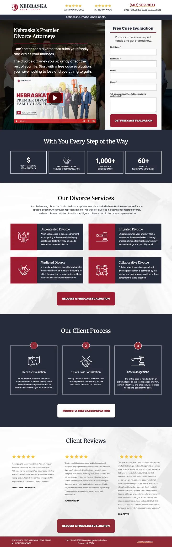
Show a team photo or video above the fold with 'Nebraska's Premier Divorce Attorneys' positioning, then immediately follow with three trust stats (dollar sign + 1,000+ cases + 60+ years combined experience). This page does everything a PPC divorce page should do: establishes authority, shows the team, explains the process, and offers a free evaluation.
Service grid showing 6 divorce types (Uncontested, Litigated, Mediated, Collaborative, Military, High Net Worth) with icons lets visitors self-identify their situation and feel understood before they even call
3-step client process (Free Case Evaluation > Client Case Consultation > Case Management) visualized with numbered icons reduces the scary unknown of 'what happens after I call' into three predictable steps
'REQUEST A FREE CASE EVALUATION' CTA appears three times on the page at different scroll depths, ensuring conversion opportunity regardless of where the visitor decides to act
The page uses a red/maroon color scheme that feels heavy and institutional -- not warm or approachable for someone going through a difficult personal situation
The team video thumbnail shows a group photo but the play button suggests video content -- if the video does not load or takes too long, the most prominent above-fold element is non-functional
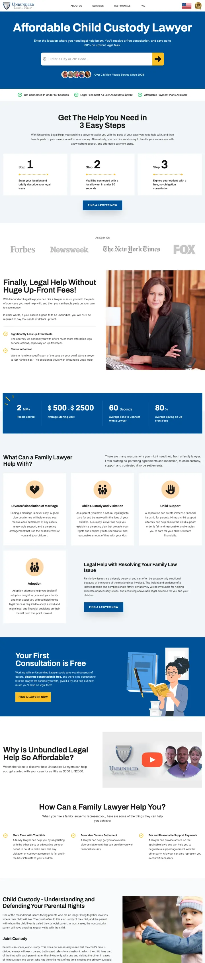
Lead with the price comparison: 'Exposed: Why Legal Help Does NOT Have To Cost $5,000 - $10,000' directly above a zip code search form. This instantly reframes the visitor's expectation from 'can I afford a lawyer' to 'I can definitely afford THIS.'
'Affordable Child Custody Lawyer' headline with '$500-$1,500 to get started' price anchor directly challenges the assumption that legal help requires a $5,000+ retainer -- this captures the entire market segment that thinks they cannot afford an attorney
Zip code search form ('Get The Help You Need in 3 Steps') localizes a national platform to feel like a local referral, addressing the 'near me' intent without requiring the platform to run separate campaigns for every city
'1-888-XXXXX' toll-free number creates a professional impression for a marketplace platform, and the 'Mon-Fri 8am-8pm' hours set availability expectations upfront
The page is extremely long and content-heavy -- it reads more like an educational article with a form attached than a conversion-focused landing page
Multiple competing visual styles (blue headers, yellow CTAs, grey cards, stock photos) create a busy, marketplace feel rather than a trustworthy legal service
Use the '/lpai/' (landing page AI) approach to generate city-specific PPC pages with a consistent template: hero with firm name + CTA form, 3-step process visualization, why-choose-us section, and FAQ. The URL path suggests this page is programmatically generated, allowing the firm to scale across cities.
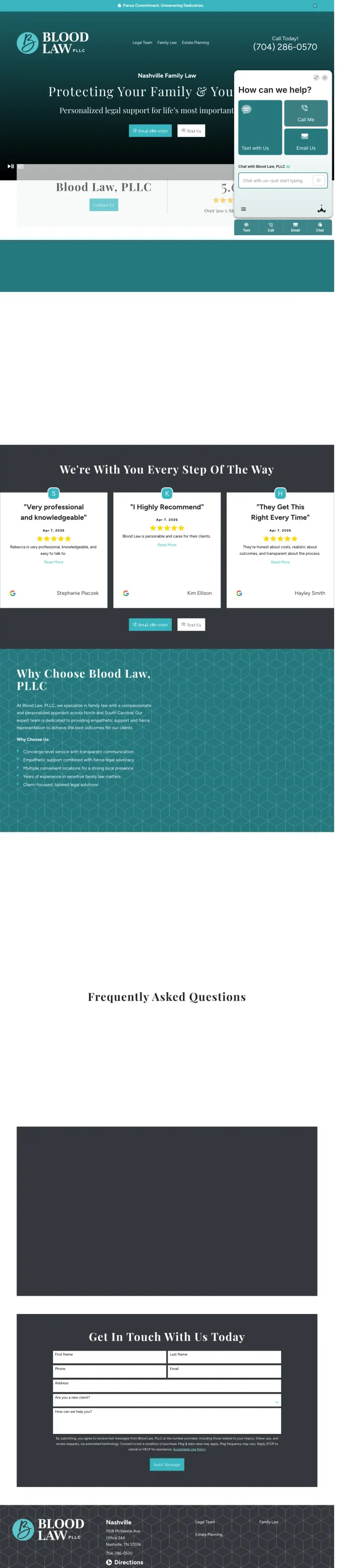
'Protecting Your Family & Your Future' headline paired with 'How can we help?' form creates an emotionally resonant entry point with an immediate conversion mechanism
3-step process cards ('We're With You Every Step Of The Way') with numbered steps reduce the unknown of working with a lawyer into a predictable sequence
Phone number prominently displayed in the top header bar ensures visitors can call immediately without scrolling
The page feels thin on content -- the 'Why Choose Blood Law, PLLC' section appears to have generic bullet points rather than specific differentiators unique to this firm
No attorney photos or bios on a page that uses 'PLLC' in the name -- the firm structure implies individual practitioners but the page shows no individuals
Pages that break the playbook in interesting ways
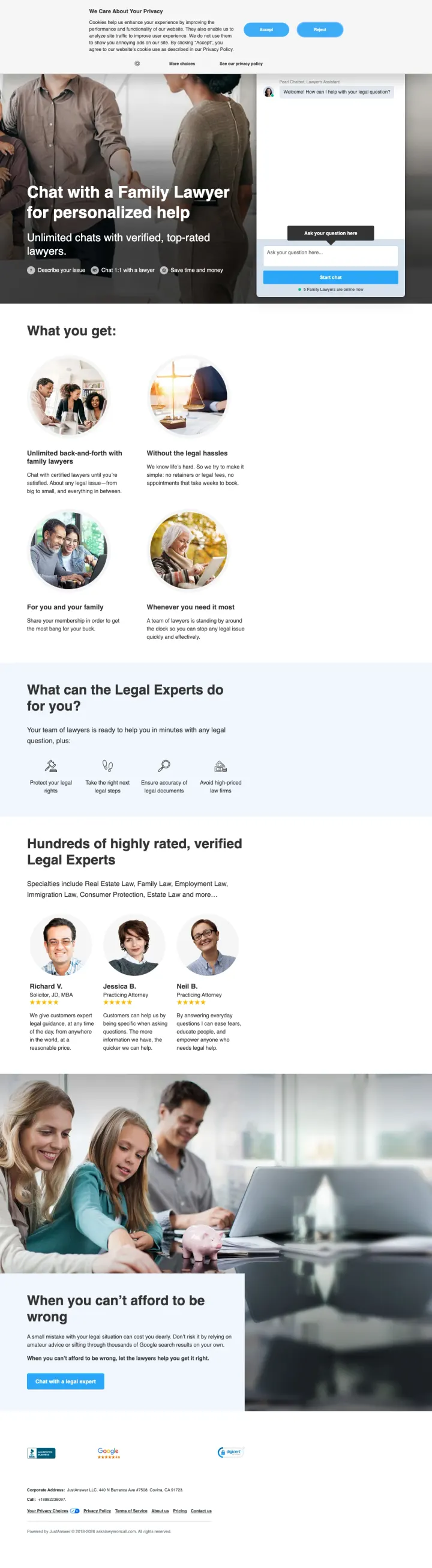
Replace your traditional intake form with a chat interface that lets visitors type their question and get matched with a lawyer immediately. AskALawyerOnCall positions the entire experience as 'Chat with a Family Lawyer for personalized help' -- the conversion mechanism IS the value proposition.
'Chat with a Family Lawyer for personalized help' positions the service as conversational and immediate rather than formal and delayed -- this appeals to the large segment of divorce-seekers who want quick answers before committing to a consultation
Feature grid ('Unlimited questions, anytime', 'With our Legal Experts', 'Whatever you need') uses consumer-tech UX patterns that feel familiar to visitors used to messaging apps
'When you can't afford to be wrong' section addresses the core fear of DIY divorce -- making an irreversible mistake -- and positions lawyer access as insurance against costly errors
The chat interface above the fold may confuse visitors who expect a traditional law firm page -- 'is this a chatbot or a real lawyer?' is not immediately clear
Stock photography of diverse professionals and legal settings feels generic -- no specific attorneys or firm identity is established
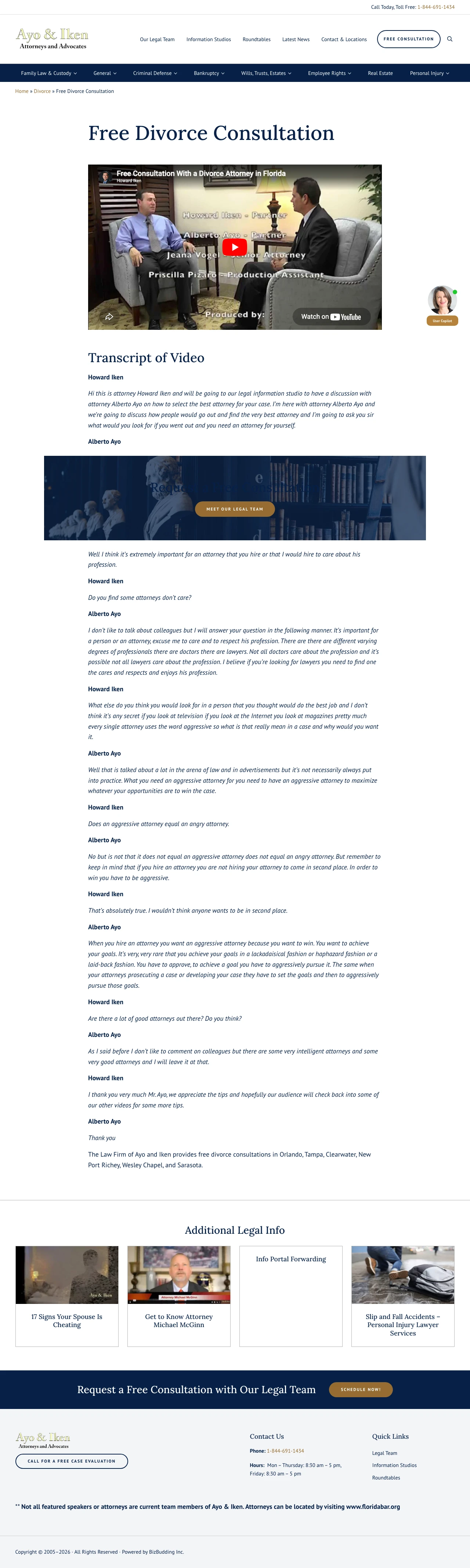
Embed a full-length consultation video as the hero element, with a video transcript below. This page bets everything on the attorney's on-camera presence and expertise to build trust. If the attorney is compelling on video, this approach may convert better than any amount of text.
A 'Free Consultation With a Divorce Attorney in Florida' video as the hero element lets visitors evaluate the attorney's personality, expertise, and communication style before making a call -- this is the closest thing to meeting the lawyer without actually visiting the office
Full video transcript below the embed serves dual purpose: accessibility for visitors who cannot play video, and SEO value for the page's organic ranking
If the video does not autoplay or the visitor cannot watch it (at work, on mute, slow connection), the page has almost nothing else -- no text-based value proposition, no form, no pricing
The page puts all its conversion eggs in one basket -- the video. If a visitor does not watch the video, they get a transcript and some sidebar links but no compelling reason to call
3 pages burning ad spend with fundamental issues
Every click to these pages costs real money. We found broken trust signals, mismatched intent, weak CTAs, and messaging that ignores what the searcher actually typed. Here is what to avoid.
This page targets 'good lawyers for divorce' (SV: 2,400) but sends visitors to a full-website service page with top navigation, sidebar, footer links, and dense paragraphs of text about divorce law concepts. The 'Our Practice Areas' section includes links to 8 other services. At divorce attorney CPCs ($25-50), every click that navigates to 'Child Custody' or 'Business Law' instead of converting is wasted spend.
Full website navigation with links to 8+ other practice areas bleeds paid traffic to non-converting pages
Dense paragraphs of legal text above the fold read like a blog post, not a conversion page -- visitors searching for 'good lawyers for divorce' want to find and contact a good lawyer, not read about what divorce entails
The first visible CTA is buried below multiple paragraphs of text -- by the time a visitor reaches it, they have either left or navigated elsewhere
The ad targets 'divorce in the state of virginia' but the landing page is a 2,000+ word blog article titled 'Everything You Need to Know Before Getting Divorced in Virginia.' The page has no form, no pricing, no CTA above the fold. Visitors who are ready to start their divorce (the paid search intent) get an encyclopedia article instead. The HelloDivorce platform has actual product pages with pricing and checkout -- this blog post should not be receiving paid traffic.
This is a blog post, not a landing page -- full site navigation, sidebar content links, and no conversion-focused CTA above the fold
The page is optimized for SEO (long-form content, internal links, keyword density) but terrible for PPC (no form, no pricing, no urgency)
The HelloDivorce brand promise (fast, affordable online divorce) is invisible -- a visitor would not know this company sells a product rather than publishing legal advice
This page targets 'divorce attorneys in OKC' (SV: 3,600) but presents a 2005-era website design with dark red borders, clip art of a gavel, and walls of text about 'uncontested grounds of divorce' and 'irreconcilable differences.' The sidebar shows attorney headshots but they are small and buried. At OKC divorce CPCs ($20-35), this page is losing to every modern competitor in the SERP.
The design is at least 15 years old -- dark red borders, gradient backgrounds, small fonts, and clip art communicate 'we have not updated our marketing since 2005'
Dense paragraphs about legal concepts (grounds for divorce, dissolution procedures) read like a law textbook, not a conversion page for someone looking to hire an attorney
The contact form in the sidebar competes with the content and is easy to miss -- it is not visually differentiated from the surrounding content
The strongest pages show exact dollar amounts: thelawinmemphis.com lists three tiers ($1,500/$2,500/$5,000+ retainer with monthly costs), and burnhamlaw.com anchors with a bold 'Colorado's #1 Divorce Lawyer' claim paired with a visible phone number. Divorce clients are price-shopping because they...
hellodivorce.com, askalawyeroncall.com, and family.unbundledlegalhelp.com all offer alternatives to full-service representation: DIY divorce packages, pay-per-question lawyer chats, and unbundled (task-based) legal help. These platforms are bidding on the same divorce keywords as traditional firm...
burnhamlaw.com/divorce-lawyer-ppc and law.cordellcordell.com/ppc/ both use dedicated, navigation-stripped landing pages with intake forms above the fold. These convert better than pages like hopelawfirm.com and egllaw.com that send paid traffic to full-website service pages with top navigation, s...
Every winning page shows at least one named attorney with a real photo. The Cordell & Cordell pages show entire local teams (3-4 attorneys per office). blood-law.com and law.nebraskalegalgroup.com both show team photos with credentials. For a decision as personal as choosing a divorce attorney, v...
Winners use dedicated PPC landing pages stripped of navigation, with intake forms or phone numbers above the fold, named attorneys with photos, and either transparent pricing or a clearly valuable free first step (case evaluation, not 'consultation'). Losers send paid traffic to blog posts about legal concepts, full-website service pages with navigation menus and links to other practice areas, or pages with no visible conversion path above the fold..