Free: 96 PPC tools + my AI Playbook book

These are real financial services pages spending actual money on Google Ads right now.
From real financial services Google Ads campaigns in the US
The landing pages actually worth stealing from
So you know exactly what to avoid
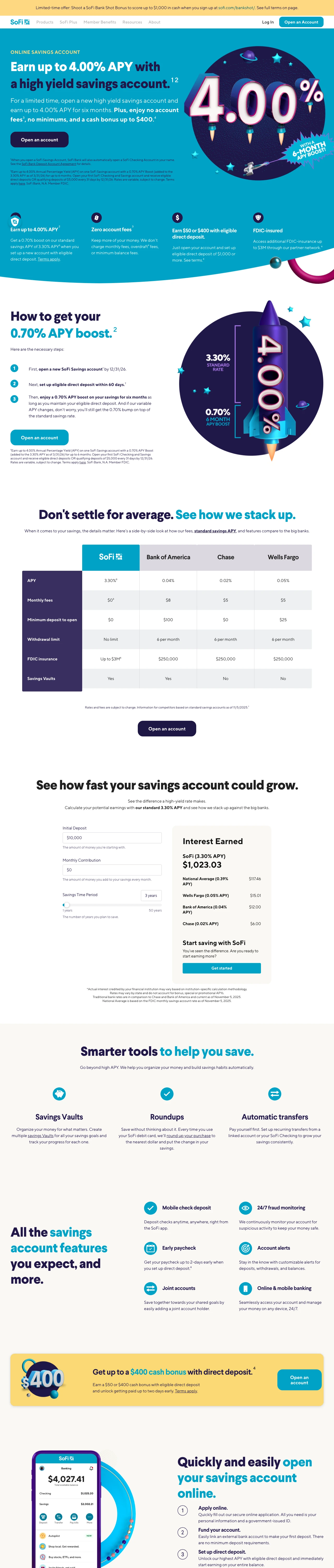
Put your APY or rate in an oversized circular badge that dominates the hero section. SoFi makes the '4.00%' the largest visual element on the page, bigger than the headline text. When visitors are comparing rates across tabs, the page where the number jumps out fastest wins.
Dual circular badges -- 4.00% APY for savings and 0.50% for checking -- let the visitor compare products without scrolling, compressing two product pages into one decision framework
'Earn 10x more interest than the national average' reframes the APY from abstract number to concrete comparison against what the visitor currently earns, making the switch decision tangible
App mockup screenshot shows the actual banking interface, letting the visitor preview the product experience before committing -- this reduces the 'will this be clunky?' anxiety that plagues digital-only banks
Full SoFi product navigation at the top (Borrow, Invest, Protect, etc.) gives the visitor 6+ ways to leave the savings page -- every nav click at savings account CPCs is wasted spend
The page is extremely long with multiple product cross-sells (credit cards, investing, crypto) that dilute focus from the core savings conversion
No form or account opening flow visible above the fold -- the CTA is 'Open an Account' but it links out rather than capturing intent on-page
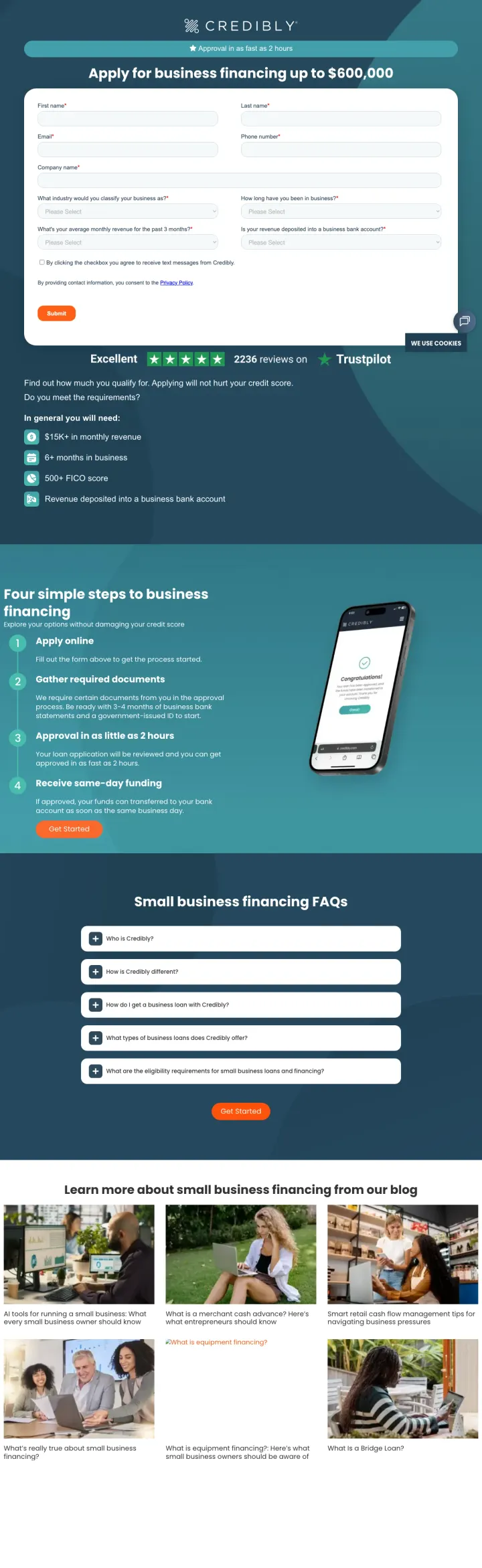
Place your lead capture form directly in the hero with the maximum funding amount as the headline ('Apply for business financing up to $600,000'). The dollar amount anchors the visitor's perception of what is possible, while the inline form captures intent before they can second-guess.
Qualification criteria displayed as checkboxes below the form ('6+ months in business, $15K+ monthly revenue, 500+ credit score') lets the visitor self-qualify before submitting -- this reduces junk leads while simultaneously reassuring qualified visitors that they will likely be approved
'Approval in as fast as 2 hours' in the header bar addresses the #2 business financing concern (speed) before the visitor even reads the headline
4-step visual timeline (Apply Online, Gather Documents, Approved in 48 hours, Receive Same-Day Funding) below the fold converts the black-box lending process into a predictable journey
The form has 7 fields visible (name, email, phone, business name, monthly revenue, credit score, loan amount) which is a high commitment for a first interaction -- a 2-field pre-qualification ('monthly revenue + credit score') would capture more leads at the top of funnel
Blog content section at the bottom ('Learn more about small business financing from our blog') adds 400+ words of educational content that dilutes the conversion focus of what is otherwise a tight LP
No named team member, founder photo, or company history visible -- for a non-bank lender most visitors have never heard of, some human credibility signal would strengthen the Trustpilot rating
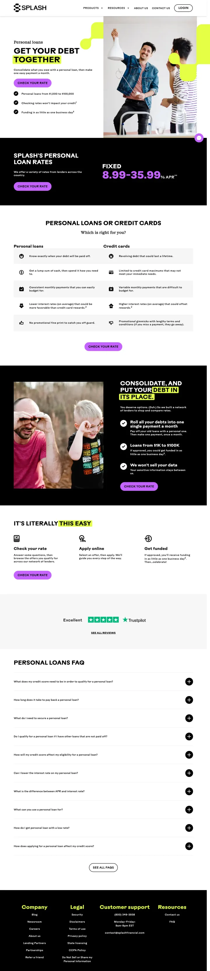
Show your rate range ('8.99-35.99% fixed APR') directly below the hero headline so the visitor immediately knows if they are in the right ballpark. Splash pairs this with 'Checking rates won't impact your credit' to neutralize the #1 fear preventing personal loan applicants from starting.
'Get your Debt Together' headline with 'Consolidate what you owe with a personal loan, then make one easy payment a month' speaks directly to the debt consolidation searcher's pain -- multiple payments, multiple rates, multiple due dates -- and positions the product as simplification
Three trust checkmarks below the CTA ('Personal loans from $1,000 to $100,000 / Checking rates won't impact your credit / Funding in as little as one business day') address the top 3 visitor questions (how much, will it hurt my score, how fast) in a scannable list
Rate range displayed as '8.99-35.99% fixed APR' with asterisk shows transparency -- hiding the upper end would feel deceptive, and showing the full range builds trust even though 35.99% is high
The page is quite long with multiple sections (credit karma comparison, 'It is literally your debt' messaging, personal loan FAQ) that pad what should be a focused conversion page
No Trustpilot or third-party review score visible above the fold -- for a non-bank lender in a category full of predatory players, third-party validation is essential
The lifestyle photography (people celebrating, looking at phones) is generic and does not connect to the debt consolidation value proposition
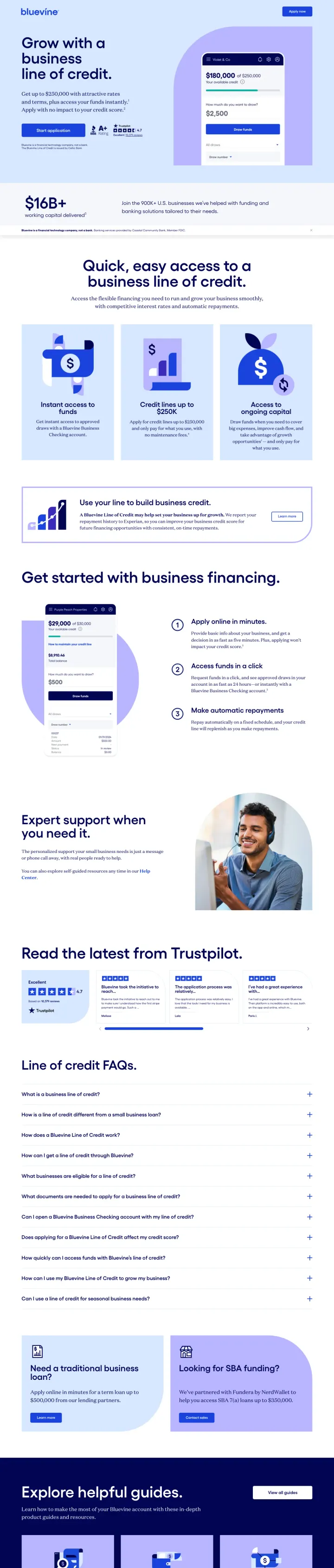
Anchor your lending LP with the maximum credit line amount in the hero headline ('Get up to $250,000') rather than the rate. For business owners seeking credit lines, the available amount matters more than the rate because they need to know if the product fits their funding gap before they care about terms.
3-step 'Quick, easy access to a business line of credit' section (Apply in minutes, Get a decision fast, Draw funds when needed) reduces perceived complexity -- business credit applications feel daunting, and showing 3 simple steps makes it feel manageable
Trustpilot reviews displayed in a dedicated section with individual reviewer quotes and star ratings provide specific, verifiable social proof from real business owners
'Expert support when you need it' section with a photo of a real support team member humanizes what is otherwise a fully digital lending product
The page is very long with extensive FAQ content and 'helpful guides' blog links at the bottom that turn a conversion page into a content hub -- paid traffic should not be directed to educational content
No rate or APR information visible anywhere on the page -- the visitor knows they can get up to $250K but not what it will cost, which means they must apply blind to learn the price
The form/application flow is not inline -- every CTA links out to a separate application page, adding friction between intent and action
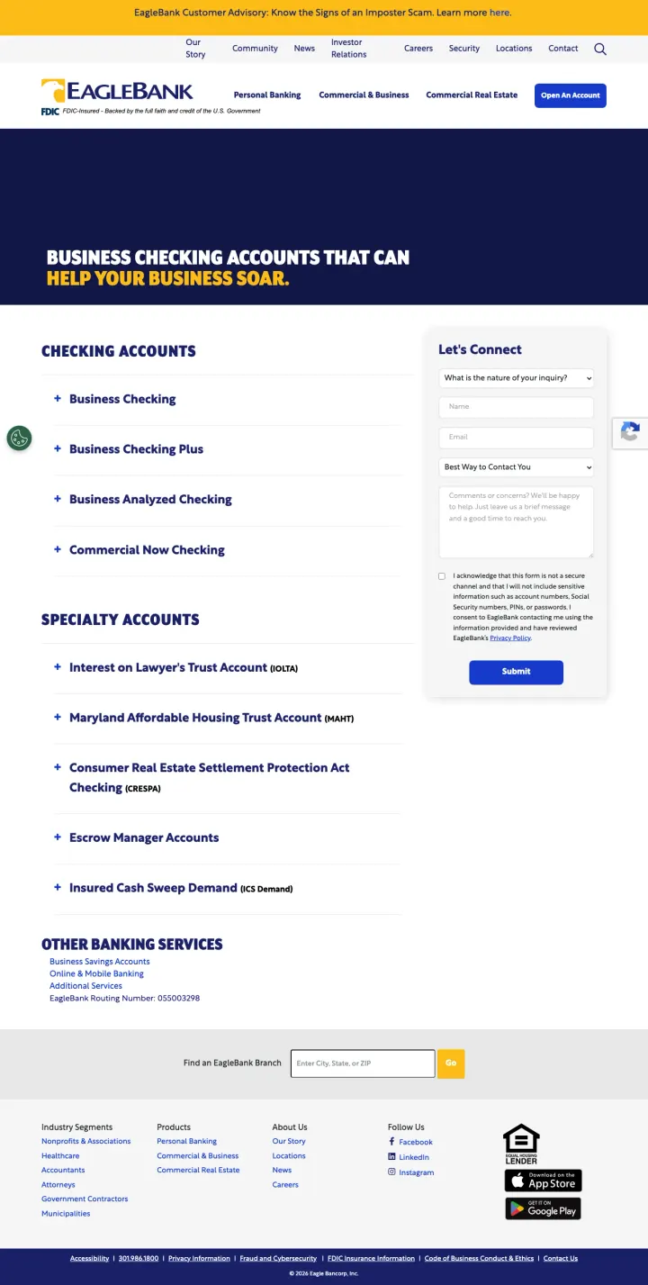
Put a 'Let's Connect' lead capture form directly beside your product listing so the visitor can browse account options and inquire in the same viewport. EagleBank places expandable account categories on the left and a contact form on the right, letting the visitor self-qualify on product type while the form captures intent.
Expandable account categories (Business Checking, Business Checking Plus, Business Analyzed Checking, Commercial Now Checking) let the visitor drill into the specific product that fits their needs without leaving the page -- this self-service approach respects the analytical business buyer
Specialty accounts section (Lawyer's Trust Account, Housing Trust Account, Escrow Manager Accounts) signals that EagleBank serves regulated industries, which builds trust with professional services firms looking for compliant banking
FDIC and Equal Housing Lender badges in the footer plus the 'Let's Connect' form name create a professional but approachable tone that works for commercial banking
The 'Let's Connect' form asks for 'nature of your request' as an open text field -- a dropdown with pre-populated options (Open Account, Compare Accounts, Schedule Call) would reduce friction and route leads better
No rates, fees, or minimum balance requirements visible for any account type -- business owners comparing checking accounts need to see the cost structure before they will fill out a form
The hero headline 'Business Checking Accounts That Can Help Your Business Soar' is generic corporate copy that could belong to any bank -- it wastes the most valuable real estate on the page
Pages that break the playbook in interesting ways
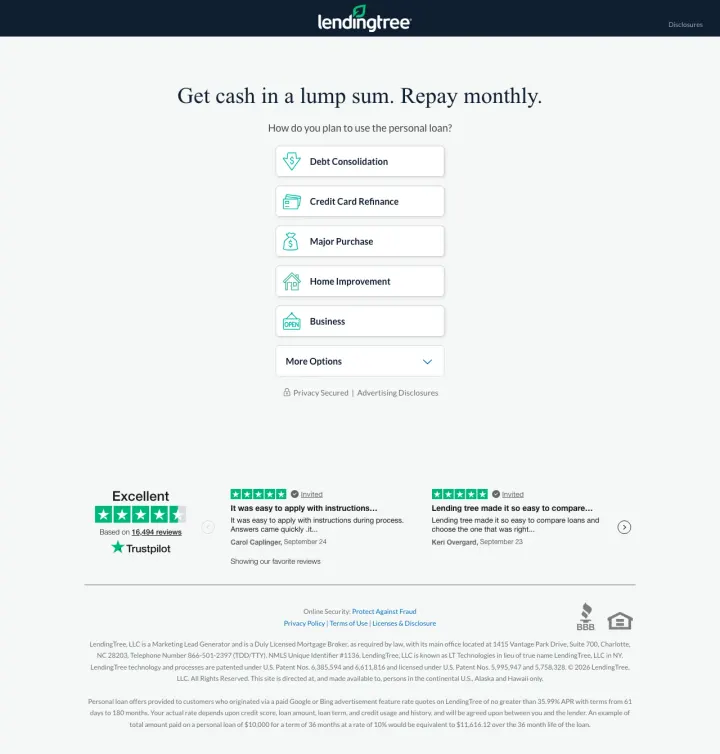
Strip your landing page down to a single qualifying question ('How do you plan to use the personal loan?') with dropdown options. LendingTree removes everything -- no hero image, no testimonials, no rates, no company bio. Just the question, options (Debt Consolidation, Credit Card Refinance, Major Purchase, Home Improvement, Business), and Trustpilot below. This radical minimalism works because LendingTree's brand recognition eliminates the need for on-page trust-building.
'Get cash in a lump sum. Repay monthly.' is a 9-word value proposition that explains personal loans to someone who may not know exactly what they are -- this plain-language framing lowers the knowledge barrier for the first-time borrower
Trustpilot 'Excellent' badge with two specific named reviews (Elian Coppola, Ken Garapoli) below the quiz provides just enough social proof without cluttering the conversion path -- the reviews are there for the hesitant scroller, not the decisive clicker
The dropdown format ('How do you plan to use the personal loan?') segments visitors by intent BEFORE they enter the funnel, which means downstream form fields and offers can be personalized to their specific need
If the visitor does not recognize LendingTree, there is zero reason to trust this page -- no rates, no credentials, no company information, no FDIC badge, nothing except the logo and a dropdown
No phone number, no chat, no alternative path -- the dropdown quiz is the only thing to do on this page, and visitors who want to talk to someone have no option
The fine print at the bottom is extensive but there is no way to access rates, terms, or product details before entering the funnel -- the visitor must commit to the quiz to learn anything about what they will actually receive
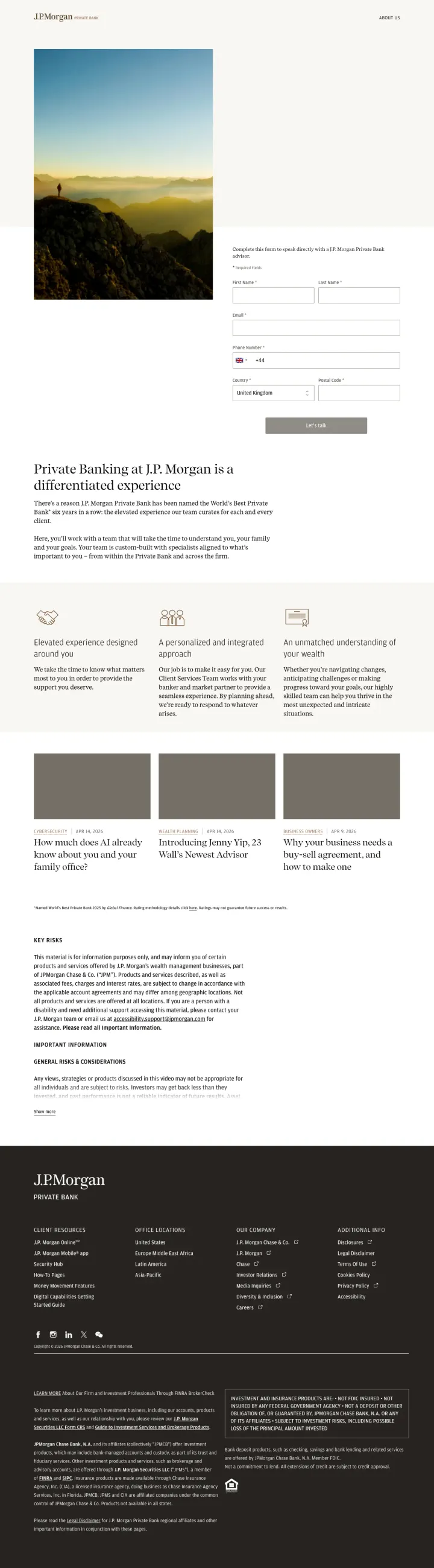
If your brand IS the trust signal, lead with aspiration instead of rates. J.P. Morgan Private Bank shows a sweeping mountain landscape, the tagline 'Private Banking at J.P. Morgan is a differentiated experience,' and three philosophical pillars -- no rates, no products, no forms. This works because the J.P. Morgan name IS the product, and the target audience (ultra-high-net-worth individuals) would be repelled by rate comparison framing.
Three positioning pillars ('Your needs drive it already -- we'll show you why and visit it,' 'Something better: Why J.P. Paull's firmest fall out,' 'Why your Wealthcare needs a PIA -- not approximately that') use philosophical framing rather than product features, positioning banking as a relationship rather than a commodity
Full-width landscape photography (mountains, sunset, horizon) communicates scale, permanence, and exclusivity without using words -- the imagery does the trust-building that other banks do with badges and rates
Minimal text density (under 200 words on the entire visible page) signals confidence -- J.P. Morgan does not need to explain itself or justify its value proposition with bullet points and comparison tables
The only CTA is 'Contact us' in the navigation -- there is no conversion path visible on the page itself, which means the paid traffic has no clear next step other than scrolling or leaving
The three pillars use abstract language that does not answer any specific question the visitor might have -- a wealth management prospect searching for 'private banking' wants to know minimums, services, and differentiation, not brand philosophy
At $50-100+ CPCs for private banking keywords, sending traffic to a brand awareness page with no form, no phone number, and no specific call to action is an expensive way to build impressions
3 pages burning ad spend with fundamental issues
Every click to these pages costs real money. We found broken trust signals, mismatched intent, weak CTAs, and messaging that ignores what the searcher actually typed. Here is what to avoid.
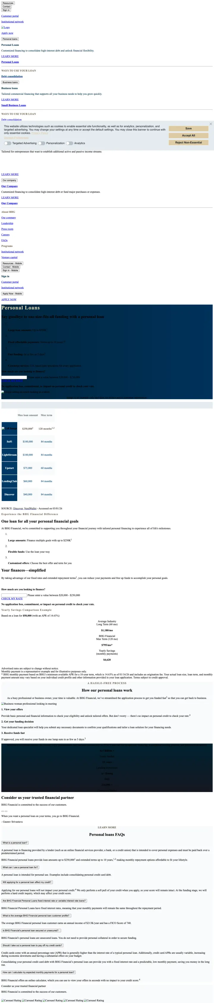
This page receives paid traffic for branded terms ('bhg financial') and personal loan queries, but delivers thousands of words of text-heavy content with no visual hierarchy, no imagery, no form above the fold, and minimal formatting. The URL literally contains 'ppc-tabbed' suggesting it was built as a PPC landing page, but it reads like a terms-and-conditions document. Visitors from $20+ personal loan CPCs bounce within seconds because the page offers no visual anchor or scannable structure.
The entire page is dense paragraph text with no images, no icons, no visual breaks, and no scannable structure -- a paid visitor decides in 3-5 seconds whether to stay, and this page gives them a wall of text to process
A tabbed quiz widget exists below the fold but it is buried under hundreds of words of unformatted text that most visitors will never scroll through
The page URL says 'ppc-tabbed-io' but the execution is indistinguishable from an SEO content page -- all the effort went into text content that PPC visitors will not read
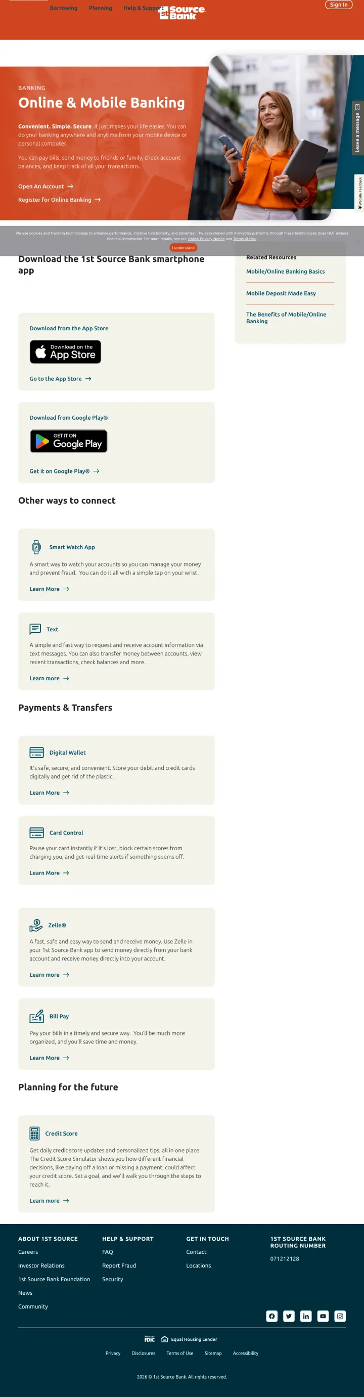
Ad keywords include 'open a us bank account' and 'internet banking usa' but the page is an app features and download page -- it describes mobile check deposit, bill pay, and Zelle rather than offering account opening. A visitor who clicked an ad to open a bank account lands on a page telling them to download an app they cannot use without already having an account. At banking CPCs, this is a complete intent mismatch.
Intent mismatch: ads target 'open a us bank account' but the page describes mobile banking features for existing account holders -- the visitor cannot use any of these features without first opening an account, which this page does not enable
The hero section ('Convenient. Simple. Secure.') describes the mobile app experience rather than presenting a value proposition for opening a new account -- there is no rate, no offer, no incentive to switch banks
Full site navigation with 5+ menu items sends the paid visitor into a maze of personal banking, business banking, loans, and wealth management pages -- none of which are optimized for conversion
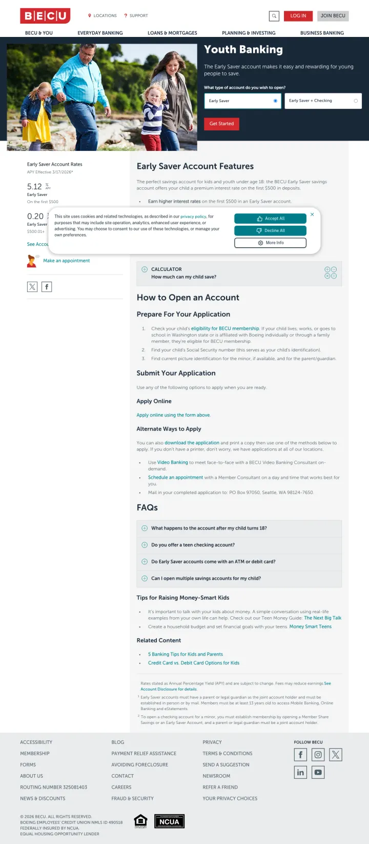
Ad keywords target 'credit union in washington' and 'credit union washington state' but the landing page is specifically about youth banking for children under 18. An adult searching for a credit union to join lands on a page about Early Saver accounts with 5.12% APY for the first $500 and parental setup instructions. The intent mismatch is total: adult banking prospects are sent to a children's product page. At credit union CPCs, every click is wasted on the wrong audience segment.
Complete intent mismatch: ads target adults looking for credit unions but the page is about children's accounts with parental consent requirements, UGMA/UTMA custodial accounts, and 'Tips for Raising Money-Smart Kids' content
Full site navigation with 7+ items (Everyday Banking, Loans & Mortgages, Planning & Investing, Business Banking) gives the adult visitor exit paths to find the right page, but each nav click is a wasted dollar from the paid campaign
The FAQ section addresses questions like 'What happens to the account after my child turns 18?' and 'Can I open multiple savings accounts for my child?' which confirm this page was never intended for the adult credit union searcher
The strongest pages put a specific rate or APY front and center -- not buried in a table three scrolls down. SoFi leads with '4.00% APY' in a large circular badge. Vio Bank shows '4.03% APY' as the dominant hero element. Live Oak Bank puts '3.80% APY' in both the hero and the bottom CTA. Financia...
Visitors comparing savings accounts or deposit products have two questions: 'what is the rate?' and 'is my money safe?' Pages that answer both within the hero section compress the trust-building phase. Live Oak Bank places its FDIC badge directly in the hero alongside the APY. Vio Bank shows 'FDI...
Lending pages that frame the first step as a soft credit check or pre-qualification outperform pages that jump straight to 'Apply Now.' Splash Financial uses 'Check Your Rate' with the reassurance 'Checking rates won't impact your credit.' Credibly leads with 'Find out how much you qualify for' b...
Non-bank lenders lack the built-in credibility of a Chase or Bank of America. The ones that convert best use Trustpilot scores with exact review counts as a proxy for legitimacy. Credibly shows 'Excellent - 4.8 - 2300+ reviews on Trustpilot' directly below their form. Bluevine features Trustpilot...
Winners strip everything except rate, trust badge, and conversion path -- they treat the landing page as a single-purpose machine built for one decision. Losers send paid traffic to website pages designed for organic browsing, with full navigation, educational content blocks, and feature lists that assume the visitor has time to explore.