Free: 96 PPC tools + my AI Playbook book

These are real help desk software pages spending actual money on Google Ads right now.
From real help desk software Google Ads campaigns in the US
The landing pages actually worth stealing from
So you know exactly what to avoid
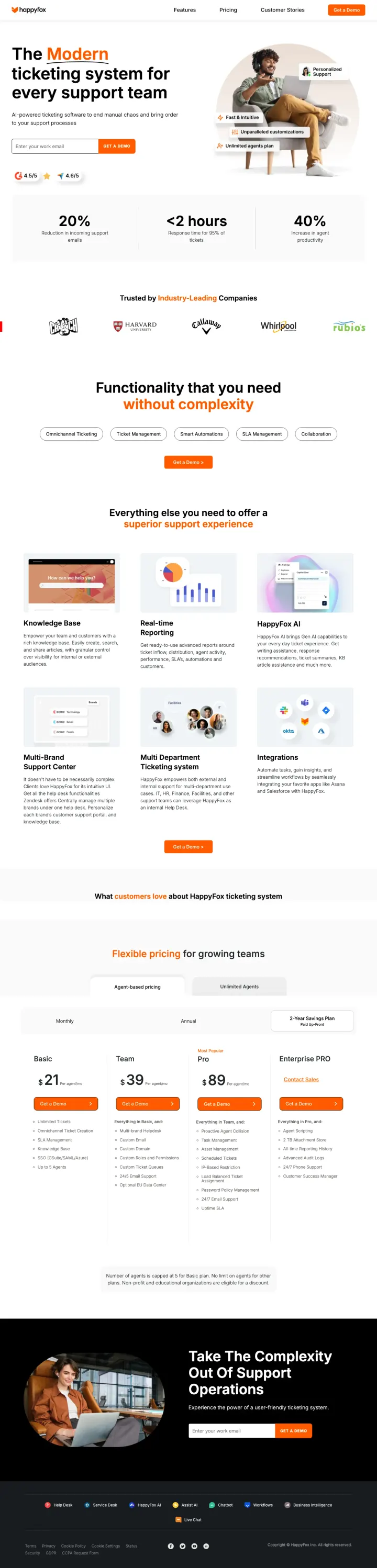
Lead with three specific performance metrics above the fold, each with a short label. HappyFox shows '20% Reduction in incoming support emails,' '<2 hours Response time for 95% of tickets,' and '40% Increase in agent productivity.' These are not vanity metrics; they directly address the buyer's top priorities (ticket volume, response time, team efficiency). Steal this three-metric hero for any SaaS product with measurable outcomes.
Three quantified outcome metrics (20% reduction, <2 hours response, 40% productivity increase) displayed as large numbers above the fold. These answer 'what will change if we switch?' before the visitor even considers features, which is the right sequence for Blue-dominant analytical buyers
Visible pricing section with four transparent tiers ($21, $39, $89/agent/month + Enterprise POA) directly on the landing page. For help desk buyers who compare pricing in spreadsheets, showing the actual numbers eliminates the 'Contact Sales' friction that causes tab-closes
G2 (4.5/5) and Capterra (4.6/5) review badges positioned between the hero headline and the form. These third-party ratings provide independent validation that the visitor can verify, unlike self-reported customer counts
599 clickable elements on the page create catastrophic leakage for paid traffic. The page includes full site navigation (Features, Pricing, Customer Stories) and an extensive footer. At $50+ per click on 'help desk ticketing system' keywords, every nav link is a wasted dollar
The hero image shows a person sitting with a laptop rather than the actual product. Every other winner in this set shows product UI (Intercom's chat mockup, Zendesk's form + metrics). A lifestyle photo of someone 'using a computer' does not help a support manager evaluate ticketing software
6,300 words makes this the longest page in the set by a factor of 10x. The excessive content buries strong elements (pricing, testimonials) deep in a scroll most paid visitors will never complete
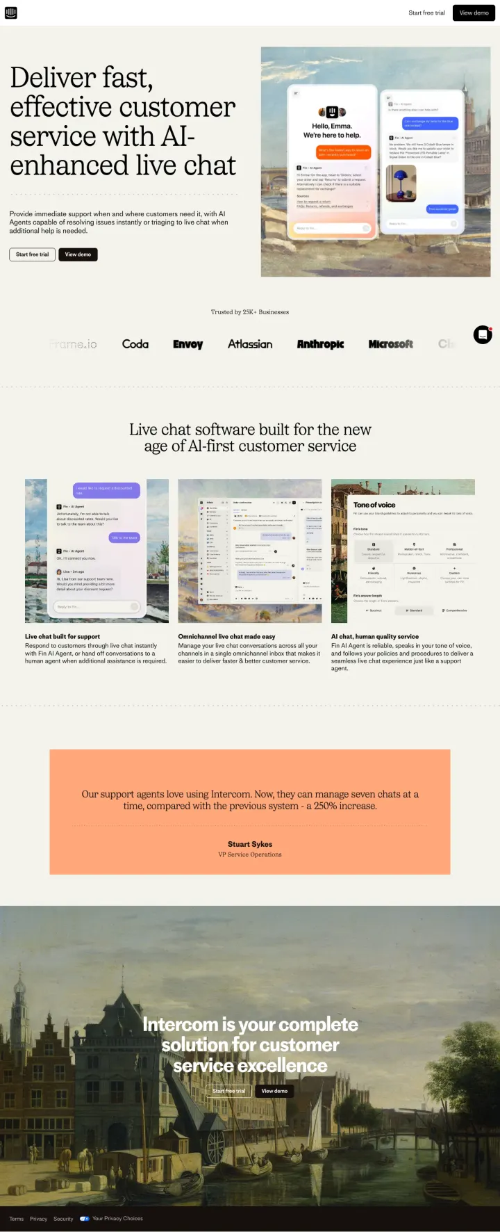
Show the product in a real conversation context above the fold. Intercom's hero displays a phone mockup with an actual chat exchange ('Hello, Emma. We're here to help.') overlaid on a painterly background. This is not a screenshot of a dashboard; it is the product doing the thing the visitor searched for. Replicate this for any SaaS LP: show the product mid-task, not idle.
Hero mockup shows a live chat conversation in progress on a mobile device, with the AI agent and customer both visible. This answers 'what does it look like for my customers?' within 2 seconds, which is the #1 question for live chat software buyers
Logo bar names Anthropic, Microsoft, Amazon, and Atlassian immediately below the hero. These are not just big logos; they are companies whose support teams are known to be sophisticated, signaling that Intercom works at scale for technical buyers
Navigation stripped to just 'Start free trial' and 'View demo' in the top right. Zero exit paths to blog, pricing, or about pages. For a page absorbing $50+ clicks, this is the correct level of focus
No quantified outcomes anywhere on the page. Zendesk shows 86% and +23% metrics; HappyFox shows 20% reduction and 40% productivity increase. Intercom relies entirely on brand recognition and product visuals without a single number to justify switching
The named testimonial ('Brent Bykov, Si Fitness') is buried at the bottom of the page where most paid visitors will never scroll. Moving one attributed quote above the fold would combine Intercom's strong visual execution with the social proof it currently lacks
The bottom section uses a Renaissance painting background with overlaid text that is difficult to read. The artistic choice undercuts the conversion intent of the final CTA section
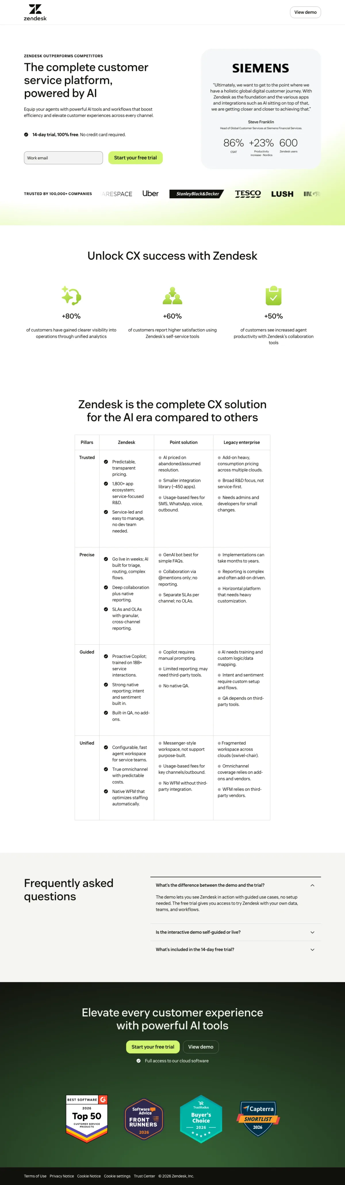
Place a named customer case study with specific metrics directly adjacent to your trial form. Zendesk puts Siemens' testimonial with three performance numbers (86%, +23%, 600) right next to the email input. The form captures the action-ready visitor; the case study converts the skeptical one. Both conversion modes operate in the same viewport.
Siemens case study with three specific metrics (86%, +23%, 600) positioned at eye level next to the trial form. This is not a logo or a generic quote; it is a named enterprise customer with quantified results, answering 'does this work for companies like mine?' before the visitor scrolls
Email-only form with a single field and 'Start your free trial' button reduces friction to near zero. The '14-day trial, 100% free. No credit card required.' line below removes the last objection. For a considered purchase at $200+ CPCs, minimizing form fields maximizes trial starts
Feature comparison table ('Zendesk is the complete CX solution for the AI era compared to others') mid-page addresses the Blue-dominant buyer's need to compare platforms side by side without opening competitor tabs
The page is advertising on 'zerobounce' (an email verification tool, 8,100 monthly searches) which has zero help desk intent. This keyword match wastes budget on visitors who will bounce immediately because they want a completely different product category
Navigation is stripped but 'View demo' link in the top right leads away from this focused trial page. For visitors who clicked a paid ad, the demo link should open a modal or embedded video, not navigate away
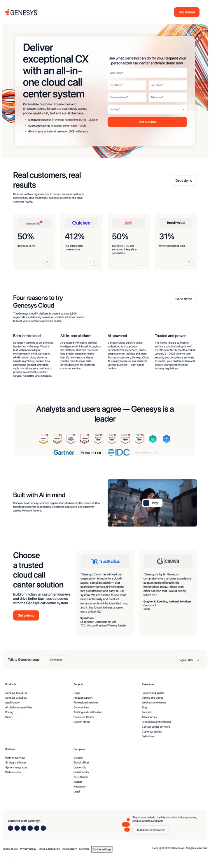
Open with named customer results as large-format stats above the fold. Genesys shows four enterprise customers (Quicken, an insurance company, a telco, a retailer) with specific metrics (50% increase in NPS, 412% more digital sales, 50% reduction in handle time, 31% increase in digital revenue). Each stat is attributed to a real company, making the numbers verifiable and credible.
Four named-customer stats (50% NPS increase, 412% digital sales growth, 50% handle time reduction, 31% revenue increase) displayed as large numbers with company attribution. This is the most comprehensive outcome-proof section in the entire set, combining the quantification of HappyFox with the named attribution of Zendesk
Analyst badge section showing Gartner, Forrester, and IDC leadership positions creates an enterprise credibility wall. For call center software where deals are $100K+, analyst validation directly addresses the buyer's need to justify the purchase to their CFO
400,000+ customers and 'Born in the cloud' positioning immediately establishes scale and modernity. The four-pillar value proposition (cloud-native, all-in-one, AI-powered, trusted) gives analytical buyers a framework for evaluation
The page targets wildly off-intent keywords like 'saas company' (12,100 monthly searches) and 'clicksend' (5,400 monthly searches). A searcher looking for 'saas company' is not shopping for call center software. This keyword waste dwarfs even Zendesk's 'zerobounce' problem because the volume is much higher
The hero uses a 'Request your personalized call center software demo now' form-focus that requires name + email + phone + company info. This multi-field form is appropriate for enterprise but creates high friction for the many SMB-intent keywords in their portfolio
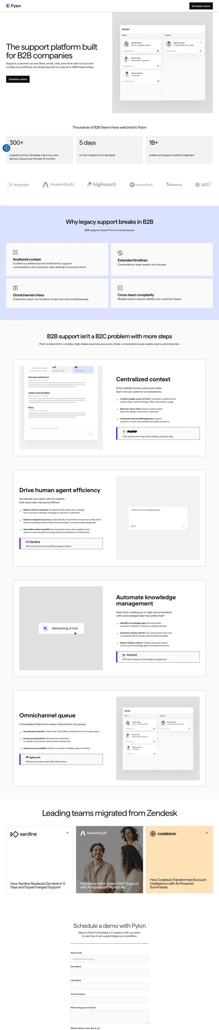
Use your competitor's name in your stat bar. Pylon's 'Thousands of B2B Teams have switched to Pylon' followed by '300+ migrations from Zendesk' turns the category leader into the implicit villain. B2B helpdesk buyers already have Zendesk pain; the page confirms they are not alone in wanting out.
Positioning against legacy incumbents by name ('Why legacy support breaks in B2B', '300+ migrations from Zendesk') works because the helpdesk buyer has already decided their current tool is broken; Pylon does not have to create the pain, only validate it
Real product UI screenshot in the hero shows the Issues queue with actual customer names and Slack/Discord/email source icons, giving the evaluator the 'does this look like my workflow?' answer in the first 3 seconds
Channel icons in the copy ('Slack, email, chat, and more with full account context') plus visible Slack and Discord indicators in the product mockup demonstrate the omnichannel promise instead of just claiming it
No specific customer logos above the fold; the 'Thousands of B2B Teams have switched' claim needs a logo bar beneath it with 4-6 recognizable B2B SaaS companies to convert the credibility promise into proof
The single 'Schedule a demo' CTA is the only conversion path; B2B buyers evaluating helpdesk tools often want to test pricing or see a feature comparison before committing to a sales call, and this page offers neither escape hatch
The '1B+' stat sits without a label until the visitor scrolls; a number that large deserves context (1B+ tickets? conversations? events?) directly beneath the figure, not in a subtitle that may get clipped on smaller viewports
Pages that break the playbook in interesting ways
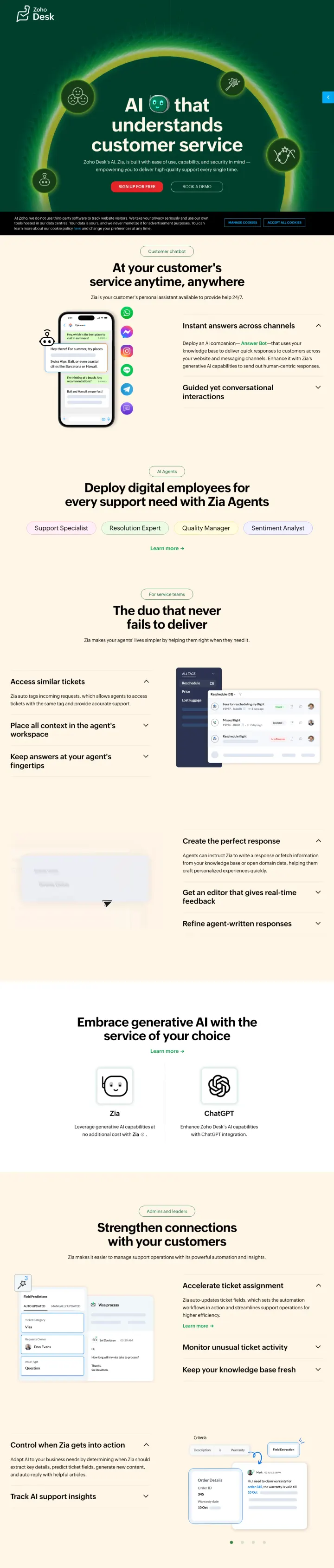
Why This Breaks the Rules: Zoho sends 'conversational ai chatbot' and 'chat bot service' traffic (557K combined monthly volume) to a page about their internal AI assistant for support agents, not a standalone chatbot product. The search intent is for a chatbot to deploy; the page sells AI-augmented help desk software. This should fail on message match, but the massive search volume (100x any other page in this set) means even a small conversion rate generates significant pipeline. The page succeeds by reframing the visitor's chatbot need as an AI-powered support platform need.
Animated hero with a glowing green arc around the headline 'AI that understands customer service' creates immediate visual distinction. No other page in this set uses motion or dark backgrounds. For a product differentiated by AI capability, the dramatic visual treatment signals 'this is different from your current help desk'
Tabbed interface showing four distinct AI Agent roles (Support Specialist, Resolution Expert, Quality Manager, Sentiment Analyst) lets visitors self-select their use case. This progressive disclosure pattern avoids the wall-of-features problem while showing depth
Dual CTA with red 'Sign Up for Free' (high contrast against dark green) and white outline 'Book a Demo' directly addresses both self-serve and guided conversion paths. The red on green creates the strongest CTA contrast of any page in this set
The page targets 'conversational ai chatbot' (368K monthly searches) but does not show a chatbot in action above the fold. A visitor searching for chatbot services sees an abstract AI headline with no product demonstration. The chatbot functionality (Answer Bot, Guided Conversations) is buried in the second section
No social proof, logos, or metrics anywhere above the fold. The entire hero section is headline, subhead, and two CTAs. At $50+ CPCs, the lack of any trust signal in the first viewport forces visitors to scroll before deciding whether Zoho Desk is credible for their use case
Cookie consent banner covers the bottom 15% of the viewport on first load, partially obscuring the CTA buttons. For paid traffic at high CPCs, any conversion friction in the first 3 seconds is costly
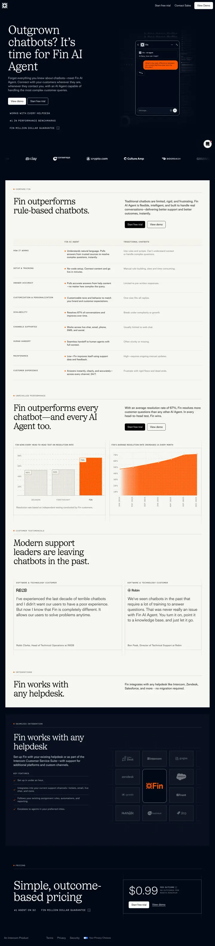
Why This Breaks the Rules: Fin.ai (Intercom's standalone AI agent) runs an entirely dark-background page that looks nothing like a typical SaaS landing page. Instead of product screenshots, it leads with a bold competitive claim ('Outgrown chatbots? It's time for Fin AI Agent') and backs it with a performance chart showing Fin outperforming every chatbot. The page reads like an editorial argument, not a product page, which is risky for paid traffic but creates strong differentiation for 'chatbot businesses' searchers who are already dissatisfied with their current solution.
Performance comparison chart showing Fin outperforming rule-based chatbots with actual data visualization (orange line chart). This is not a feature checklist or generic comparison table; it is a data-driven argument that appeals to analytical buyers who have already tried chatbots and found them lacking
Named customer testimonials from Deel and GoTo with specific quotes about replacing chatbots. These are not generic praise quotes; they specifically address the pain point the page targets (outgrowing chatbots), creating message match between the headline and the social proof
Outcome-based pricing ($0.99 per resolution) shown directly on page. This is radically different from per-seat pricing and directly addresses the cost objection by aligning Fin's revenue with the customer's success metric. No other page in this set uses outcome-based pricing
The dark background with dense text makes the page feel heavy and hard to scan. Above the fold is almost entirely text with no product visual, which forces visitors to read rather than scan. At high CPCs, the 3-second test depends on the visitor being willing to read a paragraph
No product screenshot or UI mockup anywhere above the fold. Visitors searching for 'chatbot businesses' or 'wonderchat' want to see what the product looks like. The page argues for Fin intellectually but never shows it visually until deep in the scroll
The page targets competitor brand keywords like 'wonderchat' and 'manybot' where searchers may want those specific products, creating a message match risk similar to Front's Freshdesk page
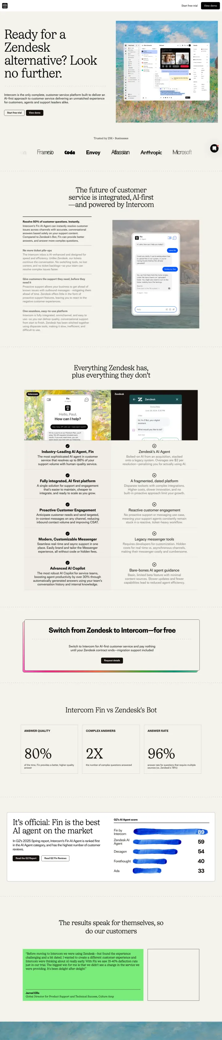
Why This Breaks the Rules: Most SaaS comparison pages soften the pitch with feature-parity tables and hedged claims. Intercom does the opposite. Every H2 on this page names Zendesk explicitly ('No more ticket pile-ups,' 'Unlike Zendesk, our tickets continue the conversation,' 'Zendesk offers little in the form of proactive support'). The page is a teardown, not a comparison. That is rare because most marketing legal teams water down competitive claims, but it works because Zendesk-frustrated buyers want validation, not diplomacy.
Every section under the hero names the competitor by brand and frames the competitor's weakness as a fact, not an opinion ('Unlike Zendesk, our tickets continue the conversation'). This only works when the buyer already has competitor pain, but the keyword 'zendesk alternative' guarantees that pain exists
The Renaissance-painting hero background returns here from Intercom's live chat page, giving the competitor-capture page the same premium feel as their brand page. Most competitor LPs look like quick-build Unbounce templates; this one signals that Intercom takes the comparison seriously enough to invest in it
'Resolve 50% of customer questions. Instantly.' pairs the Fin AI Agent claim with a direct Zendesk Bot comparison in the same paragraph. The 50% number gives the buyer something concrete to benchmark against their current Zendesk resolution rate
The hero headline 'Ready for a Zendesk alternative? Look no further.' is weak for a page that otherwise goes hard on the comparison. 'Look no further' is filler; the surrounding copy has conviction the headline does not
No side-by-side feature table anywhere on the page. The comparison lives entirely in prose paragraphs, which means an analytical buyer cannot scan for the three features they care about. A competitor-capture page without a feature grid makes the skeptical evaluator work harder than they should
The logo bar repeats the same 8 customer names (Amazon, Frame.io, Coda, Envoy, Atlassian, Anthropic, Microsoft, Clay) four times in a row as a scrolling strip. Repetition is a design tic that lengthens the page without adding information
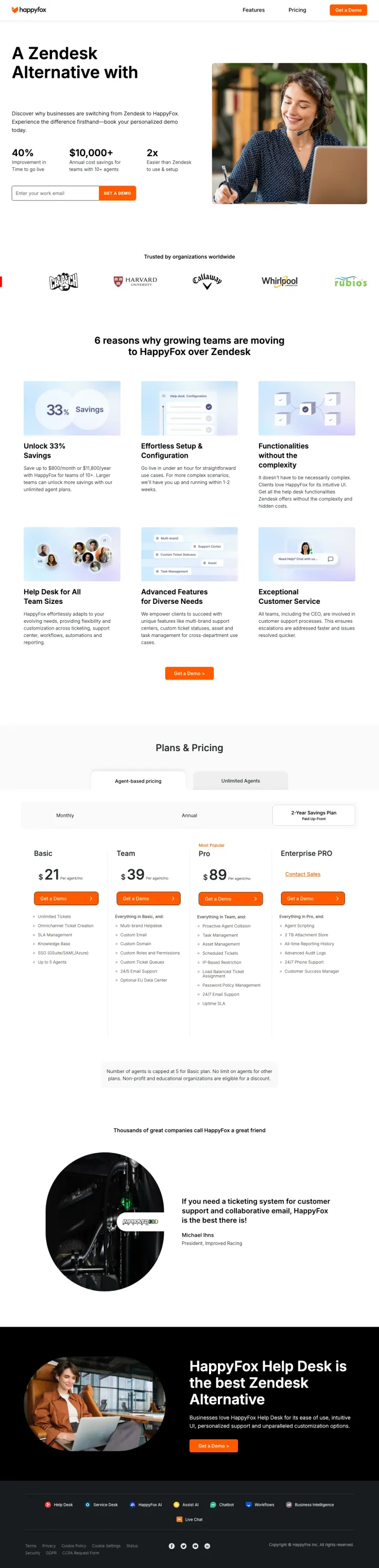
Why This Breaks the Rules: Most 'switch from X' landing pages promise qualitative improvements (better support, easier setup, happier teams). HappyFox quantifies the switch in the hero: '40% Improvement in Time to go live,' '$10,000+ Annual cost savings for teams with 10+ agents,' '2x Easier than Zendesk to use & setup.' Putting a literal dollar figure next to a competitor's name in the hero is unusually direct. Legal teams usually bleach this kind of claim; HappyFox kept it.
Three-stat hero (40% / $10,000+ / 2x) with each number tied to a concrete switching outcome: speed-to-value, annual savings, ease of setup. The $10,000+ figure is rare because most pages will not put a dollar figure on a competitor comparison for fear of legal exposure. It is also the single most persuasive number for a buyer whose procurement team has asked 'what do we save?'
Email-only form paired with the three-stat hero and an orange 'GET A DEMO' button. The form, the proof, and the comparison all live in the same viewport, which eliminates the scroll every competitor-capture page demands
The photo of a smiling agent on a headset is an obvious stock shot, but it is placed beside the numeric proof (not instead of it). Combining a warm emotional image with hard dollar figures hits both the Blue-analytical and Red-action personas that dominate helpdesk evaluation
The rotating headline ('No Hidden Costs / No Complexity / No Subpar Support') is a classic hero animation that creates a small readability tax on the first 3 seconds. The three alternatives all deliver similar 'not like Zendesk' messages, so the rotation adds motion without changing meaning
No side-by-side feature comparison table. For a page whose thesis is 'HappyFox is better than Zendesk in specific ways,' the absence of a scannable grid forces the evaluator to infer the comparison from six paragraph-style reason sections further down the page
The agent-with-headset photo is stock imagery that contradicts the otherwise specific dollar-figure claims. Buyers who trust the $10,000+ number will notice the generic photo and wonder if the savings number is equally generic
2 pages burning ad spend with fundamental issues
Every click to these pages costs real money. We found broken trust signals, mismatched intent, weak CTAs, and messaging that ignores what the searcher actually typed. Here is what to avoid.
Help Scout bids on 'service desk free' and 'servicedesk free' (60 combined monthly searches) but sends traffic to a generic free plan page that never mentions 'service desk' or 'IT.' The disconnect between the ad's IT service desk positioning and the page's general help desk framing means IT-focused searchers will bounce immediately, wasting every click at these CPCs.
The ad promises 'Free Service Desk Software - Free IT Desk Software' targeting 'service desk free' keywords, but the page opens with 'Sign Up for Free' with no mention of service desk or IT anywhere above the fold. A support manager searching for IT service desk software sees a generic help desk free plan page with no IT-specific language, workflow, or use case
Full site navigation (Products, Resources, Company, Pricing) stays visible on a page receiving paid traffic. The 'Pricing' nav link is especially damaging because it invites visitors to compare plans instead of converting on this free plan page, which is the exact action Help Scout paid for
The hero shows a product screenshot of a chat conversation, but the UI is small and hard to read at viewport size. The visitor cannot evaluate whether Help Scout looks like software their team would use. Compare to Intercom's large, readable chat mockup that lets visitors immediately assess the product
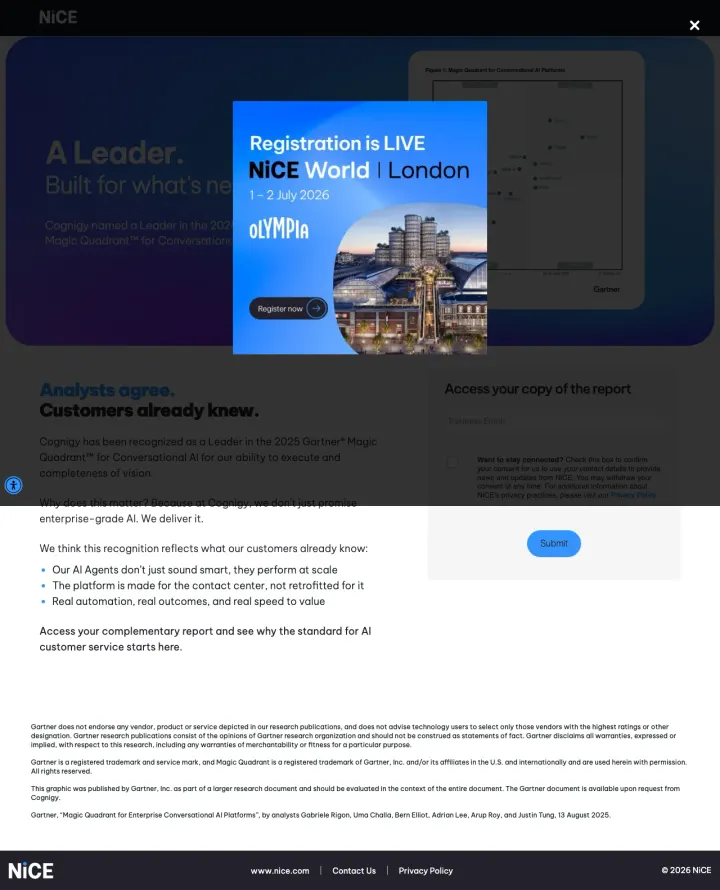
NICE bids on high-volume AI customer service keywords ('customer care chatbots' at 6,600 searches, 'ai chatbot for customer service' at 2,400, 'conversational ai for customer service' at 1,900) and sends that traffic to an analyst report download page that is immediately obscured by a NICE World London conference registration popup. Evaluators who wanted to see the Cognigy product get a lead-capture form for a PDF, plus a conference pitch, and no way to assess the actual AI product they searched for.
A 'Registration is LIVE, NICE World London' conference popup covers roughly 40% of the viewport on first load and sits directly on top of the Cognigy Gartner headline. A visitor who searched 'ai chatbot for customer service' and clicked an ad about Gartner AI leadership lands on a page whose dominant visual is a London conference they did not ask about
The ad promises a Gartner Magic Quadrant report and AI chatbot capability, but the page delivers an analyst-validation download with zero product screenshot, zero chatbot demo, and zero pricing or trial information. Visitors looking to evaluate an AI customer service product get a PDF request form and a conference pitch
No CTA visible above the fold until the conference popup is dismissed. The actual report form lives in the right rail behind the overlay. At $50+ CPCs on 'conversational ai for customer service' keywords, any conversion friction in the first 3 seconds burns budget
Multiple winners offer both a self-serve path and a guided path above the fold. Help desk buyers split between hands-on evaluators who want to test ticket routing themselves and managers who need a vendor to walk through enterprise features. Intercom ('Start free trial' + 'View demo'), Zendesk (e...
Zendesk leads with a Siemens case study showing specific metrics (86%, +23%, 600) right next to the hero form. HappyFox puts three quantified outcomes (20% reduction, <2 hours response, 40% productivity increase) above the fold. Both anchor credibility with numbers, not just names. At $200+ CPCs,...
Fin.ai builds its entire landing page around 'AI Agent vs Chatbot' with a 9-row comparison table positioning chatbots as the outdated incumbent. Searchers who typed 'chatbot' are taught that chatbots are the wrong category entirely. This reframes the decision from 'which chatbot?' to 'do I even w...
Zoho's Zia AI page targets 'conversational ai chatbot' (368K monthly searches) and 'chat bot service' (165K), but the page is about Zoho Desk's AI assistant for agents, not a standalone chatbot product. Visitors searching for chatbot services may expect a product they can deploy independently. Zo...
Winners share three traits: a specific use-case headline that matches search intent ('AI-enhanced live chat,' 'ticketing system'), quantified proof above the fold, and dual conversion paths. The loser sends paid traffic to a Help Scout free-plan page that dilutes the premium positioning these buyers are evaluating..