Free: 96 PPC tools + my AI Playbook book

These are real home security pages spending actual money on Google Ads right now.
From real home security Google Ads campaigns in the US
The landing pages actually worth stealing from
So you know exactly what to avoid
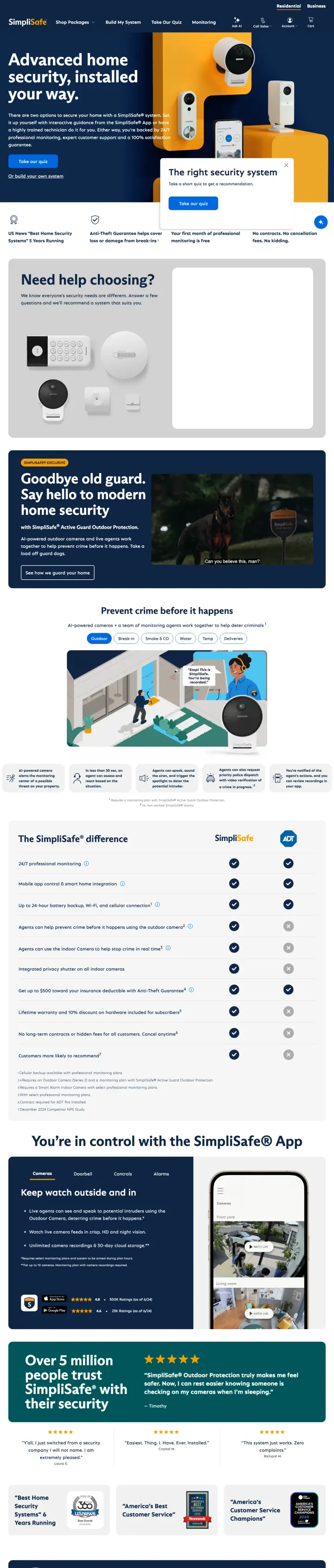
Put a Take Our Quiz CTA in the hero beside an Or build your own system secondary link. SimpliSafe gives the unsure visitor a path to self-qualify and the confident DIYer a path to the product catalog, in the same hero. Most home security competitors force a single path.
Advanced home security, installed your way names the decision the visitor is making (install how?) rather than selling features. For a category where roughly half the choice is about delivery mode, framing install as the lead value proposition captures real intent.
The right security system quiz card in the right rail is a secondary self-qualification path. Dual CTAs for confident and uncertain visitors simultaneously beat a single Shop button in a considered purchase.
Trust pills under the fold (US News Best Home Security, Anti-Theft Guarantee, 100 percent satisfaction guarantee) pre-answer the three objections every security visitor brings: reputable brand, does it actually work, can I return it.
No pricing signal anywhere above the fold. A visitor who has already decided on SimpliSafe has to scroll past three sections to find a dollar figure, which invites comparison-shop bounce.
Secondary CTA (Or build your own system) is a plain text link next to a bright blue quiz button. The visual hierarchy hides half of the dual-path strategy from anyone scanning the page quickly.
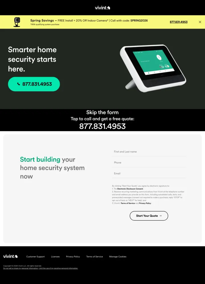
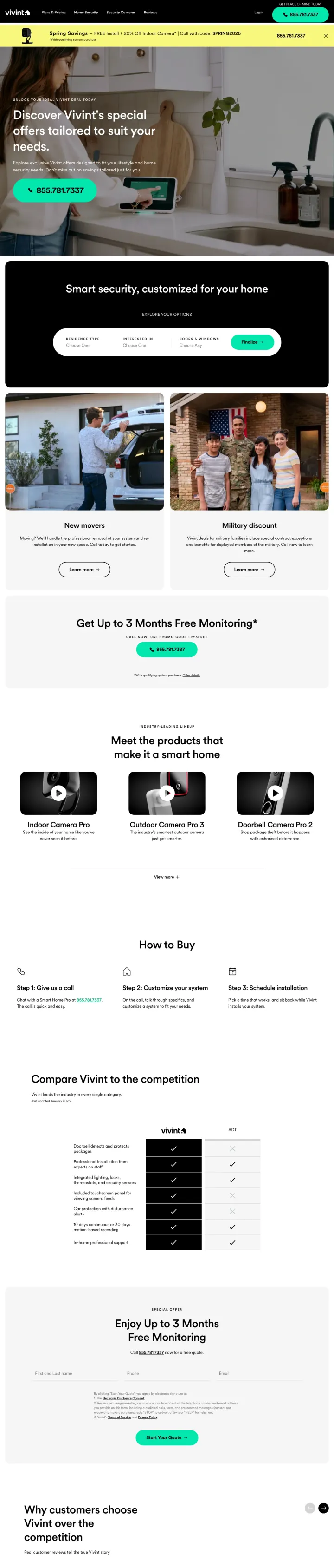
Add a Skip the form stripe under your mobile hero with a large phone number and one line of CTA copy (Tap to call and get a free quote). Vivint's mobile paid page gives the ready-to-buy visitor a zero-friction call path while the form still runs for researchers. It is a contrarian move in a form-first category.
Skip the form is the headline under the hero. Naming the friction the visitor wants to avoid, instead of hiding behind a form, builds trust in a scam-adjacent category.
Spring Savings stripe at the top shows FREE Install plus 20 percent Off Indoor Camera with code SPRING2026. The offer is specific, time-bound, and uses a code to create a commitment moment.
877.831.4953 phone number rendered large and green as the only CTA in the viewport. A single-CTA hero with phone-first conversion is contrarian in a form-first category, and the size of the number signals the company wants the call.
The viewport shows zero trust proof. A star rating, customer count, or Trustpilot badge could live beside the phone number. Trust proof is absent when the visitor first makes the call decision.
With qualifying system purchase fine print appears under the Spring Savings stripe but the specific minimum dollar amount is not stated. Visitors wary of bait-and-switch need that number visible.
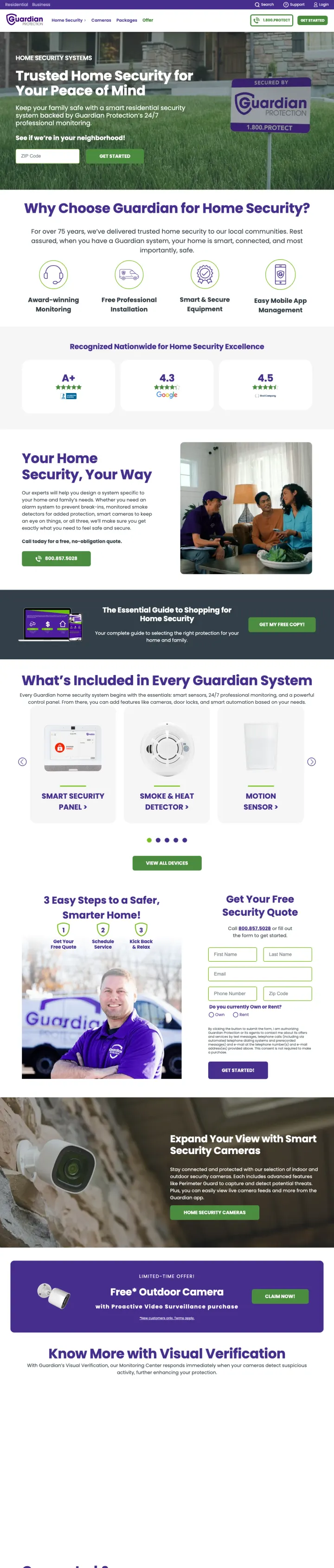
Lead with a stat bar under the headline (40 Years Protecting Customers, 400,000 Homes, A-plus BBB) instead of a generic hero image. Guardian drops four specific proof points immediately under Home Security Your Way, so the longevity objection is answered before the visitor has to scroll.
The What's Included In Every Guardian Security System section breaks the package into four tiles with photos (doors, windows, motion, environmental) instead of a feature list. Visual componentry answers a homeowner's question (what do I actually get?) faster than a bulleted spec list.
Ready to Protect Your Home with a Customized Home Security Plan? appears twice on the page, each time followed by an inline quote form. Repeated inline conversion beats a sticky bottom bar for readers who scroll past the first fold.
Trust badges (BBB A-plus, Safe.com Best, Consumer Affairs) live under the primary hero CTA. Social proof directly below the conversion button is a stronger placement than the usual bottom-of-page trust strip.
The headline HOME SECURITY SYSTEMS is rendered in all caps and sits above Home Security Your Way. Two stacked headlines split the hero's attention, and the all-caps version adds no information.
No pricing anywhere, not even a starting-at range. In a category where monthly monitoring is the real cost driver, zero price signal forces comparison-shop bounce.
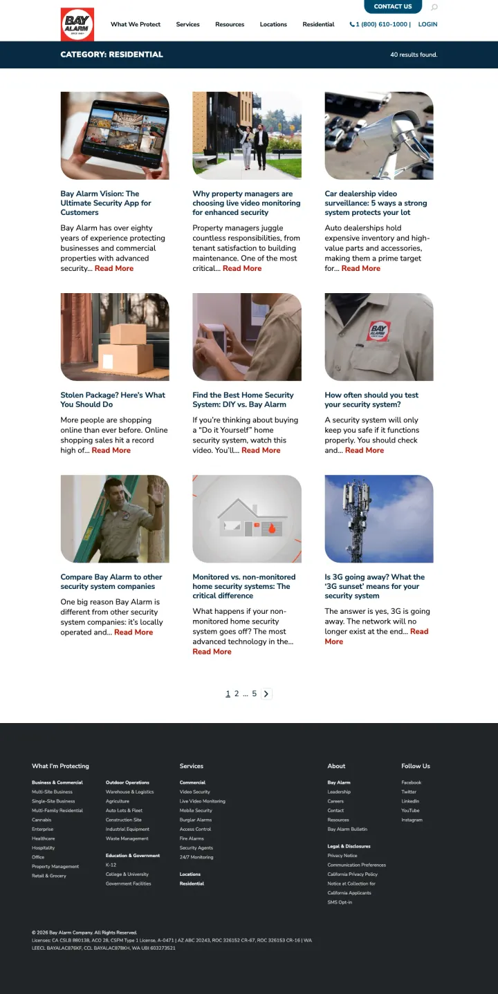
Replace the standard 'Home Security' overview page with a 9-card grid of owned articles (Vision App explainer, how often should you test your system, comparing Bay Alarm to other companies). Bay Alarm uses editorial content as the landing experience, which works for the Blue-analytical segment that will not convert on a bare form.
The 9-card editorial grid is tagged Residential as a visible category chip, signaling to the visitor they are in the right section of a multi-category site. Most multi-line security companies fail to segment their site navigation this clearly.
One of the nine cards is titled Compare Bay Alarm to other security companies. Volunteering the comparison instead of avoiding it earns analytical readers' trust.
The hero bar keeps a high-contrast Contact Us button plus a phone number and Login link. Three conversion paths served simultaneously from the same viewport.
No hero imagery, no headline beyond Category: Residential. Visitors arriving from a paid search on home security california land on what looks like a category archive, not a sales page.
Nine articles is too many choices for a paid-traffic visitor. A tighter grid of three articles plus a lead form would route more traffic to conversion while keeping the editorial trust signal.
CTA on each card is Read More rather than a conversion prompt. The page builds trust without offering the committed visitor a way to convert.
Open a best-of category page with a Just want the highlights? collapsible TL;DR directly under the H1 before the reviewer methodology or the full comparison table. SafeWise lets scanners extract a recommendation in 10 seconds and lets readers expand into the 8,200-word review if they want.
Key takeaways bullets directly under the H1 (with Best Overall, Best Value, Best DIY picks named) deliver a complete recommendation before the visitor decides whether to read further. This is the TL;DR pattern that most category pages still refuse to adopt.
Named reviewer Dr. Ben with a photo and credentials appears in the byline. A real person with a real doctorate signals editorial rather than affiliate, even though both are true.
The Cameron Family, Kalamazoo MI case study (with family photo and review of their Cove install) converts abstract product review into lived experience. Affiliates who do this instead of a feature matrix win the trust-sensitive reader.
Pricing is inconsistent. The top of the page cites $200 to $600 ranges while the table uses month values like $32.26 and $45. The range and the line items never reconcile, which invites the analytical visitor to doubt both.
The 8,244-word length means mobile visitors will never see the comparison table below. No sticky jump-links mean the scanner has to scroll through the editorial before reaching the recommendation.
Affiliate disclosure is below the first scroll. FTC compliance requires a prominent disclosure, and putting it below the fold invites regulatory risk and reader distrust if discovered.
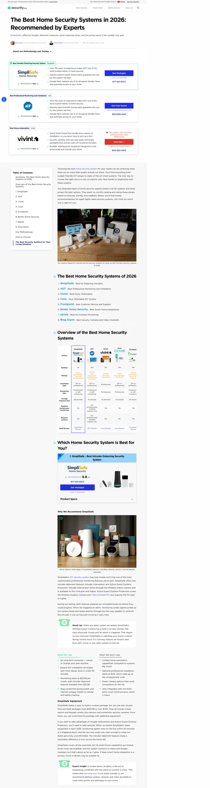
Photograph the product as it arrives at your door (boxes, foam, cables) for every recommendation in a best-of review. Security.org shows each system being unpacked and installed on a kitchen counter, which signals the reviewer actually tested it rather than cribbed from the spec sheet.
Hero table pins the top 3 picks (ADT, Vivint, SimpliSafe) with Trustpilot-style star ratings and one-line verdicts. A visitor who only reads the first scroll still gets a recommendation.
Each system gets a full photo shoot, not a stock product render. An installer's hand mounting a sensor on a door frame is a vastly different trust signal than a polished marketing shot.
Price breakdowns distinguish upfront equipment, monthly monitoring, and effective annual cost. The three-number structure is how buyers actually compare systems, and most vendor pages still refuse to publish it.
10,951 words is too long for any mobile visitor to finish. Without a sticky table of contents, the comparison table below is unreachable for most readers.
Top picks are called out in the hero, but the page still contains 10 sections of supporting content with no jump-links. Editorial breadth without navigation is weight without value.
Affiliate disclosures are in a small gray bar that most readers will miss. Transparency is the differentiator against pure-vendor pages, so the disclosure should be proud, not discreet.
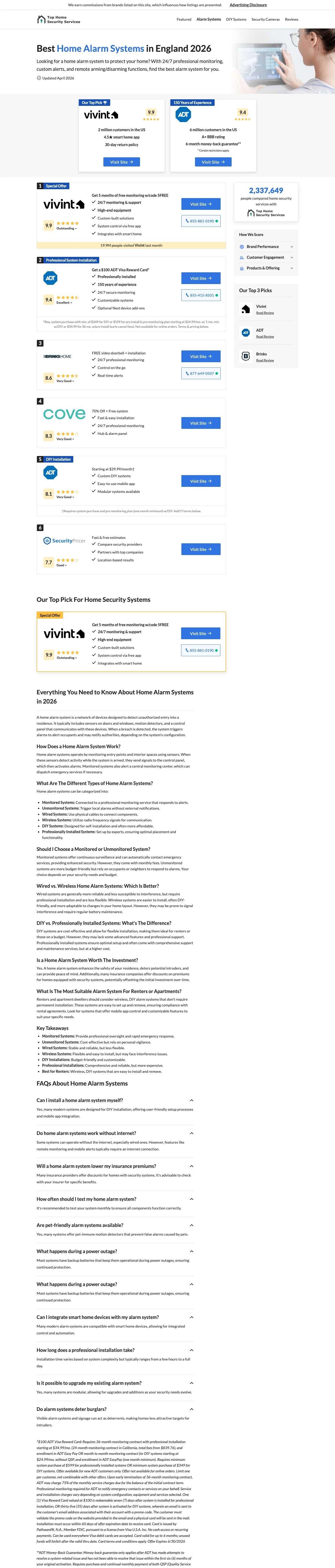
Stack vendor cards vertically with a yellow Special Offer stripe under the top pick. The stripe creates an anchor point that the eye returns to, and the vertical stack matches the way mobile visitors actually scan. Most best-of pages waste energy trying to fit horizontal comparison tables onto phones.
Each vendor card shows brand logo, Trustpilot rating, customer count, and four feature bullets in a tight 140-pixel-tall block. A mobile visitor gets 5 full vendor comparisons in one scroll.
The phone number 888-XXX-XXXX renders large in the header with a 24/7 Support label. A visitor who has already decided calls, a visitor who is still shopping scrolls through the vendor cards.
A FAQ accordion below the vendor cards answers objections (what does home security cost, does it work with renters, what about pet false alarms) without leaving the page. Question-driven content at the bottom rescues visitors who did not convert on the vendor cards.
The editorial frame is thin. Four sentences of intro copy before the vendor cards is not enough to establish Best 5 editorial authority; the page reads as a directory rather than a review.
No methodology or named reviewer. Without who reviewed these and why this order, the page is structurally an affiliate page even though it functions like a best-of.
Prices in the FAQ ($100, $349, $599) do not appear in the vendor cards. Disconnected pricing signals invite the analytical reader to doubt both.
For a bundled-service brand, skip the generic security pitch and open with Total home peace of mind paired with a photo of the touchscreen panel. Xfinity banks on existing-customer recognition: visitors who know the brand from internet or cable already trust it, so the landing page does not need to re-litigate trust.
Hero image of a hand tapping a doorbell camera mirrors the actual product interaction. A product-in-use shot outperforms lifestyle stock photography at converting considered-purchase visitors.
Price points ($10, $60, $2.50) appear in the product catalog section so the bundle economics are visible. A telecom that publishes its a la carte pricing signals confidence in its value, which is the opposite of the hide-behind-a-quote default.
Below-fold product galleries show cameras, sensors, and the touchscreen panel in clean white renders. Once trust is assumed, the page spends its real estate on product selection rather than brand building.
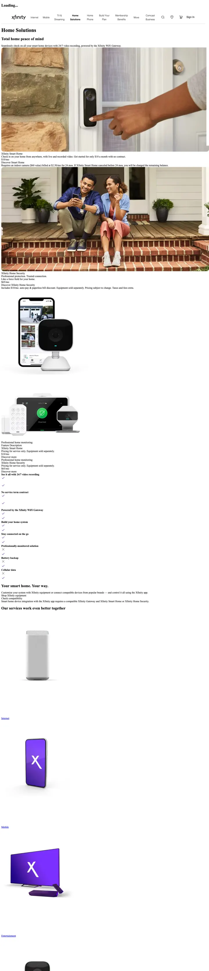
Loading is the visible top heading in the screenshot, which suggests a JavaScript render failure on capture. Any visitor seeing Loading in place of a hero will bounce.
No inline lead form or quiz. The only conversion path is a phone number in the header, which undersells a brand that could easily support a my address gets a custom quote flow.
The page assumes Xfinity brand recognition. For paid traffic from a generic keyword like home security cameras, the brand assumption may not hold and the page has no fallback pitch.
Pages that break the playbook in interesting ways
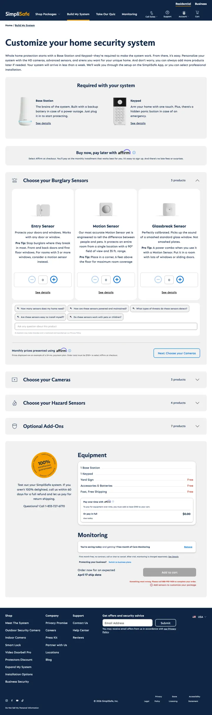
Send paid traffic straight to a product configurator rather than a marketing page. SimpliSafe opens with Customize your home security system and puts the visitor into a 4-step builder (base station, sensors, cameras, hazard detectors) with live equipment counts and a running subtotal. The configurator is the landing page.
Running subtotal ($0.00 to the side) updates as sensors are added. Persistent cart visibility keeps the price anchored while the visitor assembles the system, which is the DTC-commerce pattern most security competitors have still not adopted.
Buy Now, Pay Later with Affirm appears inline next to the subtotal. Financing at the decision moment (not buried in checkout) removes the sticker-shock objection for a $400 to $800 system.
Base Station is pre-checked as Required with Quantity 1. The page concedes the unavoidable component and lets the visitor customize the rest. Most configurators start from zero and force the visitor to learn the product from scratch.
No trust signals in the viewport. The configurator assumes the visitor arrived already sold on SimpliSafe; any visitor still deciding between SimpliSafe and a competitor gets zero reinforcement.
Monitoring plan selector is buried at the bottom. The long-term cost of the system is hidden behind a Choose Monitoring step that most visitors will not reach if they stall on sensor selection.
Mobile experience of a 4-step configurator with live add-to-cart is technically demanding. A capture failure or layout break on phone destroys the entire conversion path.
Include a side-by-side Vivint vs the competition table on a PPC landing page. Vivint lists five feature rows (smart home integration, pro install, app control, mobile monitoring, doorbell camera) with competitors marked with red Xs. Most vendors avoid comparison tables on their own paid pages. Vivint embraces them as the conversion driver.
Get Up to 3 Months Free Monitoring is the primary offer, repeated three times on the page. A specific dollar-adjacent incentive (monitoring is the monthly lock-in cost) is more compelling than a vague Save Big.
Head-to-head comparison table frames Vivint against a generic the competition rather than naming specific rivals. This hedges against comparison-site rebuttals while still anchoring Vivint as the better choice.
Customer testimonial row at the bottom uses real first names (Debbie G, Sydney White) with star ratings and one-line quotes. Testimonials positioned after the comparison table build trust without interrupting the sales logic.
The ZIP-code-gated offer box (enter your zip to see offers) forces friction before the visitor has seen any incentive. Zero-friction offer reveal would convert more analytical shoppers.
Indoor Camera Pro, Outdoor Camera Pro, and Doorbell Camera Pro are listed without prices. If the page is called /specials, showing the discounted price (not just the product name) is the obvious next step.
The comparison table competes against an unnamed the competition, which a skeptical reader will discount as marketing puffery. Naming one specific competitor (SimpliSafe, ADT) would be bolder and more defensible.
2 pages burning ad spend with fundamental issues
Every click to these pages costs real money. We found broken trust signals, mismatched intent, weak CTAs, and messaging that ignores what the searcher actually typed. Here is what to avoid.
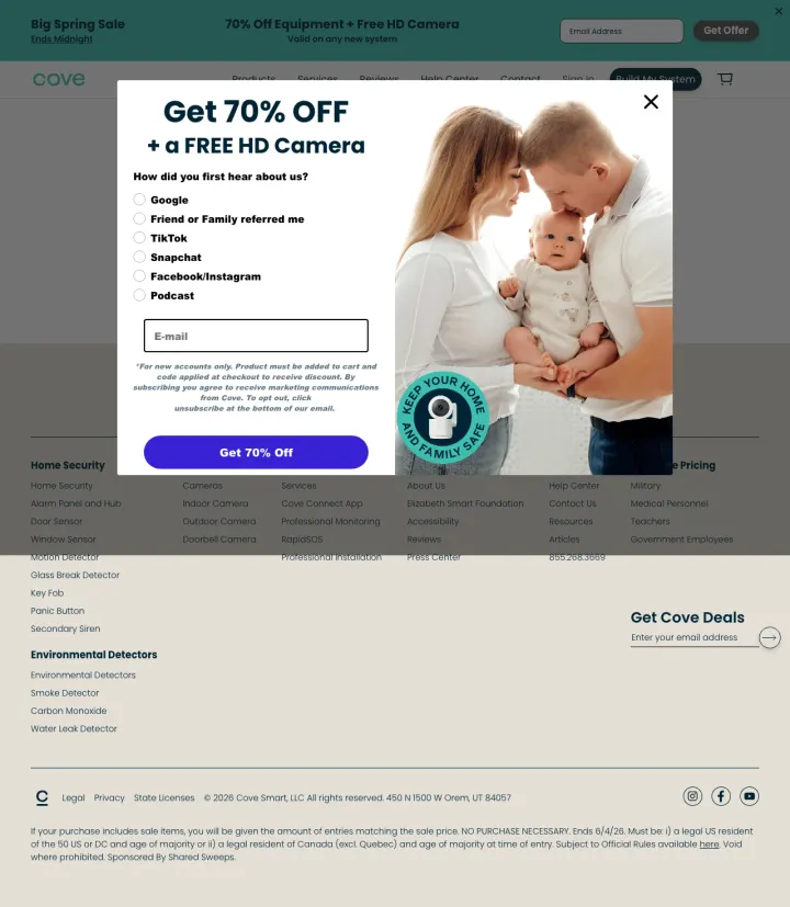
Ad targets the brand term cove home security at $10 to $15 CPC. The page loads with the H1 Page Not Found partially covered by a Big Spring Sale popup offering 70 percent off equipment. The visitor sees a broken page layered under a sales popup, which signals either URL rot or technical debt that the PPC team has not fixed.
The primary H1 is Page Not Found. A brand-term PPC click landing on a 404 page is the clearest possible signal that the PPC team is not auditing its destination URLs.
The 70 percent off popup covers the only functional content on the page. Even if the visitor dismisses the popup, they land on a blank Page Not Found layout.
No phone number, no inline form, no fallback next step once the popup is dismissed. The page has nothing left to offer a visitor who refuses the discount capture.
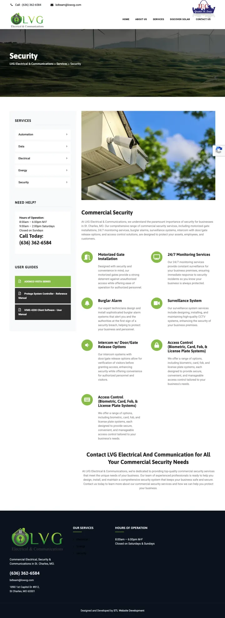
Ad targets 24/7 onsite cameras with the headline 24/7 monitoring services at $15 to $25 CPC. The landing page is a small electrical-and-communications contractor's Security sub-page with a stock windmills-on-hills hero image, no inline form, no phone-CTA button, and a bullet list of services. A visitor who typed 24/7 monitoring has to hunt through three sections to discover this is a regional contractor who also installs alarm panels.
Hero is a stock photo of windmills on rolling hills with zero connection to home security monitoring. The photo sets the visitor up to bounce before reading a word.
No conversion path in the viewport. No form, no phone-CTA button, no chat, no clear next step beyond the navigation menu. For a $20 paid click that is the minimum viable conversion path.
Security is the page title, and the ad promised 24/7 monitoring. A generic category label against a specific-service ad fails message match entirely.
SimpliSafe runs two different PPC-driven pages: /installation-landing opens with a Take Our Quiz CTA, and /build-my-system drops the visitor straight into a step-by-step product configurator. Both replace the generic Shop Now pattern with a self-qualification tool. In a considered purchase where ...
Vivint runs a mobile-specific paid page at /ppc/mobile with a single phone number hero and a Skip the form stripe. Its desktop /ppc/activate page uses a traditional form. The same brand deliberately serves mobile callers and desktop researchers different conversion paths. Most competitors run one...
SafeWise, Security.org, and Top Home Security Services each run long-form Best Home Security comparison pages that bid on category keywords like best home security systems 2026. They leverage Trustpilot scores, customer counts (2M, 6M), and neutral-sounding rubrics. Any single vendor would lose a...
Cove sends traffic to /home-security-systems where the visible hero is a 70 percent off popup layered over a broken Page Not Found heading. Xfinity sends paid traffic to a learn/home-security page that loads a product catalog with no lead form and a below-fold phone number. At $20 CPC, these are ...
Winners give the visitor a next step in the viewport that matches their decision state: a quiz, a configurator, a phone number, or a side-by-side comparison. Losers hand paid traffic a brand page, a blog, or a 404 and expect the visitor to figure out the next step..