Free: 96 PPC tools + my AI Playbook book

Hotel bookers have 3-4 tabs open and they're making the decision right now, this session. Budget travelers want the cheapest rate immediately. Luxury travelers want to feel the experience before they see a number. Most hotel pages somehow manage to serve neither.
From real hotels / hospitality Google Ads campaigns in the US
The landing pages actually worth stealing from
So you know exactly what to avoid
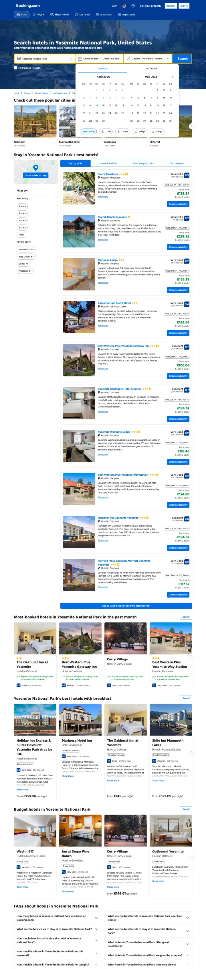
Show the total number of available properties in the page heading ('Ocean City - 2128 hotels and places to stay') so the visitor immediately knows they have enough options to find what they want without checking another OTA.
Date picker opens automatically on load, pre-filling the search form and reducing friction to the first interaction -- the visitor's next step is selecting dates, not figuring out where to click
Each hotel listing shows price, review score with volume ('8.1 from 2,128 reviews'), and a 'Show on map' link -- all three hotel-booking decision factors in one compact card
Filter bar with Star Rating, Budget, and Property Type sits above the listings so comparison-mode visitors (the 30% Blue analytical persona) can narrow 2,128 options without scrolling past them
Prices render in GBP despite the URL targeting Ocean City, MD. A US searcher who clicked a dollar-priced ad now has to mentally convert every nightly rate -- the friction kills the comparison the search was built to do.
No 'free cancellation' badge visible on the initial listings despite Booking.com offering it on most properties -- this is the #4 customer priority and it is missing above the fold
The 'Register/Sign In' buttons in the header compete with the search CTA for attention -- the visitor came to find a hotel, not create an account
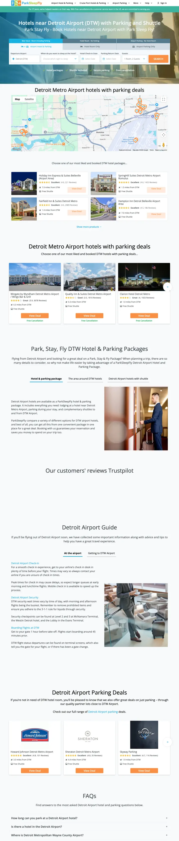
Bundle a commodity service (parking) with a higher-margin service (hotel room) into a single price, so the visitor cannot unbundle and comparison-shop each component separately. This is how parksleepfly.com competes against hotel sites that sell rooms and parking separately.
Three-tab product selector (Hotel & Parking / Hotel Room Only / Airport Parking Only) lets the visitor self-segment by need without leaving the page -- each tab reconfigures the search form for that product type
Trust bar immediately below the search form shows four green checkmarks: 'Hotel packages / Shuttle included / Secure parking / Free cancellation' -- these are the exact four objections an airport traveler has, answered in one line
Map showing all partner hotel locations near ORD with orange pins lets the visitor visually assess proximity to the airport terminal without reading addresses
No prices visible above the fold -- the visitor has to complete the search form before seeing any rates, which means the 40% Red (price-first) persona has no anchor to decide if this is worth their time
The '17 years helping travelers' banner at the top is easy to miss and uses passive language -- a stronger version would be '3.2 million bookings since 2009' or similar volume proof
Review scores appear only on individual hotel cards below the fold, not aggregated at the top -- no single trust number for the platform itself
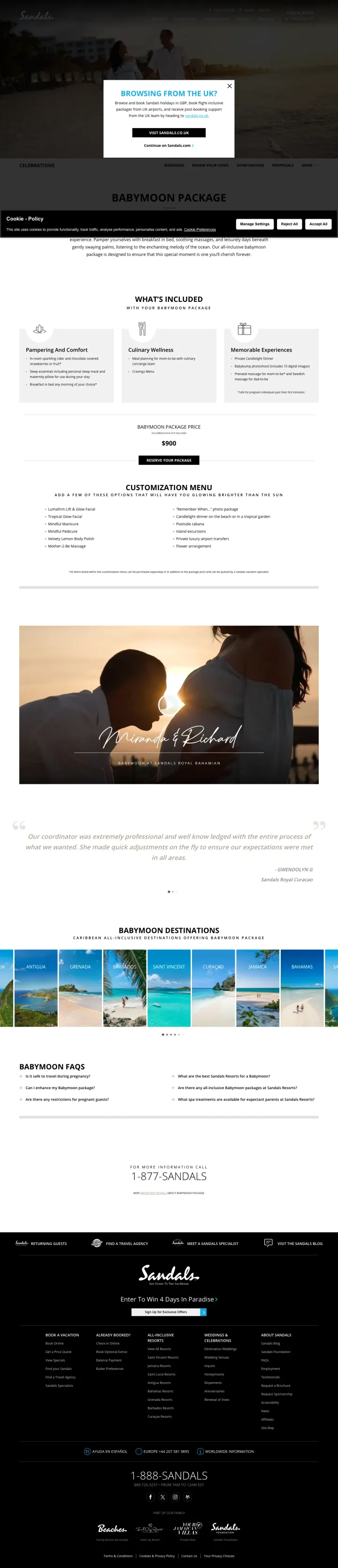
Lead with a concrete savings number ('Save up to $1,000 + 1 Free Night') paired with a countdown timer showing days/hours/minutes. The specificity of the dollar amount makes the urgency timer feel genuine rather than manufactured.
Countdown timer with days/hours/minutes/seconds ('05 days 12 hrs 49 min 25 sec') creates genuine urgency because Sandals actually runs time-limited promotions -- the timer is credible because the brand backs it with real inventory constraints
10,557 Verified Reviews prominently displayed tells the visitor this is not a new or untested property -- volume this high signals that the resort has been thoroughly vetted by thousands of couples
'Historic Beach Club Meets Private Island' headline sells an experience rather than a room rate -- this reframes the purchase from 'hotel booking' to 'unique experience you cannot get elsewhere'
Geo-redirect popup ('Browsing from the UK?') and cookie consent banner stack on top of each other, obscuring the hero image and countdown timer -- two modals competing for attention before the visitor sees any content
No specific room rate visible above the fold despite the ad promising 'All-Inclusive Deals' -- the visitor clicked expecting to see prices and instead gets a brand story
The dual CTA buttons ('Prepay for Lowest Price' / 'Free Transfers Bundle') appear far below the fold after scrolling through a photo gallery -- the booking action is separated from the urgency messaging
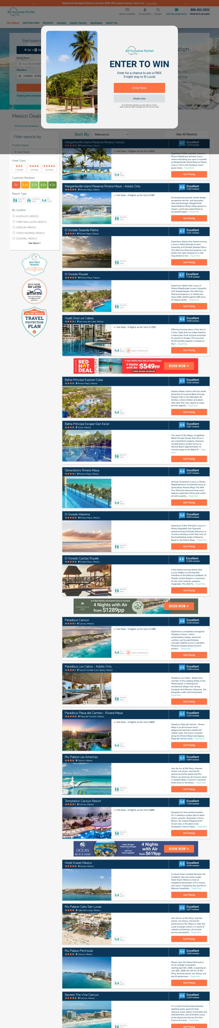
Show each deal as a complete package with airfare included ('4 Nights w/ Air from $839') so the visitor cannot easily comparison-shop against room-only OTAs. The bundled price makes the value proposition incomparable rather than competitive.
'97% Satisfaction Rating' displayed with 'Guaranteed' badge creates a platform-level trust signal that individual hotel reviews cannot match -- it tells the visitor the booking experience itself is reliable, not just the hotel
Each resort listing shows review count (2,228 / 3,423 / 9,261 reviews) alongside the deal price, combining social proof with pricing in the same card so the visitor evaluates both simultaneously
'Cancel For Any Reason Travel Insurance Available' banner addresses the #4 customer objection (what if plans change?) at the site level, not buried in individual listing fine print
Email capture popup ('Enter to Win a FREE 3-night stay to St Lucia!') fires immediately on page load and covers the entire viewport -- the visitor clicked a paid ad for Mexico all-inclusive deals and the first thing they see is a sweepstakes popup for a different destination
Full site navigation with 36 links (Hot Deals, Destinations, Resorts, Cruises, Group Travel, Weddings, About Us) provides extensive exit paths before the visitor sees any Mexico deals
Sort defaults to 'Relevance' rather than 'Price: Low to High' despite the ad copy promising savings -- the price-first visitor (40% of the audience) has to take an extra action to see the cheapest options first
Create dedicated conversion-variant landing pages (note the '/homepage-cvr-alt2' URL slug) that strip the full site experience down to a focused sales funnel with a time-limited offer, gallery, and booking buttons. This is A/B testing infrastructure that most hotel brands skip.
Dual booking CTAs ('Prepay for Lowest Price' / 'Free Transfers Bundle') appear twice on the page, serving two distinct visitor motivations: the price-optimizer who wants the absolute lowest rate, and the convenience-seeker who wants airport transfers included
'Summer Black Friday Sale - Up to 20% Off Our Best Suites' creates a named promotional event with a specific discount percentage -- named sales (Black Friday, Flash Sale) feel more credible than generic 'Special Offer' language
TripAdvisor review screenshots embedded as images with visible review text and ratings badges provide third-party social proof that the resort cannot fabricate -- screenshots of external reviews are harder to fake than testimonial quotes
No specific room rate anywhere on the page -- '20% off' means nothing without knowing the base price. The visitor searching 'adult all inclusive resorts cancun' expects to see nightly or package rates
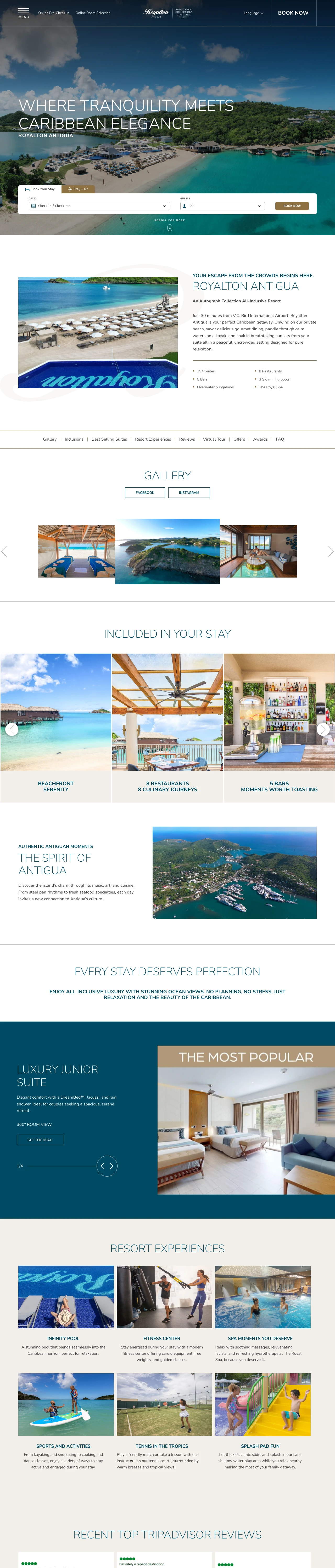
The hero image shows a person jumping into a pool with mosaic art, which communicates 'party atmosphere' -- this may alienate the 30% Blue analytical persona who wants room details, not pool parties
Marriott Autograph Collection branding at the top may confuse visitors who searched for 'Royalton CHIC' specifically -- the dual branding raises the question 'is this a Marriott or a Royalton?'
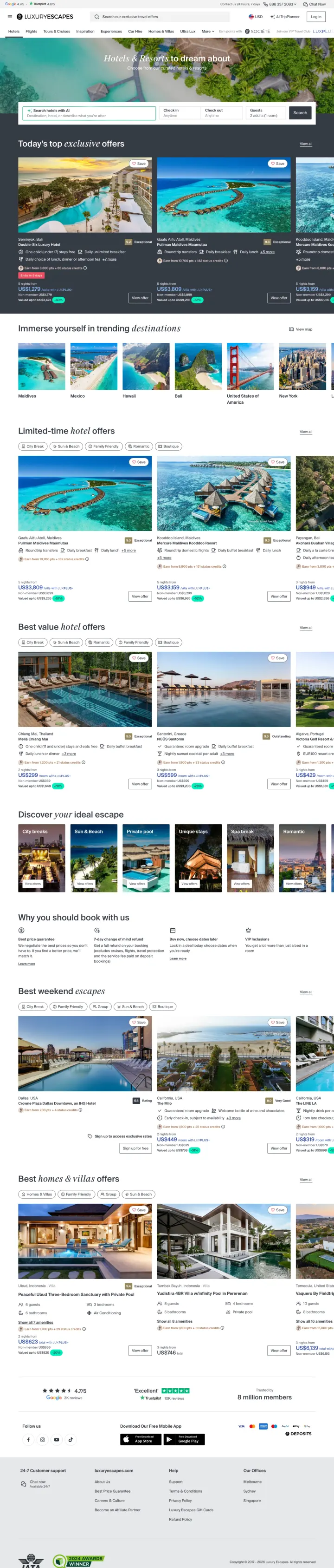
Use 'Today's top exclusive offers' as a section header above curated deals to create FOMO around time-sensitivity while positioning the platform as a curator, not just an aggregator. The word 'exclusive' implies these rates are not available on Booking.com.
'Search hotels with AI' search bar that accepts natural language queries ('describe what you're after') differentiates from every other OTA's location-only search -- this signals a modern, intelligent platform and appeals to the 20% Yellow persona who browses by mood rather than destination
Curated deal cards showing destination photos (Seminyak Bali, Maldives overwater villas) with 'Save' heart icons create a Pinterest-like aspirational browsing experience that encourages engagement before commitment
'Why you should book with us' section lower on the page addresses the 'can I find this cheaper elsewhere?' objection head-on with platform-level value propositions
The page is a generic '/us/hotels' landing page, not destination-specific -- the ad for 'maldives overwater bungalows' (6,600 monthly searches) lands on a page showing Bali, Maldives, and mixed destinations, diluting the intent match
No prices visible above the fold on any of the featured deal cards -- the visitor has to click through to see rates, adding friction for the 40% price-first persona
Phone number is the only conversion path noted but it is not prominently displayed -- a luxury travel brand should offer concierge-style phone booking as a premium feature, not hide it
Pages that break the playbook in interesting ways
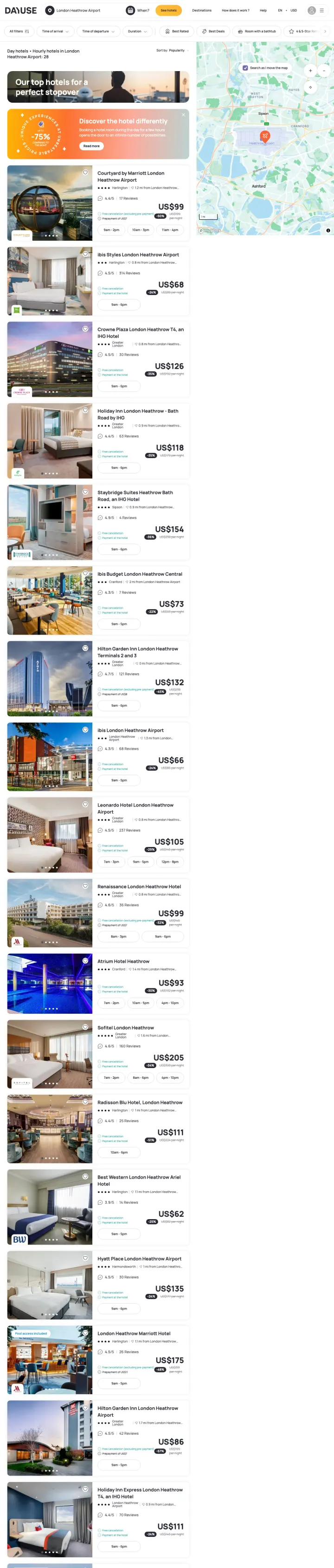
Dayuse.com breaks the convention that hotels sell nights. By selling rooms by the hour with time-slot selection (9am-2pm, 10am-5pm, 11am-6pm), they created a category that does not exist on Booking.com or Expedia. The rule they break: every other hotel page assumes the visitor wants to sleep there. Dayuse assumes they want to use the room during the day. This works because airport travelers, business professionals, and couples have genuine daytime hotel needs that overnight OTAs ignore.
'-75% compared to the night rate' badge on every listing instantly communicates the value proposition -- the visitor does not need to calculate the savings, the platform does it for them and displays the discount as a percentage
Time-slot selectors (9am-2pm / 10am-5pm / 11am-6pm) on each listing let the visitor choose their exact window without a traditional check-in/check-out date picker -- this UI innovation matches the product's hourly model perfectly
Map integration with hotel pins showing exact Heathrow proximity answers the airport traveler's primary question (how far from the terminal?) before they read any listing details
The 'Discover the hotel differently' promotional banner with a 'Read more' CTA interrupts the listing flow and feels like an educational popup -- visitors who arrived via PPC for 'day room london heathrow' already understand the concept and do not need it explained
28 hotels listed on one page with no pagination or load-more creates an extremely long scroll -- the visitor searching for 'hotel london heathrow terminal 2' wants terminal-specific proximity, not 28 options across all terminals
Review counts are low (17 Reviews on the top listing) compared to overnight OTAs showing thousands -- this is inherent to the niche but still creates a trust gap for visitors comparing across tabs
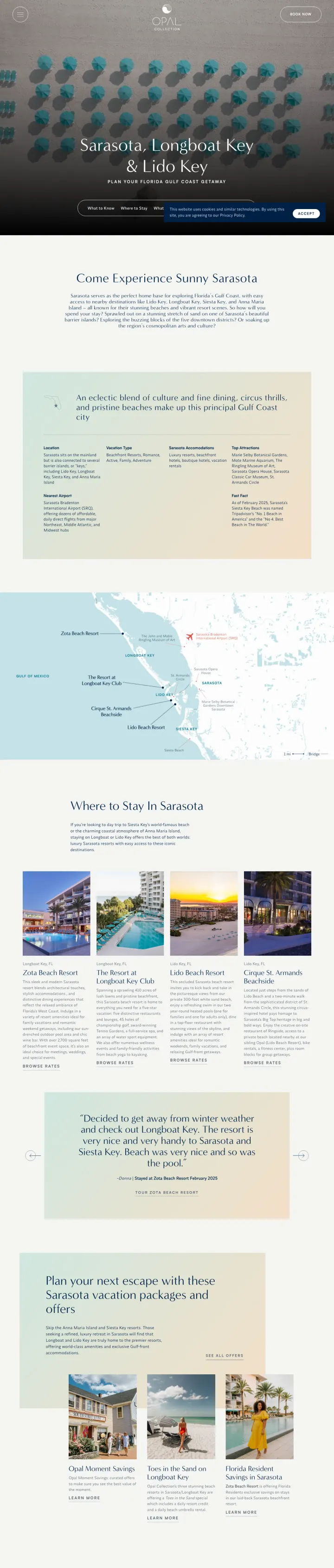
Opal Collection breaks the convention that hotel landing pages should lead with rooms and rates. Instead, they lead with the destination experience: beach umbrellas, local restaurants, art galleries, things to do. The page sells Sarasota first and their properties second. This works because the visitor searching 'sarasota fl siesta key hotels' has not yet committed to a specific property -- they are choosing a destination, and the hotel group that helps them fall in love with the area earns the booking. Most hotel brands skip this step and go straight to room photos.
Tabbed content navigation ('What to Know / Where to Stay / What to Do') lets the visitor self-select their stage in the booking journey -- someone researching the area clicks 'What to Know,' someone ready to book clicks 'Where to Stay'
Aerial beach photography with turquoise umbrellas creates an immediately recognizable and shareable hero image that communicates 'this is a real place with real beauty' without any text overlay needed
'Book Now' button in the top right corner stays visible while the page content is educational and inspirational -- the conversion path exists but does not interrupt the destination storytelling
No prices anywhere on the page -- the visitor who searched 'sarasota fl siesta key hotels' (40,500 monthly volume) expects to see nightly rates, not a destination guide. The conversion path from 'I love this area' to 'here is what it costs' is entirely missing
Destination guide content (restaurants, art galleries, things to do) appears above any hotel room photography or room types. A visitor who searched for the property wants to see where they will sleep first, not a city guide.
Ad promises 'Beachfront Hotel By Siesta Key' but the page is about Sarasota, Longboat Key, and Lido Key broadly -- Siesta Key is mentioned as a nearby attraction rather than the primary location, creating a subtle mismatch
4 pages burning ad spend with fundamental issues
Every click to these pages costs real money. We found broken trust signals, mismatched intent, weak CTAs, and messaging that ignores what the searcher actually typed. Here is what to avoid.
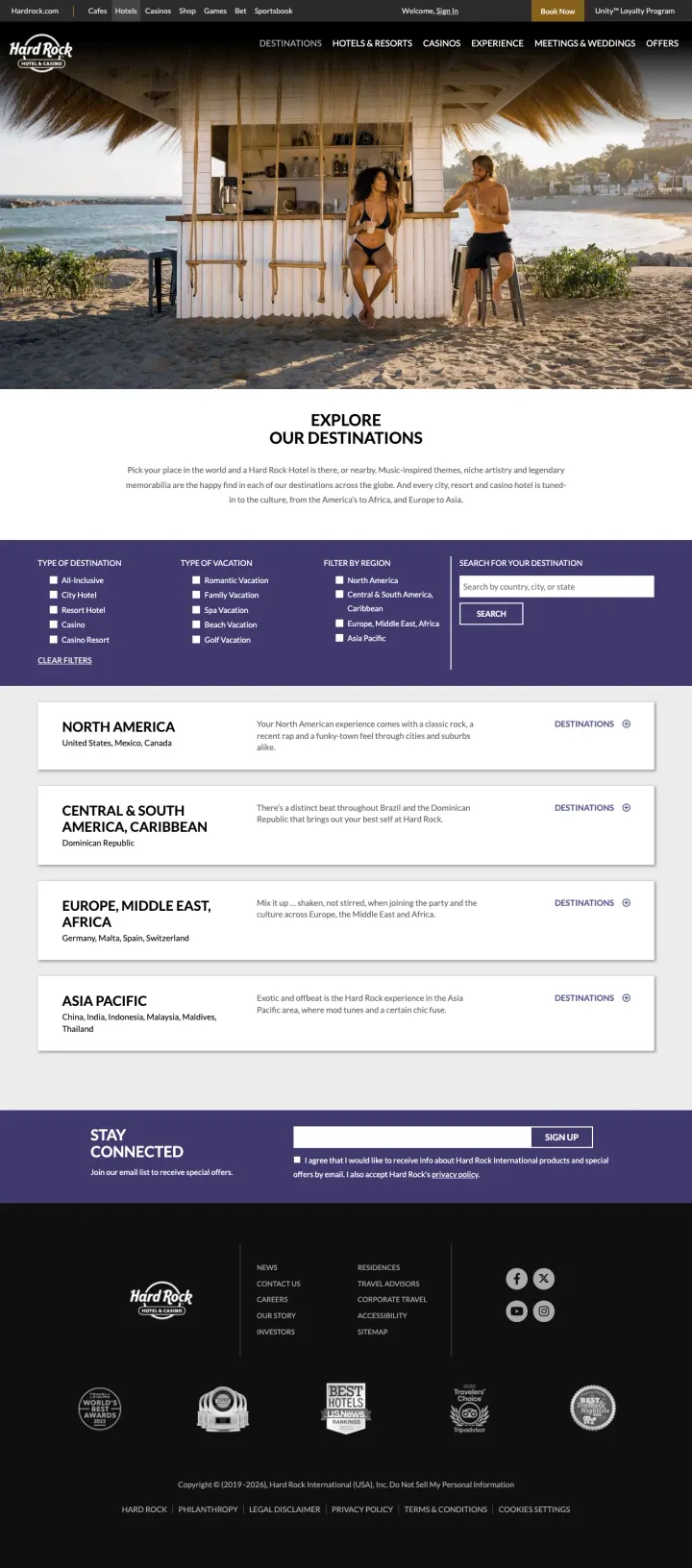
The ad targets 'hard rock cafe hotel and casino' but lands on a generic destinations index that lists continent names (North America, Central & South America, Europe, Asia Pacific) with 'Destinations' links. No hotel is shown. No price is shown. No room is bookable. The visitor searched for a specific hotel brand and received a geography lesson. Every click pays for a page that requires 2-3 more clicks to reach anything bookable.
The page lists four continental regions with brief descriptions and 'Destinations' links but shows zero individual hotels -- the visitor who searched for 'hard rock cafe hotel and casino' expects to see a specific property or at minimum a list of bookable hotels
No search form, no date picker, no booking widget anywhere on the page -- the only way forward is clicking a region name to (presumably) see a list of hotels in that region
The hero image shows a couple at a beach bar, which is lifestyle-appropriate but communicates nothing about which property they should book or what it costs
The ad targets 'all inclusive resorts in costa rica' (60,500 monthly volume) and lands on a country-level destination page that shows a single region card (Guanacaste) with no hotels, no prices, no reviews, and no booking capability. The visitor must click through to the region, then to a specific hotel, then select dates before seeing any rate. At hotel industry CPCs, every click that reaches this page and bounces is pure waste because the page does not even attempt to convert.
The entire page below the hero contains one region card (Guanacaste) and a newsletter signup form -- for a brand running ads against 60,500 monthly searches for 'all inclusive resorts in costa rica,' this is an astonishing lack of content
No hotel names, no room photos, no prices, no review scores, no availability information anywhere on the page -- the visitor searching for 'all inclusive resorts' gets a country overview with zero resort information
The booking search form at the bottom of the hero asks for destination, dates, and guests but defaults to empty fields -- it does not pre-populate with 'Costa Rica' despite the page being about Costa Rica
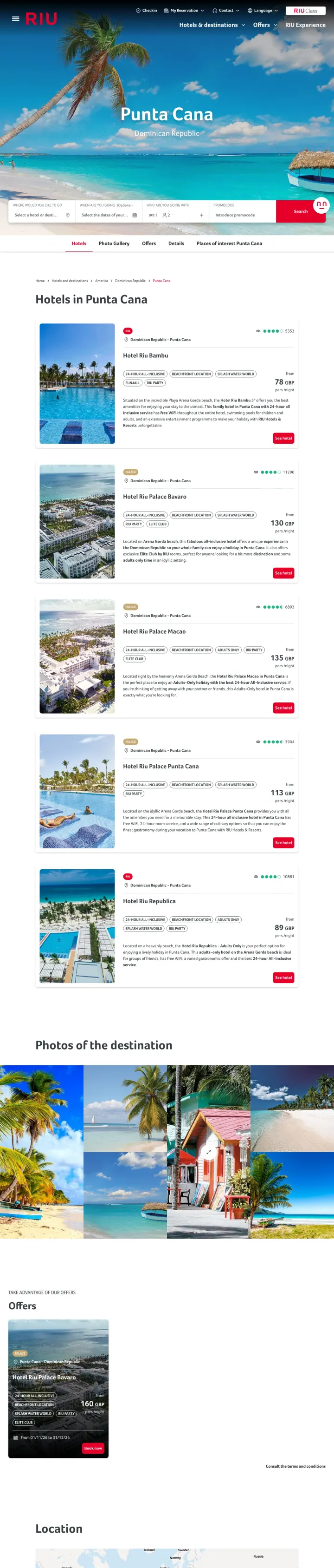
The ad targets 'all exclusive punta cana' and 'punta cana dr all inclusive resorts' (246,000 combined monthly volume) promising 'Lowest Price Anywhere,' but the landing page shows exactly one property at $442/night with no comparison options, no review scores, and no photos beyond a single thumbnail. When a visitor searches 'all inclusive resorts' (plural), they expect choice. Showing a single hotel with a cookie consent modal covering the viewport is paying premium CPCs for a bounce.
Cookie consent modal fills 80% of the viewport on first load with 'Your Privacy Choices' including toggles for Required, Functional, and Advertising cookies -- the actual hotel listing is completely hidden behind this modal
'Showing 1 hotel' for a search targeting 'all inclusive resorts in Punta Cana' means the visitor sees zero choice -- Hilton only has one all-inclusive property in Punta Cana, so this page can never satisfy the browsing intent that drove the search
No review score, no guest photos, no amenity highlights, no 'free cancellation' badge -- the single listing shows a thumbnail, a price ($442), and a 'Select Dates' button with no supporting information to justify the rate
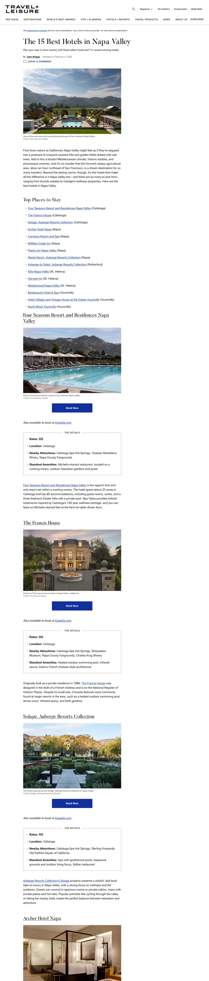
Travel + Leisure is paying for PPC clicks on 'best napa valley accommodations' to send visitors to an editorial article ('The 15 Best Hotels in Napa Valley') that contains affiliate links to Hotels.com and Expedia. The visitor pays T+L's CPC, reads a magazine-style review, then clicks an affiliate link to book on a different site. This is content arbitrage: T+L profits from the affiliate commission minus the CPC cost, but the landing page itself has no booking capability, no prices, and no conversion path beyond 'read and click an outbound link.'
Zero prices anywhere on the page -- each hotel gets a description, a photo, and a 'Book Now' button that links to Hotels.com, but the visitor never sees a rate before clicking away from T+L
The 'Book Now' buttons are affiliate links to Hotels.com/Expedia rather than direct booking -- the visitor who clicked a PPC ad expecting to book is actually 2 clicks and 1 site-change away from any booking action
Full editorial site navigation (Trip Ideas, Destinations, World's Best Awards, Tips + Planning, Hotels + Resorts, Travel Products, News, About Us, Subscribe) provides 8+ exit paths that have nothing to do with booking a Napa hotel
The strongest pages in this set show total package prices including flights ('4 Nights w/ Air from $839'). Hotel-only pricing forces the visitor to mentally add airfare and compare across tabs. All-in pricing eliminates that math and makes comparison shopping harder because each site bundles diff...
A 4.5-star rating means little without volume. Booking.com showing '8.1 from 2,128 reviews' and Sandals showing '10,557 Verified Reviews' communicate something a 5-star rating from 3 reviews never can: that thousands of people have already made this same decision and were satisfied. High review c...
The most effective non-OTA pages in this set own a specific niche rather than competing on hotel volume. Parksleepfly.com owns 'airport hotel + parking bundles.' Dayuse.com owns 'hourly hotel rooms.' Sandals owns 'adults-only all-inclusive Caribbean.' Each solves a problem that Booking.com and Ex...
Hotel searchers care deeply about proximity: how far from the airport, the beach, downtown. Pages that show a map with hotel pins above the fold (parksleepfly.com, dayuse.com, booking.com) let the visitor answer the location question visually without scrolling. Pages that bury or skip the map for...
Winners put the three things hotel searchers need in one viewport: a price, a review score, and a way to book. Losers send paid traffic to destination directories that list regions instead of hotels, editorial listicles with affiliate links instead of booking buttons, or pages so thin they show a single property for a search query that implies choice..