Free: 96 PPC tools + my AI Playbook book

These are real immigration law pages spending actual money on Google Ads right now.
From real immigration law Google Ads campaigns in the US
The landing pages actually worth stealing from
So you know exactly what to avoid
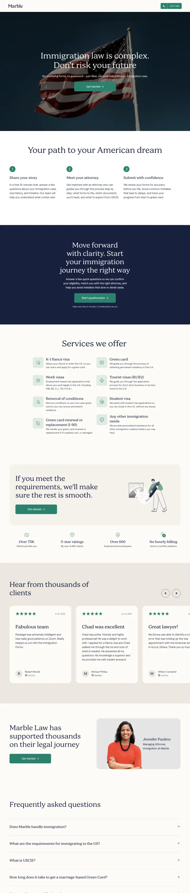
Open with a fear-based headline ('Immigration law is complex. Don't risk your future') paired immediately with the resolution ('No confusing forms, no guesswork -- just clear, personal help'). The headline names the exact emotion the visitor is feeling, then the subhead offers the antidote.
96.2% approval rate with transparent disclaimer creates the single most compelling trust signal possible in immigration law -- applicants care about outcomes above all else
3-step process (Share your story > Meet your attorney > Submit with confidence) reduces an overwhelming multi-month legal process into three digestible actions, with the first step framed as just '5 minutes or shorter'
Service grid showing every immigration case type (K-1 visa, work visas, removal of conditions, green card renewal, citizenship) with one-line descriptions lets visitors self-identify their situation without reading paragraphs of legal text
The page has duplicate content blocks -- the hero section and 3-step process both appear twice, suggesting a Builder.io CMS rendering issue that makes the page feel unfinished
No pricing information anywhere on the page beyond the $49 initial consult mentioned on the attorney-match page -- for a service that can cost $2,000-$10,000+, hiding total cost creates anxiety for price-sensitive immigration clients
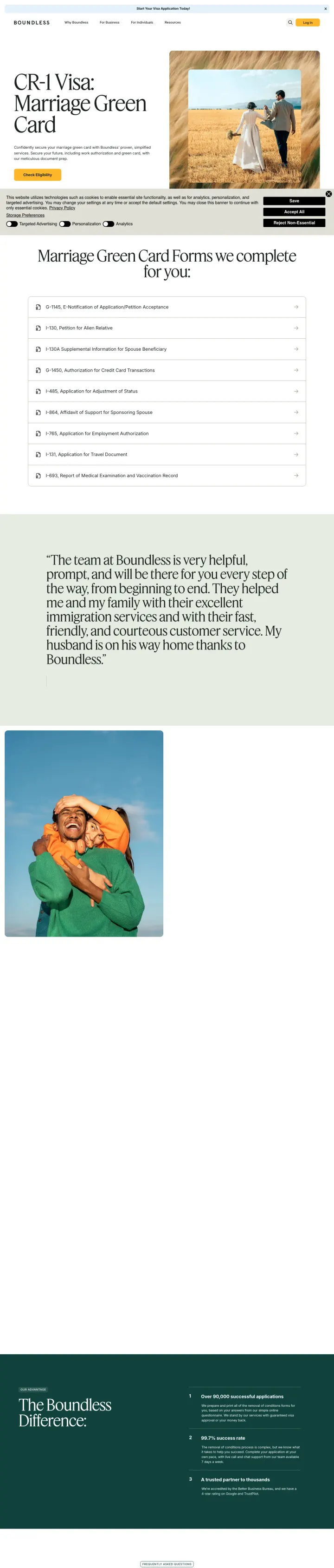
List every single government form you complete on the client's behalf by official form number AND plain-English name. This transforms 'we handle your paperwork' from a vague promise into a concrete, countable deliverable that justifies your fee.
9 USCIS forms listed by number with linked explanations (G-1145, I-130, I-130A, G-1450, I-485, I-864, I-765, I-131, I-693) -- this inventory approach makes the complexity of immigration visible, which justifies paying for help
Named customer testimonial ('My husband is on his way home thanks to Boundless' - Milena Radjenovich) tells the outcome story that matters most to marriage green card applicants: family reunification
'Check Eligibility' CTA is perfectly calibrated -- not 'hire us' or 'get a quote' but a zero-risk first step that feels like getting information rather than making a commitment
No pricing information anywhere -- for a service competing against DIY filing, not showing what Boundless costs forces visitors to leave and search for pricing reviews on Reddit
The 'Boundless Difference' section is a dark teal block with no visible differentiating content in the screenshot -- the most important positioning section appears to be hidden or collapsed
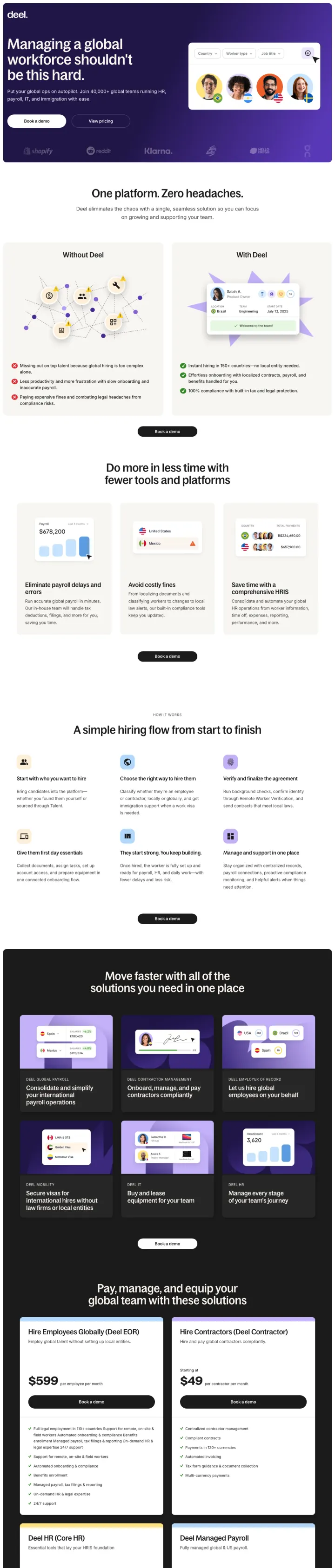
Reframe the problem before pitching a solution. Deel opens with 'Your team is probably juggling up to 16 disconnected tools' before mentioning product features. That tool count is a specific, diagnosable pain that B2B immigration buyers recognize instantly, so the reader is nodding by the time the platform shows up.
Problem-naming headline that gives the visitor a specific number to latch onto (16 disconnected tools) instead of generic 'streamline your workflow' copy everybody skims past
4.8 out of 5 with 5,665 reviews placed inline with the first CTA, so the social proof reinforces the click decision at the exact moment hesitation peaks
Dual CTA pair ('See it in action' + 'View pricing') that lets demo-seekers and price-seekers self-segment without forcing either into a sales call
Hero copy repeats itself verbatim within the same fold, a rendering bug that makes the page feel unpolished on a first scroll
Immigration-specific value proposition is buried inside the general platform pitch, so a searcher who clicked on an H-1B ad has to hunt to confirm they are in the right place
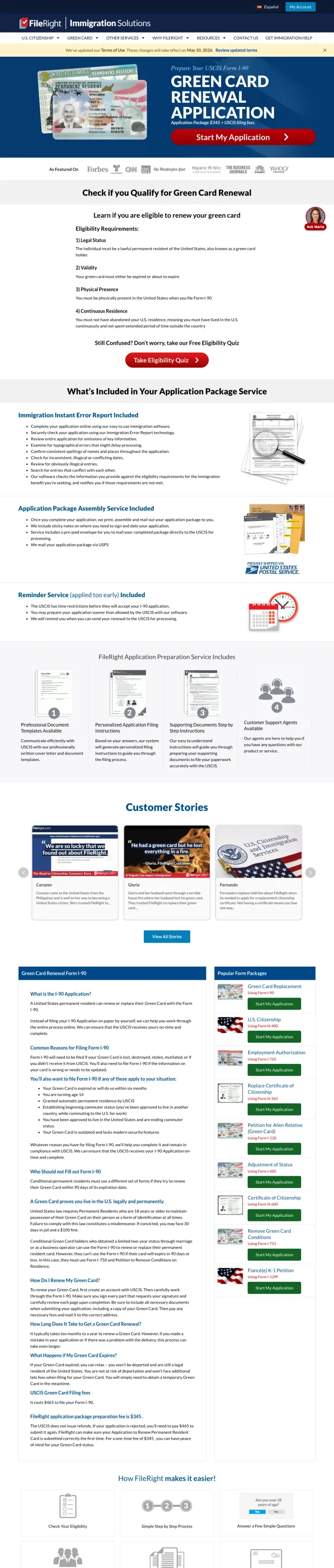
Publish the exact package price in the hero. FileRight opens with 'Application Package $345 + USCIS filing fees' before any benefit copy, which removes the top anxiety for renewal shoppers (what does this cost?) in the first three seconds and disqualifies price-sensitive bounces before the scroll.
Transparent price ($345 + USCIS fees) stated in the first paragraph, converting the highest-intent traffic immediately while filtering out low-budget shoppers who would have wasted the sales team's time anyway
Eligibility quiz repeated twice on the page with its own CTA ('Take Eligibility Quiz'), so uncertain visitors have a lower-friction on-ramp than the $345 package button
'As Featured On' press logo strip above the fold that borrows credibility from recognizable media brands, which matters in a vertical where trust is the conversion lever
Three separate CTAs fight for attention in the hero (Start My Application, Take Eligibility Quiz, plus an embedded quiz form), and a first-time visitor cannot tell which path is right for them
Eligibility requirements are written as numbered rules without any visual cue about which ones most applicants fail, so a qualified renewer has to read all three to know they are in the right place
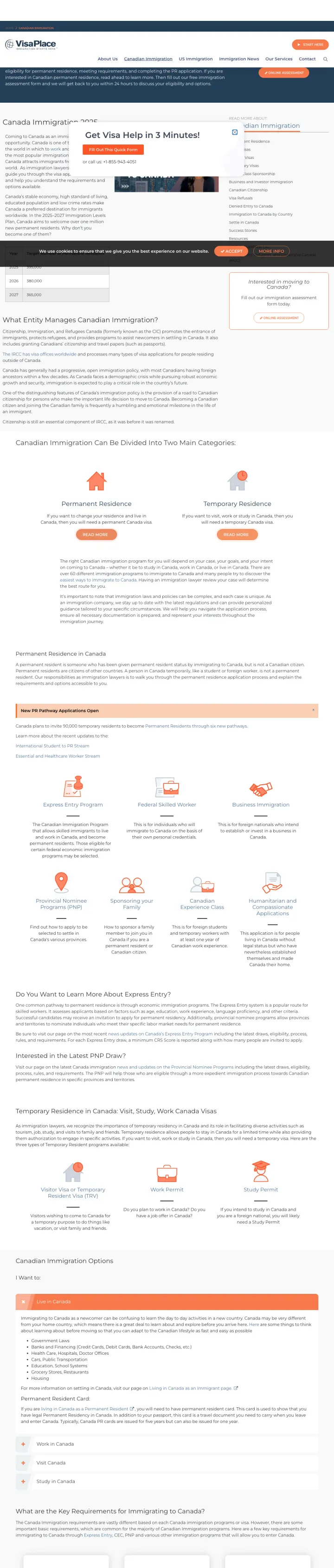
Segment above the fold, not behind a form. VisaPlace hands the visitor a two-by-two grid (Individuals vs Businesses, Canada vs US) at the top of the page, so a searcher who clicked a generic 'immigration' ad can funnel themselves into the right funnel in one click before reading any copy.
Audience-and-destination grid as the primary hero, replacing a single one-size-fits-all CTA. This keeps the page usable for both the self-represented applicant and the corporate HR buyer without splitting the ad budget into four separate landing pages
Free online assessment is framed as the entry action rather than a consultation call, lowering the commitment threshold compared to the typical 'Book a consultation' pattern most immigration firms default to
Dedicated 'I am an individual' and 'I am a business' rows below the grid reinforce the segmentation a second time, so skimmers and readers both get the same self-selection prompt
Four parallel CTAs compete for attention with near-identical styling (same orange button, same icon treatment), which means decision fatigue hits before the first click
No trust signals above the fold - BBB ratings, attorney credentials, or case outcomes all live below the segmentation grid where bouncers will never see them
Pages that break the playbook in interesting ways
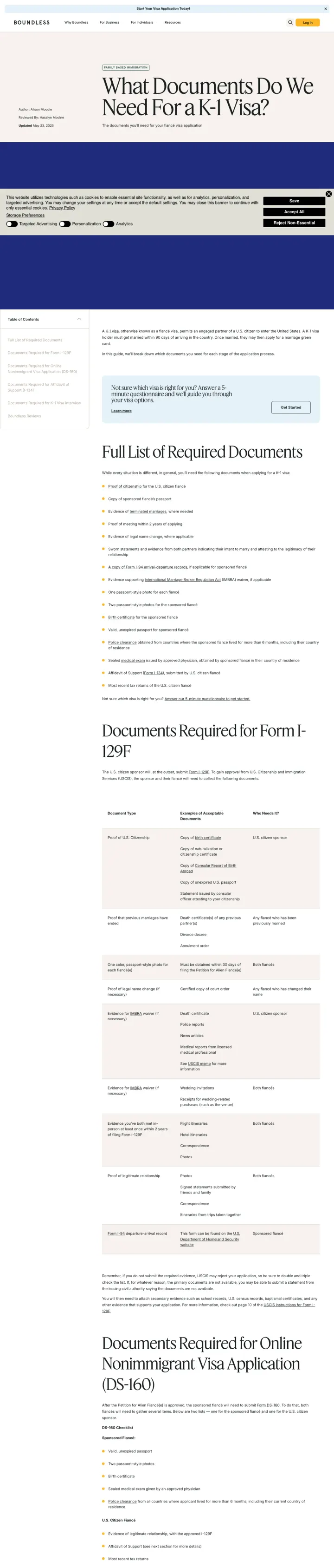
Create an exhaustive document checklist for your most common case type, organized by filing stage. Boundless turns 'what documents do I need for a K-1 visa?' into a detailed resource that establishes expertise and naturally funnels readers to their paid service when the complexity becomes overwhelming.
Stage-by-stage document organization (Online Nonimmigrant Visa Application DS-160 > Affidavit of Support I-134 > K-1 Visa Interview documents) mirrors the actual filing process, so visitors can see exactly where they are and what comes next
The page answers the exact search query ('K-1 visa requirements Philippines') with specific, actionable information rather than generic 'contact us to learn more' deflections -- this builds trust before asking for the sale
Related resources and 'Boundless Reviews' sections at the bottom provide social proof and cross-linking without interrupting the educational content flow
This is a content/SEO page being used as a PPC landing page -- there is no above-fold CTA, no pricing, and no clear conversion path until the visitor scrolls past 1,000+ words of document requirements
The page assumes readers already know what a K-1 visa is -- no introductory context for visitors who searched 'fiance visa' rather than the specific form number
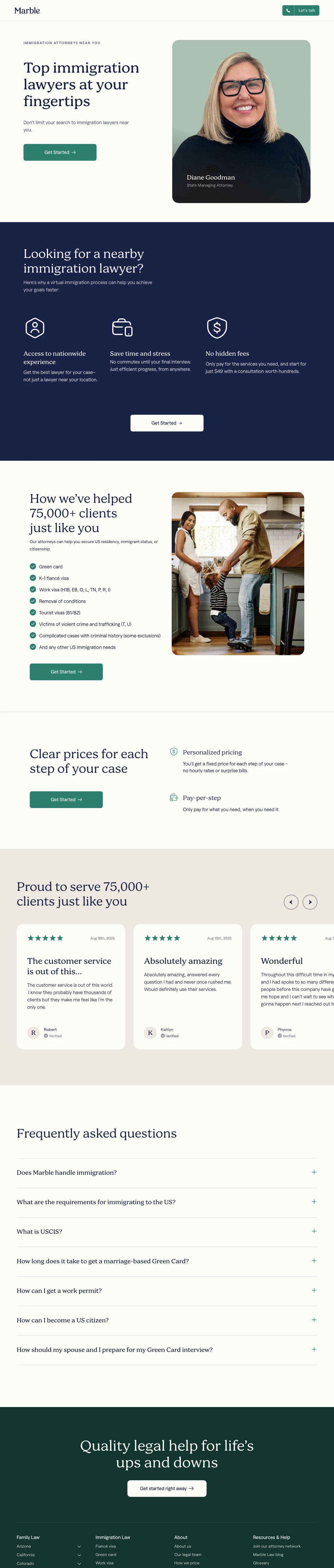
Show 10+ named attorneys with professional headshots and titles in a scrollable grid above the fold. For immigration clients who are trusting their future to a stranger, seeing real faces with real names immediately differentiates you from faceless legal marketplaces.
Grid of 12+ named attorneys with headshots and titles (Principal Attorney, State Managing Attorney) gives the impression of a large, well-resourced firm even though Marble is a tech platform -- the volume of attorneys signals capacity and coverage
'Top immigration lawyers at your fingertips / Don't limit your search to immigration lawyers near you' directly challenges the assumption that you need a local attorney, opening up the addressable market for a virtual-first law firm
Transparent pricing section with per-step pricing eliminates the billable-hour anxiety that prevents many immigration clients from even calling a lawyer
The page headline in the viewport is the attorney's name (Jeffrey Pollak) rather than a value proposition -- visitors from 'immigration attorney near me' searches need to see 'immigration attorney' in the headline, not a name they do not recognize
The attorney grid takes up the entire above-fold area with no CTA visible until scrolling past all 12 attorney photos -- the conversion action is buried below the directory
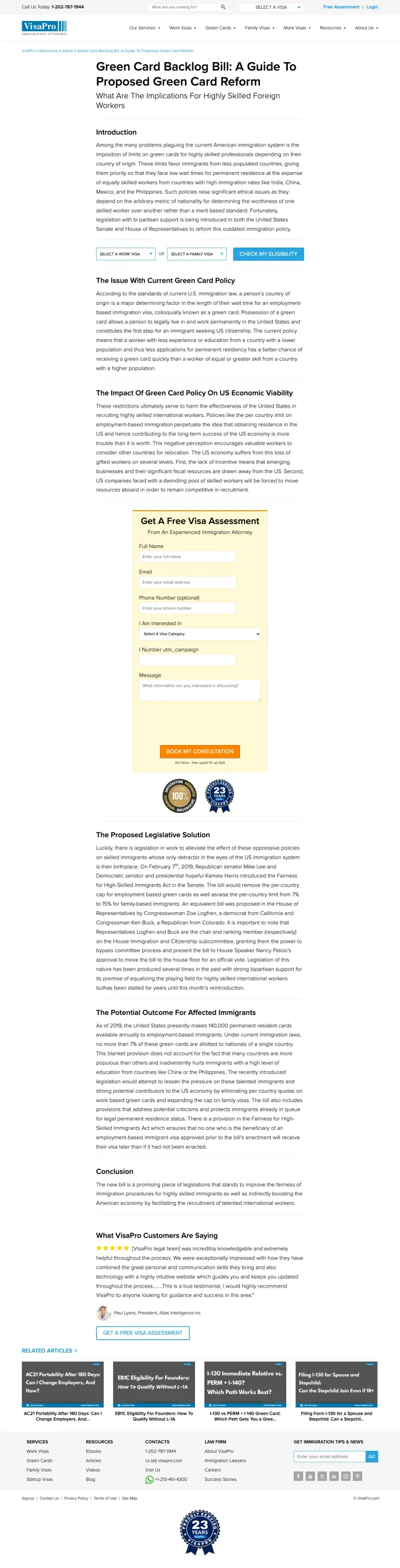
Try the article-as-landing-page for educated, high-intent searches. VisaPro drives paid traffic to a long-form piece on pending green card legislation, then floats a 'Get A Free Visa Assessment' sidebar form throughout the scroll. For skilled foreign workers researching policy before committing to an attorney, the content itself becomes the credibility proof.
Long-form policy article framed as the hero, with the conversion form living in a sticky sidebar rather than as a hero CTA. The depth signals expertise in a way that a typical hero-plus-form page cannot match
Visa-type dropdown pinned in the sidebar lets an informed reader route themselves to the right service path without scrolling back to a navigation menu
Author attribution and publication framing make the page feel like journalism, which disarms the reader's defense against sales pitches and keeps them scrolling
Primary CTA is buried in the sidebar and competes with the article body for attention, so scan readers may never see it
Article was written for a past legislative moment, so readers who arrive on an evergreen 'green card' keyword may land on stale context that undermines the firm's authority
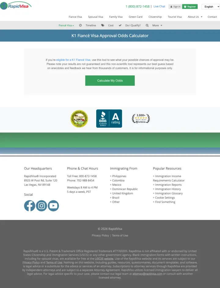
Replace 'Book a consultation' with 'Calculate my odds'. RapidVisa's hero is a multi-step quiz (country of foreign fiance, age gap, relationship length, number of in-person meetings) that returns a personalized approval-odds score, converting the searcher into a qualified lead before a sales rep is ever involved.
Interactive quiz as the hero lets a nervous applicant test their case against common rejection patterns, which is a far more engaging entry point than a contact form for this emotionally loaded decision
Question set encodes the actual K-1 approval criteria (age gap, relationship length, in-person meetings, shared language) so the quiz both qualifies the lead and educates the applicant, two conversion goals in one flow
Disclaimer about the tool being 'non-scientific' and based on anecdotal customer data makes the calculator feel honest rather than manipulative, which builds trust in a market where scam services are a real concern
Hero is almost all text with no visual framing around the calculator, so a skimming visitor may not realize the page is interactive until they scroll and read the questions
Trust badges (BBB, 3,000+ five star reviews) live in a small strip below the quiz, far from the first decision point. Moving them above the calculator would reinforce credibility at the exact moment of commitment
2 pages burning ad spend with fundamental issues
Every click to these pages costs real money. We found broken trust signals, mismatched intent, weak CTAs, and messaging that ignores what the searcher actually typed. Here is what to avoid.
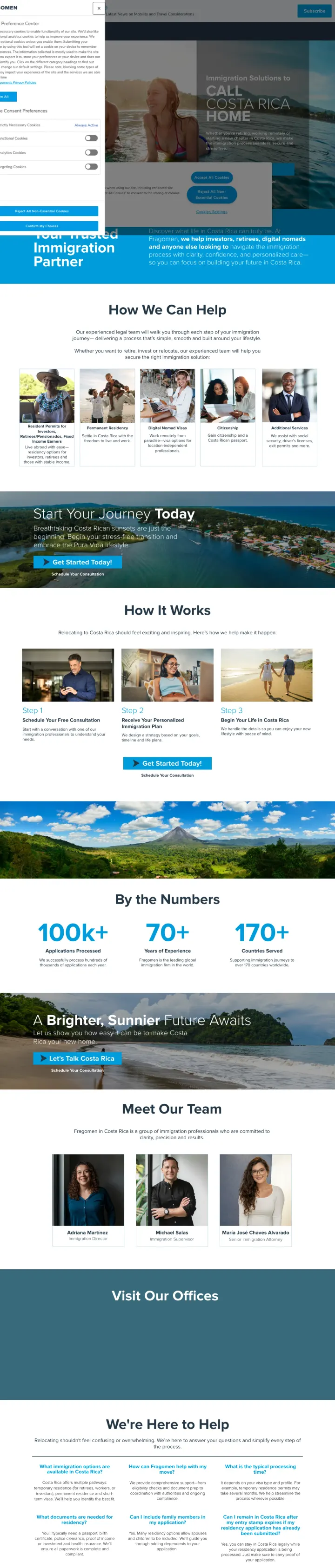
The ad targets 'how to get a work visa in costa rica' but the landing page is Fragomen's global corporate homepage featuring a news ticker about Saudi Arabian labor law, Spanish immigration regulations, and Australian legal awards. Zero mention of Costa Rica work visas above the fold. The visitor who searched for help getting a Costa Rica work permit lands on a page about Middle East mobility updates. Every click at immigration law CPCs ($15-40) pays for a bounce.
The URL path says 'costa-rica-private-client' but the page content is a global corporate homepage with zero Costa Rica content -- this is likely a broken redirect from a site migration
A scrolling news ticker dominates the top of the page with updates about Saudi Arabia, Spain, and Australia -- none relevant to Costa Rica work visa seekers
No contact form, no 'get started' CTA, no pricing, no process steps -- the only action a visitor can take is browse news articles about countries they did not search for
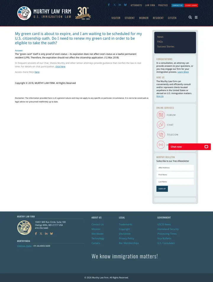
Broad green card keywords are sent to an eight-year-old single-question FAQ with no service pitch, no pricing, and no conversion CTA beyond a newsletter signup.
Page is a single-question FAQ from 2018 ('My green card is about to expire') with a 2026 copyright, sold as a landing page for broad green card keywords. There is no value proposition, no service pitch, and no price discussion
Primary content is 200 words of narrow FAQ text, but the sidebar carries a generic newsletter signup and forum links rather than a green card consultation CTA
Zero social proof, zero case results, zero attorney bios above the fold. The firm's credibility depends entirely on the Murthy name being recognized, which most paid traffic will not
Four of the ten pages either state a flat package fee (FileRight $345, Marble $49) or disclose tiered pricing (Deel) above the fold. The pages that hide pricing behind a contact form (VisaPlace, Fragomen) under-perform on trust signals because immigration buyers read 'call for quote' as 'this wil...
RapidVisa and FileRight both lead with quizzes (approval odds, eligibility check) instead of consultation-booking CTAs. For a searcher whose biggest fear is making a mistake that gets their case denied, an interactive self-diagnostic converts better than 'book a call' because it rewards the click...
VisaPlace uses a four-cell grid (Individual vs Business, Canada vs US) as its hero, letting a visitor who clicked a generic 'immigration' ad route themselves in one click. Firms bidding on broad immigration terms without a segmentation play in the hero are forced to pay for clicks from both H-1B ...
VisaPro drives paid traffic to a 2,000-word explainer on pending green card reform, with a sidebar assessment form. For a skilled foreign worker researching policy before hiring counsel, the content depth itself functions as the credibility pitch. This only works when the underlying content is ge...
Winners reward the click with a specific, personalized next step (a quiz, a price, a segmentation path). Losers drive paid traffic to legacy SEO pages (Murthy's 2018 FAQ, Fragomen's sitemap crumb) that were never designed to convert traffic and leave the visitor wondering what they are supposed to do next..