Free: 96 PPC tools + my AI Playbook book

These are real internet & telecom pages spending actual money on Google Ads right now.
From real internet & telecom Google Ads campaigns in the US
The landing pages actually worth stealing from
So you know exactly what to avoid
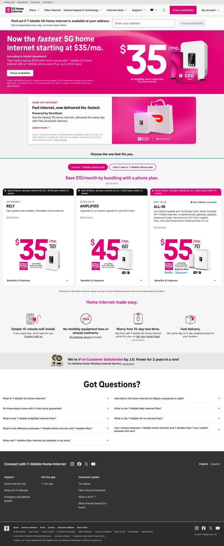
Lead with a bold price anchor ('Starting at $35/mo') in oversized type on a brand-color background, then immediately show three plan tiers with speed, price, and included features in a tabbed comparison. T-Mobile makes the cheapest plan look like a great deal while steering visitors to higher tiers with 'Most Popular' badging.
'Now the fastest 5G home internet' claim positioned as a factual statement (not 'we think' or 'we believe') paired with '$35/mo' creates the strongest speed-for-price value proposition in the dataset
Three plan tiers (RELY $35 / AMPLIFIED $45 / ALL-IN $55) with tabbed comparison showing exactly what each tier includes -- the visitor can compare in 5 seconds without reading paragraphs
'We're #1 in Customer Satisfaction by J.D. Power for 5 years in a row' banner with the J.D. Power badge is the most credible third-party validation in the dataset -- no ISP can fake a J.D. Power ranking
The address check is buried below the plan comparison -- for a service that is location-dependent, not knowing whether T-Mobile 5G is available at your address before seeing plans creates potential disappointment
The page is long and content-rich, with FAQ, articles, and additional product information that may distract from the core conversion (sign up for a plan)
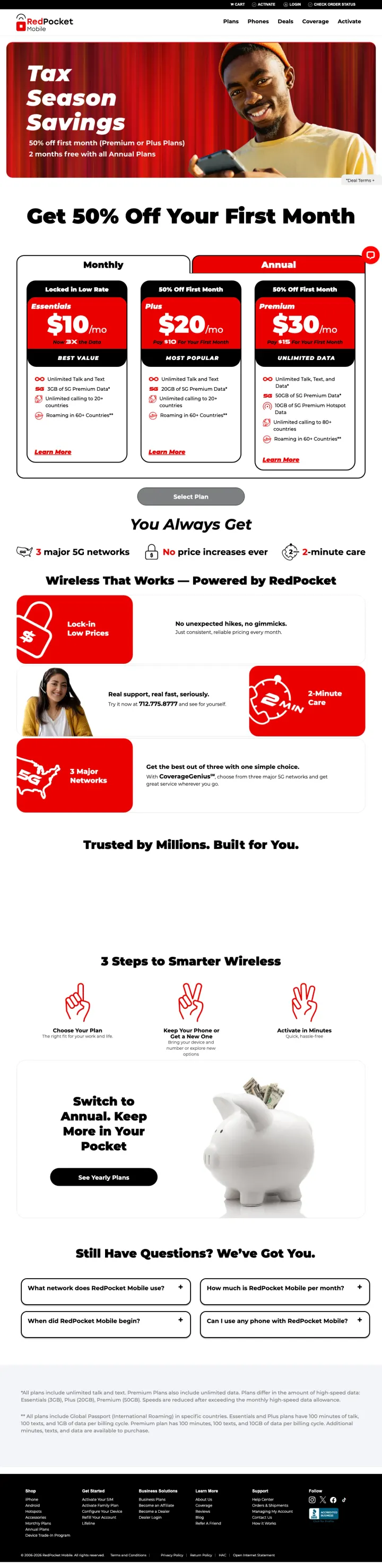
Open with a seasonal promotion banner ('Tax Season Savings -- Get 50% Off Your First Month') in bold red, then show three plans starting at $10/mo. Red Pocket makes the price the hero and the carrier network coverage the supporting proof ('1 major 5G network, All phone brands accepted').
'Get 50% Off Your First Month' seasonal promotion creates urgency in a low-urgency category -- people do not wake up thinking 'I need a new phone plan' but they do respond to time-limited savings
Three plan cards ($10/$20/$30) with exact data amounts (3GB/8GB/Unlimited) are the simplest possible comparison -- no confusing tier names, no hidden features, just data and price
'3 Steps to Smarter Wireless' (Choose your plan > Activate > Save) reduces switching anxiety by showing how simple the process is
The red-heavy color scheme with promotional banners can feel aggressive and sale-focused, which may undermine trust for visitors who associate deep discounts with inferior service
The 'Switch to Annual, Keep More in Your Pocket' section mid-page introduces a different pricing model that may confuse visitors who just chose a monthly plan above
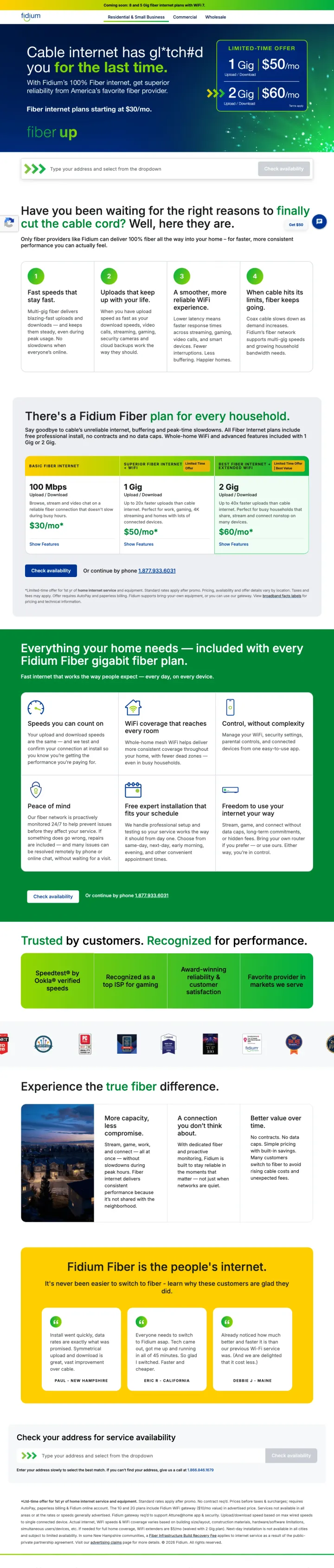
Open with a competitor attack headline ('Cable internet has ghosted you for the last time') that names the exact pain point (unreliable cable), then immediately show three fiber plans with speeds and included features. Fidium positions fiber as the escape from cable, not just another internet option.
'Cable internet has ghosted you for the last time' headline is emotionally resonant for anyone who has experienced cable outages, speed drops, or price increases -- it validates frustration before offering the solution
Three plan tiers (1 Gig / 2 Gig / 5 Gig) shown with 'Starting at' pricing and clear feature lists -- the tiered approach lets visitors self-select based on their speed needs
'Included with every Fidium Fiber gigabit fiber plan' section lists no contracts, no data caps, free professional install, whole-home WiFi -- these are the anti-cable differentiators in a single scannable list
The pricing is not visible on this page ('no-price' in the URL suggests this is a variant without pricing) -- this forces visitors to click through to see costs, adding friction to the decision process
The dark blue/green gradient hero with text overlay can feel heavy on smaller screens and the text contrast is not ideal
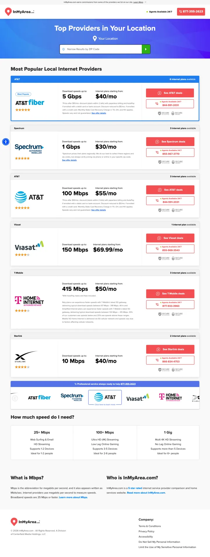
Show every ISP available at the visitor's location in a single ranked list with provider logo, speed, price, and star rating. InMyArea eliminates the need to visit 5 different provider websites by aggregating the comparison on one page.
Provider comparison cards showing logo + speed (5 Gbps) + price ($40/mo) + star rating in a consistent format let visitors compare all local options in 10 seconds
'Top Providers in Your Location' headline with location auto-detection personalizes the page before the visitor types anything
'How much speed do I need?' section with use-case benchmarks (25+ Mbps for streaming, 100+ Mbps for gaming, 1 Gig for large households) helps visitors self-diagnose their speed requirements
The 'Get MY Deal' red CTA buttons on each provider card may feel pushy and affiliate-driven, undermining the editorial credibility of the comparison
The page may show providers that are not available at every address within the geo-targeted area, creating frustration when visitors click through and discover unavailability
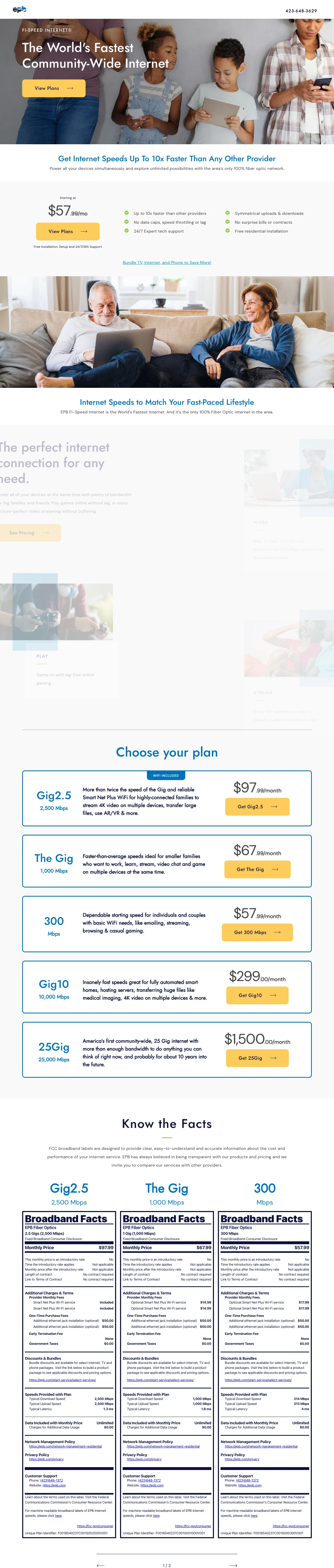
Show three internet plans in a clean comparison table with speed, price, and a 'best for' description for each. EPB's approach is straightforward: here are your three options, here is what each costs, pick one. The simplicity works because EPB is a municipal utility with built-in community trust.
Three-plan comparison (Fi Speed / Fi Plus / Fi Pro) with clear speed tiers and pricing makes the decision simple and scannable
'Choose the Best Plan' section with use-case descriptions ('Best for browsing and email' / 'Best for streaming and gaming' / 'Best for power users') helps visitors self-select without understanding technical specs
Community positioning as Chattanooga's municipal fiber provider creates a trust advantage that commercial ISPs cannot replicate -- EPB is owned by the city, not by shareholders
The page design is clean but unremarkable -- the yellow and blue palette feels more like a utility company than a modern internet provider
Limited social proof or third-party validation -- no speed test results, no awards, no customer reviews on the page
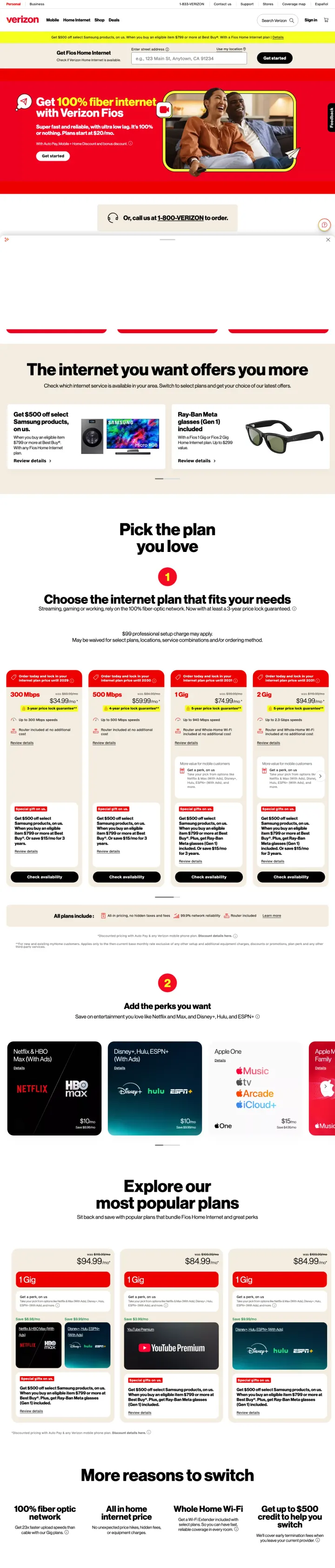
Put the address availability check as the first interaction above the fold with "Check if Fios Home Internet is available" and auto-populated address suggestions. Then show "Plans start at $20/mo" as the price anchor. The address check qualifies the visitor before they invest time researching plans.
Address auto-complete with "Check availability" button is the first and only interaction above the fold. This filters visitors immediately: if Fios is available at their address, they continue. If not, they leave before wasting time.
"Get 100% fiber internet with Verizon Fios" headline makes the technology claim specific and verifiable, unlike vague "fast internet" claims from competitors
"Plans start at $20/mo" price anchor is lower than any competitor in the dataset, creating immediate price leadership
The $20/mo price requires fine print research to understand the actual cost (equipment fees, taxes, autopay discount), which may feel like bait pricing
The lifestyle hero image (couple on couch) is generic stock photography that does not communicate "fiber internet" or differentiate from any other ISP
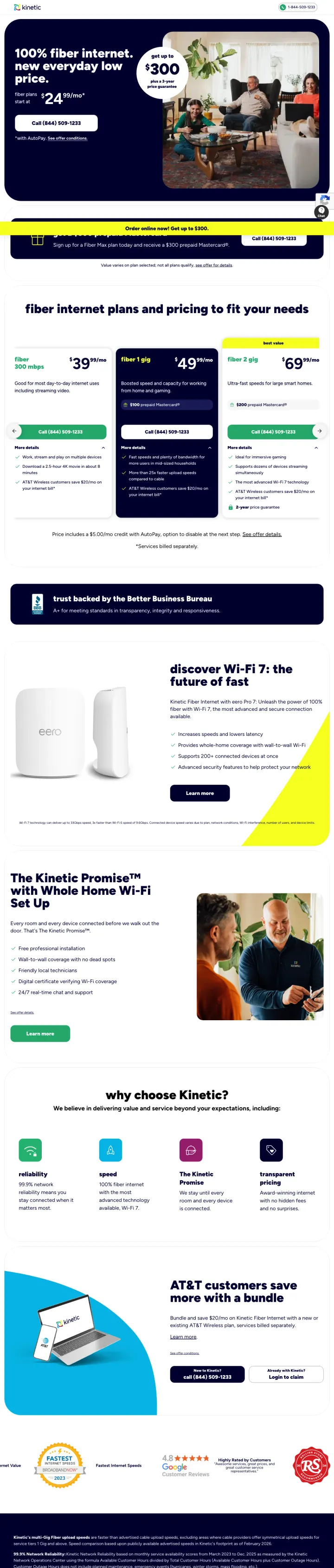
Stack three value propositions in the hero: lowest price ($24.99/mo), cash incentive ($300), and price guarantee (3 years). GoKinetic fits all three into the above-fold experience with "100% fiber internet. new everyday low price." followed by the price, then the $300 badge, then the guarantee callout.
"Get up to $300 plus a 3-year price guarantee" badge next to a lifestyle family photo creates both immediate incentive (cash) and long-term trust (price will not change)
$24.99/mo price with "new everyday low price" framing positions this as a permanent price reduction, not a promotional rate that will increase after 12 months
Phone number (844-509-1233) prominently displayed with "Call" CTA button above the fold serves visitors who prefer phone ordering
The "*with AutoPay" asterisk on the price means the advertised $24.99 requires automatic payment enrollment, which some customers distrust
The lifestyle family photo (living room scene) is generic and could be any ISP's ad. A speed test screenshot or fiber installation photo would be more relevant.
No plan comparison visible above the fold. Visitors who want to compare speed tiers must scroll.
Pages that break the playbook in interesting ways
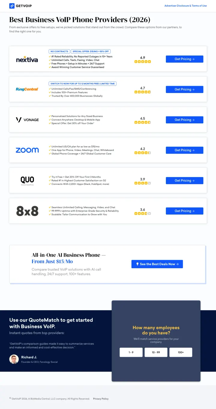
Show the top 6-8 providers in a ranked comparison list with ratings, key features, and 'Get Pricing' CTAs, then offer a QuoteMatch tool that matches businesses to providers based on employee count. GetVoIP combines editorial comparison with lead generation in a format that serves both research and purchase intent.
Ranked provider list (Nextiva 4.7, RingCentral 4.7, Vonage 4.5, Zoom 4.3) with star ratings and 2-line feature summaries gives visitors an instant overview of the market
'All in One AI Business Phone -- From Just $15/Mo' aggregated offer card presents the category value proposition separate from any single provider
QuoteMatch lead gen tool ('How many employees do you have?') captures business size data that qualifies the lead and enables provider matching -- this data makes the lead more valuable than a generic contact form
The comparison list is dense and may overwhelm visitors who just want a recommendation -- 'which one should I pick?' is not immediately answered
The QuoteMatch tool at the bottom may not be reached by visitors who find what they need in the comparison list above
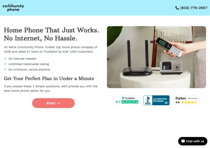
Strip your landing page down to a single headline ('Home Phone That Just Works. No Internet, No Hassle.') and a quiz-start button. Community Phone shows that for a niche product with a clear audience (people who want a landline without internet), the product description can be the page.
'Home Phone That Just Works. No Internet, No Hassle.' is one of the clearest value propositions in the entire dataset -- in 8 words, it says what the product is, what makes it different, and why you want it
'Get Your Perfect Plan in Under a Minute' with a 'Start' CTA turns plan selection into a quiz experience rather than a comparison table, which may work better for the older demographic that buys landline phones
Forbes, Trustpilot, and Consumer Affairs logos provide third-party credibility for a brand most visitors have never heard of
The page is so minimal that visitors who want more information before committing have nowhere to go -- no pricing, no plans, no FAQ visible
The chat widget in the corner is the only alternative to the quiz, which may not serve visitors who prefer to browse at their own pace
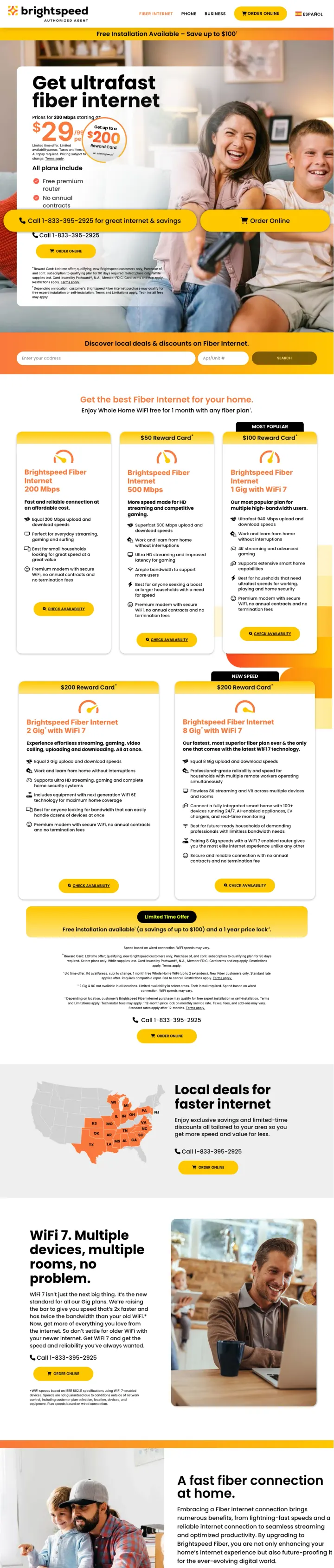
Why This Is Interesting: This is an authorized agent/reseller page, not the official Brightspeed site. The "AUTHORIZED AGENT" label in the header signals this is a sales channel partner, yet the page executes better than many official carrier pages. The aggressive stacking of three offers ($29/mo + $200 reward card + free installation) with prominent phone number and "Order Online" button creates a conversion-optimized experience.
Three-incentive stack ($29/mo price + $200 reward card badge + "Free Installation Available - Save up to $100" banner) gives the visitor three separate reasons to act now, each addressing a different objection (monthly cost, switching cost, setup cost)
"No annual contracts" with red checkmark below the price directly addresses the #1 ISP trust issue. Positioned next to the price, it turns the price into a no-risk commitment.
Phone number CTA ("Call 1-833-395-2925 for great internet & savings") uses the word "savings" to reinforce the deal in the CTA text itself
"AUTHORIZED AGENT" label may reduce trust for visitors who expected to land on the official Brightspeed website. The visitor may wonder if this is a legitimate channel.
The yellow and white color scheme with the Brightspeed dots logo is cheerful but the page feels like it is trying too hard to sell, with multiple offers competing for attention
No address availability check above the fold, which means visitors may get excited about the price before discovering Brightspeed does not serve their area
3 pages burning ad spend with fundamental issues
Every click to these pages costs real money. We found broken trust signals, mismatched intent, weak CTAs, and messaging that ignores what the searcher actually typed. Here is what to avoid.
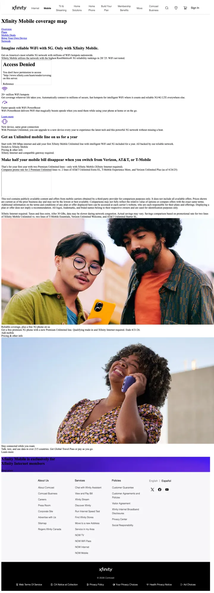
The page targets 'Xfinity mobile in Mexico' (SV: 110) and similar mobile coverage queries, but the landing page displays an 'Access Denied' error where the coverage map should be. The rest of the page contains promotional content about Xfinity Mobile deals, but the core feature the visitor searched for (coverage information) is broken. At Xfinity's CPCs, paying for clicks to a partially broken page is pure waste.
'Access Denied' error displayed where the interactive coverage map should be -- the primary reason for the visit is broken
The page defaults to promotional content around the broken map, creating a confusing experience where the visitor sees deals but cannot check if Xfinity Mobile is available in their area
Full site navigation with links to Internet, TV, Mobile, and other Xfinity products provides multiple exit paths from the paid landing page
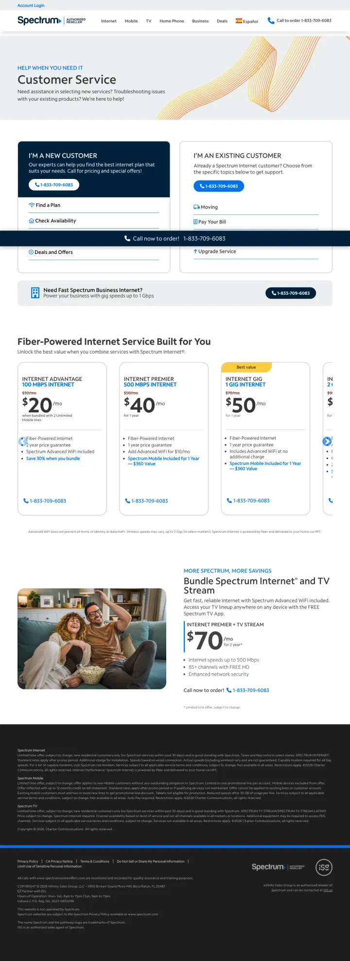
This page targets 'spectrum san antonio customer service' (SV: 590) and lands on a page that splits between 'I'm a New Customer' and 'I'm an Existing Customer.' The page is confused about who it serves. The new customer section shows internet plans ($20/$40/$50) which is functional, but the page title and framing ('Customer Service') signals support, not sales. Visitors searching for customer service are existing customers with problems, not new customers ready to buy.
The page serves two completely different audiences (new customers and existing customers seeking service) which dilutes the conversion experience for both
'Customer Service' as the page title and H1 positions this as a support page, not a sales page -- new customers who land here feel they are in the wrong place
The 'I'm an Existing Customer' section with password recovery and troubleshooting takes up significant page real estate that could be used for acquisition content
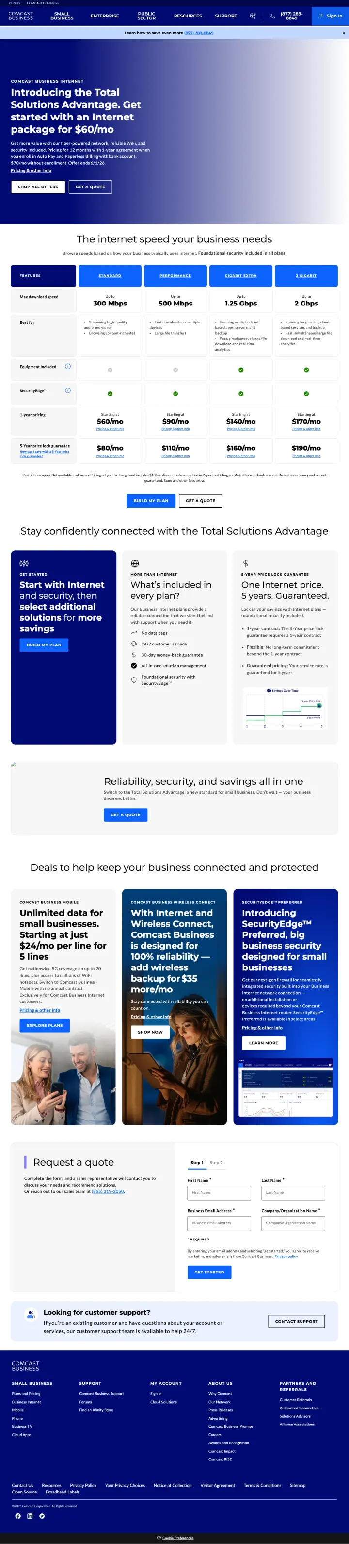
This page targets "fiber optic isp" (SV: 47,690) and delivers a page titled "Introducing the Total Solutions Advantage" with dense paragraph text about "fiber-powered network, reliable WiFi, and security included." The $60/mo price exists but is embedded in a paragraph rather than displayed as a visual anchor. For a visitor comparing fiber ISP options across 3-5 tabs, the page requires reading comprehension rather than scanning. At business internet CPCs ($15-30), every click pays for a visitor to parse corporate marketing copy.
"Total Solutions Advantage" headline is corporate jargon that communicates nothing to a visitor scanning for speed and price
$60/mo price is embedded in a paragraph rather than displayed as a visual anchor. The visitor comparing ISPs across tabs will miss it.
Dual CTAs ("SHOP ALL OFFERS" + "GET A QUOTE") compete with each other and do not indicate which path is faster or simpler
The most effective ISP landing pages lead with an address input field rather than plan details. InMyArea, Fidium Fiber, and Brightspeed all open with 'Enter your address' or 'Check availability.' This works because internet service is location-dependent: showing plans the visitor cannot actually ...
Every winning page shows plans as speed (Mbps/Gbps) paired with monthly price in a side-by-side comparison. T-Mobile shows three tiers, EPB shows three plans with speed and price. Internet is a commodity purchase where the decision comes down to 'how fast and how much.' Pages that lead with brand...
Regional ISPs differentiate from tier-1 carriers by emphasizing what they do NOT do: no contracts, no price increases, no equipment fees, no data caps. Fidium Fiber leads with 'Cable internet has ghosted you for the last time' and promises no contracts. GoKinetic highlights '24-month price lock.'...
InMyArea shows multiple ISPs with speeds, prices, and ratings on a single page. GetVoIP does the same for business VoIP providers. These marketplace pages capture visitors in research mode who want to see all options at once. The marketplace model works because internet shopping is inherently com...
Winners show speed and price for every plan at a glance, start with an address availability check to qualify the visitor, and differentiate with no-contract/price-lock guarantees. Losers send paid internet traffic to corporate information pages, coverage maps with access-denied errors, or customer service pages that assume the visitor is already a customer..