Free: 96 PPC tools + my AI Playbook book

Landscaping is visual. If your landing page doesn't have real before-and-after photos of actual projects you've done, you've already lost to the competitor who does. This is the one industry where the portfolio IS the sales pitch. Everything else is just supporting evidence.
From real landscaping & lawn care Google Ads campaigns in the US
The landing pages actually worth stealing from
So you know exactly what to avoid
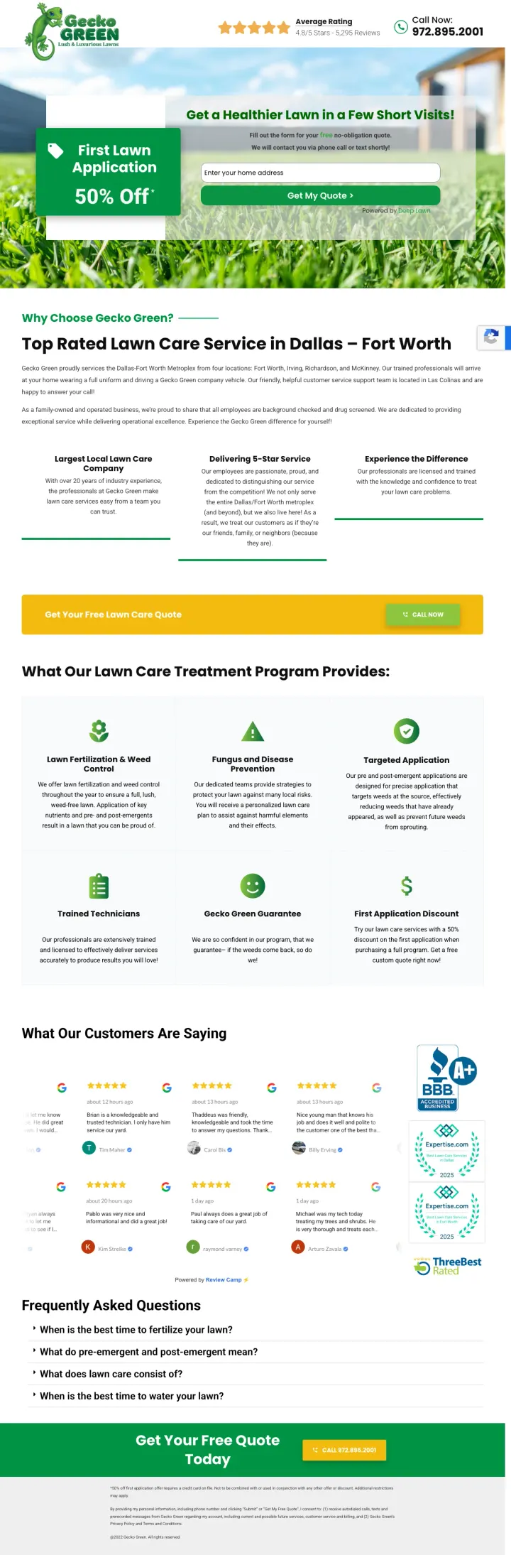
Lead with a specific percentage discount on the first application above the fold, paired with a single-field address form -- the discount gives urgency and the address form feels effortless compared to name/phone/email forms.
50% off first lawn application as a tag-shaped callout to the left of the form creates a visual anchor -- the eye hits the discount before the form, so filling in the address feels like claiming a deal rather than requesting a sales call
4.8/5 stars from 5,295 reviews in the header bar gives instant credibility without taking up hero space -- the review count (not just the star rating) signals volume that a local competitor cannot fake
Seasonal treatment breakdown (fertilization, weed control, fungus prevention, targeted application) shows exactly what the homeowner gets across the year. Annual plans die on ambiguity, and a month-by-month schedule is the easiest way to kill the 'I do not know what I am paying for' objection
The form is powered by 'Deep Lawn' (third-party tool) which adds a trust question -- am I giving my address to Gecko Green or to some other company?
No project photos anywhere on the page -- for a service where 'can I see your work?' is the #1 customer priority, this page relies entirely on the discount to convert
FAQ section at the bottom is thin (4 questions) and misses the most common lawn care objection: 'what if the treatment kills my grass or hurts my pets?'
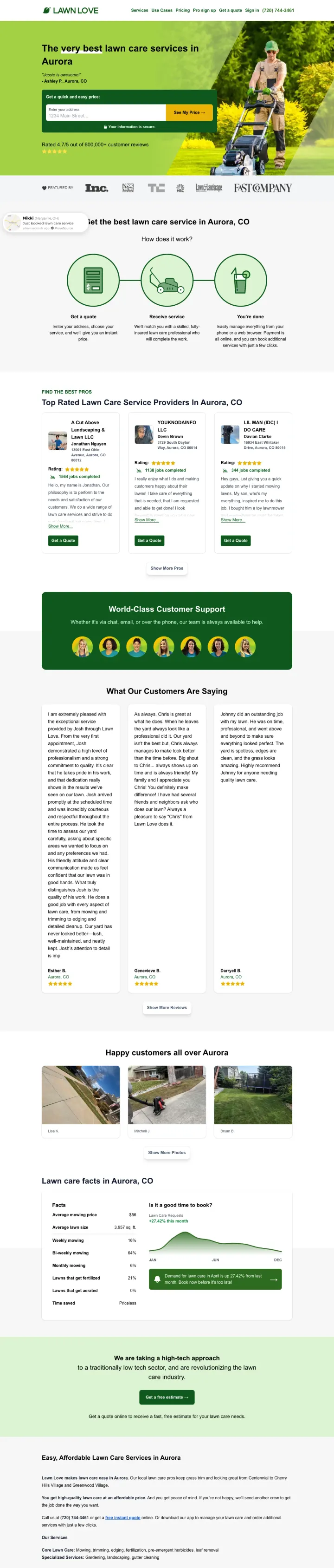
Let visitors enter their address and see a price in under 10 seconds, then display a named customer review from the same city immediately below the form -- the local testimonial plus instant price together remove both the cost and trust barriers simultaneously.
'See My Price' as CTA copy is psychologically different from 'Get a Quote' -- it implies the price already exists and the visitor is simply revealing it, which removes the fear of a sales call or negotiation process
Named customer testimonial ('Jessie is awesome!' - Ashley P., Aurora, CO) directly below the headline with the same city name as the page -- city-matched social proof feels personal rather than generic
4.7/5 from 600,000+ customer reviews is a volume number that no local competitor can match -- it positions Lawn Love as a platform with marketplace-scale trust rather than a single crew that might ghost you
Full site navigation (Services, Use Cases, Pricing, Pro sign up, Sign in) provides exit paths from a page receiving paid traffic -- every nav click is a wasted ad dollar
The hero image shows a mower operator from behind, which feels impersonal -- a forward-facing crew photo or a completed yard would build more trust
The page is extremely long with sections for lawn care tips, service area maps, and blog content that dilute the conversion focus
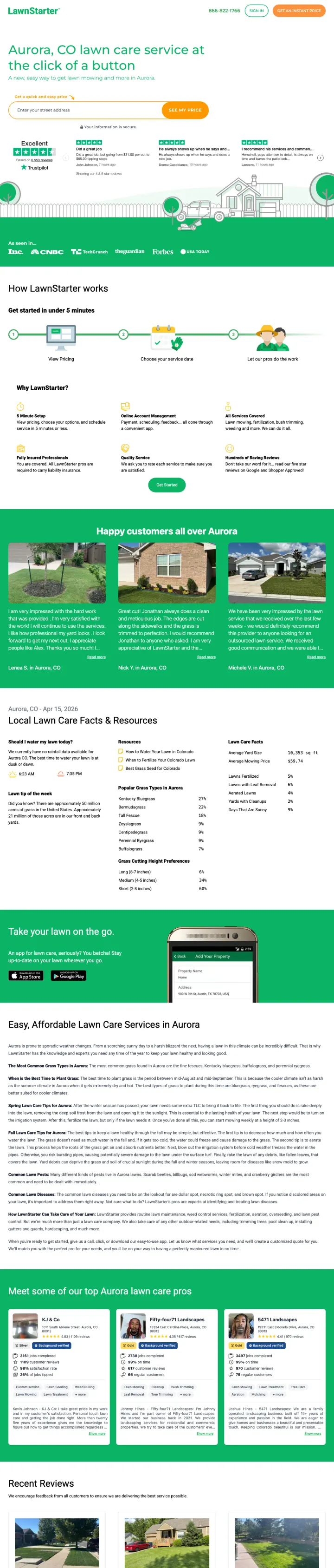
Show third-party review platform scores (Trustpilot 'Excellent') directly next to the address input above the fold -- the independent verification matters more than self-reported star ratings because visitors know you cannot manipulate Trustpilot the way you can cherry-pick Google reviews.
Trustpilot 'Excellent' badge with individual review snippets above the fold creates independent verification -- visitors trust third-party review platforms more than self-reported testimonials, especially for a service they have never used before
Individual named Trustpilot reviews with star ratings ('He always shows up when he says and does a good job') visible immediately below the form -- these read as real because Trustpilot is verifiable, not cherry-picked
Press logo bar (Inc, CNBC, TechCrunch, The Guardian, Forbes, USA Today) positioned as 'As seen in' immediately below reviews creates a credibility sandwich: reviews above, press below, form in the middle
The viewport screenshot shows mostly whitespace below the fold -- the page appears to load with the header section compressed, wasting valuable above-fold real estate
Before/after gallery photos lower on the page are tiny thumbnails that are hard to evaluate -- for a visual service, these need to be large and prominent
The page is extremely content-heavy with pricing tables, service descriptions, and FAQ sections that feel more like an SEO content play than a PPC landing page
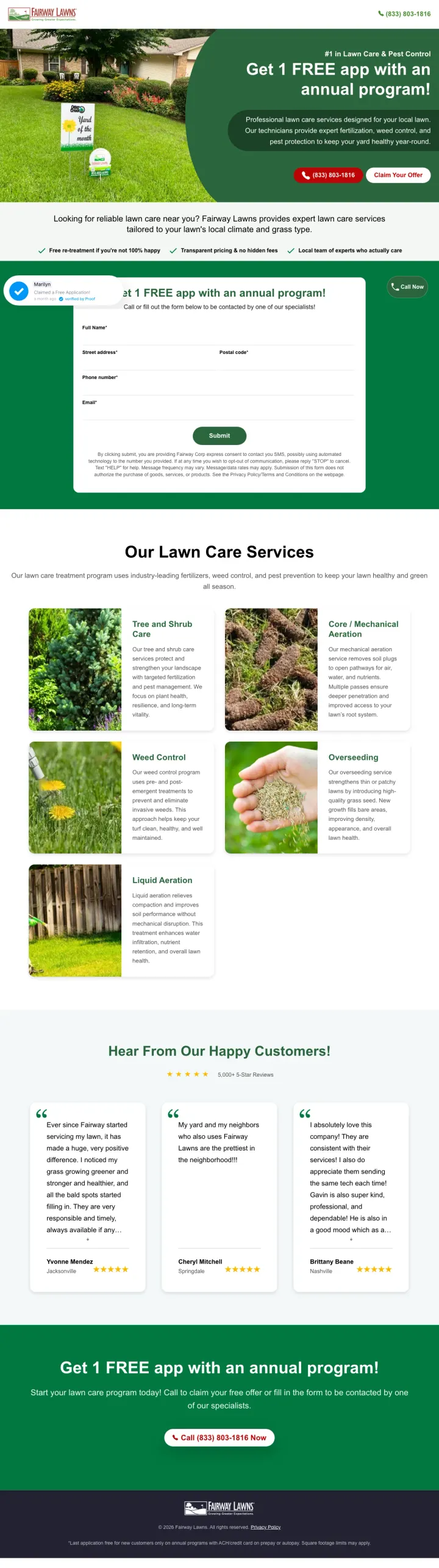
Use a photograph of a real treated yard with a 'Yard of the Month' sign in the hero section -- it shows a tangible outcome the visitor can aspire to rather than promising abstract 'healthier lawns,' and it signals that your customers win neighborhood awards.
'Yard of the Month' sign in the hero photo is genius because it answers the Yellow (Social) persona's unspoken question: 'will my yard look good enough to impress my neighbors?' -- the sign proves other customers have won visible neighborhood recognition
Three guarantee checkmarks below the fold ('Free re-treatment if you're not 100% happy', 'Transparent pricing & no hidden fees', 'Local team of experts who actually care') directly address the top 3 lawn care objections in a single scannable row
Real before/after lawn photos in the services section show actual weed-to-green transformations rather than two random pretty lawn photos -- the contrast makes the service value visible
The social proof notification popup (Marilyn from...) covers the secondary headline on load, obscuring the offer details at the exact moment the visitor is trying to read them
Services section uses real photos but they are small and hard to evaluate -- larger images with zoom capability would let visitors actually see the weed control and disease treatment results
Same HubSpot template as Eastern Exterminating (identical layout, checkmark row, and form structure). Any homeowner comparing local service websites side by side instantly clocks the duplication, and a stock template undercuts the premium positioning the hero copy is trying to sell
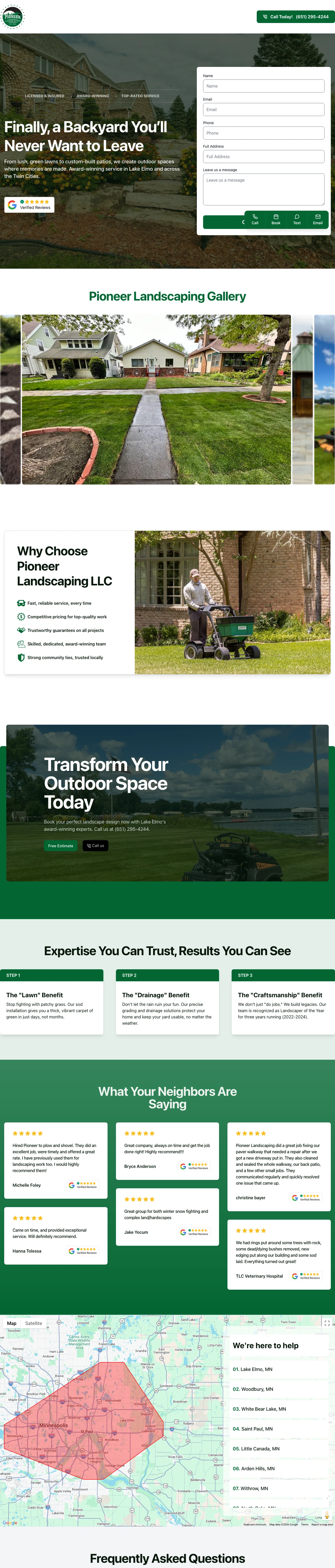
Open with an emotional outcome headline ('Finally, a Backyard You'll Never Want to Leave') over a full-bleed photo of a real completed project, with form fields directly beside it -- the emotion creates desire while the form captures it in the same viewport.
'Finally, a Backyard You'll Never Want to Leave' is the strongest headline in this swipe set because it sells the emotional outcome (enjoying your outdoor space) rather than the service (landscaping). A backyard reno is a five-figure decision driven by 'I want to love being home' much more than by 'I want new pavers'
Quad CTA bar at the bottom (Call, Book, Text, Email) gives four contact methods that serve every persona -- Red picks up the phone, Green fills the form, Yellow texts, Blue emails with specific questions
Licensed & Insured + Award-Winning + Top-Rated Service as credential badges above the headline establish trust before the visitor even reads the value proposition
The form asks for 5 fields (Name, Email, Phone, Full Address, Message) which is high-friction for a PPC landing page -- reducing to 3 fields (Name, Phone, Address) would increase completion rates
The project gallery below the fold shows real work but the images are small -- for a service where portfolio quality is the #1 decision driver, these photos need to be hero-sized with the ability to zoom
Google Verified Reviews badge in the bottom-left corner is easy to miss -- the review score should be in the hero section, not buried in a corner
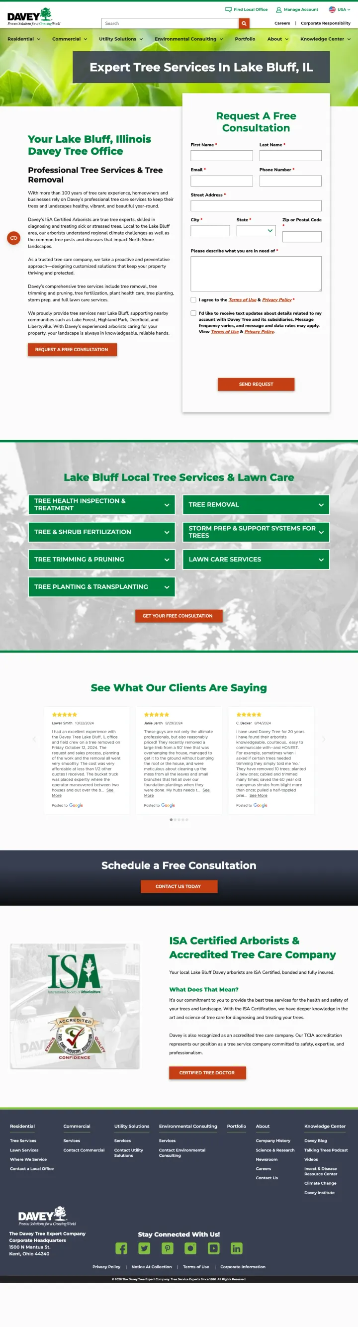
Display your professional certification (ISA Certified Arborists) alongside your years of experience (100+ years) in the body copy beside the consultation form -- for tree services where one wrong cut can kill a 50-year-old oak, credentials matter more than discounts.
Form embedded directly in the hero section with 'Request A Free Consultation' as the header -- the visitor does not have to scroll to start converting, and the form fields (name, email, phone, street address, city, state, zip) capture everything needed for a local service call
ISA Certified Arborists credential is specific and verifiable -- unlike generic 'trained professionals,' ISA certification is a real credential that tree care buyers actively search for
Service grid below fold with green 'FREE ESTIMATE' buttons for each service type (tree pruning, removal, health care, planting) lets the visitor self-select their specific need rather than filling out a generic form
Full corporate website navigation with 8+ menu items (Residential, Commercial, Utility Solutions, Environmental Consulting, Portfolio, About, Knowledge Center) gives the visitor too many exit paths from paid traffic
The hero banner uses a generic close-up photo of green leaves rather than showing actual tree work, completed projects, or the local crew -- for a visual service this is a missed opportunity
No Google review score or customer testimonial visible above the fold -- the 'See What Our Clients Are Saying' section exists but is buried below the service grid
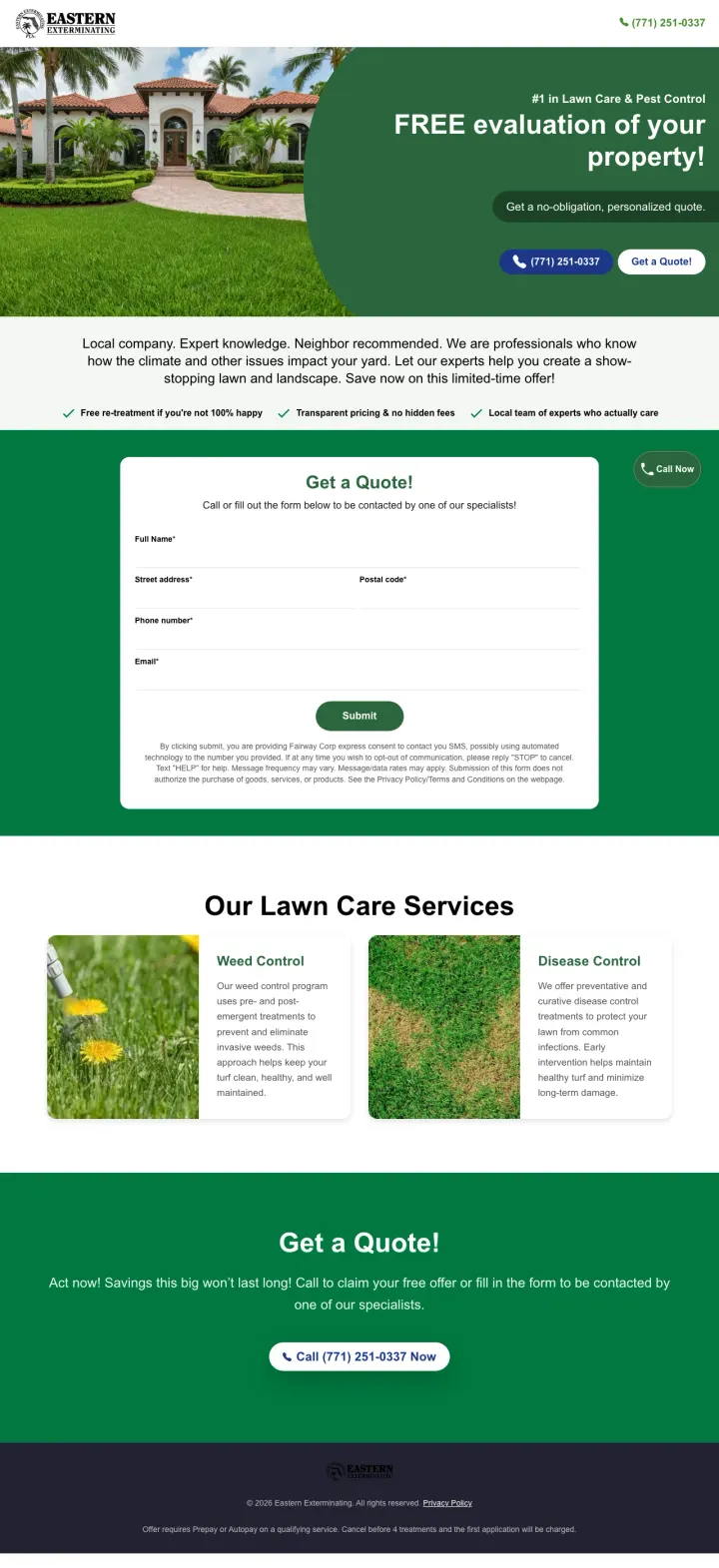
Use a hero photo showing a high-end home with immaculate landscaping as the backdrop for your lawn care offer -- it creates aspirational framing that elevates the perceived value of the service above commodity lawn mowing.
Hero photo of a luxury home with manicured landscaping creates aspirational framing -- the visitor thinks 'they work on homes like THAT' which elevates the perceived quality of the service even for a $100/month lawn care program
Three guarantee checkmarks ('Free re-treatment if not 100% happy', 'Transparent pricing & no hidden fees', 'Local team of experts who actually care') in a scannable row directly below the hero address the three biggest lawn care objections in one glance
'#1 in Lawn Care & Pest Control' claim in the hero creates a category leadership position -- even if unsubstantiated, it plants a frame of reference that competitors have to argue against
The form is below the fold, requiring a scroll to reach it -- for paid traffic, the form should be in the hero or at least partially visible on initial load
Service description section (Weed Control, Disease Control) uses real photos but they show weeds and lawn diseases up close -- photos of the PROBLEM are less motivating than photos of the RESULT
'Act now! Savings this big won't last long!' at the bottom is generic urgency that contradicts the otherwise professional tone of the page
Show a lifestyle photo of a family using a finished yard (kids playing, adults relaxing) instead of a static lawn photo. Homeowners buying recurring lawn care are really buying back their Saturdays, and a photo of what they will do with that time hits harder than a photo of the service being performed.
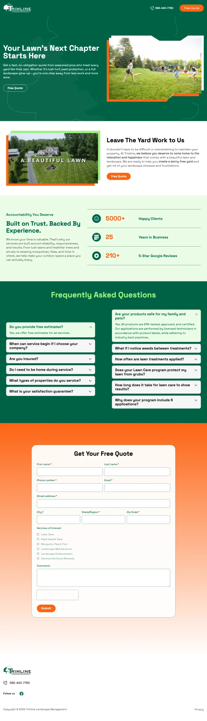
'Your Lawn's Next Chapter Starts Here' headline frames the service as a transformation rather than a transaction -- it implies the visitor's current lawn situation is about to improve, creating forward momentum
Stats bar (3000+ happy clients, 25 years in business, 250+ 5-star Google reviews) presented as large numbers in a dedicated section below the hero -- the volume signals a company that will not disappear, directly addressing the landscaper ghosting fear
FAQ section with 8 specific questions mirrors the actual objections lawn care buyers have -- 'What types of properties do you service?' and 'What if I have a satisfaction guarantee question?' show the company anticipates concerns rather than hiding from them
The hero photo shows a family playing on grass (lifestyle) rather than showing actual Trimline work -- the visitor cannot evaluate the company's quality because there are no project photos above the fold
The 'Free Quote' CTA button has a thin dark outline on a dark green background with white text, making it blend into the hero rather than pop -- at lawn care CPCs, a low-contrast CTA is expensive camouflage
The quote form is buried at the very bottom of the page behind the FAQ section -- visitors who scroll past the hero and stats may never reach it
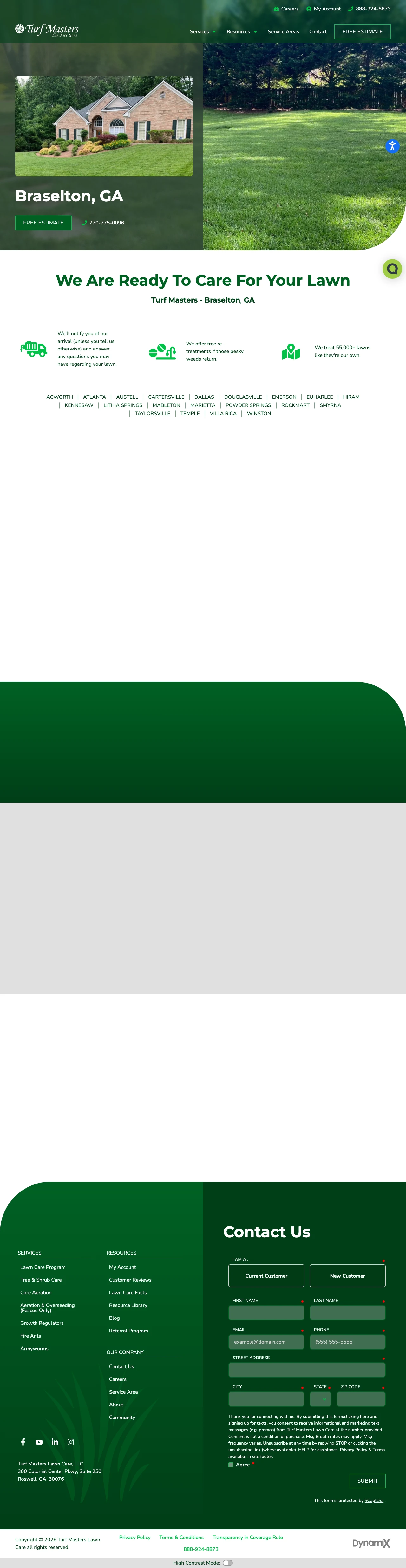
Use a split-screen hero showing both a wide yard shot and a close-up of the same property's landscaping detail -- the wide shot shows scale ('they can handle a property this size') while the close-up shows quality ('look at that edging').
Split-hero layout with a large property photo and an inset detail photo creates two levels of proof in one viewport -- the visitor sees both the scope of work and the quality of finish without scrolling
Local phone number (770-775-0096) prominently displayed next to the 'FREE ESTIMATE' button in the hero -- for Braselton, GA homeowners, a 770 area code signals 'this is a local company' more effectively than any badge could
Service icon grid below the fold (Lawn Fertilization, Weed Control, Aeration, Grub Control, etc.) lets the visitor self-identify their specific need and confirms the company handles their particular issue
Full site navigation with dropdowns (Services, Resources, Service Areas, Contact) provides exit paths from a location-specific page that should be focused on conversion
The page is very short -- below the hero and service icons, there is mostly empty grey space before a contact form, which suggests incomplete page build or missing content sections
No customer reviews, testimonials, or social proof visible anywhere on the page -- for a company asking visitors to trust them with their lawn, the absence of any customer voice is a significant gap
Pages that break the playbook in interesting ways
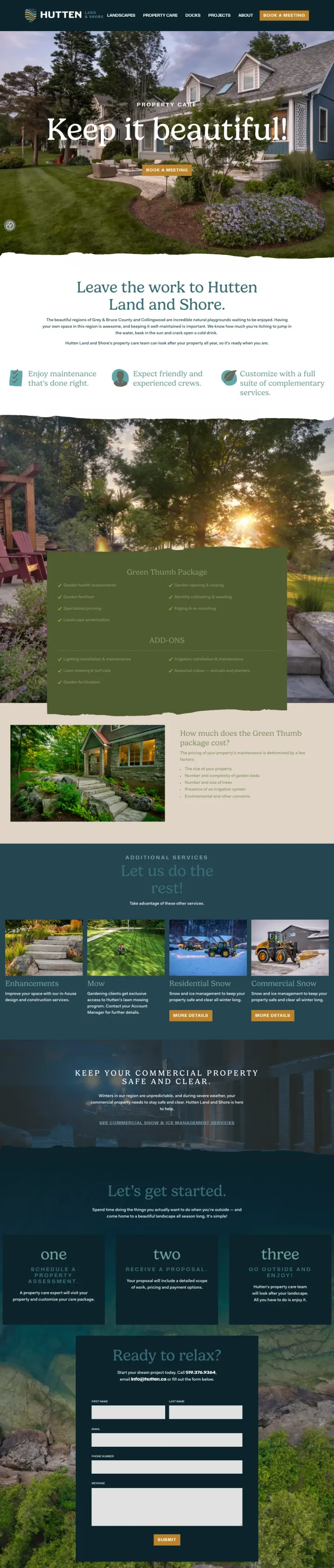
Why This Breaks the Rules: Every other lawn care page in this set uses green-and-white corporate design with badge-heavy trust signals. Hutten uses a dark navy palette, serif typography, and editorial photography that looks more like an architecture magazine than a service company. It works because their market (Grey & Bruce County cottages and waterfront properties) is upscale -- the design signals 'we are not a commodity lawn mowing service, we are your property's caretaker.'
'Keep it beautiful!' as a two-word headline with a script font is the polar opposite of the feature-heavy headlines every other page uses. Homeowners searching for lawn service on curb-appeal terms are not evaluating bullet points, they are trying to picture a yard that looks finished. An aspirational two-word hook lets them fill in the rest
3-step process section (Step, Plan, Enjoy) reduces the complexity of property care to three words -- it reframes what could feel like a big commitment into something simple and enjoyable
'Book a Meeting' as CTA copy instead of 'Get a Quote' positions the interaction as consultative rather than transactional -- it signals 'we will come understand your property' rather than 'we will send you a price'
Full site navigation (Landscapes, Property Care, Docks, Projects, About) with no conversion-focused landing page structure -- the page is a corporate website section, not a PPC landing page
No pricing, no reviews, no social proof, and no specific service descriptions above the fold -- the page relies entirely on aesthetic appeal to convert, which works for design-conscious visitors but loses analytical buyers
The form ('Let's get started') is buried below multiple content sections and requires scrolling through editorial photography to reach -- beautiful design but poor conversion architecture
3 pages burning ad spend with fundamental issues
Every click to these pages costs real money. We found broken trust signals, mismatched intent, weak CTAs, and messaging that ignores what the searcher actually typed. Here is what to avoid.
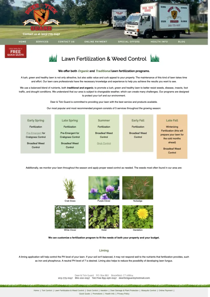
Ad promises 'Lawn Care Services - Call Us Today' and 'Fertilization & Weed Control' but the page is a static HTML content page from a previous web era with no form, no prominent phone number, no CTA button, and no way to request service online. The only contact information is a small text link at the bottom. Every click at lawn care CPCs pays for a brochure the visitor cannot act on.
No form, no CTA button, no conversion mechanism anywhere on the page -- the visitor has no way to take action except finding a tiny phone number and email at the very bottom of the page
The design is a static HTML page with a header image of company trucks, clipart-style decorative elements, and early-2000s table-based layout -- it actively undermines trust by signaling 'this company has not updated anything in 15 years'
Weed identification photos (crab grass, purple clover, dandelion) dominate the visual space instead of showing the results of treatment -- the page sells the problem rather than the solution
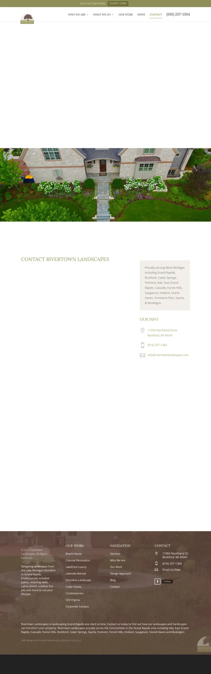
Ad keyword was 'Rockford MI lawn care' but the page is a blank contact page -- the viewport shows only the company logo, navigation menu, and a massive expanse of white space. The contact form exists below the fold but the above-fold experience is a nav bar floating in empty space. Every click pays for a page that looks broken.
The entire above-fold viewport is empty white space with only a navigation bar -- the visitor sees literally nothing about lawn care, landscaping, services, pricing, or why they should choose this company
'Client Login' and 'Client Portal' links in the header suggest this is a page designed for existing customers, not new prospect acquisition -- paid ads are bringing new visitors to a page built for retention
The ad mentions 'Rockford Groundskeeping' but the page shows 'Rivertown Landscapes' -- the brand name mismatch may confuse visitors who expected to land on the company they clicked on
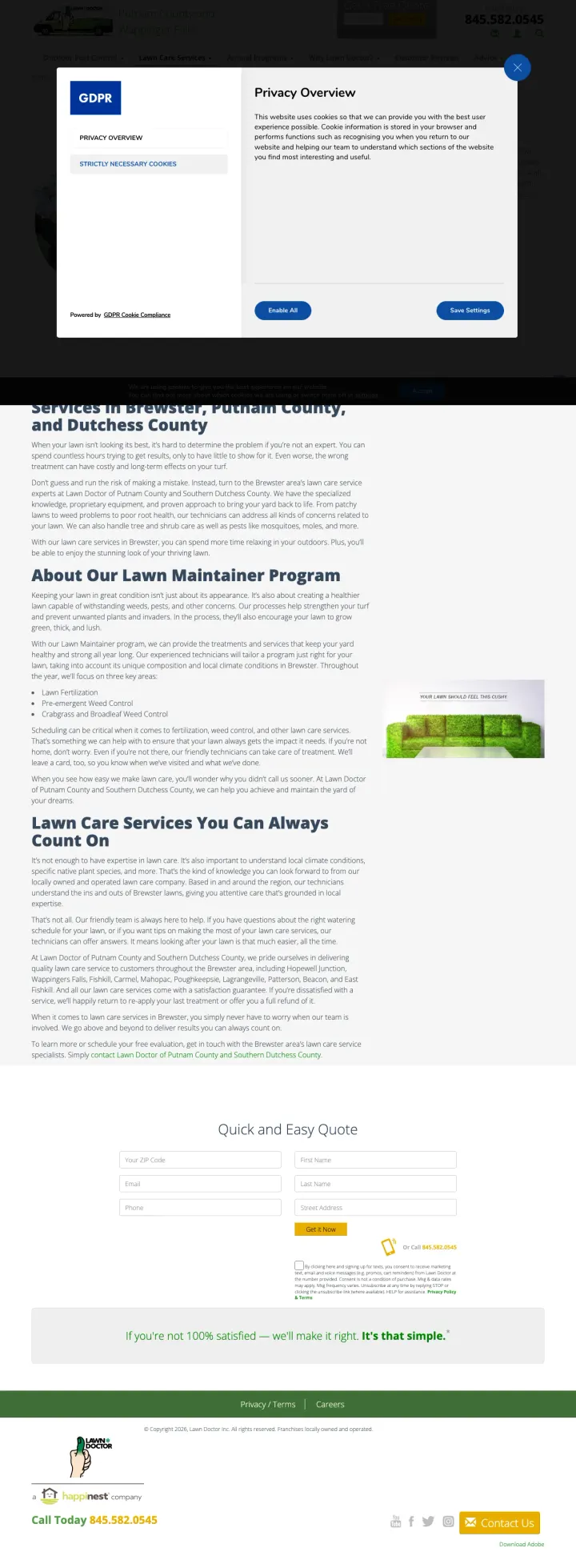
Every paid click lands on a full-screen Privacy Overview modal that covers the hero copy, the headline, the hero photo, and half of the primary form. The visitor has to interact with a cookie settings wall before they can see what this page offers. On a 'trugreen lawns' click-through that has competitive bids, you are paying for the ad auction and then immediately burying the message the ad promised.
A GDPR Privacy Overview modal takes over the viewport on page load in a US local lawn care funnel where GDPR is not even the applicable regulation. The wall is being shown to visitors the law does not cover
Behind the modal, the hero relies on a wall of prose about 'in-depth lawn evaluation' and bullet links to sub-services. Paid traffic wants an offer, not a service overview page
The page inherits the full franchise site chrome (Outdoor Pest Control, Lawn Care Services, Annual Programs, Customer Reviews nav). A paid-traffic page should strip the nav, not keep 7 exit links above the fold
The strongest lawn care pages let visitors enter their address and see a price immediately, no phone call required. This matters because lawn care is the rare home service where the property size IS the quote -- unlike plumbing or HVAC, there is no diagnostic visit needed. Pages that force a form...
Landscaping is the most visual of all local services -- the brief says portfolio is non-negotiable, and the data confirms it. Pages showing actual completed yards (Pioneer's gallery, Hutten's project photos) feel authentic. Pages showing lifestyle photography of families playing on lawns (Trimlin...
Lawn care has a meaningful split between 'HOA sent a warning, need this done Saturday' (Red persona, wants phone) and 'comparing 3 services for seasonal maintenance' (Green persona, wants form). Pages that only offer one path lose half their traffic. Gecko Green's 50% off first application with b...
The best maintenance pages do not just say 'lawn care service.' They break down exactly what happens in early spring (pre-emergent + fertilization), late spring (broadleaf weed control), summer (grub prevention), fall (aeration + overseeding), and winter (winterizing fertilization). Homeowners bu...
Winners give the visitor a price or specific dollar offer within five seconds of landing and pair it with real photography of completed work. Losers send paid lawn care traffic to branch locator pages or content-only service descriptions where the homeowner has to hunt for a phone number or price..