Free: 96 PPC tools + my AI Playbook book

These are real life insurance pages spending actual money on Google Ads right now.
From real life insurance Google Ads campaigns in the US
The landing pages actually worth stealing from
So you know exactly what to avoid
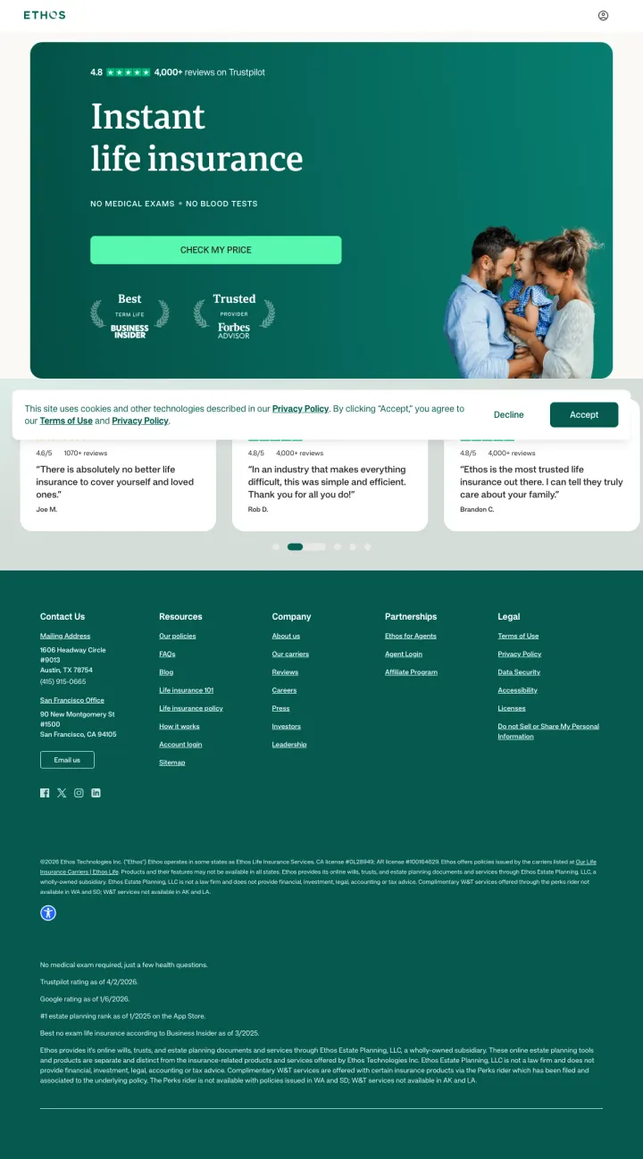
Lead with the objection removal ('No Medical Exams. No Blood Tests.') directly under your headline rather than burying it in a features list. For life insurance, removing the exam is the single biggest friction reducer, and it deserves hero-level prominence.
'Instant life insurance' as a two-word headline reframes a traditionally slow, paperwork-heavy product as something you can get right now -- this directly addresses the #1 procrastination excuse ('I will get to it eventually') by eliminating the time barrier
Trustpilot 4.8 stars with 4,000+ reviews displayed above the headline (in the dark hero section) establishes credibility before the visitor even reads the value proposition -- for an unfamiliar insurtech brand, this placement is critical
Forbes 'Best Term Life' and 'Trusted Provider' badges flanking the CTA create an authority bracket: the visitor sees third-party validation on both sides of the button they are about to click, reinforcing the decision at the moment of action
The 'Check my price' CTA does not specify what happens next -- does it start a quote form, show instant pricing, or require personal information? For life insurance where privacy concerns run high, specifying 'See prices in 30 seconds' or 'No personal info required to see rates' would reduce click anxiety
No phone number anywhere on the page -- for a product where people want to talk through coverage options with a human (especially older demographics buying life insurance), the absence of a phone path excludes an entire visitor segment
The page is extremely short: hero section, three testimonial cards, and footer. There is no coverage explanation, no FAQ, no 'how it works' section for visitors who need more information before committing to a product that protects their family's financial future
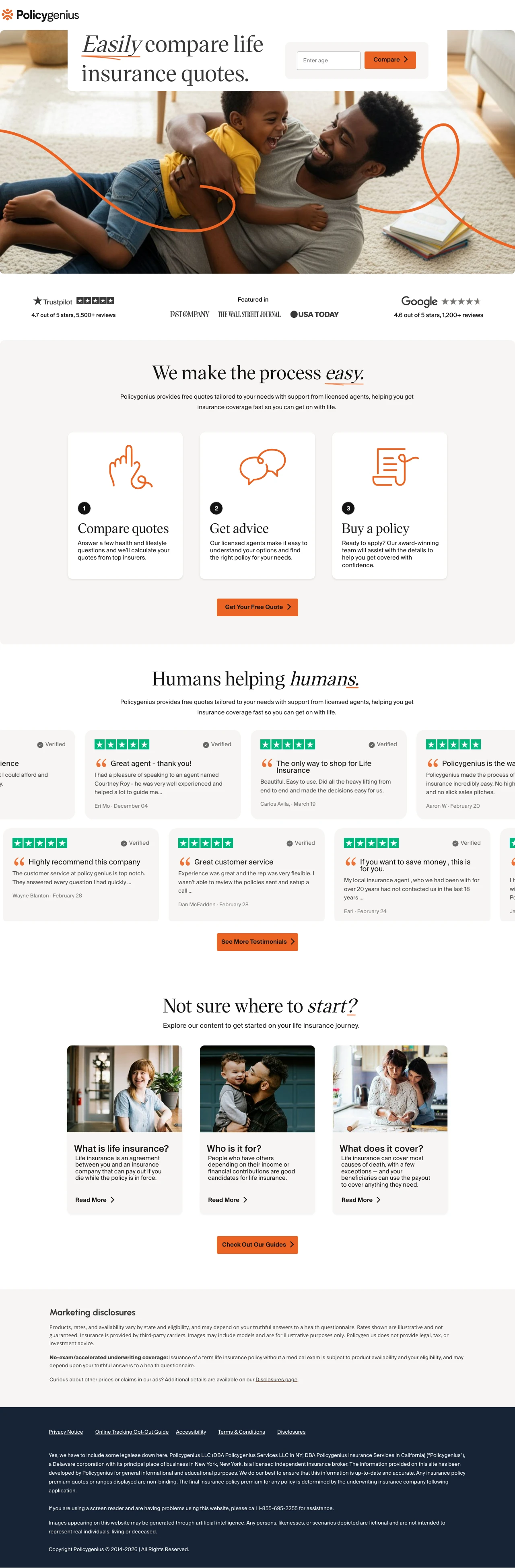
Position your quote tool as a comparison marketplace rather than a single-carrier quote. 'Easily compare life insurance quotes' reframes the visitor's task from 'apply for insurance' (scary, high-commitment) to 'compare options' (low-commitment, empowering). Even if you only show quotes from one carrier, the comparison framing reduces perceived commitment.
Single 'Enter age' field plus 'Compare' button is the lowest possible friction for a life insurance quote start -- age is the primary pricing variable for life insurance, so this one field gives enough information to show indicative rates without asking for name, email, or health details
Trustpilot 4.7/5 from 5,500+ reviews plus Google 4.6/5 from 1,200+ reviews plus 'Featured in Fast Company, Wall Street Journal, USA Today' creates a three-tier credibility stack: customer reviews + industry reviews + media coverage -- each validates from a different angle
Named agent reviews ('Courtney Roy', 'Jonathan Duong') in the testimonial section humanize the experience and address the 'will I get pushed into the wrong policy?' fear -- seeing that real humans guide the process, not just an algorithm, builds trust for a high-stakes financial decision
The ad promises '$2M Policies Start At $40/Mo' but the landing page shows zero pricing information -- the visitor clicked expecting to see rate examples and instead gets a generic 'compare quotes' message. The price anchor from the ad is completely lost
The 'Enter age' field label is placeholder text that disappears when clicked, and the field has no visible label -- visitors may not realize they need to enter their age before clicking Compare, especially on mobile where the placeholder text is smaller
Educational content section ('What is life insurance?', 'Who is it for?', 'What does it cover?') targets top-of-funnel awareness visitors, but the ads target quote-intent keywords -- this content mismatch wastes page space for visitors who already know they want life insurance and just want to see prices
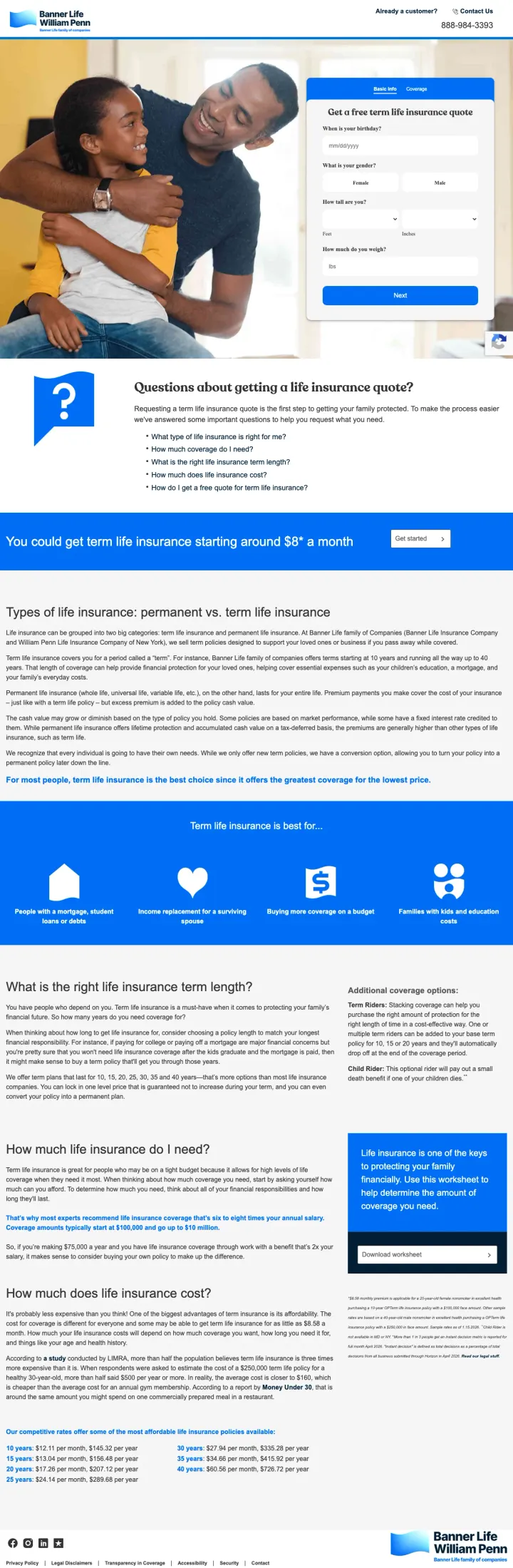
Include a specific starting price (term life insurance starting around $8 a month) directly on your landing page alongside the quote form, so visitors have a reference point before they commit to getting a personalized quote.
You could get term life insurance starting around $8 a month anchors expectations at an almost-trivially low price, reframing life insurance from expensive obligation to affordable protection
Questions about getting a life insurance quote? section with collapsible FAQ (How much coverage do I need? What is the right term length? How much does life insurance cost?) addresses the three biggest pre-quote hesitations in a compact format
Types of life insurance: permanent vs term life insurance explainer educates the visitor on their options without requiring them to leave the page, which keeps comparison shoppers engaged rather than bouncing to Google for answers
The hero photo of a couple embracing takes up significant above-fold real estate but communicates nothing specific about Banner Life or term insurance, and the quote form is pushed far to the right
The page below the fold becomes an SEO content wall (permanent vs term, term lengths, coverage amounts, cost factors) that is clearly written for organic search rather than paid traffic conversion
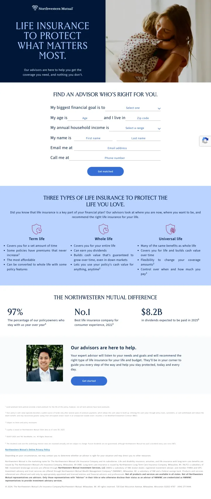
For complex financial products like life insurance, frame the conversion as finding the right advisor rather than getting a quote. Northwestern Mutual asks for financial goals, age, state, income, and contact info to match visitors with a personalized advisor, which reframes the CTA from transactional to consultative.
My biggest financial goal is dropdown as the first form field reframes the conversation from I need life insurance to I want to protect what matters most, which aligns with how real buyers think about the purchase
Three types of life insurance section (Term Life, Whole Life, Universal Life) with concise bullet points educates the visitor on their options without overwhelming them, and positions Northwestern Mutual as having the full product suite regardless of what the visitor needs
97% policyholder retention rate plus No.1 life insurance company ranking plus $8.2B in dividends paid creates a three-part credibility stack that traditional carriers can deploy but insurtechs cannot match
The form asks for 7 fields (financial goal, age, state, income, name, email, phone) which is significantly more friction than the age-only or ZIP-only approach used by digital-first competitors
No pricing information anywhere on the page. Not even a starting at price anchor. A visitor comparing Northwestern Mutual to Ethos (which shows $23/mo for $1M) has zero price context to work with
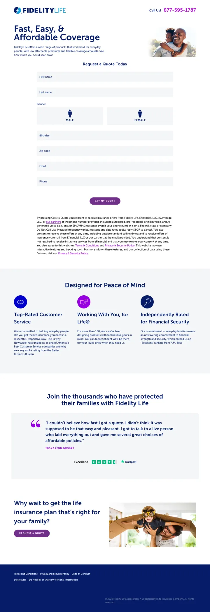
Place a prominent phone number (877-595-1787) in the top header alongside your quote form, and add a Trustpilot review badge below the form. Life insurance buyers over 50 often prefer calling, and giving them a phone CTA alongside the digital path captures both audiences.
Call Us 877-595-1787 in the header captures phone-preferred visitors immediately, which is critical for life insurance where the buyer demographic skews older and many prefer speaking to a human before committing
Designed for Peace of Mind section with three pillars (Top-Rated Customer Service, Working With You for Life, Independently Rated for Financial Security) addresses the three core anxieties: will they treat me well, will they be around when I need them, and are they financially stable
Trustpilot Excellent badge with green stars and verified review count provides third-party social proof from a platform that older demographics recognize and trust
The quote form asks for 7 fields (first name, last name, gender via icon selection, birthday, ZIP, email, phone) all visible at once, which is intimidating compared to the single-field approach of competitors like Ethos or Policygenius
The consent text below the Get My Quote button is a dense paragraph of legal disclaimers about calls, texts, and data usage that creates last-second anxiety right at the conversion point
Gender selection uses male/female icons without labels, which could confuse visitors and has accessibility issues for screen readers
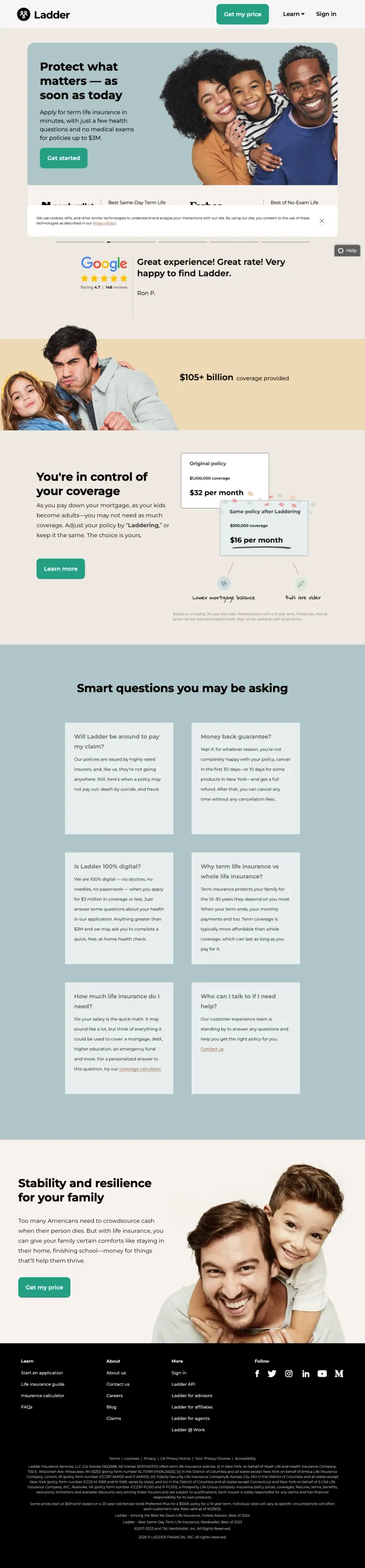
The primary CTA lives in the global navigation as a green 'Get my price' button. On a long scroll page with five content sections, the visitor can fire off a quote request from any scroll position without hunting for a hero button. Few insurance pages treat the CTA as a persistent nav element.
Specific proof point '$3M' for max coverage and 'just a few health questions' on the ad: both appear verbatim in the hero. Message match is tight enough that the visitor knows they landed on the right page before they read a second line.
Google Reviews embed with real-looking customer quote ('Great experience! Great rate!') directly below the hero. For a Blue-dominant audience comparing digital insurers, a Google review signal is more trusted than a testimonial the brand controls.
'Smart questions you may be asking' section lays out the Blue persona's exact research path (what is term, why do I need it, how much cost) in a 4x2 grid. Each tile is a self-contained answer, so the researching visitor does not have to read in order.
Cookie banner at the bottom reads 'We use cookies, AIPs, and other similar technologies' with a paragraph of compliance text that distracts on first load. Auto-dismissing or shrinking it would win back hero attention.
The '$0 per month' mockup in the middle section is a placeholder screenshot of a quote flow, not a real rate. Sophisticated visitors decode that it is UI copy and the trust hit is small but unnecessary.
Pages that break the playbook in interesting ways
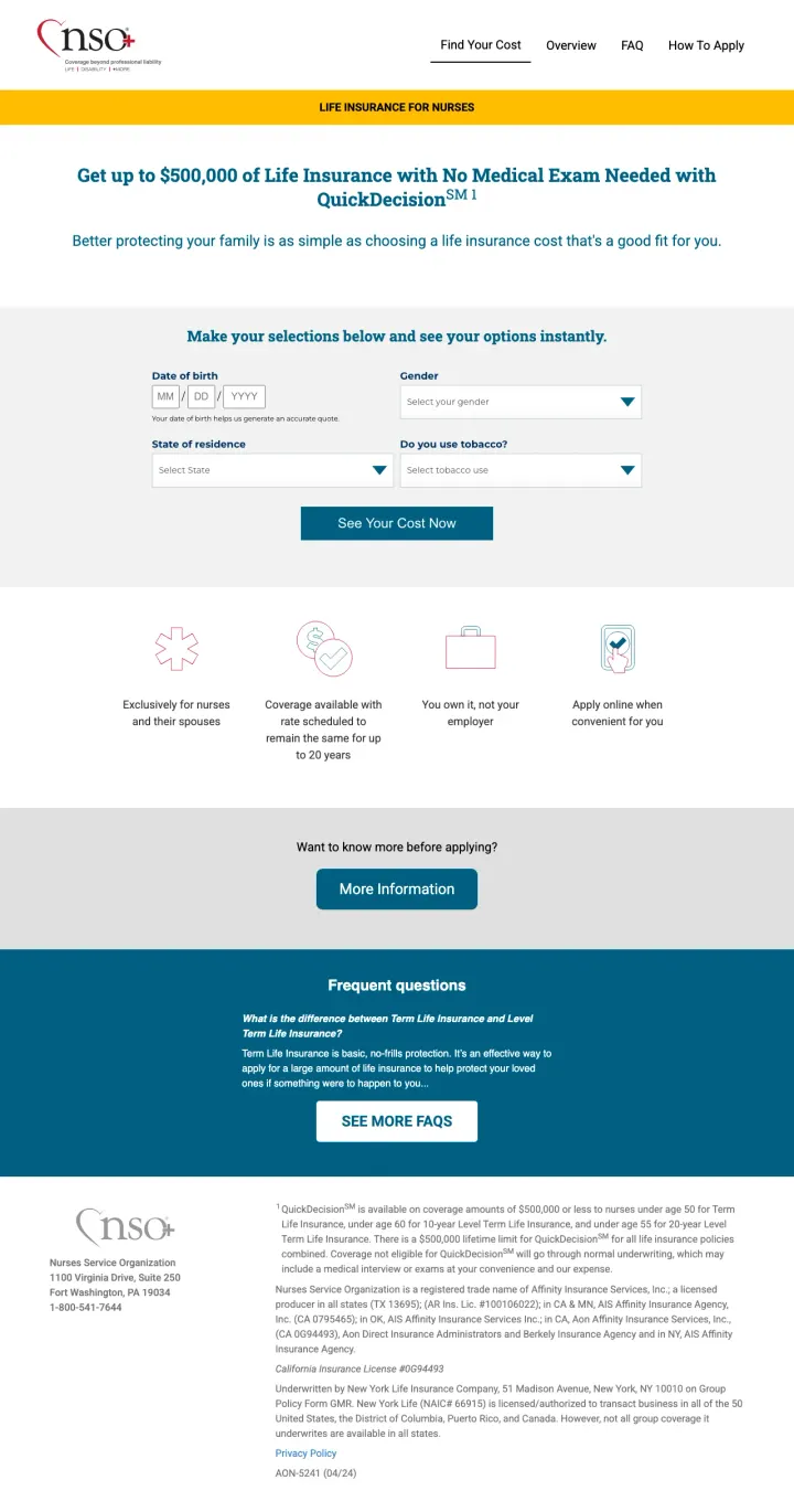
If you sell to a specific professional group, build a dedicated landing page that names the profession in the headline and tailors the messaging to their unique situation. Exclusively for nurses and their spouses immediately filters out non-qualified traffic and makes qualified visitors feel this was built for them.
LIFE INSURANCE FOR NURSES header with Exclusively for nurses and their spouses qualifier instantly signals relevance for the target audience and filters out unqualified traffic, improving lead quality
No Medical Exam Needed with QuickDecision messaging removes the biggest friction point for busy healthcare workers who have limited time for medical appointments outside their shifts
Make your selections below and see your options instantly with only 4 fields (DOB, gender, state, tobacco use) keeps the form focused on quote-relevant data only, with zero contact information required to see pricing
The page design looks dated with basic HTML form elements, minimal styling, and no lifestyle imagery, which undermines trust for a financial product where professionalism matters
coverageinfo.net is not a recognizable brand name, and the only trust signals are small print disclosures at the bottom about the underwriting company (New York Life), which most visitors will not read
The More Information button below the form leads away from the conversion path rather than toward it, creating an exit point right when the visitor should be clicking See Your Cost Now
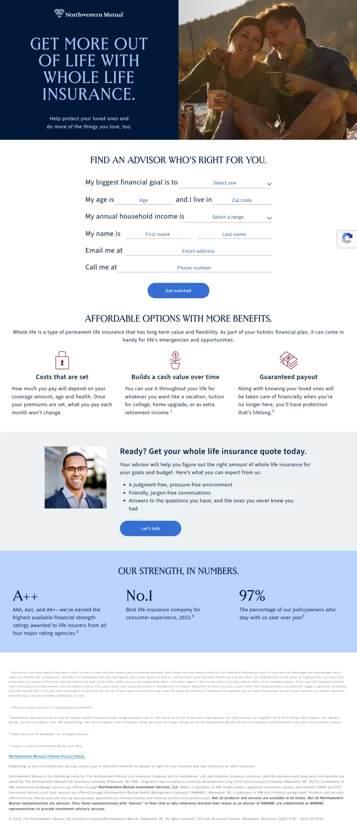
When advertising multiple product types (term vs whole life), create separate landing pages with product-specific headlines and benefits, but keep the conversion form and trust signals consistent. Northwestern Mutual does this effectively, letting the product content vary while the advisor-matching mechanism stays the same.
Affordable Options With More Benefits section repositions whole life insurance from expensive to value-packed by emphasizing cash value growth, guaranteed payout, and estate planning benefits that term life cannot offer
Three benefit pillars (Costs that are set, Builds a cash value over time, Guaranteed payout) directly counter the three main objections to whole life: it is too expensive, it is a bad investment, and what if I outlive the term
A++ AM Best rating prominently displayed alongside No.1 ranking and 97% retention creates a credibility trifecta that makes paying more for whole life feel like buying quality rather than overspending
The page is nearly identical to the term life landing page except for the headline and product description section, which means visitors who land on both pages during comparison shopping will not feel like either page was specifically built for their needs
No pricing comparison or cost calculator to help visitors understand the actual difference in monthly premiums between term and whole life, which is the #1 question whole life shoppers have
3 pages burning ad spend with fundamental issues
Every click to these pages costs real money. We found broken trust signals, mismatched intent, weak CTAs, and messaging that ignores what the searcher actually typed. Here is what to avoid.
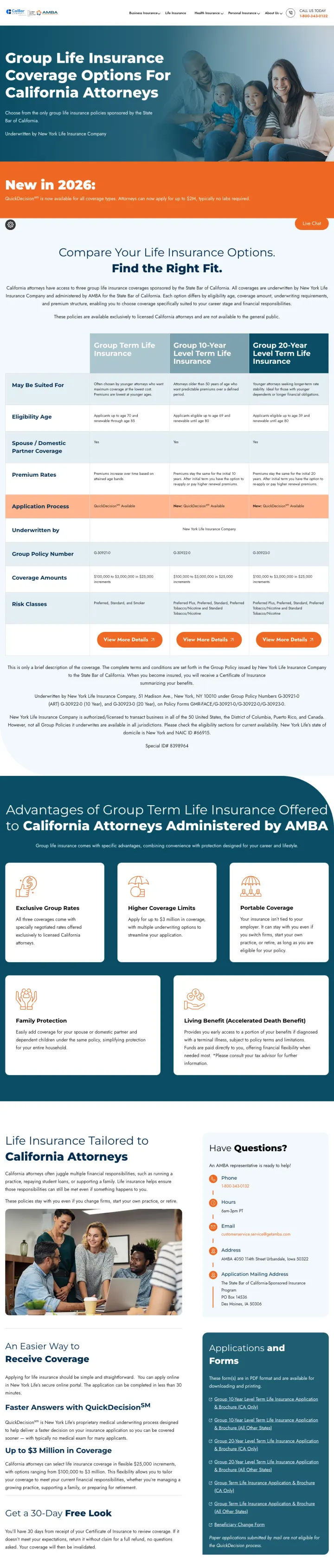
This page targets California attorneys specifically but the hero section mentions Group Life Insurance Coverage Options For California Attorneys without any price anchor, quote form, or immediate conversion path above the fold. The page is content-heavy with plan comparison tables, coverage details, and FAQ sections that read like a benefits brochure rather than a PPC landing page. A visitor clicking a paid ad expecting to get a quick life insurance quote instead lands on what feels like an employee benefits enrollment page. The How to Enroll section requires calling Aetna directly, making the entire page a referral to another company rather than a conversion endpoint.
No quote form, no price calculator, and no online enrollment path anywhere on the page. The conversion action is call Aetna at a phone number buried deep in the page
How to Enroll section directs visitors to another company (Aetna) rather than providing a self-service conversion path, making this an expensive referral page rather than a landing page
Dense comparison tables with coverage tiers, rate information, and plan details are formatted for careful reading rather than quick scanning, which is wrong for paid traffic visitors
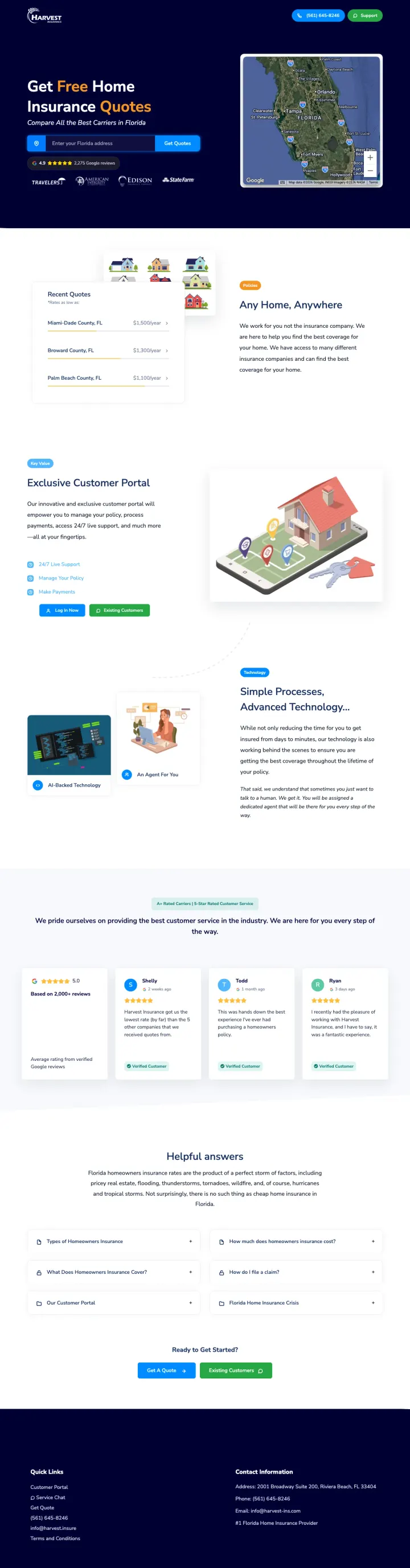
This page advertises Get Free Home Insurance Quotes and Compare All the Best Carriers in Florida, but it appeared in life insurance search results. A visitor who searched for life insurance and clicked an ad lands on a page about homeowners insurance with a Florida coverage map, home insurance carrier logos (State Farm, Allstate, Nationwide), and property-specific content (Any Home, Anywhere). Every click from a life insurance keyword is a complete waste because the page has zero life insurance content.
The entire page is for home insurance, not life insurance. The headline says Get Free Home Insurance Quotes and the page shows a Florida property coverage map, making this a total product mismatch for life insurance traffic
Even as a home insurance page, the dark navy hero with neon green accents and dense carrier comparison section feels cluttered and overwhelming above the fold
The Exclusive Customer Portal and Simple Processes sections focus on agency features rather than customer benefits, talking about the company rather than solving the visitors problem
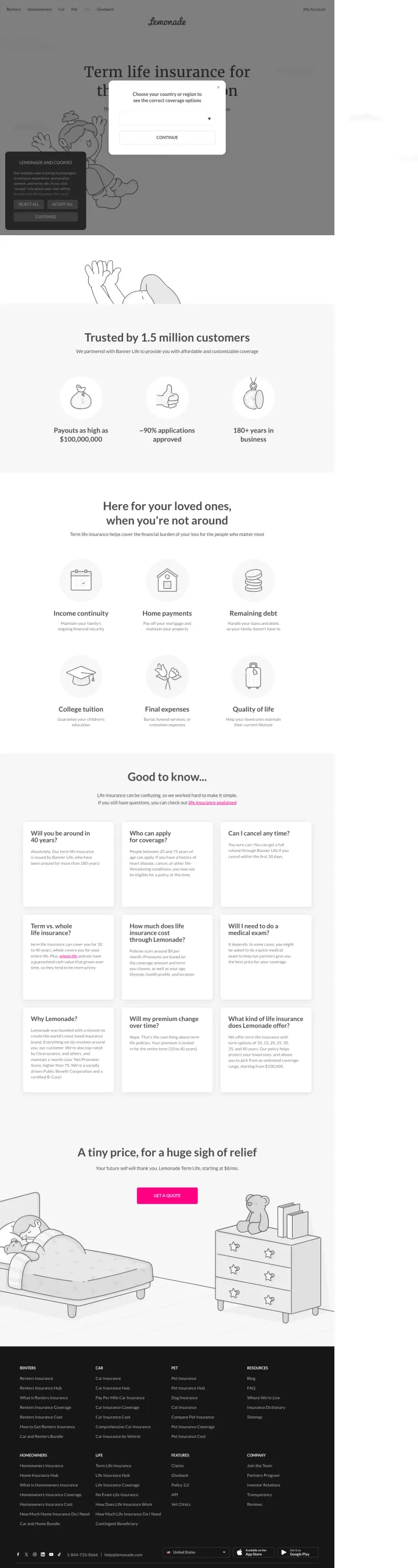
Life insurance clicks run $15-40 on terms like 'term life insurance' and 'life insurance quotes'. Putting an interruptive modal and a cookie banner on top of the hero destroys the 3-second test, and the visitor bounces before reading a single benefit line.
Modal overlay blocks the headline 'Term life insurance for...' on load, so the visitor has to dismiss or complete it before they can evaluate the offer. High bounce risk on mobile where modals stack.
Cookie consent bottom-left stacks on top of the region picker. Two simultaneous interruptions before any content is visible.
'Trusted by 1.5 million customers' is a company-wide stat for a brand that sells renters, homeowners, pet, and car. Life insurance is a newer product so the stat overpromises familiarity.
Both Ethos and Policygenius run ads with exact dollar amounts tied to coverage levels: '$1M Policy From $23/MO' and '$2M Policies Start At $40/Mo.' These price anchors reframe life insurance from 'expensive thing I should probably get' to 'this costs less than my Netflix subscription.' The specif...
Ethos leads with 'No Medical Exams. No Blood Tests' directly under the headline. This addresses the biggest behavioral barrier in life insurance: people delay buying because they dread the medical exam process. By eliminating the exam, the conversion path shrinks from 'fill out application > sche...
Policygenius positions itself as a marketplace rather than an insurer: 'Easily compare life insurance quotes' from 'multiple top carriers side by side.' This addresses the Blue-persona visitor who wants to compare before committing. Instead of competing on price against other carriers, Policygeni...
Neither Ethos nor Policygenius has the brand recognition of MetLife or Prudential. Both compensate by leading with review volume: Ethos shows '4,000+ reviews on Trustpilot' at 4.8 stars, Policygenius shows '5,500+ reviews' at 4.7 on Trustpilot plus 1,200+ on Google. For an industry where the visi...