Free: 96 PPC tools + my AI Playbook book

These are real marketing / ad agency pages spending actual money on Google Ads right now.
From real marketing / ad agency Google Ads campaigns in the US
The landing pages actually worth stealing from
So you know exactly what to avoid
Build a dedicated landing page for each geo-targeted campaign that names the city, references local businesses, and offers a free audit of the prospect's entire funnel (pre-click, post-click, follow-up) rather than just one channel.
'Free Marketing Execution Audit' that covers three specific areas (Pre-Click, Post-Click, Follow-Up) gives the prospect a concrete deliverable to expect from the call, not just 'let's chat about your business'
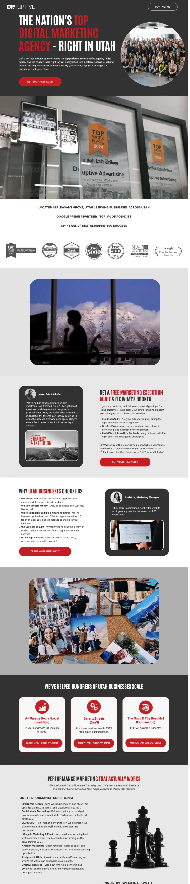
'The nation's #1 performance marketing agency... right in your backyard' connects national authority with local proximity, addressing the Red-dominant buyer's need for proof AND the Green buyer's preference for accessibility
Three audit pillars (Are your ads showing up? Is your website converting? Are you closing deals?) map to the exact funnel stages where agencies fail their clients, which directly addresses the 'been burned before' objection
The hero image uses a dramatic mountain/billboard composite with text overlay that is hard to read at smaller viewports, undermining the otherwise strong message
Case study section shows client work examples but with no specific revenue or ROAS numbers attached to any of them, wasting the strongest trust signal opportunity on the page
The page is long (8+ sections) but the form is only accessible via a single anchor link at the very top, requiring the visitor to scroll back up after being convinced by mid-page content
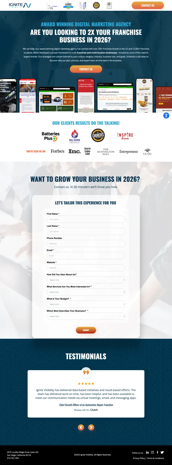
Include a budget range dropdown ($5K-$10K, $10K-$20K, $20K-$50K, $50K+) in your lead form to pre-qualify prospects and signal that you work with serious budgets, simultaneously filtering out tire-kickers and positioning your agency as premium.
Form asks 'Which Best Describes Your Business?' with options (Franchisor, Franchisee, Multi-Location, Ecommerce) so the sales team knows the exact business model before the first call, eliminating the awkward discovery phase
'Our Clients' Results Do the Talking' headline above award badges (Forbes, Inc., Clutch) plus named client results flips the typical agency pitch from 'here is what we do' to 'here is what happened when we did it'
Budget dropdown with ranges ($5,000-$50,000+/month) serves as both a qualifier and a price anchor, letting the prospect self-select into a tier before the call so there are no budget surprises
The page leads with the form before establishing any credibility. A franchise owner searching for 'seo franchise' sees 9 form fields before seeing any results or case studies, which is asking for commitment before earning trust
The testimonial section uses star ratings and text but no company logos or headshots with the testimonials, making them feel less verifiable for the analytical buyer comparing agencies
The 'as seen on' logos (Forbes, Inc., Entrepreneur) are used as trust signals but these are typically pay-to-play features, not editorial endorsements. Savvy agency buyers know this.
Build industry-specific service pages (law firm SEO, dental SEO, plumber SEO) that use the prospect's exact language and show results from their vertical, rather than generic 'we do SEO' pages that force the visitor to imagine whether your expertise applies to them.
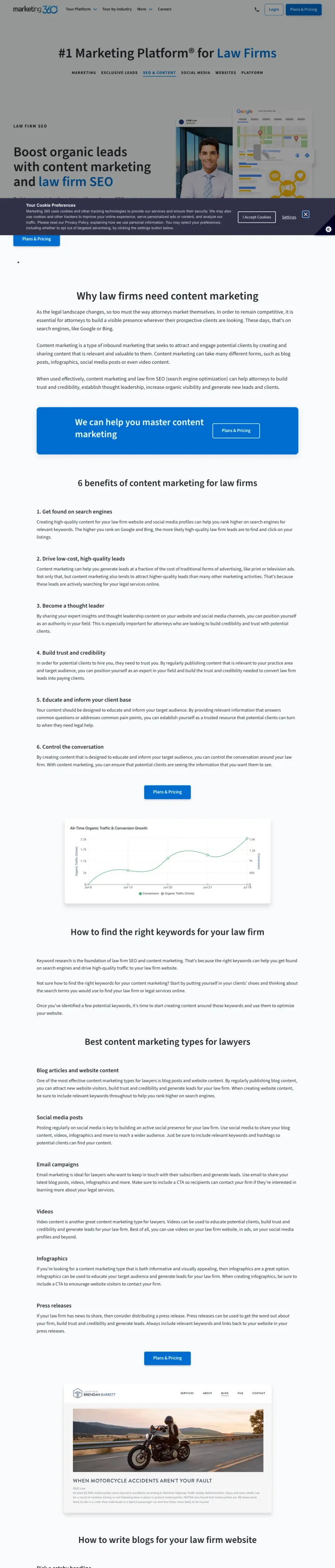
The page tab navigation (Marketing, Exclusive Leads, SEO & Content, Social Media, Websites, Platform) lets the law firm visitor self-select their interest without leaving the vertical context, keeping them in a 'law firm marketing' frame rather than a generic one
'Plans & Pricing' CTA links directly to signup, signaling pricing transparency -- in an industry where most agencies hide pricing, the willingness to show plans upfront addresses the 'how much does it cost?' objection before the first call
Video testimonials from named law firm clients embedded in the page provide verifiable social proof. Video is harder to fake than text testimonials and lets the prospect see someone from their own industry endorsing the service
The page serves 12 different keyword intents through the tab system (marketing, leads, SEO, social, websites, platform) which means the visitor who searched 'law firm SEO' has to find the right tab rather than landing directly on SEO content
The form is buried mid-page below a video section and multiple content blocks, requiring significant scrolling from a prospect who arrived ready to act
The hero uses a generic motorcycle rider silhouette photo that has zero connection to law firms, creating a disconnect between the vertical promise and the visual execution
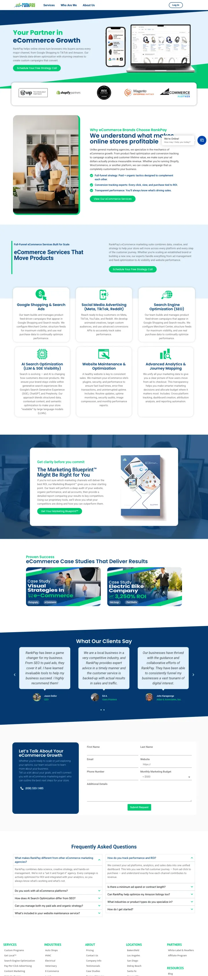
Show platform partnership badges (Shopify Partner, WooCommerce, BigCommerce, Magento) above the fold to immediately signal ecommerce specialization. Then list every channel you cover (Google Shopping, TikTok, Amazon) so the prospect sees full-funnel coverage in one glance.
Five platform partner badges (Shopify, WooCommerce, BigCommerce, Magento, Wix) arranged horizontally below the hero instantly communicate ecommerce depth, which separates RankPay from generalist agencies that 'also do ecommerce'
'Schedule Your Free Strategy Call' is a softer CTA than 'Get a Quote' -- it positions the first interaction as strategic advice rather than a sales pitch, which matters for ecommerce brands evaluating agencies
The page breaks services into specific ecommerce channels (Google Shopping, Amazon, TikTok Shop) with individual sections, letting the prospect see that RankPay has dedicated expertise in their specific channel rather than treating all channels the same
The testimonial section uses first names and star ratings but no company names, revenue numbers, or ROAS metrics -- for ecommerce brands that live and die by unit economics, 'great team!' testimonials carry zero weight
Nav links (Home, Blog, About) survive on what is otherwise a dedicated landing template. Every exit path bleeds a $40+ click to a content page that does not convert.
No case study or portfolio section showing actual ecommerce results (revenue growth, ROAS improvements, shopping ad performance) despite having space for it
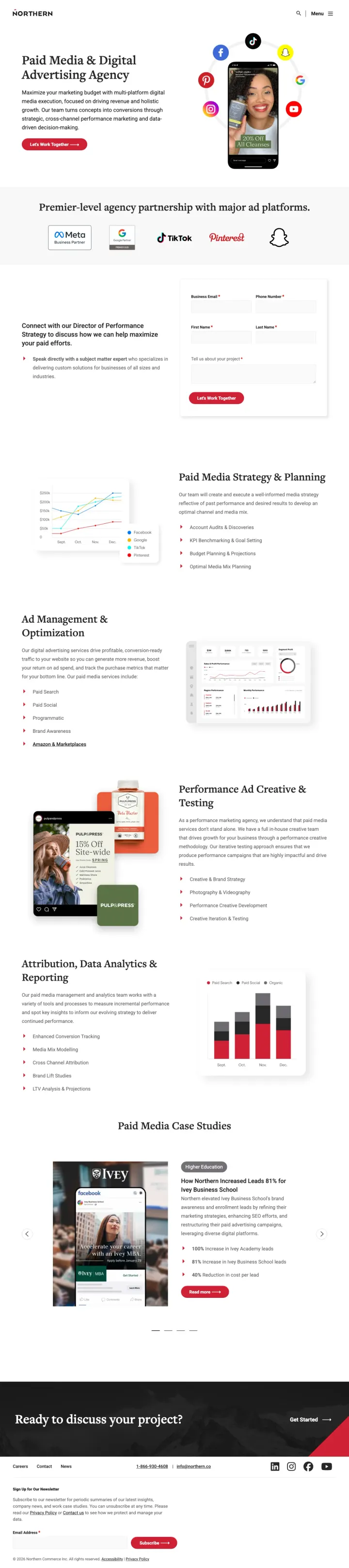
Name a specific contact by title ('Director of Performance Strategy') and offer a direct conversation with that person, not a generic 'Contact us.' It makes the next step concrete and signals that the prospect is getting a senior person, not an SDR.
'Connect with our Director of Performance Strategy' names the actual role the prospect will speak to, which removes the usual fear of being routed through a BDR
Platform partner logos (Meta Business Partner, Google Partner, TikTok, Pinterest) run as a dedicated row immediately under the hero, addressing the 'can they run what I need' objection in one glance
The mobile-device-with-social-icons hero imagery shows actual ad creative (a skincare promo with '20% off all cleanses'), signaling the agency produces real ads, not just runs them
Single 'Let's Work Together' CTA serves both enterprise and SMB intents, so the sales team has no way to segment the inbound before the first reply
No client metrics visible above the fold despite Northern's legitimate case studies existing deeper on the site
The headline 'Paid Media & Digital Advertising Agency' is descriptive rather than competitive, so the page does not stake a position against the other 8 agencies the buyer is evaluating
Pages that break the playbook in interesting ways
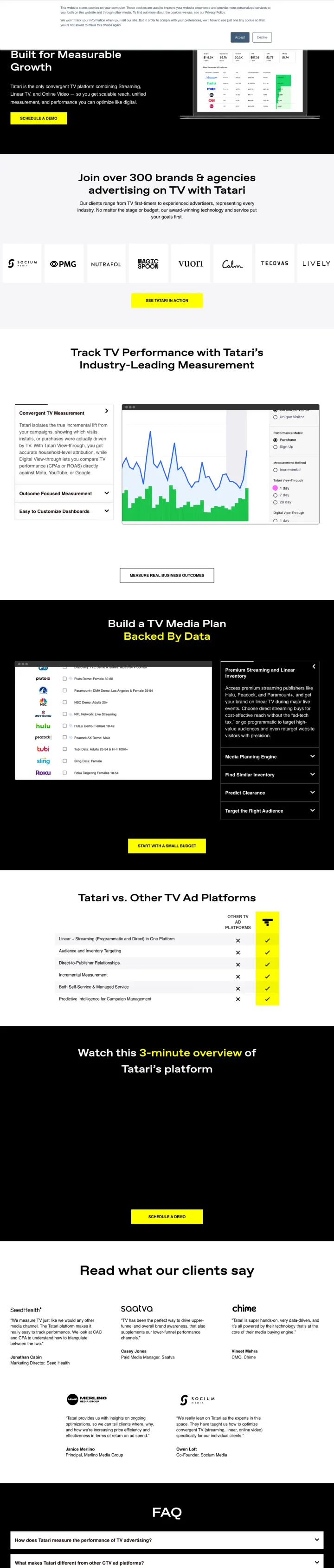
Position yourself AGAINST the category the buyer is searching in. Tatari runs ads on agency-related keywords ('allied marketing group,' 'signal theory') but the page says 'Ditch the agency.' This reframes the purchase from 'which agency?' to 'do I even need an agency?' -- which is a fundamentally different and more powerful conversion trigger.
'Ditch the agency. Tatari gives you better pricing, data, and full campaign control' directly attacks the buyer's existing mental model. Instead of competing with other agencies for the same consideration set, Tatari creates a new category (platform vs agency) and positions itself as the only option in that category
The page leads with product screenshots showing the actual platform interface (campaign analytics, performance graphs) rather than team photos or client logos. This is proof of capability through the product itself, not through claims about the team
'Join over 300 brands & agencies' uses social proof that includes agencies as customers, which neutralizes the anti-agency positioning by saying 'even agencies use us for their clients' TV campaigns'
The page targets 23 different keywords including generic terms like 'create campaign' and competitor names like 'signal theory kansas city,' which means the message match varies wildly depending on how the visitor arrived
The bottom-of-page form asks only for email and company name, which is extremely low-friction for a platform that handles TV advertising budgets of $50K+ -- this may generate high volume but low-quality leads
The 'Trusted vs. Other TV Ad Platforms' comparison table compares Tatari to unnamed competitors, which feels less credible than naming specific alternatives the buyer is actually considering
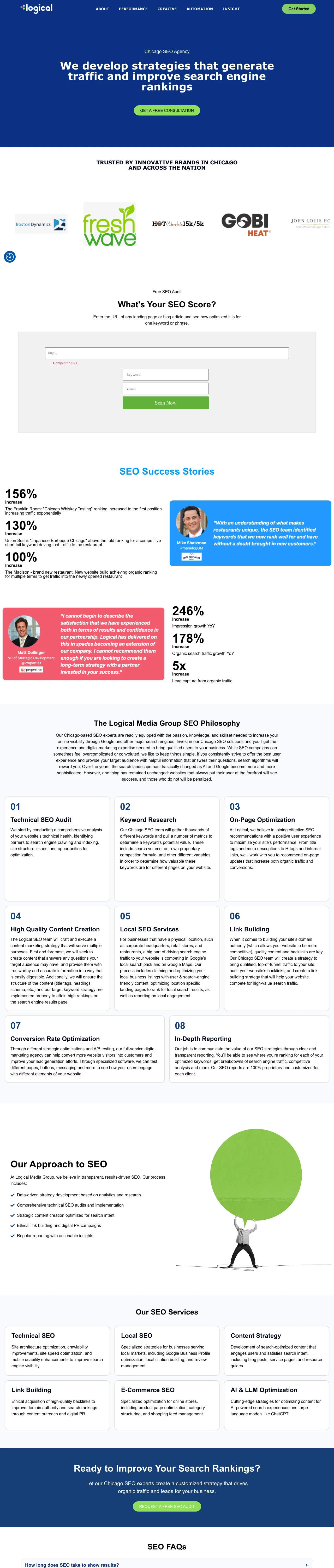
Lead your service page with specific client results as data visualizations (bar charts showing 139% organic traffic increase, 245% keyword ranking improvement) rather than capability descriptions. Logical Media Group turns their SEO page into a results dashboard, which reframes the conversation from 'what do you do?' to 'what did you achieve?'
Above-fold stat blocks (139% average organic traffic increase, 245% keyword ranking improvement) with green highlighting give the analytical buyer specific numbers to compare against other agencies, which is exactly what the Blue persona needs when evaluating 3-5 options side by side
Named client case study (Orbit Baby) with specific metrics shown mid-page proves these are not fabricated aggregate claims but attributable results with named clients the visitor can verify
The animated character/mascot and bright green branding create a distinctive visual identity that stands out from the sea of blue-and-white agency pages. At a glance, this page is instantly recognizable as a different kind of agency
Full site navigation with 10+ links including blog, careers, and about pages gives the visitor extensive exit paths from what should be a conversion-focused page at $30+ per click for 'digital marketing company' keywords
The form is pushed to the very bottom of the page below multiple content sections, case studies, and FAQ accordion, requiring committed scrolling from a visitor who may have been ready to convert after seeing the stats
The page serves a 1,900-volume 'digital marketing company in usa' keyword but the content is Chicago-focused (the city is mentioned in navigation and footer), creating a geographic mismatch for national searchers
6 pages burning ad spend with fundamental issues
Every click to these pages costs real money. We found broken trust signals, mismatched intent, weak CTAs, and messaging that ignores what the searcher actually typed. Here is what to avoid.
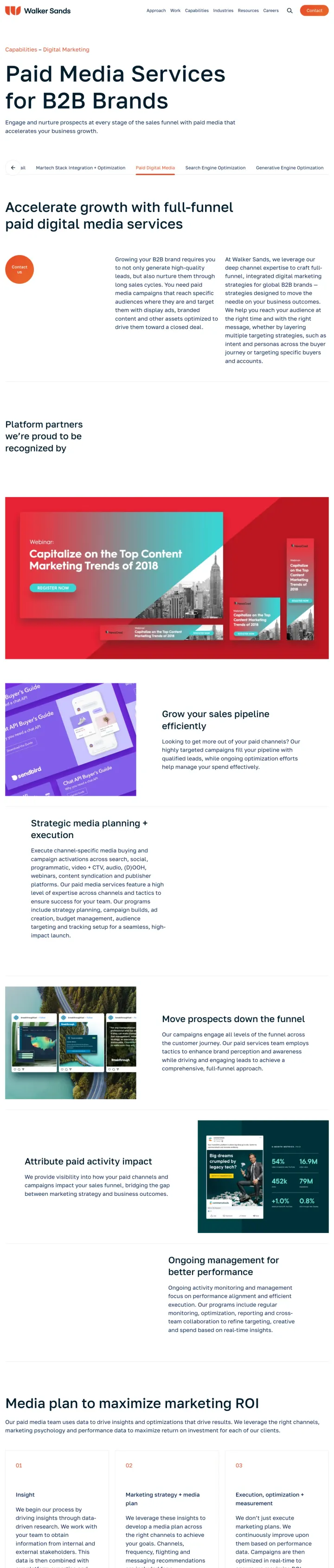
The ad promises 'Paid Digital Marketing Agency' targeting B2B keywords at $30+ CPCs, but the page is a full website service page with complete navigation, zero client results with metrics, no form above the fold, and a generic 'Contact us' text link buried after 600+ words of agency-speak. A visitor evaluating 3-5 agencies has no reason to choose Walker Sands from this page because nothing on it differentiates from any other agency's 'Paid Media Services' page.
Full site navigation (Capabilities, Industries, About, Insights, Careers, Contact) gives the visitor 6+ exit paths before encountering any conversion mechanism at all
The 'Contact us' CTA is a plain text link, not a button, and it appears only after scrolling past multiple content sections. At B2B agency CPCs ($30-50+), every click that bounces from this page wastes a meaningful ad dollar
Client logos appear (Onsip, Pandadoc, etc.) but with zero performance data attached to any of them. Named logos without results are decoration, not trust signals. The visitor needs '340% revenue growth for PandaDoc' not just the PandaDoc logo
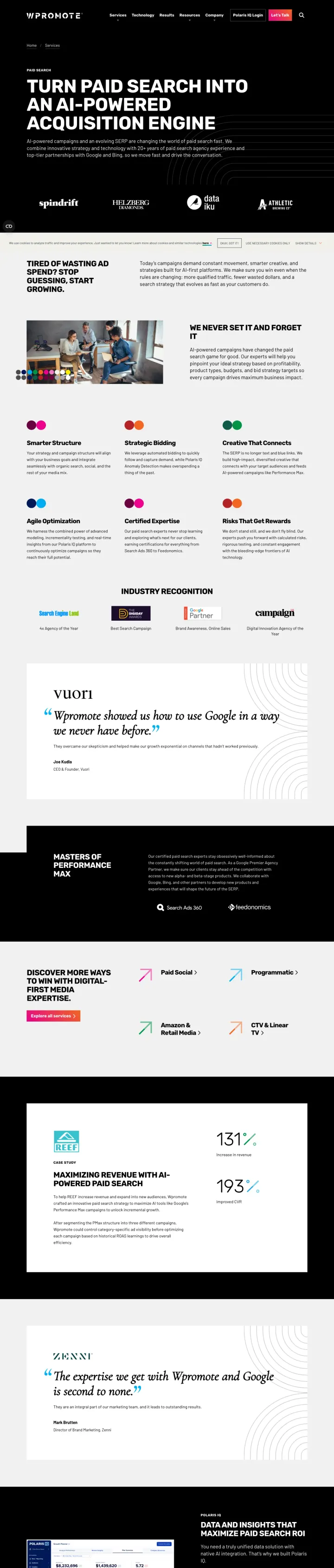
Ad promises 'Premier Google Ads Agency' at $40+ CPCs, but the landing page has no form, no phone number, no chat, and no visible conversion action above the fold -- no form, no phone, no calendar embed. The page reads like a capabilities brochure: '20+ years of paid search agency experience,' client logos (Spindrift, Helzberg, Dataiku), and a case study teaser. But the visitor who is ready to act has nowhere to act. At 'google ads agent' search volume, every visitor who leaves without a conversion path is $40+ burned.
Zero conversion path on the entire visible page. No form, no phone, no chat widget, no 'Get a Quote' button. The visitor searching for a Google Ads agency and clicking a paid ad has literally no way to become a lead from this page
The hero says 'Turn Paid Search into an AI-Powered Acquisition Engine' which is agency-facing jargon, not client-facing value. A marketing director searching for help does not want an 'AI-Powered Acquisition Engine' -- they want more leads at lower cost
Client logos appear but are disconnected from results. Showing that Spindrift and Helzberg Diamonds are clients means nothing without knowing what Wpromote achieved for them. Trust through association only works for household names.
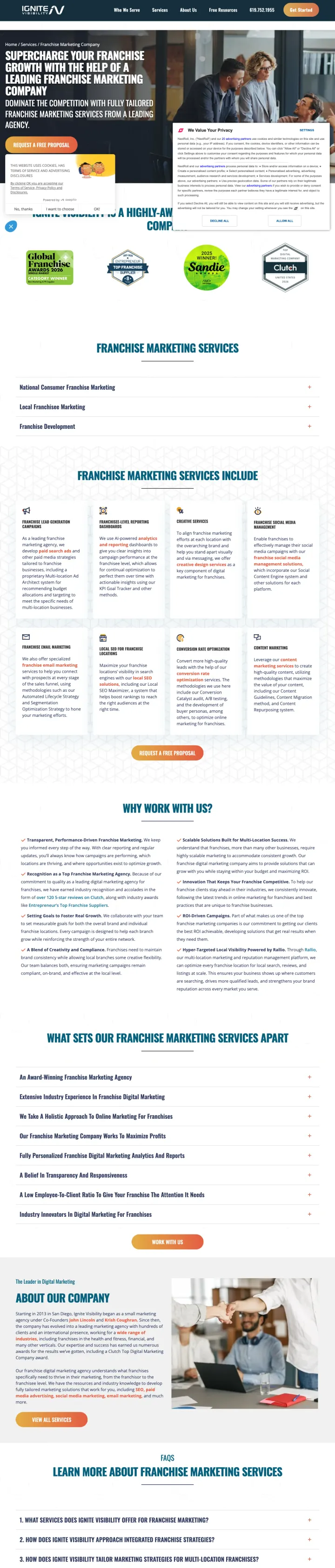
Ignite Visibility runs a dedicated LP (go.ignitevisibility.com/franchise-marketing) for franchise keywords AND sends paid traffic to this full-site service page. This page has 2,000+ words of content about franchise marketing, complete site navigation, and a contact form buried beneath walls of text. Every click to this page that could have gone to the dedicated LP is wasted budget because this page converts like a blog post, not a landing page. At 'digital marketing franchise' CPCs ($15-30), the company is paying for two landing pages and only one works.
Complete site navigation with dropdown menus (Services, Industries, About, Blog, Contact) gives the franchise buyer a dozen ways to leave the page without converting, each one a wasted click at $15-30
The page reads like a franchise marketing guide with headings like 'Franchise Marketing Services Include,' 'Why Use Our Franchise Marketing Company,' and 'How to Choose a Franchise Marketing Company.' This is educational content for organic traffic being served to paid visitors who already decided they need an agency
Ignite Visibility is cannibalizing their own campaign by running ads to both this page and go.ignitevisibility.com/franchise-marketing. The dedicated LP has a form, budget qualifier, and awards. This page has paragraphs about what franchise marketing is.
Disruptive Advertising already has a high-converting dedicated landing page on get.disruptiveadvertising.com. Yet they also run paid traffic to this main-site ecommerce page, which carries full navigation, no form above the fold, and drifts from ecommerce specifics into generic agency capabilities below the hero. At ecommerce agency CPCs, every click to this page that could have gone to the dedicated LP is wasted.
Full site navigation provides 5+ exit paths for a visitor who clicked an ecommerce marketing ad. This is the exact problem their dedicated LP subdomain was built to solve
After leading with a 7-figure run-rate claim, the conversion CTA is 'GET YOUR GAME PLAN' -- a vague promise disconnected from the revenue hook. Match the CTA to the headline: 'Get my 7-figure scale plan' beats 'game plan' every time.
Below the hero, the page shifts into generic agency capabilities (Creative, Paid, SEO, CRO) that apply to any client type, losing the ecommerce specialization promised by the ad
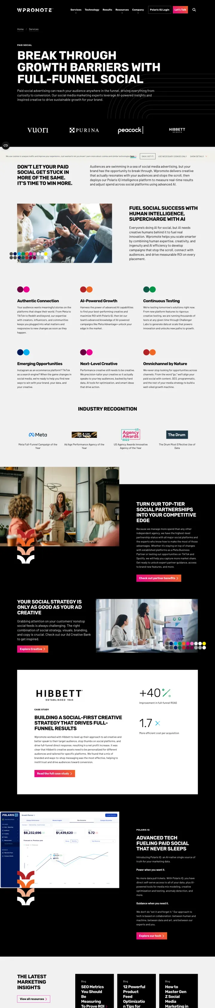
The ad promises an "Expert Paid Social Agency" for "tiktok marketing company" searches, but the hero is a 6-word poster headline with no form, no phone, and only a full site nav with a pink "Let’s Talk" button. A visitor comparing 3 social agencies on their shortlist sees brand logos (Vuori, Purina, Peacock, Hibbett) but has to scroll through 8 more sections and then fill a generic contact form to talk to anyone.
No inline form and no direct phone anywhere in the viewport. The only conversion mechanism is a gradient "Let’s Talk" button in the top nav, which visitors from "tiktok marketing company" ads have to hunt for.
Headline "Break Through Growth Barriers With Full-Funnel Social" is a category claim, not a reason to choose Wpromote over Tinuiti, Power Digital, or any other enterprise social agency. The ad promised "Expert Paid Social Agency" and the page restates the ad without proving it.
Keyword was "tiktok marketing company" but TikTok is only mentioned once in a list ("Meta to TikTok to Reddit"). A visitor with TikTok intent has no reason to believe this is a TikTok specialist rather than a generalist running the same page against every social keyword.
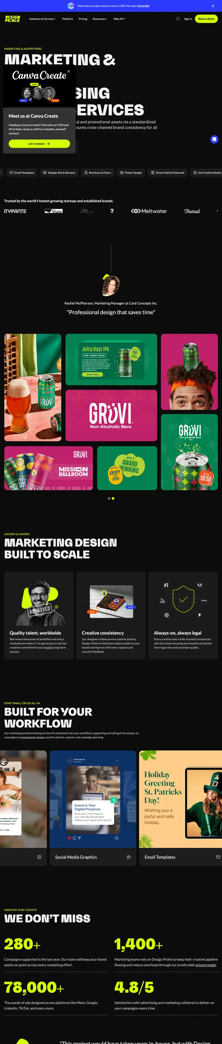
The ad targets "advertising agencies us" and promises a fix for creative bottlenecks. The page loads with a "Canva Create" event invitation popup that sits directly over the main "MARKETING & DIGITAL ADVERTISING SERVICES" headline, so the first impression for every paid visitor is an unrelated event RSVP instead of the pitch they came for. Nobody searching for an ad design service wants to go meet Design Pickle’s CEO at a Canva conference.
The Canva Create popup covers roughly one third of the hero and sits on top of the actual headline. Paid visitors arriving from "advertising agencies us" keywords have to close an unrelated event promo before they can read what the page offers.
The only hero CTA is "Get Started" which routes to the pricing page, not a demo, quote, or sales contact. For a managed creative service sold to marketing leaders, pricing-first before trust signals is the wrong order.
No customer logos, no sample work, and no case results above the fold. A service selling "high-volume digital and promotional assets" needs to show the work, not list deliverable categories in icon form.
The strongest agency pages frame the first interaction as a deliverable the prospect receives, not an obligation they take on. 'Get a Free Marketing Execution Audit' (Disruptive Advertising) and 'Get a Free ROI Forecast' (Ignite Visibility) reframe the consultation from a sales call into somethin...
Disruptive Advertising built a dedicated 'Utah Agency' landing page for geo-targeted campaigns, and Ignite Visibility built separate franchise marketing pages for franchise-specific keywords. Meanwhile, Walker Sands and Wpromote send paid traffic to generic service pages that could be about any a...
Disruptive Advertising claims '90% of our clients hit 7-figure run rates in the first year' with a specific mechanism. Marketing360 shows named law firm testimonials with before/after SEO rankings. Compare this to Wpromote and Walker Sands, which show client logos but zero performance numbers. Ag...
Ignite Visibility's form includes 'What Is Your Budget?' with ranges from $5,000 to $50,000+ per month. This serves two purposes: it pre-qualifies leads so the sales team does not waste time on $500/month prospects, and it signals to serious buyers that this agency works with real budgets. Agenci...
Winners build dedicated landing pages for specific keyword intents (geo-targeted, niche-specific, or channel-specific) with a value-framed CTA (free audit, free ROI forecast, free strategy call) and at least one named client result with metrics. Losers send paid traffic to full-site service pages with complete navigation, zero client metrics, and generic 'Contact Us' CTAs that give the visitor no reason to choose this agency over the next tab they have open..