Free: 96 PPC tools + my AI Playbook book

Nobody wants to be shopping for pest control. They've got ants in the kitchen or something worse, and they want it gone yesterday. The emotional state is disgust plus urgency. Pages that lead with 'free inspection' win because they lower the commitment bar for someone who just wants this problem to disappear.
From real pest control Google Ads campaigns in the US
The landing pages actually worth stealing from
So you know exactly what to avoid
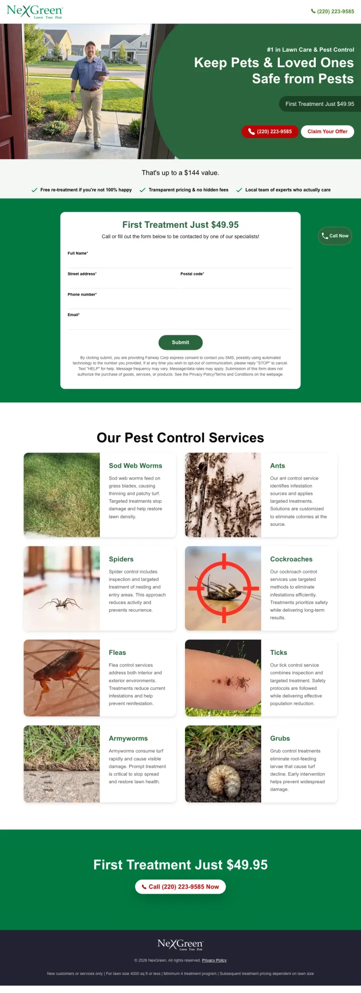
Lead your hero with a safety-first headline ('Keep Pets and Loved Ones Safe') paired with a specific dollar offer and savings anchor. This combination addresses the emotional concern (safety) and the rational objection (cost) in a single glance.
'That is up to a $144 value' reframes a $49.95 intro price from suspiciously cheap to genuinely discounted -- pest control customers expect intro offers to be loss-leaders, and the savings anchor makes the deal feel real
Trust bar with three checkmarks ('Free re-treatment if not 100% happy / Transparent pricing and no hidden fees / Local team of experts who actually care') answers the top 3 objections in one horizontal strip without taking scroll space
Pet-and-family safety as the PRIMARY headline rather than a buried FAQ answer -- this is the only page in the set that leads with what the customer actually worries about most
The form section below the fold asks for full name, email, and phone but does not tell the visitor what happens next -- do they get a call, a text, an email quote? Setting expectations would reduce form abandonment
Pest grid section mid-page shows 8 pests with photos but no indication of which ones NexGreen specializes in -- a visitor with a specific rodent problem cannot tell if this company handles rodents better than a generalist
No Google reviews or star rating visible anywhere on the page despite the 'local team' positioning -- for a local service, social proof from named neighbors matters more than company claims
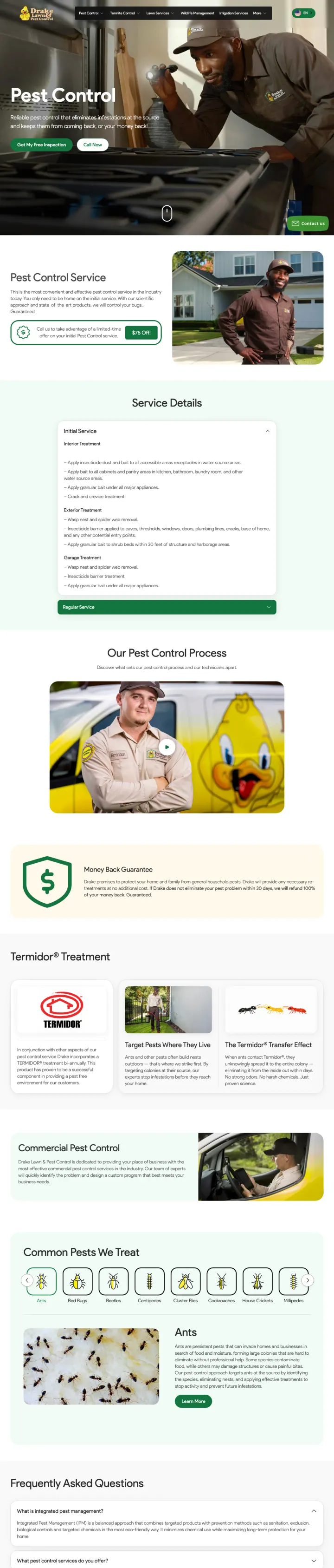
Put your guarantee directly into the hero subhead, not a trust badge or footer. Drake's 'eliminates infestations at the source and keeps them from coming back, or your money back' does double duty -- it is both a value prop and a guarantee in one sentence.
'Eliminates infestations at the source and keeps them from coming back, or your money back' is the strongest guarantee language in the entire set -- it names the outcome (elimination), addresses recurrence (keeps them from coming back), and provides a remedy (money back) all in one line
Dual CTA in contrasting colors ('Get My Free Inspection' in green, 'Call Now' in white outline) lets the visitor choose their preferred conversion path without scrolling
Real branded technician inspecting inside a kitchen with a flashlight -- this image says 'thorough, professional, already inside your home' which is exactly the visual proof pest control customers need
Full navigation menu (Pest Control, Termite Control, Lawn Services, Wildlife Management, Irrigation Services, More) sits above every emergency pest ad -- a visitor with roaches in the kitchen does not need six service categories, they need a phone number, so every nav click is a paid click that bounces
Service details section mid-page lists 'Pest Control Services' with generic pest categories but no pricing or even a price range -- the ad mentions 'free inspection' but the visitor still has no idea what treatment costs
FAQ section is collapsed by default and buried below a large pest identification gallery -- visitors who scroll that far are already in research mode, and the FAQ answers would have been more useful higher up
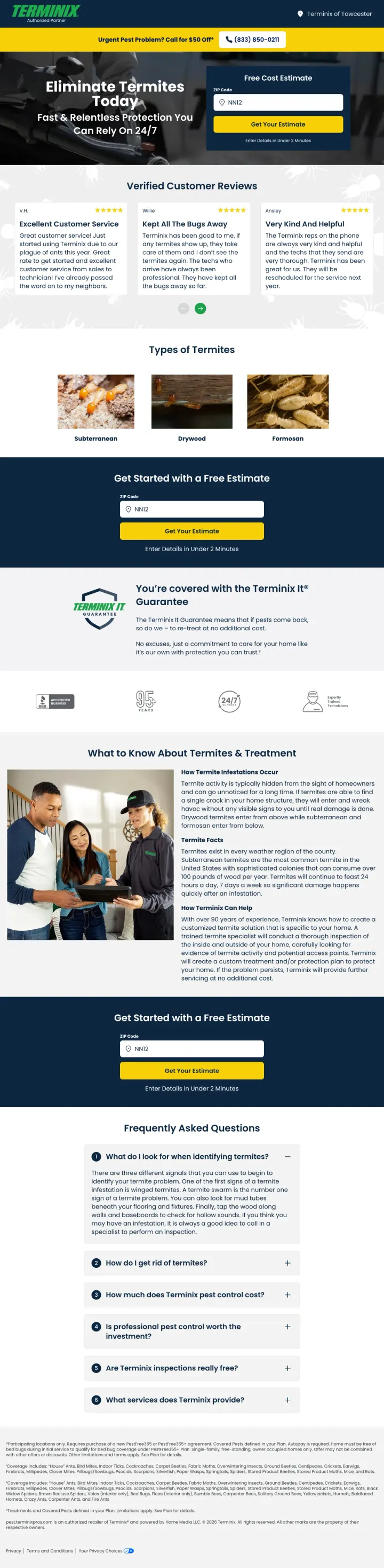
Use a ZIP code as the only form field above the fold. Terminix Pros' 'Free Cost Estimate' form asks for just a ZIP code and one button click. This micro-commitment is far less intimidating than a full name/email/phone form, and it gets the visitor into the funnel where you can collect details later.
ZIP code as sole form field above the fold reduces friction to almost zero -- the visitor gives one piece of non-personal information and gets a cost estimate, which is exactly what they searched for
Three named customer reviews with star ratings immediately below the hero ('V.H.' / 'Willie' / 'Ansley') provide social proof that specifically mentions effectiveness ('Kept All The Bugs Away') rather than generic service quality
'You are covered with the Terminix #1 Guarantee' section mid-page shows a shield icon with specific guarantee language -- this is more convincing than a text mention because the visual treatment signals it is a formal policy, not a marketing claim
The $50 off offer is in a top banner bar ('Urgent Pest Problem? Call for $50 Off') that looks like a site-wide promo rather than a termite-specific offer -- visitors may assume it does not apply to their termite treatment
The 'Types of Termites' education section with termite photos mid-page adds length without advancing conversion -- visitors searching for termite treatment already know they have termites and do not need a species identification lesson
'Enter Details in Under 2 Minutes' promise below the ZIP form sets a time expectation but also signals that more steps follow -- which may deter visitors who thought the ZIP code was all they needed
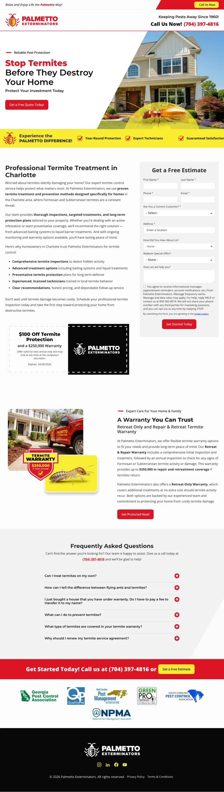
Lead with the financial consequence of inaction rather than the service you offer. Palmetto LP's 'Stop Termites Before They Destroy Your Home' combined with '$250,000 termite damage warranty' makes the visitor feel the cost of NOT acting, which is more urgent than any discount offer.
'Stop Termites Before They Destroy Your Home / Protect Your Investment Today' pairs an emotional fear trigger with a rational financial frame -- the visitor thinks about their home value, not just the pest problem
Trust bar immediately below hero with three checkmarks ('Year-Round Protection / Expert Technicians / Guaranteed Satisfaction') provides structural reassurance without consuming scroll space
$250,000 termite damage warranty is a specific, large dollar amount that makes the guarantee feel substantial -- generic 'satisfaction guaranteed' language cannot compete with a quarter-million-dollar warranty figure
The 'Get a Free Estimate' form on the right side asks for name, phone, email, address, and a message field -- five fields is too many for a termite panic searcher who just wants someone to come look at their house
Mid-page copy is dense paragraph text explaining Palmetto's history and treatment process -- this reads like a company bio rather than addressing the visitor's termite concerns
Cartoon termite illustration in the hero, while attention-getting, may undermine the seriousness of the damage claims -- you cannot sell '$250,000 warranty' alongside a cartoonish bug and maintain credibility with analytical visitors
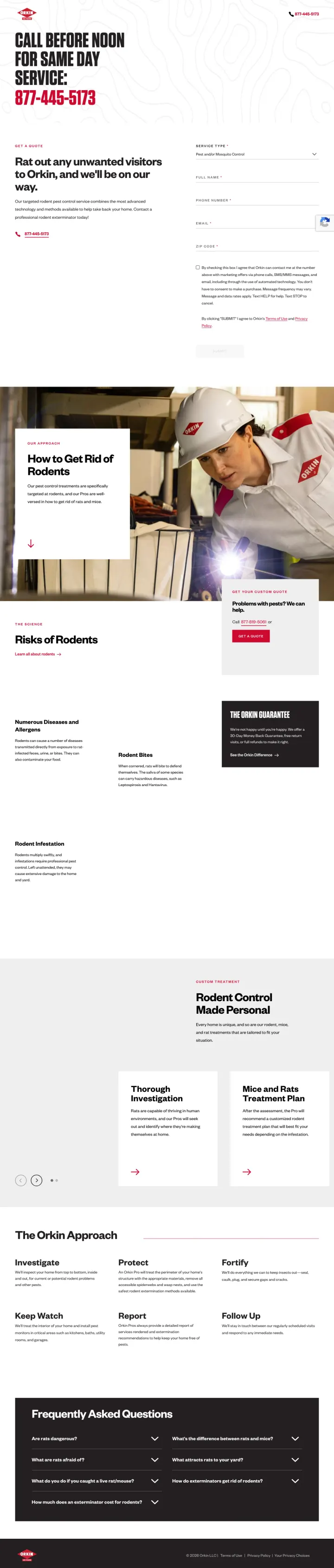
Put a same-day service promise as your dominant headline if you can deliver on it. Orkin's 'CALL BEFORE NOON FOR SAME DAY SERVICE' with the phone number immediately below eliminates the 'how fast can they come?' objection in the first second of the visit.
'Call Before Noon for Same Day Service' is a conditional urgency trigger that feels honest because it names a deadline -- unconditional 'same day service' claims feel like marketing, but 'before noon' feels like a real operational constraint
The page is rodent-specific (matching rodent ad keywords) with rodent-specific content sections ('How to Get Rid of Rodents', 'Photo of Rodents', 'Rodent Control Made Personal') rather than generic pest control messaging
Form on the right side of the hero with 'Service Type' dropdown pre-set to the pest type creates immediate relevance -- the visitor sees the form is already partially completed for their specific problem
The page is almost entirely text on a white background with minimal visual hierarchy -- no technician photos above the fold, no trust badges, no reviews. For a brand with national recognition, the visual execution is surprisingly plain
No guarantee language anywhere visible on the page despite Orkin's known 30-Day Money-Back Guarantee -- the strongest brand asset in pest control is not being used
FAQ section at the bottom is useful content but competes with the conversion goal -- visitors reading FAQs are still in research mode, and the page provides no mechanism to capture them if they are not ready to book
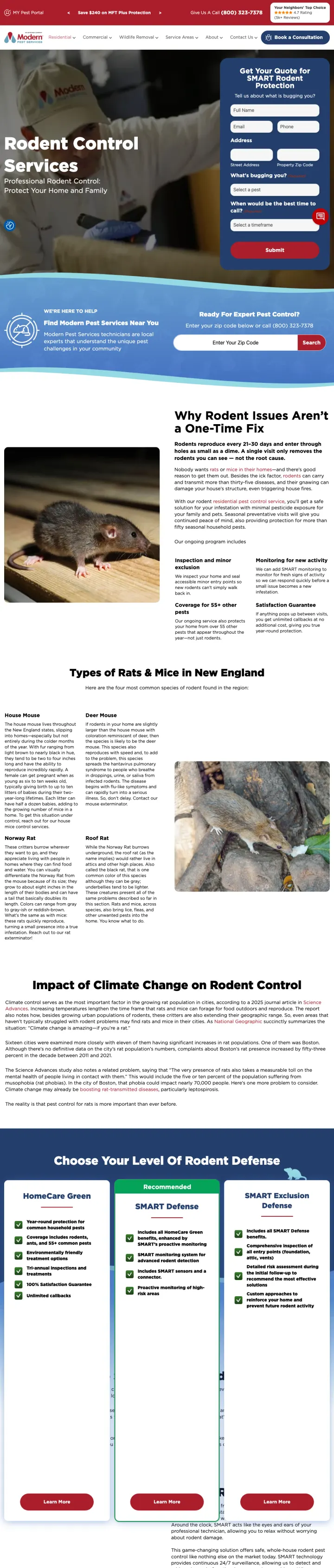
Name your treatment method specifically and explain why it is different. Modern Pest's 'SMART Rodent Protection' (referring to IoT monitoring traps) gives the visitor a reason to pick them over generic competitors who just say 'rodent removal.'
'Get Your Quote for SMART Rodent Protection' names a proprietary treatment system rather than generic 'rodent control' -- this creates a branded reason to choose Modern Pest over any other exterminator and makes price comparison harder
Hero form asks 'What is bugging you?' with a pest-type dropdown plus 'When would be the best time to call?' dropdown -- qualifying the lead by pest type and availability in the form itself means warmer leads for the sales team
5k+ reviews with 4.7 rating displayed in the top bar provides social proof at scale -- most local pest companies show 100-200 reviews, so 5,000+ immediately signals a larger, more established operation
The hero form has 7 fields (name, email, phone, street address, ZIP, pest type, call time) which is excessive for a pest control landing page -- at $15-30 per click for rodent keywords, every abandoned form is expensive
Mid-page content dives into 'Impact of Climate Change on Rodent Control' which is interesting editorial content but irrelevant to a visitor who has rats in their attic right now
Full site navigation (Residential, Commercial, Wildlife Removal, Service Areas, About, Contact Us) stays in place on a page pest shoppers reach from a high-intent ad -- every one of those six links leaks the click Modern Pest just paid for
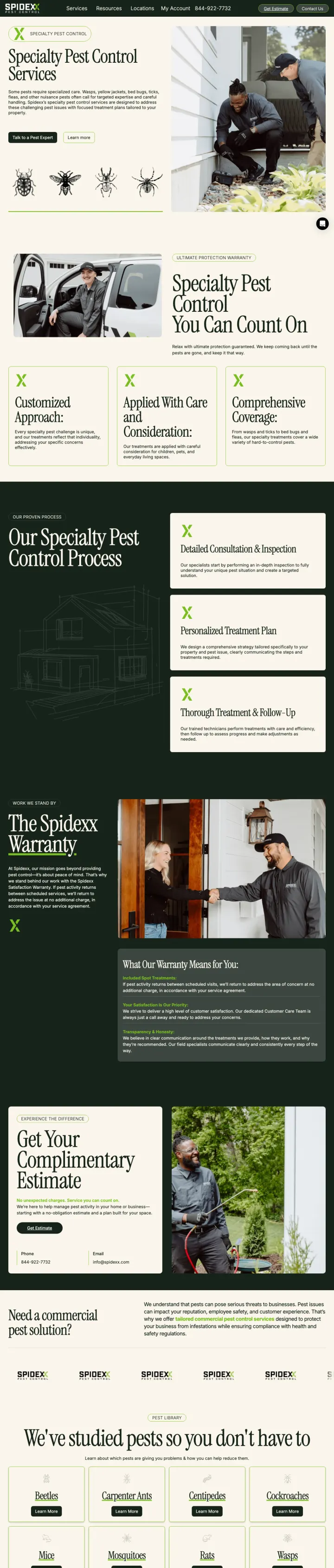
Show your treatment process as numbered steps with icons. Spidexx's 'Our Specialty Pest Control Process' section breaks down what happens during service into clear phases, which addresses the 'what treatment method do they use?' concern that analytical visitors care about.
'Customized Approach' and 'Applied With Care and Consideration' as subheads reframe pest control from aggressive extermination into thoughtful, tailored treatment -- this language appeals to eco-conscious and family-safety-focused visitors
Dual CTA with 'Talk to a Pest Expert' (dark, primary) and 'Learn More' (light, secondary) serves both ready-to-act and still-researching visitors in the hero without overcrowding
Warranty section with specific coverage details mid-page ('The Spidexx Warranty') turns the guarantee from a vague promise into a formal policy with named terms
Hero headline 'Specialty Pest Control Services' is generic and descriptive rather than benefit-driven -- it tells the visitor WHAT Spidexx does but not WHY they should choose Spidexx or what outcome they will get
Pest illustration row (beetle, bee, spider, tick drawings) below the hero uses scientific-style line drawings that look educational rather than urgent -- a visitor with wasps in their attic does not need an entomology lesson
The 'Get Your Complimentary Evaluation' form section is below multiple content sections and requires significant scrolling to reach -- for paid traffic, the primary conversion mechanism should not require 4+ scrolls
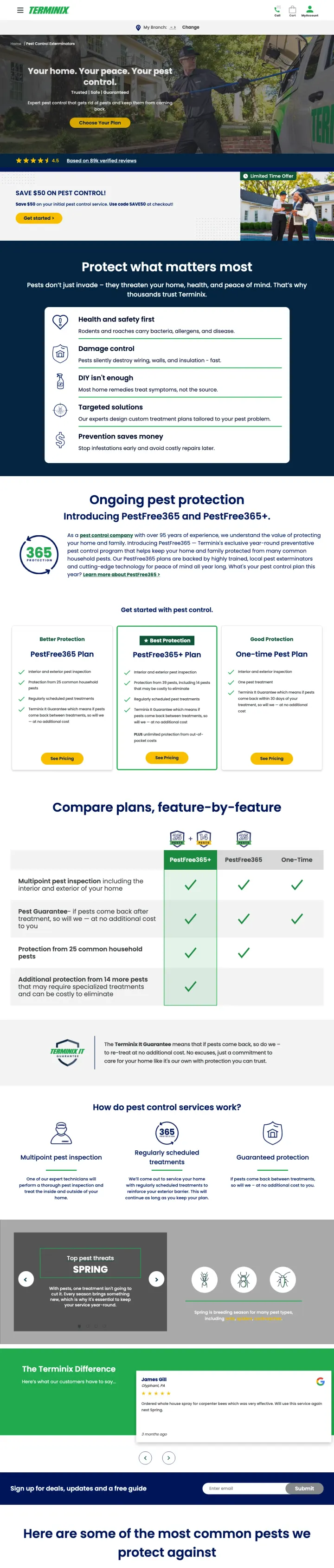
Add a coupon code to your landing page offer. Terminix's 'Use code SAVE50 at checkout' feels like a deal the visitor found rather than a standard discount, which increases perceived value and creates urgency to use it before it expires.
'SAVE $50 ON PEST CONTROL -- Use code SAVE50 at checkout' gives visitors a specific, actionable discount mechanism they can reference when calling -- coupon codes feel exclusive even when they are publicly available on the landing page
89k verified reviews with 4.5 star rating displayed prominently below the hero is the largest social proof volume in the entire set -- this scale of proof is hard for local competitors to match
Plan comparison table ('Compare plans feature by feature') lets analytical visitors compare Basic, Premium, and Premium+ tiers with specific feature differences -- this serves the 'how much does it cost?' objection with structured transparency
The hero form asks 'What is your address?' as the first question, which feels premature -- visitors may not want to share their address before they even understand what Terminix offers or costs
Full site navigation with cart, account, and branch selector creates an e-commerce experience that may confuse visitors expecting a local service page
The 'Limited Time Offer' badge next to the $50 coupon section uses a stock photo of technicians talking to a homeowner that feels staged and overly corporate
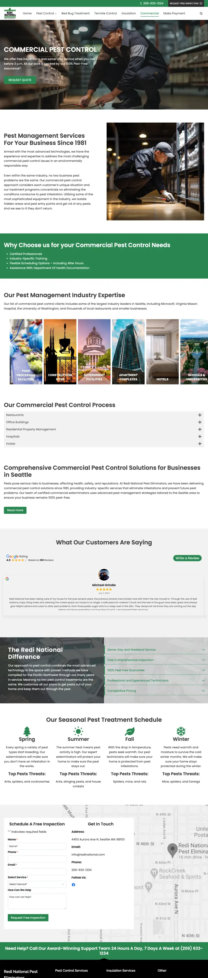
If you serve commercial clients, build a separate landing page that speaks their language. Redi National's 'Pest Management Services For Your Business Since 1981' immediately signals this is B2B, not residential, which filters the audience correctly and builds trust through longevity.
'100% Pest-Free Assurance' is a stronger commercial guarantee than residential-style satisfaction guarantees because businesses face health code violations and shutdowns from pest sightings -- the word 'assurance' carries more weight than 'guarantee' in a B2B context
Industry expertise section with icons for specific commercial verticals (restaurants, warehouses, offices, healthcare) shows the visitor that Redi National understands THEIR type of facility rather than treating all businesses the same
'Same-day service when you call before 3 p.m.' provides a specific, verifiable promise with a clear deadline -- commercial clients need predictable response times for compliance reasons
Full navigation ('Home', 'Bed Bug Treatment', 'Termite Control', 'Insulation', 'Make Payment') sends commercial facility managers down residential-service rabbit holes -- the page positions for commercial clients but every nav link invites them into the wrong funnel
No case studies or named commercial clients visible despite 40+ years in business -- commercial buyers want to see that similar businesses use the service, and 'Since 1981' without named clients is just a number
The 'Request Quote' CTA button in the hero is white text on a dark green background that has low contrast against the dark warehouse hero image behind it
Pages that break the playbook in interesting ways
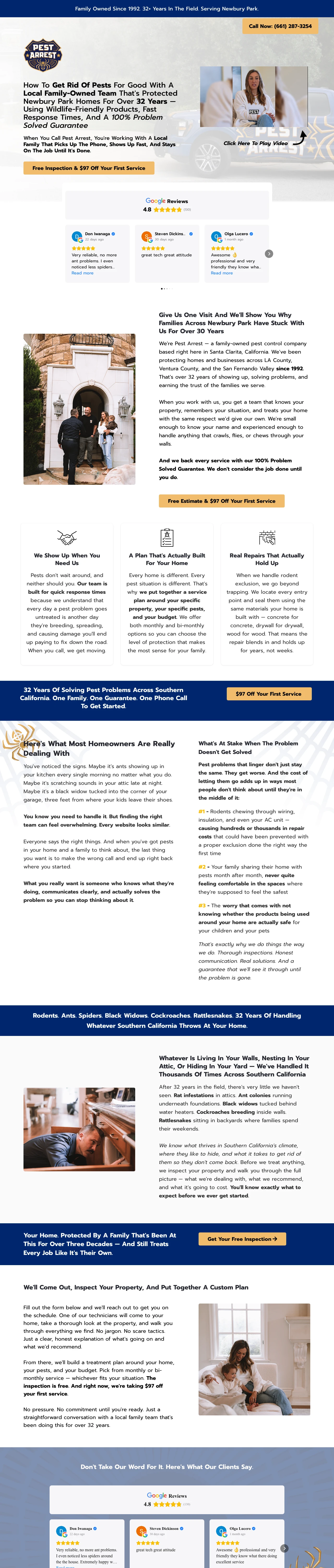
Replace your corporate landing page with a long-form story about your family, your team, and why you do this work. Pest Arrest's page reads like a letter from the owner, not a marketing page. This breaks every 'keep it short' rule but works because pest control is a trust-first purchase where the visitor is letting strangers into their home -- and a family story builds that trust faster than any trust badge.
The headline is a 40-word story-style sentence ('How To Get Rid Of Pests For Good With A Local Family-Owned Team That Has Protected Newbury Park Homes For Over 32 Years') that would fail every headline best-practice test but works because it front-loads every trust signal the visitor needs: local, family, experienced, guaranteed
Video testimonial embed with a named team member explaining the service adds a human face and voice that static pages cannot match -- the 'Click Here To Play Video' with a real person thumbnail builds familiarity before the visitor even calls
Google Reviews section with named reviewers (Don Iwanaga, Steven Dickins, Olga Lucero) and specific 4.8/5 rating with count (130+) appears immediately below the hero, establishing social proof before the long-form copy begins
The page is extremely long with dense copy blocks, bold/italic formatting, and a narrative structure that requires the visitor to read rather than scan -- Red (dominant/urgent) personas who just want to call and book will bounce before reaching the phone number below the fold
The '$97 Off Your First Service' offer from the ad appears only as a button in the hero but is not reinforced or explained further down the page -- on a page this long, the offer should be restated multiple times
The family-story approach only works for local single-location businesses. This is not a scalable template -- it cannot be replicated by multi-location or franchise pest control companies because the authenticity IS the conversion mechanism
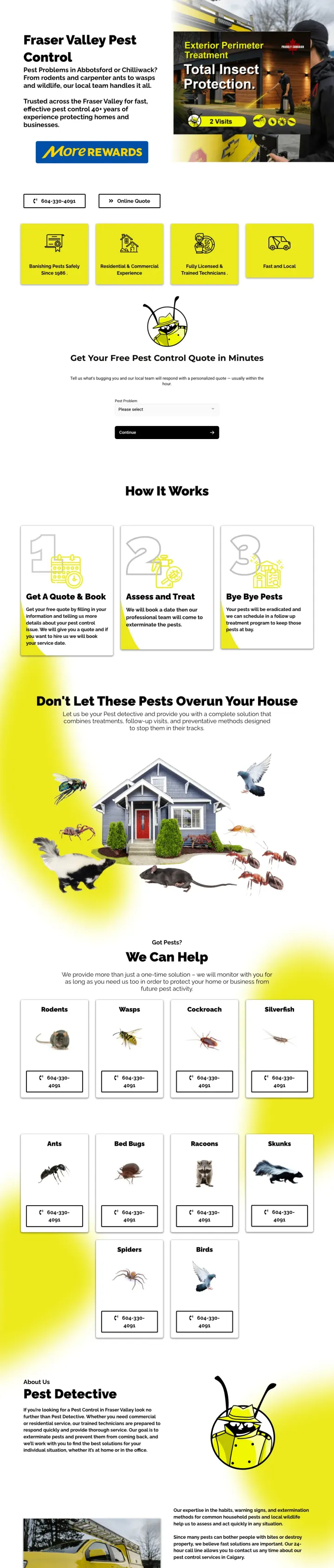
Build a distinctive visual brand identity that makes your pest control company instantly recognizable. Pest Detective's yellow-and-black color scheme, cartoon detective mascot, and 'detective' framing turns a commodity service into a character-driven brand. When every competitor uses green-and-white nature themes, a bold yellow page with a magnifying glass mascot stands out in ad recall and word-of-mouth referrals.
'Exterior Perimeter Treatment -- Total Insect Protection' product card in the hero gives a named, packaged service with a specific treatment scope (exterior perimeter, 2 visits) -- this makes an intangible service feel like a concrete product you can buy off the shelf
MoreRewards loyalty program badge above the fold signals an ongoing relationship model rather than a one-time transaction -- this is unusual for pest control and appeals to Green (steady) personas who want a long-term provider
'How It Works' section with simple numbered steps (Contact, Inspect, Treat, Protect) makes the service process transparent and predictable -- the visitor knows exactly what will happen when they call, which reduces anxiety about letting a stranger into their home
The 'Free Quote' form overlay from the ad is not prominently integrated into the page flow -- the hero area splits between a text block and a product card image, and the form requires scrolling or clicking a separate button to access
Yellow background with black text is high-contrast but also visually intense -- the page feels loud and busy compared to the calm green-and-white pest control convention, which may increase bounce rate among visitors who equate calm design with trustworthy service
The page lists multiple service areas (Abbotsford, Chilliwack, Fraser Valley) but does not confirm which specific location would serve the visitor -- no ZIP code or address validation to personalize the experience
4 pages burning ad spend with fundamental issues
Every click to these pages costs real money. We found broken trust signals, mismatched intent, weak CTAs, and messaging that ignores what the searcher actually typed. Here is what to avoid.
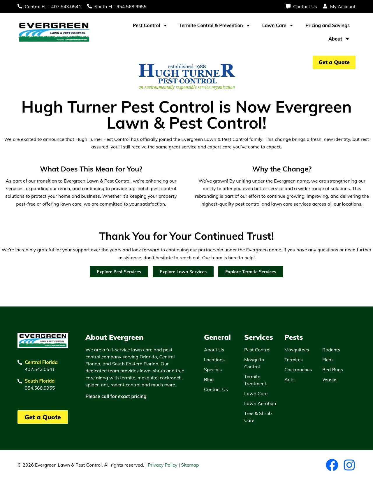
This page exists solely to announce that Hugh Turner Pest Control has been acquired by Evergreen Lawn & Pest Control. It has no form, no phone number above the fold, no service description, no pricing, and no CTA beyond 'Explore Pest Services' links to other pages. Every click at pest control CPCs ($15-30) pays for a corporate press release that tells the visitor their old company changed its name. The visitor searching for pest control does not care about a rebranding -- they have bugs in their house.
No form, no phone number visible, no CTA above the fold -- the page has literally zero conversion paths for a paid visitor. The only actionable elements are three green buttons at the bottom ('Explore Pest Services', 'Explore Lawn Services', 'Explore Termite Services') that link to other pages
Full website navigation with dropdowns (Pest Control, Termite Control & Prevention, Lawn Care, Pricing and Savings, About) means the visitor can go anywhere except convert
The entire page content is about the company's internal business decision (rebranding from Hugh Turner to Evergreen) which is relevant to zero percent of PPC visitors searching for pest control
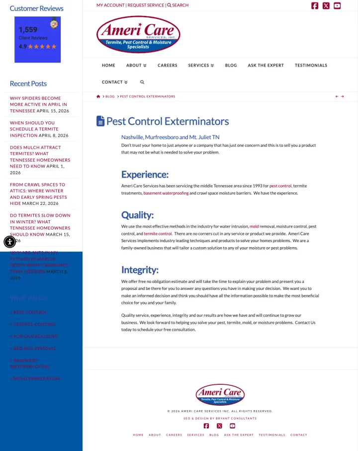
The ad promotes 'Pest control service' for Nashville/Murfreesboro but the page is a text-heavy blog-style article with a left sidebar showing 'Recent Posts' and 'Customer Reviews' in a widget. There is no form, no prominent phone number, no pricing, and no CTA above the fold. The page reads like a company brochure written in paragraphs ('Experience: Ameri Care Services has been servicing the middle Tennessee area since 1993...') rather than a conversion-focused landing page. At Nashville pest control CPCs, every click funds a company bio that reads like a LinkedIn About section.
Left sidebar with 'Recent Posts' links (spider season articles, termite inspection tips, mulch advice) and a blog-style 'Customer Reviews' widget signal this is an interior blog page, not a landing page -- the visitor's attention is split between the content and the sidebar
No form, no phone number above the fold, and no CTA button visible until scrolling -- the visitor has to read multiple paragraphs about the company's experience, quality, and integrity before they can take any action
The headline 'Pest Control Exterminators -- Nashville, Murfreesboro and Mt. Juliet TN' reads like a Yellow Pages listing from 2005 rather than a conversion-focused headline -- it tells the visitor what the company does and where, but not why they should choose Ameri Care or what they get
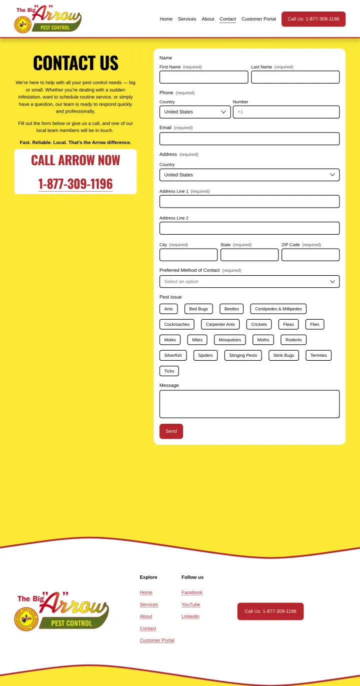
The ad says 'We are Here To Help With All Your Pest Control Needs' but the landing page is a bare contact form asking for first name, last name, phone, country, email, address line 1, address line 2, city, state, ZIP, preferred contact method, pest issue checkboxes, and a message field. There is no hero image, no service description, no pricing, no guarantee, no reviews -- just a massive form on a yellow-and-red page. The visitor who clicked an ad expecting pest control help gets a data collection form that feels like applying for a loan. At $15-30 per click, Arrow is paying to show visitors a form they have no motivation to complete.
15+ form fields with no explanation of what filling out the form gets the visitor -- no 'free inspection' promise, no 'we will call you within 1 hour' commitment, nothing. The visitor is asked to give maximum information in exchange for no stated value
The 'CONTACT US' headline and 'CALL ARROW NOW 1-877-309-1196' subhead are the entire above-fold content -- there is no service description, no trust signal, no reason to believe Arrow is better than the next pest control company
Yellow and red color scheme with no imagery creates a visual experience that looks like a traffic citation rather than a professional service -- the visitor's first impression is a giant form on a garish background
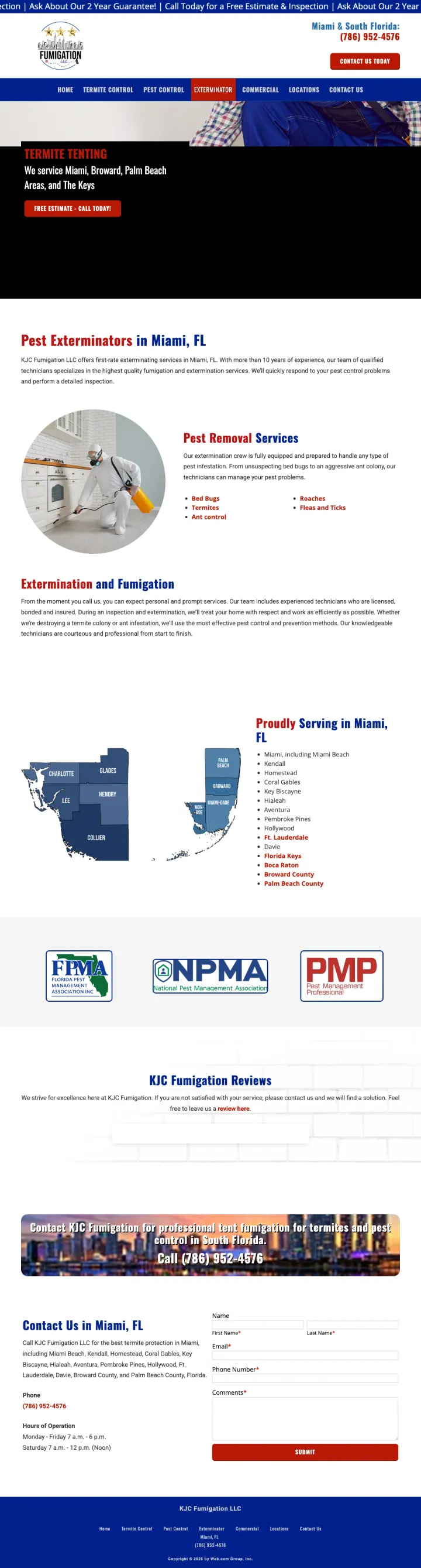
The ad promotes general exterminator services ('Our Mission Is To Keep Your Property Protected Clean & Pest Free') but the page leads with 'TERMITE TENTING' in the hero and shows a tent fumigation photo. A homeowner searching for a general exterminator sees a specialized structural fumigation page and likely bounces -- tenting is an expensive, disruptive service that most pest searchers are not looking for. The page also scrolls through dense paragraphs about fumigation methods, pest removal services, and company history with no clear conversion path above the fold.
Hero shows 'TERMITE TENTING' with a photo of a tented house, but the ad promotes general exterminator services -- a homeowner searching 'exterminator near me' does not want structural fumigation, they want someone to spray for roaches
The page mixes fumigation content with general pest control descriptions without clear visual separation -- the visitor cannot tell if KJC does routine pest spraying or only structural fumigation
Contact form at the bottom asks for name, email, phone, and message but has no offer attached -- no free inspection, no discount, no stated response time. The form just exists with no incentive to fill it out
Pages showing '$49.95 first treatment (up to $144 value)' or '$97 off your first service' give the visitor a concrete reason to act now. Free inspections are table stakes in pest control and do not differentiate. The savings anchor ('that is up to a $144 value') reframes the offer from a cheap in...
The number one customer concern in pest control is 'will the pests come back?' Pages that state 'free re-treatment if you are not 100% happy' in the hero section or trust bar directly below it convert better than pages that mention guarantees only in FAQ sections or footer copy. Drake Pest's 'eli...
Pages showing a uniformed, branded technician actively inspecting or treating a property (Drake, Spidexx, Modern Pest, Orkin) feel trustworthy because the visitor sees who will show up at their home. Pages leading with close-up photos of termites, roaches, or rodents trigger disgust without build...
Only NexGreen and Farrow explicitly lead with 'Keep Pets and Loved Ones Safe from Pests' as their primary headline. Most pages never mention safety at all, leaving the visitor to assume chemical treatments are dangerous. For a service where the technician sprays chemicals inside a family home, no...
Winners strip navigation, lead with a specific dollar offer or guarantee above the fold, show a real technician photo, and address the safety question without being asked. Losers send paid traffic to full-website service pages with menus, sidebars, and blog rolls, or worse, to pages targeting the wrong audience entirely (commercial pest control for residential searchers, rebranding announcements for people with active infestations)..