Free: 96 PPC tools + my AI Playbook book

Plumbing is two totally different businesses. There's the 2am emergency where someone's basement is flooding and they need a phone number in 1 second. And there's the bathroom remodel where they're comparing 3 quotes over a week. Same keyword, completely different person. One template doesn't work for both.
From real plumbing services Google Ads campaigns in the US
The landing pages actually worth stealing from
So you know exactly what to avoid
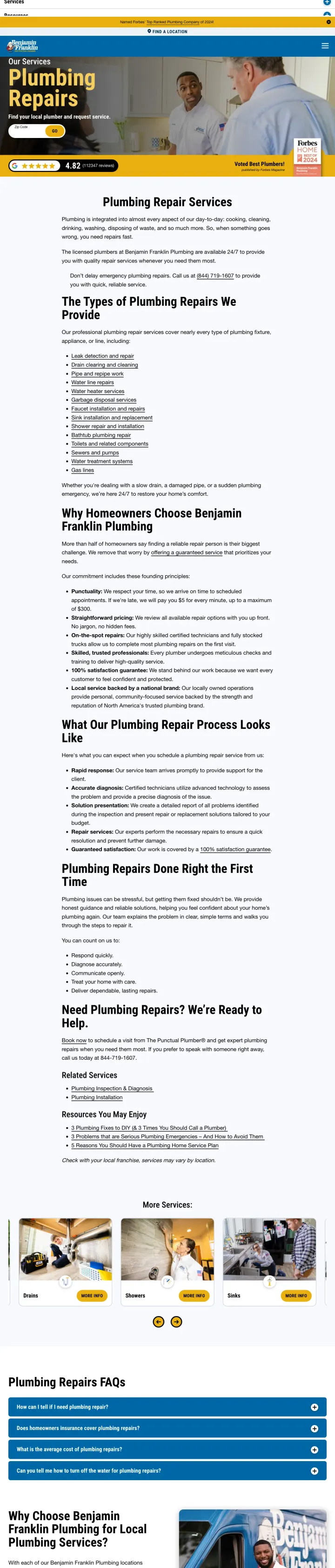
Display your total review count at company-wide scale (112,347 reviews) with a third-party validation badge (Forbes Home Best of 2024) side by side -- the combination of volume and editorial endorsement creates trust that no local competitor can match.
Google 4.82 rating from 112,347 reviews shown as a prominent bar below the hero -- the sheer volume (six figures) makes competitive review counts look insignificant and the 4.82 (not 5.0) reads as genuinely aggregated rather than cherry-picked
'Voted Best Plumbers! published by Forbes Magazine' with the Forbes Home 2024 badge -- third-party editorial validation from a recognized publication is harder to earn and harder to fake than self-reported certifications
Zip code entry field with 'Find your local plumber' lets the visitor self-localize before engaging further, pre-qualifying them for the nearest franchise location
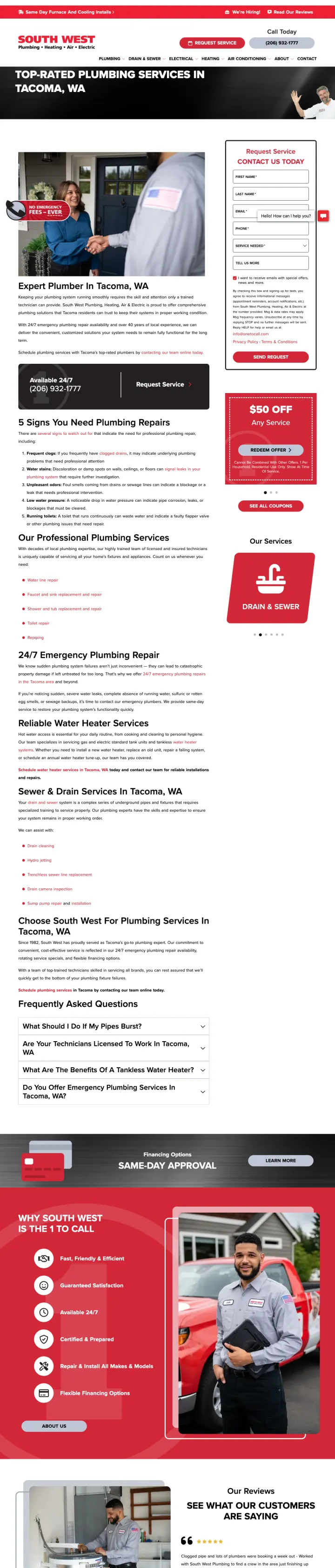
The page is a national service page (/services/plumbing-repairs) rather than a local landing page -- a visitor searching 'plumbers lafayette la' lands on a page about plumbing repairs generally, not Lafayette plumbing specifically
No pricing, no offers, and no specific dollar amounts anywhere above the fold -- for a considered purchase where pricing transparency is a top-3 customer concern, this page asks the visitor to call before knowing what anything costs
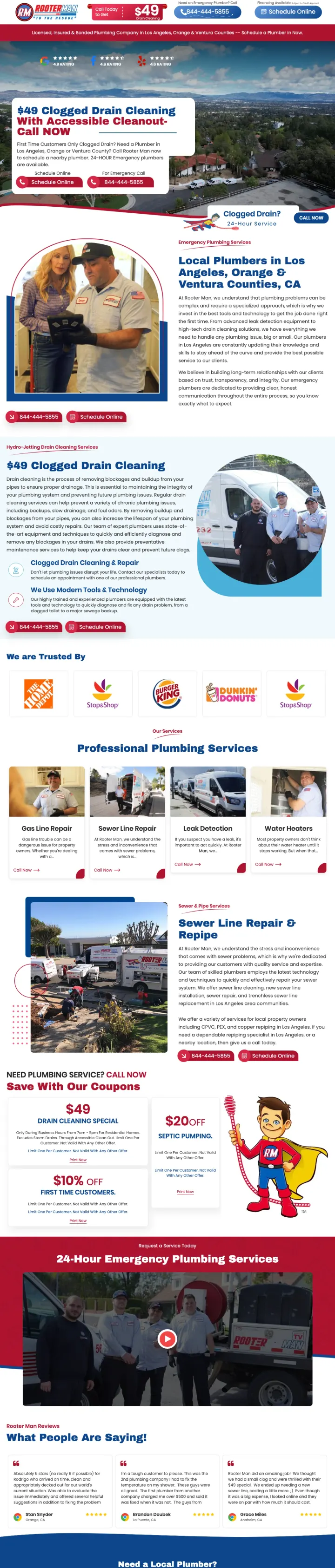
Lead with your lowest-commitment service at a specific dollar amount ($49 drain cleaning) as the hero headline, then repeat the offer mid-page and at bottom -- the price itself becomes the trust signal because it is too specific to be bait-and-switch.
$49 drain cleaning with explicit conditions (first-time customers, accessible cleanout, business hours 7am-5pm) counters the overcharging fear by showing the company has nothing to hide about pricing limitations
Dual CTA above fold -- 'Schedule Online' button and '844-444-5855' phone button side by side -- serves both the planned-work visitor who wants to book and the emergency caller who needs to talk to someone now
Three review platform ratings (4.9, 4.6, 4.6) shown as separate badges across the top rather than a single score -- this triangulation across platforms is harder to fake than one inflated number
The hero background is an aerial cityscape photo with no plumbing context -- a burst pipe or technician working would reinforce the service faster than a neighborhood view
Named reviewer testimonials are excellent but buried past two full scrolls -- the long-form reviews (Paul Savage, Stan Snyder, Brandon Doubek) should appear higher since plumber trust is review-driven
Commercial client logos (Home Depot, Burger King, Dunkin Donuts) signal B2B capability but may confuse residential homeowners who wonder if this company serves regular homes
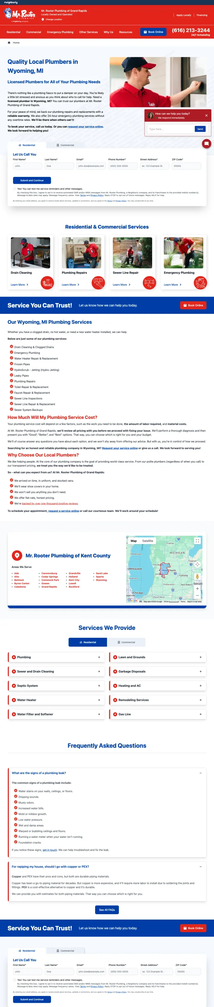
State your warranty and pricing policies in the body copy rather than burying them in terms -- 'we back our plumbing repairs and replacements with a reliable warranty' and 'no overtime rates' in the first three paragraphs answers the two biggest plumbing objections before the visitor even formulates them.
'We also offer 24-hour emergency plumbing services without any overtime rates' stated plainly in body copy -- this is the single most powerful sentence on any plumbing page because it eliminates the #1 fear (emergency surcharges) without requiring a badge or banner
Residential and Commercial tabs above the service list let visitors self-segment without loading a new page -- the homeowner sees residential services first while the property manager can switch to commercial
Chat widget with 'We respond immediately' text signal visible in the lower right -- for visitors who are not ready to call but want fast answers, immediate chat response is a meaningful differentiator
The hero image shows a single technician in a red polo looking at a clipboard rather than actively working -- a plumber fixing a pipe or using equipment would communicate competence more immediately
The body copy is dense with three paragraphs before any visual break -- for an emergency visitor, this reads like a terms-of-service page rather than a 'we can help you right now' page
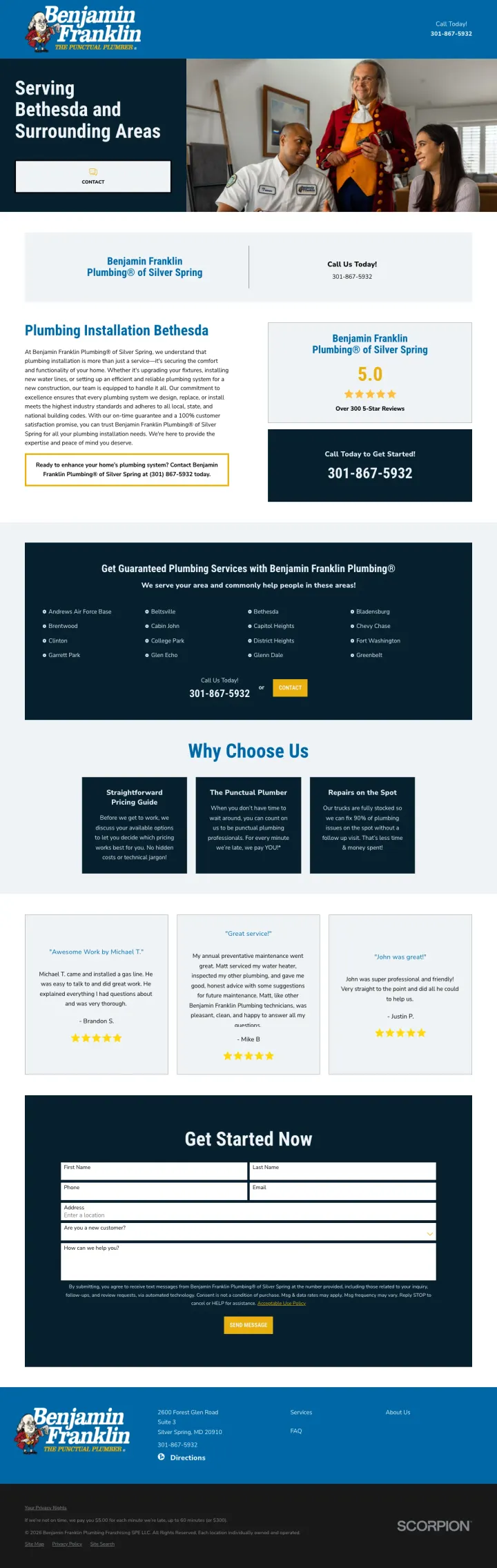
Lead your ad headline with 'There Are No After-Hour Fees' and deliver that promise visibly on the landing page -- for plumbing, where 80% of emergencies happen outside business hours, this single statement removes the biggest cost anxiety.
The ad headline 'There Are No After-Hour Fees' directly addresses the emergency plumbing surcharge fear before the click happens -- the visitor arrives already knowing the price will not spike because it is 2am
'Get Guaranteed Plumbing Services with Benjamin Franklin Plumbing' section mid-page with a form reinforces the quality promise at the exact point where the visitor might be evaluating alternatives
5.0 review score with blue badge visible in the right sidebar provides constant trust reinforcement as the visitor scrolls through service descriptions
The hero headline says 'Serving Bethesda and Surrounding Areas' which is a location confirmation, not a value proposition -- the no-after-hour-fees promise from the ad is nowhere in the hero section
The Ben Franklin mascot character in colonial costume occupies significant hero space but adds no trust or urgency for a modern homeowner with a plumbing emergency
Turn your most common service into a money-back guarantee ('$153 Drain Clear Or It's Free') that eliminates the risk entirely -- the odd, specific dollar amount ($153 not $150) signals this is a real calculated price, not a marketing round number.
The '$153 Drain Clear Or It's Free' headline in the ad copy is an unusually specific price that signals genuine cost calculation rather than a marketing-friendly round number -- specificity builds trust
'No Emergency Fees -- EVER' badge overlaid on the hero image directly addresses the #1 plumbing objection (emergency price gouging) before the visitor even has time to worry about it
Side-by-side layout with real technician-at-the-door photo on left and lead form on right means both the emotional proof (uniformed professional, American flag patch) and the conversion path are visible in a single glance
The page headline says 'Tacoma, WA' but does not mention plumbing until below the fold -- the visitor searching 'plumbers tacoma' sees a location confirmation but not a service confirmation in the first two seconds
Discount badge ($50 off) is positioned below the fold requiring a scroll to discover -- for a price-sensitive industry, the offer should be the first thing the visitor processes
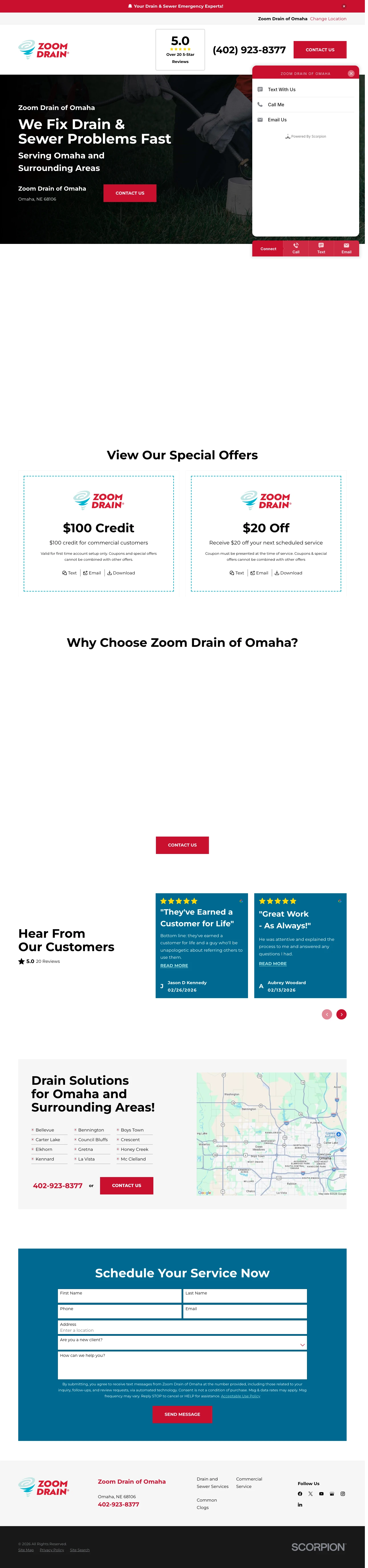
Position as a specialist (drains and sewers only, not general plumbing) so the visitor immediately knows this company does their exact problem all day, every day -- specialization is a trust shortcut in a generalist market.
5.0 rating with 'Over 20 5-Star Reviews' shown in a bordered box next to the phone number -- the perfect score plus the modest review count reads as authentic rather than inflated
Multi-channel contact widget (Text With Us, Call Me, Email Us) lets the visitor choose their preferred communication method -- critical because some drain problems are embarrassing and text removes the awkwardness of describing a sewage backup by voice
$150 credit and $20 off special offers shown immediately below the fold with clear redemption terms -- gives the planned-work visitor a reason to choose Zoom Drain over the next search result
The hero image shows gloved hands holding a drain pipe, which communicates 'we do plumbing' but not 'we can be there fast' -- an image showing a van arriving or a technician at a doorstep would better serve the emergency visitor
'Zoom Drain of Omaha' appears four separate times above the fold (header, hero subhead, hero footer, contact widget header) -- this repetition wastes space that could show a response-time guarantee or warranty
The scheduling form at the bottom requires scrolling past six full sections -- an emergency caller should not have to scroll past 'Why Choose Zoom Drain' content to book
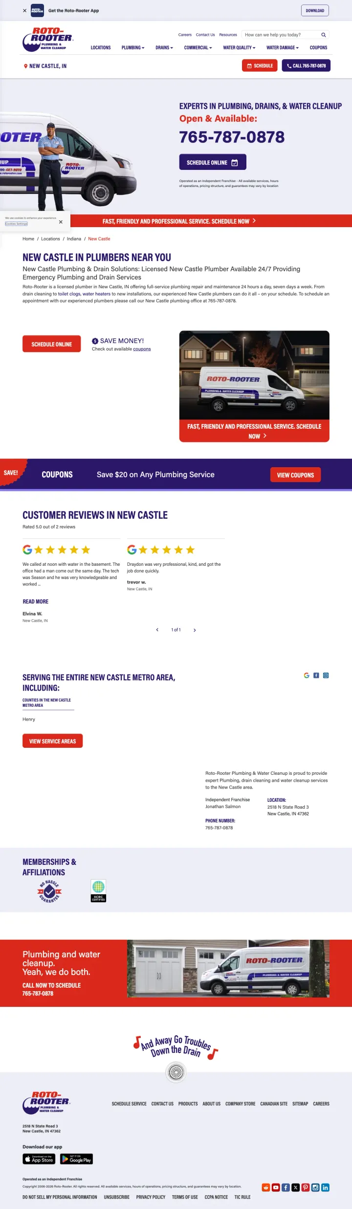
Show the phone number at full headline size directly under 'Open & Available:' -- for emergency plumbing, the number being the visual anchor of the page communicates readiness more than any copy could.
Phone number (765-787-0878) appears at near-headline size directly under 'Open & Available:' text -- the juxtaposition of availability status and phone number creates an instant 'call now' trigger for emergency visitors
'Save $60 on Any Plumbing Service' coupon with 'Get Coupon' button creates a micro-conversion for visitors not ready to call -- they engage with the offer and are one step closer to booking
Local reviews section with named New Castle customers and star ratings grounds the national brand in the specific community, countering the 'just a franchise' objection
The franchise disclaimer ('Operated as an Independent Franchise - All available services, hours of operations, pricing structure, and guarantees may vary by location') undermines every promise on the page -- it tells the visitor that nothing they are reading is guaranteed
Service area list (13+ cities) takes up significant page real estate that could show pricing or response time guarantees -- area coverage matters but not as much as cost and speed for a plumbing emergency
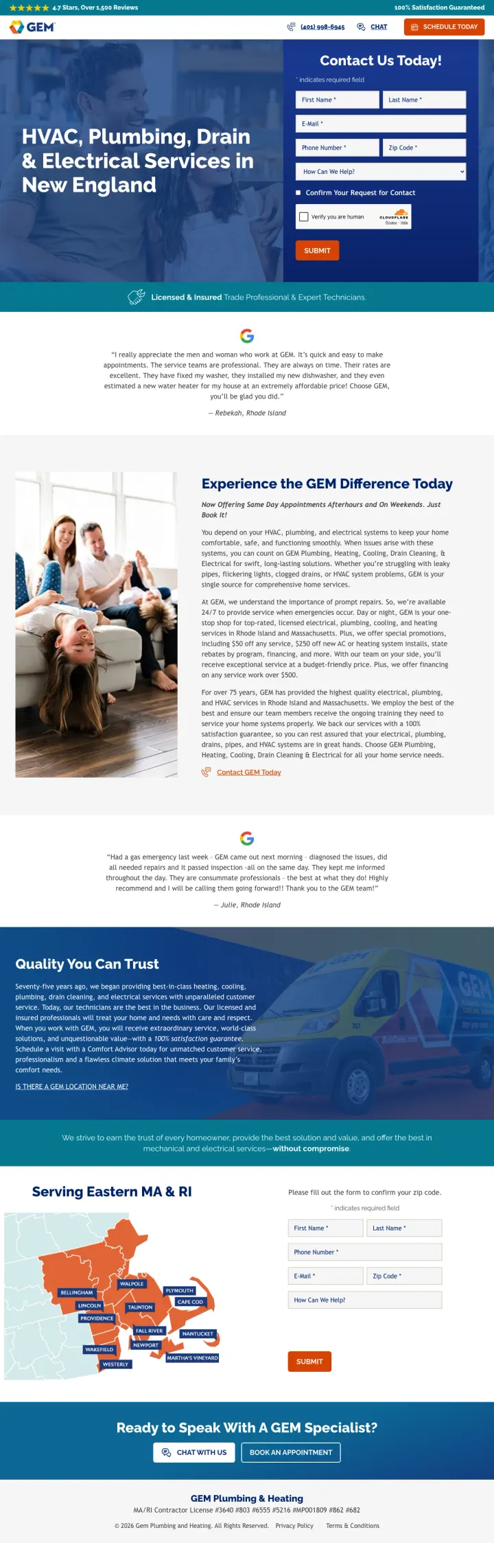
Stack your three strongest trust signals in a single top banner (star rating + review count + satisfaction guarantee) so the visitor absorbs all three before even processing the headline or form.
'4.7 Stars, Over 1,500 Reviews' and '100% Satisfaction Guaranteed' in the top banner line -- the visitor sees social proof and risk reversal before they process anything else on the page
Form includes 'How Can We Help?' dropdown with specific service categories (HVAC, Plumbing, Electrical, Commercial) -- this pre-qualification saves the dispatch team time and signals to the visitor that the company handles their specific need
'Licensed & Insured Trade Professional & Expert Technicians' bar immediately below the form section uses a checkmark icon to visually confirm the credential, making it feel verified rather than claimed
The headline reads 'HVAC, Plumbing, Drain & Electrical Services in New England' which lists four service categories -- a visitor searching for 'gem plumbing' has to parse whether plumbing is the primary focus or an afterthought
The form requires SMS consent checkbox and Cloudflare verification before submission -- each additional friction step in the form reduces completions, and mandatory SMS opt-in is aggressive for a first interaction
Pages that break the playbook in interesting ways
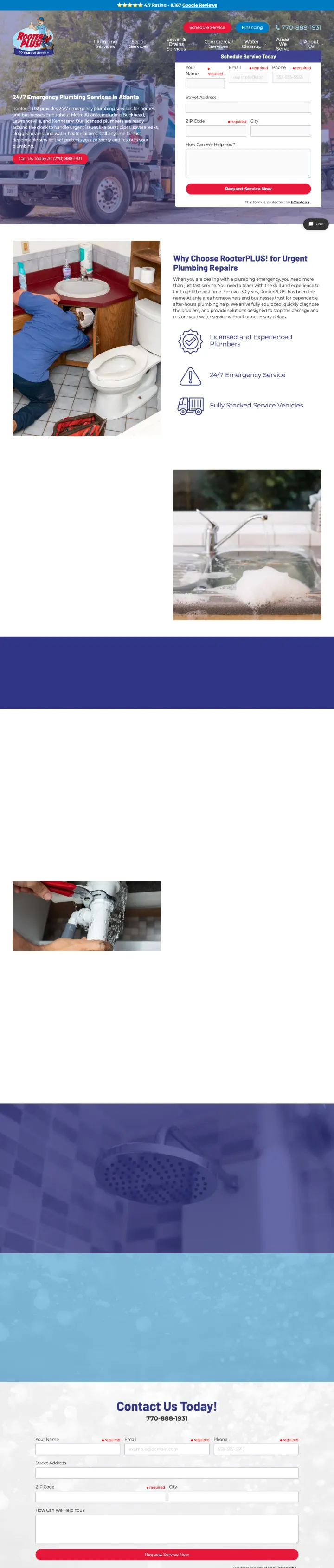
For emergency-intent keywords, let the lead form BE the hero -- skip the headline-image-CTA convention entirely and put the form fields where the hero image would normally go, so the visitor's first interaction is filling out their information.
The lead form occupies the entire right half of the above-fold viewport -- there is no hero image, no headline section, no trust section that the visitor must process before seeing the form
8,167 Google Reviews at scale creates an intimidation gap that no local competitor can close -- the specific number (not rounded to 8,000) signals live data rather than a marketing claim
Purple and red color scheme is visually distinctive in a market where every competitor uses blue and red -- brand differentiation through unexpected color choice makes the page memorable
The 7-field form (name, email, phone, address, zip, city, message) is too long for emergency intent -- when water is flooding the kitchen, the visitor will call the phone number rather than type their street address into a form
Below the fold, the page has sparse content with large whitespace gaps between sections -- the above-fold experience is intense but the rest of the page feels unfinished
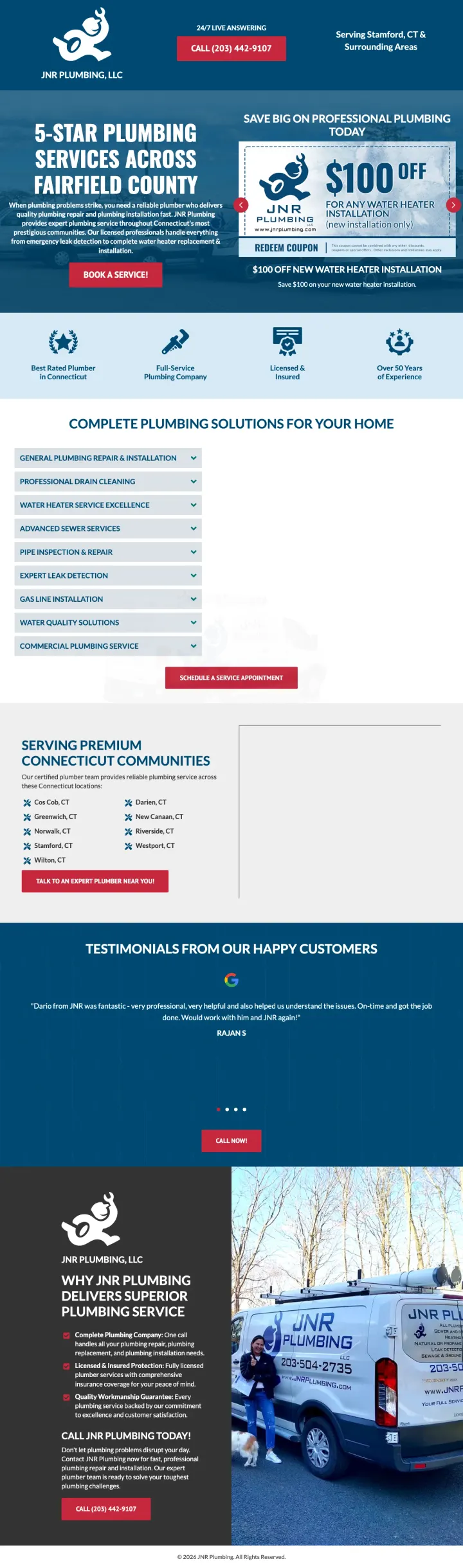
Instead of hiding your service area in a footer list, name-drop your most prestigious neighborhoods in the hero section as a positioning statement -- 'Serving Connecticut's most prestigious communities' tells affluent homeowners this company understands their expectations.
The coupon carousel format (rotating physical-coupon-styled cards with dashed borders) breaks the plumbing landing page convention of a single hero offer -- most plumbing pages pick one price to lead with, JNR shows three and lets the visitor choose
Naming specific affluent communities (Stamford, Greenwich, Darien, Westport, New Canaan) in the service area section is geographic targeting AND price positioning -- it signals 'we serve expensive homes and charge accordingly'
The dedicated PPC subdomain (call.jnrplumbing.com) isolates paid traffic conversion tracking from the main website, a technical sophistication most small plumbers lack
No review score visible anywhere on the page -- in a market where competitors show 4.7+ ratings with thousands of reviews, the absence reads as 'we do not have reviews worth showing'
The testimonials section shows quotes but no star ratings, no review platform badges, and no full names -- unverifiable quotes are the weakest form of social proof
3 pages burning ad spend with fundamental issues
Every click to these pages costs real money. We found broken trust signals, mismatched intent, weak CTAs, and messaging that ignores what the searcher actually typed. Here is what to avoid.
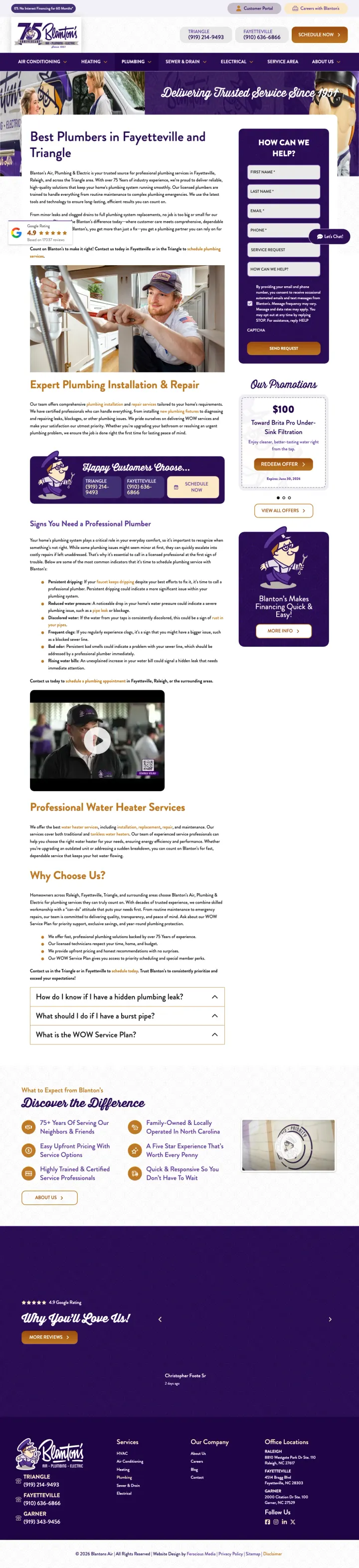
The company name is 'Blanton's Air, Plumbing & Electric' with 'Air' first -- a visitor searching 'plumbers in chapel hill nc' lands on a page where the brand signals HVAC as the primary service
The hero image shows a van with 'Air - Plumbing - Electric' branding and the hero text says 'Delivering Trusted Service Since 1951' -- neither the image nor the tagline confirms this page is about plumbing specifically
75 years of experience (since 1951) is buried in a anniversary badge rather than stated as a headline -- this is the strongest differentiator a local plumber could have, and it is treated as decoration
The above-fold content is a paragraph explaining why chemical drain cleaners are bad for pipes -- the visitor already knows they have a clogged drain, they do not need a chemistry lesson on why Drano is harmful
No phone number, no form, and no pricing visible above the fold -- the visitor searching 'drainage service' on Oahu at $15+ per click sees a headline and an educational paragraph before any conversion path
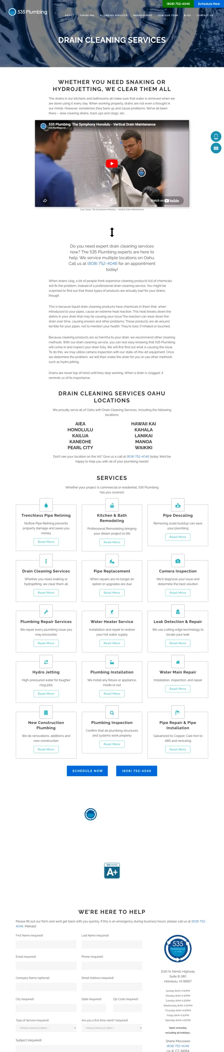
The page headline ('DRAIN CLEANING SERVICES') is the exact same text as the service category -- it confirms what the page is about but offers no reason to choose 535 Plumbing over any other drain cleaner
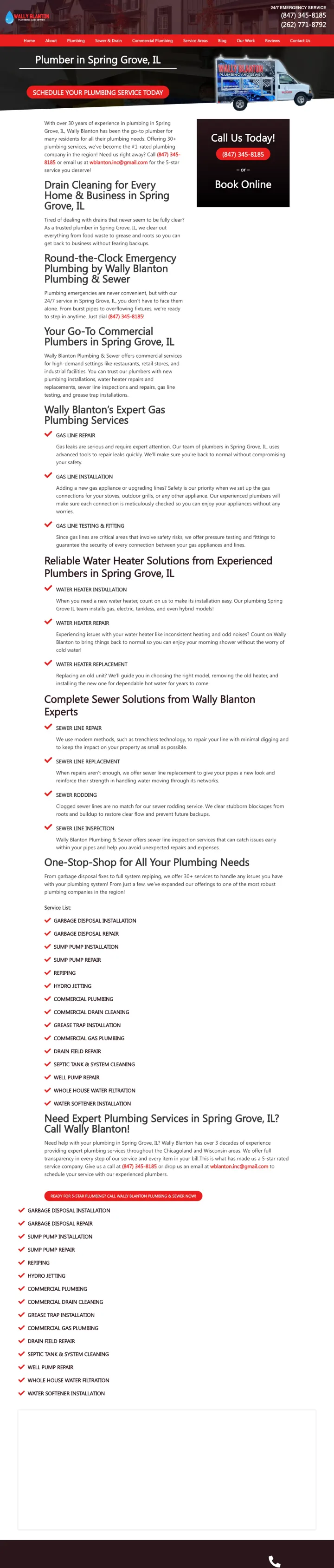
The page packs two phone numbers, a 'Schedule Your Plumbing Service Today' button, a Gmail address, a sidebar CTA, body text, and a service truck image all above the fold -- the visitor processes visual noise rather than a clear message
The company email is wblanton.inc@gmail.com (a Gmail address) which undercuts every other trust signal on the page -- a 30-year plumbing company using a free email service signals that the web presence is an afterthought
The page is a full website with 10-item navigation menu (Home, About, Plumbing, Sewer & Drain, Commercial, Service Areas, Blog, Our Work, Reviews, Contact Us) sending PPC traffic to a leaky funnel
The strongest plumbing pages lead with a concrete price ($49 drain cleaning, $153 drain clear or it is free, $100 off water heater installation) rather than vague promises. This works because plumbing searchers -- especially emergency ones -- have been burned by the '$29.99 service call' that bec...
Pages where the phone number is visually the largest or second-largest element above the fold outperform pages where it sits in a standard header bar. For emergency plumbing callers in fight-or-flight mode, the phone number IS the conversion action. Making it massive and clickable communicates 'w...
Pages that show 2-3 rotating or adjacent coupon cards ($49 drain cleaning + $100 off water heater + free sewer camera inspection) outperform single-offer pages. Plumbing searchers often know what is broken but not what the service is called. Showing multiple bounded offers lets the visitor find t...
National brands (Roto-Rooter, Benjamin Franklin, Mr. Rooter) all serve localized pages, but the ones that work include local reviews with named reviewers and specific neighborhoods mentioned. The ones that fail show corporate boilerplate with a city name swapped in. Plumbing is inherently local -...
Winners lead with a dollar-specific offer or massive phone number within two seconds of page load, serve a single plumbing intent, and reinforce trust with local reviews from named customers. Losers send plumbing search traffic to multi-service catch-all pages, bury the phone number in a standard header, and pad the page with SEO paragraphs that no emergency caller will read..