Free: 96 PPC tools + my AI Playbook book

These are real project management software pages spending actual money on Google Ads right now.
From real project management software Google Ads campaigns in the US
The landing pages actually worth stealing from
So you know exactly what to avoid
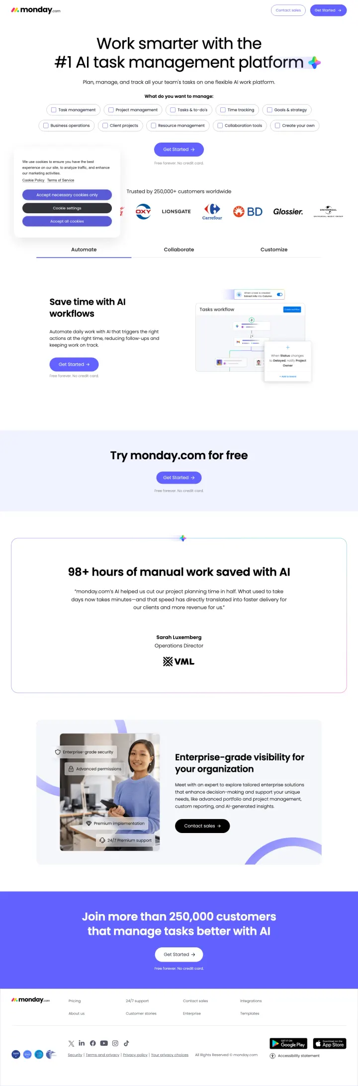
Put a Google SSO signup button and email field directly in the hero section (not behind a 'Get Started' button that navigates to another page) with 'Free forever. No credit card.' underneath, so the visitor can start a trial without leaving the landing page.
Use-case selector dropdown in the hero ('What do you want to manage: Task management / Project management / Tasks & to-dos / Time tracking') lets the visitor self-identify their need, which both personalizes the experience and gives monday.com data about search intent for follow-up
Named testimonial with specific metric: Sarah Luxemberg, Operations Director -- '98+ hours of manual work saved with AI' -- is more credible than an anonymous '5-star review' because it attaches a real name, title, and quantified outcome to the claim
'Free forever. No credit card.' repeated 5 times throughout the page hammers the zero-risk message -- this addresses the Green persona's adoption anxiety ('what if my team tries it and we have to switch again') by making the trial feel consequence-free
The hero product screenshots are too small to read -- the Kanban board, Gantt chart, and dashboard views are visible but the text and data within them are illegible, which defeats the purpose of showing the product
The tabbed section (Automate / Collaborate / Customize) below the fold shows product screenshots but requires clicking each tab -- visitors who do not click miss 2 of 3 product views, and tab interaction rates on landing pages are typically under 20%
The enterprise section ('Enterprise-grade visibility for your organization / Contact sales') creates a jarring tone shift from the self-serve trial messaging above it -- the visitor was being told 'free forever' and is now being asked to talk to sales
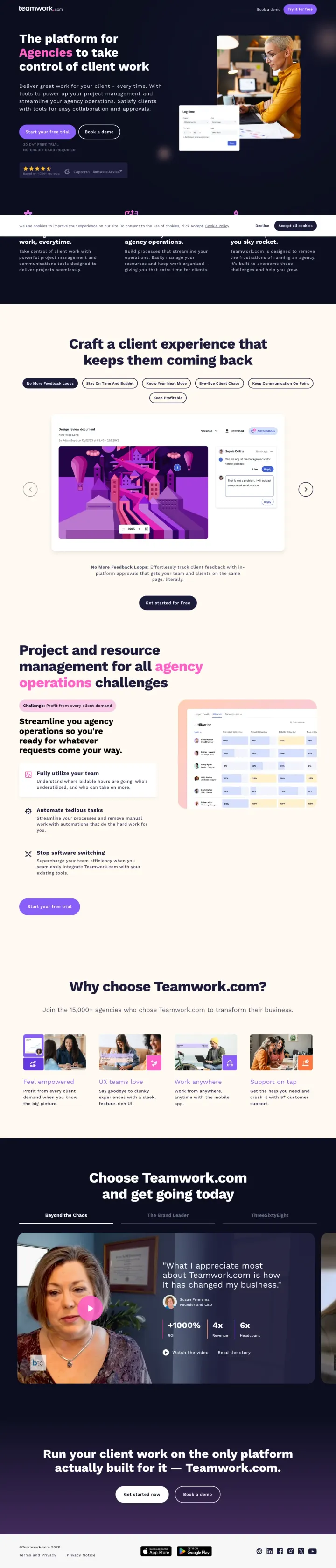
Name your buyer segment in the headline ('The platform for Agencies') and back it with a named customer video testimonial that includes specific business metrics ('+1000% ROI, 4x Revenue') so the visitor sees both who this is for and proof that it works in the first two scrolls.
Three named video testimonials (Susan Fennema/Beyond the Chaos, Kyle Duford/The Brand Leader, Kara Pitre/ThreeSixtyEight) with company logos, headshots, and specific metrics -- video testimonials from real agency owners are nearly impossible to fake and carry more weight than any G2 badge in this market
Tab-based feature showcase ('No More Feedback Loops' / 'Stay On Time And Budget' / 'Know Your Next Move') with product screenshots for each tab -- this lets the visitor self-select the feature they care about instead of forcing them through a linear scroll of features they may not need
Dual CTA structure ('Start your free trial' + 'Book a demo') with '30 DAY FREE TRIAL / NO CREDIT CARD REQUIRED' directly below serves both self-serve evaluators and enterprise buyers who need a guided walkthrough
The hero section uses a real photo of people in a meeting room, but it is not a product screenshot -- the visitor has to scroll past the hero to see what Teamwork.com actually looks like, which wastes the most valuable real estate on the page
Three full video transcripts are embedded as text on the page (1,000+ words of transcript), adding significant page weight and visual clutter that most visitors will scroll past without reading
The 'Why choose Teamwork.com?' section shows four thumbnail images (profitability, UX, remote work, support) but they are stock-style thumbnails that do not show the actual product -- a missed opportunity to reinforce the product demo
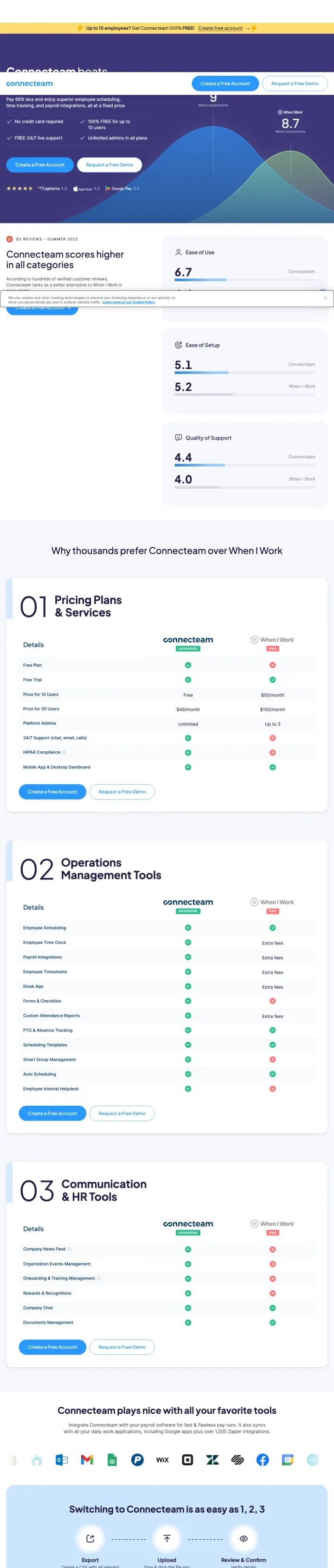
Build a dedicated comparison landing page that names the competitor in the headline, shows side-by-side pricing, and includes numbered feature advantages so the visitor scanning for differences finds them instantly.
Numbered feature sections (01 Pricing Plans & Savings, 02 Operations Management Tools, 03 Communication & HR Tools) give the comparison page a structured, scannable format that lets visitors jump to the category they care about most
Direct pricing comparison showing Connecteam at $0 for up to 10 users vs When I Work paid plans makes the cost advantage immediately tangible without requiring the visitor to visit a separate pricing page
Named testimonial with photo and star rating (4.5/5 from a real user) placed mid-page breaks up the comparison content with social proof at the exact moment the visitor is evaluating credibility
The page is extremely long with dense text comparisons that repeat similar points across sections, causing scroll fatigue before the visitor reaches the CTA at the bottom
The hero gradient (purple to blue) with small text and a busy chart graphic makes the above-fold content hard to parse quickly, and the primary value proposition gets lost in visual noise
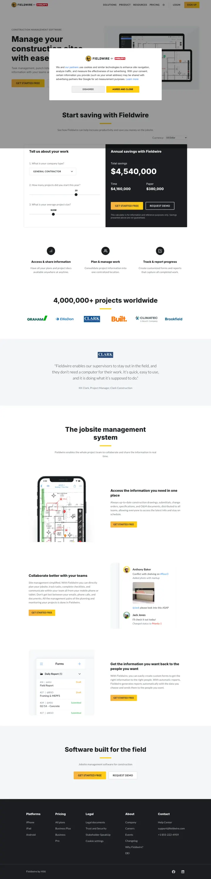
Embed an interactive savings calculator above the fold that shows annual dollar savings based on company size, so the visitor sees their personal ROI before they even scroll to features.
Interactive savings calculator (Annual savings with Fieldwire: $4,540,000) dynamically updates based on company size inputs, turning the hero section into a personalized ROI tool rather than a generic value proposition
Named testimonial from a Project Manager (Fieldwire enables our superintendents to stay out in the field...it is quite easy to use) uses plain language that sounds authentic, not marketing-polished
Transparent pricing in the footer section ($23/user/month and $59/user/month) with feature breakdowns removes the contact-sales-for-pricing friction that kills conversion for mid-market buyers
The hero headline (Manage your construction projects with ease) is generic and could describe any of 50 construction PM tools, wasting the most valuable real estate on a slogan instead of the savings calculator headline
The How can we help modal overlay in the hero with 4 options adds an unnecessary decision step before the visitor can engage with the page content
Pages that break the playbook in interesting ways
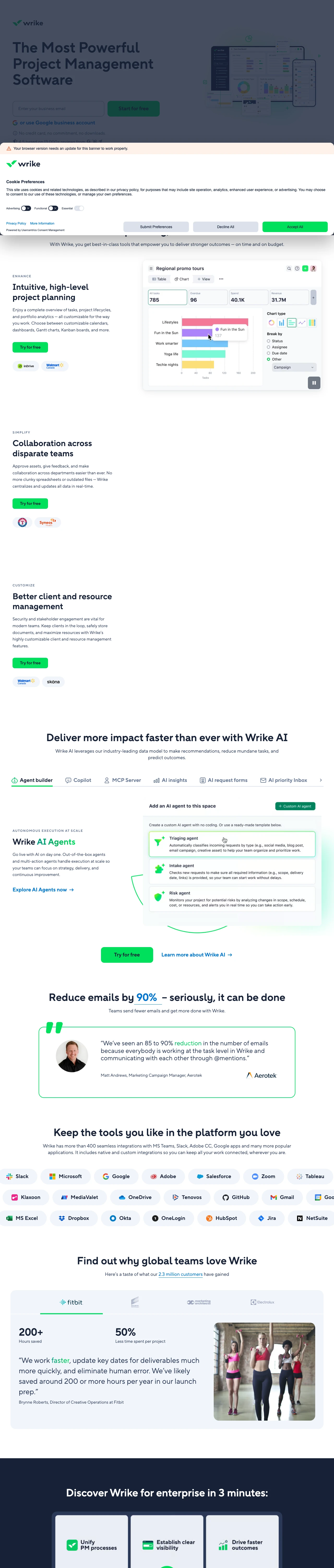
Why This Breaks the Rules: Wrike runs its paid traffic through trial.wrike.com, a separate subdomain with zero site navigation, no hamburger menu, and no exit paths except the signup form. Most PM tools send PPC traffic to their main marketing site with full navigation (monday.com has 8 nav links, ClickUp has 5). Wrike eliminates every distraction and puts the email signup field directly in the hero -- not behind a button, not on a separate page. The page then unfolds into a full-length content page (1,465 words, 20 headings) that rivals the depth of a homepage, but with no way to leave except signing up. This is a hybrid: the conversion focus of a squeeze page combined with the content depth of a marketing site.
Email input field directly in the hero with 'Start for free' button and 'No credit card, no commitment, no downloads' subtext removes every friction point -- the visitor can start a trial without clicking through to another page, entering a credit card, or downloading anything
Customer logo pairs under each feature section (inDrive + Walmart under Planning, Texas Rangers + Syneos Health under Collaboration) contextualize each feature with real customers who use it for that specific purpose, which is more persuasive than a generic logo wall
The AI section (Agent builder, Copilot, MCP Server, AI insights, AI request forms, AI priority inbox, AI content) is the most comprehensive AI feature showcase in this set -- it positions Wrike as the AI-forward choice by dedicating 7 subsections to AI capabilities while competitors mention AI in passing
The headline 'Effortless planning, smarter execution' is generic enough to describe any of 100 PM tools -- it does not match the ad copy ('Plan Projects With Wrike' / 'Design Your Own AI Agents') and wastes the above-fold real estate on a slogan instead of a specific value proposition
The page is extremely long (1,465 words, 20 headings) with repeating content sections -- the same three feature tabs (Planning, Collaboration, Resource Management) appear to be duplicated, which suggests a CMS template issue rather than intentional design
The named testimonial (Matt Andrews, Aerotek: '85 to 90% reduction in emails') appears far below the fold in a section most visitors will never reach -- burying the most credible social proof element on the page
5 pages burning ad spend with fundamental issues
Every click to these pages costs real money. We found broken trust signals, mismatched intent, weak CTAs, and messaging that ignores what the searcher actually typed. Here is what to avoid.
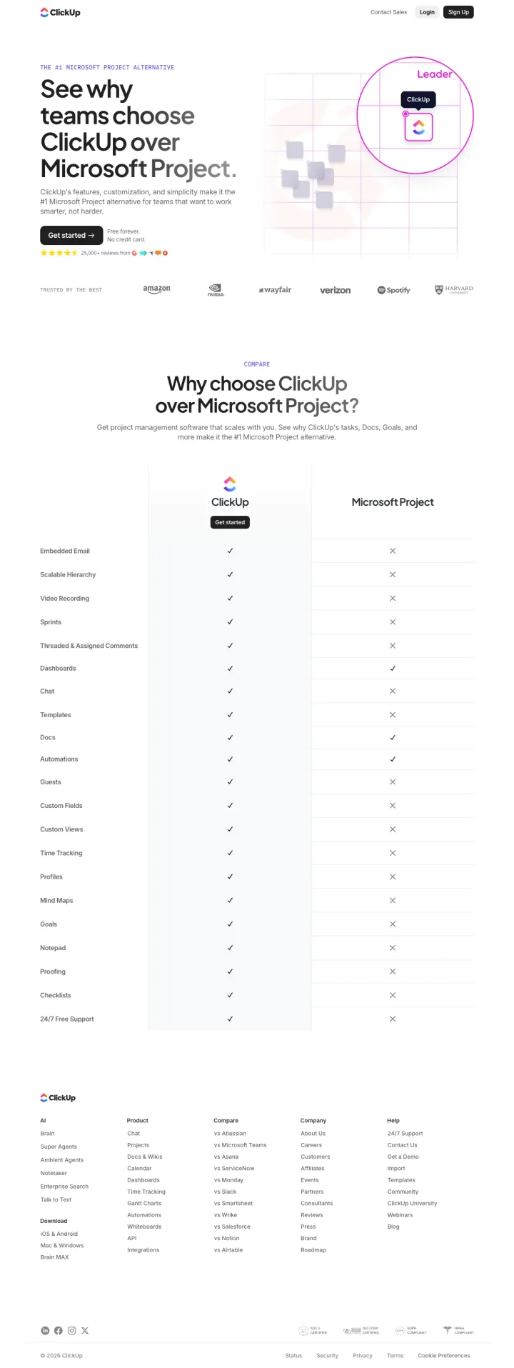
The ad promises 'Free Project Management Tool' and 'Plan, track, and collaborate on projects in one place', but the page delivers a feature comparison table with checkmarks and X marks instead of showing what ClickUp actually looks like. At PM software CPCs of $20-60, every click pays for a spreadsheet of checkmarks that tells the visitor ClickUp has 'Embedded Email' and 'Mind Maps' without showing either one. The visitor searching for a Microsoft Project alternative wants to SEE the alternative, not read a checklist.
Zero product screenshots on the entire page -- the visitor sees ClickUp's logo and a G2 comparison badge but never sees what the actual product looks like, which is the single most important thing an evaluator needs to see
The 21-row feature comparison table uses only checkmarks and X marks with no detail -- 'Sprints: check' tells the visitor nothing about how ClickUp handles sprints compared to Microsoft Project's implementation, and analytical buyers (55% of this market) need more than binary yes/no
The page has no testimonials, no customer logos, no usage statistics, and no named users -- the only social proof is '25,000+ reviews' with a G2 badge, which is generic and unverifiable from the page itself
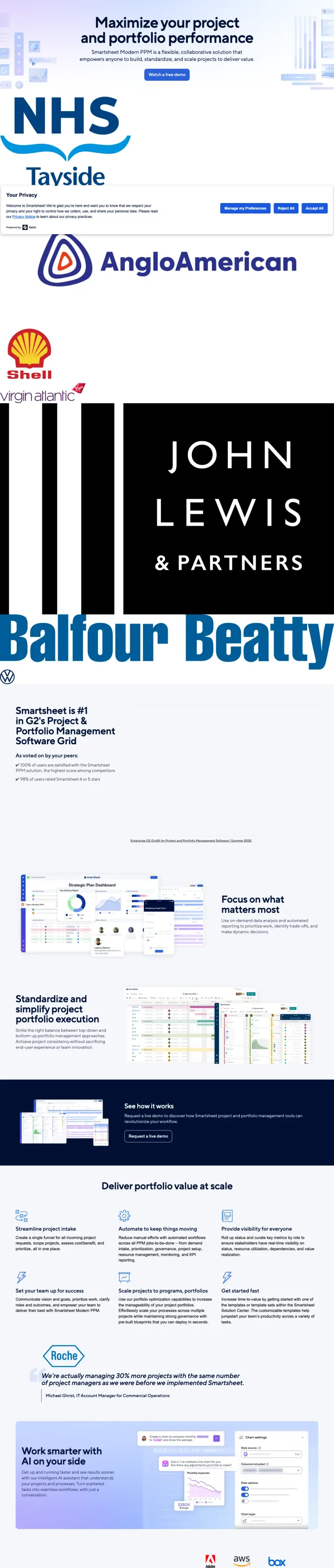
The ad says 'Watch a Free Demo' and 'Workflow Automation Tool' but the page above the fold is dominated by 6 massive enterprise logos (NHS, Tayside, Anglo American, Shell, John Lewis, Balfour Beatty) with no product screenshot and no demo embed. At $20-60 CPCs, the visitor clicks expecting to see the tool in action and instead sees a corporate credential display. The 'Watch a free demo' CTA button leads to a form, not an actual demo -- so even the promised demo requires giving up personal information first.
Enterprise logos (NHS, Shell, John Lewis, Balfour Beatty) take up roughly 60% of the above-fold visual space, pushing the actual value proposition and product screenshots far below -- the visitor sees who uses Smartsheet before they see what Smartsheet does
The primary CTA 'Watch a free demo' leads to a gated form, not an embedded demo video -- this is a bait-and-switch that will frustrate the 30% Red (dominant) visitors who clicked expecting to watch something immediately, not fill out a lead gen form
No free trial or self-serve signup option anywhere on the page -- in a market where every competitor offers 'free forever / no credit card', Smartsheet forces every visitor through a sales-gated demo request, which filters out the majority of evaluators who prefer to try before talking to sales
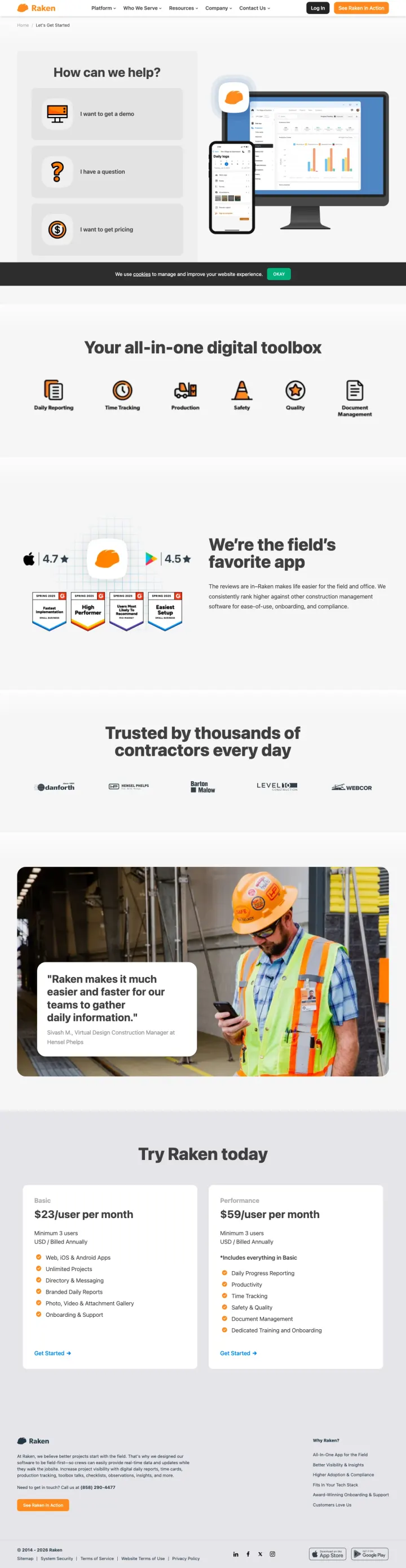
The visitor clicks a branded ad for Raken and lands on a page where the hero is a modal asking How can we help? with four options (get a demo, pricing, suggestion, support). The visitor already searched for Raken by name, so they know what Raken is. Instead of immediately reinforcing why Raken is the right choice with product value and social proof, the page forces a routing decision. At branded keyword CPCs, every click is from a visitor who already has intent. Making them self-triage before seeing any content wastes the highest-intent traffic in the account.
The hero modal (How can we help?) with four navigation options blocks the visitor from seeing the page content, adding an unnecessary click before they can evaluate the product
The headline Your all-in-one digital toolbox appears below the fold after the modal, and is generic enough to describe any construction software, not specifically Raken
The testimonial (Raken makes it much easier and faster for our teams to gather daily information) is not attributed to a named person or company, making it unverifiable and weak
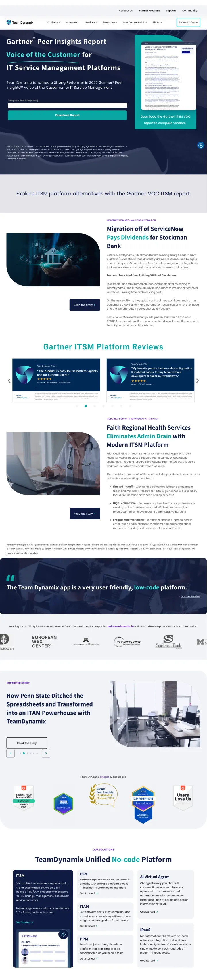
The visitor clicks an ad for IT Service Management software and lands on a page selling a Gartner Peer Insights Report download, not the actual product. The hero headline (Voice of the Customer for IT Service Management Platforms) and primary CTA (download the report) mean the visitor has to trade their contact information for a third-party PDF before they can learn anything about TeamDynamix. At ITSM software CPCs, the visitor wanted to evaluate a tool and instead got a lead magnet funnel. The case studies and testimonials lower on the page are strong, but they are buried behind a content gate that most PPC visitors will bounce from.
The hero leads with a Gartner report download instead of showing the product, forcing the visitor into a content gate before they can evaluate TeamDynamix as a solution
The Faith Regional Health Services testimonial (The Team Dynamix app is a very user friendly, low-code platform) is the strongest product validation on the page but appears below two full scroll heights of Gartner report content
No free trial, no product demo, no interactive element anywhere on the page. Every conversion path requires form submission, which filters out the majority of SaaS evaluators who expect to try before buying
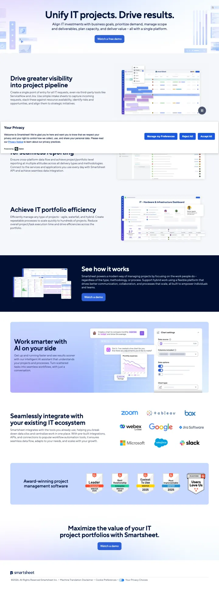
The ad promises a Free Demo for IT Portfolio Management, and the page above the fold shows 'Unify IT projects. Drive results.' with a 'Watch a free demo' button. But a large Your Privacy consent modal occupies the center of the viewport, covering the demo CTA and the first product screenshot. The visitor has to dismiss a modal before they can engage with any content. At $20-40 CPCs on IT PM terms like 'collaboration platforms' and 'collaborative tools online' ($1,000-8,100 monthly volume), the first interaction every PPC visitor has with this page is a cookie-consent decision, not a product evaluation.
A large 'Your Privacy' consent modal sits in the middle of the viewport on first load, covering the primary 'Watch a free demo' CTA and the hero product screenshot - every PPC visitor's first action is dismissing a modal instead of evaluating the product
No pricing, no named testimonial, no customer logos above the fold. The only trust signal is the Smartsheet brand itself. For a $20-40 CPC visitor evaluating enterprise IT PM tools, the page offers zero peer proof before asking for a demo booking
Every CTA on the page routes to '/contact/it-portfolio-management-demo' which gates the demo behind a form. No self-serve trial, no ungated product tour, no phone number. The page is built entirely around one conversion event (booking a demo) with no lighter-touch alternative for visitors not ready to talk to sales
Teamwork.com targets agencies specifically ('The platform for Agencies to take control of client work') and matches ad copy ('Agency Management Software') precisely. Monday.com targets task management searchers with '#1 AI task management platform'. Connecteam targets hourly-workforce managers wi...
Wrike embeds an email input field directly in the hero with 'Start for free' next to it. Monday.com offers Google SSO signup plus an email field. Both remove the intermediate step of clicking a CTA button, navigating to a signup page, and then entering an email. In a market where every competitor...
Wrike shows actual Gantt charts, Kanban boards, and AI copilot interfaces in context. Teamwork.com shows its feedback approval UI, resource planner, and reporting dashboards. Fieldwire shows blueprint markup screens native to construction workflows. The screenshot IS the proof. Pages that describ...
Teamwork.com's Susan Fennema testimonial includes specific metrics: '+1000% ROI, 4x Revenue, 6x Headcount.' Monday.com quotes Sarah Luxemberg by name with '98+ hours of manual work saved with AI.' Smartsheet quotes Michael Ghrist: 'managing 30% more projects with the same number of project manage...
Winners pick a specific buyer segment (agencies, construction crews, hourly-workforce managers) and align every element to that segment. The losers either show a feature checklist without product visuals, target enterprise PPM buyers with a demo-gated funnel that adds friction, or send brand-term traffic to a page with minimal conversion path.