Free: 96 PPC tools + my AI Playbook book

Everyone clicking your real estate ad already has Zillow open. So the question isn't 'is this page nice?' It's 'does this give me something Zillow doesn't?' Local expertise, off-market stuff, a human who'll actually call back. Trying to out-Zillow Zillow is a losing game.
From real real estate Google Ads campaigns in the US
The landing pages actually worth stealing from
So you know exactly what to avoid
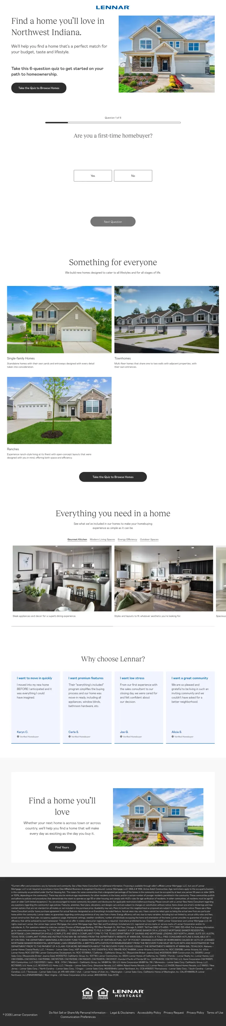
Replace your standard property search page with a 6-question quiz that filters by budget, timeline, and buyer type. The quiz converts passive browsers into qualified leads by collecting intent data before showing results, which makes the follow-up call warmer and the inventory more relevant.
6-question quiz format ('Are you a first-time homebuyer?' is Question 1) replaces the overwhelming search-and-browse experience with a guided journey. For new construction where floor plans, communities, and timelines are complex, the quiz reduces decision fatigue by narrowing options before showing them
'Everything's Included' messaging in the testimonials section (Carla S: 'our home was move-in ready, including all appliances, window blinds, bathroom hardware') addresses the hidden-cost anxiety that plagues new construction. Buyers worry about upgrade charges -- Lennar preempts this by making inclusion the brand promise
Named customer testimonials organized by motivation ('I want to move in quickly' - Karyn C., 'I want premium features' - Carla S., 'I want low stress' - Joe G.) let the visitor self-select their priority and see proof from someone who shares it. This is more effective than generic '5 star' reviews
The quiz landing page is for 'Northwest Indiana' but the ad was found on 'buy house new jersey' keywords with 197,200 monthly search volume -- this is either a geo-targeting error or an extremely broad campaign that wastes budget sending NJ searchers to an Indiana quiz
No pricing visible above the fold. The ad says 'New Houses For Sale' but the visitor has to complete the quiz or scroll past it to discover homes start 'From the upper $300s.' Price is the #1 filter for home buyers and hiding it creates unnecessary friction
The quiz has no progress indicator beyond 'Question 1 of 6' -- adding a visual progress bar would reduce abandonment by showing the visitor how close they are to results
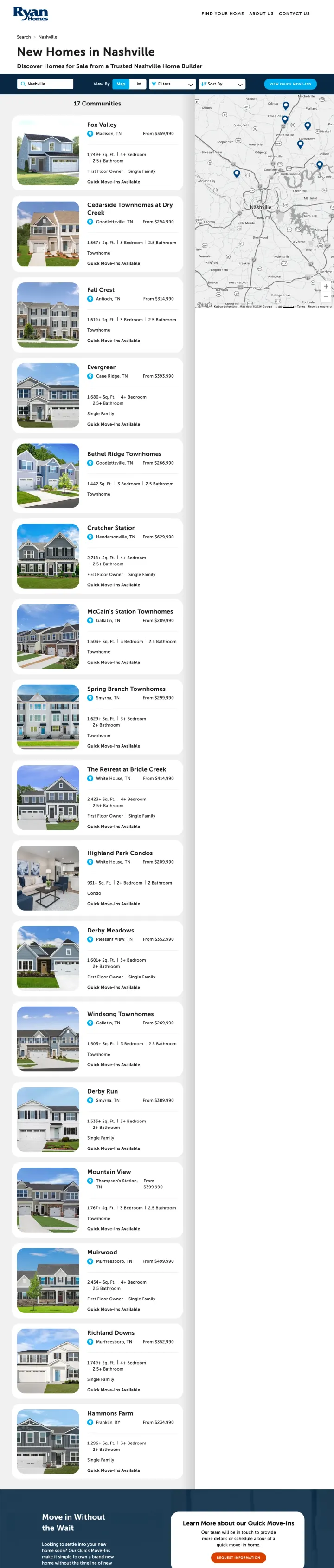
Show a filterable list of communities with starting prices, square footage ranges, and map pins -- not individual homes. For new construction, the community decision comes before the floor plan decision, so organize your page around locations first.
'New Homes in Nashville' headline with 'Discover Homes for Sale from a Trusted Nashville Home Builder' subhead delivers exactly what the ad promised. The city name appears in the H1, the subhead, and the page URL -- triple message match that validates the visitor's click instantly
17 communities listed with starting prices (From $294,990 to $549,990), bedroom counts, square footage, and property type (Single Family, Townhome, First Floor Owner). This structured format lets the visitor self-qualify by budget and preferences without clicking into each community
'View Quick Move-Ins' blue CTA button in the header serves the time-sensitive buyer who cannot wait 6-12 months for new construction. This single button creates a fast track for the highest-intent visitors -- those who need a home NOW
Full site navigation (Find Your Home, About Us, Contact Us) stays pinned on what is supposed to be a Nashville-specific landing page. A Nashville buyer has five ways to exit to national inventory before they ever see the local value prop.
No testimonials, reviews, or trust signals visible anywhere on the page. For a $300K-$550K purchase, the absence of any social proof is a significant gap. Ryan Homes is a national brand but the page relies entirely on brand recognition without reinforcing it
The contact form and 'Request Info' CTA are buried deep below the community listings and a large blue marketing section. A visitor who scrolls through 17 communities and wants to take the next step has to scroll past even more content to find it
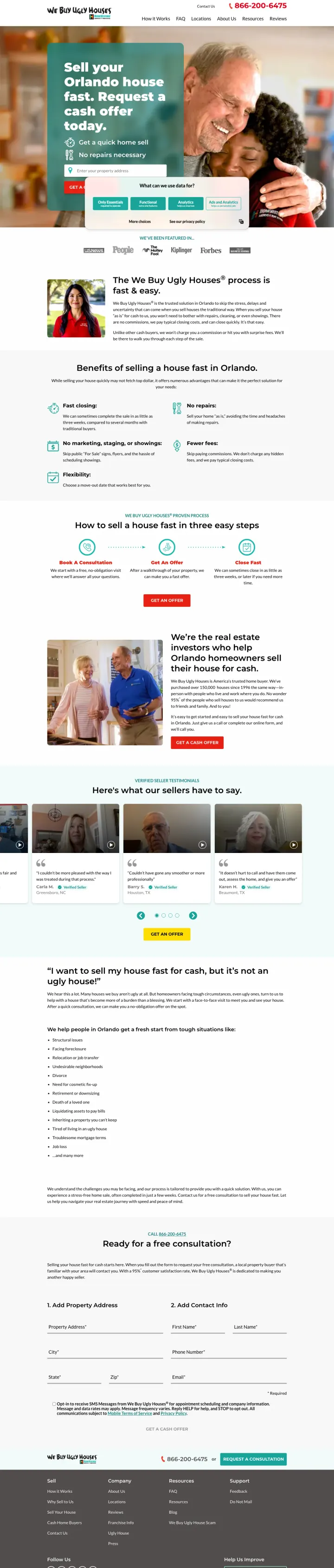
Replace your phone number CTA with a single address-entry field and 'Get a Cash Offer' button. Distressed sellers want a number before they want a conversation, and the address form promises exactly that with minimal friction.
Single address-entry field with 'GET A CASH OFFER' button is the entire above-fold conversion mechanism -- no phone number to call, no form with 10 fields, just enter your address and get an offer. This matches the distressed seller's mental model perfectly: they want a price, not a relationship
Press logo bar (Forbes, People, US News, Kiplinger, Motley Fool, Dallas Business Journal) immediately below the hero addresses the #1 objection for cash home buyers: 'is this legitimate or a scam?' Press coverage is harder to fake than Google reviews and signals institutional validation
'Trusted By 150,000 Homeowners' in the ad copy creates volume social proof that carries through to the page. For a transaction where you are selling your house to a stranger for cash, knowing 150,000 other people did it first is the most powerful trust signal possible
Cookie consent popup covers the lower portion of the hero on first load, hiding the 'GET A CASH OFFER' button -- the single most important element on the page is obscured by a compliance popup
The page says 'trusted solution in Orlando' but the ad was found on Jacksonville-area keywords -- if the geo-targeting does not match the city-specific landing page, message match breaks
Named local buyer photo and bio are below the fold when they should be above -- for a visitor worried about selling to a faceless corporation, seeing the local franchise owner's face immediately would reduce anxiety
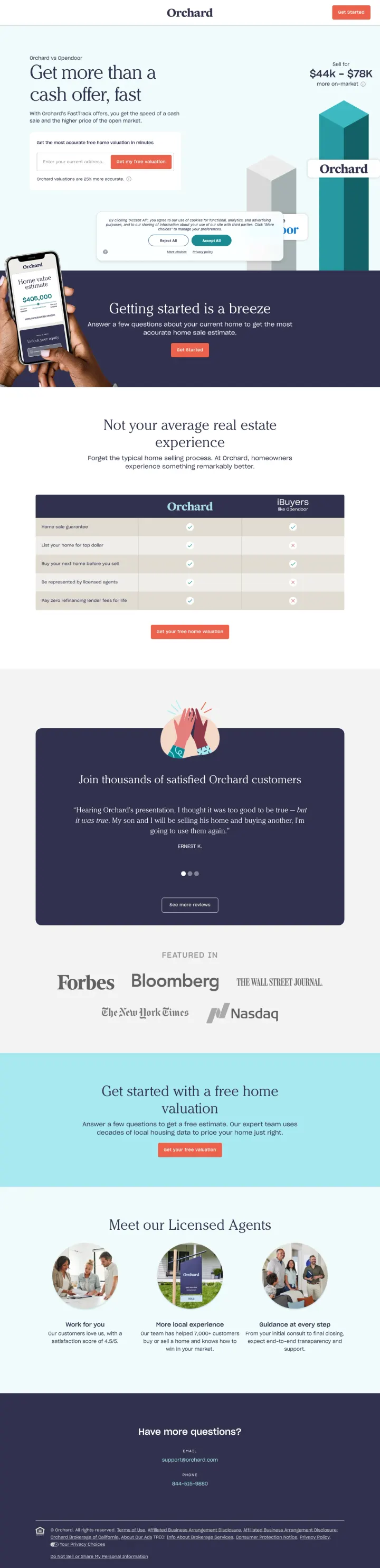
Show a cash offer range (e.g. $44K-$79K) in the hero section before asking for any personal information. Orchard gives the visitor a concrete number range immediately, which transforms the page from 'fill out a form and maybe we will call you' into 'here is roughly what your home is worth, want a precise number?'
Cash offer range ($44K-$79K) displayed prominently in the hero section next to a phone mockup gives the visitor an immediate anchor before they enter any information
5-star review quote from a real customer ('Having Orchard presentation, I thought it was so great to be here') with carousel navigation lets visitors self-select proof points
Forbes, Bloomberg, New York Times, Wall Street Journal press logos in a 'Featured In' bar provide institutional credibility for a relatively unknown brand
The ad targets 'opendoor denver' and '72 sold reviews' but the page never mentions either competitor by name. The URL slug 'orchard-vs-ibuyers' suggests comparison content but the page itself is a standard lead gen page, not a comparison
The 'Meet our Licensed Agents' section at the bottom feels generic with stock-style icons rather than real agent photos, undermining the personal service angle
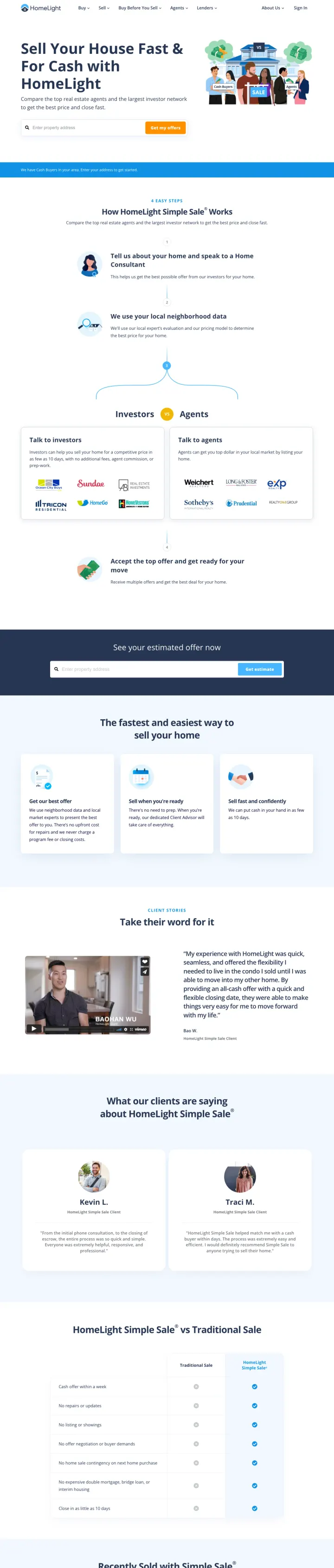
Add a side-by-side comparison table showing your service vs the traditional alternative. HomeLight compares Simple Sale (cash, no repairs, close in 10 days) against a traditional sale (staging, showings, 60+ days), letting the visitor see the tradeoff in seconds rather than reading paragraphs of copy.
3-step process flow (Request Offers, Compare Offers, Close) with icons above the fold makes the entire experience predictable before the visitor commits to anything
Forbes, Bloomberg, New York Times, Wall Street Journal, Nasdaq press logos create instant credibility right above the final CTA, resolving trust objections at the decision point
Customer testimonial carousel with real quotes specifically mentioning closing timeline and ease, which are the two things cash-offer sellers care about most
The ad targets keywords like 'open door' and 'open door realty' but the landing page is for HomeLight Simple Sale with no mention of Opendoor, so every click starts with confusion from competitor keyword bidding
The hero section address entry form is small relative to the page width when the entire job of this page is to get an address entered
Pages that break the playbook in interesting ways
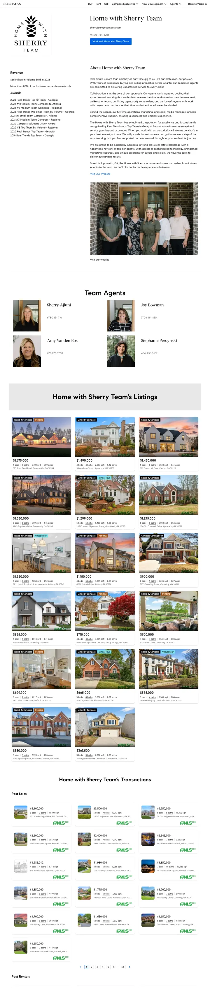
If you are running ads on your own name as a keyword, an agent profile page with volume stats, awards, and team photos works because the visitor already knows who you are. But add a property search widget or 'See Our Current Listings' CTA above the fold so the name-aware visitor can immediately do what they came to do: look at homes.
'$65 Million in Volume Sold in 2023' and 'More than 80% of our business comes from referrals' appear in the left sidebar above the fold. These two stats instantly answer 'are they successful?' and 'do their clients recommend them?' -- the only two questions a brand-aware visitor has when they search an agent's name
Eight consecutive years of awards (2019-2023 Real Trends, Compass regional rankings) create a 'wall of credentials' that builds cumulative trust. Each individual award is forgettable, but the pattern of consistent recognition across years signals sustained excellence rather than one lucky year
The 'Work with Home with Sherry Team' CTA button is the only conversion action above the fold, and it requires the visitor to initiate a relationship with no context about what happens next. Does clicking it start a chat? Send an email? Book a call? The ambiguity creates friction
No property listings visible above the fold. A visitor who searched 'home with sherry team' likely wants to see their current listings or recently sold properties -- the proof of what the team actually does. Instead, the above-fold content is biography and awards
The page is a standard Compass agent profile template with no customization for paid traffic. Full Compass navigation bar (Buy, Rent, Sell, Compass Exclusives, New Development, Agents) gives the visitor 6+ exit paths to other agents or Compass features
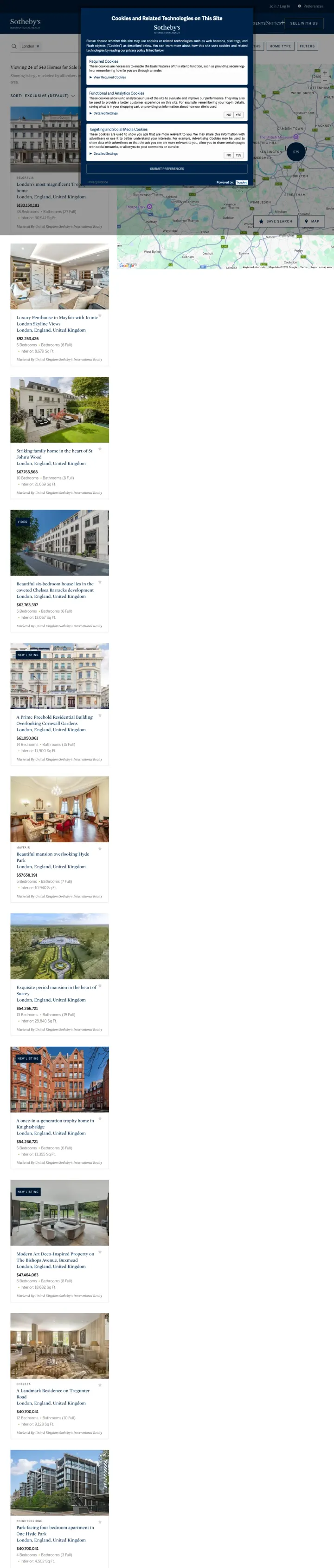
Place a property inquiry form above your listings grid so visitors who want personal service can skip the browse-and-click process entirely. Sotheby's puts name/email/phone fields and a message box above the property grid, offering a concierge path alongside self-serve browsing. This dual-path approach serves both the hands-on buyer who wants an agent and the independent browser.
Lead capture form positioned above the property listings with name, email, phone, and message fields gives the high-intent visitor an immediate conversion path without scrolling through listings first
The dark navy header with the Sotheby's International Realty wordmark communicates ultra-premium positioning instantly. For luxury real estate, the brand presentation IS the trust signal
The ad targets 'real estate for sale in london' but the form and listings page has no London-specific headline or imagery. The page could be for any city, which wastes the location specificity that made the ad relevant
The property grid shows 20+ listings in a dense layout with small photos that are hard to appreciate. Luxury properties deserve larger images that sell the lifestyle, not a grid of thumbnails
No pricing visible on the listing cards in the main grid, which for luxury real estate creates unnecessary friction. Buyers at this level have specific budget parameters
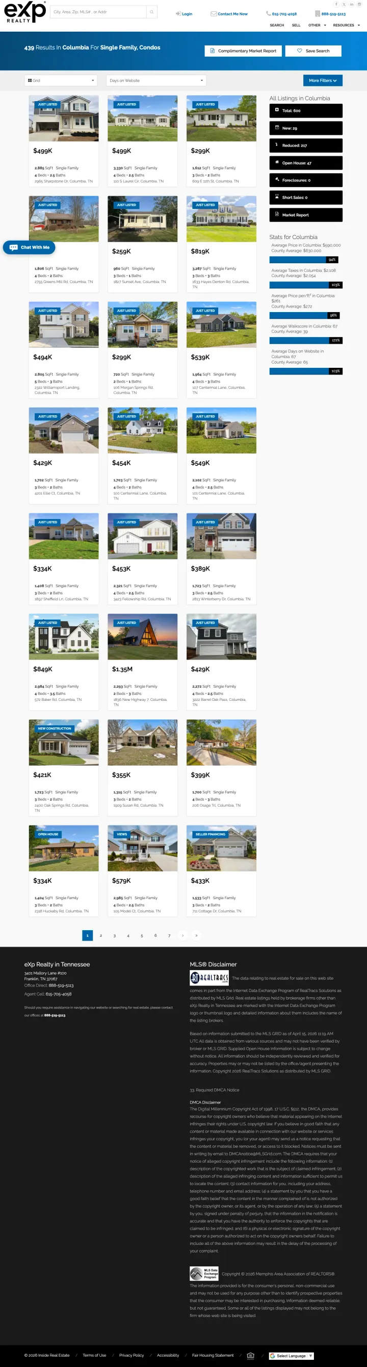
Own the freshness angle. "Updated Every 15 Minutes" in the ad and a sidebar showing Foreclosures, Short Sales, Open Houses, and Reduced Listings as filterable categories tells a distressed-property buyer this is the live deal flow, not a stale portal. Most agent IDX templates hide these category counts. Surfacing them turns a generic listings grid into a specialized research tool.
"439 Results in Columbia For Single Family, Condos" in the hero gives the visitor the size of the dataset immediately. The number is the proof that you actually cover this market.
Sidebar category counts (Total 943, New Listings, Reduced List, Open Houses, Foreclosures, Short Sales, Market Report) replace a generic filter panel with a research-mode taxonomy. A foreclosure shopper can click straight to the 50 matching homes instead of hunting through filters.
"Complimentary Market Report" and "Instant Home Value" buttons in the top nav give the visitor two secondary conversion paths if they are not ready to browse listings yet.
No named agent photo, bio, or phone number above the fold. "Craig McHugh" appears only in the tiny ppc tracking parameter in the URL. For a solo agent positioning as the foreclosure specialist, the specialist themselves is missing.
Listings show Just Listed badges but no beds, baths, or square footage on the thumbnail cards. A foreclosure investor scanning for value cannot compare without clicking into each card.
URL is a 350+ character IDX query string that looks broken. Any visitor who shares this link will get a mess; any competitor running "exp realty" keywords will outrank this on brand recall alone.
4 pages burning ad spend with fundamental issues
Every click to these pages costs real money. We found broken trust signals, mismatched intent, weak CTAs, and messaging that ignores what the searcher actually typed. Here is what to avoid.
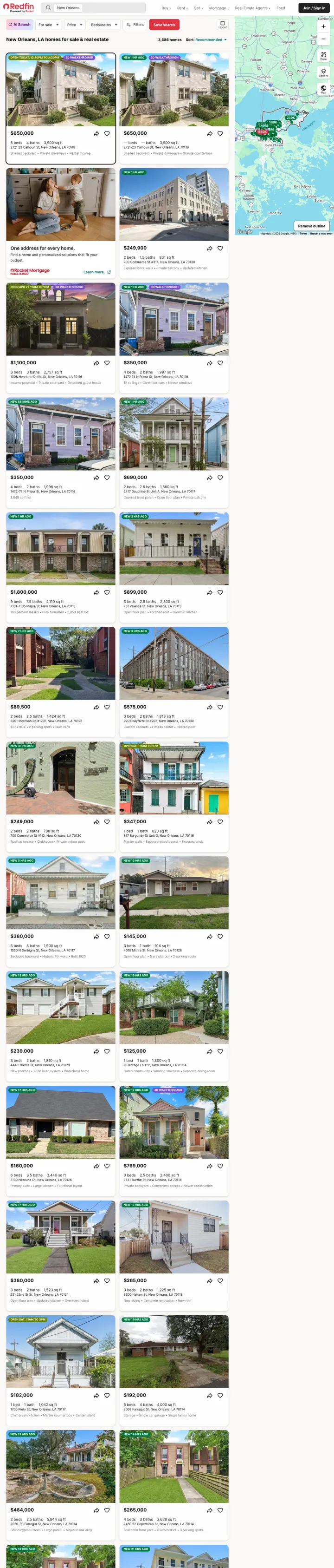
Every click costs money, and this page treats paid visitors identically to organic visitors. No unique value proposition, no narrowed funnel, no urgency, no reason to convert on Redfin rather than bouncing to Zillow. The 244 link count means the visitor has 243 ways to leave without converting.
The ad pays for a click on 'homes for sale new orleans' and sends the visitor to a page with 3,585 listings, a full navigation bar, and 244 total links. This is the same page organic visitors see -- there is zero paid-specific optimization. The visitor is paying you to enter a department store, not a fitting room
AI Search prompt overlay appears on load and partially obscures the first listing. The visitor who clicked an ad for 'homes for sale' is immediately shown a second search interface asking them to describe their dream home -- this adds a step instead of removing one
No trust signals specific to Redfin's value proposition above the fold. No 'save 1% on commission,' no 'tour within 24 hours,' no agent assigned. The page is pure inventory with no reason to use Redfin over Zillow or Realtor.com
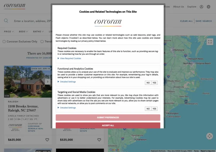
The page sends paid traffic from 'houses for sale in durham nc' to a generic property search results page with a cookie consent popup covering the lower half of the viewport. The visitor sees a cookie banner before they see any homes. Behind it, there are 16+ listings, full site navigation, price/beds/baths filters, and a map. This is the same experience organic visitors get with zero paid-specific optimization.
Cookie consent popup dominates the viewport on first load, covering listing content and requiring the visitor to interact with a compliance element before they can browse homes
Full site navigation bar (Price, Beds, Baths, Home Type, More, Corcoran Exclusives Only) gives the visitor extensive filter options but also extensive exit paths away from converting
The ad promised 'Durham County Homes' and 'Browse Homes For Sale Now' but the page URL is /regionId/140 with no city name visible in the URL or prominently in the heading, weakening message match
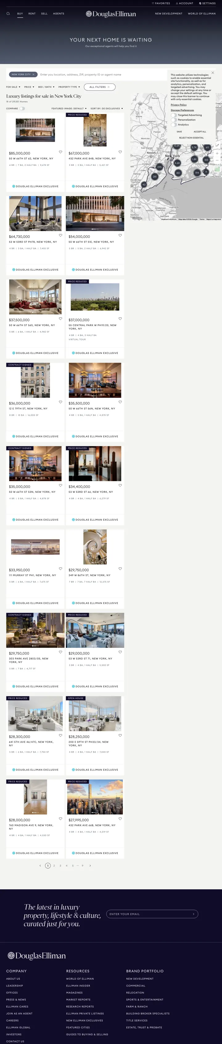
The ad targets 'houses for sale in the united states' (3,600 monthly searches) and sends the visitor to a New York City luxury listings page with 20+ properties, a full navigation bar, and a map. There is no lead capture form, no 'contact an agent' CTA, no 'schedule a tour' button visible. The page is a luxury property catalog that assumes the visitor will browse indefinitely rather than convert. Every paid click buys a window-shopping session.
No lead capture mechanism visible anywhere on the page. The visitor can browse 20+ luxury listings but there is no form, no phone number prominently displayed, no 'request a showing' button on individual listings
The ad targets 'houses for sale in the united states' but the page shows only New York City luxury properties. A visitor searching nationally lands on a city-specific page with no way to change location above the fold
Full navigation with Luxury Rentals, New Development, Commercial, and other tabs gives the visitor paths to entirely different product lines
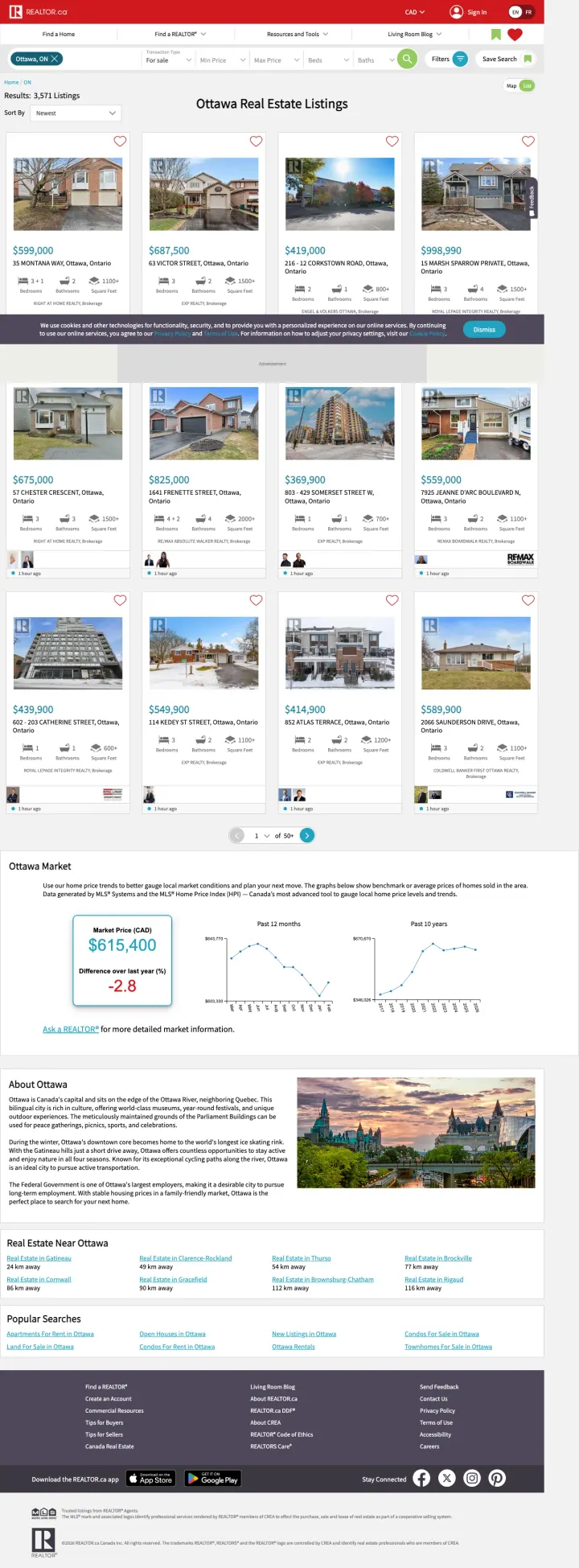
The ad buys "house for sale in ottawa ontario canada" (4,800 monthly searches) with the headline "REALTOR.ca Ottawa Listings - View Ottawa Listings Now." The page delivers on the promise: 3,571 listings, clean grid, accurate prices. But there is no agent, no saved-search signup, no "get new listings by email" capture, and a cookie consent bar clinging to the bottom of every viewport. Paid traffic lands, browses, and leaves without ever giving REALTOR.ca a way to bring them back.
The cookie consent bar covers the bottom of every viewport including all the CTAs on the first row of listings. Every paid visitor sees legal copy over homes before they see the homes.
No lead capture anywhere above the fold. No "Save this search" prompt, no email signup for new listings, no broker-referral path. The visitor pays in attention and leaves nothing behind.
Generic category filters (For sale, For rent, Sold) plus one national red nav give the visitor six+ ways to leave the Ottawa page before they engage with a single listing.
Lennar's quiz landing page asks 6 questions (first-time buyer? budget? timeline?) before showing any homes. This works for new construction because the buyer journey is longer and more complex than resale -- visitors need guidance on what they can afford, what is available, and when they can move...
We Buy Ugly Houses leads with a single address input field and 'GET A CASH OFFER' button. The visitor who searched 'sell my house fast' wants a number, not a phone call. The address-entry form promises exactly that -- enter your address, get a cash offer. This is fundamentally different from the ...
Redfin sends paid 'homes for sale new orleans' traffic to the same search results page that organic visitors see. This means the visitor arriving from a paid click gets 3,585 listings, an AI search prompt, multiple filter options, and a full navigation bar. For organic traffic this works because ...
We Buy Ugly Houses shows Forbes, People Magazine, US News, Kiplinger, and Motley Fool logos instead of Google reviews. This works for cash home buyers because the transaction is a one-time event with a corporation, not an ongoing relationship with a person. Nobody reads individual reviews of 'I s...
Winners match their conversion mechanism to the specific search intent: quiz funnels for new construction browsers, address-entry forms for distressed sellers, filtered community listings for city-level home searchers. The weakest pages either send paid traffic to the same open-ended search experience organic visitors get (Redfin) or rely on team credentials alone without giving the visitor a concrete next step tied to their search query (Compass)..