Free: 96 PPC tools + my AI Playbook book

Solar is a $25,000 decision and the entire conversion is... typing a zip code. Five digits. Everything on the page is either building enough trust to type those digits or giving someone a reason to close the tab. Local installers and national marketplaces approach this totally differently.
From real solar installation Google Ads campaigns in the US
The landing pages actually worth stealing from
So you know exactly what to avoid
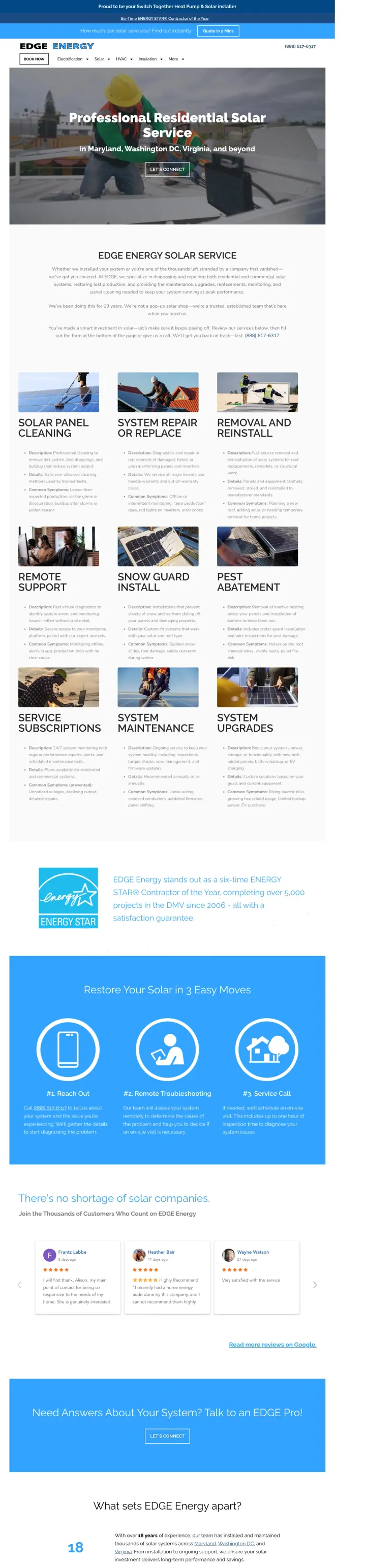
If you offer solar service/repair, lead with the emotional hook of abandoned customers ('one of the thousands left stranded by a company that vanished') before listing services. This reframes your company as the rescue, not just another vendor.
'Whether we installed your system or you're one of the thousands left stranded by a company that vanished' is a masterful opening that turns the industry's biggest weakness (installer bankruptcy) into a customer acquisition wedge -- this single sentence validates the visitor's frustration and positions EDGE as the solution
9 distinct service categories (cleaning, repair, removal/reinstall, remote support, snow guards, pest abatement, subscriptions, maintenance, upgrades) each with symptoms-based descriptions help visitors self-diagnose their problem and feel confident the company handles their specific issue
6-time ENERGY STAR Contractor of the Year with 5,000+ projects since 2006 provides longevity proof that directly counters the 'will they still be around?' objection -- 19 years of government-recognized work is hard to fake
The 'LET'S CONNECT' CTA button in the hero has a thin white border on a photo background that does not command attention -- at solar service CPCs, the primary action button needs to dominate visually
The contact form is buried at the very bottom of a long page behind 9 service descriptions, stats sections, and testimonials -- visitors with urgent repair needs (system down, no power production) need to reach it faster
The sticky top bar advertising 'How much can solar save you? Find out instantly / Quote in 2 Mins' is for new solar installation, not service/repair -- this creates message mismatch for visitors who clicked a repair-specific ad
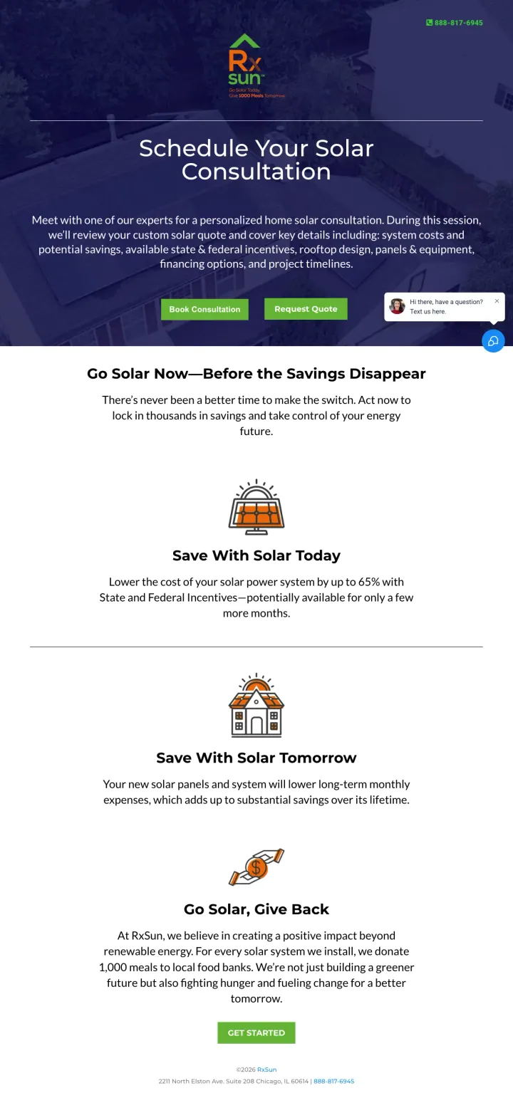
Offer two distinct CTAs above the fold: 'Book Consultation' for visitors who want face-to-face guidance and 'Request Quote' for visitors who just want numbers. Solar shoppers split cleanly between people who want a human to walk them through it and people who just want the math -- forcing both down one path loses one of them.
Dual CTA buttons ('Book Consultation' + 'Request Quote') above the fold serve two different buyer mindsets at once: the shopper who wants to be walked through it and the one who just wants a number to compare -- most solar pages pick one path and lose half the traffic
The subhead listing exactly what the consultation covers ('system costs and potential savings, available state & federal incentives, rooftop design, panels & equipment, financing options, and project timelines') tells the visitor precisely what they will learn, which removes the biggest reason people avoid booking sales calls
'For every solar system we install, we donate 1,000 meals to local food banks' is a differentiated trust signal that lets the values-driven buyer feel good about picking this installer without stealing space from the ROI numbers everyone else also needs
'Save up to 65% with State and Federal Incentives -- potentially available for only a few more months' uses urgency language that may already be expired (references December 2025 deadline) and the 65% figure is higher than actual ITC (30%), which could include state incentives but feels inflated without a breakdown
No specific savings figures, no system pricing, no payback period data anywhere on the page -- for a page titled 'free-custom-quote' there are no actual numbers to anchor against
The page uses GoHighLevel (LeadConnector) platform with generic icons instead of real installation photos -- for a company asking homeowners to trust them with a $25,000 purchase, illustrated clip art undermines credibility
Pair your quote tool with a specific average savings number ('Homeowners are saving $55/month') and an FAQ section that answers the top solar objections directly on the landing page, so researchers get their questions answered without leaving.
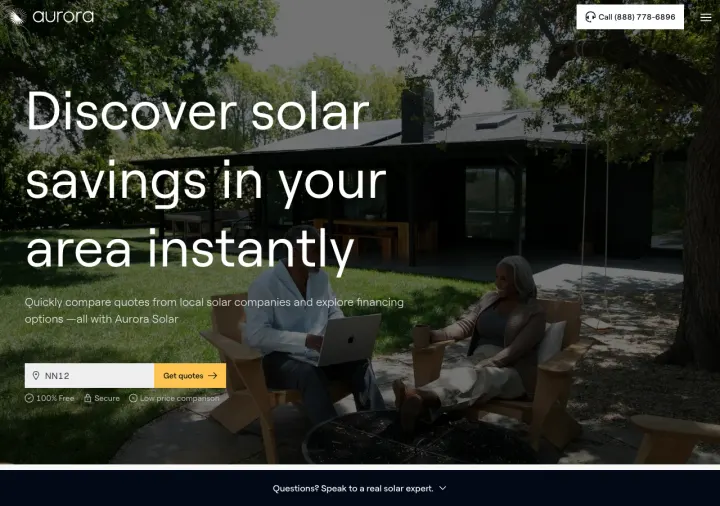
'Discover solar savings in your area instantly' headline with 'Get quotes in 90 seconds' subtext sets a specific time expectation that makes the quote process feel fast -- solar buyers who have been quoted 'we'll get back to you in 48 hours' by competitors will gravitate toward instant results
'100% Free / Secure / Low price comparison' trust badges directly below the zip code input address three anxieties simultaneously: cost of the tool, data safety, and whether they will actually get competitive pricing
FAQ section answers 10 common solar questions (battery necessity, panel lifespan, maintenance, tax incentives, energy bill savings, property value impact) directly on the page -- this serves the Blue-dominant researcher who wants answers before committing to a call
The 'Homeowners are saving $55/month' figure feels low for a $25,000+ investment -- at that rate the payback period would be 37+ years, which actually undermines the ROI argument rather than supporting it
Phone number in the header says '(888) 778-6896' but the bottom form section says '(888) 891-3531' -- two different numbers erode trust and suggest a lead routing operation rather than a single company
The hero photo shows a couple in a backyard with no visible solar panels -- for a visual-proof industry where 'show me your work' is critical, this lifestyle image provides zero evidence of solar capability
Replace your static lead form with a progressive qualification quiz (zip code > homeowner check > electric bill range > email > name > phone) so each step feels like the visitor is getting closer to a personalized answer rather than filling out a generic form.
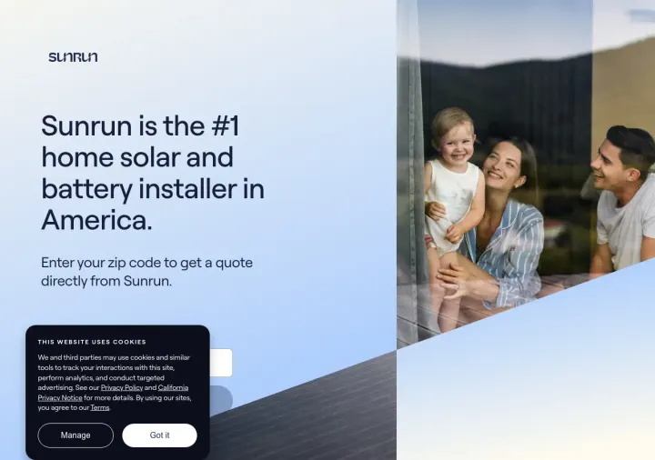
The '#1 home solar and battery installer in America' claim in the H1 is a bold, singular positioning statement that shortcuts the trust-building process -- visitors searching for solar companies want to know who is the biggest and most established
Progressive disclosure via multi-step form (zip > homeowner? > electric bill > email > name > phone) with percentage progress bar (20% > 40% > 60% > 80% > 95%) makes a 6-field form feel like a personalized assessment rather than a data collection exercise
'Good news, you're a great fit!' confirmation message after the electric bill question creates a micro-win that makes the visitor feel pre-approved, increasing completion momentum for the remaining contact fields
The cookie consent banner on initial load covers the bottom third of the viewport, pushing the zip code input below the visible area -- paid visitors may not realize there is a form to fill out
No savings estimate, no pricing indication, no dollar figure anywhere on the page -- the visitor completes 6 form steps and gets 'a solar advisor will be calling you soon' rather than any personalized data
If the visitor answers 'No' to homeownership, they are immediately disqualified with a referral program offer -- this abrupt rejection after engaging with the page wastes the click
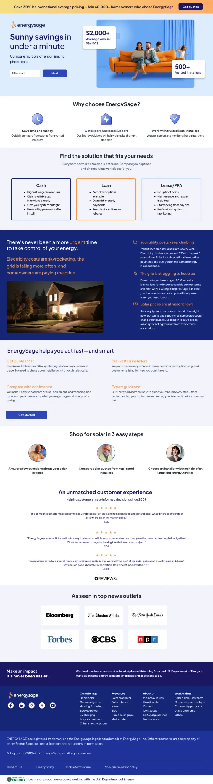
Put a specific dollar savings number ('$2,000+ average annual savings') in a visible callout box directly adjacent to your quote input field, so the visitor sees the reward and the action in the same visual zone.
'Save 30% below national average pricing' in the sticky top bar creates a price anchor before the visitor even reads the headline -- this positions EnergySage as the comparison-shopping tool that protects you from overpaying, directly addressing the 'will I get ripped off?' objection
'500+ vetted installers' badge next to the quote form shifts the trust burden from 'trust this one company' to 'trust a marketplace that pre-screens companies for you' -- this is a fundamentally different trust architecture than single-installer pages
Bloomberg, Forbes, CBS, and New York Post logos as 'seen in top news outlets' provide third-party credibility that no amount of self-reported reviews can match for a $25,000+ purchase decision
The page is built on Instapage (a landing page builder) which loads heavy tracking scripts that slow initial render -- for paid traffic at solar CPCs ($15-40), every second of load delay bleeds budget
The 'Find the solution that fits your needs' section mid-page offers Solar, Community Solar, Heat Pumps, and Roofing as equal options -- this dilutes focus for visitors who clicked a solar-specific ad
'Electricity costs are skyrocketing, the grid is failing more often' uses fear language that may feel manipulative to the analytical Blue-dominant solar buyer who wants data, not emotional pressure
Place your lead capture form directly beside the hero headline (not below it) so the visitor sees the value proposition and the action step in a single viewport without scrolling.
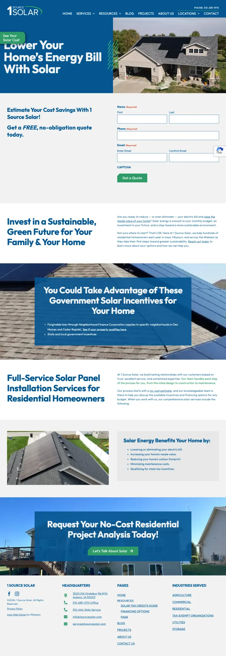
'Lower Your Home's Energy Bill With Solar' headline paired with a real photo of a residential home with rooftop solar panels gives visitors immediate visual proof that this company installs on homes that look like theirs -- the specific Iowa/Midwest residential style makes it feel local, not corporate
Government incentive section listing specific programs (Neighborhood Finance Corporation forgivable loan for Des Moines and Cedar Rapids, state/local incentives) addresses the 'how do tax credits work?' question with locally-relevant specifics rather than generic federal ITC language
Form visible above the fold with 'FREE, no-obligation quote' emphasis reduces commitment anxiety -- the form sits right next to the hero image so the visitor never has to scroll to take action
Full site navigation with 7 menu items (Home, Services, Resources, Blog, Projects, About Us, Locations, Contact) gives the visitor 7+ exit paths before they reach the form -- every nav click at solar CPCs ($15-30) is potential wasted spend
No specific savings figures, no system pricing ranges, no payback period estimates anywhere on the page -- the visitor has to request a quote to learn anything about cost, which adds friction for the 60%+ Blue analytical visitors who want numbers before talking to sales
The 'See Your Solar Cost' button in the top left links to a separate page instead of scrolling to the form below -- this splits the conversion path and may send visitors away from the landing page entirely
Pages that break the playbook in interesting ways
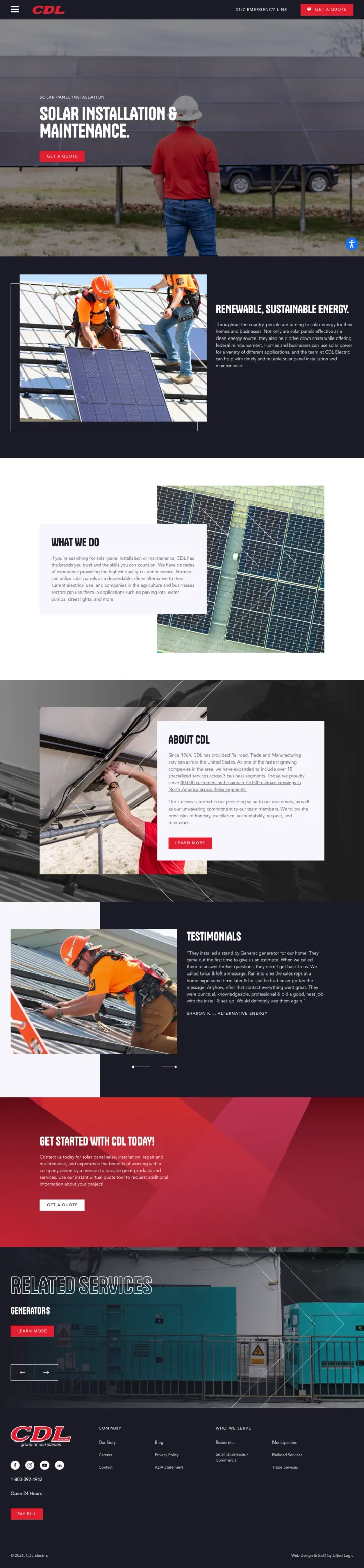
Skip the savings calculators and financing breakdowns. Lead with real workers in the field (hard hats, safety vests, hands on panels) and emphasize execution reliability over financial returns. This works for the homeowner who already decided on solar and now fears their installer will go out of business before the warranty claim. CDL's 60-year history as a railroad and electrical contractor signals permanence in a way no solar-boom startup can match.
Hero image of a real CDL worker in hard hat and red company polo standing in front of a ground-mount solar array -- this is not a stock photo, it is their actual employee at their actual job site, and it signals 'we are tradespeople who build things' rather than 'we are a sales organization that subcontracts the work'
'Since 1964' company history spanning railroad, trade, and manufacturing before expanding into solar tells a story of institutional permanence -- a company that has survived 60 years across multiple industries is more likely to honor a 25-year warranty than a company founded in the solar boom
Testimonials from generator installation customers (Sharon K., 'Alternative Energy') are candid and specific ('They ran off, got the parts, came back and finished it that day') -- these read as real because they include minor complaints that were resolved, which is more believable than curated 5-star reviews
Zero financial information on the entire page -- no savings estimates, no financing options, no tax credit mention, no pricing ranges, nothing that answers the first question almost every solar shopper types into Google: 'how much will this save me?'
Both testimonials are from generator installations, not solar -- the page uses 'Alternative Energy' testimonials as a proxy for solar credibility, but a solar buyer wants to hear from someone who actually bought solar from CDL
The 'Get a Quote' CTA links to a separate quote tool page rather than embedding a form -- this adds a click and a page load that increases drop-off, especially on mobile
3 pages burning ad spend with fundamental issues
Every click to these pages costs real money. We found broken trust signals, mismatched intent, weak CTAs, and messaging that ignores what the searcher actually typed. Here is what to avoid.
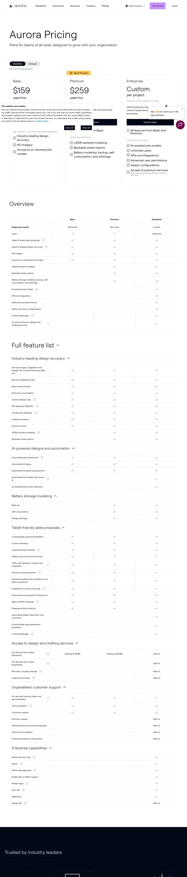
This is a SaaS pricing page for Aurora Solar's design software ($159-$259/month/user plans for solar professionals). The ad triggers on 'aurora solar com' but the page sells project design tools to solar installers, not solar panels to homeowners. A consumer searching for solar installation who lands here sees subscription tiers, API integrations, and 'unlimited users' -- completely wrong audience. Every click is 100% wasted spend.
This is a B2B SaaS pricing page for solar design software, not a solar installation landing page -- consumer visitors see monthly subscription prices and API documentation instead of panel specs and savings estimates
The ad targets a branded keyword ('aurora solar com') but routes to a pricing page that assumes the visitor already knows what Aurora does and is ready to compare plans -- no education, no context for non-customers
Cookie consent banner on load obscures the pricing tiers, adding an extra click before the visitor can even assess whether they are on the right page
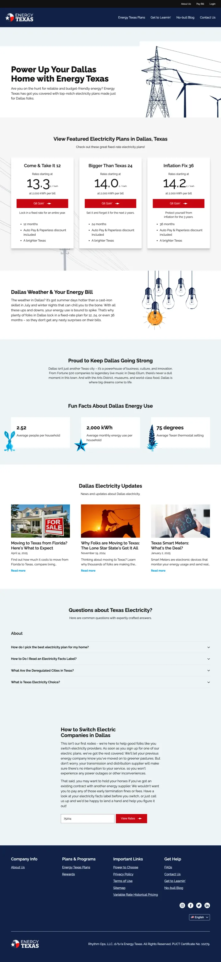
This is a retail electricity provider landing page for Texas deregulated energy market. The page promotes electricity rate plans, 30-day test drives, and bill management. There is zero mention of solar panels, installation, financing, or any solar-related content. The page appeared in solar keyword results because 'energy' keywords overlap, but a visitor searching for solar installation finds a utility company page about locking in electricity rates. Complete category mismatch.
Zero solar content on a page appearing in solar keyword results -- the visitor searching for 'solar panels' or 'solar installation' finds electricity rate plans and account management features
The Texas-cowboy branding ('Lasso in one of the best electricity rates,' 'skedaddle on outta here') is charming for its target audience but completely irrelevant to solar panel shoppers
The ad targets 'utility companies houston tx' and 'electricity companies in baytown tx' which are legitimate electricity provider keywords -- this page is in the solar capture pool by accident due to keyword overlap in the data collection, not because Energy Texas is bidding on solar terms
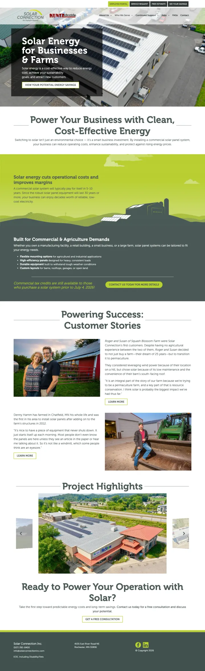
The ad triggers on high-volume residential keywords like 'solar plate for home' (135K searches) and 'california solar panels' (1,900 searches), but the landing page is specifically for commercial and agricultural solar installations. A homeowner searching for residential panels sees 'Solar Energy for Businesses & Farms,' warehouse rooftop photos, and customer stories about permaculture farms and Habitat for Humanity commercial buildings. The page has no residential content, no home photos, no residential pricing. At solar CPCs, sending 135K monthly searches worth of residential intent to a commercial page is a significant budget leak.
The ad targets 'solar plate for home' (135K monthly searches) but the landing page headline is 'Solar Energy for Businesses & Farms' -- this is a fundamental audience mismatch where residential searchers land on a commercial page
Drone photography of commercial warehouse rooftops with large-scale panel arrays signals industrial scale, not the 10-20 panel residential system a homeowner is shopping for
The 'Commercial tax credits are still available to those who purchase prior to July 4, 2026' deadline reference is commercially-focused tax language that residential buyers will not understand or trust
The two strongest pages (EnergySage and Sunrun) both lead with a zip code input rather than a name/email form. This works because solar buyers want to know 'will this save ME money?' before committing to a sales call. A zip code is low-friction, feels like a tool rather than a form, and the visit...
EnergySage shows '$2,000+ average annual savings' in a callout box next to the hero headline. This immediately reframes solar from 'should I go green?' to 'how much money am I leaving on the table?' Solar buyers are 60%+ Blue (analytical) persona and they want the number first, the story second. ...
EnergySage displays Bloomberg, Forbes, CBS, and other news outlet logos as social proof. EDGE Energy leads with '6-time ENERGY STAR Contractor of the Year.' These third-party validations address the core solar fear: 'will this company still exist in 25 years?' A company that Bloomberg writes abou...
EDGE Energy targets the growing segment of homeowners whose original solar installer went out of business. 'Whether we installed your system or you're one of the thousands left stranded by a company that vanished' directly addresses the #1 solar fear and turns it into a customer acquisition chann...
Winners give the visitor a tool (zip code lookup, savings calculator, instant quote) that delivers personalized value before asking for contact information. Losers send paid traffic to pages that serve the wrong audience entirely: B2B software pricing pages shown to homeowners searching for solar panels, electricity provider landing pages shown to solar installation searchers, and commercial/farm solar pages triggered by residential solar keywords..