Free: 96 PPC tools + my AI Playbook book

These are real travel / vacation packages pages spending actual money on Google Ads right now.
From real travel / vacation packages Google Ads campaigns in the US
The landing pages actually worth stealing from
So you know exactly what to avoid
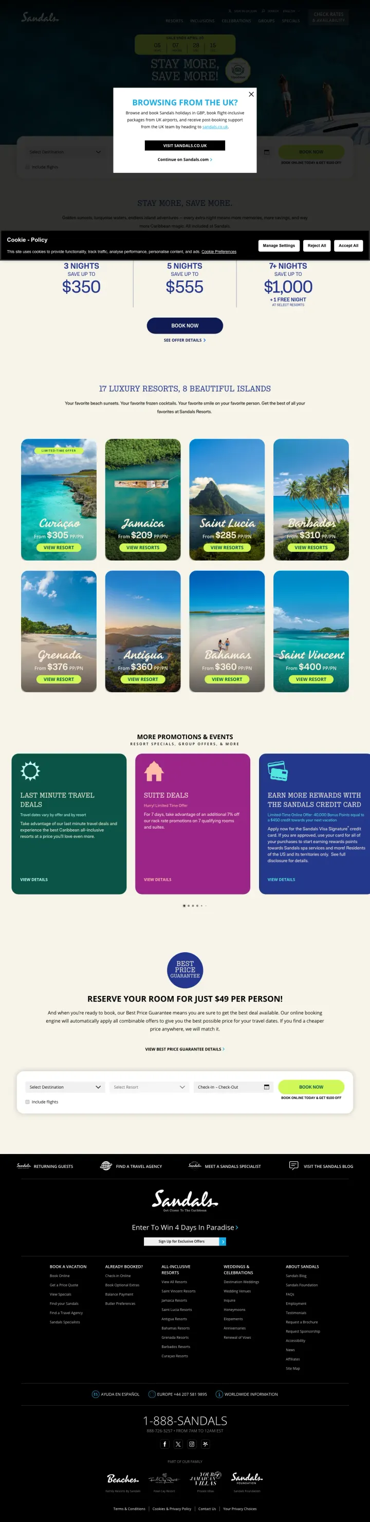
Show savings as a tiered table by stay length (3 nights = $350 off, 5 nights = $555 off, 7+ nights = $1,000 off) so the visitor immediately understands that staying longer saves more, without needing to click into a quote tool.
Countdown timer with a specific end date ('Sale Ends April 20') plus exact dollar savings ('Save up to $1,000 + 1 Free Night at select resorts') creates authentic urgency paired with concrete value. The date is real because Sandals runs named seasonal sales that actually end
Inline booking calendar with resort selector embedded directly on the sale page eliminates the extra step of navigating to a separate booking flow. The visitor picks destination, resort, and dates without leaving the promotional context
Tiered savings by stay duration ($350 for 3 nights, $555 for 5 nights, $1,000 for 7+ nights) gamifies the booking decision and naturally upsells longer stays. The visitor thinks 'if I stay 2 more nights I save $445 more' without Sandals having to push
Geo-targeting popup ('Browsing from the UK?') obscures the entire sale page on first load. For a PPC click from a US-targeted campaign, this is an unnecessary interruption that adds friction to an already-paid visit
Seventeen resorts across 8 islands appear below the pricing section with no filter for price band, travel dates, or party size. An all-inclusive buyer who knows 'Caribbean in March, family of four, $6k budget' has to compare properties by hand.
'Book your room for just $49 per person' deposit offer is buried at the bottom of the page, below the resort grid. This low-commitment first step addresses the #1 objection ('I am not ready to commit $5K+') but only visitors who scroll past everything else will ever see it
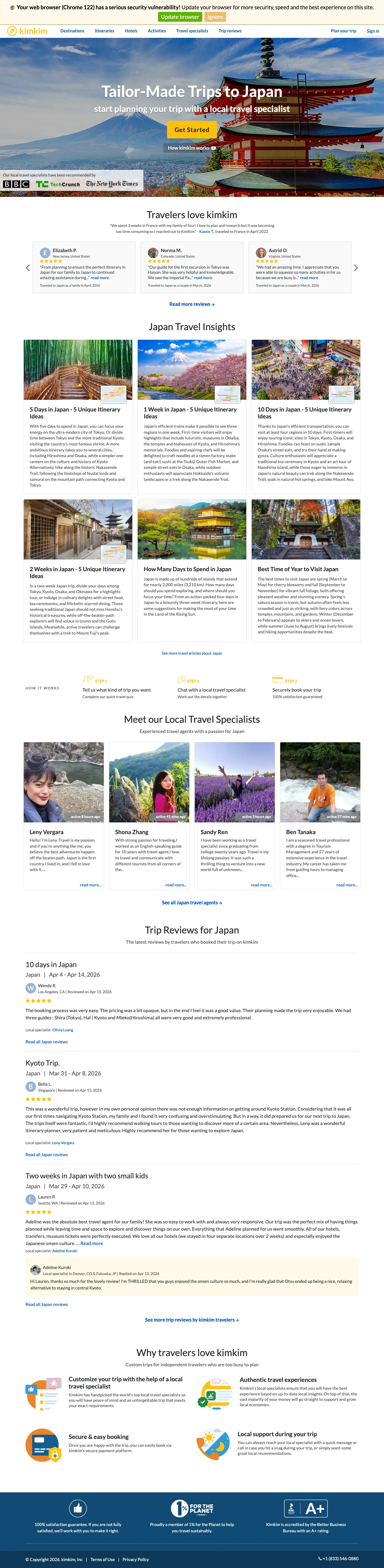
Replace generic 'Contact Us' forms with a quiz-style onboarding flow ('Get Started') that asks trip length, interests, and travel dates before connecting the visitor to a named specialist. This converts the passive form-fill into an active planning experience.
BBC, TechCrunch, and New York Times logos placed directly below the hero CTA create instant credibility for a brand most searchers have never encountered, compressing the trust-building phase from minutes to seconds
Traveler testimonials include full names, locations, trip dates, and destination ('Crystal B., Canada, traveled to Japan as a family in April 2026') making them verifiable and specific in a way that 'Great trip! - John S.' never is
Itinerary content organized by trip duration (5 days, 1 week, 10 days, 2 weeks) lets the Blue-analytical visitor self-qualify by the constraint they care about most: how much time they have
Chrome security warning banner ('Your web browser has a serious security vulnerability!') at the top of the page is a site-level issue that instantly undermines the trust signals below it
No pricing visible anywhere on the page forces every visitor into the quiz funnel, which loses the Red-dominant 20% who want to see a number before they engage with any process
The 'How kimkim works' link is a text link below the CTA that is easy to miss, yet understanding the specialist model is critical for a first-time visitor who has never heard of the brand
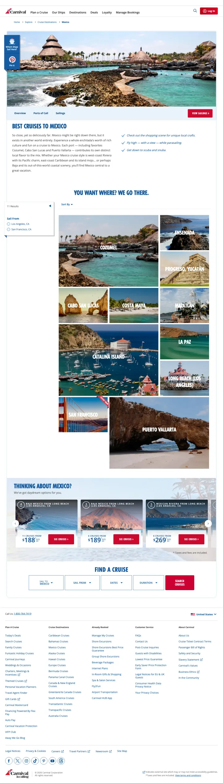
Show a grid of destination ports with real photos and names (Cozumel, Cabo San Lucas, Puerto Vallarta, Ensenada) immediately after the hero, so the visitor who searched 'Mexico cruise' can self-select the specific coast and port that interests them.
The 'You Want Where? We Go There' port grid with 11 Mexican ports, each with a real destination photo, transforms the vague intent of 'Mexico cruise' into a specific, browsable set of options. This serves the discovery-mode visitor who knows they want Mexico but has not decided which coast
'View Sailings' CTA anchors directly to a cruise search filtered for Mexico, so the transition from inspiration to booking happens in one click without re-entering any search criteria
Pricing cards at the bottom show specific from-prices per cruise with departure ports and dates ('From $188, 4 Nights, Los Angeles'), giving the Red-dominant visitor the number they need to make a quick decision
The hero section uses three rotating carousel images of Mexico ports, but the rotation speed means most visitors will only see one. The other two destination photos are wasted on carousel mechanics that studies consistently show underperform static content
IT outage banner at the top of the page ('Carnival is experiencing some IT issues that occurred during planned maintenance') during our capture is a temporary issue, but it demonstrates how operational messages pushed to the top of a PPC landing page can undermine the visitor's first impression
Body copy in the overview section ('Experience a whole enchilada's worth of rich culture') uses a food pun to describe Mexico, which feels tone-deaf and could alienate travelers looking for cultural depth
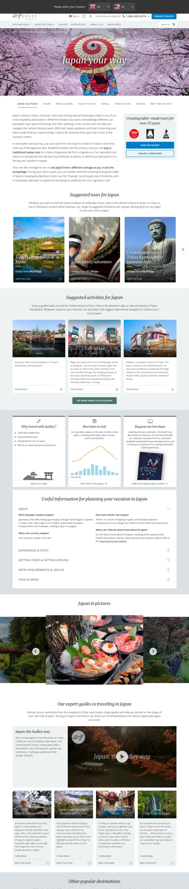
Show suggested tour itineraries with exact day counts and per-person pricing ('8 days from $4,875pp') as clickable cards below the hero, so the visitor can see what a trip actually costs before deciding whether to engage further.
Conde Nast Traveler and Travel + Leisure A-List awards placed as badges in the sidebar create authority positioning without requiring the visitor to read anything. These editorial awards carry weight with the Yellow-social 30% who trust recommendations from publications they read
'Creating tailor-made tours for over 25 years' is a single line that answers 'is this operator established?' instantly. Longevity is the most efficient trust signal in travel because it implies thousands of successful trips without stating a number
Dual CTA strategy (phone number '1-866-490-0974' plus 'Request a Quote' button) serves both the visitor who wants to talk now and the one who wants to browse first, which is critical when 35% of your audience is Blue-analytical and hates phone calls
Geo-targeting popup ('Please select your location: UK / US') interrupts the hero experience and adds a click before the visitor sees any content, which is friction on a paid click that already targeted US users
The hero image shows a woman in a kimono under cherry blossoms, which is beautiful but generic for Japan travel. Every Japan tour page uses cherry blossom imagery, so this fails to differentiate Audley's specific offering
Body copy below the fold reads like a travel guide rather than a sales page ('Buddhist temples dot the country...'), which serves SEO but not the PPC visitor who already knows they want to go to Japan and needs to know why Audley specifically
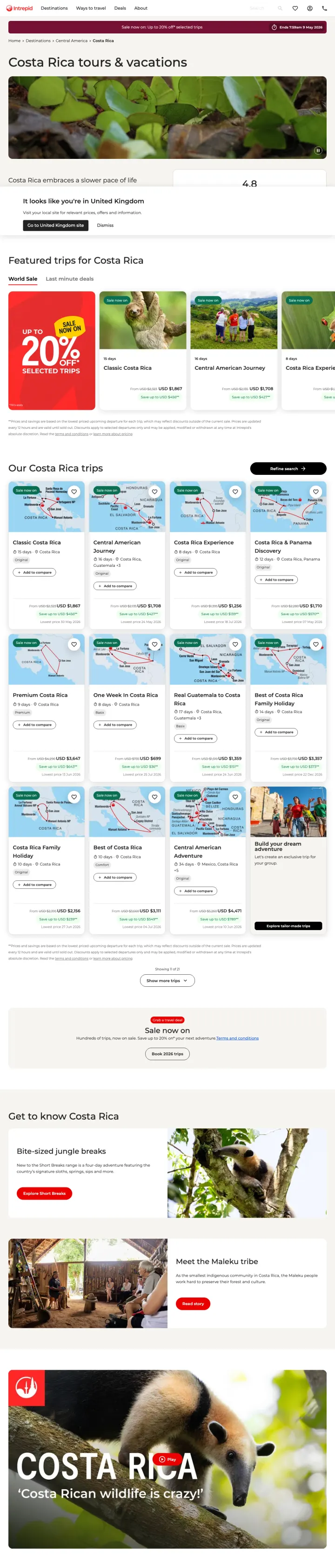
Place a sale banner with a specific end date and percentage off ('Up to 20% off selected trips, Ends 7:59am 9 May 2026') above the fold on every destination page during promotional periods, so the visitor immediately knows they are seeing a time-limited opportunity.
Sale pricing shown as struck-through original next to discounted price ('Was $2,323, Now $1,867') on individual trip cards makes the savings tangible per-trip rather than abstract ('up to 20% off'). The visitor does not have to calculate the discount themselves
4.8 rating from 2,041 reviews displayed prominently next to the destination header provides social proof at a scale that solo operators cannot match. Two thousand reviews is not a trust signal you can fake
Trip cards show exact duration, original vs sale price, and a brief itinerary name ('Classic Costa Rica, 15 days') so the visitor can compare multiple trips on one page without clicking into each one
Geo-targeting popup ('It looks like you are in United Kingdom') partially covers the content area on the US-targeted page, adding an unnecessary click for US visitors who arrived via a US PPC campaign
Hero image shows a close-up of green leaves rather than Costa Rica's iconic volcanoes, beaches, or wildlife. For a destination page competing against stunning imagery from Audley and kimkim, a macro plant photo fails to inspire the travel dreamer
The page title 'Costa Rica tours & vacations' is functional but forgettable. It describes the category rather than selling the experience, missing the opportunity to hook the Yellow-social visitor with aspirational language
Pages that break the playbook in interesting ways
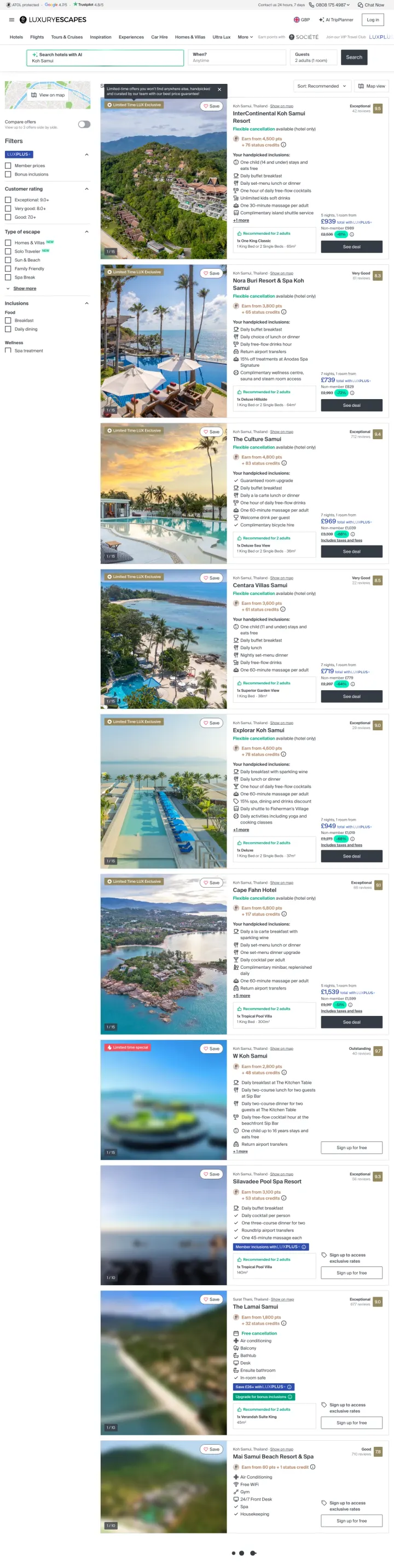
Send PPC traffic directly to a filtered search results page showing specific hotel deals with prices, photos, and inclusions, skipping the destination inspiration phase entirely. This only works if your deals are genuinely compelling and your search UI is strong enough to function as a landing page.
'Your handpicked inclusions' listed for each property (one child stays free, daily buffet breakfast, daily set-menu lunch or dinner, one hour of daily free-flow cocktails, unlimited kids soft drinks, one 30-minute massage per adult) turns the generic 'all-inclusive' label into a specific, countable list of value items
Crossed-out original prices next to discounted prices with percentage savings badges ('-45%') on every listing create constant price-anchoring that makes every deal feel like a steal, whether or not the 'original' price is real
'Limited Time LUX Exclusive' badges on select properties create a sense of curation. The visitor feels they are seeing deals that are not available on Expedia or Booking.com, which justifies engaging with a less-known brand
The page is a search results grid with filters, which means there is no hero section, no destination storytelling, no emotional hook. The Blue-analytical visitor loves this but the Yellow-social 30% who want to dream before they compare will bounce
AI search bar ('Search hotels with AI') at the top suggests a tech-forward brand but adds complexity for visitors who just want to browse Koh Samui deals. The search bar is a distraction when the results are already filtered correctly
Prices shown in GBP despite targeting presumably US traffic, and the conversion to USD requires mental math that adds friction to every price comparison
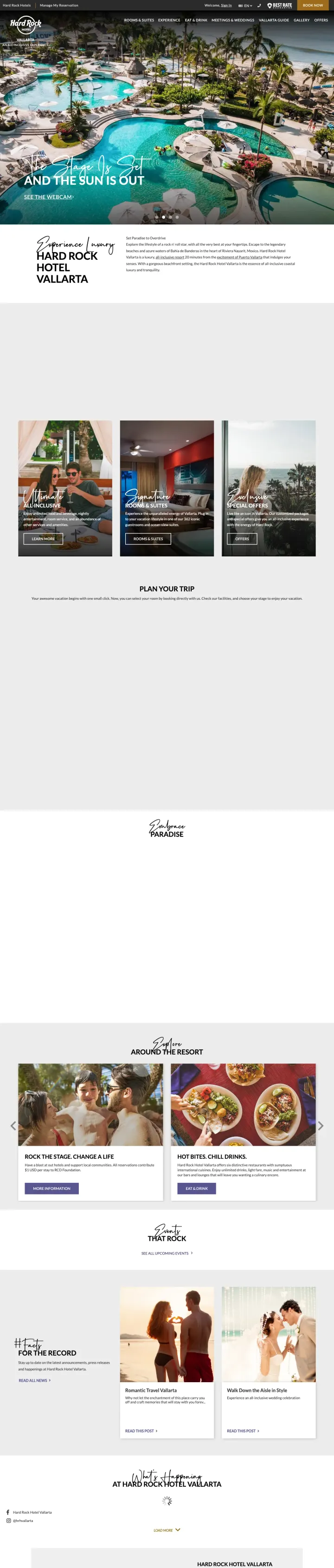
Add a live webcam feed or 'See the webcam' link to your resort hero section, letting visitors see the actual current conditions at the property. This is the ultimate antidote to the 'photos are not real' objection because it is literally live footage.
'See the Webcam' link in the hero section is a radical transparency move. Instead of curated marketing photos, the visitor can see the actual pool area right now. This directly addresses the #3 visitor objection ('The resort will not look like the photos') in a way no amount of reviews can match
'An All-Inclusive Experience' positioned as a sub-brand descriptor immediately below the hotel name answers the 'what is included?' question before the visitor even scrolls. The phrase does work that a paragraph of copy cannot
Best Rate Guarantee badge in the header with 'Book Now' CTA positioned next to it creates a framing where direct booking is always the best deal, which fights the instinct to comparison-shop on OTAs
The hero headline 'The Stage Is Set and the Sun Is Out' is brand-voice creative writing that tells the visitor nothing about rates, rooms, or what makes this property different from the 50 other all-inclusive resorts in Vallarta
Below the hero, the page shows category cards (Rooms & Suites, Dining, Rock Spa, Kids Club) but no pricing and no availability. The visitor who came from an ad promising a Vallarta hotel has to click at least twice more before seeing any rate
Full site navigation with 8+ top-level menu items and deep dropdowns makes this clearly a homepage rather than a landing page. The visitor has dozens of exit paths before encountering a booking mechanism
3 pages burning ad spend with fundamental issues
Every click to these pages costs real money. We found broken trust signals, mismatched intent, weak CTAs, and messaging that ignores what the searcher actually typed. Here is what to avoid.
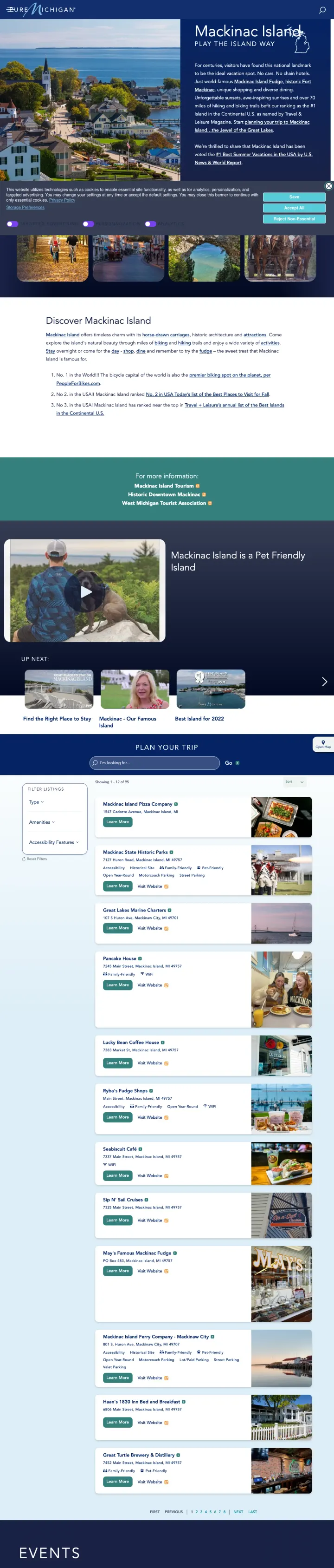
Zero conversion mechanism on the entire page. No booking widget, no hotel search, no form, no package pricing, no phone number for reservations. The visitor is paying to read a tourism brochure with no way to act on it
Every actionable link on the page (Plan Your Stay, Mackinac Island Tourism, biking, hiking, dining) sends the visitor to external sites, meaning michigan.org pays for the click but another site gets the conversion
A full cookie-consent panel eats the bottom 20% of the viewport on load, so the editorial content already has less real estate than it should on a page with no form, no price, and no calendar.
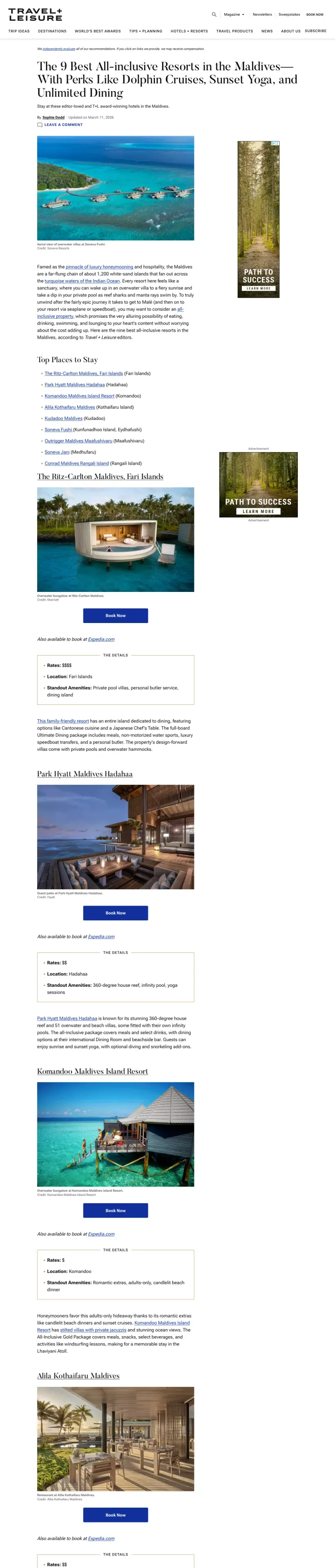
This is an editorial article, not a landing page. The ad promised '9 Top Resorts in the Maldives' and the page delivers editorial reviews, but the visitor who clicked a PPC ad for Maldives all-inclusive resorts expects to compare prices and book, not read a magazine article
Sidebar display ads (a forest photo unrelated to Maldives travel) compete with the editorial content and signal to the visitor that this is a content farm monetising attention, not a travel planning page.
No booking mechanism, no pricing, no CTA beyond 'Book Now' affiliate links to individual resorts. The visitor has to leave Travel + Leisure entirely to take action on any recommendation, making this a paid referral page rather than a conversion page
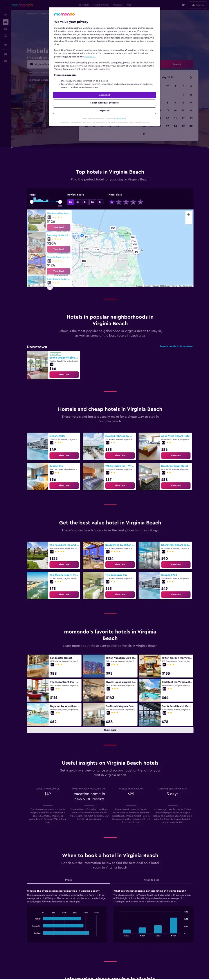
momondo is bidding on 'Virginia Beach All Inclusive Resorts' and 'Jacuzzi Suites Virginia Beach' (14,800 monthly searches on the lead keyword, 16,280 total across 3 keywords). The visitor clicks an ad promising 'Hotels from $97/night' all-inclusive and lands on a generic Virginia Beach hotels listing with a full-width GDPR privacy modal blocking the search widget and map. Even after dismissing the modal, there is no all-inclusive filter pre-applied and no jacuzzi filter the jacuzzi-keyword visitor expected. Every all-inclusive-hunter who bounces costs momondo the full CPC.
Full-width GDPR privacy modal dominates the viewport on first load with 4 buttons (Accept all, Select individual purposes, Reject all, close); the visitor cannot see the hotel search widget or any hotel cards until they make a privacy choice
Ad keyword 'All Inclusive Resorts' drops the visitor onto a generic hotels page with no all-inclusive filter pre-selected, forcing them to find the filter themselves and re-run the search; this is a message-match break worth the difference between $97/night metasearch commission and zero
Dark purple hero backdrop behind the privacy modal makes the modal itself the brightest element on the page, pulling attention away from the search widget that would actually convert the visitor
The strongest travel pages do not just list tours and prices. They show named, photographed local specialists who will personally design your trip, with bios explaining how long they have lived in the destination country. This matters because a $4,000+ custom trip requires trusting a stranger wit...
kimkim.com organizes its entire page around trip length (5 days, 1 week, 10 days, 2 weeks) with unique itinerary ideas for each. This directly answers the Blue-analytical visitor's first question: 'How many days do I need?' Without forcing them to request a quote or call a number. Audley does sim...
kimkim.com places BBC, TechCrunch, and New York Times logos directly below the hero CTA, and Audley leads with Conde Nast Traveler and Travel + Leisure awards. For brands that most searchers have never heard of, these third-party endorsements do the trust-building work that years of brand awarene...
Sandals runs a countdown timer ('Sale Ends April 20') with a specific date, not a vague 'limited time offer.' Combined with concrete savings figures ('Save up to $1,000 + 1 Free Night'), this creates authentic urgency because seasonal travel pricing is genuinely time-sensitive. Intrepid Travel do...
Winners give the visitor a concrete next step matched to their research stage: kimkim offers a quiz-style trip planner ('Get Started'), Audley offers both a phone number and a brochure request, and Sandals shows tiered stay-length pricing with an inline booking calendar. Losers send paid traffic to pages that are not landing pages at all: destination guides with no booking path and editorial articles that exist to generate ad revenue rather than convert a traveler..