Free: 96 PPC tools + my AI Playbook book

Water damage is pure emergency. Mold starts in 24 hours. These people aren't comparison shopping, they're panicking. The entire page needs to scream 'we're available right now and we'll be there in an hour.' Anything that slows them down, a form, a quiz, a 'request a quote', is losing you the call.
From real water damage restoration Google Ads campaigns in the US
The landing pages actually worth stealing from
So you know exactly what to avoid
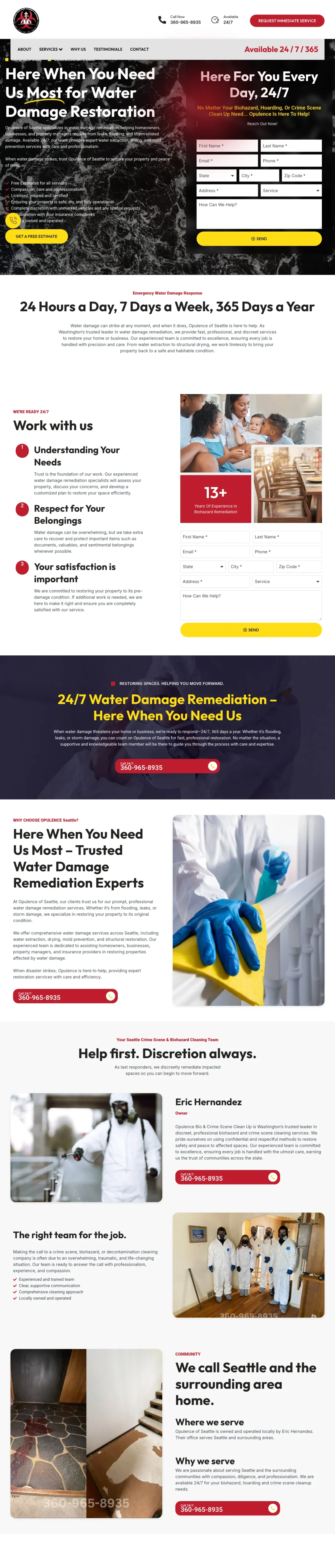
Place a multi-field form (First Name, Last Name, Email, Phone, State, City, Zip, Address, Service dropdown) in the right column of the hero with 'Here For You Every Day, 24/7' as the form headline -- the extensive form fields signal that this company takes the job seriously enough to need your full details.
Seven-item bullet list in the hero (Free Estimates / Compassion, care and professionalism / Licensed, insured and certified / Ensuring your property is safe, dry, and fully operational / Complete discretion with unmarked vehicles / Collaboration with your insurance companies / Locally owned and operated) -- each bullet addresses a different anxiety without being generic
'Complete discretion with unmarked vehicles' is a trust signal unique to this page -- it acknowledges that some water damage situations (sewage backup, hoarding-related) carry stigma and the visitor may not want neighbors to see a branded 'disaster cleanup' truck
Split-screen hero with dark dramatic water imagery on the left and a clean white form on the right creates visual tension that matches the emotional state of someone dealing with water damage
The form has too many fields for an emergency conversion (9 fields including State dropdown and Address) -- a panicking homeowner will not fill out their full mailing address while standing in water
The 'Service' dropdown defaults to biohazard/crime scene options, not water damage -- visitors arriving from water damage ads may wonder if they are on the right page
The page headline 'Here When You Need Us Most for Water Damage Restoration' buries the service type mid-sentence instead of leading with it
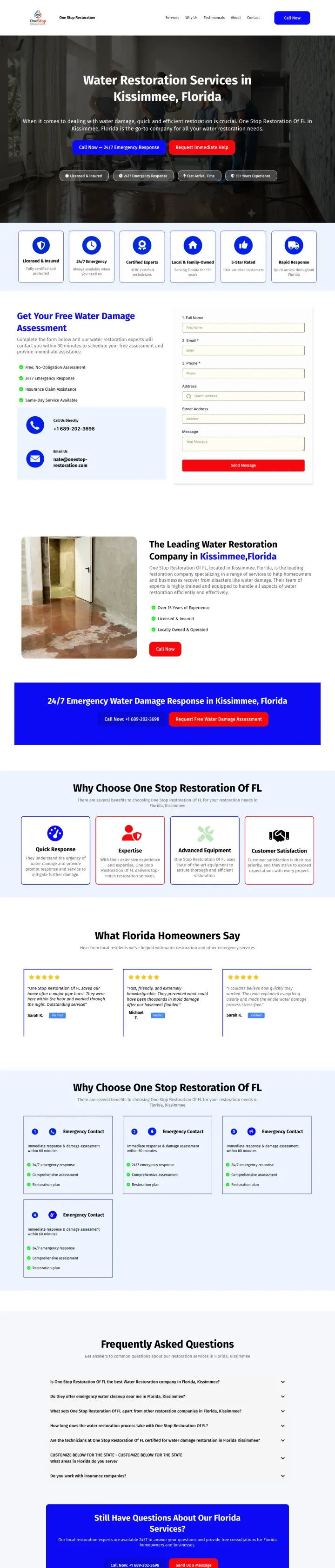
Use a dark hero background with white text, dual CTA buttons ('Call Now - 24/7 Emergency Response' in red + 'Request Immediate Help' in blue), and a horizontal trust bar (Licensed & Insured / 24/7 Emergency Response / Fast Arrival Time / 15+ Years Experience) to create a focused emergency page.
Four trust badges as horizontal pills below the CTAs (Licensed & Insured, 24/7 Emergency Response, Fast Arrival Time, 15+ Years Experience) -- each badge addresses a distinct trust concern and the horizontal layout lets visitors scan all four in under two seconds
Dual CTA buttons in contrasting colors (red for phone, blue for form) let the visitor self-select their urgency level -- red for 'my house is flooding now' and blue for 'I need help soon but not this second'
IICRC certified technicians mentioned as a trust badge rather than buried in body text -- meets insurance company requirements at the point where the visitor is deciding whether to call
The page title says 'Water Restoration Services in Kissimmee, Florida' but the ad copy promises 'Full Cleanup & Repair' -- the page could reinforce the ad's cleanup promise more directly in the headline
Below the fold, the page becomes a long-scroll site with multiple sections (services, testimonials, FAQ) that dilutes the emergency focus of the hero
No specific response time guarantee -- 'Fast Arrival Time' is vague compared to competitors promising 45 or 60 minutes
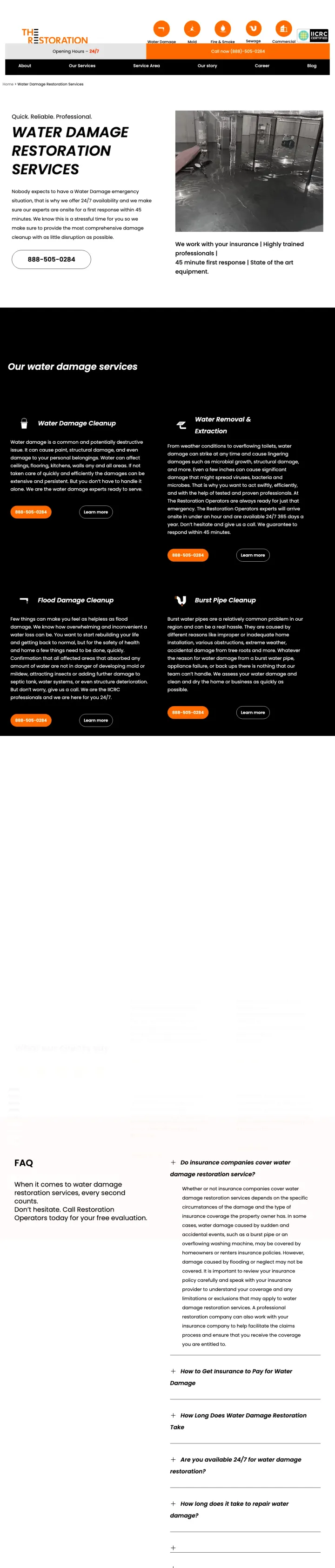
Strip your water damage page down to the essentials above the fold: headline, one sentence acknowledging the stress, a massive phone number, and a single line of trust signals ('We work with your insurance | 45 minute first response | Highly trained professionals'). Let the phone number do the work.
'45 minute first response' as a standalone trust signal line -- more specific and aggressive than the industry-standard '60 minutes,' which creates competitive differentiation on the one metric that matters most
The page opens with 'Nobody expects to have a Water Damage emergency situation, that is why we offer 24/7 availability' -- this empathy-first framing acknowledges the visitor's emotional state before selling anything
Service breakdown into four specific scenarios (Water Damage Cleanup / Water Removal & Extraction / Flood Damage Cleanup / Burst Pipe Cleanup) helps the visitor self-identify their exact situation
The phone number is displayed in a bordered box below the hero content rather than as the dominant visual element -- at $50+ per click, the number should be impossible to miss
No form anywhere on the page -- visitors who are not ready to call (insurance adjusters, property managers comparing options) have no conversion path
The real flood photo is good but the page overall feels sparse and template-basic, which could undermine trust for a service that costs $3,000-$10,000+
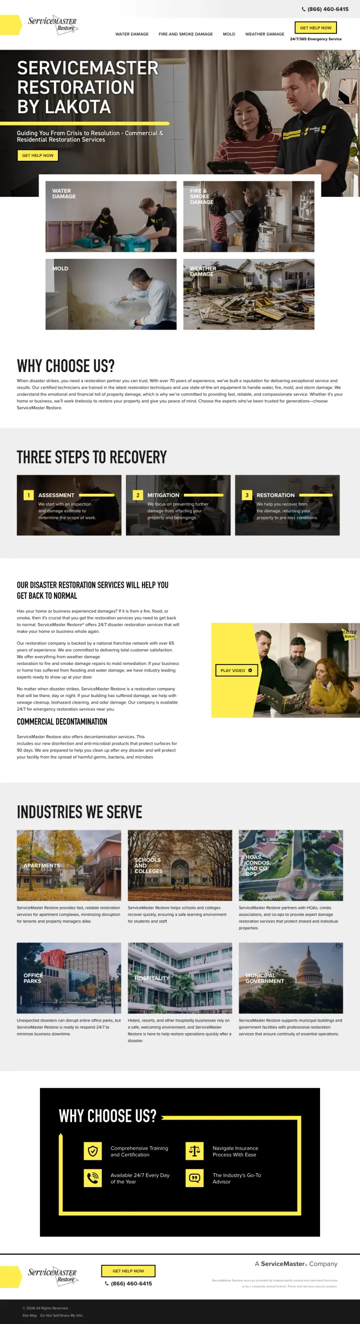
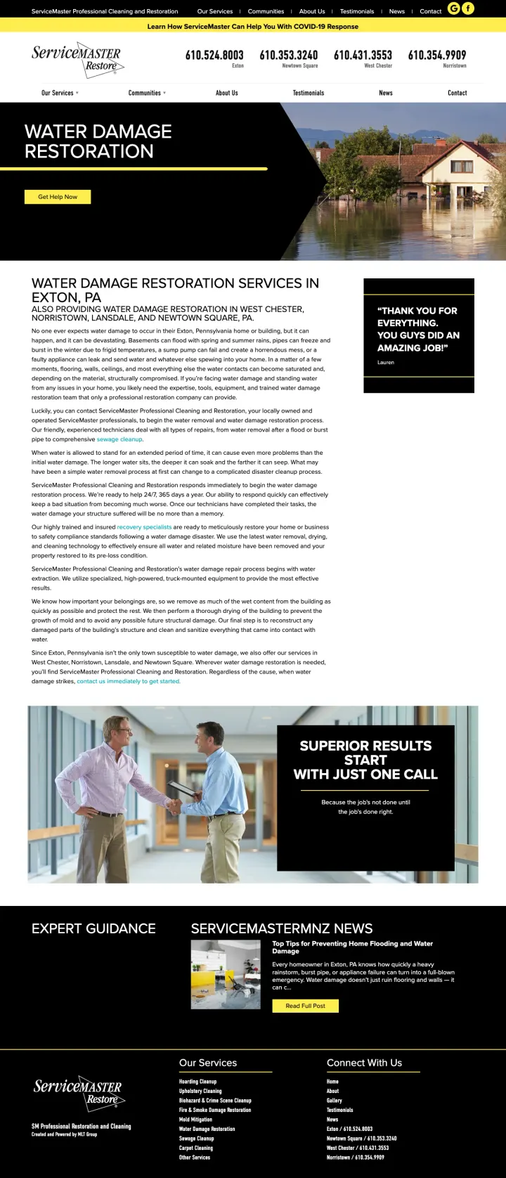
Use a hero image showing a real employee interacting with a real customer (not posing for the camera, but reviewing something on a tablet together), with the franchise name as a text overlay -- this 'caught in the moment' photography feels more authentic than staged team portraits.
Hero image shows a uniformed ServiceMaster employee reviewing restoration plans with a homeowner on a tablet -- this 'we will guide you through it' visual directly addresses the overwhelmed homeowner's need for a knowledgeable partner
'Three Steps To Recovery' process section simplifies the restoration process into Assessment, Restoration, Reconstruction -- the word 'Recovery' reframes the experience as a journey back to normal rather than a disaster response
Service category cards (Water Damage, Fire & Smoke, Mold, Weather) with separate Residential and Commercial links let visitors self-route to the right page rather than reading irrelevant content
The page is a general restoration landing page, not water-damage-specific -- visitors from water damage ads land on a multi-service page that dilutes the message match
No phone number visible in the hero area -- the '24/7/365 Emergency Service' claim in the header has no accompanying number to call, forcing visitors to find 'Get Help Now' and navigate to a contact page
'Why Choose Us?' section is generic franchise copy that could describe any ServiceMaster location -- no local differentiators, no specific team credentials
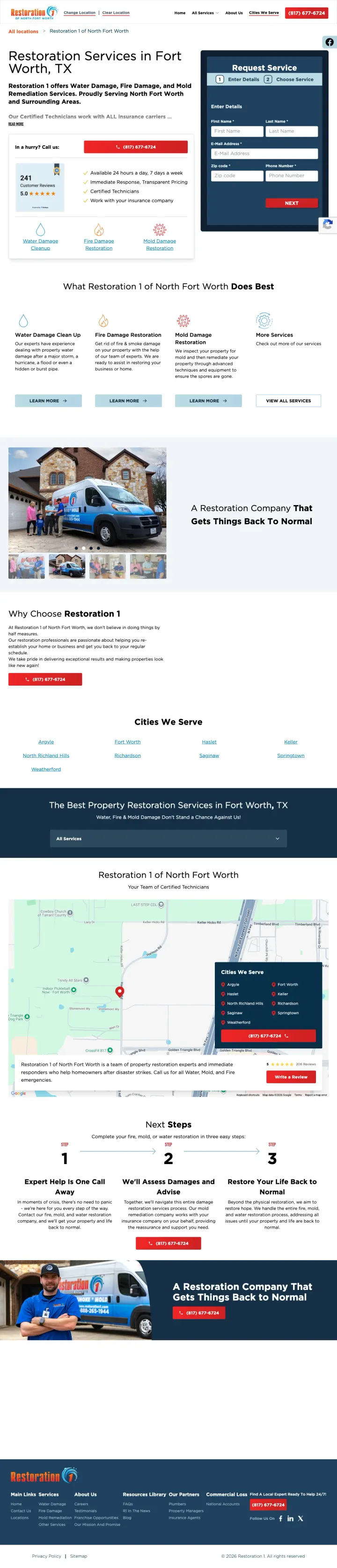
Place a lead form in the right column of the hero with name, phone, and service dropdown, then stack trust signals (241 Google reviews, 5.0 rating, certified technicians, insurance partners) in the left column -- the visitor sees social proof and the form simultaneously.
241 Google reviews at 5.0 stars displayed as a visual badge directly beside the form -- this specific, verifiable review count is far more persuasive than an abstract 'highly rated' claim
Four-bullet trust stack below the form: 'Available 24 hours a day, 7 days a week / Immediate Response, Transparent Pricing / Certified Technicians / Work with your insurance company' -- each bullet answers a distinct objection
'In a hurry? Call us' with phone number positioned as an alternative to the form, explicitly acknowledging that some visitors want to skip the form entirely
The page says 'Restoration Services in Fort Worth, TX' as the headline -- too generic for someone who typed 'water damage' and needs to know immediately that this company handles water emergencies
The van photo in the hero, while real, takes up valuable above-fold real estate that could show water damage restoration work or technicians in action
Service category icons (Water Damage, Fire Damage, Mold Damage) at the bottom of the viewport compete with the form for attention when the visitor already knows they need water help
Pair a specific response time guarantee ('90 Minute Response Time') with both a phone number and a form on the same viewport -- this lets the visitor choose their preferred conversion path without scrolling.
'90 Minute Response Time' as a bold standalone line directly under the phone number -- the specificity is more credible than generic '24/7' and gives the visitor a measurable commitment to hold the company to
Service-type dropdown in the form (Fire Damage / Water Damage / Mold Removal / Commercial / Residential) pre-qualifies the lead so the dispatcher can prioritize water emergencies over general inquiries
Before/after photo gallery showing real water extraction jobs with industrial equipment visible -- proves the company owns professional gear and has documented completed work
The hero area has no background image or visual urgency -- just blue text on white, which fails to convey the emergency nature of water damage at $50+ CPCs
The phone number competes with a navigation menu that includes 'About Us,' 'Financing,' and 'Make a Payment' -- irrelevant links for someone whose house is flooding
IICRC and insurance messaging are present but buried below the fold in body text rather than in the hero where panicking visitors would see them
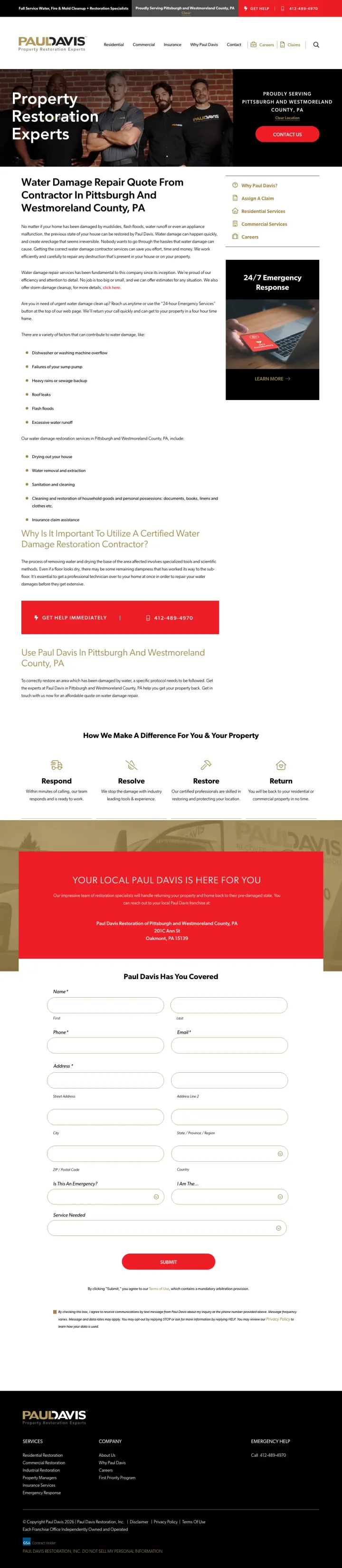
Use a hero photo of your actual restoration team (3-4 people in branded shirts, looking confident but approachable) instead of stock flood imagery or equipment photos -- this answers 'who is coming to my house?' before the visitor even reads the headline.
Hero image shows three real Paul Davis team members in branded black shirts standing together -- the visitor immediately knows these are real people who will show up, not a faceless franchise
'Get Help' and 'Contact Us' buttons are prominently placed, and the top bar includes both a phone number and 'Assign A Claim' link for insurance-directed visitors -- separate paths for homeowners vs. insurance adjusters
Sidebar navigation (Why Paul Davis? / Assign A Claim / Residential Services / Commercial Services / Careers) keeps the page focused while giving secondary audiences a clear path
The headline 'Water Damage Repair Quote From Contractor In Pittsburgh And Westmoreland County, PA' reads like an SEO title tag, not a headline that a panicking homeowner connects with emotionally
The body content below the fold is a long text block about water damage causes and restoration processes -- no bullet points, no visual breaks, just paragraphs that no emergency visitor will read
The form is buried far below the fold in a gold-background section, requiring significant scrolling to reach
Show certification badges (IICRC, Yelp, Google, BBB) in a horizontal row in the body section, paired with 'Available 24/7' in the header and a 'Free Inspection' button -- the badge row converts skeptics who scroll past the hero.
Ad copy promises 'On-Site in 60 Minutes' and the page header shows 'Available 24/7' with a phone number -- the response time guarantee from the ad is reinforced on the page, creating genuine message match
Certification badge row (Yelp, Google, IICRC, BBB) displayed as a horizontal strip gives the visitor four independent trust signals at once -- the IICRC badge is critical for insurance acceptance
'Free Inspection' button in bright green in the top-right corner provides a low-commitment entry point for visitors who are not ready to commit to a full restoration
The hero image is a rendered/stock 3D image of a flooded living room with furniture floating in water -- this looks artificial and undermines trust for a company that needs to prove it handles real emergencies
The hero has no form and the phone number, while present, is small in the header -- the largest visual element is the stock flood image rather than the conversion path
Below the fold, the 'Services' section shows three equal-size cards (Water Damage, Fire & Smoke, Mold Removal) that dilute focus from the water damage intent the visitor arrived with
If you serve multiple locations, show a phone number for each town in the header (not just one toll-free number) -- this signals that you have local presence in the visitor's specific area, not just a call center.
Four local phone numbers displayed in the header (Exton, Newtown Square, West Chester, Norristown), each labeled with the town name -- this hyperlocal signaling is far more convincing than a single 1-800 number for proving you can actually respond quickly to the visitor's location
Inline customer quote ('Thank you for everything. You guys did an amazing job!') positioned as a pull-quote beside the main content, attributed to a named person (Lauren) -- the casual tone feels genuine rather than solicited
'24/7/365 Response' plus 'Get Help Now' button positioned together in the hero section, connecting the availability promise directly to the conversion action
Outdated COVID-19 banner at the top of the page wastes the most valuable real estate on a page where every pixel above the fold counts
Flood stock photo in the hero (house partially submerged) is dramatic but generic -- it does not show the company's own work or team
The page is extremely text-heavy below the fold with multiple paragraphs about water damage restoration process -- a panicking homeowner will never read 800+ words of educational content
Lead with 'We Bill Directly to Insurance' as a bullet point in the hero, paired with 'On Our Way in 60 Minutes or Less' -- these two lines together eliminate both the urgency objection and the cost objection in a single glance.
Four-bullet hero stack ('Talk to a Live Person 24/7 / On Our Way in 60 Minutes or Less / We Bill Directly to Insurance / Experienced, Certified, Licensed Technicians') answers the top four homeowner questions without requiring any scrolling
Five trust badges in a horizontal row below the form (Google, GuildQuality, HomeAdvisor, Angi, BBB) -- this volume of third-party validation directly under the conversion form reduces last-second hesitation
Real job photos of technicians working in flooded properties with professional equipment visible, including before/after shots that show the actual transformation -- not rendered flood imagery
The form headline 'Get a Consultation' is too soft for a crisis search -- 'Get Emergency Help Now' would match the visitor's mental state at $50+ per click
Phone number in the header is present but does not visually dominate -- it competes with the nav bar and the form for attention when it should be the single largest element on the page
Video testimonials and detailed content sections extend the page far beyond what a panicking homeowner will ever read
Pages that break the playbook in interesting ways
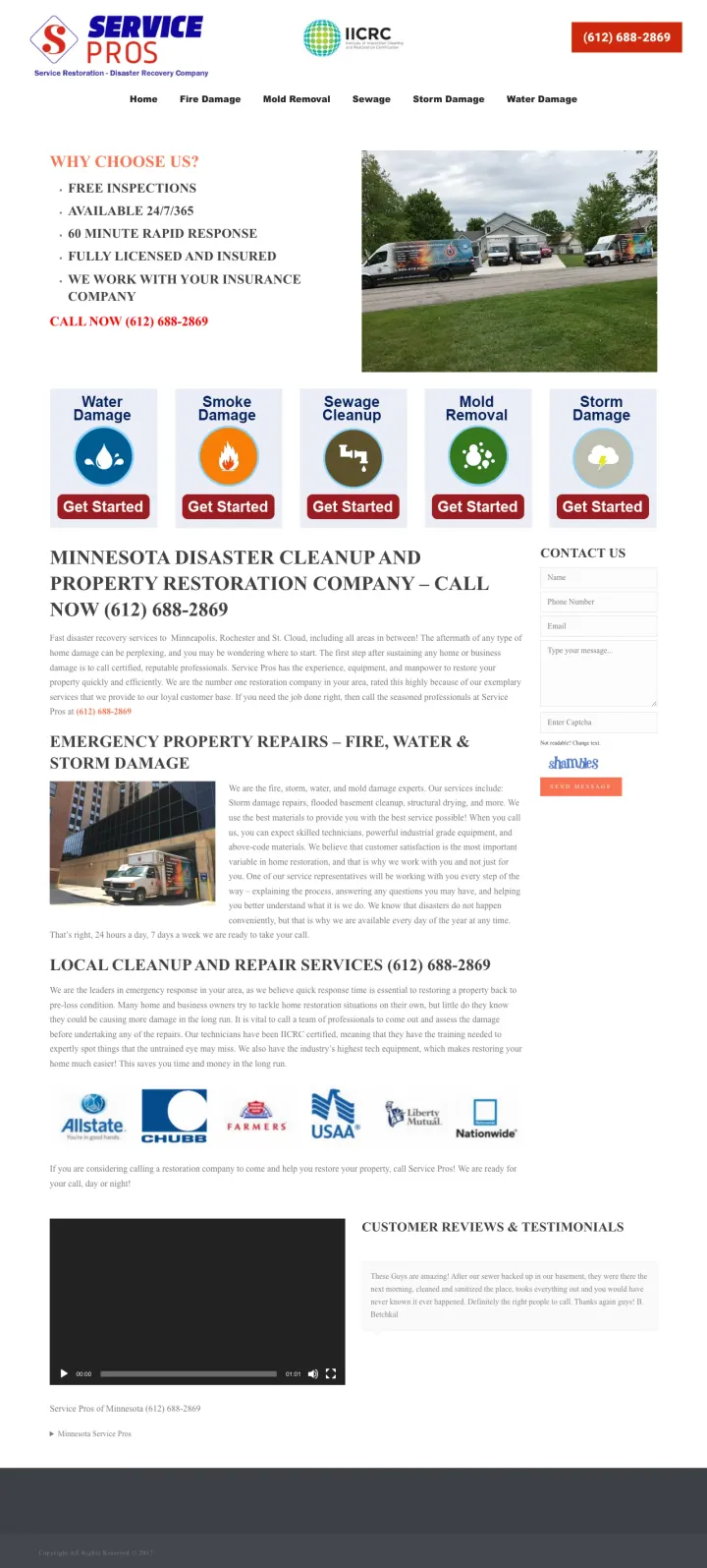
This page proves that in emergency services, trust signals matter more than design. It places the IICRC badge in the header next to the phone number, lists five bullet points ('Free Inspections / Available 24/7/365 / 60 Minute Rapid Response / Fully Licensed and Insured / We Work With Your Insurance Company'), and shows a real photo of branded service trucks. No hero image, no styled layout, no design system. It converts because it answers every question a panicking homeowner has in the first two seconds.
IICRC certification logo displayed at the same visual weight as the company logo in the header -- this positions insurance-required certification as part of the brand identity, not an afterthought
Five-bullet 'Why Choose Us' list with exactly the five things a water damage victim cares about (Free Inspections / 24/7/365 / 60 Minute Response / Licensed & Insured / We Work With Insurance) -- zero filler, zero marketing language, just the facts
Insurance company logos (Allstate, Chubb, Farmers) displayed in a horizontal row prove that 'we work with your insurance' is not an empty claim -- the logos make it verifiable
The visual design looks like it was built in 2008 -- mismatched fonts, no consistent spacing, raw HTML bullet points, and a photo that is not properly sized or cropped
Five identical 'Get Started' buttons under each service category (Water, Smoke, Sewage, Mold, Storm) create decision paralysis -- the water damage visitor already knows what they need
The body text is extremely long with multiple sections of dense paragraphs about emergency property repairs that no emergency visitor will read
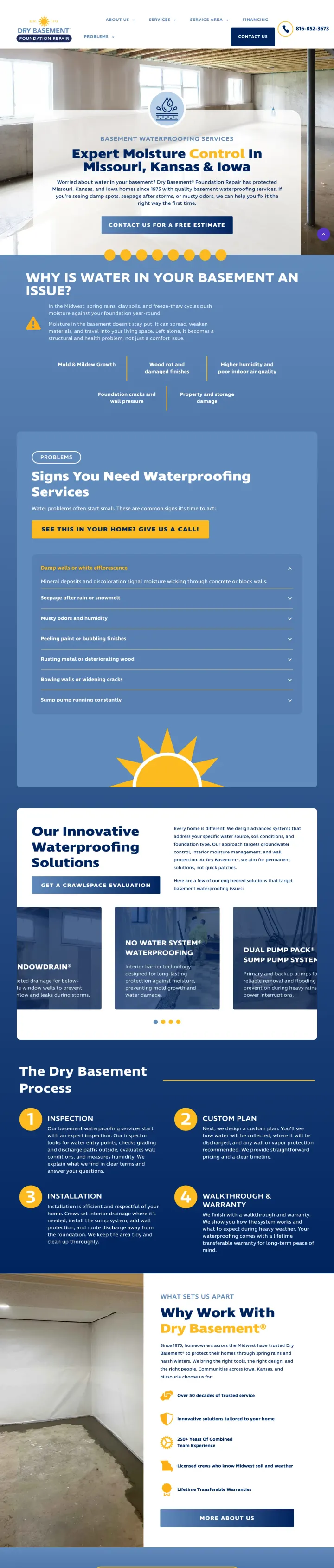
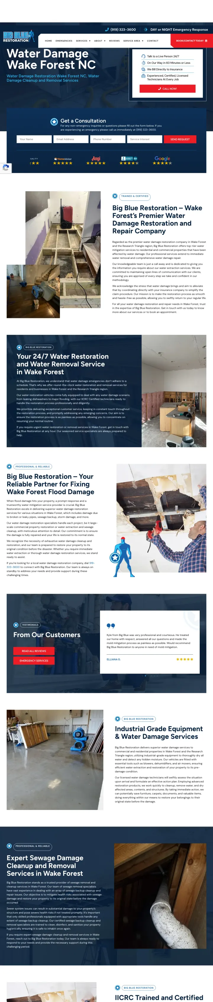
If you serve the waterproofing/prevention segment (not just emergency restoration), build a page around problem education ('Why Is Water In Your Basement An Issue?') with a free estimate CTA. This targets the visitor who googled 'leaking basement fix' and is not standing in water -- they want a permanent solution, not an emergency crew.
'Expert Moisture Control' as the headline frames the service as expertise-driven rather than labor-driven -- this positions the company as specialists who understand the root cause, not just workers who pump water out
Problem-education section ('Why Is Water In Your Basement An Issue?') with specific consequences (Mold & Mildew Growth, Wood rot, Higher humidity, Foundation cracks, Property damage) educates the visitor on why they should act now rather than waiting for a catastrophe
'Since 1975' establishment date signals permanence in an industry full of fly-by-night operators -- 50+ years is the strongest longevity claim in the entire set
The page targets prevention-stage visitors but appeared in a water damage restoration capture pool -- visitors with active flooding will find no emergency messaging, no 24/7 availability, no response time guarantees
The phone number is present but not styled as an emergency hotline -- it is a standard contact number in the header, appropriate for waterproofing consultations but not emergency calls
No form above the fold -- the 'Contact Us For A Free Estimate' button links to a separate page
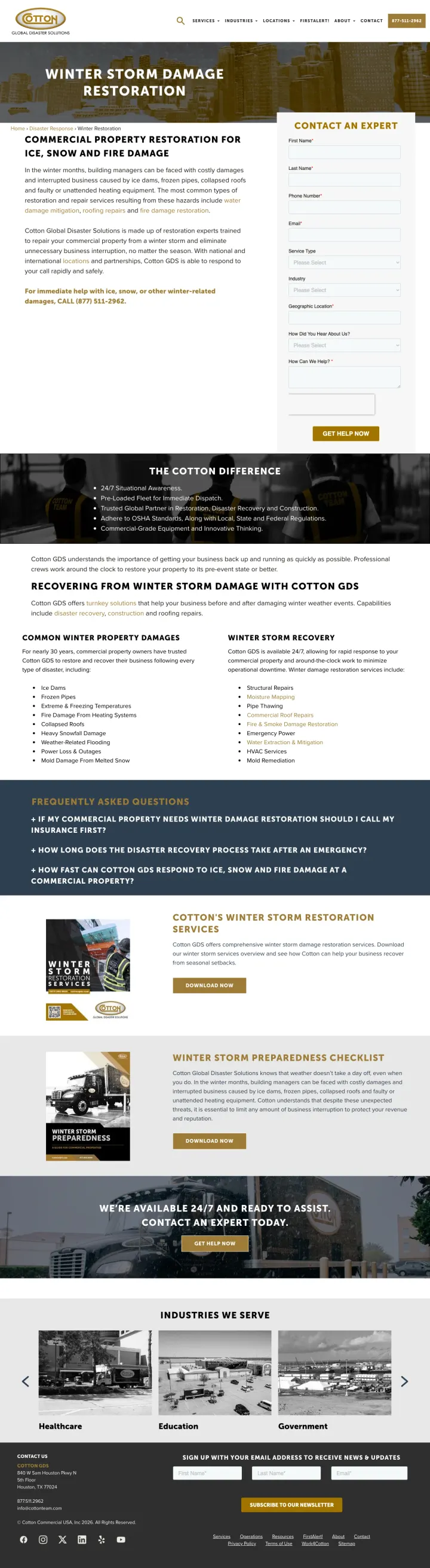
If your target is commercial property managers (not homeowners), build a page that speaks their language: 'Commercial Property Restoration for Ice, Snow and Fire Damage' with a 'Contact an Expert' form that includes 'Service Type' and 'Industry' dropdowns. Skip the 24/7 panic messaging -- property managers want competence and scale, not emotional urgency.
'Contact an Expert' form with Service Type and Industry dropdowns signals that this company handles complex commercial restoration projects, not just residential pipe bursts -- the form fields themselves communicate the company's scale and specialization
'The Cotton Difference' section lists five operational capabilities (24/7 Situational Awareness / Pre-Loaded Fleet for Immediate Dispatch / Trusted Global Partner / OSHA Standards / Commercial-Grade Equipment) -- each bullet is about capability and compliance, not emotional reassurance
'Winter Storm Preparedness Checklist' section positions the company as a proactive advisor, not just an emergency responder -- this builds a relationship with property managers before the crisis happens
The page is about winter storm damage specifically, not water damage broadly -- a visitor searching for water damage restoration from a pipe burst or flood finds seasonal content about ice dams and collapsed roofs
The gold-and-white color scheme with serif fonts feels like a corporate brochure rather than an emergency service -- this is intentional for the B2B audience but alienates any residential visitors
No phone number prominently displayed -- the number is mentioned once in body text ('CALL (877) 511-2962') but not in the header or as a CTA button
2 pages burning ad spend with fundamental issues
Every click to these pages costs real money. We found broken trust signals, mismatched intent, weak CTAs, and messaging that ignores what the searcher actually typed. Here is what to avoid.
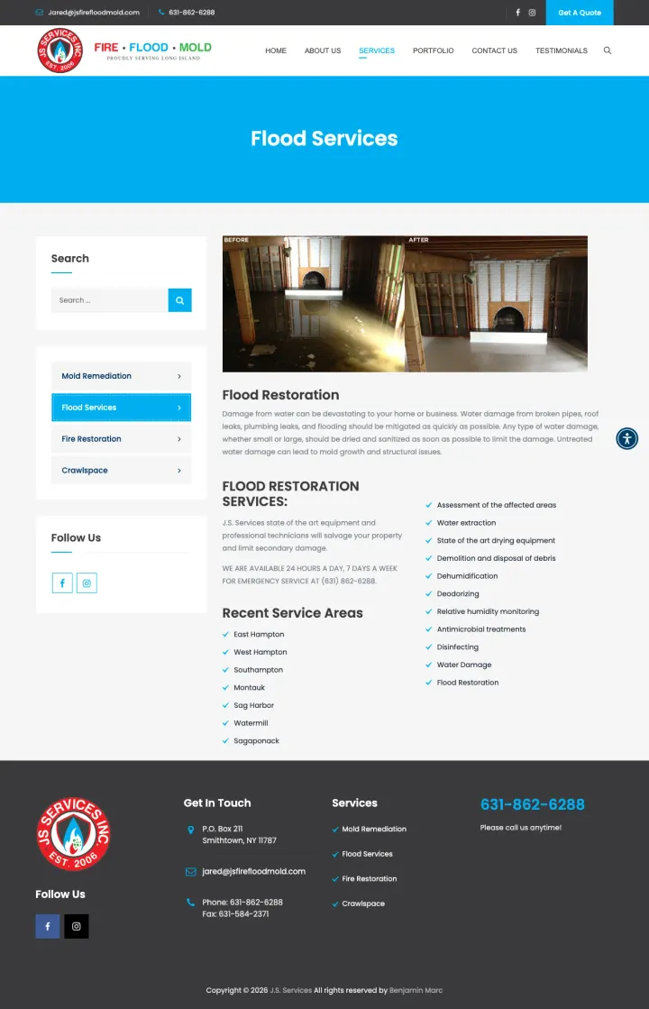
The ad headline is 'Home Flooded?' targeting 'water damage queens' at $40-80 per click. The page has a genuine before/after flood photo proving real expertise, but the phone number is tiny in the header bar and there is no form, no CTA button, and no emergency messaging above the fold. The headline is just 'Flood Services' in plain blue text. A panicking homeowner who clicked 'Home Flooded?' lands on what looks like a brochure page and bounces to a competitor with a massive phone number.
No CTA button, no form, no prominent phone number in the main content area -- the page reads like an informational service listing rather than an emergency response page
A search sidebar with 'Mold Remediation / Flood Services / Fire Restoration / Crawlspace' navigation takes up valuable left-column space that should be used for a form or phone number
The 'Recent Service Areas' list (East Hampton, West Hampton, Southampton, Montauk, etc.) is useful for SEO but irrelevant to a visitor who already found the page through a paid ad targeting their location
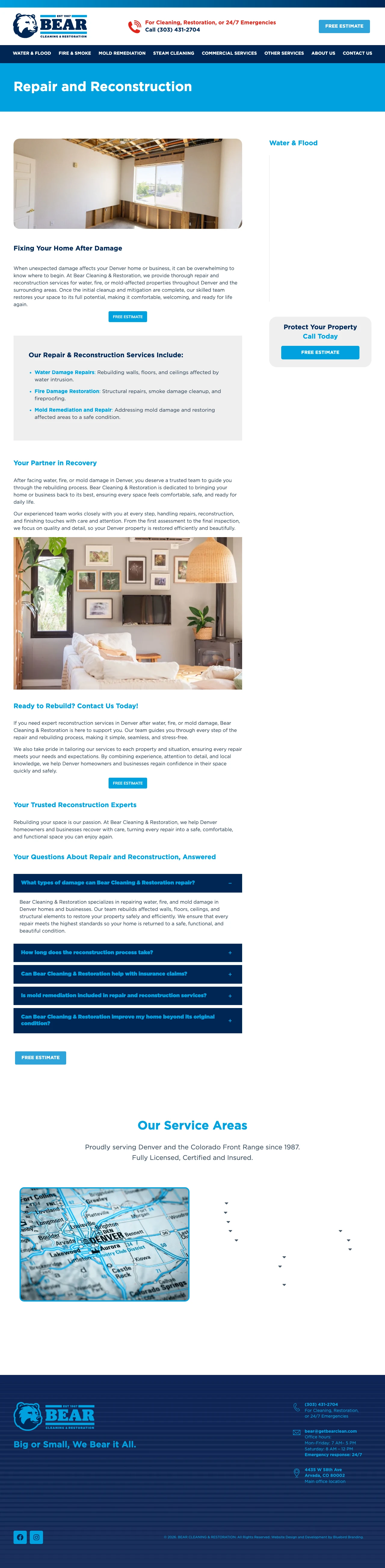
The ad promises 'We'll Be On Site In 60 Min' and '24/7 Water Removal | Call Now' -- urgent, crisis-mode messaging. But the landing page is about 'Repair and Reconstruction,' the step AFTER water extraction. A homeowner with a flooding basement needs water removed RIGHT NOW, not a page explaining how walls and ceilings get rebuilt after the water is gone. The ad writes the check that the page cannot cash.
Fatal message mismatch: ad says '24/7 Water Removal | Call Now' but the page talks about 'Repair and Reconstruction' and 'Fixing Your Home After Damage' -- the visitor needs water OUT, not walls rebuilt
No phone number visible in the main content area -- the number is only in a small header bar, while the ad specifically says 'Call Now' implying the phone number would be prominent
The page content focuses on what happens after cleanup ('once the initial cleanup and mitigation are complete') -- this presumes the emergency is over, but the visitor is in the middle of it
The strongest water damage pages do not just say '24/7 available' -- they promise a specific arrival window ('On-site in 45 minutes,' 'On our way in 60 minutes or less'). This matters because a homeowner standing in water needs to know WHEN help arrives, not just that someone will eventually come...
After the immediate crisis ('can someone come NOW?'), the next question is always 'how do I pay for this?' The winning pages state explicitly that they handle insurance paperwork and bill insurance companies directly. This is different from saying 'we work with insurance' -- direct billing means ...
Insurance companies require IICRC certification for claim approval. The best pages show the IICRC badge in the header or hero area, not buried in the footer. This serves a dual purpose: it reassures the homeowner that the company is legitimate AND it preemptively answers whether their insurance w...
In an industry plagued by 'storm chasers' and fly-by-night operators, real job photos separate established companies from newcomers. The strongest pages show actual water extraction and restoration work -- equipment on site, technicians in action, flooded rooms becoming dry rooms. Pages relying o...
Winners give the panicking caller a phone number and an arrival-time promise inside the hero. Losers make the same caller scroll past a content block about 'our restoration process' before the number appears -- which for a homeowner standing in water means the next SERP result gets the call instead..