Free: 96 PPC tools + my AI Playbook book

Wedding planning is the only purchase where someone goes from 'I've never thought about this' to spending $30,000 in about 6 months. They're googling venues at midnight, emotionally charged, juggling 15 vendor categories at once. The pages that win aren't the prettiest. They're the ones that answer 'can we afford this?' and 'is the date available?' before anything else.
From real wedding services Google Ads campaigns in the US
The landing pages actually worth stealing from
So you know exactly what to avoid
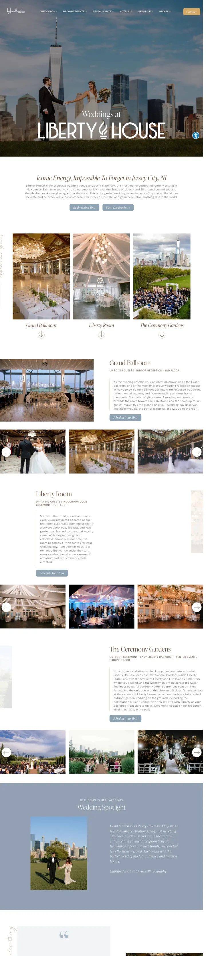
If your venue has an iconic backdrop, put a real couple in front of it as the hero image instead of an empty room. Liberty House shows a bride and groom with the Manhattan skyline behind them. The venue sells itself through what your photos will look like.
Hero image is a real couple with the NYC skyline behind them. Not the venue empty, not a table setting, not a floorplan. This instantly answers 'what will MY wedding look like here?' which is the #1 question venue-shopping couples ask.
Named testimonials from real couples (Adriana T., Devin S., Maddie L., Catie M.) with specific details ('cocktail hour room was stunning,' 'food at Liberty House was divine'). These read like friends recommending a venue, not marketing copy.
Space breakdowns (Grand Ballroom up to 325 guests, Liberty Room up to 150 guests) with separate photo galleries per space let couples self-qualify by wedding size before scheduling a tour.
The ad keyword 'liberty house wedding prices' gets 260 monthly searches, but the page contains zero cost information. Couples must fill out a Typeform just to learn what a wedding here costs -- a direct mismatch with pricing intent.
The 'Begin with a Tour' CTA links to a Typeform with tracking parameters visible in the URL (utm_source=xxxxx). The broken tracking suggests the Typeform integration was set up but never properly configured with actual UTM values.
A photographer testimonial (Alex K.) is mixed in with couple testimonials. A photographer saying 'one of the best venues' serves a different purpose than a bride saying 'dream come true.' Separating vendor endorsements from couple reviews would strengthen both.
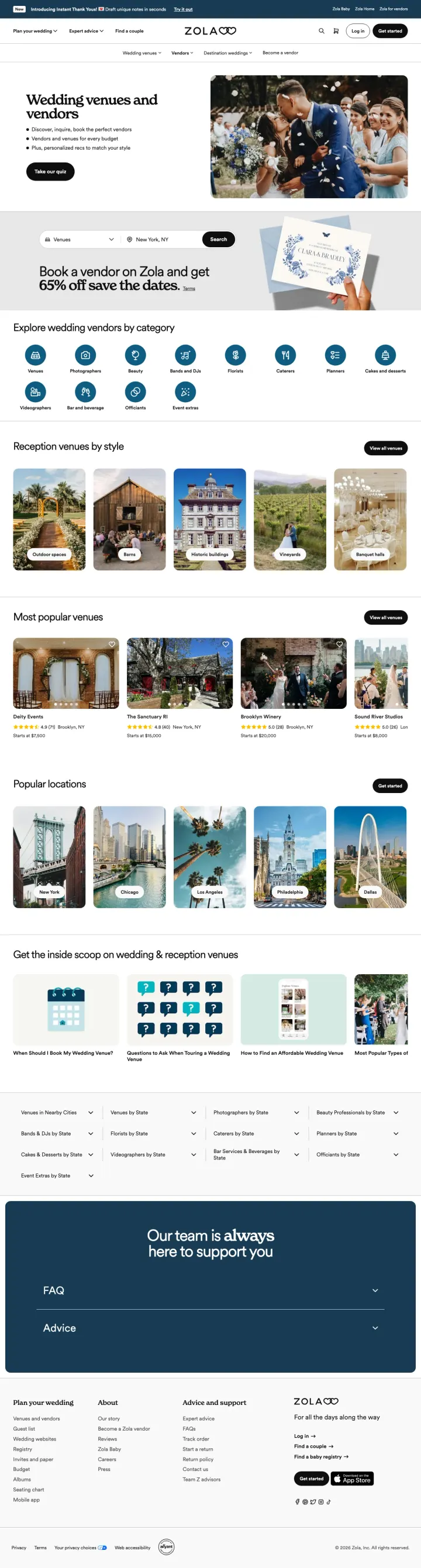
Replace your vendor search bar with a style-matching quiz ('Take our quiz') as the primary CTA. Couples who feel personally matched to a vendor are more likely to inquire than couples browsing an anonymous directory.
'Take our quiz' as the primary CTA above fold transforms passive browsing into an active, personalized experience. For the 30% Yellow persona who wants to feel emotionally guided (not sold to), a quiz feels like help, not marketing.
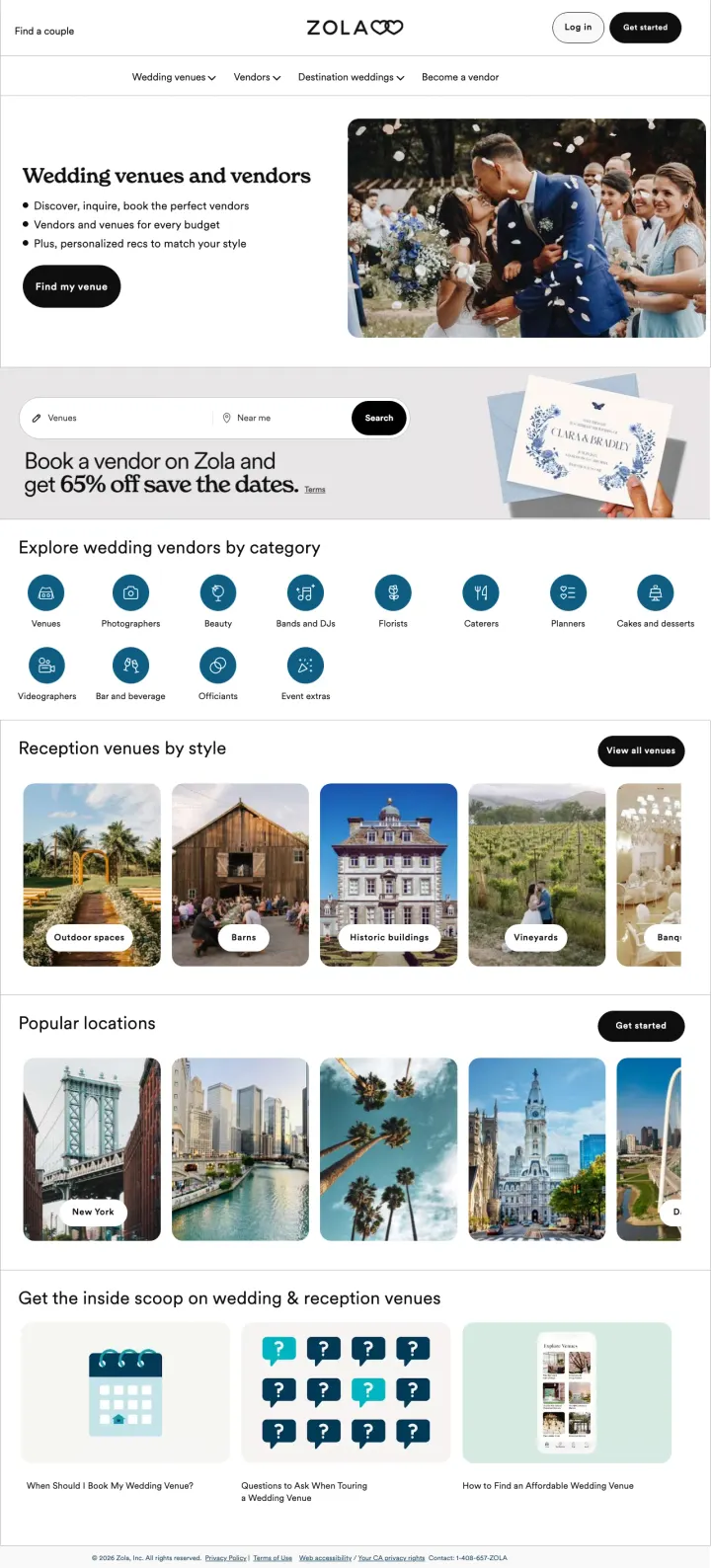
Cross-sell incentive ('Book a vendor on Zola and get 65% off save the dates') creates a platform lock-in that benefits couples financially. This addresses the overwhelm problem by rewarding couples who consolidate vendor decisions in one place.
Vendor category icons (Venues, Photographers, Florists, DJs, Planners, etc.) let couples navigate by vendor type rather than geography. This matches how couples actually plan: by decision type, not by map radius.
City-specific searches ('venues for weddings in chicago,' 'wedding venues in mn') land on a page defaulting to 'New York, NY' in the search bar. Chicago and Minnesota searchers see irrelevant default results.
Despite ads promising 'Venues for Every Budget,' the listings page shows venue photos and categories without any price ranges. Budget-conscious couples comparing options have nothing to compare until they click through each listing individually.
Hero photo shows a real couple but the image is small relative to the text-heavy left column. For a platform competing against Pinterest and Instagram, the visual-to-text ratio should lean heavily visual.
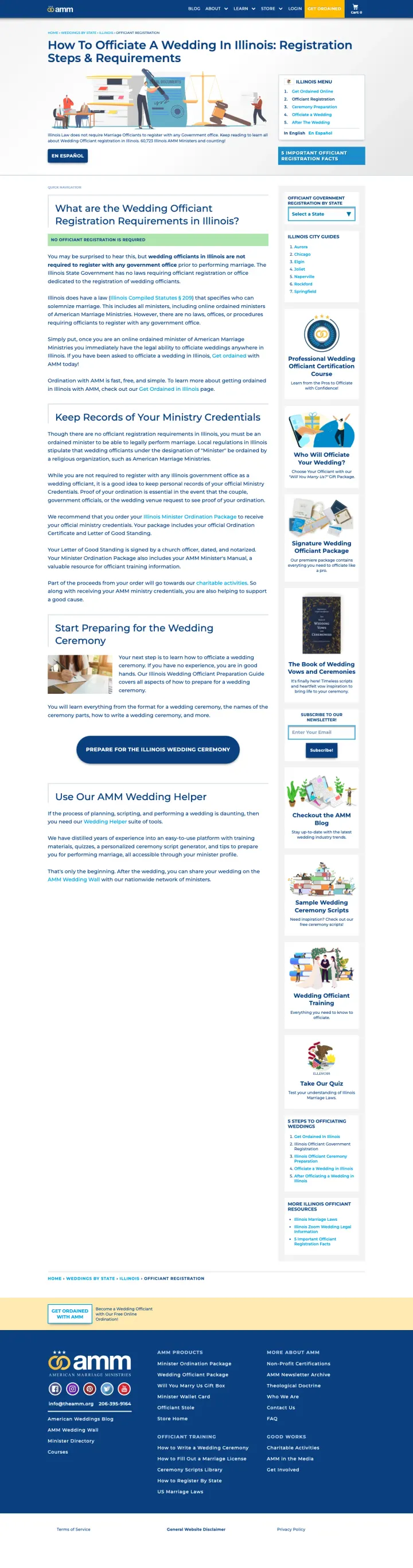
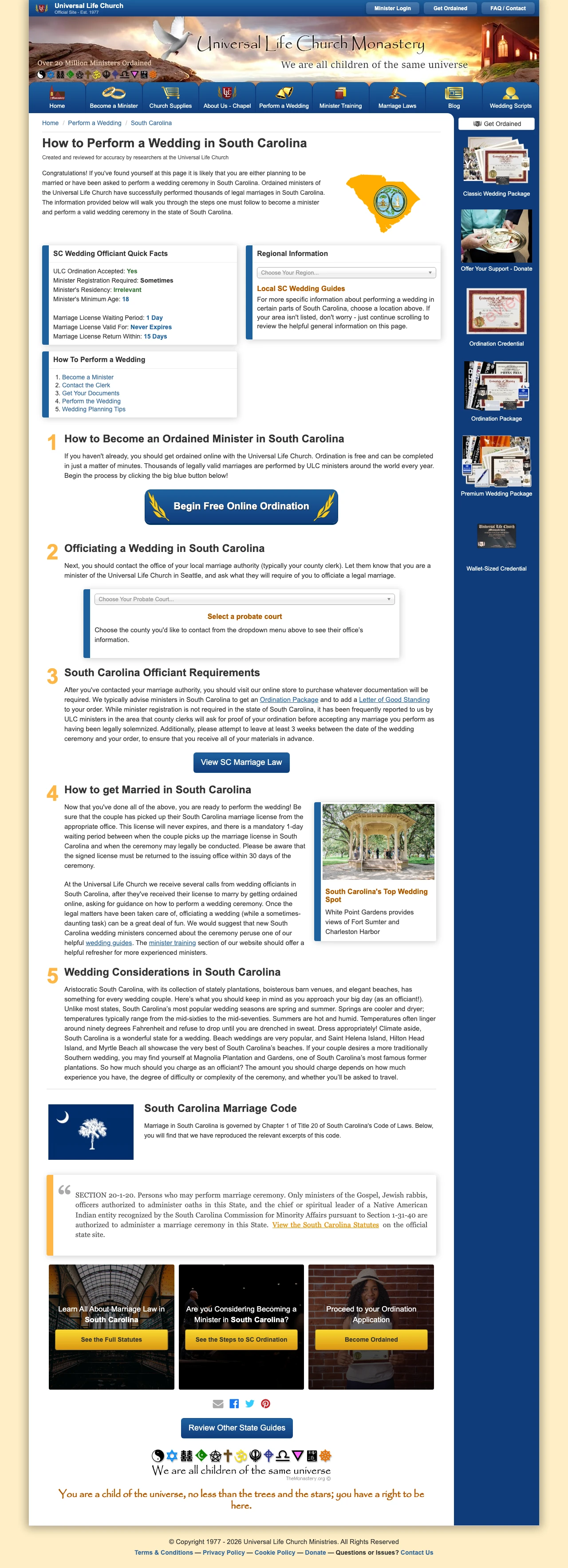
For informational-intent keywords ('how to X in [state]'), build a content-first landing page with the answer immediately visible, then embed your product as the natural next step. AMM answers 'No registration required' in the first paragraph, then positions 'Get Ordained' as the obvious action.
The answer to the search query ('No Officiant Registration is Required') appears in bold within the first scroll. This builds instant trust with the 40% Green persona who needs to feel informed before acting. The page educates first, sells second.
State-specific quick facts box (ULC Ordination: Yes, Registration Required: Sometimes, Waiting Period: 1 Day) gives the 20% Blue analytical visitor a scannable reference they can screenshot and compare across states.
'60,723 Illinois AMM Ministers and counting!' quantifies social proof in a way that is specific to the visitor's state. It is not 'millions ordained' -- it is 'thousands in YOUR state,' which feels more relevant and verifiable.
The page layout is visually dated with a busy sidebar (Illinois Menu, City Guides, state selector) competing with main content. For mobile visitors, this sidebar likely pushes the primary content below the fold.
The 'Get Ordained' CTA appears in the site header but is not repeated within the main content area until well below the fold. The highest-intent moment (right after reading 'no registration required') has no nearby conversion action.
Product upsell for the 'Illinois Minister Ordination Package' reads like an afterthought rather than a natural next step. Framing it as 'here is everything you need to officiate legally' rather than 'order your credentials' would align better with the educational tone.
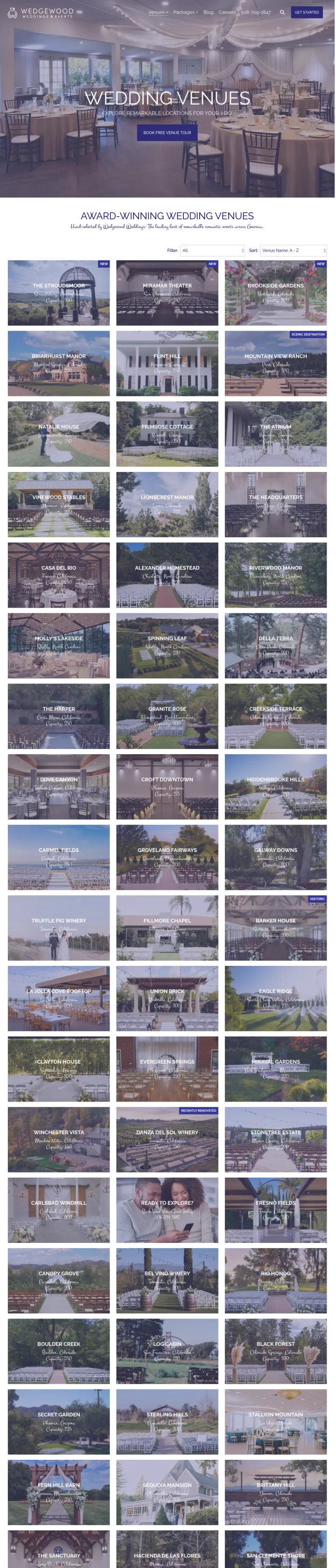
If you operate multiple venues, add location and capacity filters to your listings page so couples can narrow by their state and guest count in one click, instead of scrolling through 30+ venues hoping to find one near them.
The ad promises 'All-Inclusive Wedding Packages' and the page immediately reinforces this with 'Book Free Venue Tour' above fold. The word 'free' removes cost-of-inquiry anxiety for Green personas (40%) who worry about sales pressure.
Phone number (508-709-1847) visible in the navigation bar means couples who are ready to talk can call immediately. This serves the 10% Red persona who wants to book fast without filling out forms.
Each venue card shows location, state, and capacity. For couples comparing venues, seeing 'Carmel, California, Capacity: 250' at a glance is faster than clicking into each venue's page individually.
Keywords target 'cheap wedding halls in arizona' and 'wedding places in the bay area' but the page has no state pre-filter. An Arizona couple scrolls past Pennsylvania, California, and Georgia venues first.
The ad headline promises 'All-Inclusive Wedding Packages' which sets a cost expectation, but the listings page never reveals what those packages actually cost. The all-inclusive promise without a number leaves couples guessing.
The hero image shows an elegantly set ballroom but no people. For a company selling 'romantic wedding venues,' an empty room is less emotionally compelling than showing a real couple's celebration.
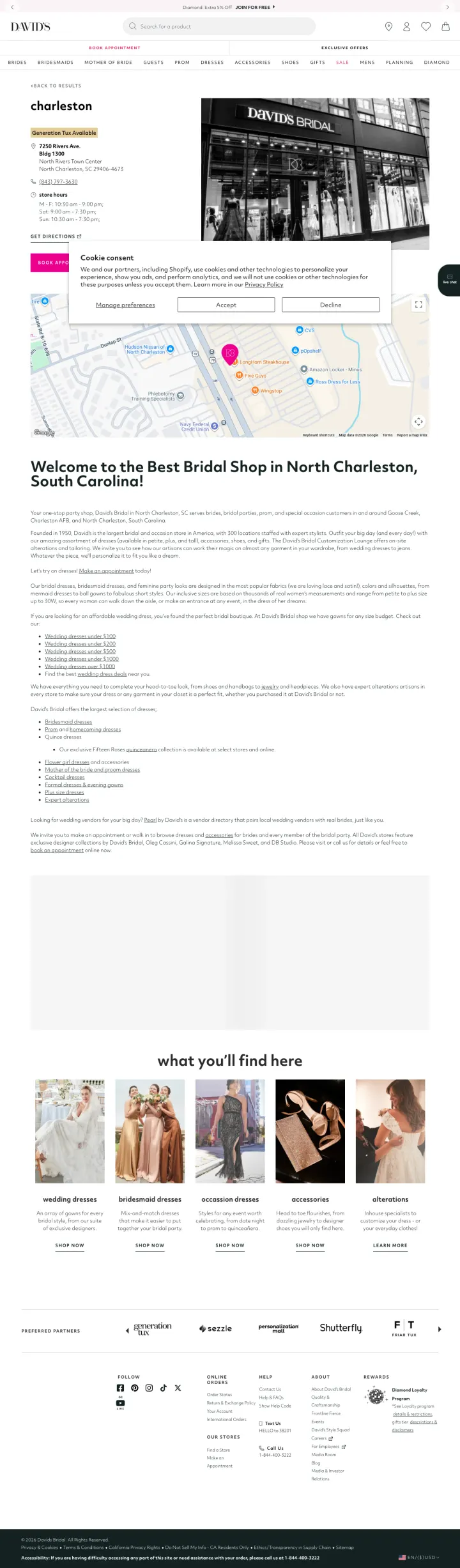
For branded local searches ('brand + city'), make the store page answer the three things every visitor needs in under 3 seconds: address, hours, and how to book an appointment. David's Bridal does exactly this.
'Book Appointment' is the primary CTA in pink, high-contrast against the white page. For a bridal shop where appointments are the conversion action, this is exactly right. Walk-ins may happen but appointments drive revenue.
Store-specific details (address, phone, hours including Sunday) are all visible above fold. For the 40% Green persona who needs logistical certainty before committing, this removes friction before they even consider booking.
'Generation Tux Available' tag signals an additional service (tuxedo rentals) that many wedding couples also need. Cross-selling at the store level reminds couples they can consolidate wedding shopping.
A consent overlay blocks approximately 30% of the viewport on first load. For a branded search where the visitor already chose this store, the wall delays the one action they came to do: book an appointment.
The store photo is black-and-white, which feels intentionally editorial but loses the warm, inviting feeling a bridal shop should project. Color photography showing actual dresses would create more emotional pull.
No reviews or ratings on the store page. When a bride searches 'David's Bridal North Charleston,' she is comparing this location against other bridal shops nearby. Store-level reviews would differentiate this location.
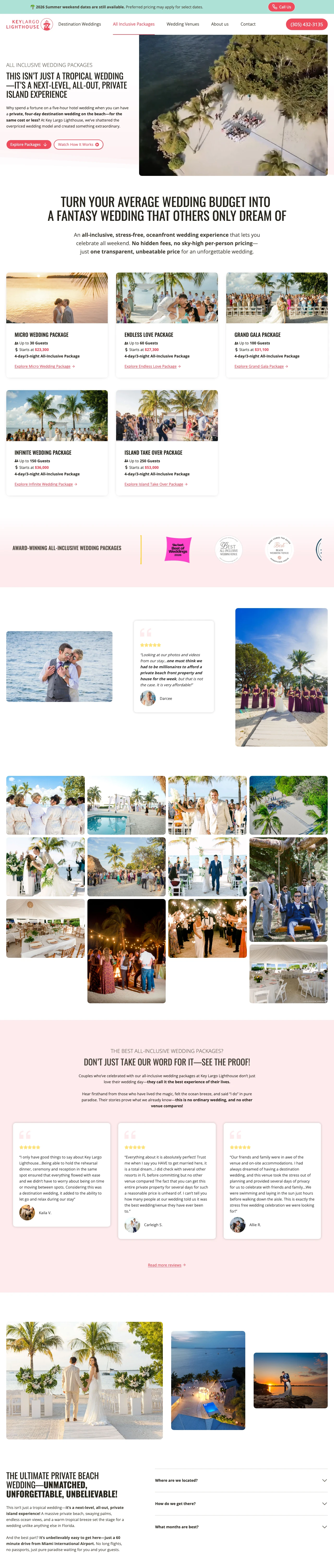
Lead with a cost-reframing headline ('Turn your average wedding budget into a fantasy wedding') instead of listing your price first. Show the price AFTER you have repositioned what the money buys.
Five tiered all-inclusive packages ($23,300-$53,000) with guest counts let couples self-select by budget AND party size without talking to anyone. Couples running spreadsheets comparing 3-5 venues need this level of pricing transparency.
Urgency banner '2026 Summer weekend dates are still available' creates real scarcity (not fake countdown timers) because wedding dates genuinely are limited inventory. It also signals to couples that this venue is popular enough to book up.
Testimonial from Darcee says 'one must think we had to be millionaires to afford a private beach front property... but that is not the case.' A real couple demolishing the #1 objection (cost) is 10x more powerful than the venue saying 'affordable.'
Dual CTAs above fold ('Explore Packages' and 'Watch How It Works') compete for attention. The video CTA dilutes the primary action for risk-averse couples who want to compare packages first.
No availability checker or calendar despite the urgency banner. The disconnect between 'dates are filling up' and having no way to check your date forces an unnecessary phone call.
Award logos (The Knot, WeddingWire) are shown without context. 'Hall of Fame' and 'Couples Choice 2026' mean different things. One sentence explaining what the award means would help analytical couples evaluating credibility.
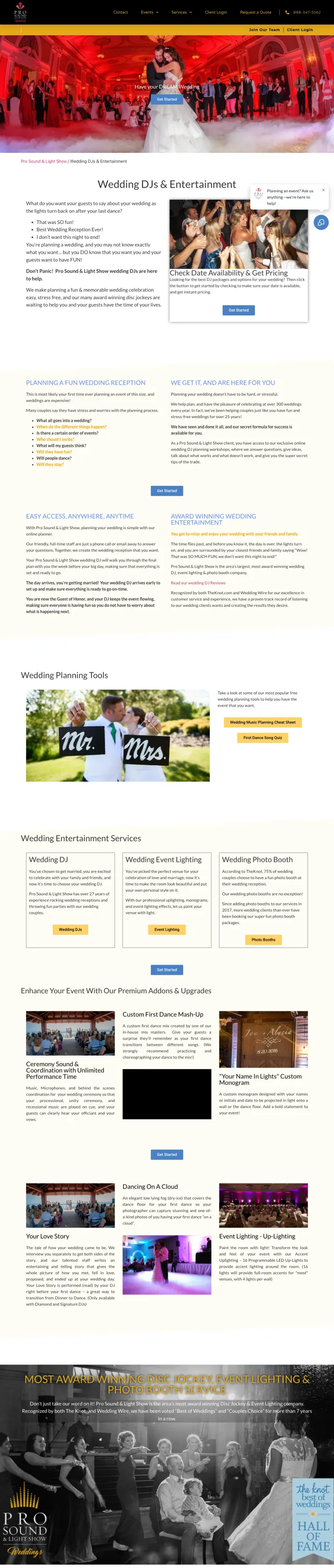
Replace your 'Contact Us' CTA with 'Check Date Availability' as the hero action. For vendors booking a fixed-inventory service (DJs, venues, photographers), availability is the real first question. Pro-1 turns it from a sales friction point into the opening line.
The CTA 'Check Date Availability & Get Pricing' answers the two most-asked questions before a couple has to call. Every other wedding DJ makes couples fill out a contact form just to find out if their date is even open. This page respects the visitor's time.
300+ weddings per year and 25+ years in business mentioned above fold gives the 40% Green (risk-averse) persona the volume-based proof they need. A DJ who has done 300 weddings has seen every possible problem.
Transparent package pricing ($900 to $2,000 range visible on scroll) with ceremony and lighting add-ons listed as clear line items. Couples comparing 3-5 DJ quotes can drop this into a spreadsheet without requesting a quote.
The ad keyword 'dj minneapolis' (260 monthly searches) has no Minnesota-specific content above fold. A Minneapolis couple sees generic wedding copy first and has to scroll to confirm this is a local service. Pre-filtering the hero by geo would tighten message match.
The hero video shows a crowded dance floor but no named couple, no venue credit, no wedding date. Compared to static hero images with captioned real weddings, unattributed dance-floor b-roll reads as stock footage even when it is not.
The 'Have your DREAM Wedding' subhead is a generic promise that could belong to any wedding vendor. For a DJ specifically, a more pointed line ('Your guests will actually dance') would differentiate from every photographer, florist, and planner also promising a dream wedding.
For state-specific informational searches, add county-level contact directories (addresses, phones, office hours for every county) beneath the main content. Visitors bookmark and share pages that solve their specific problem in their specific county, which compounds into organic traffic.
A state-wide quick-facts box (ULC Ordination: Yes, Registration Required: Sometimes, Waiting Period: 1 Day) gives the analytical visitor a scannable reference in under 5 seconds. This template repeated across all 50 states creates a content moat that ranks for every state+officiant query.
Full legal code citation (South Carolina Code Title 20 Chapter 1) reproduced inline builds authority trust that a competitor's 'See how to get ordained' ad copy cannot match. For the 40% Green persona who needs legal certainty before acting, quoting the statute is the unbeatable move.
A complete county-level directory (all 46 SC counties with probate office address, phone, fax, website) turns the page into a reference document. Ministers bookmark this, share it, and return to it when the wedding actually happens.
The design is visibly dated (circa 2015 palette, busy sidebar, cartoon illustrations in the nav bar). Modern couples searching from mobile will question credibility based on aesthetics before reading content.
'Become a Minister' CTA is buried in the header bar with low visual weight. The highest-intent moment (after reading 'Yes, ULC ordination is accepted') has no nearby CTA. The page educates well but under-converts.
The mobile experience is likely compromised by the sidebar navigation pushing main content below the fold. The sidebar adds value on desktop (state selector, local guides) but needs to collapse gracefully on small screens.
Pages that break the playbook in interesting ways
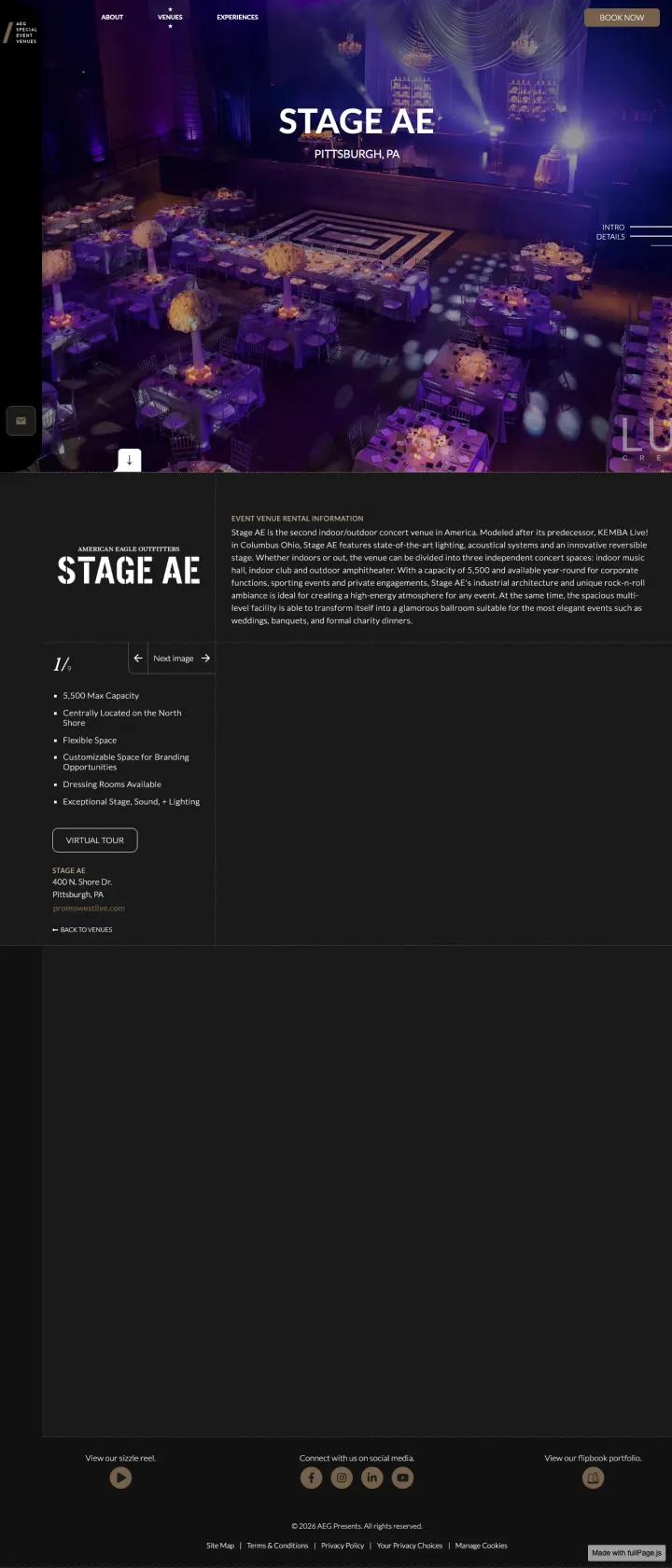
Why This Breaks the Rules: Most wedding venues show garden ceremonies and white tablecloths. Stage AE leads with a dramatically purple-lit concert hall set up for a formal dinner. It does not say 'wedding' anywhere above fold. It says 'Stage AE, Pittsburgh, PA' and lets the visual drama do the selling. For the couple who does NOT want a traditional wedding, this is the anti-venue-page. It breaks every wedding landing page convention and works precisely because of that.
Full-bleed dramatic photography of the actual space set up for a formal event (purple uplighting, concert-stage dance floor, round tables with floral centerpieces) sells an experience that no traditional venue page can match. Couples who want an unconventional wedding will self-select immediately.
Minimal copy. The page has almost no text above fold because the venue's visual identity IS the pitch. For a concert venue pivoting to events, letting the photography speak is smarter than trying to sound like every other wedding venue.
AEG (Anschutz Entertainment Group) brand backing provides implicit trust for a concert venue entering the events space. This is not a random warehouse renting out space; it is a professionally managed entertainment venue.
The keyword 'places for bridal showers in pittsburgh pa' has specific occasion intent, but the page is a general event venue with no mention of bridal showers, weddings, or wedding-specific packages.
No pricing, no capacity details above fold, no testimonials. The page relies entirely on visual impact. For the 20% Blue persona who needs numbers, there is nothing to compare against other Pittsburgh venues.
The 'Book Now' CTA is gold text on a dark background in the top-right corner. It is easy to miss against the dramatic photography. A more prominent CTA anchored within the visual would capture visitors who are sold by the image.
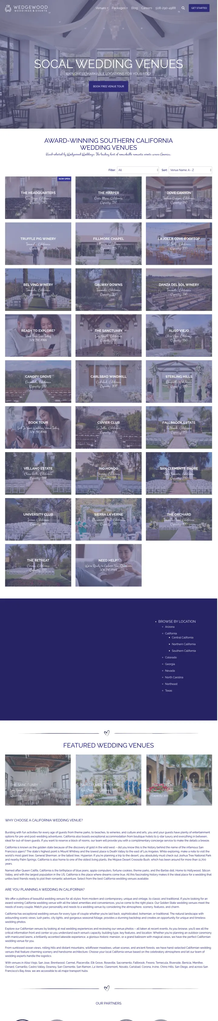
If you operate in multiple markets, build a dedicated SEO+PPC landing page per region (not just a filter on a master page). Wedgewood runs /southern-california-wedding-venues as a separate URL with California-specific hero, photos, and venue grid. The message match for 'San Diego wedding venues' searches is near-perfect.
The hero headline 'ENCHANTING SOCAL WEDDING VENUES' speaks directly to visitors who searched a California-specific keyword. Compared to landing on a generic /venues page showing Georgia and Pennsylvania locations first, this geo-specific hero eliminates the 'am I in the right place?' bounce moment.
The page uses the same 'Book Free Venue Tour' CTA as the master venues page. Repeating CTAs and trust patterns across geo-variants saves design time while still delivering geo-specific message match. One codebase, many landing pages.
Regional venue grid shows only California properties with capacity and city visible. Couples comparing three California venues can stay within the Wedgewood ecosystem rather than bouncing to compare against other California brands.
'SoCal' in the headline is a regional colloquialism but the ad keyword is 'places to have a wedding in san diego.' A visitor searching San Diego specifically sees 'Southern California' and wonders whether any of these venues are actually IN San Diego.
The hero shows a single ballroom image rather than a map or collage of the region's venues. A visitor who wants to scan multiple California locations at a glance has to scroll through a text-heavy section first.
No price ranges visible on the venue grid despite the ad promising 'All-Inclusive Wedding Packages.' The master /venues page has the same omission, so this is a brand-wide pattern, not a geo-page problem.
2 pages burning ad spend with fundamental issues
Every click to these pages costs real money. We found broken trust signals, mismatched intent, weak CTAs, and messaging that ignores what the searcher actually typed. Here is what to avoid.
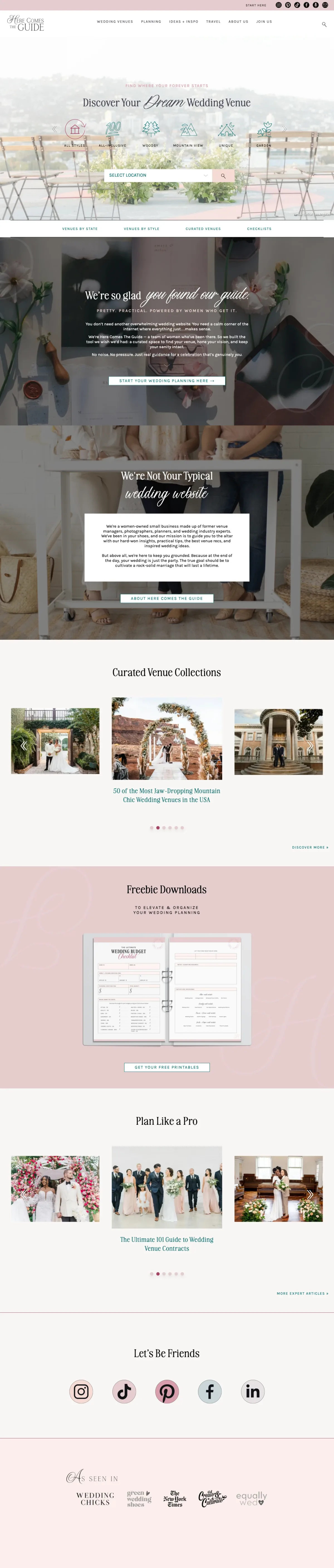
The ad sells a specific, valuable piece of content (29 affordable New England venues with prices). The landing page delivers none of it. The visitor searched for 'affordable wedding venues in MA' (880 monthly searches), clicked an ad promising exactly that, and landed on a homepage showing California venues. Every click is a complete waste of ad spend because the content the ad promised exists somewhere on the site but this page is not it.
The ad headline '29 Most Affordable New England Wedding Venues | See Prices' promises a specific listicle with pricing. The landing page is the site's generic homepage showing a venue discovery tool defaulting to venues in California, Texas, and Illinois. New England is not even visible.
The homepage shows venue carousels (Sofitel Los Angeles, Firefly Gardens Texas) that are geographically irrelevant to someone who searched 'affordable wedding venues in MA.' Every second on this page confirms the visitor is in the wrong place.
The 'Select Location' dropdown is the closest thing to addressing the search intent, but it requires the visitor to manually navigate to New England rather than landing directly on the promised '29 affordable venues' list.
The ad spend is buying city-specific keyword traffic ('Wedding Venues In Chicago' at 9,900 monthly searches, 'Wedding Venues In Michigan' at 9,900 searches, 'wedding locations in dallas texas' at 8,100 searches) and dropping all of it on a page that defaults to 'Near me.' A Chicago searcher clicks an ad for Chicago venues, lands on a page that asks them to re-enter their location. At competitive wedding-venue CPC ($3-$8), every mismatched click is $5 of lost ad spend that could have been saved by pre-populating the location field from the referring keyword.
The ad copy promises 'Wedding Venues In Chicago' (9,900 monthly searches) and 'Wedding Venues In Michigan' (9,900 monthly searches). The landing page hero reads 'Wedding venues and vendors' with a location field defaulting to 'Near me.' The ad's most valuable signal (the city) is thrown away at the moment of landing.
The vendor grid below the fold shows Venues, Photographers, and Videographers cards without any location context. A visitor searching 'wedding locations in dallas texas' sees generic vendor categories instead of Dallas-area examples. The 65% off save-the-dates banner is the only concrete offer on the page.
The page has no phone number, no live chat, and no named human. For the 40% Green persona (risk-averse couples), the absence of a real person makes the 'Find my venue' CTA feel like a portal into an anonymous database rather than the start of a relationship.
The top-performing pages in this set all show specific dollar amounts. Key Largo Lighthouse lists five tiered packages from $23,300 to $53,000. Eventective shows per-event pricing ($225-$1,998) inline with each listing. Pro-1 leads with 'Check Date Availability & Get Pricing' as their primary CTA...
Liberty House (bylandmark.com) has a 'Wedding Spotlight' section with named couples (Demi & Michael) and photographer credits. Their testimonials quote real people (Adriana T., Devin S., Maddie L.) describing specific details like 'cocktail hour room' and 'skyline views.' Compare this to pages us...
The clearest loser sends paid traffic to a completely wrong page. Here Comes The Guide advertises '29 Most Affordable New England Wedding Venues | See Prices' but lands on a generic venue discovery homepage showing venues in California and Texas. When wedding venue clicks cost $5-15 each, sending...
Only Pro-1 makes 'Check Date Availability' the primary action. Yet availability is the #1 practical filter couples use. You can have the perfect venue at the right price, but if it is booked on your date, nothing else matters. Pages that surface availability early (even just 'Summer 2026 dates st...
Winners answer the specific question the searcher typed and show real weddings with real pricing. Losers send paid traffic to pages that have nothing to do with the ad promise.