Free: 96 PPC tools + my AI Playbook book

These are real cell phones & wireless plans pages spending actual money on Google Ads right now.
From real cell phones & wireless plans Google Ads campaigns in the US
The landing pages actually worth stealing from
So you know exactly what to avoid
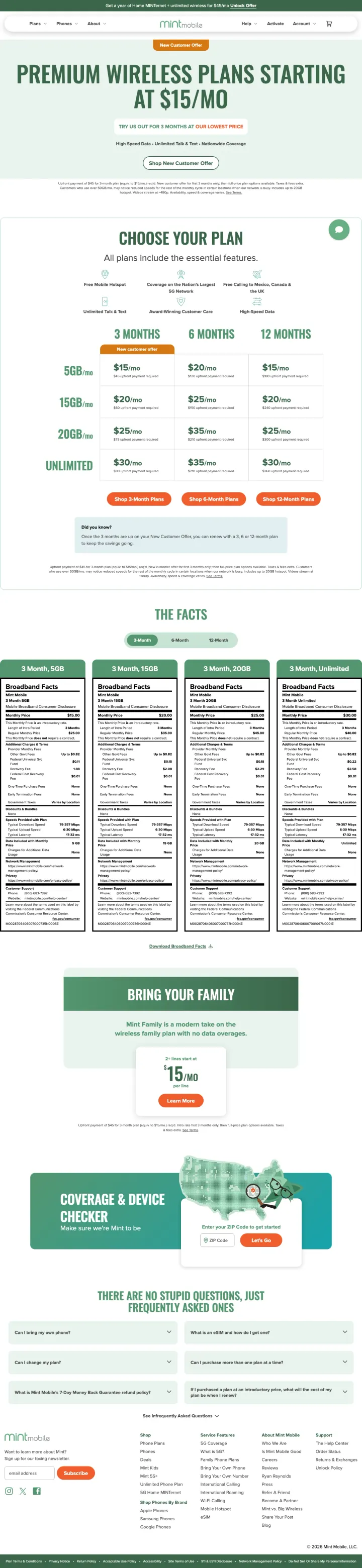
Instead of claiming savings with percentages or 'save $XX,' show the math by putting 3-month vs 6-month vs 12-month side by side. Mint's visitors see that $15 for 12 months is $5 cheaper per month than $20 for 3 months without the page needing to tell them. The grid does the selling.
'PREMIUM WIRELESS PLANS STARTING AT $15/MO' is the single-line hero, no perks list competing for attention, no animated graphics, just the price point that keyword-matched searchers came for
Data tier rows (5GB / 15GB / 20GB / Unlimited) crossed with commitment length columns create 16 price cells on one screen. Every visitor finds their intersection instantly without a 'plan finder' quiz
Broadband Facts nutrition-label tables below the grid kill the 'hidden fees?' objection in a format the visitor already trusts from food packaging
No phone number or chat visible above the fold. Wireless buyers with porting questions have to scroll past the grid to find human help, which loses cross-network switchers
The 'Bring Your Family' section is buried at the bottom, for multi-line households it's the highest-AOV segment and should earn more real estate than the single-line grid does
Coverage & Device Checker is mentioned but not embedded inline. Visitors should be able to check compatibility without clicking away from the plan they just picked
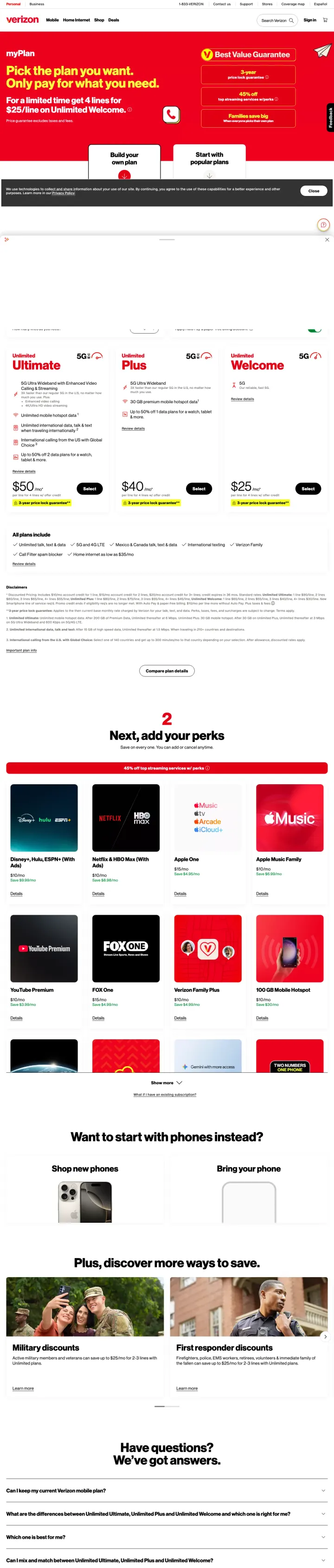
Split the buying decision into two numbered steps: step 1 pick a plan (30 seconds), step 2 pick your perks (the actual differentiation). Verizon's 'Next, add your perks' section gives visitors a sense of customization that premium-price buyers want to feel, while keeping the plan tier simple to scan.
'Pick the plan you want. Only pay for what you need' is the single-sentence value prop, anchored against every MVNO's 'cheap plan' positioning by reframing choice as control
Three-plan grid (Ultimate / Plus / Welcome) with ascending prices $50/$40/$25 and explicit 'Most Popular' flag on the middle tier uses standard decoy pricing effectively
Perks grid with Disney+, Apple Music, YouTube Premium, Netflix, Hulu as separate add-ons creates an AOV lever that MVNO winners don't have access to
The $25 Welcome plan has to compete with $15-20 MVNO plans on the same Google SERP. Without a 'why Verizon' differentiator above the fold, price-sensitive clickers bounce
The red top-banner promo ('iPhone 17 Pro Max on us') competes with the plan hero for attention. Two different offers above the fold means neither gets the mental space it needs
The perks selector requires scrolling and clicks before the visitor sees the final monthly cost. Premium-price clarity suffers when the real number is 3 interactions away
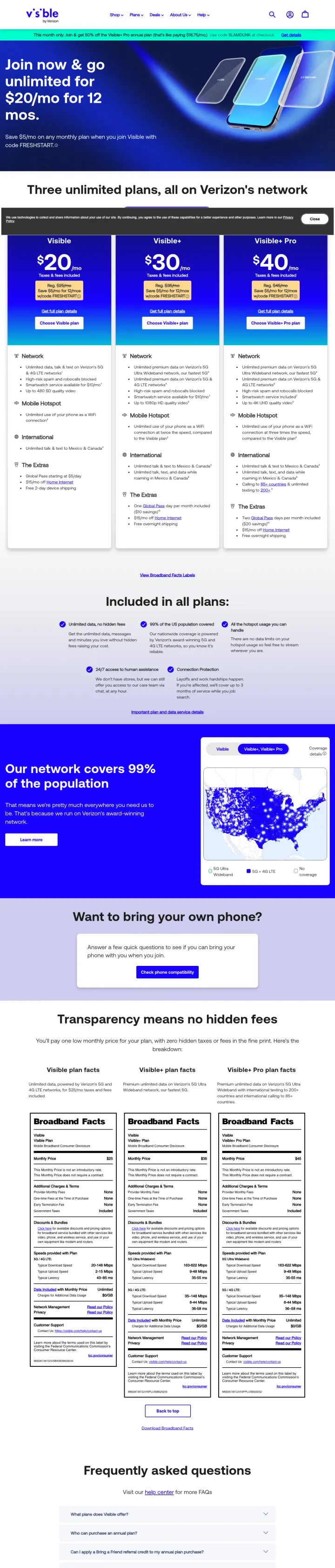
If you're an MVNO, name the underlying network in the first line of the hero. Visible says 'Three unlimited plans, all on Verizon's network' before the prices even appear. The coverage objection, 'I'll save $30 but my signal will suck', is the whole argument for premium carriers. Name-check the network, kill the objection in one sentence.
'Three unlimited plans, all on Verizon's network' headline neutralizes the coverage-risk objection before the visitor has a chance to think about it
Feature bullet column beneath each plan card uses visible icons (5G, Data, Hotspot, Calling) so the feature scan takes seconds, not a second read-through
US coverage map with '99% of the population' claim sits below the plan grid as a visual reinforcement of the Verizon-network promise
$20 (first year) vs $25 ongoing distinction is in small gray text below the hero number. A price-sensitive visitor who misses the footnote thinks they'll pay $20 forever
'Want to bring your own phone?' is a full section when it should be a 2-second toggle, BYOD is the primary MVNO customer path and deserves to live in the plan grid, not 8 sections down
Broadband Facts tables are the second-largest content block on the page but no summary callout tells the visitor 'here's the 30-second version', regulation-formatted data without a plain-English hook
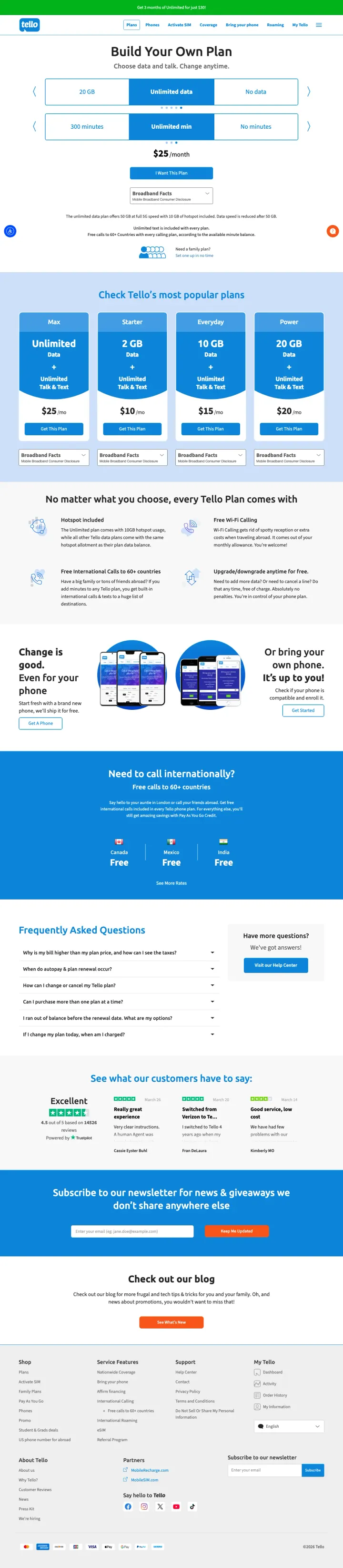
Replace the three-tier grid with two sliders (data GB and voice minutes) that recalc a single price in real time. Tello's 'Build Your Own Plan' lets the visitor feel like they're controlling cost rather than choosing between locked tiers, which converts both the casual and the power-user segments with one page.
Two slider controls (1GB to Unlimited data, 100min to Unlimited voice) paired with a live price output at $25 make pricing feel like a calculator instead of a menu. Every configuration lands on a valid plan
Grid of 'most popular' preset combinations below the slider gives decision-averse visitors an easy out if configuration anxiety sets in
'Need to call internationally?' section with Free Canada/Mexico/China/India calls addresses the high-AOV international-caller segment that standard plan grids tend to miss
The slider UI is keyboard-friendly but not mobile-friendly, on small screens the drag interaction becomes clumsy and the live price jumps instead of smoothly updating
No comparison to Tello against other MVNOs anywhere on the page. When the visitor arrives from 'cheap phone plans' they're comparing to Mint and Visible, and the page should anticipate that competitive frame
Customer quotes are in a small Trustpilot widget rather than large testimonial cards. For a BYO-slider page the 'other people configured it and loved it' social proof should be more visible
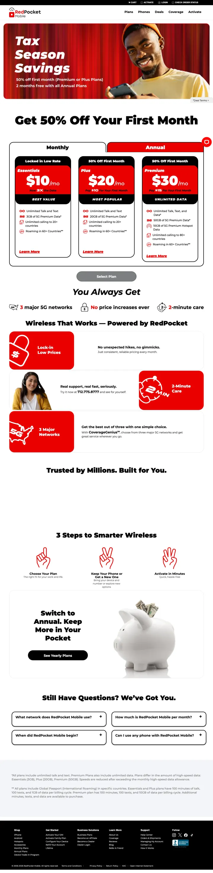
Time-box your promo in the headline ('Tax Season Savings, 50% off your first month Premium or Plus Plans') so visitors arriving from evergreen keyword ads still feel they caught a limited deal. The seasonal frame creates urgency without a live countdown clock, which feels less manipulative than fake timers.
'Get 50% Off Your First Month' hero immediately under the seasonal banner turns a generic discount into something that feels tied to a moment, which reduces the 'this is always on sale' skepticism
Monthly / Annual toggle on the plan cards defaults to Annual (marked 'Best Value') and shows monthly equivalents like '$10 / $20 / $30 per month,' which nudges visitors toward the higher-LTV annual commitment
'You Always Get' section below the grid ('3 major 5G networks,' 'No price increases ever,' '2-minute activation') addresses three distinct objections, coverage, price-lock, setup friction, in three bullets
Two separate 'Activate in 3 Steps' sections feel redundant. A single workflow card with 3 icons would do the job cleaner
The monthly/annual toggle is above the grid but doesn't persist as the visitor scrolls, when they reach the FAQ they've forgotten whether the number they remember was monthly or annual
Social proof is 'Trusted by Millions' without a named trust signal (star rating, review count, media mention). Specific numbers would outperform the generic claim
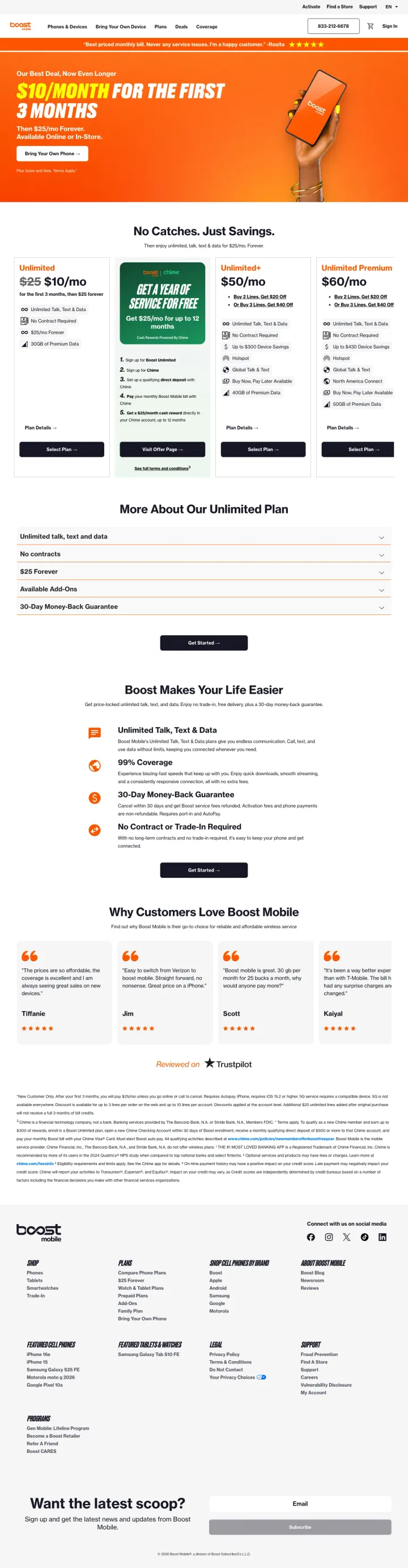
If your pricing has an intro-then-ongoing two-stage cost, put both numbers in the hero instead of hiding the ongoing price. Boost shows '$10/month for the first 3 months' with a tiny '$25/mo after' disclaimer, which is less effective than showing both numbers at the same size would be.
Orange-banded '$10/month for the first 3 months' hero turns a marginal discount into a visual event that visitors remember even after the intro period
'No Catches. Just Savings' section directly names the bait-and-switch fear that every MVNO visitor has and tries to defuse it with a 30-day money-back guarantee callout
Customer quote carousel below the grid uses first names and specific switch scenarios ('I switched from Verizon and saved $50/month'), which feels more credible than star-only reviews
The '$10/month' hero undersells the 'after 3 months' price. A visitor who doesn't read the disclaimer will convert at an intro rate that expires, and the 3-month churn cliff is a known Boost problem
'No Contract or Trade-in Required' claim is buried in the second benefit section when it's the single biggest differentiator vs. premium carriers, should be in the hero band
The comparison section ('Why Customers Love Boost Mobile') lists reasons but doesn't compare Boost to a specific competitor. Visitors in compare-mode need a visible A-vs-B frame
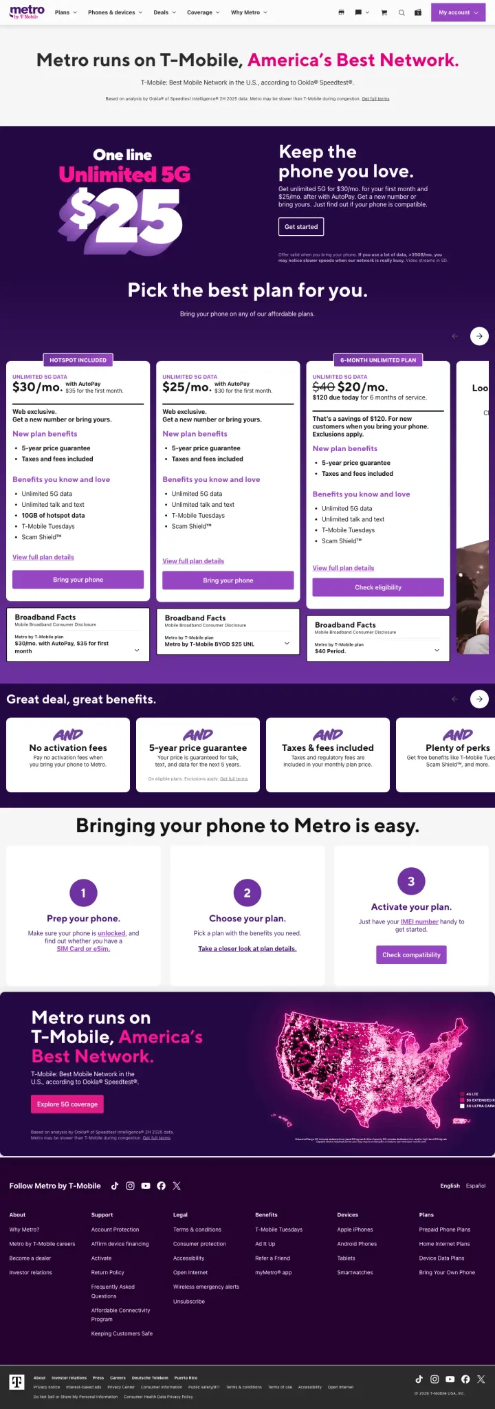
If you're the value tier of a premium brand, put the parent brand's reputation in the hero: 'Metro runs on T-Mobile, America's Best Network.' This single sentence does the work of a 5-bullet differentiation pitch. The visitor stops worrying about coverage and starts comparing prices.
'Metro runs on T-Mobile, America's Best Network' headline resolves the coverage-risk objection in one sentence, without making the price-sensitive visitor hunt for technical reassurance
Three-plan grid (Starter $30 / Basic $25 / Premium $60) with 'Includes 5G access' baked into every tier kills the 5G-vs-4G differentiation game that confuses wireless shoppers
AARP, 5-year price guarantee, taxes-and-fees included callouts address the three biggest 'what's the catch' objections from value-tier switchers
The $25 and $30 prices live in identical card layouts, and the visitor has to read carefully to figure out which one has more data. Visual hierarchy should match the price difference
'Keep the phone you love' is a BYO-phone section that lives 4 scrolls down when it should be in the plan-selection phase. BYOD is a 25%+ cohort for value-tier carriers
No live chat, no phone number in the hero. The page assumes visitors will self-serve but a 55+ AARP segment (which Metro explicitly pitches to) expects phone support visible
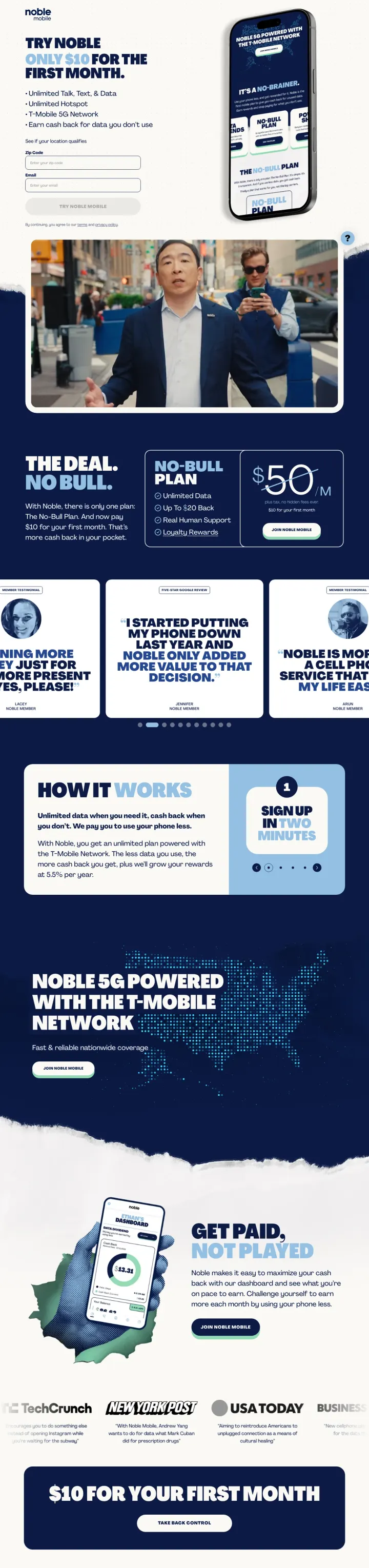
If you're a challenger MVNO, pick a voice and commit to it. Noble's 'THE DEAL. NO BULL.' and 'NO-BULL PLAN' repeat the frame 4 times on one page. Repetition of a voice-driven line gives the brand a personality that a plan grid alone can't create, and personality is the only differentiator MVNOs have in a feature-parity market.
'$10 for Your First Month' inline signup form above the fold collects the email immediately, no 'see plans' funnel step, just an instant commitment mechanic for the intro price
'Started Putting My Phone Down Last Year And It Changed My Life' testimonial headline reframes the product as a tool for intentional phone use, aligning with a growing consumer segment that premium carriers ignore
Tech press logos (TechCrunch, Fortune, USA Today) as social proof belt at the bottom borrows legitimacy from media brands the visitor already trusts
The $10 hero is for the first month only and the $50 ongoing price is buried in fine print. Same bait-and-switch risk as Boost but with less disclosure
'Noble 5G Powered with the T-Mobile Network' is in its own dedicated section rather than in the hero, which delays the coverage-objection resolution by 3 scrolls
No plan grid at all. For visitors comparing to Mint/Visible/Tello, the single-offer format forces a 'this or nothing' choice that could lose analytical shoppers
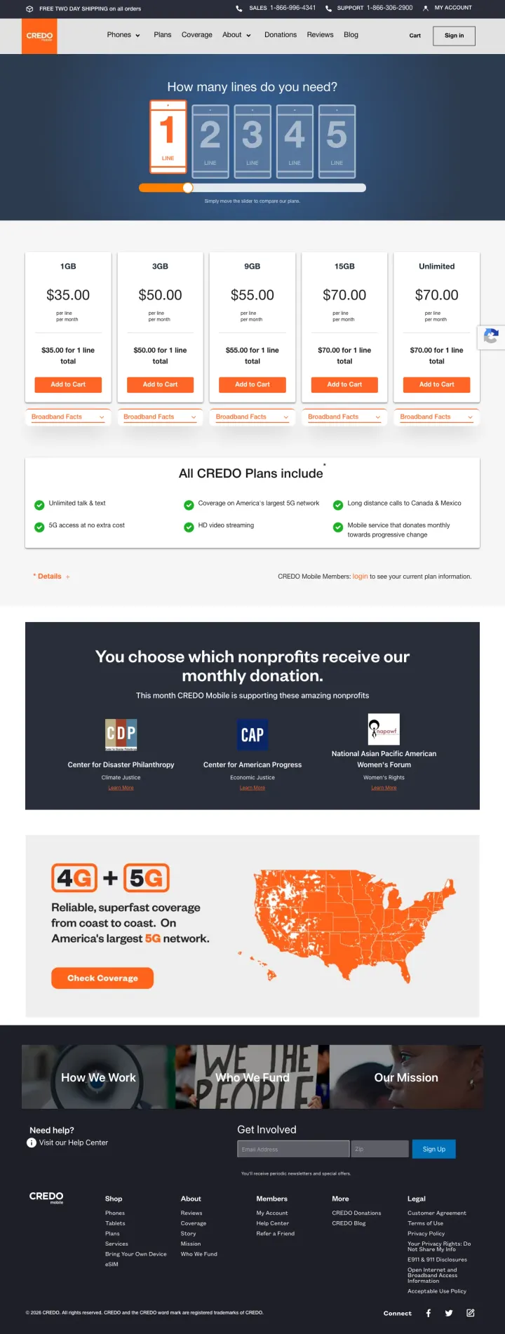
If your product has a values-driven differentiator (nonprofit, B Corp, sustainable), build a dedicated section that shows exactly which outcomes the customer's dollars fund, with named partner logos. Credo's 'You choose which nonprofits receive our monthly donation' section names CPP, CAP, and Women's Forum, which converts the 'do they really donate' skepticism into specific accountability.
Line-count selector at the top (1/2/3/4/5 lines) is a clean progressive disclosure, the plan grid updates based on how many lines the visitor picks, which pre-qualifies family vs individual shoppers in one click
'4G + 5G' orange callout with US coverage map and 'America's largest 5G network' sits exactly where MVNO visitors worry about coverage, reinforcing the network story mid-scroll
Named nonprofit partners (Center for Disaster Philanthropy, Center for American Progress, National Asian Pacific American Women's Forum) make the 'we donate' promise specific and verifiable
The $35 starting plan is more expensive than Mint, Visible, Tello, and most value MVNOs. The page doesn't do enough work justifying the premium with the mission-driven angle, a direct price comparison to competitors would help
The line-count selector defaults to 1 line but the plan grid shows all 5 columns always visible. The filter is a soft nudge rather than a hard narrowing, which dilutes the cleanness of the selector UX
Mission positioning is strong but the page waits until scroll-depth 3 to mention the donation program. For values-aligned buyers, the mission should be in the hero, not buried below plan comparison
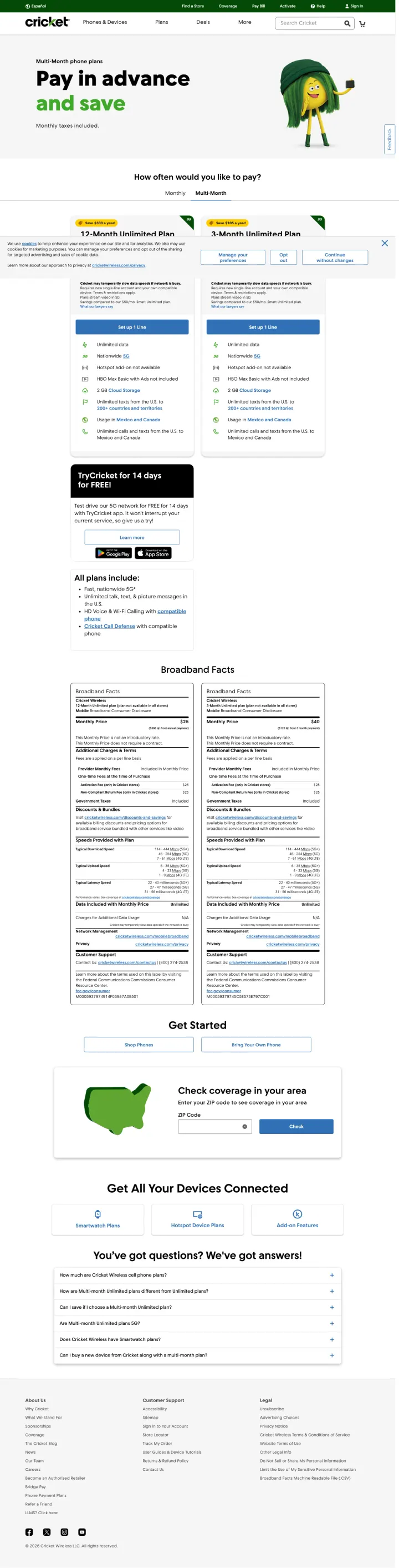
If you're a prepaid carrier, own the prepaid positioning instead of trying to look postpaid. Cricket's 'Pay in advance and save' hero line explicitly calls out prepaid as the advantage, no hidden bills, no bill shock, no credit check. Visitors searching 'cheap phone plans' are often credit-damaged or budget-first, and the prepaid frame is their primary match.
Hero green cartoon character animating cash savings keeps the prepaid tone playful and reduces the 'prepaid means I'm broke' stigma that the category still carries
Two visible plans (3-Month Unlimited Plus / 3-Month Unlimited) with detailed Broadband Facts tables underneath let visitors compare multi-month commitments without scrolling
'Get All Your Devices Connected' family/multi-line callout with coverage-check form combines cross-sell with qualification in one section
The plan grid only shows two tiers when most MVNO winners show three. A third entry-level tier would capture price-first visitors who bounce at the $65/month anchor
'Try Cricket for 14 days for FREE' callout is text-only and doesn't pop visually. A free-trial offer deserves stronger visual treatment, especially in a category where free trials are rare
No 'powered by AT&T' network name-check in the hero. Cricket is AT&T-owned and the coverage story would benefit from the parent brand's explicit presence, the current page leaves the visitor to figure it out
Pages that break the playbook in interesting ways
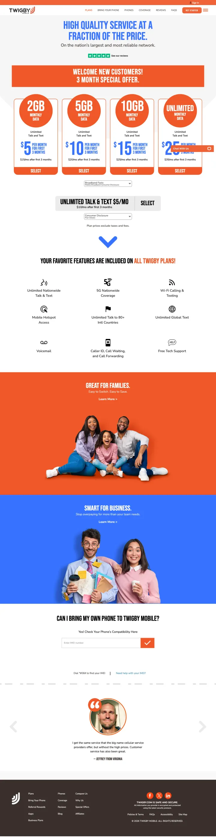
If your product has a genuinely simple buy flow, make the onboarding flow itself the landing page. Twigby's page is structured as a How-It-Works narrative with plan tiles embedded in-story, rather than a plan grid with a help section. This pattern trades comparison-shopper appeal for walkthrough-shopper clarity, and it works for the segment that arrives confused about how prepaid works.
Four-tier plan grid with bold price callouts ($5, $10, $15, $25) in colored cards makes the price hierarchy immediately readable without feature bullets competing
'Great for Families' orange section and 'Smart for Business' blue section split the two AOV segments with distinct visual treatment, letting each self-identify
Single testimonial card with a person's photo and specific savings claim feels more credible than a carousel of star ratings
No 'powered by T-Mobile / Verizon / AT&T' in the hero, unusual omission for an MVNO where network naming is standard practice
Benefits grid below the plans uses small icons and subtle text, which reads as brochure rather than conversion page. A stronger benefits hierarchy would do more work
'Can I Bring My Own Phone to Twigby?' is a compatibility-check form in the body but the result isn't visible without interaction. For BYOD visitors the compatibility answer should be a calm yes/no flow, not a text field
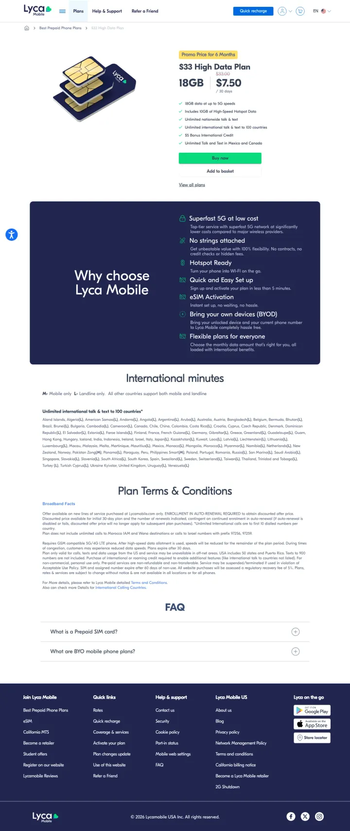
For international-calling-focused carriers, put the country list in the hero instead of buried below features. Lycamobile's page is dominated by a single-plan detail ($33 for 18GB) but the real differentiation, free calling to 100+ countries by name, lives in a list below. Swap the order: country list first, plan detail second, for visitors who came from international-calling keywords.
Single-plan detail page with product photo, feature list, and buy button treats the plan like a SKU, unusual pattern that works for single-plan conversion vs tier comparison
Detailed feature grid (Superfast 5G at low cost / Hotspot Ready / Quick and Easy Set Up / Bring Your Own Device / Flexible Plans) addresses every objection in a single scan
International minutes country list with 100+ named destinations is the strongest differentiator on the page, no other carrier in our sample lists specific countries with this granularity
Hero is a product-shot of a gold-gradient SIM card, which is visually striking but disconnected from the international-calling value prop that's the whole pitch
'Promo Price for 6 Months' label next to '$33 High Data Plan' means the price expires, but no 'after promo' price is shown. Same disclosure gap as Boost and Noble
Country list is a dense comma-separated block of text, which is the correct content but the worst possible format. A scannable chip layout or country-flag grid would convert the same data into a visual asset
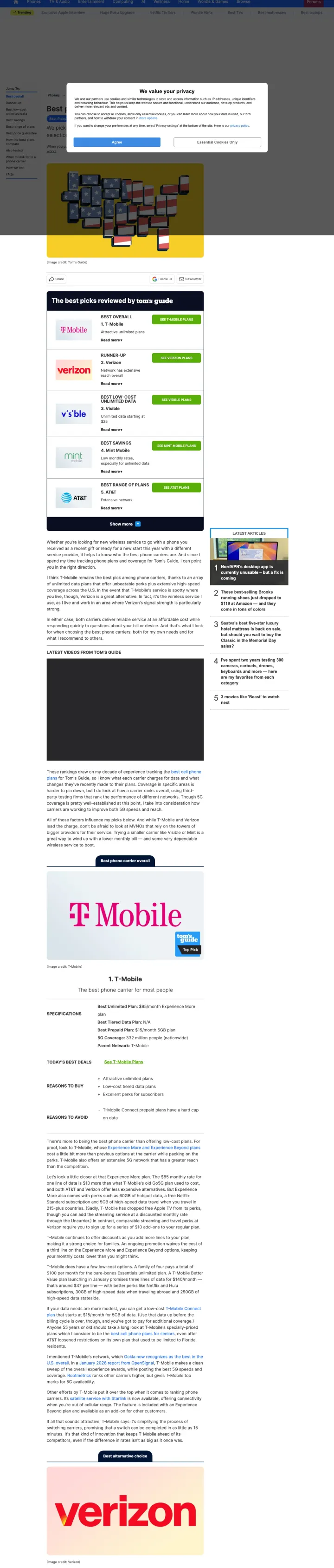
If you're running affiliate or advertising monetization, consider running PPC to your best-of listicle pages for competitor-brand keywords. Tom's Guide bids on 'best phone carrier' and lands visitors on an editorial comparison with affiliate links to every carrier. The revenue model isn't subscription, it's high-intent traffic monetized through affiliate payouts from the carriers themselves.
Editorial page-structure signals (numbered 'Best overall / Runner-up / Best price guarantee' sidebar) let visitors jump to their own comparison frame, a discovery pattern direct-carrier pages can't easily replicate
Cookie-consent modal is triggered on page load, which is annoying but standardizes the visitor's first interaction to 'Agree / Essential Only', a mechanic that raises dwell-time metrics artificially
American-flag-patterned phone stack as the hero image sidesteps the visual cliches of carrier landing pages (magenta gradients, stock business photos) and reads as editorial rather than advertorial
The consent modal covers the entire hero on load, which delays the visitor's first orientation by the time it takes to dismiss. Paid clicks deserve a cleaner first-paint
Editorial page loads in >5 seconds with 278 cookies declared, the 'privacy is important to us' line reads awkwardly next to the cookie count
Affiliate disclosure is buried in page footers. For a comparison page earning revenue from the brands compared, the disclosure ethics should be explicit and above-the-fold
3 pages burning ad spend with fundamental issues
Every click to these pages costs real money. We found broken trust signals, mismatched intent, weak CTAs, and messaging that ignores what the searcher actually typed. Here is what to avoid.
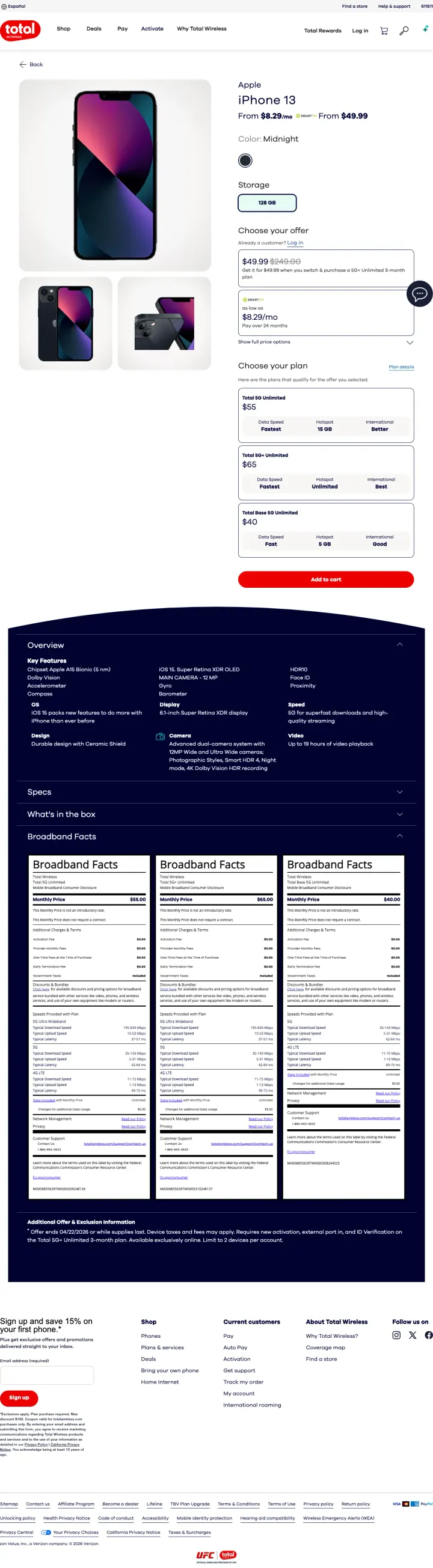
Total Wireless bids on 'total wireless iphone 13' keywords and delivers a page where the iPhone 13 starts at $49.99 (great) but every visible plan option ($55 unlimited) is more expensive than Mint Mobile's $25/mo plans or Visible's $25 starter. The device-price hook pulls clicks in, but the plan-selector mechanic downstream makes the total cost uncompetitive. For a prepaid brand whose whole pitch is affordability, selling a cheap device on expensive plans is a churn engine.
The plan options start at $35 and jump to $55, with the 'Unlimited' tier at the top of the visible list. There's no cheap-plan decoy to anchor the $35 as affordable
No '24-month total cost' math anywhere on the page. The device-plus-plan bundle is the real purchase, and hiding the all-in cost sets up post-purchase regret
The Total Wireless brand is owned by Verizon but no 'on the Verizon network' language appears in the hero, missing the coverage-reassurance move that every successful MVNO in our sample makes
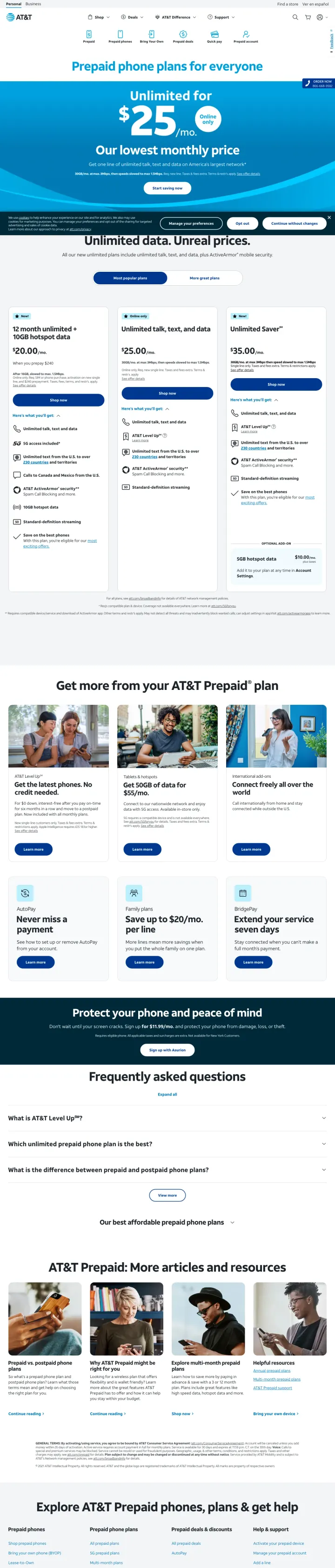
AT&T bids on 'prepaid phone plans' and the page delivers a three-tier grid at $25/$35/$55, but the hero is 'Prepaid plans for everyone' and the '$25 Our lowest monthly price' banner looks like a footnote. Visitors arriving from intent-heavy cheap-plan keywords see a generic corporate hero and bounce to the MVNO competitors (Cricket is an AT&T prepaid sub-brand and ranks better on the same queries). CPC for prepaid plan keywords runs $4-8, and the $25 plan should be the hero, not a secondary callout.
Hero buries the $25 price under a blue gradient banner and a generic 'Unlimited data, Unreal prices' line that describes the category rather than differentiating AT&T
The three-plan grid uses similar card styling for all tiers, the $25 'lowest' plan doesn't visually dominate the way a value-hero should
AT&T owns Cricket, which runs a better prepaid page on the same keywords. The internal competition means AT&T Prepaid is often paying for clicks that then churn to Cricket via sibling SEO, a budget-waste pattern the page doesn't acknowledge or solve
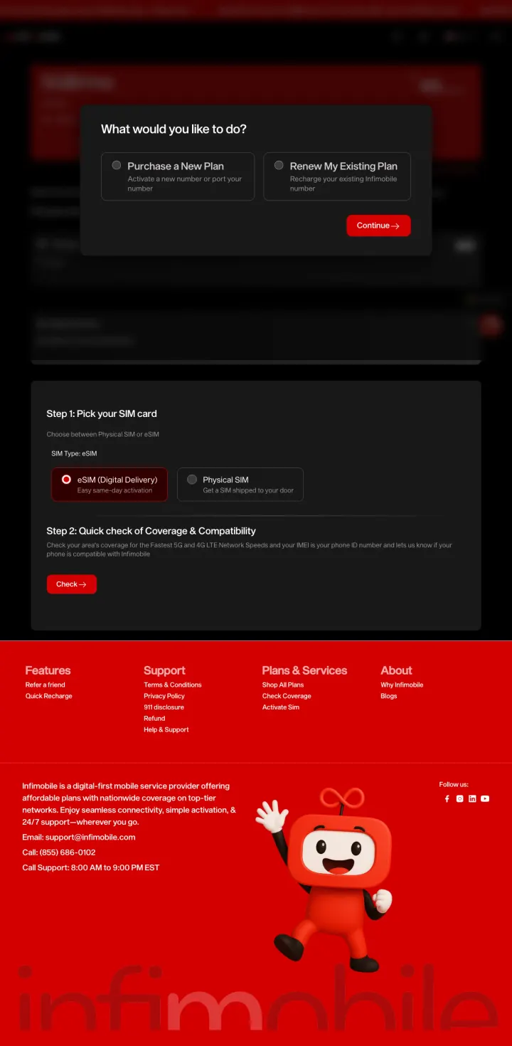
The ad pitches a specific offer ($150 for 5GB, 12 months, unlimited talk and text, bring your own phone) and the landing URL is literally the plan-details page for that coupon. Then the page opens with a modal asking 'Purchase a New Plan' or 'Renew My Existing Plan' before showing any plan details. Visitors who clicked a price-specific ad are interrogated before they get to see what they already decided they wanted. Every one of those $2+ clicks pays to interrupt the purchase the visitor was ready to make.
Modal appears before the visitor sees the plan price, inclusions, or any proof they are on the correct page
Ad promises $150 for 12 months but the hero (once you dismiss the modal) buries that number; the page behind the modal leads with SIM selection instead of the price the ad just promised
Mobile visitors on the same ad get the same modal, which is even harder to dismiss on a 375px screen with thumbs
Mint, Visible, Tello, Boost, Metro, and Red Pocket all run the same structural pattern: three plan cards side by side, with the middle or right card highlighted as 'Most Popular' or 'Best Value.' This is a deliberate choice architecture move. Visitors compare within the page instead of bouncing b...
Mint's '$15/mo' is more effective than Boost's '$10/month for first 3 months then $25.' The visitor converting on a cheap-plan keyword wants to know their steady-state cost, not an intro rate that resets. Mint, Tello, Red Pocket, and Credo all show the ongoing monthly price as the hero number. Bo...
FCC-mandated Broadband Facts tables (which look like nutrition labels) appear on Mint, Visible, and Cricket's plan pages. Most carriers treat them as compliance overhead, but they are doing heavy conversion lifting. They preempt the 'what are the hidden fees' objection with a standardized format ...
Visible says 'all on Verizon's network.' Metro says 'Metro runs on T-Mobile, America's Best Network.' Noble says 'Noble 5G-powered with the T-Mobile network.' Every MVNO winner tells the visitor which of the Big 3 they are actually using, because the #1 objection to budget wireless is 'will I hav...
Winners treat the plan price as the headline and use the grid to sell upgrades. Losers either hide the steady-state price behind intro promo math or lead with feature bullets that the visitor has to parse before finding out the monthly cost.