Free: 96 PPC tools + my AI Playbook book

These are real dtc / ecommerce pages spending actual money on Google Ads right now.
From real dtc / ecommerce Google Ads campaigns in the US
The landing pages actually worth stealing from
So you know exactly what to avoid
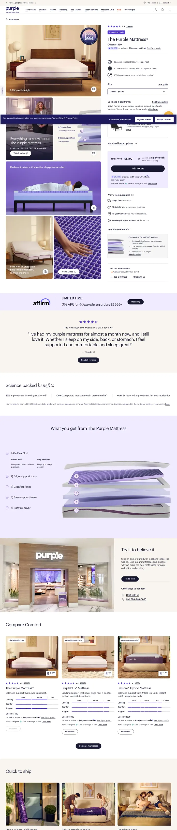
Put the finished product photo in the hero with a specific size price (Queen $1499) and a financing line immediately beneath (0 percent APR or $39/month or $89/month). Purple makes the decision concrete in three lines: what it looks like, what it costs, what it costs to finance. Most DTC pages hide at least one of the three and force the visitor to scroll or calculate.
Queen $1499 with 0 percent APR or $39 per month or $89 per month stacked as a 3-line price block directly under the hero. Financing copy lets the visitor do budget math in a single glance, which is the quiet decision that either kills the sale or saves it.
The Original Purple as a product-name label above the full product name (The Purple Mattress). Two-tier branding signals the lineage (this is the one you are thinking of) and gives the visitor permission to pick the flagship.
4.8 star rating with 19,931 reviews in the header bar. A 5-digit review count with a decimal rating is the strongest review-based trust signal a DTC can show; most competitors round to a rating only.
A cookie overlay on first load sits over the size selector and the financing text. At $5-$10 per paid click, obscuring the exact fields a comparison shopper is scanning for turns a small friction into meaningful bounce at volume.
Size selector shows only Queen by default. A visitor on a Twin XL or King search needs to click the size to see their specific price, and the price changes, which may contradict the Queen figure they first anchored on.
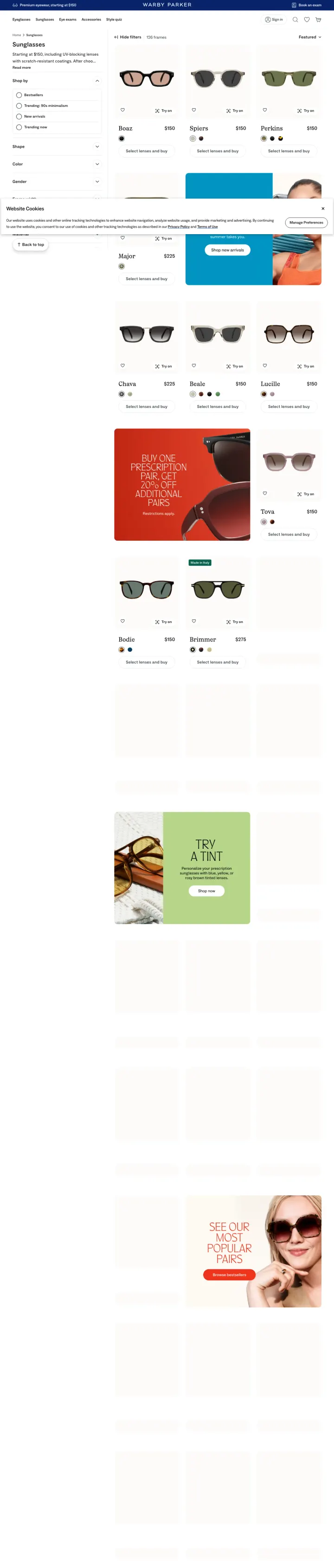
Make your broad-keyword landing page a shoppable grid, not a hero plus copy. Warby Parker Canada's sunglasses page shows 126 frames with Try On buttons per card, per-product pricing (Boaz $150, Spiers $150, Perkins $150), and Select lenses and buy CTAs. The grid IS the landing experience. Visitors from broad keywords (sunglasses) do not want to be sold; they want to browse.
126 frames counter as a hero-level stat. The number communicates inventory breadth and signals that the visitor will find their style here. Most DTCs hide their catalog size; Warby Parker brags about it.
Try On button on every product card alongside the heart-icon save-for-later. Virtual try-on built into every product tile removes the only real objection to buying glasses online (will they suit my face?) at the browse stage, not the checkout stage.
Filter sidebar with Bestsellers, Trending: 90s minimalism, New arrivals, Trending now as the default filter order. Trending-first filters signal the social proof of the catalog and let the visitor skip to what is validated as popular.
Starting at $150, including UV blocking lenses with scratch resistant coatings is a Read more link, which means the actual price-anchor promise requires a click to unfurl. The hero ran out of copy space for the line that closes the sale.
Website Cookies dialog at the bottom takes up a horizontal strip on initial load. It is less disruptive than a center modal but still obscures the bottom row of frames.
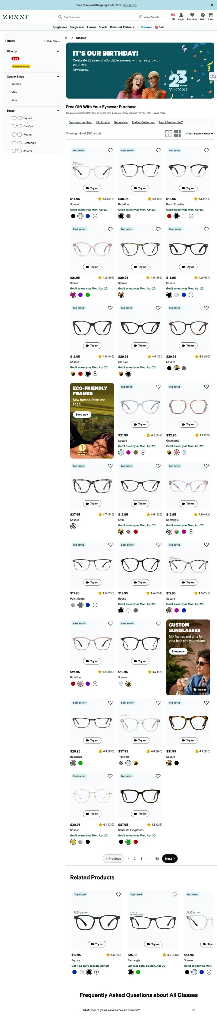
Put a birthday or anniversary banner across the top of your catalog page (IT'S OUR BIRTHDAY, 23 years of affordable eyewear with a free gift with purchase). Zenni's category page uses a promotional reason-to-celebrate framing to pair a discount offer with a gift with purchase, creating both price and delight motivations in one banner. Birthdays and anniversaries give brands permission to discount without looking desperate.
IT'S OUR BIRTHDAY anniversary promo banner above the product grid with a free gift callout. Celebration framing is a stronger discount vehicle than a generic SALE banner because it signals the brand is succeeding, not struggling.
Free Shipping on Orders $59 plus strip at the very top (site-wide). Low minimums on free shipping is table stakes for ultra-low-price DTC, and showing it as a site-wide band means it will be visible regardless of what page the visitor lands on.
Sort by Relevance dropdown plus Best seller, Best rated, Discover, Sale as filter categories. Discover as a filter name is playful and invites browsing; most competitors use New Arrivals.
Hides the actual price until the product card appears below the fold. For a DTC brand whose entire value proposition is affordability, not leading with the Starting at $6.95 price is leaving conversion on the table.
7,036 of 7,094 results visible counter is impressive but the filtering system could surface popular combos (Progressive for women, under $30) as one-click shortcut tiles above the grid.
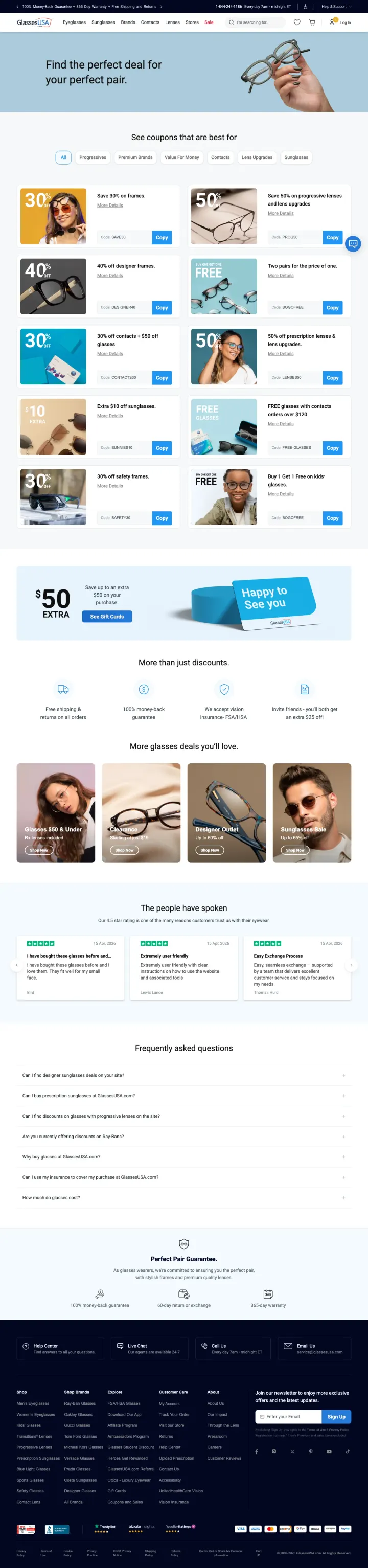
Run a dedicated /coupons page as a paid landing page for discount-intent keywords. GlassesUSA lists SAVE30 for 30 percent off frames, PROG50 for 50 percent off progressive lenses, and more, each with a Copy code button. The page ranks for deal-seeker keywords (glasses coupon, eyeglasses discount) that the main store pages cannot target without cheapening the brand.
SAVE30 code visible on the card with a Copy button. One-tap copy-to-clipboard removes the friction of memorizing or switching apps, which is the entire point of a coupon landing page.
Tabbed filter system (All, Progressives, Premium Brands, Value For Money, Contacts, Lens Upgrades, Sunglasses) sorts codes by shopping intent. Visitors pre-qualify into the code that applies to their cart before they even see it.
100 percent Money-Back Guarantee, 365 Day Warranty, Free Shipping and Returns as a strip across the very top. Trust signals above the coupon codes build credibility that the discount is legit and not a bait-and-switch.
The hero photo (glasses in a hand) is stock-like and does not showcase a product the visitor can identify. A real frame with the exact code highlighted below would close the gap between the discount and the decision.
Search bar is prominent in the header but search is not the coupon-visitor intent. For a coupon-page visitor, the search bar competes with the coupon cards for attention.
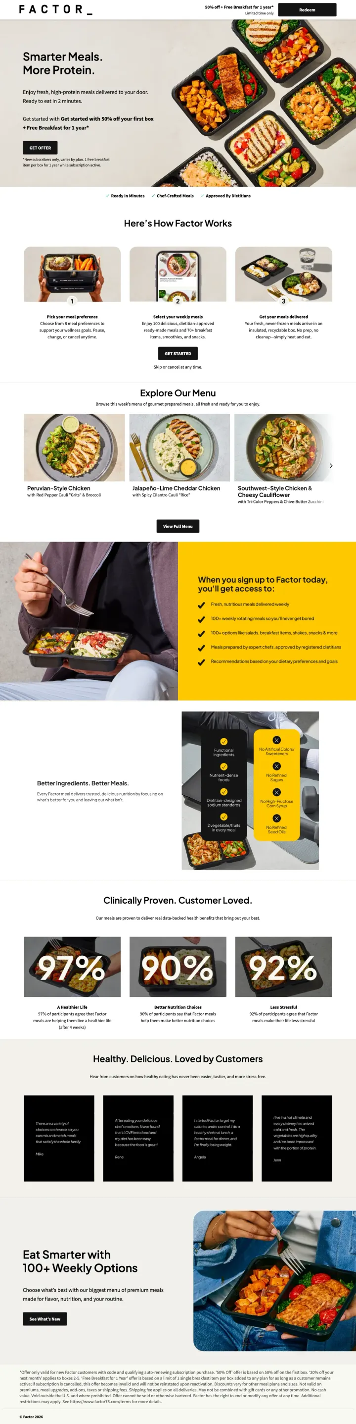
Pair a two-line product thesis (Smarter Meals. More Protein.) with a dense food-tray collage and a stacked 3-part offer beneath it (50 percent off your first box, plus Free Breakfast for 1 year, plus Ready in 2 minutes). Factor compresses the positioning, the incentive, and the effort-reduction into one viewport. Most meal-delivery DTCs either pick one of the three or spread them across 3 separate sections.
Smarter Meals. More Protein. as a 4-word positioning line. Two product-truth lines that speak to the two biggest meal-kit objections (is this just convenience food? will I feel good eating it?). Short headlines in a low-consideration category let the food photo do the selling.
50 percent off your first box plus Free Breakfast for 1 year stacked as a two-tier promotion. The multi-reward structure (discount plus ongoing gift) is stronger than a single higher-percentage discount because it extends brand presence into future boxes.
97 percent, 90 percent, 92 percent customer-proof trio below the fold (satisfaction, dietitian-approved, convenience). Triads of round percentages scan as scientific; most competitors use one vanity metric and lose the visitor who wants to triangulate.
Ready to eat in 2 minutes is buried under the hero headline as secondary copy. The convenience promise is the single strongest objection-killer for a first-time meal-kit buyer and deserves a visual badge, not a subtitle.
Get started with 50 percent off your first box + Free Breakfast for 1 year is duplicated (the same wording appears twice in the hero). The repeat pattern suggests A/B test code leakage rather than intentional emphasis.
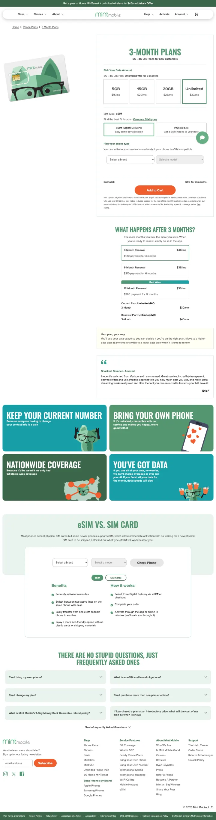
Lay out 4 price tiers side-by-side (5GB $15, 15GB $20, 20GB $25, Unlimited $30) with the ad-selected tier pre-highlighted in brand color. Mint deep-links the ad's promoted plan into the selection state, so the visitor lands with their tier already chosen. Most DTC product pages force the visitor to re-pick the variant they already saw in the ad, which resets the decision clock to zero.
5GB $15, 15GB $20, 20GB $25, Unlimited $30 side-by-side with the ad-selected tier pre-outlined in green. The deep-link into the variant state is a PPC-native detail most product pages skip, and it shaves a click off the conversion path.
eSIM plus Physical SIM as a second-row selector below the data tier. Decomposing the buy decision into two small choices (plan, then delivery) lets the visitor commit to each without feeling trapped, which converts better than a single monolithic buy button.
Get a year of Home MINTernet plus unlimited wireless for $45/mo Unlock Offer strip across the very top. Cross-sell to the adjacent product (home internet) at the exact moment the visitor is already choosing wireless extracts 50 percent more lifetime value from the same paid click.
The SIM-card illustration in the hero panel sits on a blank white background that makes the viewport feel empty on desktop. A photo of a phone in use or a coverage map next to the pricing ladder would visually balance the layout and reinforce the product is real.
3-MONTH PLANS as a page title is category-internal language; most visitors think in monthly cost, not commitment length. A headline reframe (Pick your 3-month prepay and save) would make the page's intent clearer at first glance.
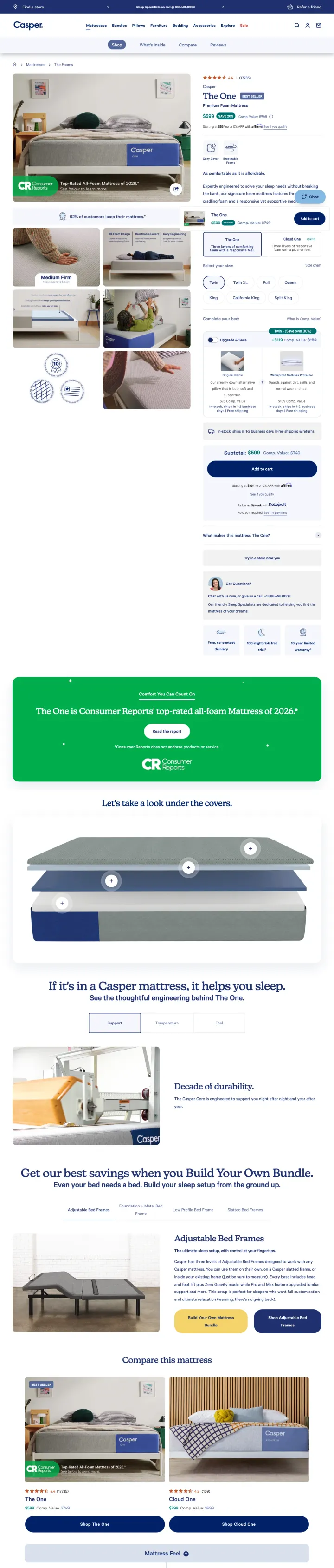
Give your flagship product a single-word name card in the hero (The One, $899, BEST SELLER) and pair it with a Consumer Reports Top-Rated badge directly on the product photo. Casper turns a mattress listing into an editorial endorsement at a glance. The combination of a brand-simple name (The One) and a third-party authority badge (Consumer Reports) answers both the identity and credibility questions at the same time.
The One as the product name card with $899 BEST SELLER beneath it and a 4.4 star rating with 17,772 reviews pill above. Single-word product names make the flagship memorable and let the visitor say the name back to themselves, which is the first step of consideration.
Consumer Reports Top-Rated All-Foam Mattress of 2026 as a ribbon overlay on the product photo. Third-party authority lives on the hero image, not buried in a badges strip below the fold, so skimmers register it with the product.
92 percent of customers keep their mattress as a below-fold stat bar, paired with a sleeper-type return policy promise. Keep rate is a smarter conversion stat than satisfaction because it survives the 100-nights objection a first-time mattress buyer brings.
The cookie consent banner appears as a top-of-page blocker on initial load; a visitor arriving from a paid ad sees Accept or Decline before the product photo resolves. Casper is competing with Purple and Nectar on paid mattress keywords where every first second counts.
Premium Foam Mattress as the secondary headline is generic category language when The One above it has already done the positioning work. The line duplicates the effort of the hero without adding new information.
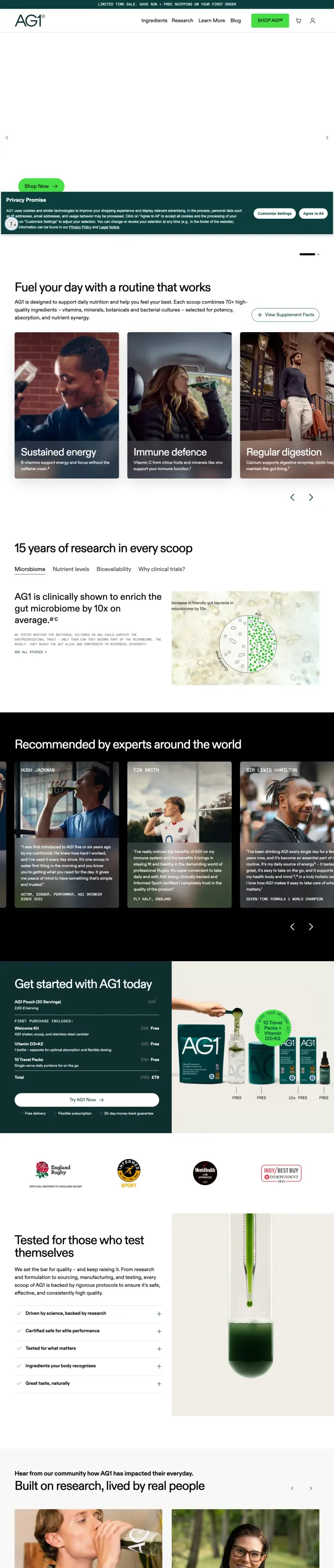
Anchor a premium subscription to a single credible person and stack the social proof (50,000+ verified 5-star reviews, Dr. Andrew Huberman). AG1's /start page leads with a cheeky celebrity pun (Better Mornings, No Matter Hugh You Are, referencing Hugh Jackman) then steps into expert-backed clinical language. The voice pivot from playful to clinical matches how a high-AOV subscription visitor wants to be talked to.
Better Mornings, No Matter Hugh You Are as a hero pun that names the celebrity endorser in the headline. Wordplay headlines signal confidence; the brand is not afraid to be cute about the person backing it, which reads as authenticity rather than desperation.
50,000+ verified 5-star reviews for AG1 products as a trust bar directly below the hero, then repeated beside the next Get Started CTA. Review volume at 5 digits plus verified framing is the strongest trust signal a DTC supplement can show given the category's skepticism baseline.
Trusted by Dr. Andrew Huberman as a named expert-endorsement line above Join thousands of people who have made AG1 part of their daily ritual. A specific named neuroscientist out-performs a generic doctor claim because the visitor can search the name and verify.
The hero image failed to render on load (blank viewport with Shop Now pill at the bottom), which suggests a JS-gated image or a heavy video that blocks first paint. For a $99 subscription decision, a blank hero costs more than a slow page in any other DTC category.
Privacy Promise modal at the bottom of the viewport asks for cookie consent and covers the first Shop Now CTA on initial load. The modal is less severe than a center-blocker but it still steals the visitor's first action.
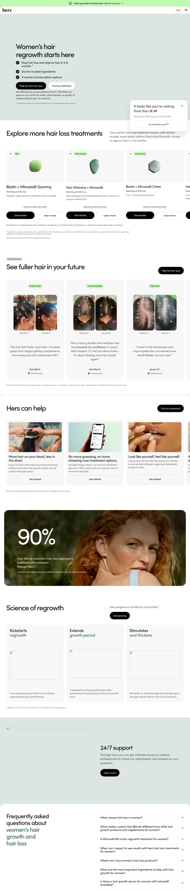
Build a telehealth-style quiz-funnel landing page with a 3-bullet benefit stack and a Take the free hair quiz CTA as the primary action. For Hers opens with Women's hair regrowth starts here, then Stop hair loss and regrow hair in 3-6 months, Doctor-trusted ingredients, A variety of prescription options. The quiz captures intent and preferences without asking for payment, which raises the conversion rate on a category where pricing would kill the first visit.
Take the free hair quiz as the black-pill primary CTA with Find my treatment as the white-outline secondary. Two-CTA pattern (guided quiz vs. direct-to-treatment) serves both the uncertain visitor and the repeat visitor who already knows what they want.
Stop hair loss and regrow hair in 3-6 months, Doctor-trusted ingredients, A variety of prescription options as a 3-checkmark claim stack. Checkmarks are stronger than bullets because they imply verification, and the benefits are sequenced by severity (outcome, safety, choice).
90 percent effectiveness ribbon on a hero-like portrait photo below the fold, paired with a gentle green background and an at-home context. The stat becomes part of the image rather than a sterile number block, which retains attention in a skim-heavy category.
It looks like you are visiting from the UK, Would you like to go to our UK site modal appears as a bottom-right pop-up on first visit. Geo prompts are less disruptive when they are corner-dismissible like this one, but any interrupt before the quiz starts erodes the quiz-completion rate.
Hair Blends are compounded products. FDA does not approve nor verify fine-print runs directly under the primary CTA. Required FTC disclosure is correct, but the placement under the button flirts with cold-feet on an impulse click.
Pages that break the playbook in interesting ways
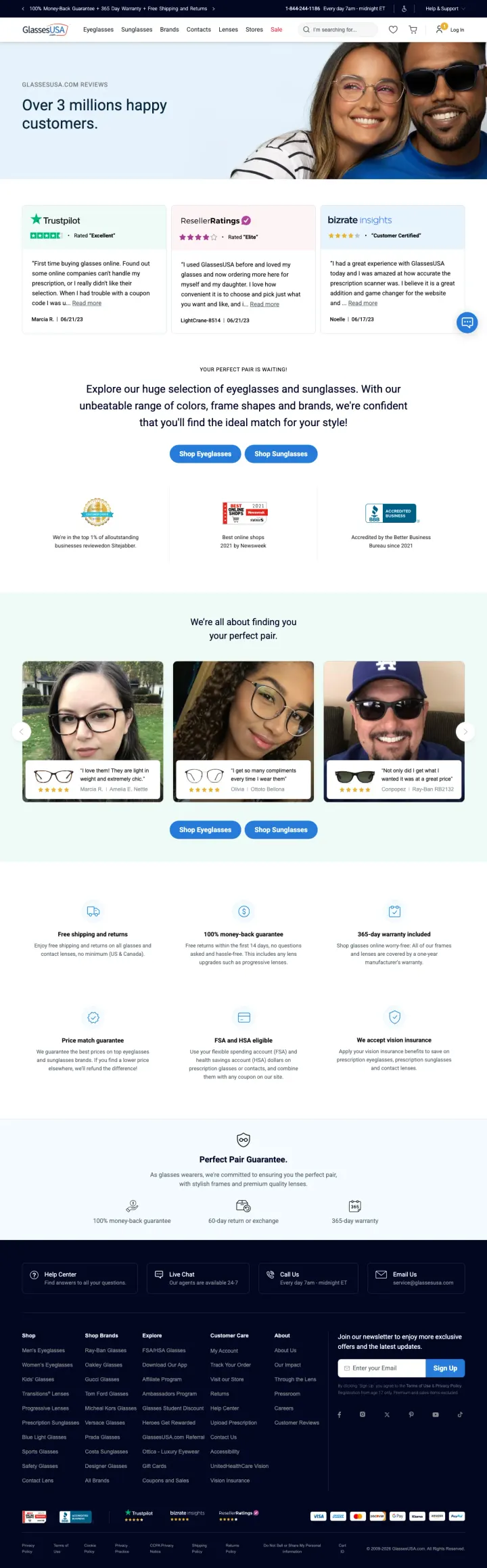
Run a /yourbrand-reviews page on your own domain to capture the brand + reviews searches before Trustpilot or Sitejabber do. GlassesUSA shows Over 3 millions happy customers in the hero, then displays reviews from Trustpilot, ResellerRatings, and Bizrate Insights as 3 equal-weight cards. The page aggregates third-party reviews while keeping the visitor on the brand's own domain, which is a powerful meta-trust move.
Over 3 millions happy customers as a hero stat with a brand-color underline is a large round-number claim that, while imprecise, anchors the visitor's estimate of scale.
Three third-party review platforms (Trustpilot Rated Excellent, ResellerRatings Rated Elite, Bizrate Insights Customer Certified) shown as 3 cards. Aggregating independent rating systems lets the visitor triangulate without leaving the brand's page.
Named reviewers with dates (Marcia M. 06/21/23, LightCare-Win 06/19/23, Nanette L. 06/19/23) give the reviews specificity. Real names and dates defeat the skeptic's default assumption that reviews are manufactured.
The review dates shown are from 2023, which on a page captured in 2026 means the visible reviews are 3 years old. Fresh reviews from the last 30 days would carry more weight for a visitor making a purchase decision today.
The hero photo (a couple wearing glasses) is stock-like and does not visually tie to any of the reviewers' words. A photo collage of named customer selfies would reinforce the review authenticity.
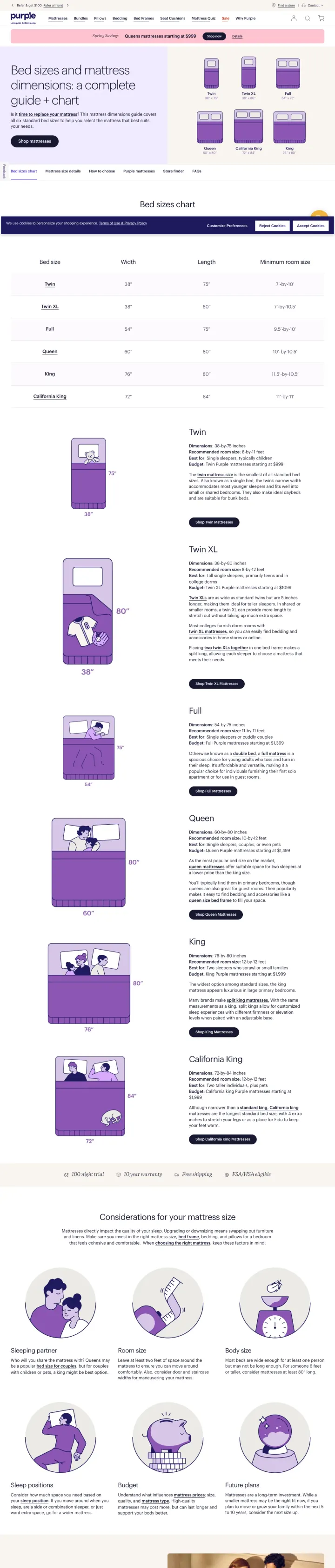
Build a standalone /mattress-sizes-dimensions page that doubles as a paid landing destination. Purple treats the size guide as a full shopping experience with a dimensions chart (Twin 38 by 75, King 76 by 80, California King 72 by 84), a Shop mattresses CTA, and a horizontal tab bar (Bed sizes chart, Mattress size details, How to choose, Purple mattresses, Store finder, FAQs). The visitor searching mattress sizes gets a buying guide and a store locator on one URL.
Bed sizes chart with Twin (38 x 75), Twin XL (38 x 80), Full (54 x 75), Queen (60 x 80), California King (72 x 84), King (76 x 80) as an illustrated grid with pastel-purple bed outlines. Visual dimensions answer the question before the visitor reads any text.
Time to replace your mattress link under Is it hyperlinked at the front of the copy. Pairing the education question (is it time to replace?) with a buying CTA reframes the visit from research to decision.
Spring Savings stripe above the fold with Queens mattresses starting at $999 plus Shop now button. The promo is contextually relevant because the visitor is already reading about sizes, and the call-out pre-empts the next question (okay how much does a Queen cost?).
The dimensions chart uses imperial measurements only. International visitors (Canada, UK, Australia) looking at Queen 60 by 80 without centimeter equivalents will bounce to a local site or Google a converter.
Cookie overlay sits across the bottom of the viewport on load, which is a recurring pattern across Purple product pages. Mattress shoppers comparison-click 3-4 brand pages in a session, so any load-time UI debt compounds into real spend waste.
3 pages burning ad spend with fundamental issues
Every click to these pages costs real money. We found broken trust signals, mismatched intent, weak CTAs, and messaging that ignores what the searcher actually typed. Here is what to avoid.
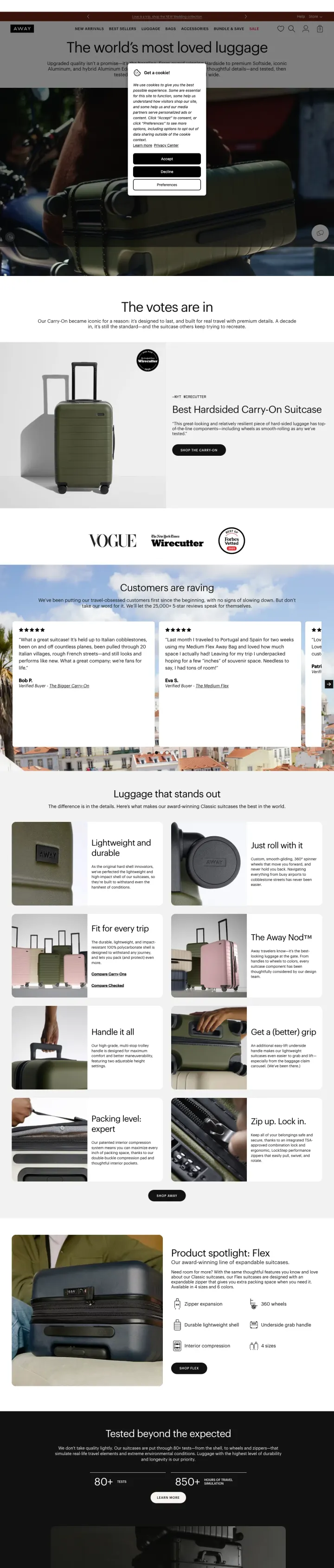
Ad targets the Away Travel brand at a premium CPC, but the landing page loads with a cookie consent modal covering the center of the viewport. The hero content (The votes are in...) is barely visible, and the Get A Cookie modal sits atop the comparison imagery the page was built to show. A visitor who clicked a brand-awareness ad is forced to dismiss a privacy dialog before they can even see the comparison the URL promised.
Cookie modal (Get a Cookie) covers the center of the viewport on initial paid load, obscuring the hero content and blocking visitor action until dismissed. The modal is the first brand interaction, which is the wrong first impression.
The hero image appears to be a car driving at night (visible behind the modal), which has no obvious connection to luggage, travel, or a comparison claim. A suitcase photo or side-by-side brand comparison would match the URL's promise.
Decline and Accept buttons in the cookie modal are standard privacy choices, but the third button (Preferences) adds a branching path that increases cognitive load at the exact moment the visitor is least patient.
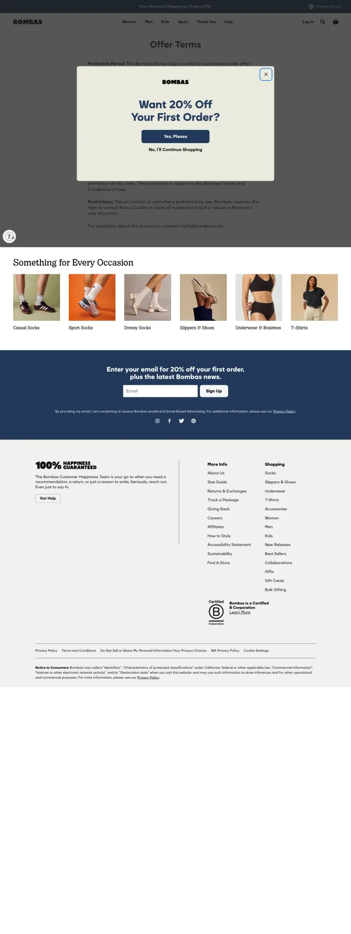
The URL /pages/offer-terms-bonus-days is a legal terms page (Promotion Period, Redemption, Restrictions) that Bombas has somehow received paid traffic on. A visitor who clicked a brand or promo ad is immediately confronted with a legal document and a Want 20 percent Off Your First Order pop-up modal. The terms page exists to be linked from promo campaigns in fine print, not to run as a destination.
The visible page content is legal text under an Offer Terms heading (Promotion Period, Redemption, Restrictions). A first-time paid visitor expects a product, not a legal agreement. This is a campaign-structure mistake where the wrong URL is the paid destination.
The 20 percent Off modal blocks the legal text it should be reinforcing. The visitor has two confusing interfaces competing for attention (the fine print and the offer).
No product photo, no navigation into the catalog, no clear path out of the legal content. The visitor is stranded on a disclosure page.
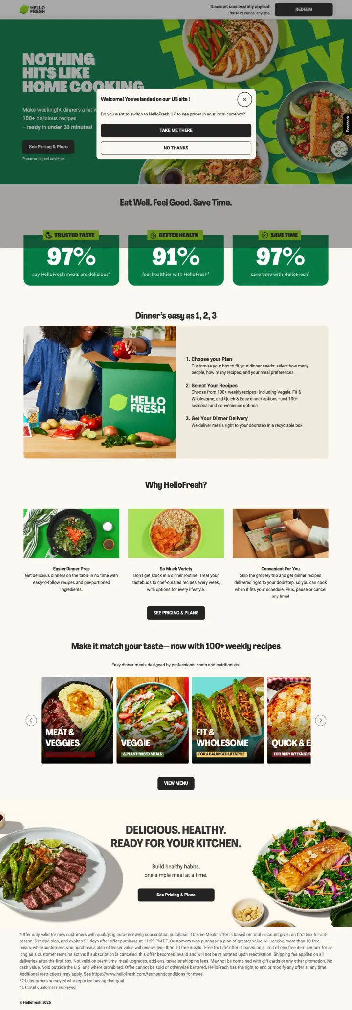
The ad promised America's #1 meal kit with 50 percent off, and the page does deliver that with the hero (NOTHING HITS LIKE HOME COOKING, 100+ recipes, ready in under 30 minutes). But a geo-detection modal (Welcome! You've landed on US site. Do you want to switch to HelloFresh UK) covers the See Pricing and Plans CTA on initial load. The page paid for a click that lands the visitor on a yes/no dialog about a different country's site before they can see the offer the ad sold.
Geo-detection modal (Welcome! You've landed on US site) covers the See Pricing and Plans CTA on initial paid load. This is the strongest wasted-spend pattern in DTC: paying for a click and immediately blocking the CTA with an unrelated interruption.
The modal offers Take Me There (UK site) and No Thanks as the two options. Neither button resumes the decision the visitor came to make, so every click through the modal starts the attention clock over.
Discount successfully applied appears as a top strip even before the visitor has interacted with a discount, which implies the entire page is running in post-click promotional state for a traffic segment it was not built for.
Purple leads with Queen $1499 and a financing strip. Mint Mobile leads with a 4-tier price ladder (5GB $15, 15GB $20, 20GB $25, Unlimited $30). Warby Parker shows Starting at $150. Factor leads with 50 percent off first box plus Free Breakfast. Visitors pre-qualify on price before any other claim...
Warby Parker's Canadian sunglasses category page shows 126 frames in a grid with Try On buttons, per-product pricing, and Select lenses and buy CTAs. Zenni shows thousands of pairs filtered by Brand, Gender, and Shape. For visitors from broad keywords (sunglasses, eyeglasses), the category page a...
3 of 3 DTC losers in this set are killed by the same failure mode: a cookie overlay, a terms modal, or a geo-detection modal covering the exact CTA the ad promised. Away Travel, Bombas, and HelloFresh each paid for a click that lands on a modal before the product. For comparison DTCs (mattresses,...
For Hers leads with a 3-bullet pitch plus Take the free hair quiz, which routes visitors into a preference-capture flow before they ever see a price. Mint Mobile reads the tier from a URL parameter (MINT-UNLIMITED-03) so the ad's selected plan is pre-highlighted on page load. Both tactics remove ...
Winners lead with product, price, and shop-now action in the hero. Losers send paid traffic to pages where cookie, terms, or geo modals block the visitor from ever seeing the CTA the ad promised..