Free: 96 PPC tools + my AI Playbook book


Insurance shoppers will open 5 quote tools in 5 minutes. Whoever gives them a number fastest wins. But they also need to trust you with their biggest asset. So it's speed AND credibility. Most pages only do one.
From real home insurance Google Ads campaigns in the US
The landing pages actually worth stealing from
So you know exactly what to avoid
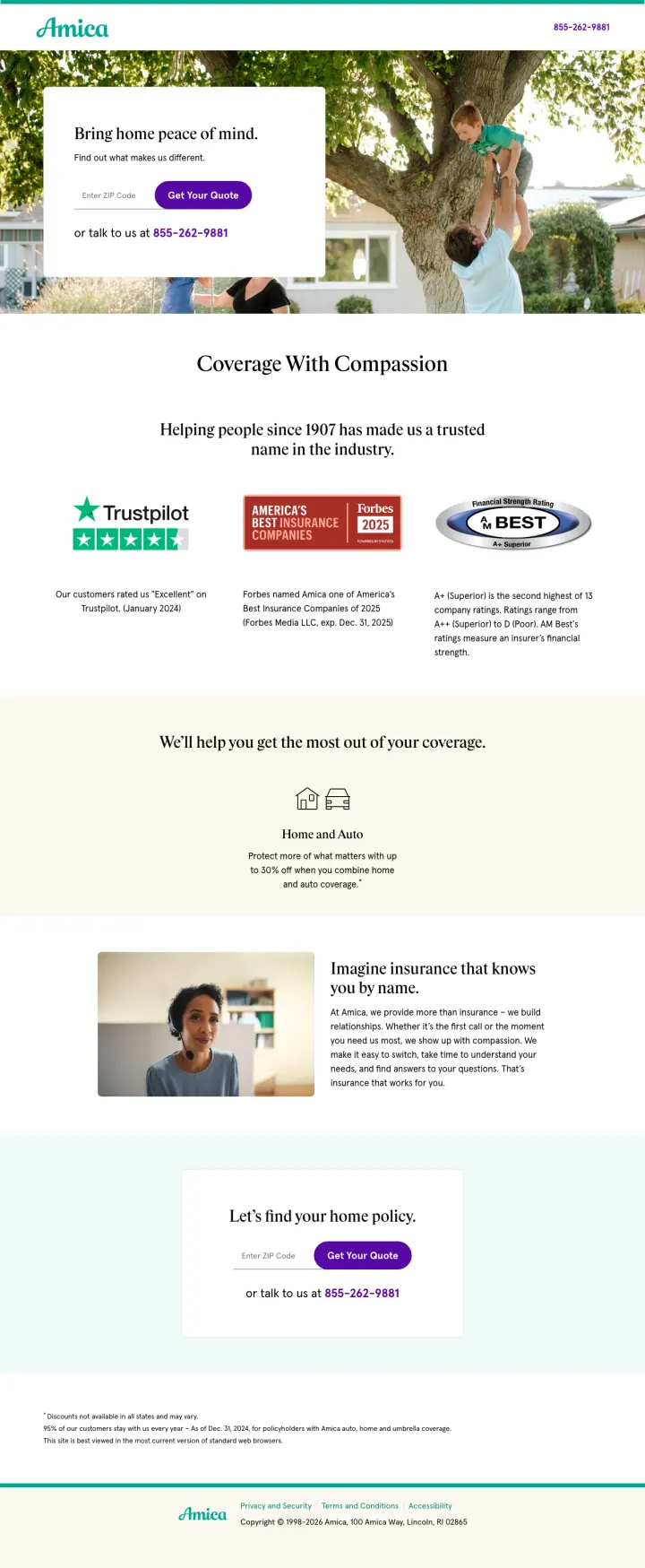
Stack three independent trust badges (Trustpilot + Forbes + AM Best) in a single horizontal row directly below the hero section, so comparison shoppers see third-party validation before they scroll past the quote form.
Trustpilot 'Excellent' + Forbes Best Insurance Companies 2025 + AM Best A+ (Superior) in one row creates a credibility wall that individual customer reviews cannot match -- these are the exact signals Blue-persona comparison shoppers look for when evaluating whether an insurer will actually pay claims
'Up to 30% off when you combine home and auto' with a dedicated Home and Auto section addresses the #5 customer priority (bundling discount) and gives price-sensitive visitors a concrete savings number before they start the quote
Two-tier home policy selection (Platinum Choice Home vs Standard Choice Home) lets coverage-anxious Green-persona visitors self-select into higher coverage without feeling upsold -- the coverage comparison happens before the quote, not after
Hero headline 'Bring home peace of mind' is emotional but says nothing about home insurance specifically -- a visitor scanning 5 tabs cannot instantly confirm this is a home insurance page from the headline alone
'Find out what makes us different' as the subhead is a promise with no payoff above the fold -- the visitor has to scroll past the quote form to discover what is actually different about Amica
The 95% customer retention stat ('95% of our customers stay with us every year') is buried in fine print at the very bottom -- this is one of the strongest trust signals on the page and it is invisible
Strip your insurance quote page down to a single ZIP code field with product type icons (Auto, Home, Property) above it, a savings headline, and one CTA button. Nothing else above the fold. Liberty Mutual proves that for multi-product insurers, the fastest path to quote wins.
'You could save up to 12% when you purchase online' quantifies the benefit of using this specific channel (online vs calling an agent) which gives the visitor a reason to complete the quote digitally rather than picking up the phone
Product type icons (Auto, Home, Property) above the ZIP field let the visitor self-select their insurance type in one click before entering any personal information -- this is faster than a dropdown and more visual than radio buttons
Phone number (800-837-5254) and 'Log in here' for existing customers are present but visually subordinate -- they serve secondary personas without competing with the primary ZIP-entry conversion path
No trust signals of any kind above the fold -- no ratings, no years in business, no customer count, no financial strength. For a company with 100+ years of history, this is a missed opportunity to differentiate from insurtech startups
The page ends after the hero section with only legal footer content -- there is literally no below-fold content addressing coverage details, FAQs, or customer testimonials for visitors who need more information before committing
The lifestyle illustration of a couple with a dog feels generic and does not specifically signal 'home insurance' -- a visitor comparing tabs cannot visually distinguish this from an auto insurance page
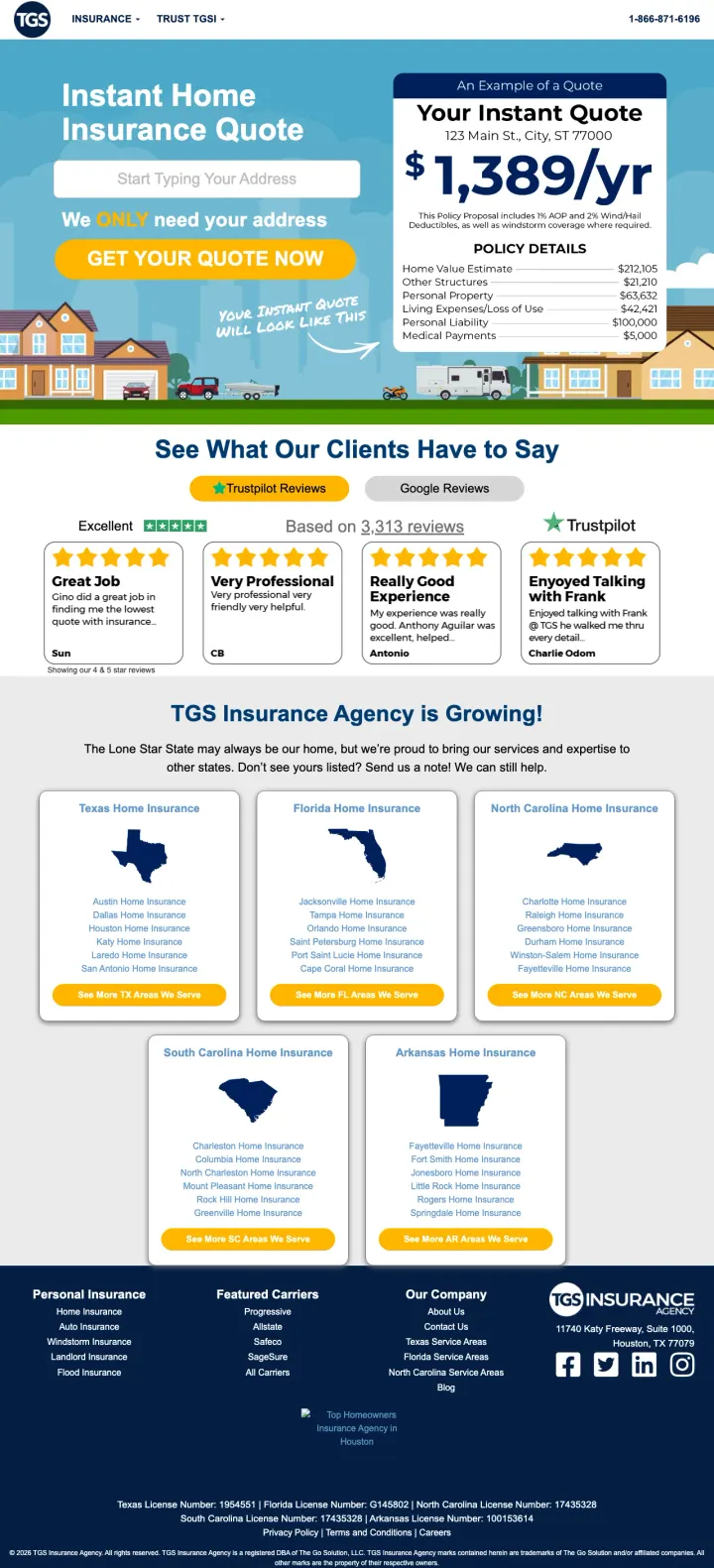
Display a real example quote with line-item breakdown (dwelling, liability, medical payments) directly on your landing page so visitors see exactly what a policy costs before they enter any personal information.
Example quote card showing $1,389/yr with itemized policy details (dwelling $275k, liability $100k, medical payments $5k) gives visitors a concrete reference price and eliminates the black-box feeling of most insurance quote pages
Trustpilot reviews embedded with real names and 5-star ratings plus Google Reviews tab option lets visitors toggle between review sources, building credibility through volume (3,213+ reviews at Excellent rating)
State expansion section with clickable maps for Texas, Florida, North Carolina, South Carolina, and Arkansas shows geographic reach while creating state-specific landing page entry points for geo-targeted PPC campaigns
The address input field says Start Typing Your Address but does not indicate whether this triggers an instant quote or starts a multi-step form, creating uncertainty about the commitment level
Hero section tries to do too much: address field, example quote card, We only need your address callout, and Your current quote will look like this all compete for attention above the fold
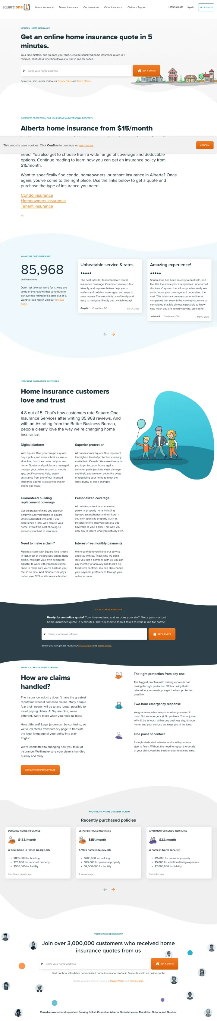
Lead with a geo-specific price anchor (Alberta home insurance from $15/month) and back it with a large customer count (85,968 customers) so visitors from paid search immediately see affordability proof plus social proof before scrolling.
Geo-targeted price anchor (Alberta home insurance from $15/month) matches the ad keyword intent perfectly and sets expectations before the visitor even considers filling out a form
85,968 customers stat displayed prominently with Unbeatable service and rates and Amazing experience badges creates a three-part credibility wall for a brand most visitors have never heard of
How are claims handled section with step-by-step process addresses the #1 hidden fear in home insurance (will they actually pay my claim?) and moves it from abstract promise to concrete workflow
The page is extremely long with multiple content sections (claims process, FAQ, recent purchases, join 3M+ customers) that dilute the conversion path for paid traffic visitors who just want a quote
Primary CTA button is not visually prominent above the fold compared to the surrounding content blocks and orange accent elements
Build separate landing pages for each property type (condo, house, rental) with property-specific price anchors and coverage explanations, so visitors from condo insurance keywords land on a page that speaks their exact situation.
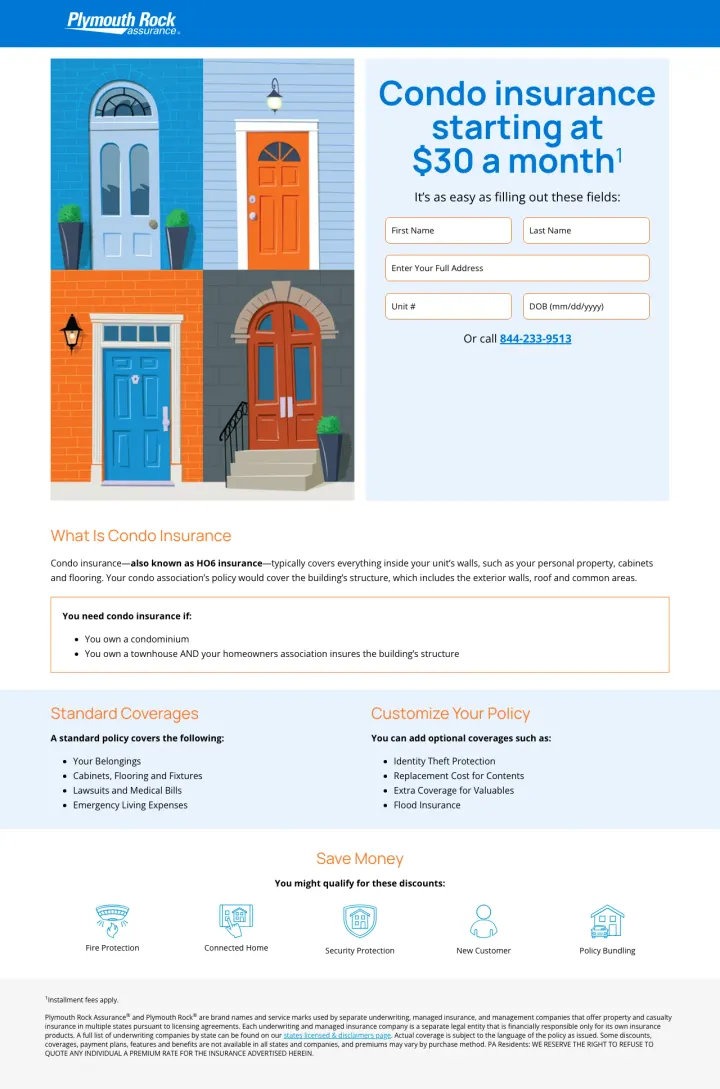
Condo insurance starting at $30 a month price anchor in the hero headline immediately qualifies the offer for budget-conscious condo owners who often assume insurance is more expensive than it is
What Is Condo Insurance explainer section distinguishes unit coverage from building coverage (HOA policy vs personal policy), addressing the #1 confusion condo owners have about what they actually need to insure
Customize Your Policy section lists add-on coverages (Identity Theft Protection, Replacement Cost for Contents, Extra Coverage for Valuables, Flood Insurance) that let visitors self-select higher coverage tiers
The form asks for First Name, Last Name, Full Address, Unit #, and DOB all at once above the fold, which is 5+ fields of friction compared to the ZIP-only approach that top performers use
No trust signals anywhere on the page: no reviews, no ratings, no financial strength badges, no years in business for a regional carrier that most people outside the Northeast have never heard of
Pages that break the playbook in interesting ways
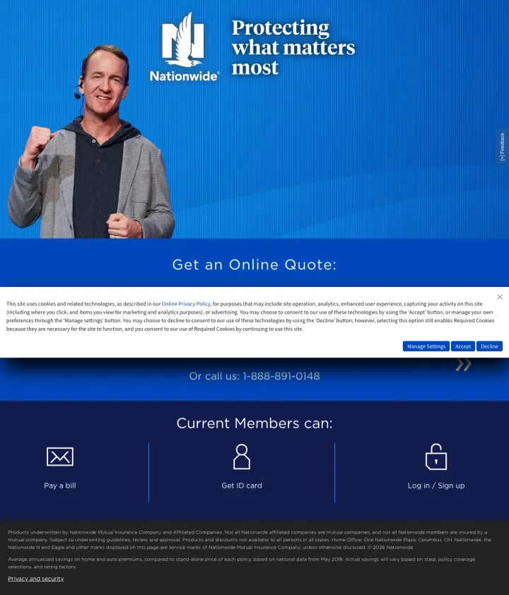
If you have a recognizable spokesperson, use them as the hero image but pair it with a single-field quote form overlaid on top, so the brand familiarity drives attention while the conversion path stays frictionless.
Peyton Manning as the hero image creates instant brand association and stops the scroll for anyone who recognizes him, which is a different trust mechanism than badges or reviews
Current Members can section with Pay a Bill, Get ID card, and Log in/Sign up acknowledges that brand search traffic includes existing customers, not just new prospects, and gives them a fast exit path instead of bouncing
Cookie consent banner and privacy policy text block cover nearly half the above-fold space on initial load, pushing the actual quote form below the visible area
The Get an Online Quote heading is followed by a wall of privacy/cookie text rather than a form field, creating a bizarre user experience where legal disclaimers are more prominent than the conversion action
No quote form fields are visible above the fold at all. The visitor sees Peyton Manning, a heading, legal text, and a phone number, but cannot start a quote without scrolling past the consent banner
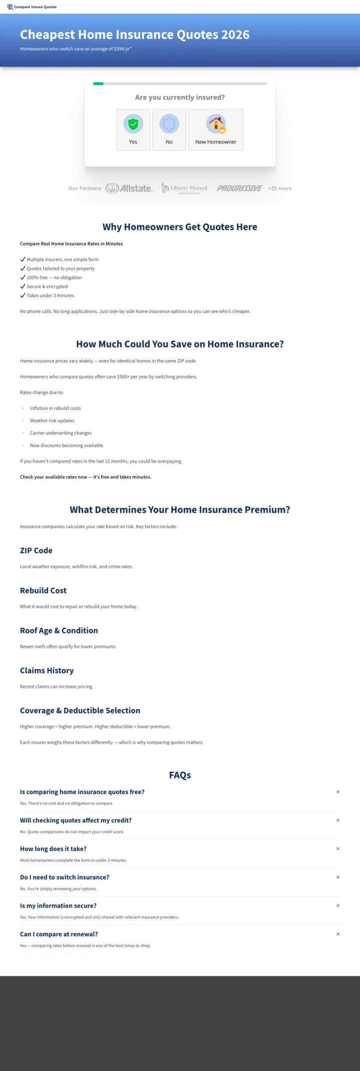
Replace your standard quote form with a single-question quiz widget (Are you currently insured? Yes / No / New Homeowner) so visitors make one easy choice before entering any personal information.
Quiz-style entry (Are you currently insured? with three clickable options: Yes, No, New Homeowner) reduces perceived friction by turning the first step into a simple tap rather than a form field entry
Partner logos row (Allstate, Liberty Mutual, Progressive, +25 more) immediately establishes that this is a comparison marketplace backed by recognizable carriers, which compensates for the unknown brand name
Educational SEO content below the fold (What Determines Your Home Insurance Premium: ZIP Code, Rebuild Cost, Roof Age, Claims History) serves dual purpose: helps with organic rankings and pre-educates visitors about pricing factors
The page headline (Cheapest Home Insurance Quotes 2026) leads with cheap which attracts the lowest-quality leads and positions insurance as a commodity rather than protection
Massive wall of text below the quiz widget (Why Homeowners Get Quotes Here, How Much Could You Save, What Determines Your Premium, FAQs) is clearly SEO content that dilutes the conversion focus for paid traffic visitors
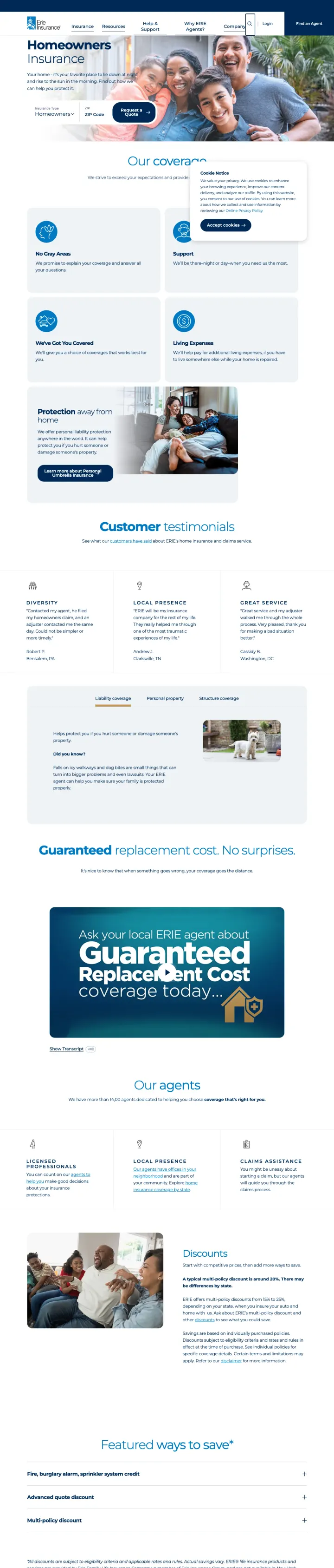
If you must send paid traffic to a site page instead of a dedicated landing page, at least ensure the hero section has a ZIP-entry quote form and your strongest trust signal (Guaranteed Replacement Cost) visible without scrolling.
Guaranteed Replacement Cost coverage as a hero-level differentiator is a powerful message for homeowners worried about being underinsured after a total loss, and Erie makes it the centerpiece of a dedicated callout section with bold typography
Customer testimonials section with named reviewers and star ratings adds social proof that most carrier site pages skip entirely
This is a full website page with global navigation, not a dedicated landing page, so paid traffic visitors can easily leak to other sections (Our Coverages, Our Agents, Details, Compare) instead of converting
The quote form (Enter your ZIP Code) is small and competes with multiple other content blocks above the fold rather than dominating the hero section
The page serves both SEO and PPC purposes with extensive content sections (coverages breakdown, agent finder, details/discounts, compare section, blog links) that dilute conversion focus for paid visitors
3 pages burning ad spend with fundamental issues
Every click to these pages costs real money. We found broken trust signals, mismatched intent, weak CTAs, and messaging that ignores what the searcher actually typed. Here is what to avoid.
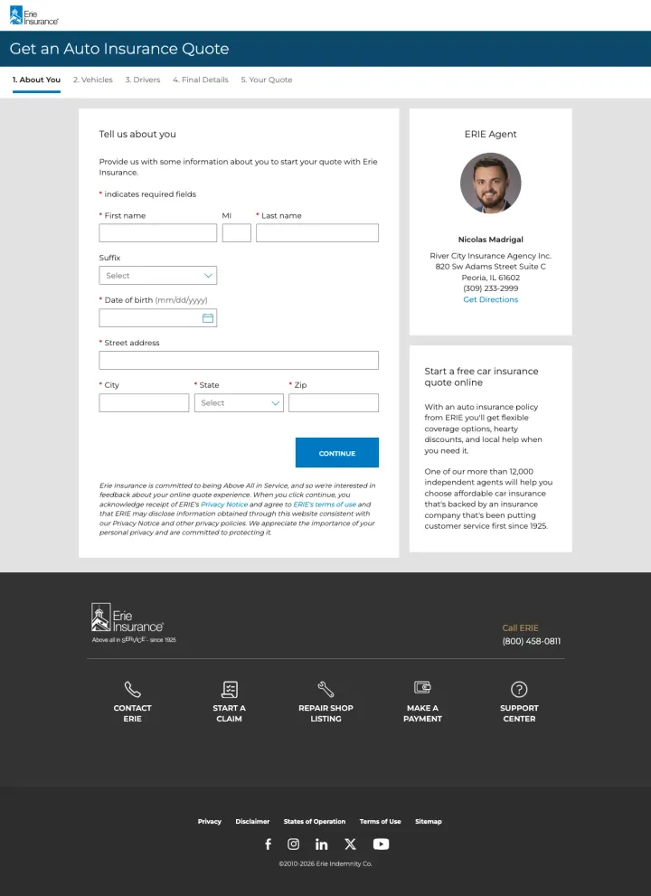
Erie's paid ads target home insurance keywords ('erie homeowners insurance quote') but this URL loads an 'Auto Insurance Quote' page with the title 'About You | Auto Insurance Quotes | Erie Insurance.' The form collects name, date of birth, and street address for an auto policy. A visitor who searched for home insurance and clicked an ad promising homeowners coverage lands on a page that says 'Get an Auto Insurance Quote' at the top. At $20-60 per click, every single click is a complete mismatch -- the visitor either bounces immediately or wastes time filling out a form for the wrong product.
Page title says 'Auto Insurance Quotes' when the ad targets home insurance keywords -- this is the most fundamental message match failure possible, sending the visitor to the wrong product entirely
The multi-step progress bar (About You > Vehicles > Drivers > A Few Details > Your Quote) confirms this is an auto quote funnel with no home insurance path visible anywhere on the page
At $20-60 CPCs for home insurance keywords, every click to this auto quote page is pure waste -- there is zero chance of conversion for the visitor's actual intent
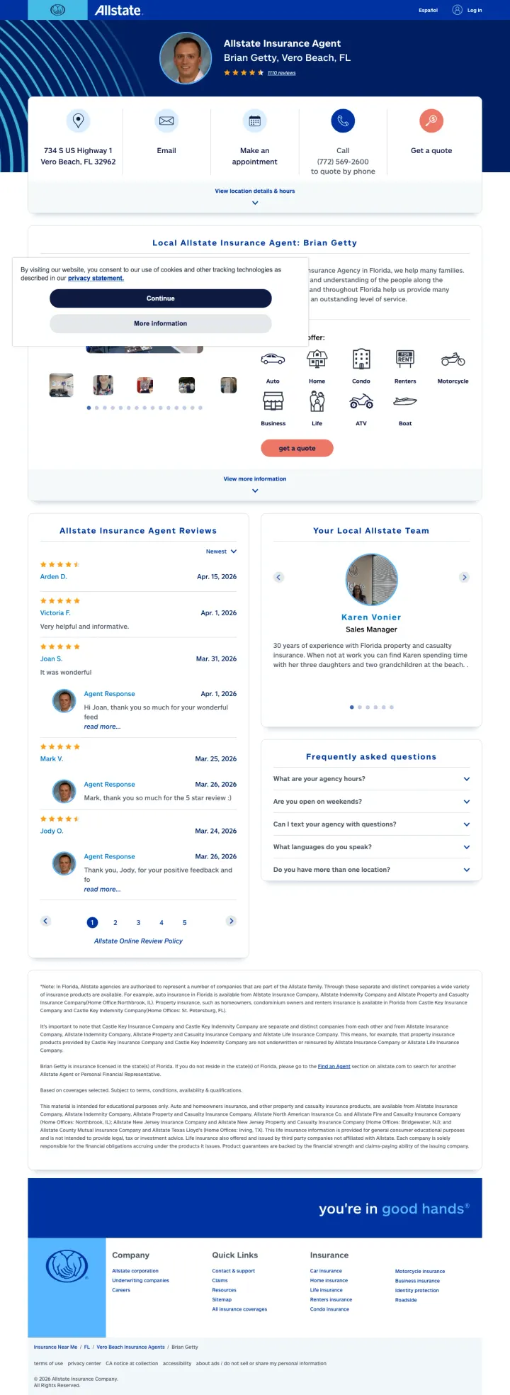
The paid ad targets 'insurance vero beach' but lands on a generic agent biography page for Brian Getty. The above-fold content shows the agent's photo, address, star rating (4.3/5 from 1,110 reviews), and contact options (email, appointment, call, quote). There is zero home-insurance-specific content visible without scrolling. The 'Get a quote' dropdown requires clicking to reveal product options, and even then, the home insurance option does not link to an online quote -- it appears to require contacting the agent. The visitor who wanted to compare home insurance quotes online has to navigate a contact-the-agent page.
Cookie consent overlay sits on top of the agent bio on initial load, adding a dismissal step before the visitor sees page content -- at $20-60 CPCs this delay costs real money
The 'Get a quote' button opens a product selector dropdown rather than starting a home insurance quote directly -- adding an unnecessary decision step when the visitor already clicked a home insurance ad
Full agent biography, office hours, areas served, and team photos occupy the majority of the page while the actual conversion path (getting a home insurance quote) requires multiple clicks through a dropdown menu
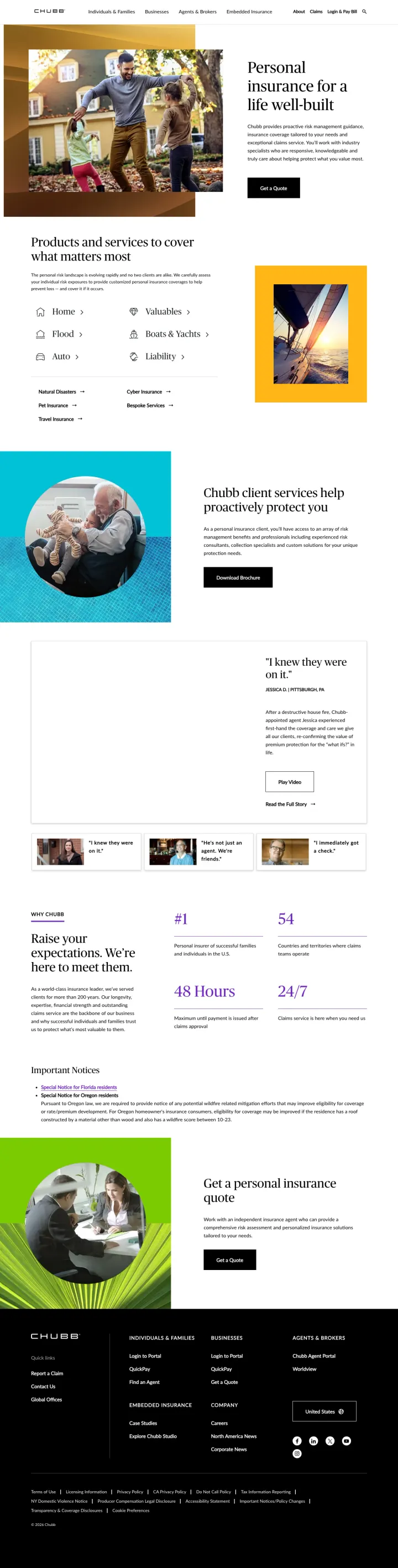
Chubb sends paid home insurance traffic to their general Individuals and Families corporate page, which lists six product categories (Home, Valuables, Flood, Auto, Boats and Yachts, Liability) without a single quote form or price indicator above the fold. A visitor who searched for home insurance must first find and click the Home link, then navigate to a quote form on a subsequent page. At premium CPCs (Chubb targets high-net-worth individuals), every click to this page requires 2+ additional clicks to reach a quote, and most visitors will bounce before finding the right path.
Six product categories (Home, Valuables, Flood, Auto, Boats and Yachts, Liability) above the fold force the visitor to self-navigate rather than landing directly on a home insurance conversion page
The headline Personal insurance for a life well built is pure brand messaging with zero relevance to the home insurance search query that brought the visitor here
The Get a personal insurance quote CTA is buried at the very bottom of a long page, below testimonials, stats, Important Notices, and a lifestyle photo section
Amica stacks three independent trust signals above the fold: Trustpilot 'Excellent' rating, Forbes Best Insurance Companies 2025, and AM Best A+ financial strength rating. For home insurance buyers comparing coverage adequacy (the #2 priority after price), these third-party validations answer 'wi...
Both Amica and Liberty Mutual lead with bundle savings (Amica: 'up to 30% off when you combine home and auto', Liberty Mutual: 'save up to 12% when you purchase online'). Since most home insurance shoppers already have auto insurance, the bundle discount directly addresses the #5 customer priorit...
The winners ask for only a ZIP code to start the quote process. Home insurance shoppers are comparing multiple carriers simultaneously, and every additional field (name, email, phone, property details) before showing any value is a drop-off point. At $20-60 per click, a 5-field form that loses 40...
Two of four pages failed at the most basic level: Erie sent home insurance searchers to an auto insurance quote form, and Allstate sent them to a local agent's bio page with no home-specific content above the fold. Neither page addresses any of the top 7 customer priorities for home insurance. At...