Free: 96 PPC tools + my AI Playbook book

Moving is stressful enough without your landing page making it worse. People want one thing: how much will it cost to move my stuff from A to B? The pages that give an instant quote or a clear pricing framework win. The ones that make you call for a 'free estimate' lose to whoever has a calculator.
From real moving companies Google Ads campaigns in the US
The landing pages actually worth stealing from
So you know exactly what to avoid
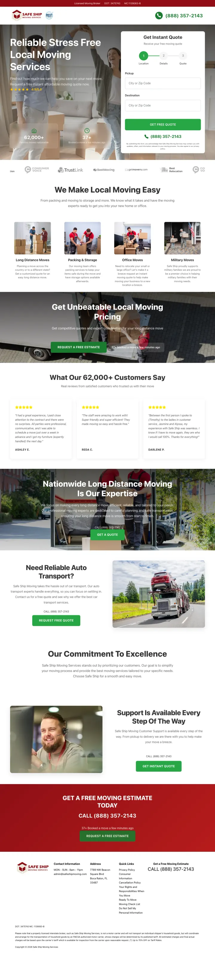
Put a 3-step quote wizard in the hero with a visible progress indicator (Location, Details, Contact). Safe Ship collects pickup and destination ZIPs on step one before a single feature claim, and the step indicator tells the visitor they are 33 percent done before they have committed any real information. The Green-persona moving visitor needs to feel like they are making progress, not starting an interrogation.
Quote wizard collects pickup and destination ZIPs first, not name and phone. Moving visitors are wary of being spammed before they know what the service costs. Asking for a ZIP first signals the company will price the move before they contact you, which flips the power dynamic.
4.55 star rating badge with a visible star bar and the dollar-ticker stat (62,000 plus customers) side by side creates a one-glance trust block. Moving is a scam-averse category where a star rating plus a customer-count number in the hero substitutes for the sales pitch most competitors spend 8 scrolls building.
Phone number in the top right with a green Get Free Quote button and a separate phone CTA below the form gives the impatient mover a call-now option while the researcher fills the form. Dual paths in the hero serve both without forcing a choice -- important in a category where the move date splits traffic between 'I have three months' and 'I have three weeks.'
The hero background image is a generic stock photo of a smiling couple hugging in front of boxes. Real crew photography or a branded truck would build more trust than staged models whose identity the visitor has no way to verify.
Ad says Short Distance Movers but the hero headline is Reliable Stress Free Local Moving Services. The copy is close but the ad keyword phrasing is not echoed, which costs a few points of message match on a visitor who just typed that exact phrase.
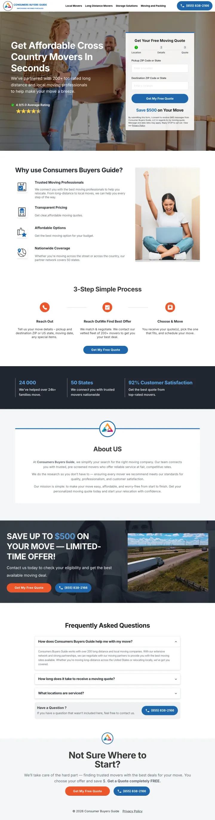
Put a branded Save $500 on Your Move banner directly beneath the quote form. Consumers Buyers Guide runs a green stripe with a dollar amount that acts as a closer under the primary CTA. It reframes the quote as a route to a discount rather than a commitment. A mover that tried the same tactic above the fold would collapse the what and the why into one visual block.
We have partnered with 200 plus top-rated long distance and local moving professionals under the 4.8 out of 5 star rating creates marketplace legitimacy. The visitor feels like they are being matched rather than sold, which lowers the sales-avoidance response that movers trigger.
Get Your Free Moving Quote form card lives in the hero with a step indicator and the final-step Save $500 stripe. The form is the conversion; the content page is the brochure. An aggregator embedding a form is copying the mover playbook better than the movers.
Get Affordable Cross Country Movers In Seconds as the headline makes a time-to-value promise. Moving visitors are in the worst part of their year and the word Seconds directly counters the fear of hours on the phone collecting quotes from 5 companies.
The page is an affiliate lead aggregator, not a mover. The visitor might not realize the quote will send their details to multiple companies who will call repeatedly. Transparency about who actually gets the lead would build long-term trust even if it costs some conversions.
Trust signals stop at the star rating and customer count. No BBB badge, no individual mover reviews, no specific carrier names until you scroll. For the visitor who is already paranoid about moving scams, the aggregator needs to over-index on legitimacy signals.
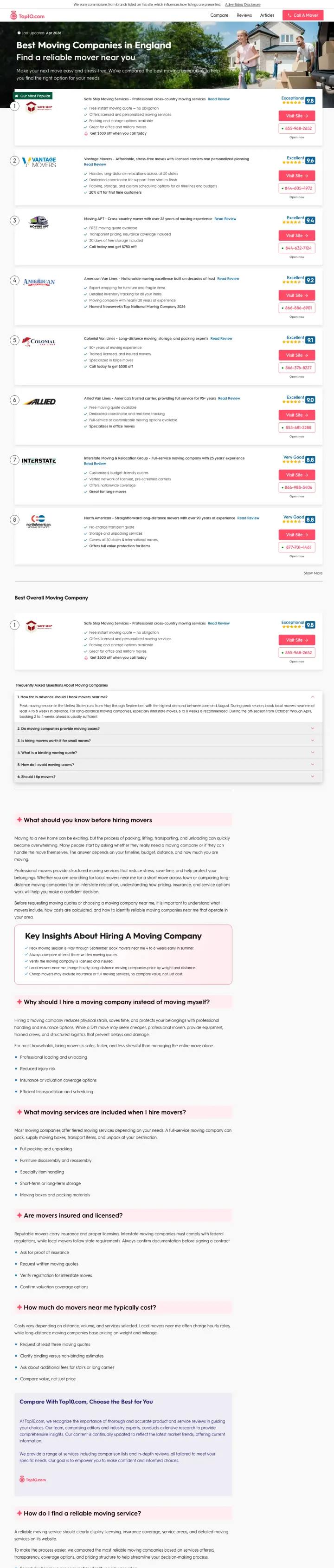
Show a numbered list of 3 to 5 movers with distinct numeric scores (Exceptional 9.8, Excellent 9.6, Excellent 9.5) and a Call A Mover button per row. Top10 treats every row as its own landing page, which means the visitor only has to decide between Top10 and Google, not between one mover and every mover. Movers running comparison campaigns should take note: aggregators are eating their lunch by making the choice easier than any single-mover page can.
Exceptional 9.8 and Excellent 9.6 as numeric scores with colored backgrounds (green for 9.8, blue for 9.6) creates a visual hierarchy that lets the visitor skim to the top pick. The specific number and the color-coded tier communicate more quickly than 5 stars ever do.
Most Popular and Best Overall ribbons on the first two entries steer the decision without pretending to be neutral. Visitors who do not want to read everything will click the first badge they see, and that is by design.
Call A Mover in the top-right header bar is clickable from any scroll position, giving the impatient visitor a direct action path even if they do not want to pick a specific provider from the list.
The page is positioned as Best Moving Companies In England in the header despite the ad targeting US moving keywords. Visitors from a US search who hit an England-tagged page may bounce out of confusion before reading the first review, especially since the movers below are mostly US-branded.
Last Updated Apr 2026 is a freshness signal but without the day the page might have been published 30 minutes or 30 days ago. Consumers comparing multiple aggregators will trust the one with the most specific date.
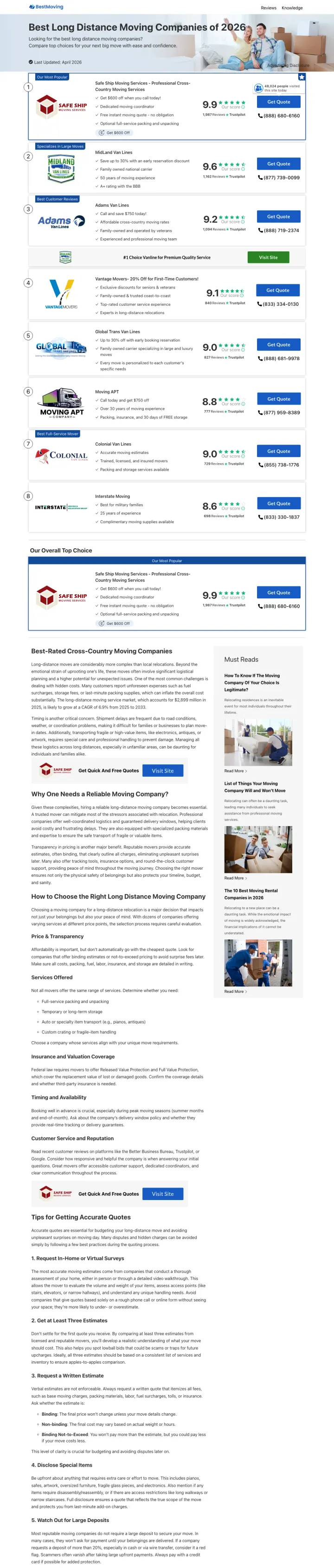
Show the underlying Trustpilot review count next to each mover, not a summary rating. 10Best displays 1,887 Reviews on Safe Ship and 1,162 Reviews on MidLand Van Lines right next to the 9.9 and 9.6 scores. The review count is what makes the rating believable: a 9.9 on 50 reviews is a rounding error, and a 9.9 on 1,887 reviews is a business truth. Showing both numbers together is the strongest single trust signal in this entire data set.
9.9 Our Score and 1,887 Reviews on Trustpilot stacked in one block per mover. The score is the recommendation; the review count is the evidence. Most aggregators show only the first number, which lets visitors assume the sample is tiny.
Our Most Popular and Specializes in Military Moves and Best Customer Service are differentiating tags per provider. The visitor who came to find a mover can match their specific need (military relocation, customer service) to a specific provider without reading a full comparison.
$500 Discount When You Mention 10Best as a deal tag on each listing is a conversion forcing function that gives the visitor a reason to book through the aggregator rather than going direct to the mover. Pricing competition is bad for movers but great for the aggregator who can extract a commission either way.
The layout is extremely text-dense with small fonts. A visitor skimming on mobile has to zoom to read the differentiating tags, which likely buries the Trustpilot count that is the strongest asset on the page.
Call Now buttons appear on each row with different phone numbers, which is correct for accurate tracking but creates a visually busy right rail. A single persistent Call button would reduce cognitive load for the impatient visitor.
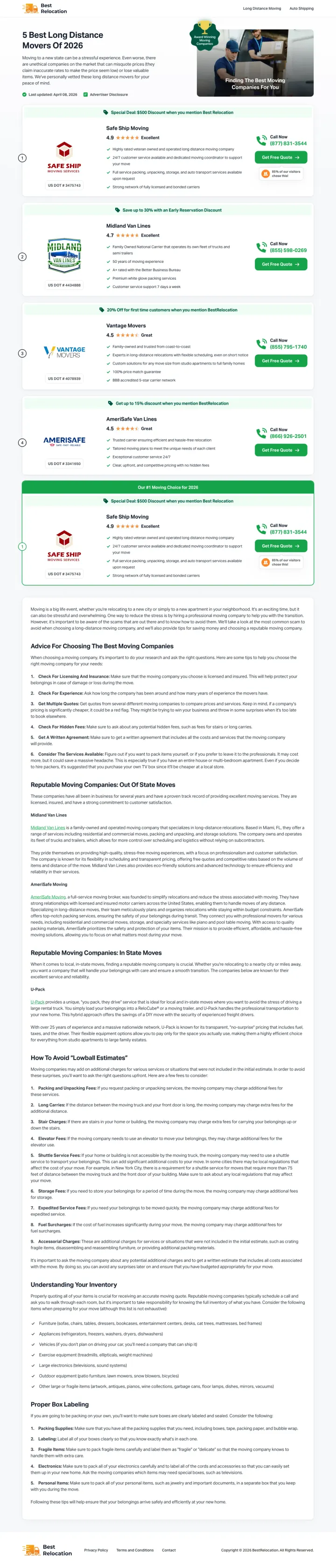
Frame the top-ranked mover as a limited offer (Special Deal: $500 Discount when you mention Best Relocation) with an Advertiser Disclosure next to it. The disclosure is legally required but also builds trust: the visitor now knows the page monetizes via commission, which paradoxically increases credibility because nothing is hidden. Most aggregators bury the disclosure; Best Relocation highlights it next to the $500 offer.
Special Deal $500 Discount as a green pill badge next to the top-ranked mover (Safe Ship) converts the ranking into a promotion. Visitors see both the rank (Most Popular) and the price reason (Discount), which is a double-tap on the decision-making brain.
Moving to a new state can be a stressful experience as the opening sentence names the emotion the visitor is feeling before selling anything. Green-persona moving visitors are in a grief-adjacent state, and naming that state before pitching a service creates empathy that a feature list cannot.
4.9 Excellent rating with 1,887 Reviews on Trustpilot for the top-ranked mover matches exactly what 10Best shows, which tells you both aggregators are pulling from the same data provider. The Trustpilot-as-truth pattern is the new default for trustworthy comparison pages.
Our Top Pick badge and Advertiser Disclosure are side by side in the hero, which is transparent but also signals to savvy visitors that the Top Pick is paid placement rather than organic ranking. A short explainer (how we rank) would convert skeptics who notice the disclosure.
The page title 5 Best Long Distance Movers Of 2026 with a Last Updated April 08, 2026 date is close to current but not today. A last-updated-today stamp (even if rotated automatically) would carry more conversion weight for a visitor making a same-week decision.
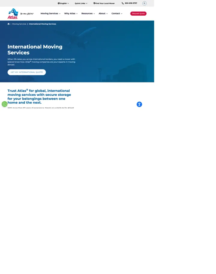
Build a dedicated International Moving Services page that does not try to also sell local moves. Atlas gives international searchers a clean International Moving Services hero with Get My International Quote as the primary CTA, rather than sending them to a generic moves page that asks them to pick their category. When your keyword pool includes specific verticals (international, military, corporate), every vertical deserves its own landing page, not a section of a catch-all.
When life takes you across international borders, you deserve a mover with special know-how names the emotional stake of an international move (you are leaving your country) before selling the service. Green-persona international movers are typically following a spouse's job or a diplomatic assignment and need reassurance before features.
Trust Atlas for global, international moving with secure storage for your belongings between one home and the next makes the continuity promise explicit: the thing you are scared of (will my stuff be lost in transit) is directly addressed in the sub-headline.
Get My International Quote as the specific CTA (not Get A Quote) mirrors the specific product. The extra two words increase perceived relevance for an international searcher, which matters more than brevity when CPCs are $30 plus.
The airplane-over-globe hero illustration is a stock visual used by most international movers. A real container-ship or customs-paperwork photo would differentiate, because every international mover shows an airplane.
No pricing signal (not even starting from a range) and no case study above the fold. International moves are $10,000 to $50,000 commitments and the visitor needs at least one specific number or named destination to anchor their expectations.
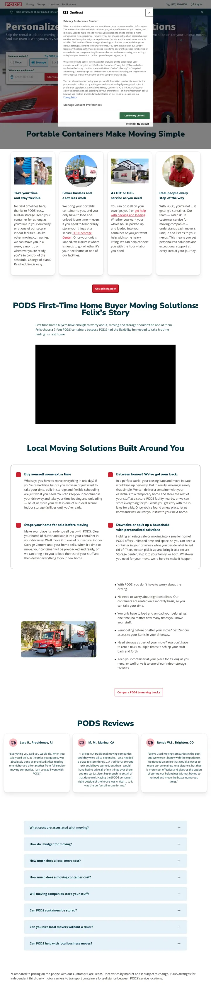
Add a prominent DIY or Full-Service toggle in the hero that filters the service into two completely different flows. PODS visitors fall into two camps (I will pack it myself vs I need someone else), and forcing a single flow loses half of them. By making the choice explicit in the hero, PODS lets both personas self-qualify into a path that makes sense before a single feature claim.
Personalize a plan and a DIY or Full-Service filter in the hero before any product description. Moving visitors know whether they want to load their own stuff or pay someone to do it. Asking them to commit to that choice first means the downstream content is targeted, not generic.
Portable Containers Make Moving Simple as a straightforward product descriptor beneath the hero filter works because PODS invented the category. Naming your product category directly (Portable Containers, not Moving Solutions) forces the visitor to recognize you are the default option in a new category you defined.
Save 10 Percent limited-time offer stripe at the very top creates urgency without being aggressive. The percentage is specific, the offer is clear, and the banner does not cover the hero content. Timeboxed incentives are standard; PODS executes the pattern with restraint.
OneTrust cookie consent modal covers the right-center of the viewport on initial load, blocking both the quote filter and the Personalize a plan call-to-action. For a $25 CPC visitor, the first interaction is dismissing a privacy dialog, which is a conversion-quality failure.
The DIY or Full-Service toggle reveals itself only after the cookie banner is dismissed, so the differentiating feature of the page is invisible until the visitor commits to dismissing a modal they did not come to see.
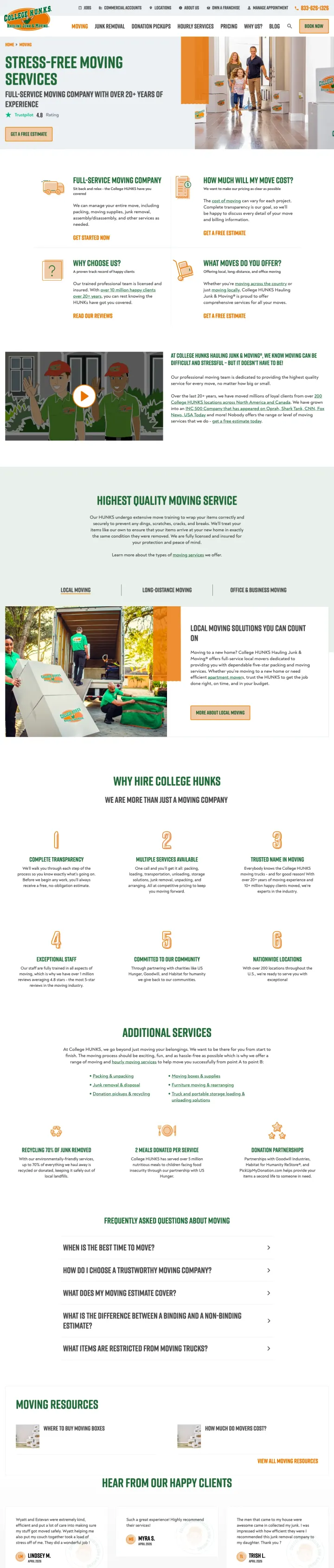
Put a 4-box grid directly beneath the hero that answers the visitor's 4 questions at once (what, how much, why you, what moves). College Hunks Hauling Junk treats each box as a mini-landing page with its own CTA, which respects the visitor's unknown starting question rather than assuming they already know what they want to ask.
Trustpilot 4.8 rating with the Trustpilot brand mark above the fold. In a category where visitors assume every self-reported rating is inflated, a third-party rating system the company cannot edit carries more weight than any internal metric.
FAQ section explicitly defines binding vs non-binding estimates and itemizes what the estimate covers (truck, labor, packing, disassembly, supplies). Scammers succeed because consumers do not know what a binding estimate is. Educating at the conversion point builds trust AND inoculates the visitor against cheaper competitors who omit line items.
10 million happy clients over 20 years plus 200 locations nationwide creates a scale proof point that small operators cannot match. For a visitor whose core fear is the mover disappearing with their stuff, national scale is a hostage-risk eliminator.
Complete transparency is our goal pricing section says the cost varies and links to another page instead of showing any number. The transparency claim is immediately contradicted by hiding the information the visitor came for.
Get A Free Estimate CTA links to an external booking subdomain rather than an embedded form on the page. Every click after a $15 to $30 paid visit is measurable revenue leakage, and this pattern repeats across the page.
The 3 service sections (Local, Long-Distance, Corporate Relocation) render 3 times in sequence, which looks like a CMS bug and doubles the scroll length for no added information.
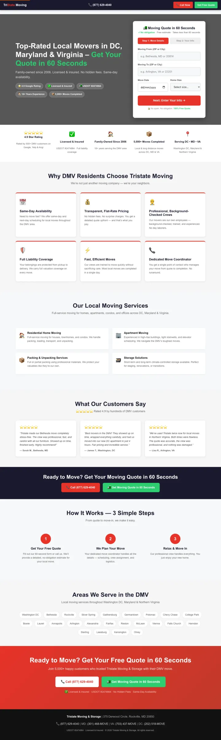
Put your USDOT number as a pill badge beside your Google rating in the hero. TriState shows 4.9 Google Rating, Licensed and Insured, and USDOT number 2474864 as three equal-weight trust pills directly under the headline. In an industry where rogue movers are a federal problem, a registered USDOT number is a check the visitor can verify on safer.fmcsa.dot.gov before they even fill the form. Treat the DOT number as a primary trust signal, not a footer disclosure.
Moving Quote in 60 Seconds as the form header with No obligation, Free estimate, Takes less than 60 seconds sub-text. Three friction-removers stacked in one line address the three objections a visitor brings to every quote form: cost, commitment, and time.
Step 1 Move Details and Step 2 Your Info as a visible progress indicator lets the visitor see that move data comes before personal data. Asking for ZIP and date first, name and phone second is a respect move; it signals the company will price the move before they call you.
No spam. No obligation. 100 percent Free Quote as a reinforcing line under the form button is the kind of over-communication a paranoid visitor needs. The words are all verbatim the objections the visitor had before clicking; answering them beside the button removes them.
Hero is dark gray with limited photography. For a DMV-specific local mover, a real crew photo in front of a real DMV landmark (or a branded truck in a Washington neighborhood) would make the geographic specificity feel tangible rather than only claimed.
Get Your Quote in 60 Seconds is a strong promise but the form requires ZIP, date, AND home size before the step advance. If home size is a required field, the 60-second promise is optimistic for someone who has to go measure rooms.
Pages that break the playbook in interesting ways
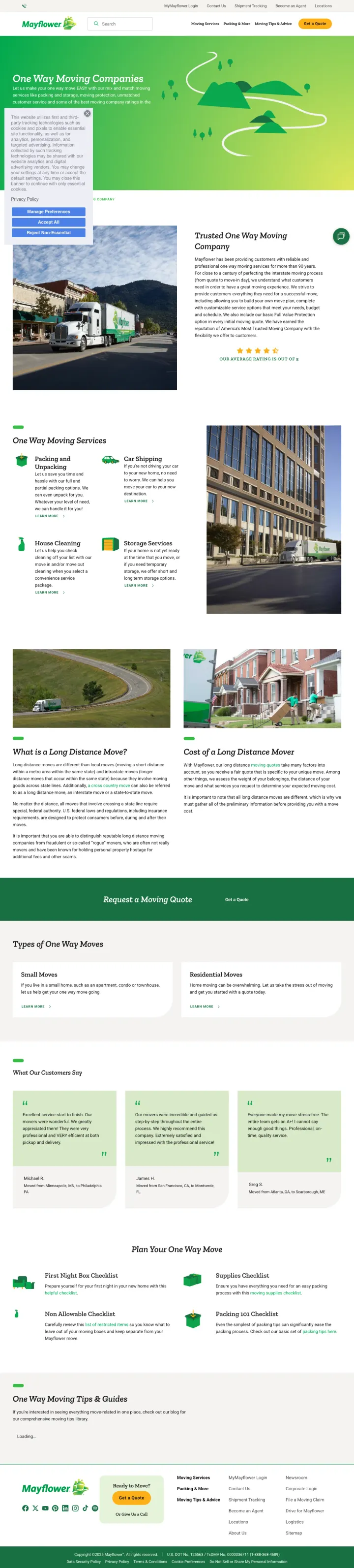
If your brand has 90 plus years of equity, you can afford to go against the category's stock-photo instinct and run a cartoon-illustrated hero. Mayflower uses a cheerful green-hill-and-road illustration with the One Way Moving Companies headline, which signals warmth and simplicity in a category where everyone else is showing real trucks and real crews. The approach is risky (cartoons undercut scam-fear reassurance) but the brand equity buys the permission.
Customize Your Move mix-and-match service menu (debris removal, packing, storage) lets the shopper build their own package. The feeling of designing the move rather than picking from fixed tiers gives an anxious first-timer a sense of control that reduces moving-day fear.
Snapmoves as a named long-distance product turns a commodity service into something with a brand. Visitors can comparison-shop for Snapmoves specifically rather than being forced into a generic long-distance quote bucket, which is a retention mechanism disguised as product naming.
Hero illustration with a green winding road and rolling hills signals a simple, stress-free move rather than a high-stakes one. Warm for confident repeat movers; risky for first-timers who want to see a real truck. Mayflower's brand equity buys the permission to take that risk -- most movers cannot.
Cookie consent overlay sits in the bottom-left of the viewport on initial load, the same UX failure United commits -- it signals the UniGroup-template landing pages carry the same consent friction across brands, costing every paid click a dismiss-tap before the visitor can engage.
Ad targets rosa del monte puerto rico (a direct competitor brand name) but the landing page makes zero mention of Puerto Rico, international moves from the Caribbean, or comparison to Rosa del Monte. Competitor-keyword traffic deserves a page that acknowledges the competitor.
The page functions as a service directory with 8 sub-categories linked out. It is a sitemap, not a conversion page, which is the wrong information architecture for paid traffic.
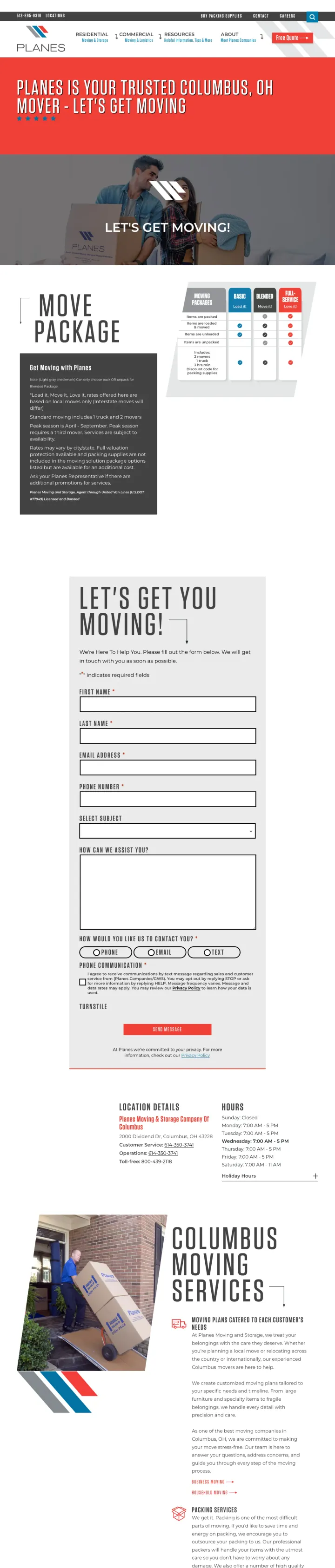
Replace your generic Get A Quote CTA with a 3-tier Moving Packages grid named Basic (Load It), Blended (Move It), and Full-Service (Love It). Planes Moving turns what is normally a fog of pricing unknowns into three labeled options the visitor can point at. The visitor is no longer forced to articulate what kind of move they want; they pick a package that matches their budget and effort tolerance, which short-circuits the most stressful part of the conversation.
Basic (Load It), Blended (Move It), Full-Service (Love It) as 3 branded package names in a horizontal card grid. The naming pattern (verb-it) is playful without being unprofessional, and the progression from Load to Love matches how visitors actually escalate their budget as they realize how much work a move is.
Lets Get Moving as a location-specific hero headline (Columbus OH) paired with a family photo holding moving boxes. The geographic callout answers the local-intent search directly, and the real (if staged) family photo communicates that real humans work at this location.
Residential, Commercial, Resources, About navigation reads as a service-focused top bar. The Resources link tells a visitor still comparing movers that help is available, while the Free Quote button in the top-right handles the visitor who is ready to get a number today -- the split serves both without a nav bar that leaks clicks to dead ends.
The hero family photo is stock-like and the face of the woman is obscured by a diagonal brand stripe. Moving is a category where real faces build more trust than partial-face compositions, and the brand stripe overlay undercuts the humanizing effect.
The 3-package grid sits below the hero rather than being the hero itself. The package system is the best differentiating feature of the page and should be the first thing a visitor sees, not a scroll reward.
2 pages burning ad spend with fundamental issues
Every click to these pages costs real money. We found broken trust signals, mismatched intent, weak CTAs, and messaging that ignores what the searcher actually typed. Here is what to avoid.
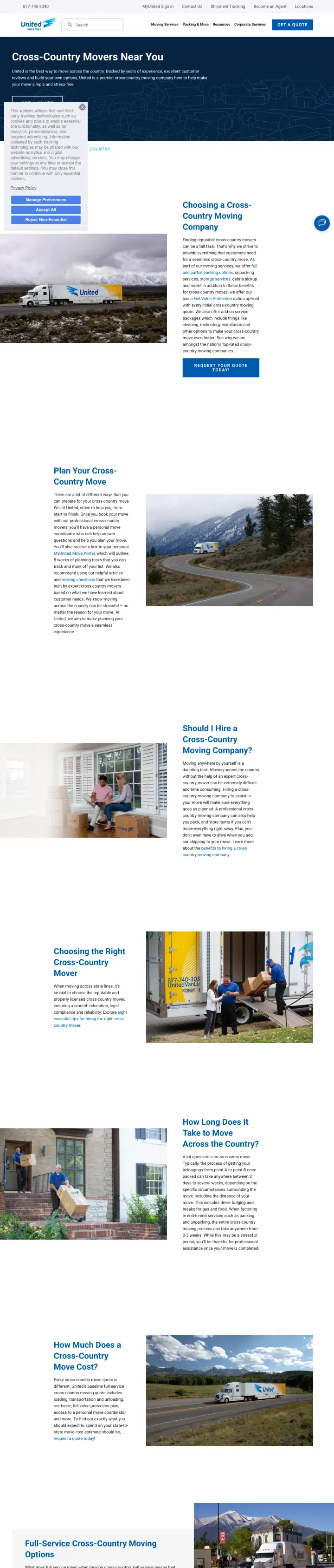
Ad promises White-Glove Moving Services, No Deposits, No Hassles at $20 to $30 CPC, but the landing page loads with a cookie consent panel covering the left third of the viewport and the hero simply says Cross-Country Movers Near You. The phrase No Deposits never appears in the hero, the quote form is a link to a separate page, and the content that does render is a 2,000-word SEO article about cross-country moving timelines. The visitor who clicked a conversion ad lands on what is essentially a blog post.
OneTrust cookie consent panel covers the left third of the viewport on initial load, obscuring the hero headline and blocking the Manage Preferences vs Accept All choice path. Every paid visitor's first action is dismissing a privacy dialog rather than seeing the promise that earned the click.
Ad headline is White-Glove Moving Services, No Deposits, No Hassles but the landing hero says only Cross-Country Movers Near You with no echo of the specific ad promise. The visitor has to scroll and read to re-qualify the offer, which on a considered purchase is too much cognitive effort for a $25 paid click.
Get A Quote button is the only conversion path, and it links to a separate quote page. Every extra click between a $25 paid visit and a form is measurable revenue loss, and the page offers zero embedded form alternatives.
Ad targets branded city searches (two men and a truck columbus ohio, two men and a truck st louis) at a $20 CPC, but the landing page loads with the main navigation menu expanded as a sidebar overlay covering the right half of the desktop viewport. The hero message is partially obscured, the Free Quote CTA is blocked by the menu, and the page is a generic national full-service movers page with zero local relevance for the specific city search that triggered the ad.
Desktop viewport on initial load shows the main nav menu expanded as a full-height sidebar on the right, covering the hero visual and most of the right half of the page. The visitor's first paid impression is a menu overlay that normally only appears on mobile.
Ad targets branded city searches (Columbus Ohio, St Louis) but the page has zero geographic content. A branded city search should route to the local franchise page with local reviews, local phone number, and local crew photos, not a national full-service overview.
Free Quote and Start Your Quote CTAs both trigger consent-management dialogs before loading the quote widget, adding a permission gate between the visitor and the conversion. Two permission prompts in a row is a hard ceiling on form-fill rates.
Safe Ship runs a 3-step instant-quote wizard directly in the hero, collecting pickup and destination ZIPs before a single feature claim. Consumers Buyers Guide does the same with a sticky quote form on the right rail. The losers (United, Mayflower, Atlas) hide the quote behind a Get A Quote butto...
Top10 leads with Excellent 9.6 and Exceptional 9.8 scores per provider. 10BestMovingCompanies shows Trustpilot counts (1,887 reviews, 1,162 reviews) next to each listing. Safe Ship shows 4.55 stars with a visible star bar. Moving is the industry where customers assume every provider is lying abou...
Top10, Consumers Buyers Guide, Best Relocation, and 10BestMovingCompanies all buy the same Best Affordable Movers and Long Distance Movers keywords that United, Mayflower, and Atlas buy. The aggregator pages lead with a numbered list, real scores, and a Get Quote button per provider, so every cli...
Ads promise No Deposits, No Hassles or Best Prices Guaranteed. The pages that repeat these phrases in the hero (Safe Ship, Pods) convert the specific fear the ad triggered into a promise. The pages that do not (United, Mayflower) drop the promise entirely once the visitor lands, forcing them to r...
Winners put an instant-quote form or a real third-party review score above the fold and repeat the ad promise in the hero. Losers lead with brand identity, hide the quote behind a button to another page, and let a cookie banner cover the hero on load..