Free: 96 PPC tools + my AI Playbook book

The person searching 'online MBA programs' is really asking 'will this change my career?' but they'll evaluate your page like they're buying enterprise software. Weird tension. The pages that get it right speak to the dream up top and prove the ROI below.
From real online education / courses Google Ads campaigns in the US
The landing pages actually worth stealing from
So you know exactly what to avoid
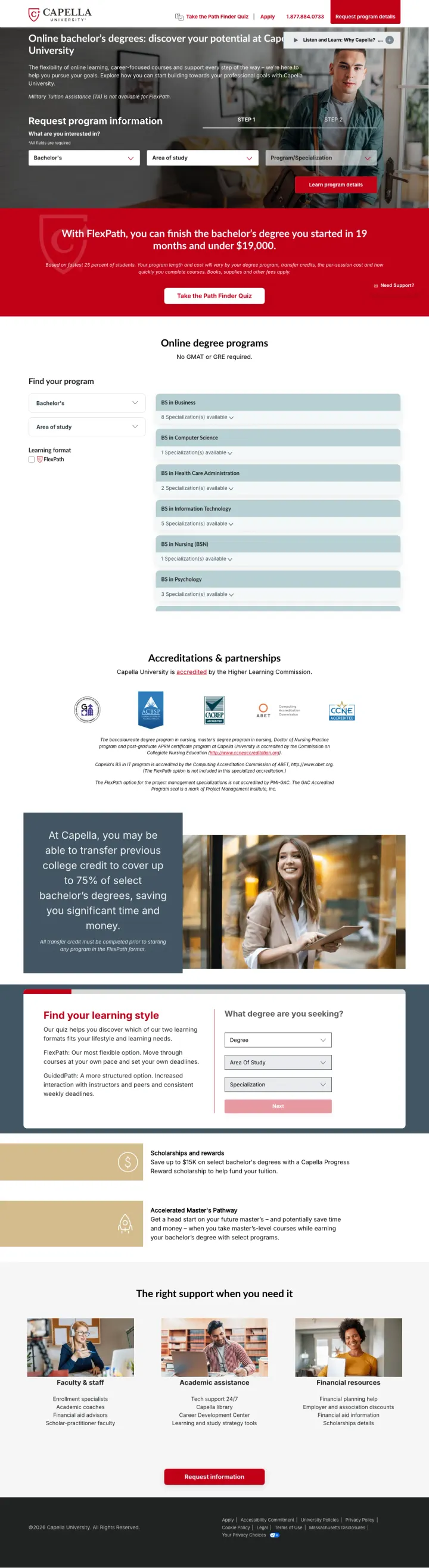
Put your most specific cost-and-timeline claim in a banner immediately below the hero form, so visitors who scroll past the form hit the strongest conversion argument before they can bounce.
FlexPath pricing banner ('finish bachelor's in 19 months and under $19,000') appears immediately below the hero -- this is the single most compelling data point on the page and it catches visitors who scrolled past the form
Two-step form starting with degree level and area of study lets visitors self-qualify before entering personal info, which feels like a program finder rather than a lead capture form
Audio content ('Listen and Learn: Why Capella?') provides an alternative content format for visitors who process information auditorily -- unusual in higher ed and genuinely useful for busy working adults
Hero headline 'Catch What You're Chasing' is aspirational fluff that wastes the most valuable real estate on the page -- the $19K/19-month stat should BE the headline
Accreditation logos (IACBE, CAEP, CCNE) appear far down the page despite accreditation being the #1 concern for online degree seekers
The 'Path Finder Quiz' CTA competes with the main form for attention without clearly differentiating who should use which path
Show your strongest outcome statistic as a massive number (92%, 94%, 85%) with the full survey methodology footnoted -- this serves analytical visitors who check sources and builds more trust than unsourced claims ever could.
Three outcome statistics (92% quality, 94% flexibility, 85% career applicability) each sourced to a specific survey with sample size and response rate -- this level of transparency is rare in education marketing and passes FTC scrutiny
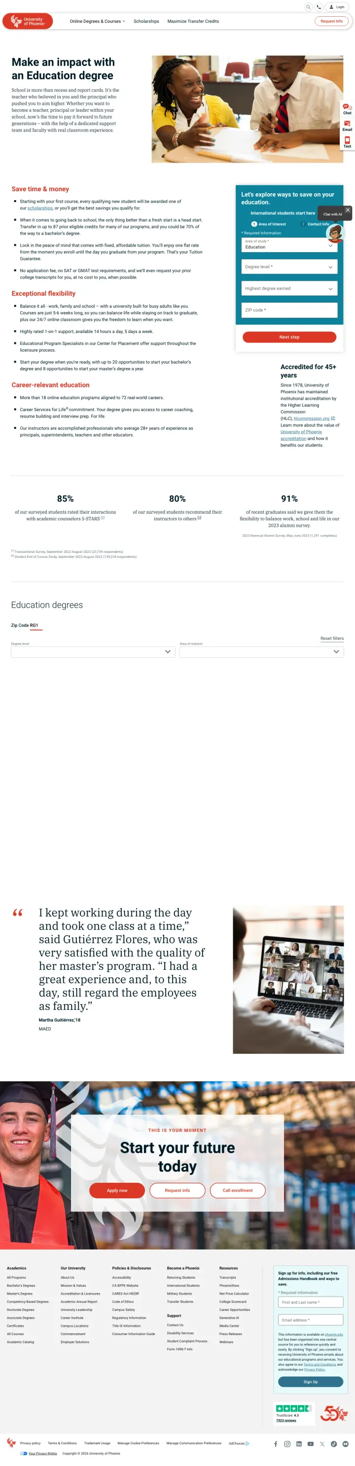
Employer search tool ('Type in the first 3 letters of your employer's name') lets visitors instantly check if their company offers tuition reimbursement -- this directly addresses the cost objection with personalized data
Every 3 credits = $1,300 saved' translates abstract credit transfer into concrete dollar savings, making the transfer process feel like money found rather than paperwork
Hero headline 'Our built-for-real-life model' is institutional messaging that does not match the ad copy ('Online School Education' / 'Earn More') -- the visitor expected earnings data and got a mission statement
The form appears mid-page rather than above the fold, pushed down by the employer search tool and savings messaging
Chat widget, email icon, and text icon stacked on the right side create visual clutter that competes with the main CTA
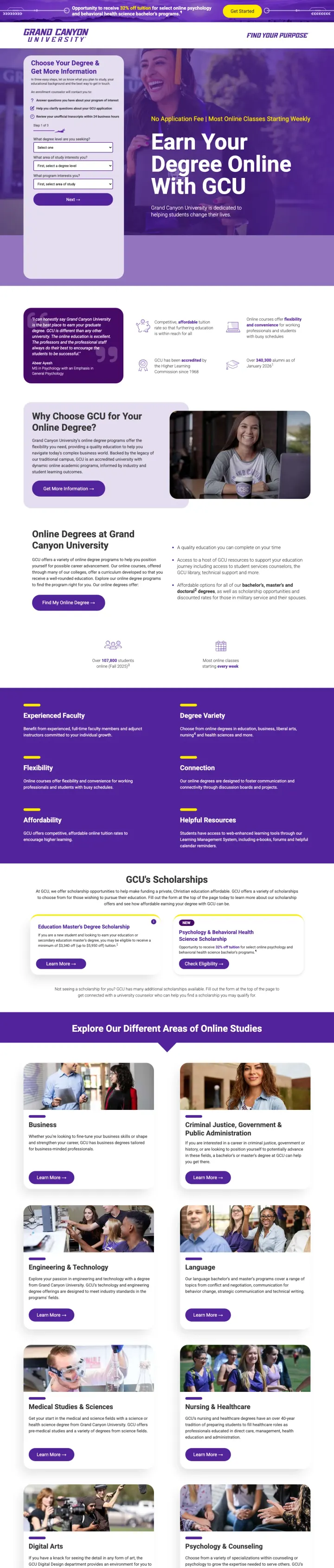
Frame your lead form as a 3-step guided quiz ('Choose Your Degree & Get More Information') with checkmarks showing what the visitor gets at each step -- answer questions, clarify application, review transcripts within 24 hours.
Form copy explains what happens AFTER submission ('An enrollment counselor will: answer questions, help clarify application, review unofficial transcripts within 24 business hours') -- this reduces form anxiety by making the next step concrete rather than mysterious
32% tuition discount banner at the top creates urgency with a specific savings figure rather than vague 'scholarships available' messaging
Hero text combines two power phrases: 'No Application Fee' and 'Most Online Classes Starting Weekly' -- both directly address friction points that stop degree-seekers from taking the first step
The purple overlay on the hero image makes the background photo nearly invisible -- the visual storytelling is sacrificed for brand color consistency
Three dropdown fields ('What degree level', 'What area of study', 'What program') without any pre-selected defaults force cold decision-making from visitors who may not know exactly what they want yet
The page below the fold shifts to a text-heavy layout with long paragraphs about accreditation that could be condensed into badge + one-liner format
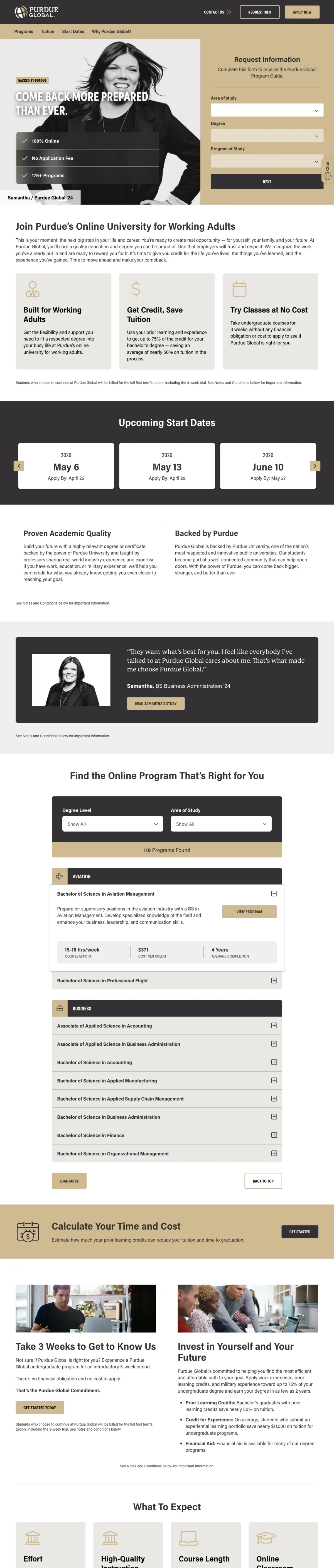
Use a named, photographed graduate ('Samantha / Purdue Global '24') as your hero image instead of stock photography -- it simultaneously proves people actually finish the program and humanizes the online experience.
Hero image shows a real named graduate (Samantha, class of '24) in confident pose with her graduation year -- this is more persuasive than any testimonial because the visitor sees someone who actually completed the program
Three green checkmarks above the fold (100% Online, No Application Fee, 175+ Programs) answer the top three qualifying questions before the visitor even reads the body copy
'Come back more prepared than ever' headline directly targets the career-changer persona who left college previously -- this is not a generic headline, it speaks to a specific emotional state
The form is positioned to the right without a visible submit button in the viewport -- it starts with dropdowns but the 'Next' button requires scrolling down within the form itself
The page runs long with multiple content sections below the fold that repeat the same 'for working adults' message in different ways
'Backed by Purdue' badge is small and easy to miss despite being the single strongest trust signal on the page
For profession-specific search terms, build dedicated pages that use the profession's own language in every headline -- 'MSN Nurse Practitioner' not 'Advanced Healthcare Degree' -- and lead with the number of specializations available.
The savings banner ('Save Up To $9,202 -- Commitment to Completion Grant') with an 'Apply Now' button creates a time-bound financial incentive that gives fence-sitters a reason to act today rather than next month
'Choose from four NP Specializations and Finish in as Few as 3 Semesters' answers both the customization question and the timeline question in a single line -- two major objections resolved in one sentence
'USA's Largest Nursing School' claim in the ad copy is backed by the page showing multiple nursing pathways (RN to BSN, MSN, DNP) -- the breadth of options validates the scale claim
The hero screenshot shows 'MSN Nurse Practitioner' while the ad copy promotes 'RN to BSN' -- the page may be serving multiple nursing ad groups with one URL, creating message mismatch for some visitors
Form asks for graduation year and state before program interest, which feels like qualification screening rather than information gathering
No accreditation badges visible above the fold despite CCNE accreditation being critical for nursing program credibility
Place your entire lead form (all fields through submit button) visible within the first viewport alongside a phone number alternative -- when visitors can see both the form and a call option without scrolling, conversion paths are immediately clear.
The full form (program selector, name, email, phone, zip, and 'Request Info' button) plus 'Or call 800-730-2753' all fit within the above-fold viewport -- zero scrolling needed to convert through either channel
Gold accreditation badges (HLC, AACSB, CAEP) appear immediately below the hero alongside a '150 Years' badge -- stacking institutional age with accreditation creates a legitimacy wall that newer online-only schools cannot replicate
'Support for Military and Military Graduates' section with Yellow Ribbon and Military Friendly badges directly addresses a significant subset of online degree seekers without making the whole page about military
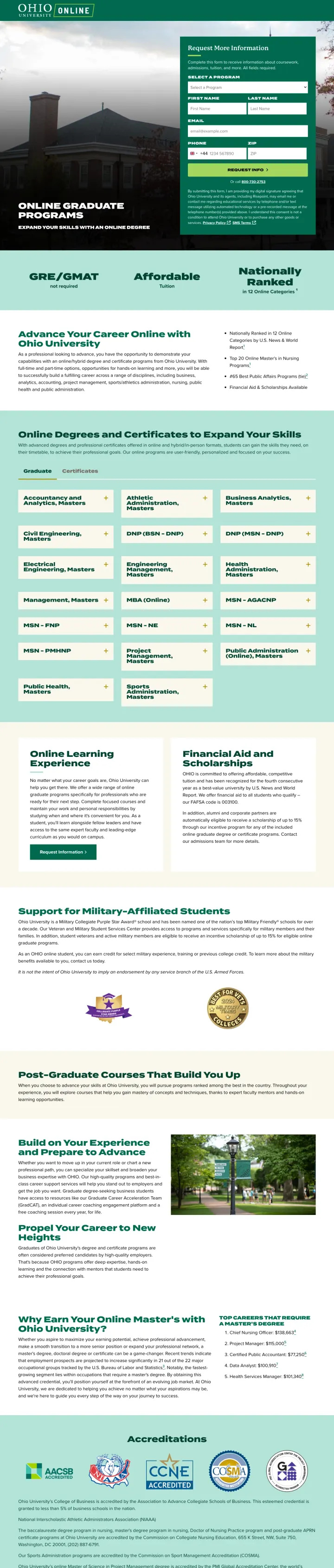
The hero image (a building with an overcast sky) is the least inspiring visual in the entire set -- every competitor shows people, and Ohio shows architecture
Below the fold, the page becomes a dense wall of program listings and text that reads more like a course catalog than a conversion page
'Expand Your Skills With An Online Degree' as the below-fold headline is generic and could appear on any university's page
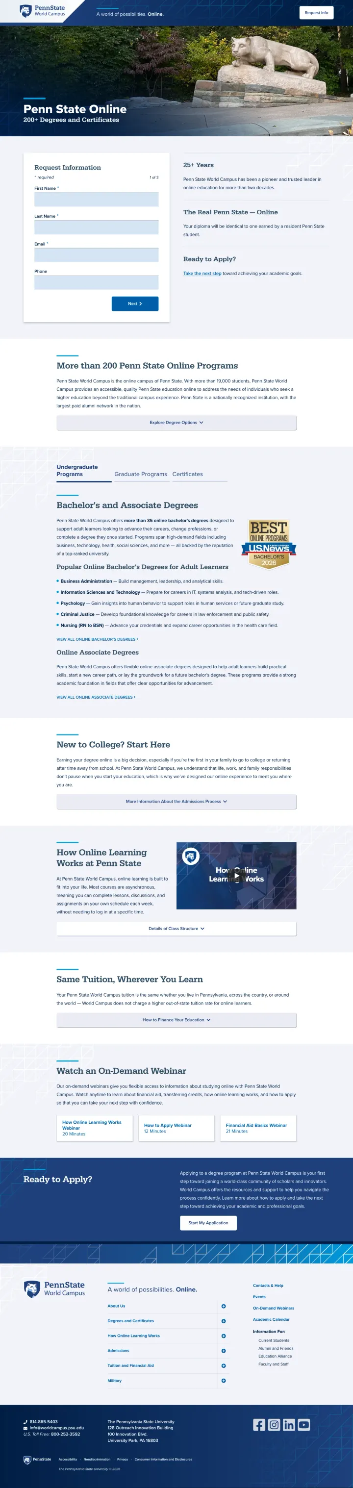
If your university has an iconic campus landmark, use it as the hero image for your online program page -- it instantly communicates 'this is the same institution' and answers the 'is this a real degree?' objection before the visitor reads a word.
'Your diploma will be identical to one earned by a resident Penn State student' is the single most powerful sentence any online program can write -- it directly neutralizes the 'is an online degree as good?' objection with an irrefutable promise
The Nittany Lion statue as the hero image triggers instant brand recognition for anyone who has ever considered Penn State -- it signals 'this is the real thing, not a separate online-only brand'
'25+ Years' of online education experience positioned next to the form gives Penn State a pioneer claim that newer online programs cannot match
The form requires scrolling to reach the submit button -- at Penn State CPCs, every extra scroll before conversion is expensive friction
No specific pricing or tuition information anywhere on the page despite cost being the #3 concern for degree seekers
US News 'Best Online Programs' badge appears far down the page when it should be near the hero to support the 'nationally recognized' URL slug
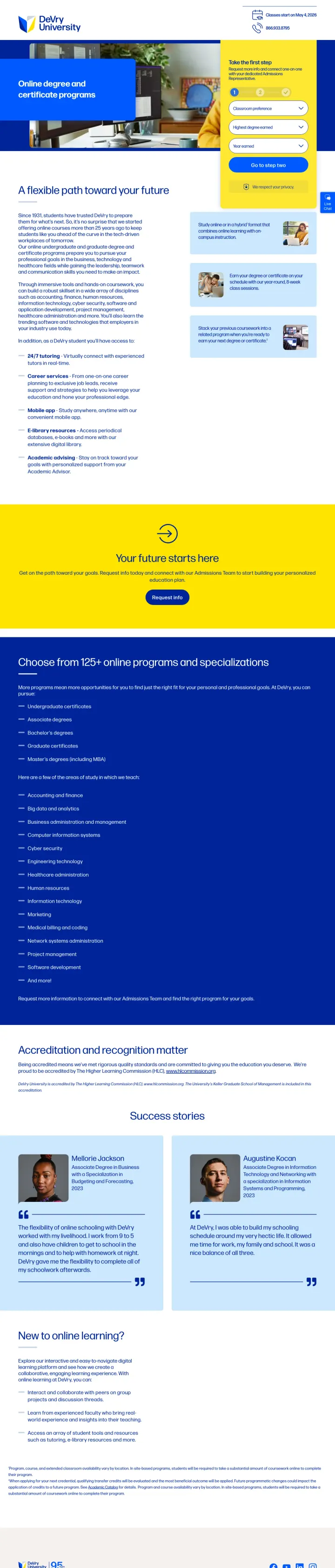
Make your lead form a contrasting color from your brand palette -- DeVry's yellow form against blue creates an impossible-to-miss conversion element that the eye is drawn to before anything else on the page.
Yellow form panel against blue brand palette creates the strongest visual contrast of any form in this set -- the form is the first thing you see, which is exactly what a paid landing page should do
'Since 1931' and 'online courses more than 25 years ago' establish institutional longevity without making it the headline -- it is proof of staying power, woven into the narrative rather than shouted
Two real student success stories with photos and names (visible below the fold) prove outcomes through specific individuals rather than aggregate statistics
Hero headline 'Online degree and certificate programs' is purely descriptive -- it tells the visitor what the page is about rather than why DeVry specifically
'Classes start on May 4, 2026' is useful urgency but it is small text in the header rather than a prominent countdown or banner element
The page lists 120+ programs as expandable text lists below the fold, making it feel more like a catalog page than a conversion-focused landing page
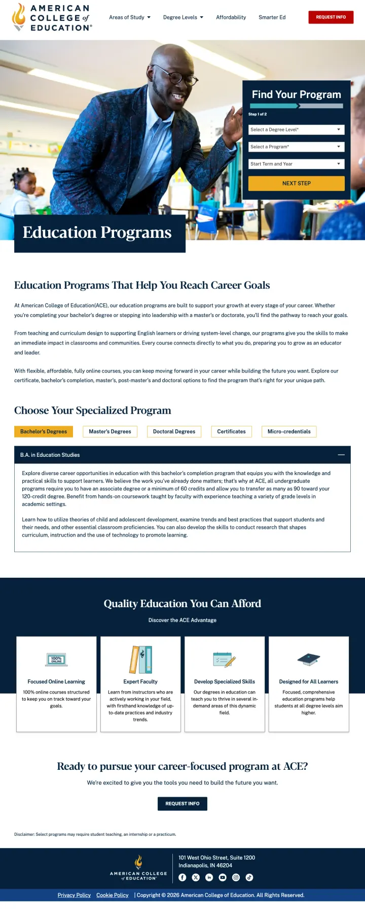
When your price is genuinely lower than competitors, make it the ad headline AND the page headline -- ACE's '$10,000 M.Ed.' is so far below market rate that it becomes the entire selling proposition.
Ad copy leads with '$10,000 M.Ed.' and the page delivers education-specific programs -- this is the tightest price-to-page match in the set, and at education CPCs the direct message match saves every penny
Real classroom photography (a teacher interacting with students in what looks like an actual classroom) signals 'we understand the education profession' rather than generic campus stock
Program browser below the fold with tabs for Bachelor's, Master's, Doctoral, Certificates, and Micro-credentials lets visitors self-sort into their education level without leaving the page
The $10,000 price from the ad copy is not visible above the fold on the landing page -- it appears in 'Quality Education You Can Afford' section well below the form, wasting the strongest message match
'Find Your Program' form uses the same stepped approach as competitors but without explaining what happens after submission
The page headline is just 'Education Programs' -- the most generic possible title for a page that has a killer price story to tell
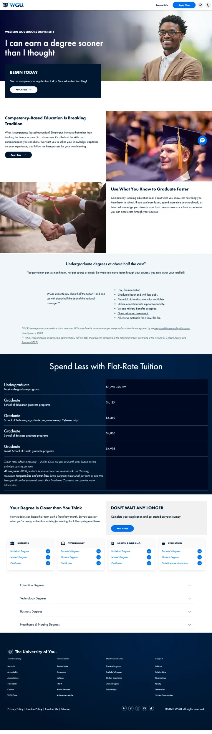
Publish a complete tuition table by program area showing per-term costs alongside a 'tuition covers unlimited courses per term' disclaimer -- radical transparency on cost is the single biggest differentiator when every competitor hides behind 'request info for pricing.'
Full tuition table showing exact per-term costs by program ($3,760-$5,325 undergrad, $4,125-$4,995 grad) with the 'unlimited courses per term' model explained -- this is the most transparent pricing in the entire set
'I can earn a degree sooner than I thought' headline uses first person to put words in the visitor's mouth -- it frames the page as validation of what the visitor was hoping was true
Competency-based education explained simply: 'it is all about the skills and comprehension you can show' -- this demystifies WGU's unusual model without jargon
No form anywhere on the page -- the only conversion path is 'Apply Free' buttons, which is a much higher commitment than 'Request Info' for someone still researching
The tuition table appears below two full content sections, requiring significant scrolling to reach the strongest conversion argument on the page
'Begin Today' section feels rushed -- 'Your education is calling!' is fluff that could be replaced with a specific start date or timeline
Pages that break the playbook in interesting ways
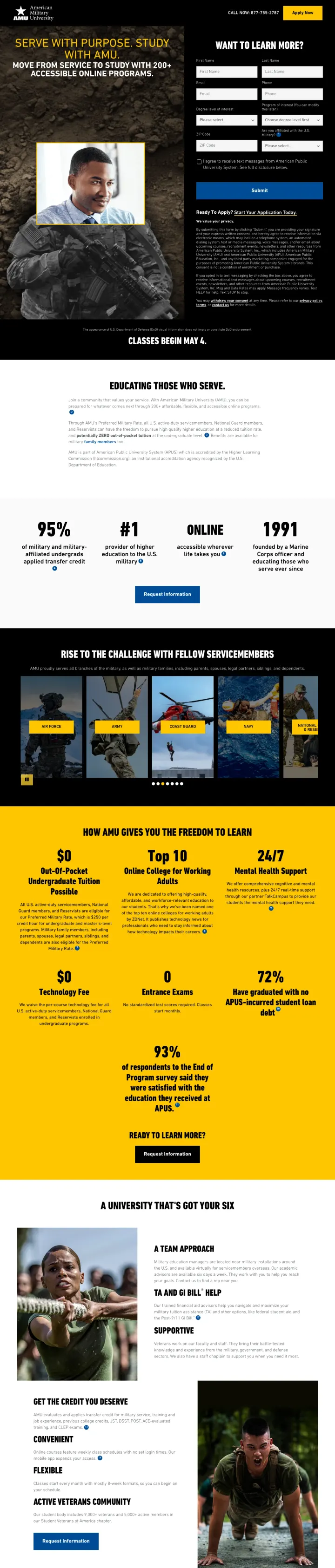
This page breaks the rule that landing pages should appeal broadly. AMU deliberately excludes civilians with military imagery, military language ('Serve with purpose. Study with AMU.', 'Move from service to study'), and a military affiliation dropdown on the form. By rejecting 80% of the market, it becomes the obvious choice for the 20% it serves. This only works because military education benefits create a distinct buyer with different objections (Will my TA cover this? Is this DoD-approved? Can I study during deployment?) that generic education pages never address.
'#1 Provider of Higher Education to the U.S. Military' in the ad copy is a category-of-one claim that no competitor can match -- and the page delivers on it with military-specific trust signals throughout
Military affiliation dropdown on the form ('Are you affiliated with the U.S. Military?') immediately segments the audience and likely triggers different follow-up sequences for active duty vs. veterans vs. spouses
Stats row (95%, #1, 100,000, 1991) creates a rapid-fire proof wall: completion rate, market position, total students, founding year -- four numbers that tell the entire story in one line
Dark textured background with overlaid text creates readability issues in several sections -- military does not mean the page needs to look like a bunker
The form asks for 7 fields plus a dropdown plus a checkbox before submission -- for military personnel who may be filling this out on a phone during downtime, that is a lot of friction
Below-fold content gets repetitive with multiple sections restating the military education value proposition in slightly different ways
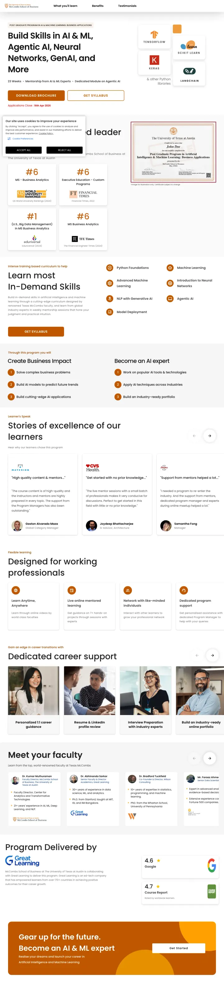
This page breaks the standard education landing page rule by having zero form fields visible. Instead of asking for information, it gives information: 'Download Brochure' and 'Get Syllabus' are the primary CTAs. For a 23-week, $3,000+ professional certificate aimed at working professionals, the page bets that a tech-savvy AI/ML audience will self-select through content rather than being funneled through a form. The technology tool logos (TensorFlow, Keras, Python) act as trust signals that speak directly to practitioners who know these tools.
Technology tool logos (TensorFlow, Keras, Python, etc.) above the fold serve as trust signals that resonate specifically with the technical audience -- a practitioner sees these and immediately knows the curriculum is current and hands-on
'Applications Close: 16th Apr 2026' creates genuine urgency with a real deadline rather than fake countdown timers -- this is scarcity that cannot be dismissed as marketing
Learner testimonials ('Stories of excellence of our learners') with career context and photos provide social proof from the exact persona the page targets -- working professionals who completed the program while employed
No conversion form anywhere on the page -- 'Download Brochure' and 'Get Syllabus' both likely lead to a form on another page, adding friction and losing the visitor from this landing page entirely
The UT Austin McCombs branding is relatively subtle for an institution that ranks #6 in multiple analytics categories -- the rankings appear below the fold when they could anchor the hero
The above-fold content is partially obscured on first load, blocking the program description and technology tool logos that serve as key trust signals for technical visitors
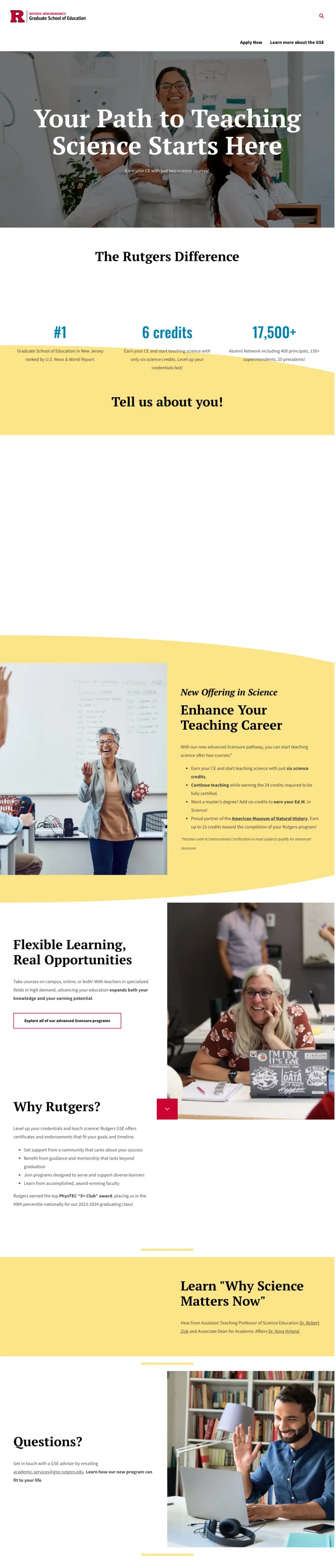
This page breaks the rule that education landing pages need long-form content. It is a short, focused page for an extremely specific audience: career-changers who want to teach science in New Jersey through a 24-credit certification pathway. The headline 'Your Path to Teaching Science Starts Here' and subhead 'Earn your CE with just two science courses!' speak to a person who has already decided they want to teach science -- the page only needs to confirm Rutgers offers what they are looking for and make it easy to act. When your audience is this narrow, less content is more.
'Earn your CE with just two science courses!' is the most specific, least generic headline in the entire set -- it tells a career-changer exactly how close they are to their goal, making the pathway feel achievable rather than daunting
The 'Tell us about you!' section with minimal fields respects the visitor's time -- for a niche pathway page, the form does not need 7 qualifying fields
Real classroom photography of a science teacher with students in lab coats creates immediate context identification -- the visitor can picture themselves in this role
No form visible above the fold -- the page relies on 'Apply Now' and 'Learn more about the GSE' text links rather than an embedded form
No pricing or financial information for the 24-credit pathway despite cost being a major concern for career-changers investing in a new certification
The page is so short and sparse that it may not provide enough information for the analytical visitor who needs to compare Rutgers against other NJ teaching certification programs
3 pages burning ad spend with fundamental issues
Every click to these pages costs real money. We found broken trust signals, mismatched intent, weak CTAs, and messaging that ignores what the searcher actually typed. Here is what to avoid.
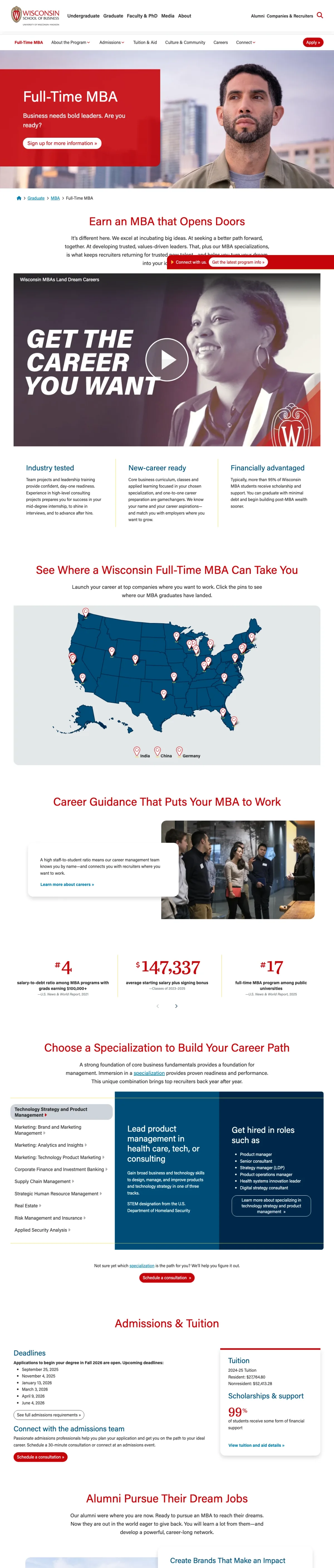
Ad promises '$147K Avg. Base Salary + Bonus' and 'Earn An MBA That Opens Doors' but the paid click lands on a full website page with complete navigation (Undergraduate, Graduate, PhD, Professional Development, Faculty, Research, Industry Engagement) and breadcrumb trail. The headline 'Earn an MBA that Opens Doors' appears below a scrolled viewport showing a random content section. At MBA CPCs ($50-100+), every click that hits this unfocused page wastes budget on a visitor who can navigate to 8+ other sections instead of converting.
Full site navigation with 8 dropdown menus gives paid traffic unlimited exit paths -- at MBA CPCs this is burning $50+ per escaped visitor
The ad's strongest claim ($147K salary) does not appear above the fold on the page -- the visitor who clicked specifically for salary data has to hunt for it
The viewport screenshot shows the page scrolled past the hero to a random mid-section -- if this is how visitors land, they miss the program positioning entirely
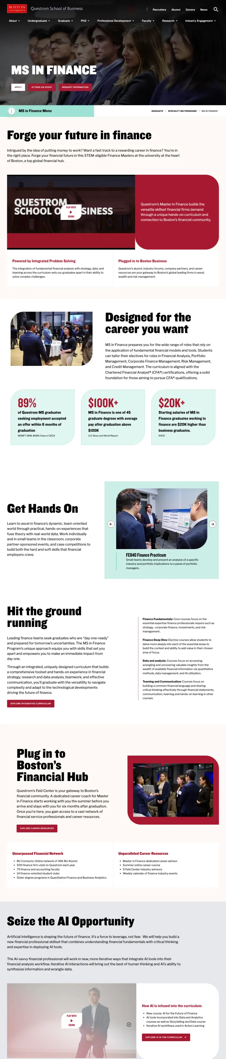
Ad says 'Apply To The MS in Finance' and 'BUild Your Future in Finance' but the click lands on the full Questrom School of Business website with complete navigation (About, Undergraduate, Graduate, PhD, Professional Development, Faculty, Research, Industry Engagement, Recruiters, Alumni, Donors, News). The page has real content -- STEM eligibility, 10-month program length, multiple CTAs -- but the full navigation provides 12+ exit paths before the visitor reaches any of them. At MS Finance CPCs ($30-60+), each click is paying for access to the entire Boston University website rather than a conversion-focused experience.
Full website navigation with 8 top-level menus plus sub-menus gives visitors more ways to leave than to convert -- and every departure is a wasted click at MS Finance CPCs
The ad's strongest hook ('BUild Your Future in Finance') uses clever brand wordplay but the landing page opens with 'MS IN FINANCE' as a flat descriptor rather than carrying the brand voice forward
'MS in Finance Menu' sticky bar appears below the hero CTAs, adding another navigation layer that can pull visitors away from the primary conversion path
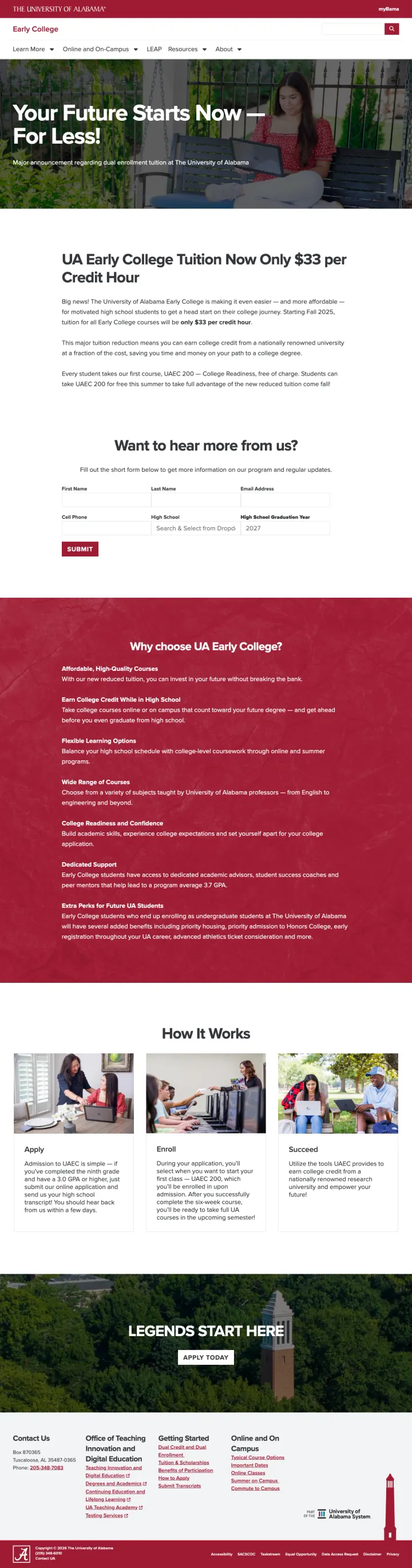
Ad targets 'High school students can earn college credit through UA for just $33 per credit hour' but the landing page is a content page with full site navigation (Learn More, Online and On-Campus, LEAP, Resources, About) and a search bar. The form mid-page asks for contact info but does not appear until after multiple paragraphs of text about tuition pricing changes. For a niche dual-enrollment audience, the page does not even explain HOW to enroll -- it just announces the price drop. Any paid click here is paying for an announcement page, not a conversion page.
Full site navigation plus a search bar on a paid landing page gives the visitor every reason to browse rather than convert
The 'Want to hear more from us?' form appears mid-page after several paragraphs and requires scrolling -- at the moment a parent or student decides to act, they have to search for the form
The page reads like a press release about a tuition change rather than a call to action -- 'Major announcement regarding dual enrollment tuition' is news copy, not conversion copy
The strongest pages (GCU, Capella, ACE, DeVry, Purdue Global) use stepped forms that start with program interest before asking for name and email. This works because the visitor feels like they are getting personalized results rather than submitting to a sales funnel. The 'Step 1 of 2' pattern re...
Capella's '$19,000 for a bachelor's in 19 months' and WGU's '$3,760-$5,325 per term' give the analytical visitor something concrete to compare. Phoenix's 'every 3 credits earned means $1,300 saved' translates abstract transfer credits into dollars. Meanwhile, pages saying 'affordable' or 'scholar...
Nearly every page shows accreditation (HLC, WASC, regional accreditors) somewhere. The pages that win put accreditation in the first scroll alongside outcome stats. The pages that lose bury accreditation in the footer or a section visitors never reach. For degree seekers where 'is this legit?' is...
Phoenix shows '92% believe it provides high-quality education' with the exact survey methodology footnoted (1,542 respondents, June-July 2025). This passes the FTC scrutiny test and serves the Blue analytical persona who will check the asterisk. Pages making vague outcome claims without sourcing ...
Winners treat their landing page as a purpose-built conversion tool: stripped navigation, stepped forms, specific cost figures, accreditation above the fold, and outcome data with sourced methodology. Losers send paid traffic to full website pages with complete navigation menus, no form above the fold, vague 'transform your future' messaging, and zero pricing.