Free: 96 PPC tools + my AI Playbook book

PI clicks cost $200-$1,000 each. And the person clicking is probably injured, scared, maybe on their phone from a hospital. They're not calmly comparing firms. They need to feel 'these people will fight for me' in like 3 seconds flat. Corporate brochure pages just don't cut it here.
From real personal injury law Google Ads campaigns in the US
The landing pages actually worth stealing from
So you know exactly what to avoid
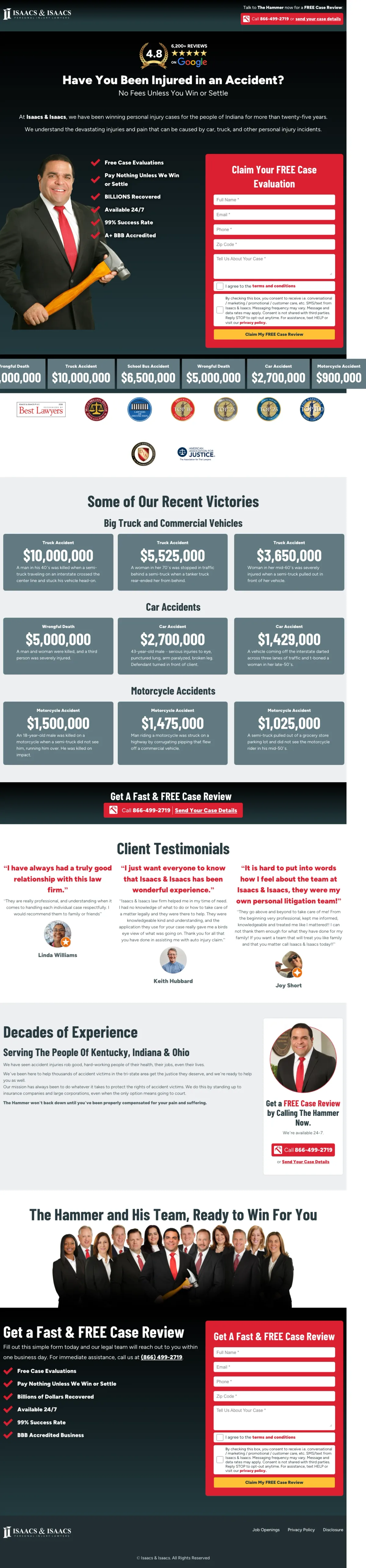
Lead with Google review count (6,200+ reviews at 4.8 stars) as the very first element above the hero headline -- puts social proof before the visitor even reads the value proposition.
Checklist-style benefit list next to the form (Free Case Evaluations, Pay Nothing Unless We Win, BILLIONS Recovered, 99% Success Rate) gives the visitor 5 reasons to fill out the form while they are literally looking at the form fields
Named attorney photo ('Darryl The Hammer Isaacs') with personal brand identity creates instant TV-commercial recognition for visitors who have seen the ads, reducing the trust gap to zero
Settlement ticker showing specific case types with dollar amounts ($8M Big Truck, $2.7M Car Accident, $1.47M Motorcycle) lets visitors find their exact accident type and see what it paid out
The form asks only for name, email, phone -- no case type selector, which means intake staff must qualify every lead manually and the visitor gets no signal that their specific injury type is handled
Dark background with red accents feels aggressive rather than empathetic -- may alienate the Green persona visitors who are scared and want reassurance, not a fighter
Client testimonials section is text-heavy with no photos or video -- at this CPC level, real client faces or video testimonials would dramatically increase credibility
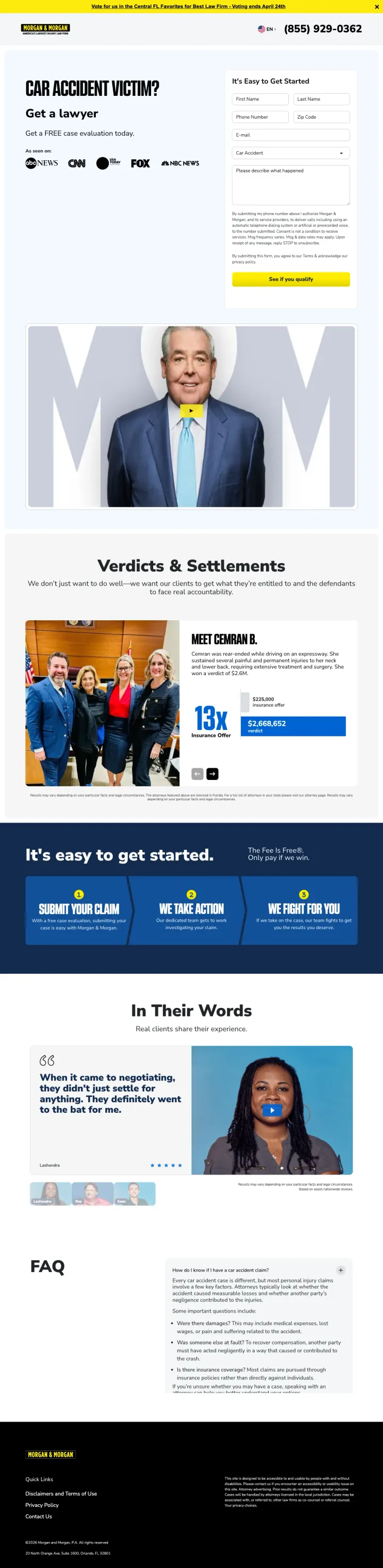
Media logo strip (CNN, NBC, FOX, NBC News) directly under the headline as 'As Seen On' social proof -- these logos do more trust-building in 1 second than a paragraph of credentials.
Case type dropdown in the form ('Car Accident' pre-selected) immediately qualifies the lead and tells the visitor this page is specifically about their problem -- not a generic PI page
Three-step process section ('Submit Your Claim / We Take Action / We Fight For You') reduces the perceived complexity of hiring a lawyer to three simple steps, directly addressing the fear that legal processes are overwhelming
Specific client verdict with named person ('Matt Simmons B. -- 13x more than insurance company offered') makes the result tangible and personal rather than just a dollar figure
The hero section has no settlement amount or total recovered figure above the fold -- for a firm that has recovered billions, burying this below the fold misses the #1 question PI visitors have
Yellow brand color is unusual for legal -- while distinctive, it may undercut the authority and seriousness that PI visitors expect from a firm handling their life-changing case
The form's legal disclaimer text beneath the submit button is dense and may cause hesitation -- 'By submitting my phone number I authorize...' reads like a terms-of-service trap
Inline intake form at the bottom of the hero with case-specific fields (Injury Month, Injury Year, Injury Type dropdown) -- this pre-qualifies leads before they even hit submit and signals that the firm takes truck cases seriously enough to build a custom intake process.
Grid of individual settlement amounts ($3M, $1.4M, $2.5M, $1.8M, etc.) each labeled by case type creates a visual 'menu' of outcomes that lets the visitor find a case similar to theirs and see exactly what it settled for
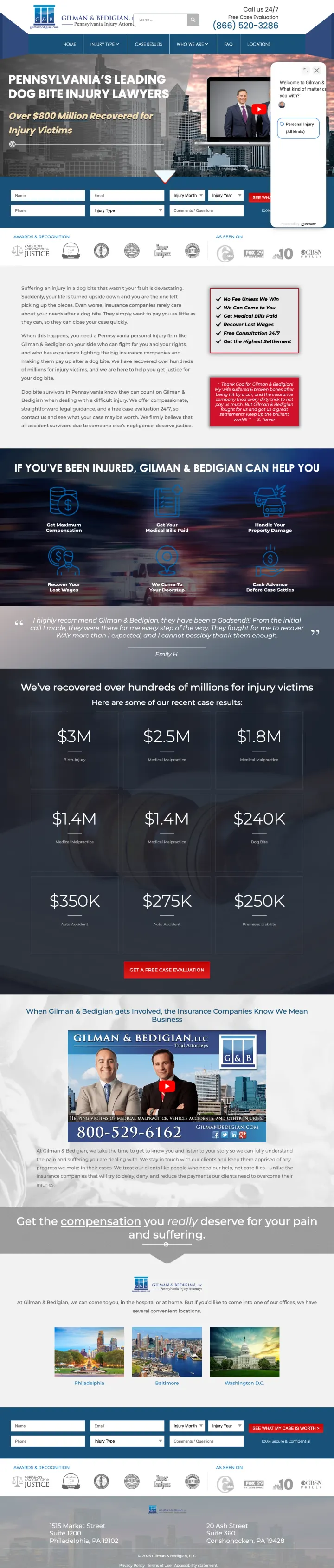
City skyline hero photo (Philadelphia) with specific geographic targeting in the headline ('Pennsylvania's Leading Truck Accident Injury Lawyers') creates local relevance that national firms cannot match
Awards & Recognition badges immediately below the hero (Super Lawyers, ABA, AVVO) stack institutional credibility before the visitor has to scroll
Chat widget popup partially obscures the intake form fields on first load -- a paid visitor seeing a chatbot cover the form they came to fill out may bounce rather than close the popup
No contingency fee messaging visible above the fold -- 'No Fee Unless We Win' is the #2 customer priority and it is missing from the first screen
The hero heading uses italic styling for 'Over $800 Million Recovered' which actually reduces visual impact -- bold or oversized type would make this number hit harder
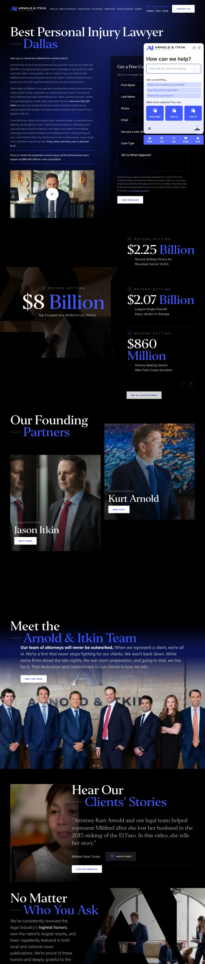
AI-powered chat widget with suggested questions ('What kind of cases do you handle?', 'How long will my case take?', 'What is my case worth?') directly addresses the top 3 PI visitor questions without requiring them to type anything.
Multi-channel contact bar at bottom of screen (Book Appt, Text Us, Call Us, Email, Chat) offers 5 distinct conversion paths simultaneously -- recognizes that different visitors prefer different communication channels and removes all friction to first contact
'Top 3 Largest Jury Verdict in U.S. History' as the opening headline is not a generic claim but a verifiable, specific superlative that immediately positions the firm above every competitor the visitor is comparing
Dark cinematic design with blue-black palette and team photography creates a premium feel that matches the gravity of multi-million dollar injury cases -- the visual weight signals 'we handle serious cases, not fender benders'
The chat widget and the form compete for the same screen real estate on desktop -- the chatbot opens over the form fields, forcing the visitor to choose between two conversion paths that should complement each other
Left column is a wall of text explaining the firm's philosophy -- at $100+ per click for Dallas PI keywords, nobody is reading three paragraphs before deciding to call
No contingency fee messaging visible anywhere above the fold -- 'you don't pay unless we win' is buried while the firm's resume takes center stage
Real 18-wheeler truck photo in the hero background with attorneys standing in front of it -- visually communicates 'we handle truck accidents specifically' faster than any headline could, and creates an immediate emotional connection for someone who was just hit by a truck.
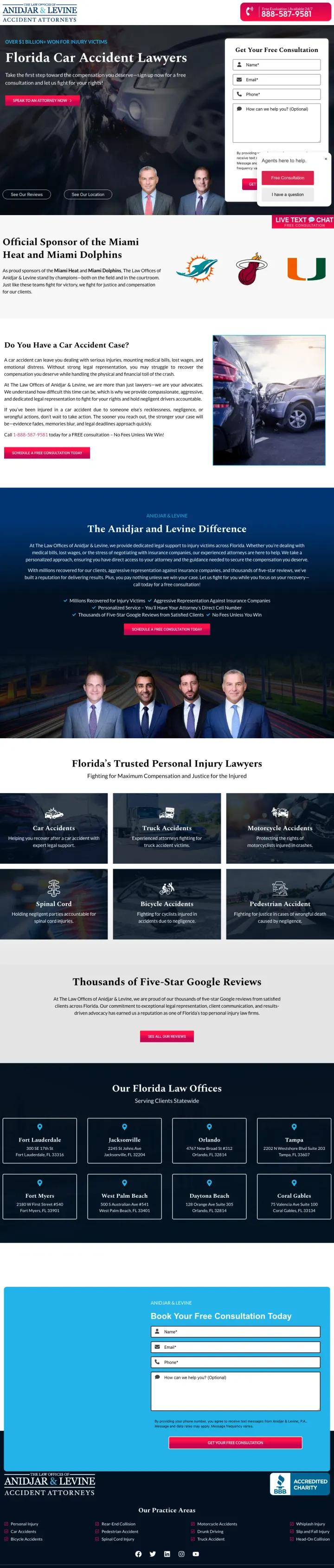
Sports sponsorship badges ('Official Sponsor of the Miami Heat and Miami Dolphins') serve as an unconventional trust signal -- they communicate financial stability and local roots without the typical lawyer award badges that every competitor uses
Live text and chat button ('LIVE TEXT & CHAT - FREE CONSULTATION') fixed to bottom-right offers an immediate low-commitment path for visitors who are not ready to call or fill out a form
'Speak to an Attorney Now' red CTA button below the headline text creates urgency without fake countdown timers -- the word 'Now' combined with the red color is a natural urgency cue
Three competing conversion widgets on screen simultaneously (form, chat popup, live text button) create decision paralysis -- the visitor sees three different ways to reach out and may hesitate on all of them
The '$1 Billion+ Won' claim is in small text above the headline rather than being the headline itself -- burying the most powerful trust signal in a subhead wastes its impact
Form placement in the right column competes with the 'Agents here to help' chat popup that loads on top of it -- the chat widget literally covers the form on first load
Intaker chatbot with clickable case type buttons (Car Accident, Workers' Comp, Slip & Fall, Other Injuries) as the primary conversion mechanism -- turns lead intake into a guided conversation rather than a form, which feels more personal for someone who just got hurt.
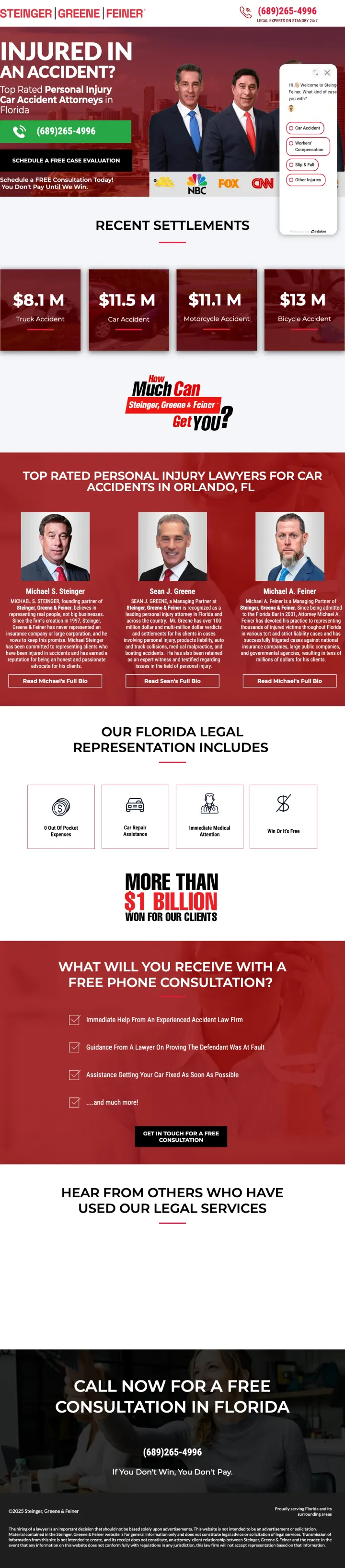
Settlement amounts displayed as a horizontal scrolling ticker ($8.1M, $11.5M, $11.1M, $13M) with case types creates a casino-style 'jackpot' visual that answers 'how much is my case worth' with aspirational numbers
'More Than $1 Billion Won For Our Clients' displayed as a large graphic element mid-page reinforces the firm's track record at the exact scroll point where visitors might start comparing other firms
Named attorneys grid with individual photos, titles, and specializations gives the visitor a sense of team depth -- important because PI clients worry about being handed off to a junior associate
The chatbot popup covers a significant portion of the hero on load, partially obscuring the headline and phone number -- the first thing a $100+ click visitor sees is a widget asking them to select a case type before they have even read what the firm offers
Bold red color scheme with all-caps headlines ('INJURED IN AN ACCIDENT?') feels aggressive and may overwhelm visitors who are already stressed and in pain
'What Will You Receive With A Free Phone Consultation?' section promises benefits but is buried below multiple scrolls -- this content should be condensed into the hero area
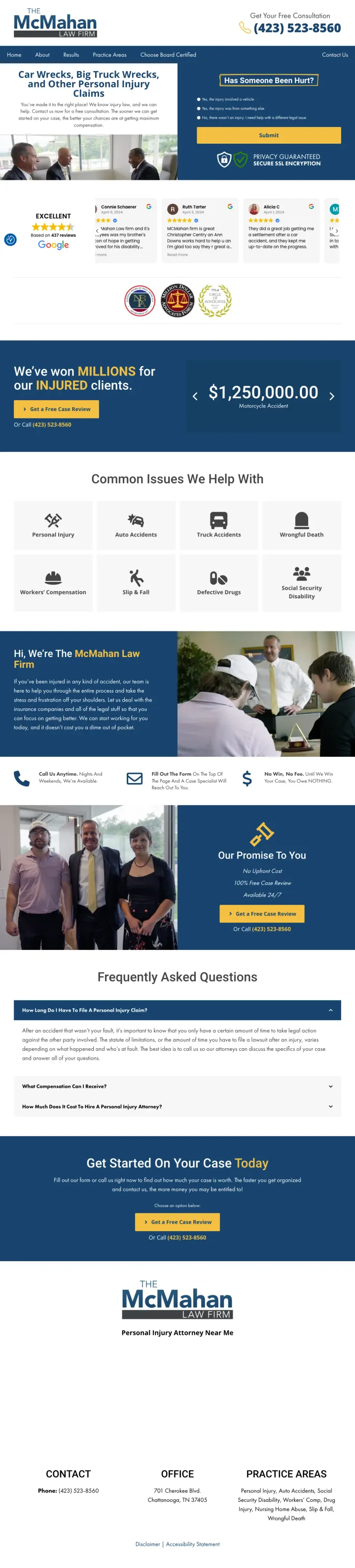
Triage-style intake form ('Has Someone Been Hurt?') with radio buttons for injury context (vehicle, something else, different legal issue) -- qualifies the lead AND creates an empathetic entry point by asking about the person's situation before asking for contact info.
Google Reviews carousel with 437 reviews at 'EXCELLENT' rating directly below the hero -- real reviews with reviewer names and dates are more credible than an abstract star rating, and the carousel lets visitors scroll through them like a social feed
'Privacy Guaranteed - Secure SSL Encryption' badge next to the form submit button directly addresses the fear that personal injury details shared online might not be private -- a concern unique to legal intake that most PI pages ignore
First-name basis attorney branding ('Jay & Brent got an injured client $8,000,000') creates a personal relationship feel that large firms cannot replicate
Minimal navigation menu (Home, About, Results, Practice Areas, Choose Board Certified, Contact Us) still provides exit paths that a dedicated PPC landing page should eliminate
The $1,250,000 settlement showcase below the fold uses a single figure instead of the settlement grid approach that top performers use -- one number is less convincing than a grid showing multiple case types
The 'Choose Board Certified' nav link is a strong trust signal buried as a navigation item instead of being featured prominently in the hero or trust bar
Case type dropdown selector ('What type of accident were you in?') as the first form field before name/phone -- leads with the visitor's situation rather than their contact info, which feels consultative rather than salesy.
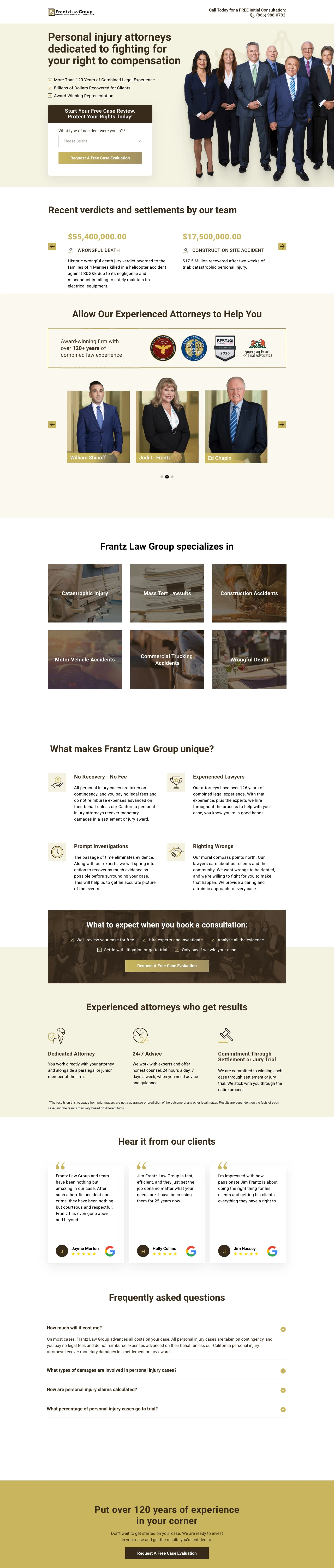
Full team photo showing 8+ attorneys in professional attire creates a visual 'depth of bench' signal that solo practitioners and small firms cannot match -- the visitor sees an army of lawyers who could work on their case
Settlement grid with exact dollar figures ($55,400,000 / $17,500,000 / $5,000,000) and the precision of including cents ($55,400,000.00) communicates that these are real, verified settlement amounts rather than rounded marketing numbers
FAQ section addressing specific objections ('How long will my case take?', 'What if I was partially at fault?') pre-empts the exact questions the brief identifies as top visitor concerns
Warm beige/cream color palette feels more like a real estate firm than a personal injury powerhouse -- the design undersells the $55M verdict that should dominate the visual hierarchy
'126 years of combined legal experience' is a vague claim that could mean 12 lawyers with 10 years each or 3 lawyers with 42 years each -- specific individual credentials would be more persuasive
The hero has no phone number or click-to-call -- only the form. Crisis-mode visitors (calling from accident scenes) have to look at the very top of the page for the phone number
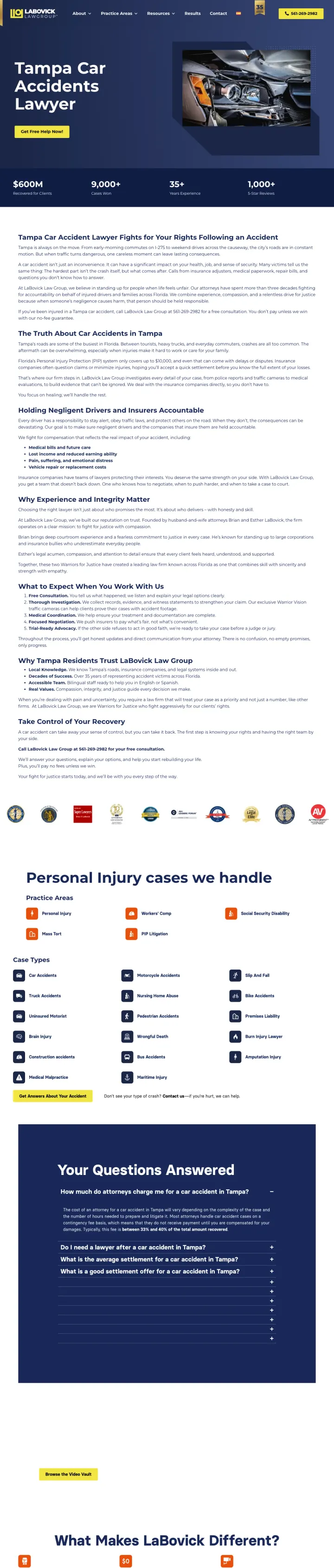
FAQ section specifically about Tampa car accidents ('The Truth About Car Accidents in Tampa') with local statistics and Florida-specific legal information -- creates hyper-local relevance that national firms cannot replicate.
Stats bar ($600M Recovered, 9,000+ Cases Won, 35+ Years Experience, 1,000+ Five Star Reviews) immediately below the hero hits all four trust dimensions (money, volume, experience, social proof) in a single horizontal strip
'We See Traffic Camera Footage' ad copy headline is a brilliant differentiator -- it tells the visitor this firm has a capability their competitors do not, directly addressing evidence preservation which is the #1 tactical concern after a car accident
Local content strategy with Tampa-specific accident statistics and Florida insurance law references turns the landing page into a local resource rather than a generic PI page
The hero image is a car wreck stock photo that feels generic despite the Tampa-specific content -- a real Tampa intersection or local landmark would reinforce the geo-targeting
The page is long with dense text sections about Tampa accident statistics -- this contradicts the brief's guidance that PI visitors are in crisis mode and need confidence fast, not a research paper
No attorney photos or names visible above the fold -- the page leads with the firm brand rather than a named advocate
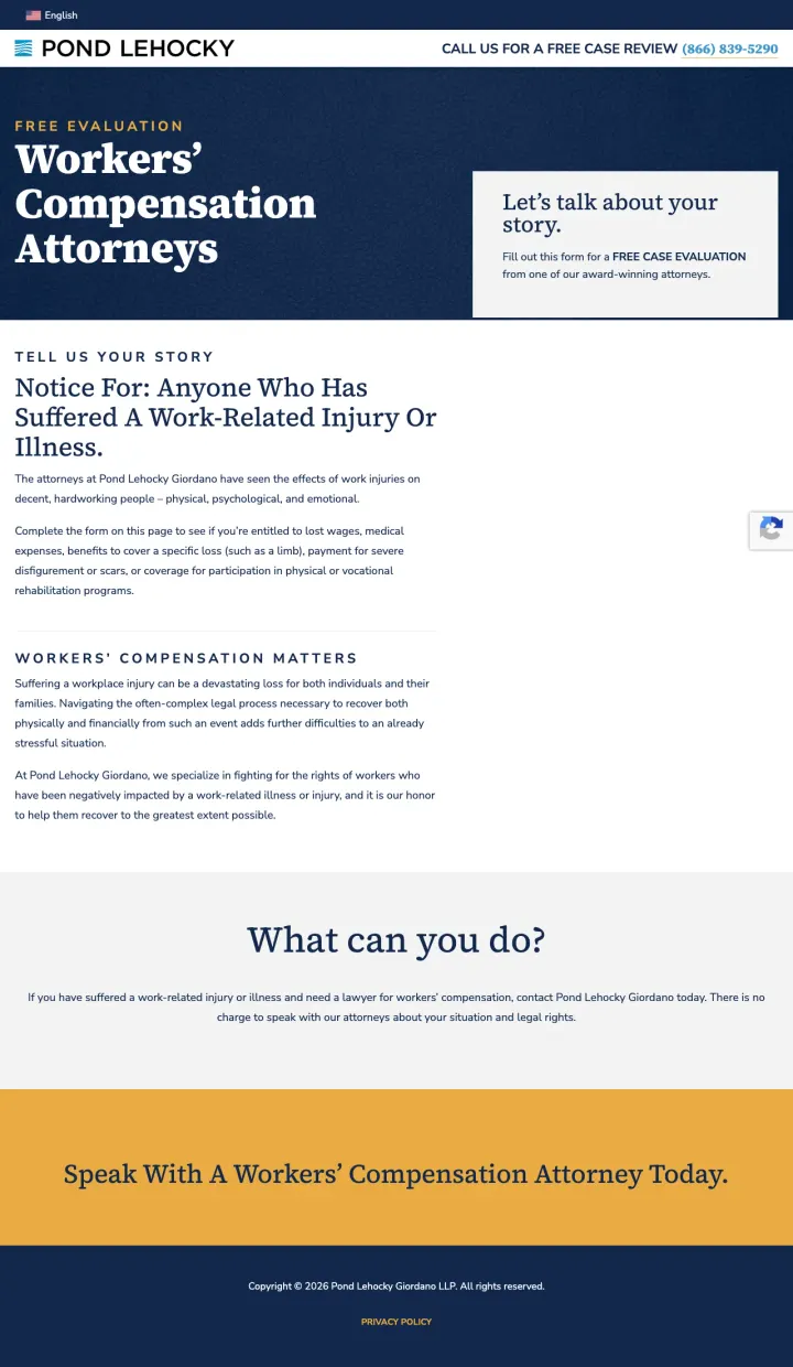
Class-action-style notice framing ('Notice For: Anyone who has suffered a work-related injury or illness') creates urgency by making the visitor feel they might be part of a larger group of victims -- a psychological framing device borrowed from mass tort advertising.
Narrative-driven form header ('Tell Us Your Story' / 'Let's talk about your story') reframes the intake form from a data collection exercise into an empathetic conversation -- for a workers' comp victim who feels powerless against their employer, being invited to tell their story is emotionally powerful
Zero-distraction page design with no navigation, no footer links, no social media icons -- every pixel serves the single goal of getting the visitor to fill out the form. This is the purest PPC landing page in the dataset
Language toggle (English flag visible) at the very top signals inclusivity for non-English speakers without taking up hero real estate
No settlement amounts, no case results, no dollar figures anywhere on the page -- for a visitor trying to decide if hiring a workers' comp lawyer is worth the effort, seeing that other workers recovered significant settlements is the #1 motivator
No attorney photos or names -- the page is entirely anonymous, which is the opposite of what PI/workers' comp visitors need (they want to know WHO will fight for them)
The form itself is not visible above the fold -- the visitor sees the headline and notice text but has to scroll to find where to actually submit their information
Pages that break the playbook in interesting ways
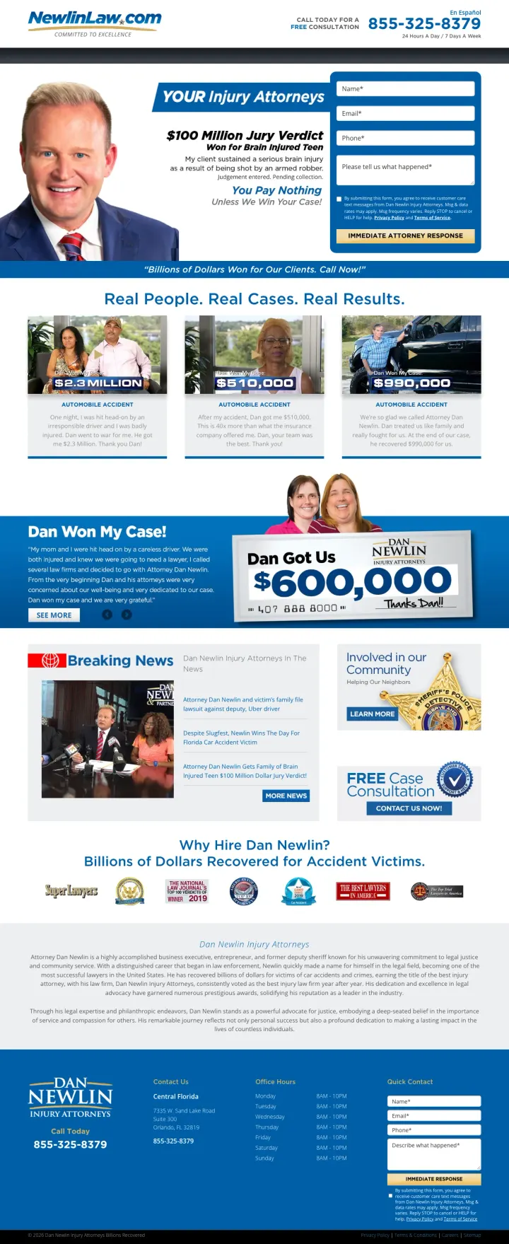
Why This Breaks the Rules: The page looks like a late-night TV infomercial -- oversized attorney headshot, bold blue and yellow, all-caps 'WINNING BILLIONS' -- which should undercut credibility for a high-stakes legal decision. But 15,000+ five star reviews and a 99.5% success rate overwhelm any design objections with sheer volume of social proof.
'In a Wreck and Need a Check? CALL NOW!' tagline is deliberately informal and almost comedic -- but for a Red-dominant persona in crisis mode, this casual urgency cuts through the legal jargon that every competitor uses and feels accessible rather than intimidating
Individual client testimonials with names, star ratings, and case outcomes ('Dan Won My Case! $1.4 Million') combine a named real person, a verdict amount, and an emotional endorsement in a single testimonial card
Settlement amounts displayed as individual cards with photos ($8.5M, $850K, $890K, $875K) each with a case description visible -- not just numbers but mini case studies
The page is extremely long with repeating CTAs and content sections that feel like a direct-response sales letter -- visitors who are not the Red persona may find the aggressive tone off-putting
Multiple overlapping font sizes and bold text create visual chaos -- the page tries to emphasize everything, which means nothing stands out
Form placeholder text ('Please tell us what happened*') is the only content prompt -- a case type dropdown or checkboxes would reduce friction and improve lead quality
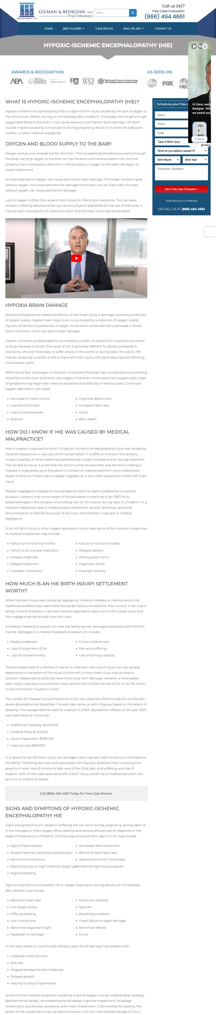
Why This Breaks the Rules: This page is extremely long and content-heavy -- normally a loser pattern in PI. But for birth injury (specifically HIE), the visitor is a parent desperately researching a terrifying medical condition. The medical depth IS the trust signal because it proves the firm understands the specific injury, not just personal injury in general.
Condition-specific subdomain (philadelphiabirthinjuries.gilmanbedigian.com) creates the impression of an entire website dedicated to birth injuries -- the visitor feels they found a specialist, not a generalist
Quiz-style intake chatbot asking 'What do you believe caused it?' with options (Child Birth Injury, Wrongful Death) qualifies leads by medical context rather than legal context -- speaking the parent's language rather than lawyer language
Settlement amounts specific to birth injury cases ($1.4M, $1.3M, $799K, $589K) with the condition name let parents see what HIE cases specifically have settled for -- not generic PI results but their exact situation
Awards & Recognition strip appears before any empathetic content -- a parent of an injured newborn needs emotional validation before they care about ABA memberships and WSJ features
The page is extremely long with detailed medical content about oxygen deprivation, brain damage, and neonatal complications -- while appropriate for the audience, the sheer volume may overwhelm a parent who is already emotionally devastated
Chat widget video (attorney talking head) auto-plays and covers a significant portion of the page content -- disruptive for a visitor trying to read about their child's condition
3 pages burning ad spend with fundamental issues
Every click to these pages costs real money. We found broken trust signals, mismatched intent, weak CTAs, and messaging that ignores what the searcher actually typed. Here is what to avoid.
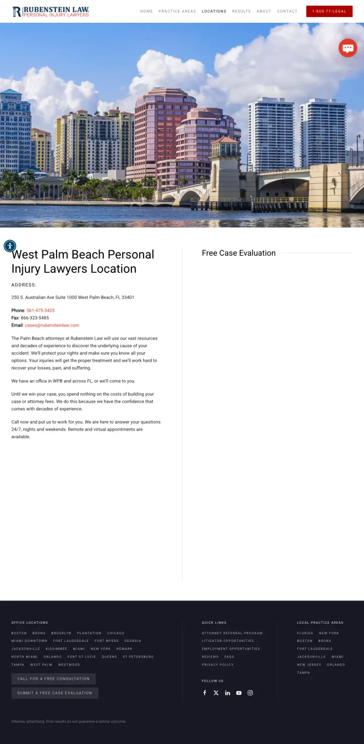
Ad says 'Rubenstein Law - Hurt or Injured? Billions in Client Settlements' but the landing page is a location office page with a giant skyline photo of West Palm Beach, an address, and two paragraphs of boilerplate text. No settlement figures (despite claiming 'Billions'), no attorney photos, no case types. At PI CPCs, each click pays for a Google Maps pin with extra words.
Hero image is a city skyline photo of West Palm Beach that occupies 60% of the above-fold viewport -- a paid visitor searching for a personal injury lawyer sees a tourism photo instead of settlement amounts, attorney faces, or a form
Ad claims 'Billions in Client Settlements' but the landing page shows zero dollar figures -- the strongest trust signal in the ad copy is completely absent from the page
Full website navigation (Home, Practice Areas, Locations, Results, About, Contact) with 6 exit paths on a page that already has minimal conversion architecture
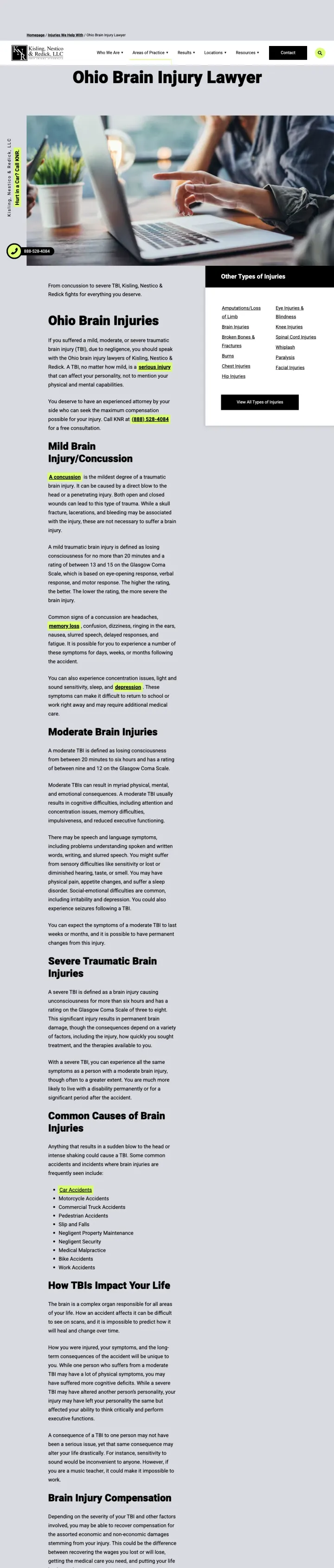
Ad promises 'Legal Help After TBI -- Max compensation, max compassion. No fees unless we win' but the landing page is a 2,000+ word medical education article about brain injury classifications (mild, moderate, severe TBI), the Glasgow Coma Scale, and diffuse axonal injury pathology. No settlement figures, no case results, no form. The page reads like a neurology textbook at $100+ per click.
No form anywhere on the page -- the only conversion path is a phone number in a floating sidebar button. For a brain injury victim who may have cognitive difficulties, asking them to make a phone call rather than fill out a simple form creates an unnecessary barrier
2,000+ words of medical content about TBI classifications (Glasgow Coma Scale ratings, diffuse axonal injury, subdural hematomas) serves the wrong audience -- the visitor searched for a lawyer, not a medical reference
'Other Types of Injuries' sidebar links (Amputations, Eye Injuries, Knee Injuries, Spinal Cord Injuries) create exit paths to other practice area pages, fragmenting the visitor's journey instead of converting them
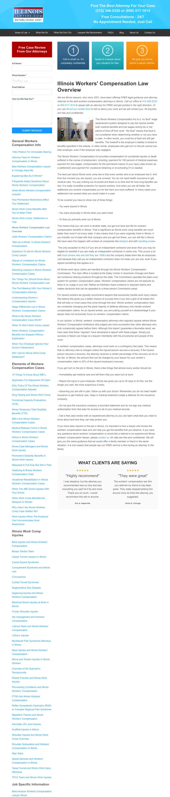
Ad promises 'Need a Workers Comp Attorney? No Fee Unless You Win. Talk to a lawyer for free' but the page is a comprehensive legal overview of Illinois Workers' Compensation Act, covering benefit calculations, employer obligations, and legal procedures. The form exists but is overshadowed by thousands of words of legal content. At workers' comp CPCs, each click subsidizes a law school textbook.
The page is a legal encyclopedia: 'Illinois Workers Compensation Act is a no fault wage replacement system designed to pay the injured worker both medical benefits and lost wages' -- this reads like a law school casebook, not a landing page for an injured worker who just wants help
No settlement amounts, no case results, no success metrics anywhere -- the page says '300,000+ Cases Since 2001' in the ad but never shows what those cases were worth
Construction site stock photo next to walls of text creates an educational resource feel rather than an actionable landing page -- an injured worker needs empathy and a phone number, not a legal primer
The top-performing pages lead with specific dollar amounts recovered -- not vague claims but exact figures like '$8 Billion Won' or '$800 Million Recovered.' This matters because PI searchers are fundamentally asking 'how much is my case worth?' and seeing big numbers immediately answers that que...
Three of the strongest pages use intelligent chat widgets that ask 'What kind of case?' with clickable options (Car Accident, Truck Accident, Slip & Fall) instead of or alongside traditional forms. This converts the intake form from a chore into a conversation, and immediately routes the visitor ...
12 of 16 relevant pages offer both a prominent phone number and a form. The pages that do this best make the phone number feel urgent (24/7, click-to-call) and the form feel safe ('Free Case Review' vs 'Contact Us'). Pages with only phone or only form are leaving money on the table because PI vis...
Nearly half of pages reviewed include full website navigation menus. At $100-$1,000+ per click, every nav link is an exit path that wastes ad spend. The strongest performers (wewin.com, forthepeople.com, arnolditkin.com) strip navigation entirely and create focused conversion funnels.
Winners lead with specific dollar figures recovered, named attorneys with photos, and intake forms or chatbots above the fold on stripped-down landing pages with no site navigation. Losers send $100-$1,000+ clicks to team photo galleries, location stub pages, or educational content articles that answer legal questions without providing any conversion path..