Free: 96 PPC tools + my AI Playbook book

These are real senior living pages spending actual money on Google Ads right now.
From real senior living Google Ads campaigns in the US
The landing pages actually worth stealing from
So you know exactly what to avoid
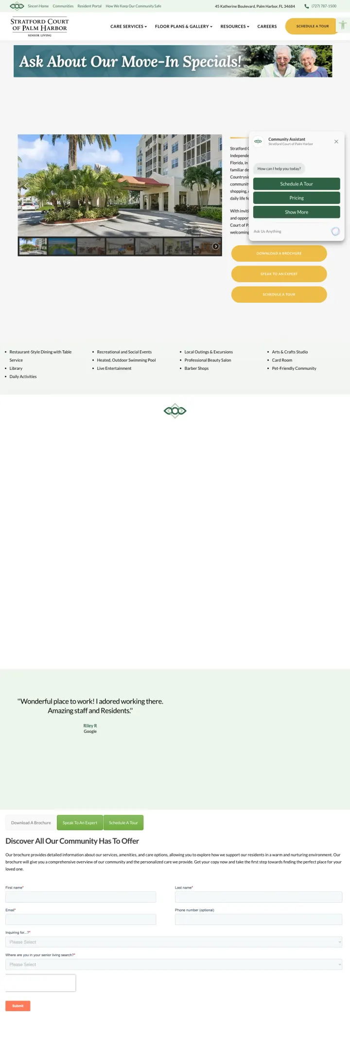
Add a 'Move-In Specials' or 'Limited Availability' banner to the hero section of community pages. Senior living has no natural urgency (unlike emergency services), so creating a financial incentive to act now rather than next month is the only way to compress the decision timeline.
'Ask About Our Move-In Specials!' gold banner across the hero creates financial urgency in a category with no natural deadline, giving families a reason to inquire now rather than continuing to research
Named resident testimonial quote ('Wonderful place! I started working there. Amazing staff and volunteers.') with attribution creates authentic social proof from someone who actually lives or works there
Photos of named team members or residents (visible in the hero alongside the form) humanize the community and let the visitor see real people, not stock photography
The green and gold color scheme feels dated and does not match the clean, modern aesthetic that younger adult children (the primary decision-makers) expect
Multiple form fields visible in the hero section (name, phone, care type dropdown, relationship) ask for significant personal information before showing any community details or pricing
The page structure below the fold shifts to a long-form content page with amenity lists and another form, making it unclear which conversion path is primary
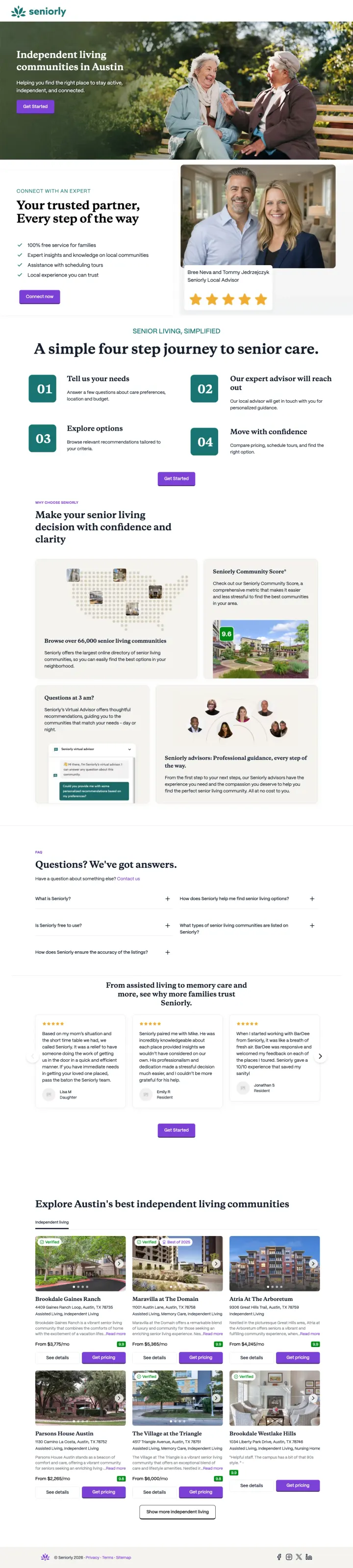
Generate dynamic landing pages per city and care type (e.g., 'Independent Living in Austin, Texas') so the ad headline, page headline, and content all match the visitor's specific search query. This is the strongest message-match strategy in the sample.
Dynamic headline 'Independent living communities in Austin' matches the exact search query, producing strong message match and Quality Score for location + care type keyword combinations
Map preview showing community pins gives the visitor an immediate visual of where options are located relative to their preferred area, which is critical for a location-dependent decision
Four-step process explanation (Tell us your needs, Explore options, Tour communities, Make your decision) sets expectations for the journey and reduces the perceived commitment of the first step
The named advisor ('Your trusted partner') with photo feels generic rather than personally assigned. If Seniorly actually assigns a specific advisor, showing their real name and credentials would build more trust
Community cards at the bottom show facility photos but no pricing ranges, which is the primary information families need to narrow their options before touring
No testimonials from families who used Seniorly to find senior living, which would validate the marketplace model
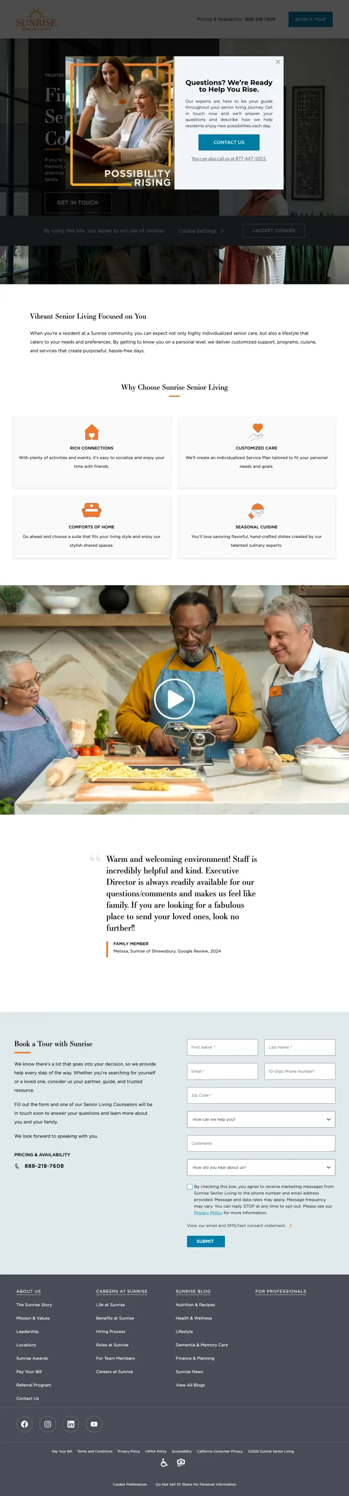
Combine a lifestyle video (staff and residents interacting naturally) with an embedded form in the same viewport. The video builds emotional connection while the form captures intent, both without scrolling.
Hero section combines a lifestyle image/video with the headline 'Senior Living That Transforms Your Next Chapter', selling a positive future rather than addressing the anxiety of placing a parent
'Possibility Rising' brand campaign embedded as both a visual element and content section creates emotional resonance around optimism rather than decline
Video testimonial of resident and staff member cooking together shows genuine human interaction, not staged facility photography
The form is partially hidden behind content sections and requires scrolling to fully access. For a page designed to capture tour requests, the form should be more prominent
'35 Years and Rising' history section, while credible, takes up significant real estate before the visitor sees the community-specific content they need to make a decision
No specific community highlighted by default. The visitor must select a location, which adds a step to the conversion path for someone who searched for a specific city
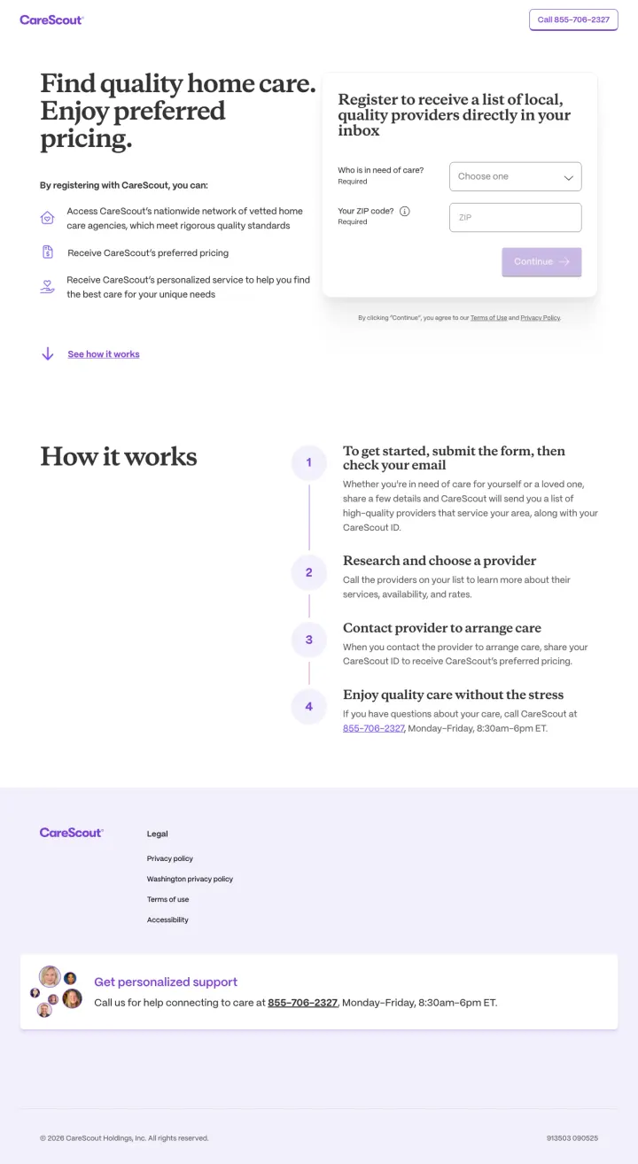
Use a split-panel layout with value proposition on the left and a registration form on the right. This gives the visitor both the 'why' and the 'how' in the same viewport without requiring a scroll.
Split-panel design: left side shows three specific benefits (access vetted network, receive preferred pricing, personalized service) while right side shows a simple registration form. Both visible without scrolling
Four-step 'How it works' section (submit form, check email, research and choose, contact provider) sets crystal-clear expectations for what happens after form submission, reducing the anxiety of 'will I get spammed with calls'
'Enjoy quality care without the stress' framing positions the service as stress reduction rather than provider search, which better matches the emotional state of a family dealing with aging parent care needs
The form asks for 'Who is in need of care?' and 'Your ZIP code' plus a required checkbox, which is more friction than the single-field search used by A Place for Mom and Caring.com
No imagery of real people, seniors, or care environments. The page is text-and-form only, which feels clinical compared to the emotional warmth of A Place for Mom
No social proof, testimonials, or 'families helped' count anywhere on the page
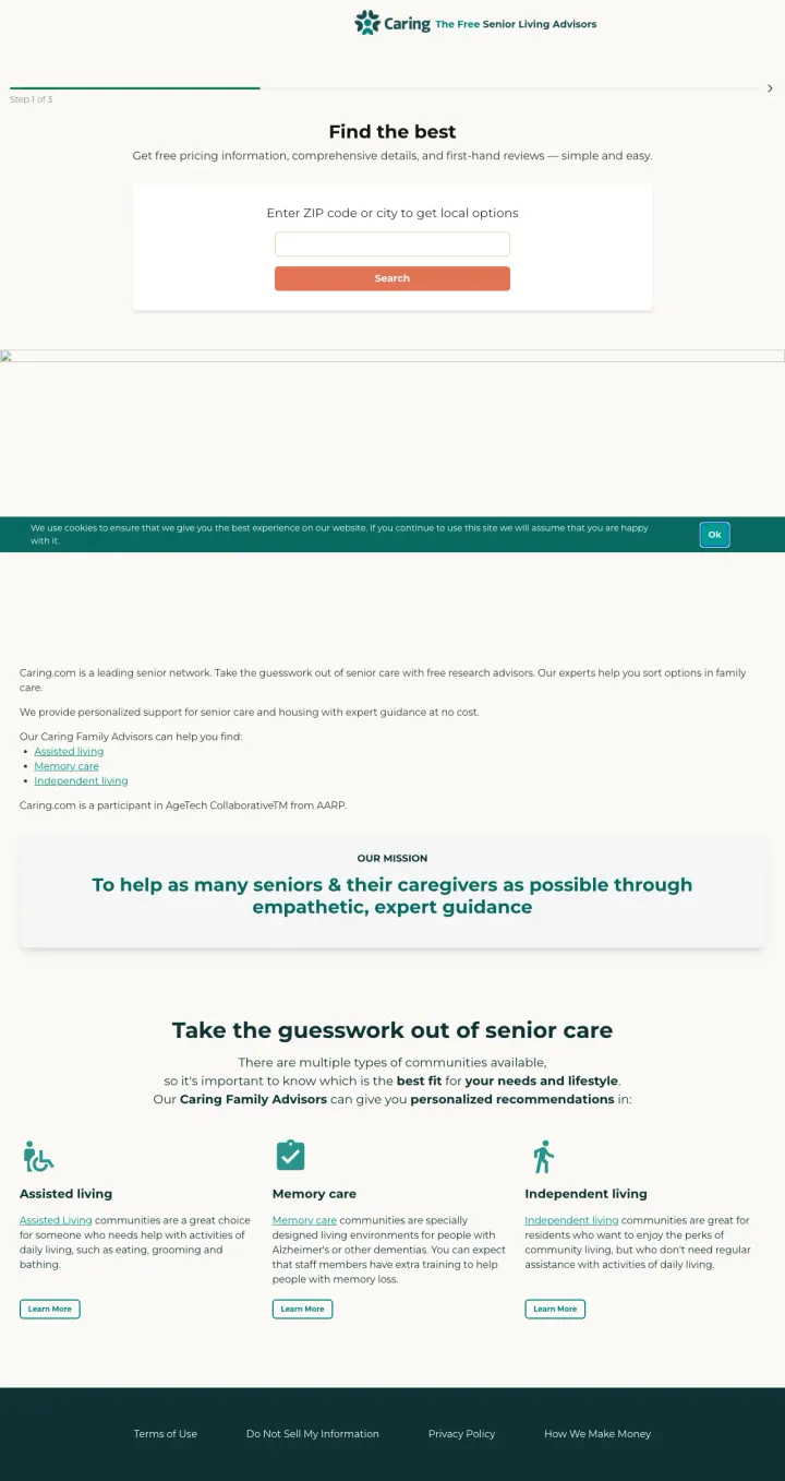
Position your marketplace as free, expert-guided, and personalized. Caring.com's tagline 'The Free Senior Living Advisors' immediately eliminates two objections: 'what will this cost me' and 'will I get real help or just a list'.
'Find the best' headline with 'Get free pricing information, comprehensive details, and first-hand reviews' subhead communicates the three things every family searching for senior living wants: cost, detail, and proof
Mission statement section ('To help as many seniors & their caregivers as possible through empathetic, expert guidance') addresses the emotional dimension of the decision and positions Caring.com as an ally, not a vendor
Care type education section (Assisted Living, Memory Care, Independent Living) with brief descriptions helps early-stage researchers understand their options before they start searching
The page design is utilitarian and slightly dated compared to A Place for Mom's polished emotional design. The teal color scheme and simple layout feel functional rather than warm
Cookie overlay sits on top of the zip search on first visit, which means the one conversion action every adult child arrived to do is hidden behind a click-to-dismiss
No specific advisor profiles or 'families helped' count, which reduces the social proof compared to A Place for Mom's '+2 million families' claim
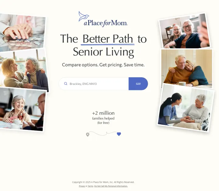
Use a single zip-code search field as your only above-the-fold interaction. The visitor types their location, clicks 'Go', and immediately sees results. No name, no email, no phone number required to start.
Photo mosaic of real seniors in warm, connected moments (laughing, embracing, doing puzzles) creates an emotional promise: 'your parent will be happy'. This is the correct visual approach for a decision driven by guilt and love
'+2 million families helped (for free)' is a massive social proof stat that also eliminates the 'what does this cost me' objection in a single line
Single search field with 'Go!' button reduces the first interaction to one piece of information (location), which is the minimum viable input to start the matching process
The page auto-detects location (showing 'Brackley, ENG NN13' for a UK-based visitor) which exposes a geo-targeting gap. US-focused service showing UK locations to non-US traffic is a wasted impression
No information about what happens after you search. The visitor does not know if they will see a list, get a phone call, or receive an email. Setting expectations reduces anxiety
The minimalist page design provides no educational content for visitors who are not yet ready to search and need help understanding the difference between assisted living, memory care, and independent living
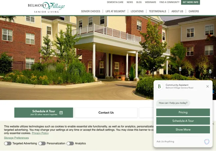
Put the buy-in model in the ad headline AND the page headline. Adult children comparing communities are terrified of six-figure entrance fees on top of grief, so saying 'No Buy-In Required' upfront removes the single objection that collapses most deals before the tour.
Left-rail status card ('Pay for What You Need', 'Activity Calendar', 'See Life at Belmont') is sticky context that keeps the decision frame visible no matter how far the adult child scrolls. Tour and call buttons are anchored here so the conversion target never leaves the screen.
Tiered care pricing grid ('Independent Living, Assisted Living, Memory Care') with monthly starting rates shows the visitor they can move in at one level and age in place without a second move. This directly addresses the #1 family fear: having to do this again in three years.
Awards strip (Inc. 5000, US News Best, Fortune Best Workplace Aging Services) sits above the testimonial block. For a decision that costs $80K+/year, a single cluster of awards is worth more than a dozen written reviews.
Three-column hero buttons (Schedule A Tour / Contact Us / Chat widget) compete for the same click at the exact moment the adult child has not decided whether to commit. One primary tour CTA with a clear secondary call would convert better at this stage.
Cookie consent bar plus GDPR targeting preferences panel eats real estate above the fold on first visit, pushing the awards and tiered pricing below the fold for anyone not already persuaded.
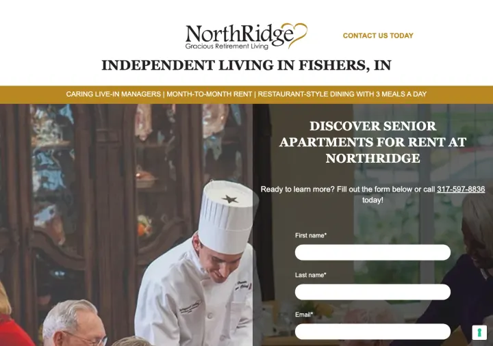
Put the starting monthly rate above the fold in a bold number and label it 'all-inclusive' so the family does not have to do math. Senior living shoppers call ten communities, and the one with a specific all-in number on the landing page is the one they actually budget against.
Three yellow-and-black ribbon badges under the headline ('Caring Live-In Managers', 'Month-To-Month Rent', 'Restaurant-Style Dining With 3 Meals A Day') turn the three biggest adult-child objections into a visual checklist. Each badge removes one reason to call a competitor.
Right-column form with just First Name / Last Name / Email sits next to the phone number as a pair, not a choice. The page is built for the hesitant researcher (form) and the urgent caller (phone) at the same time, which matches how senior living decisions actually get made inside a family.
Chef-in-uniform hero photo is a specific micro-reassurance. Food quality is the #2 complaint families hear from current residents, so leading with a real chef (not a stock dining room photo) pre-empts a conversation that normally happens on the tour.
No community photos in the hero. The chef is good for the food objection but the family also wants to see what the apartment actually looks like before they fill out a form.
'Live, Rent, Vacation FREE ANYWHERE!' offer below the fold is clever but the language is clickbait-adjacent for a financial category. A family researching mom's next home will question any offer that reads this promotional.
Pages that break the playbook in interesting ways
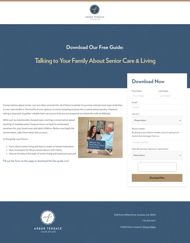
Create a free guide that addresses the emotional barrier to senior living ('Talking to Your Family About Senior Care & Living') and gate it behind a lead capture form. This captures families months before they are ready to tour, building a nurture pipeline that communities with tour-only CTAs miss entirely.
The guide title ('Talking to Your Family About Senior Care & Living') addresses the actual emotional pain point: the conversation with siblings and parents about moving, not the logistics of choosing a community
Clean landing page design with guide cover image, brief bullet points of what the reader will learn, and a form. No navigation, no distracting links. Pure lead capture
Form asks 'How did you hear about our community?' which helps attribute paid traffic spend to leads and downstream move-ins
The form asks for 8+ fields (first name, last name, email, phone, 'I Am A...', phone number again, 'How did you hear', plus a free text field) which is too many fields for a free guide download. 3-4 fields would convert better
No preview of the guide content. The visitor has to trust that the guide is worth filling out 8 fields for, without seeing a table of contents or sample page
Arbor Terrace branding is minimal. The page focuses on the guide, but a visitor who downloads it may not remember which community it came from
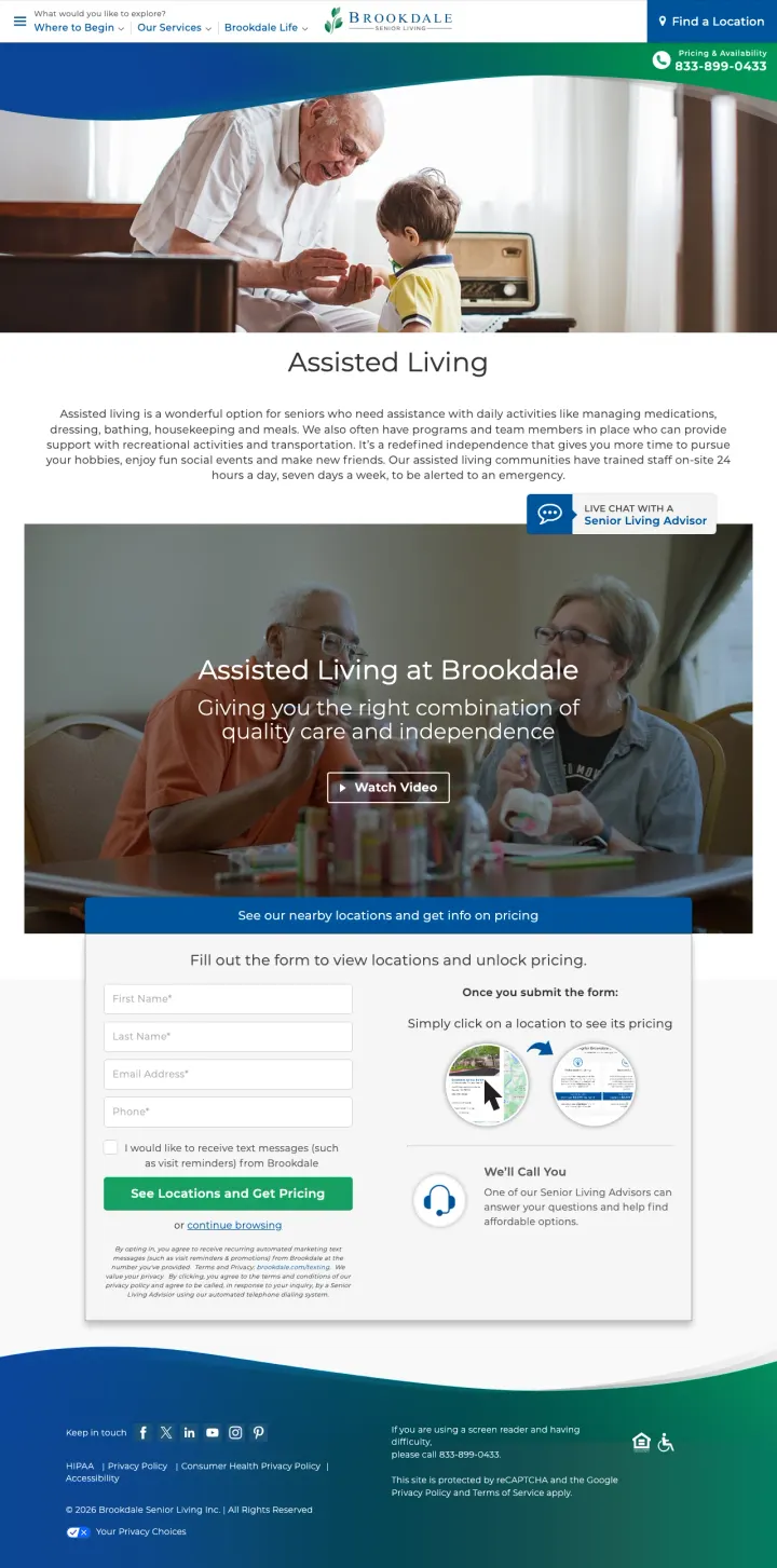
Create separate landing pages per care type (assisted living, independent living, memory care) rather than one generic community page. Brookdale runs distinct pages for each, which allows precise message matching with care-type-specific ad groups.
Care-type-specific hero: 'Assisted Living at Brookdale - Giving you the right combination of quality care and independence' matches the exact search intent for 'assisted living' queries
'Watch Video' CTA in the hero gives visitors an experiential preview of the community without requiring a tour visit, which is ideal for the research phase
'Live Chat with a Senior Living Advisor' persistent CTA provides immediate human connection for visitors who want answers now but are not ready to fill out a form or call
The lead capture form asks for First Name, Last Name, Email Address, and Phone before showing any locations or pricing. This is a significant friction barrier for a visitor who just wants to see what is available near them
'I would like to receive text messages' opt-in checkbox feels aggressive for a first interaction with a family making a vulnerable decision about their parent's care
The page promises 'See its pricing' after form submission, which means the visitor must give personal information before learning if Brookdale is financially viable for them
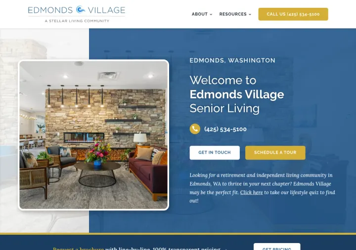
Why This Breaks the Rules: Edmonds Village offers a 'lifestyle quiz' as a third CTA alongside phone and tour. Senior living pages almost universally push one action (book a tour). The quiz gives the family a pressure-free entry point that the industry categorically avoids.
Lifestyle quiz link tucked into the hero paragraph ('Click here to take our lifestyle quiz to find out') captures the researcher who is not ready to commit to a tour but will answer 5 questions about mom's day. This is a list-building move the category does not do.
Community name set in condensed serif display type ('EDMONDS VILLAGE') as a faint watermark through the hero works as a location signature, so visitors from local keywords know they are in the right place without a city headline.
Two stacked buttons under the phone number ('Get In Touch' + 'Schedule A Tour') separate the low-commitment and high-commitment actions, letting the researcher pick the action that matches their emotional readiness.
Wall of long-form paragraphs below the fold buries the quiz and the pricing link. The editorial tone is appropriate for the category but the scannable elements a family needs (amenities list, floor plan preview) are missing.
Single interior-only photo in the hero (well-furnished lobby) skips the exterior and the resident photography. A page that wants to feel warm still needs to show the people.
3 pages burning ad spend with fundamental issues
Every click to these pages costs real money. We found broken trust signals, mismatched intent, weak CTAs, and messaging that ignores what the searcher actually typed. Here is what to avoid.
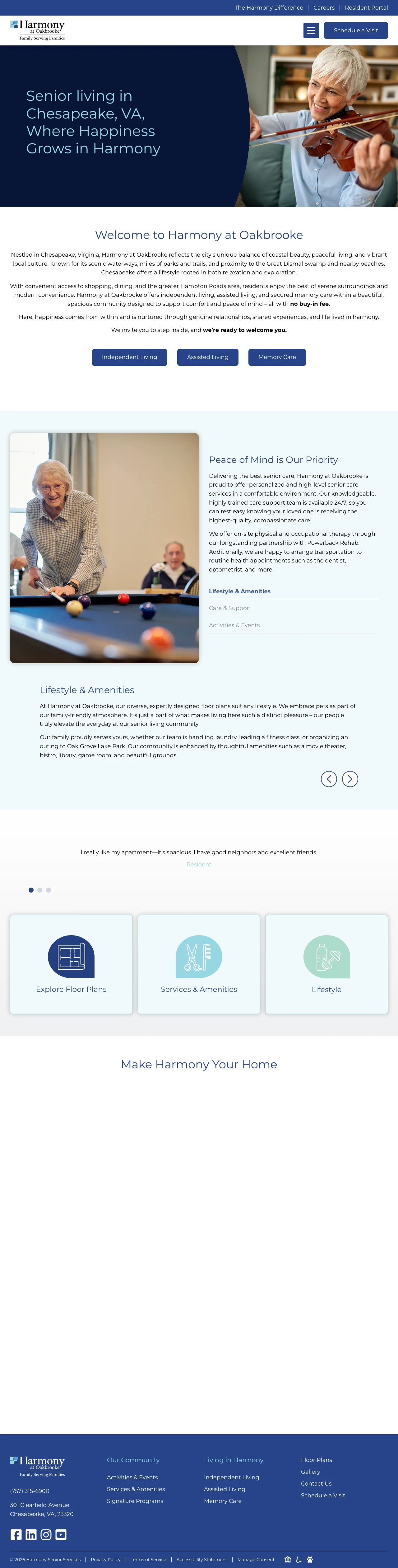
Paid traffic for 'senior living Chesapeake VA' lands on a community page that opens with 'Senior living in Chesapeake, VA Where Happiness Grows in Harmony' and a hero image of an elderly couple at a pool table. The first substantive content is a paragraph of generic welcome text. No pricing, no availability, no tour offer, no form visible without scrolling. At senior living CPCs ($15-30), every visitor who bounces from this generic welcome page costs the community real money.
No form, pricing, or availability information visible above the fold. The visitor must scroll through welcome text, care type tabs, amenity descriptions, and lifestyle sections before reaching any conversion mechanism
Hero image shows an elderly couple at a pool table, which is a pleasant but generic stock-style image that could be any senior living community in the country
Map section at the bottom shows the location but the map image appears broken or failed to load, leaving a large gray placeholder
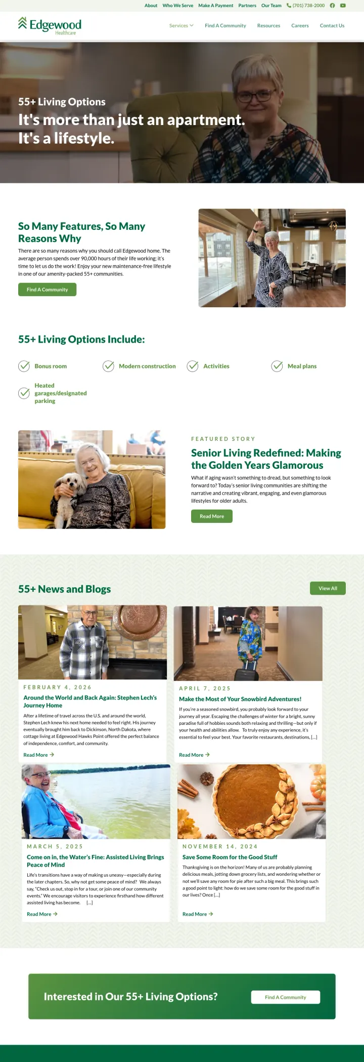
Paid traffic for senior living keywords lands on a page headlined 'It's more than just an apartment. It's a lifestyle.' followed by paragraphs of marketing copy about '55+ Living Options Include' with checkmark lists (restaurant-style dining, housekeeping, transportation). Then a 'Featured Story' blog section and 'News and Blogs' articles about Valentine's Day crafts and baking recipes. At senior living CPCs ($15-30), every click that lands on a blog page with no form, no pricing, and no tour booking is wasted budget.
No lead capture form anywhere on the page. No 'Schedule a Tour', no 'Get Pricing', no 'Contact Us' form visible without navigating to another page
Blog articles about Valentine's Day crafts and baking recipes occupy the bottom third of the page, which is irrelevant to a family making a $5,000+/month living decision
No specific community highlighted. The page describes '55+ Living Options' generically without showing which communities offer these options or where they are located
Paid traffic for senior living keywords lands on a page that looks like a SaaS product page, not a senior living community. Green gradients, data charts, progress indicators, and technology-focused messaging dominate the design. The page appears to be marketing a senior living technology platform or management company rather than an actual community a family can visit. At senior living CPCs ($15-30), families searching for 'assisted living near me' will bounce immediately from a page that looks like a fintech startup.
The page design communicates 'technology platform' rather than 'caring community', which is a fatal mismatch for families searching for senior living options
No photos of real seniors, real communities, or real caregivers anywhere on the page. The imagery is abstract and corporate
Green gradient backgrounds, data charts, and progress bars look like a SaaS dashboard, not a place where grandma will live
A Place for Mom, Caring.com, SeniorAdvisor, and AgingCare all use the same pattern: a single prominent search box asking for a zip code or city, with a single 'Go' or 'Search' button. This one-field approach captures the visitor's location and intent in a single action. Compare this to Brookdale'...
A Place for Mom uses a mosaic of photos showing seniors laughing together, a caregiver holding a patient's hand, a couple embracing, and a grandmother with a puzzle. Sunrise Senior Living uses a video still of a staff member and resident cooking together. These images communicate 'your parent wil...
Caring.com runs separate landing pages for general senior housing and memory care specifically. Brookdale runs separate pages for assisted living and independent living. Senior Lifestyle shows three lifestyle options (Independent, Assisted, Memory Care) as cards. Families searching for memory car...
Arbor Company (Arbor Terrace) runs a dedicated landing page offering a free downloadable guide: 'Talking to Your Family About Senior Care & Living'. The page is a pure lead-gen form with the guide cover image, a brief description of what the visitor will learn, and a form requesting name, email, ...
Winners use minimal-friction entry points (zip code search, single-field forms), emotionally resonant imagery (human connection, not buildings), and care-type-specific landing pages. Losers send paid traffic to generic community pages with institutional photography, multi-field forms that ask for personal details before showing any value, and no differentiation between the adult child researching assisted living and the one desperately searching for memory care..